7 Landing Page Design Mistakes to Avoid
7 landing page design mistakes to avoid? Let’s dive in! Creating a high-converting landing page isn’t about luck; it’s about understanding and avoiding common pitfalls. From ignoring mobile responsiveness to neglecting a killer call to action, we’ll uncover the seven most frequent errors that sabotage your conversion rates and leave potential customers frustrated. Get ready to transform your landing pages from underperformers to lead-generating powerhouses!
This post will dissect each mistake, providing actionable advice and practical examples. We’ll cover everything from optimizing images for speed to crafting a compelling value proposition that resonates with your target audience. By the end, you’ll have a clear roadmap to build landing pages that not only look great but also convert visitors into customers.
Ignoring Mobile Responsiveness

Source: noupe.com
In today’s mobile-first world, neglecting mobile responsiveness is a cardinal sin of landing page design. A non-responsive landing page not only frustrates visitors but also significantly impacts your conversion rates. Users encountering a clunky, unreadable, or unusable page on their smartphones are far more likely to bounce than those presented with a seamless, optimized experience. Let’s explore why mobile responsiveness is paramount and how to achieve it.A responsive landing page adapts its layout and content to fit various screen sizes seamlessly.
Imagine a webpage that shrinks its elements proportionally on smaller screens, maintaining readability and usability. This is the essence of responsive design, and it’s crucial for maximizing your reach and conversions across all devices.
Responsive Landing Page Layout, 7 landing page design mistakes to avoid
Designing a responsive landing page requires a thoughtful approach to layout and content organization. Instead of creating separate mobile and desktop versions, aim for a single, fluid design that adjusts automatically. This often involves using flexible grids, relative units (like percentages instead of pixels), and media queries in your CSS. A successful responsive design prioritizes clear navigation, easily accessible calls to action, and a clutter-free layout, regardless of screen size.
For example, a landing page featuring a hero image might adjust the image size and position to avoid obscuring important content on smaller screens. Similarly, long blocks of text might reflow to multiple columns on larger screens, but remain single-column on smaller screens for improved readability.
Common Mobile Design Pitfalls and Their Solutions
Several common mistakes hinder the effectiveness of mobile landing pages. Tiny text, cluttered layouts, and slow loading times are major culprits. Avoiding these pitfalls involves careful planning and testing. For example, using excessively small font sizes makes content difficult to read on smaller screens. The solution is to employ responsive typography, which automatically adjusts font sizes based on screen dimensions.
Similarly, overly complex layouts with many elements crammed together can be overwhelming on smaller screens. Simplifying the layout, prioritizing essential information, and using whitespace effectively are key to creating a user-friendly experience. Finally, images and videos that are not optimized for mobile devices can significantly slow down loading times. Compressing images without compromising quality is vital for a smooth mobile experience.
Optimizing Images and Text for Mobile Viewing
Image optimization is critical for mobile performance. Large, uncompressed images drastically increase loading times, leading to high bounce rates. Employing techniques like compression (reducing file size without sacrificing visual quality) and using appropriate image formats (WebP offers excellent compression) are essential. For text, ensure sufficient line spacing, clear headings, and a legible font size. Consider using responsive typography, where font sizes automatically adjust based on screen size, and sufficient whitespace to avoid cramped text blocks.
Remember to test your text size and readability on different devices and screen sizes.
Mobile-First Design Approach
Adopting a mobile-first design strategy means prioritizing the mobile experience during the initial design phase. This approach ensures that the core functionality and content are optimized for smaller screens before adapting to larger ones. This helps to identify and address potential mobile usability issues early on, leading to a more efficient and effective design process. For example, by designing for the smallest screen size first, you automatically ensure that all essential elements are easily accessible and visible on any device.
Then, you can progressively enhance the design for larger screens, adding additional features and content without compromising the core mobile experience. This approach guarantees a positive user experience regardless of the device used.
Neglecting Clear Call to Action (CTA)
A compelling call to action (CTA) is the cornerstone of a successful landing page. Without a clear and concise CTA, visitors are left unsure of what you want them to do, leading to a significant drop in conversions. A well-designed CTA guides users towards the desired action, whether it’s making a purchase, signing up for a newsletter, or downloading a resource.
Ignoring this crucial element is a recipe for wasted potential.A strong CTA doesn’t just tell visitors what to do; it persuades them to do it. It needs to be easily visible, clearly understood, and compelling enough to overcome any hesitation. Think of it as the final push needed to convert a casual visitor into a loyal customer or engaged lead.
Three Distinct CTA Designs and Their Effectiveness
Let’s consider three different CTA designs and analyze their potential effectiveness:
1. “Learn More” Button
This is a common, yet often underwhelming, CTA. While it’s relatively neutral, it lacks the urgency and specificity needed to drive strong conversions. It’s suitable for pages aiming for brand awareness or lead generation through content consumption, but it often falls short when the goal is immediate action. Conversion rates are typically lower compared to more direct CTAs.
2. “Get Your Free Trial Now!” Button
This is a much more effective CTA because it offers immediate value (“free trial”) and creates a sense of urgency (“Now!”). The clarity and benefit-driven approach are likely to result in higher click-through rates compared to the “Learn More” button. It’s ideal for software or service-based businesses.
3. “Buy Now and Save 20%!” Button
This CTA is highly effective due to its clear benefit (saving 20%) and direct call to action (“Buy Now”). The combination of immediate value and limited-time offer (implied) significantly increases its persuasive power, leading to higher conversion rates, particularly for e-commerce businesses.
Characteristics of a Compelling and Highly Visible CTA
A compelling and highly visible CTA possesses several key characteristics:* Clear and Concise Language: Avoid jargon and ambiguity. Use action verbs and focus on the benefit to the user.
Strong Visual Hierarchy
Make it stand out using contrasting colors, size, and placement. It should be the focal point of the page.
Sense of Urgency (Optional)
Limited-time offers or scarcity tactics can increase the click-through rate. However, use these sparingly to avoid appearing manipulative.
Compelling Value Proposition
Clearly communicate the benefit of taking the desired action. What will the user gain?
Strategic Placement
Place the CTA strategically within the page’s natural flow, ensuring it’s easily visible without being intrusive.
A/B Testing Different CTA Designs
A/B testing is crucial for optimizing CTA performance. By creating two or more versions of your CTA (varying color, text, or placement), you can track which version performs better in terms of click-through rates and conversions. Tools like Google Optimize or VWO allow you to easily set up and analyze A/B tests. By iteratively testing different variations, you can refine your CTA until you achieve optimal results.
For example, you might test a green button against a red button, or a shorter text against a longer one. Analyze the data to see which performs better and iterate from there.
Comparison of CTA Button Styles
| Button Style | Color | Size | Text | Pros | Cons |
|---|---|---|---|---|---|
| Primary CTA | High contrast (e.g., green, orange, blue) | Larger, prominent | Action-oriented (e.g., “Buy Now,” “Sign Up”) | High visibility, clear call to action | Can be overwhelming if overused |
| Secondary CTA | Less prominent color (e.g., light blue, gray) | Smaller | More informative (e.g., “Learn More,” “Get Started”) | Provides additional options, less intrusive | May receive fewer clicks |
| Ghost Button | Transparent background, text only | Medium size | Concise text (e.g., “Download”) | Modern aesthetic, less obtrusive | May not be as noticeable as other styles |
| Rounded Button | Various colors | Variable size | Action-oriented text | Visually appealing, modern | Can be less noticeable than sharply-edged buttons if not properly designed |
Poor Page Load Speed
A slow-loading landing page is a surefire way to lose potential customers. In today’s fast-paced digital world, users expect instant gratification. A sluggish page will frustrate visitors, leading them to abandon your site before they even see what you have to offer. This translates directly into lost conversions and a damaged brand reputation. Let’s explore how to avoid this common landing page pitfall.In the cutthroat world of online marketing, every second counts.
A slow landing page significantly impacts user experience and conversion rates. Studies have shown that even a delay of a few seconds can drastically reduce conversions. This is because impatient users are more likely to bounce, meaning they leave your website without taking any desired action, such as filling out a form or making a purchase. The longer your page takes to load, the higher the bounce rate, and consequently, the lower your conversion rate.
The resulting loss in potential revenue can be substantial.
Techniques to Improve Landing Page Load Times
Optimizing your landing page’s speed involves a multifaceted approach. Several key strategies can significantly reduce loading times, improving user experience and boosting conversions. Implementing these techniques can make a noticeable difference in your overall performance.
- Optimize Images: Compress images without sacrificing quality using tools like TinyPNG or ImageOptim. Using appropriately sized images for the specific screen resolution is also crucial. Avoid using unnecessarily large images.
- Minify CSS and JavaScript: Minification removes unnecessary characters from your code, reducing file sizes and improving load times. Many online tools can perform this task automatically.
- Leverage Browser Caching: Enable browser caching to store static assets (images, CSS, JavaScript) locally on users’ computers. This eliminates the need to download these assets repeatedly, significantly speeding up subsequent visits.
- Use a Content Delivery Network (CDN): A CDN distributes your website’s content across multiple servers globally, allowing users to access your landing page from the server closest to them. This drastically reduces loading times, especially for users located far from your main server.
- Improve Server Response Time: A slow server is a major bottleneck. Ensure your hosting provider offers sufficient resources and optimize your server configuration for optimal performance. Consider upgrading to a more powerful hosting plan if necessary.
Image Optimization for Faster Loading
Images are often the largest contributors to slow page load times. Optimizing them without sacrificing visual quality is crucial. This involves a combination of techniques.
- Compression: Use lossy compression techniques (like JPEG for photographs) to reduce file size without significant visible quality loss. Lossless compression (like PNG for graphics with sharp lines) maintains quality but results in larger files.
- Format Selection: Choose the appropriate image format based on its content. JPEGs are suitable for photographs, while PNGs are better for graphics with sharp lines and text. WebP offers superior compression compared to both JPEG and PNG.
- Resizing: Resize images to the exact dimensions needed on your landing page. Avoid uploading oversized images and relying on browser scaling, as this can significantly impact performance.
- Lazy Loading: Lazy loading is a technique that delays the loading of images until they are about to be visible in the user’s viewport. This prevents the browser from downloading all images at once, improving initial load time.
Tools to Measure and Analyze Page Load Speed
Several tools are available to measure and analyze your landing page’s load speed, providing valuable insights for optimization. These tools offer detailed reports, pinpointing areas for improvement.
- Google PageSpeed Insights: This free tool from Google analyzes your page’s performance and provides specific recommendations for improvement. It provides scores for both mobile and desktop devices.
- GTmetrix: GTmetrix offers a comprehensive analysis of your website’s performance, including detailed waterfall charts showing the loading times of individual resources. It provides suggestions for optimization based on industry best practices.
- Pingdom Website Speed Test: This tool provides a quick overview of your website’s performance, including load time, page size, and number of requests. It also offers suggestions for improvements.
Lack of Compelling Visuals: 7 Landing Page Design Mistakes To Avoid
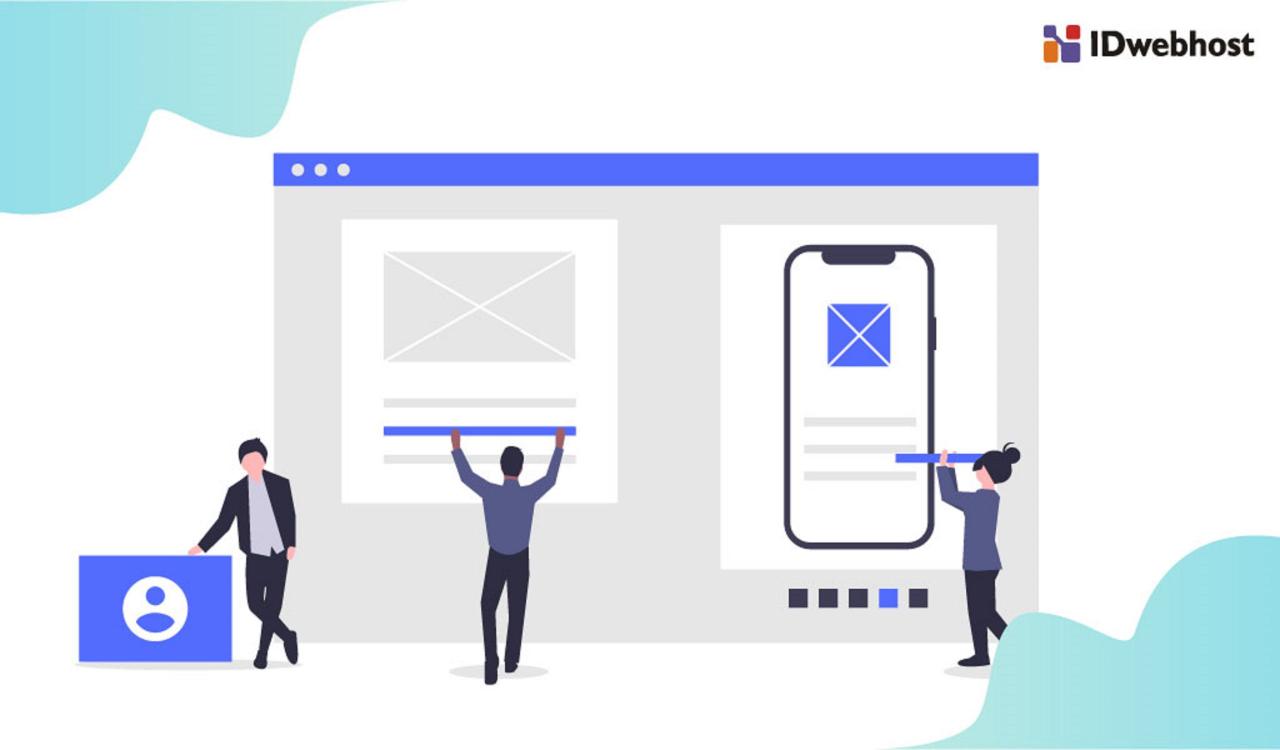
Source: idwebhost.com
Avoiding those seven killer landing page design mistakes is crucial for conversions, and it’s a lesson that applies across all your online marketing. For example, think about how you’d apply those same principles to your YouTube strategy – check out this great guide on getting it on with youtube to see what I mean. Mastering landing page design, after all, directly impacts the success of your YouTube promotion efforts and overall marketing strategy.
A picture is worth a thousand words, and on a landing page, that’s a thousand words you can’t afford to waste. In the cutthroat world of online marketing, grabbing attention is paramount, and compelling visuals are your secret weapon. Without them, your meticulously crafted copy risks being ignored, leaving your conversion rates languishing.High-quality images and videos are crucial for capturing attention and conveying your message effectively.
Think about it: a blurry, low-resolution image screams amateurism, while a crisp, professional-looking photo instantly builds trust and credibility. Videos, especially short, engaging ones, can dramatically increase engagement by showcasing your product or service in action. They offer a dynamic and immersive experience that static images simply can’t match. Consider using high-quality stock photos or investing in professional photography and videography if your budget allows.
Visual Hierarchy on a Landing Page
A well-designed landing page guides the user’s eye naturally towards the most important information. This is achieved through visual hierarchy, which prioritizes elements based on their importance. The key is to create a clear path to conversion. Your most important element, the call to action (CTA), should be the most visually prominent.Think of it like a funnel: The user enters the top, and through careful visual cues, they are guided down to the CTA at the bottom.
This can be achieved through size, color, contrast, and placement. The headline should be the largest and most prominent element, followed by supporting visuals and then the CTA button. Use whitespace effectively to separate different sections and prevent visual clutter.
The Power of Whitespace
Whitespace, or the empty space around elements on a page, is often overlooked, but it’s a powerful tool for improving readability and visual appeal. It prevents the page from feeling cluttered and overwhelming, making it easier for users to focus on the key information. Whitespace acts as a visual buffer, allowing the eye to rest and process information more effectively.
Proper use of whitespace dramatically enhances the overall user experience, making your landing page more appealing and easier to navigate. Think of it as the breathing room your design needs. A page crammed with text and images will feel claustrophobic, while a page with ample whitespace feels clean and inviting.
Impact of Visual Elements on User Engagement
| Visual Element | Impact on User Engagement | Example | Potential Improvement |
|---|---|---|---|
| High-Quality Images | Increased attention, improved brand perception, better understanding of product/service | A crisp image of a product in use, showing its benefits. | Using lifestyle imagery to showcase the product in a relatable context. |
| Videos | Enhanced engagement, improved comprehension, increased memorability | A short explainer video demonstrating how a software works. | Adding user testimonials or case studies within the video. |
| Infographics | Simplified complex information, improved understanding, increased memorability | A visual representation of statistics related to the product’s benefits. | Using interactive elements within the infographic. |
| Whitespace | Improved readability, enhanced visual appeal, reduced cognitive load | Adequate spacing between text blocks and images. | Strategically using whitespace to guide the user’s eye towards the CTA. |
Unclear Value Proposition
A compelling value proposition is the bedrock of any successful landing page. It’s the concise statement that clearly communicates the benefit your product or service offers and why someone should choose you over the competition. Without a clear value proposition, visitors will be left confused and unlikely to convert. A muddled message leads to lost opportunities.Crafting a concise and compelling value proposition requires understanding your target audience and their needs.
It’s not just about what you offer; it’s about how that offering solves a problem or improves their lives. A strong value proposition speaks directly to their pain points and promises a tangible solution.
Crafting a Concise and Compelling Value Proposition
To create a winning value proposition, focus on clarity and brevity. Think of it as your elevator pitch – you need to convey the core benefit in a few short words. Start by identifying your target audience’s primary needs and frustrations. Then, articulate how your product or service directly addresses those issues. Finally, distill that information into a short, memorable statement that highlights the key benefit and differentiates you from the competition.
Consider using the formula: “For [target audience], [product/service] is a [category] that [key benefit] because [reason].”
Examples of Effective Value Propositions
Let’s look at some examples across different industries:* Dropbox: “Dropbox simplifies how you create, share, and collaborate on files.” This clearly communicates the benefit (simplification) and the target audience (creators and collaborators).
Mailchimp
“Send better email, grow your business.” This concisely highlights the key benefit (business growth) and how the product helps achieve it.
Headspace
“Mindfulness made simple.” This value proposition is incredibly brief, yet effectively targets a specific need (simplicity) in a busy world.
Highlighting Unique Selling Points
Your unique selling proposition (USP) is what sets you apart from the competition. It’s the one thing that makes your product or service uniquely valuable. This could be a specific feature, a superior level of customer service, a lower price point, or a unique combination of features. Once identified, prominently feature your USP on your landing page.
Don’t bury it; make it the focal point. Use strong visuals and persuasive language to emphasize its importance.
Different Approaches to Communicating Value
The following table compares different approaches to communicating value:
| Approach | Description | Example | Best For |
|---|---|---|---|
| Problem/Solution | Highlights a problem and presents the product/service as the solution. | “Tired of complicated software? Our intuitive platform makes it easy.” | Products solving a specific problem. |
| Benefit-Driven | Focuses on the positive outcomes of using the product/service. | “Increase your sales by 20% with our targeted marketing tools.” | Products with measurable results. |
| Feature-Focused | Emphasizes the key features and functionalities. | “Experience seamless integration with all your favorite apps.” | Products with innovative or unique features. |
| Value-Based | Emphasizes the overall value proposition, considering price and benefits. | “Get premium quality at an affordable price.” | Products offering a strong value proposition relative to cost. |
Ignoring User Experience (UX) Principles
A landing page isn’t just about pretty visuals and compelling copy; it’s about guiding your visitor towards a specific action. Ignoring user experience (UX) principles can severely hinder your conversion rates, no matter how stunning your design is. A positive user experience ensures visitors easily navigate your page, understand your value proposition, and ultimately, complete your desired call to action.A well-designed landing page anticipates user behavior and makes the journey seamless.
Poor UX, on the other hand, leads to frustration, confusion, and ultimately, abandoned sessions. This translates directly to lost opportunities. Let’s explore how to avoid common UX pitfalls and build a landing page that delights your visitors.
Intuitive Navigation and Clear Information Architecture
Intuitive navigation and a well-structured information architecture are fundamental to a positive user experience. Visitors should be able to quickly find what they’re looking for without feeling lost or overwhelmed. A cluttered layout with disorganized content makes it difficult for users to understand your message and take the desired action. Effective information architecture involves strategically organizing content to create a logical flow.
This ensures a clear path for the user to follow, from initial engagement to conversion. For example, a clear headline immediately communicates the page’s purpose, while concise subheadings and bullet points break up large blocks of text, making the information more digestible. Navigation should be simple and uncluttered, perhaps using a clear menu or prominent internal links.
Common UX Mistakes and Their Corrections
Many landing pages suffer from common UX flaws. One frequent mistake is burying the crucial information. Instead of prominently displaying the key benefits and call to action, vital details might be hidden within lengthy paragraphs or tucked away in less visible sections. The solution? Prioritize key information and make it easily scannable.
Use clear headings, concise bullet points, and visuals to highlight the most important details. Another mistake is inconsistent branding. The visual style, messaging, and overall tone should align with your brand identity across all platforms. Inconsistent branding can confuse visitors and damage trust. Maintain consistency in your color palette, typography, imagery, and overall tone of voice.
Finally, failing to test your design leads to missed opportunities for optimization. User testing allows you to identify pain points and areas for improvement before your page goes live. Regularly A/B test different design elements to see what resonates best with your audience.
User-Centered Design Principles Applied to Landing Pages
User-centered design puts the user at the heart of the design process. This involves understanding your target audience, their needs, and their expectations. For example, consider using personas to represent your ideal customer. This helps to create a clear picture of who you’re designing for and tailor your messaging and design accordingly. Emphasize visual hierarchy, guiding the user’s eye to the most important information first.
This can be achieved through strategic use of whitespace, font sizes, and colors. Furthermore, ensure accessibility for users with disabilities. This includes providing alternative text for images, using sufficient color contrast, and ensuring keyboard navigation is functional.
Ideal User Journey on a Landing Page
Imagine a simple user flow: The user lands on the page, sees a clear headline and compelling visuals immediately conveying the value proposition. Their eyes then move to concise bullet points highlighting key benefits. A strong call to action, visually distinct and easy to find, is strategically placed. The user clicks the call to action, completing the desired conversion.
This simple flow illustrates the ideal user journey: quick understanding, clear guidance, and effortless conversion. A well-designed landing page minimizes friction and maximizes conversion.
Failing to Track and Analyze Performance
Building a high-converting landing page isn’t a set-it-and-forget-it process. You need to constantly monitor its performance to identify what’s working and what’s not. Without tracking and analysis, your landing page optimization efforts will be essentially guesswork, leading to wasted time, resources, and ultimately, lost conversions. Regularly analyzing data provides invaluable insights that guide your improvements and maximize your return on investment.Ignoring data-driven insights is like sailing a ship without a compass – you might eventually reach your destination, but it’ll be far less efficient and much more likely to end in disaster.
Understanding your landing page’s performance is crucial for making informed decisions and achieving your marketing goals.
Essential Metrics for Landing Page Analysis
Tracking the right metrics is key to understanding your landing page’s effectiveness. Focusing on the wrong metrics can lead you down a rabbit hole of irrelevant information, obscuring the real issues hindering your conversion rates. Prioritize metrics that directly reflect your landing page’s ability to achieve its objective, whether that’s generating leads, driving sales, or increasing brand awareness.
- Conversion Rate: This is the percentage of visitors who complete your desired action (e.g., filling out a form, making a purchase). A high conversion rate indicates a well-optimized landing page. For example, a conversion rate of 5% means that 5 out of every 100 visitors complete the desired action. This metric is arguably the most important to track.
- Bounce Rate: This metric shows the percentage of visitors who leave your landing page after viewing only one page. A high bounce rate (generally above 70%) often suggests problems with your page’s content, design, or relevance to the user’s search query. A low bounce rate indicates that visitors are engaged with your content and are more likely to convert.
- Average Session Duration: This metric measures the average amount of time visitors spend on your landing page. A longer average session duration suggests that your content is engaging and relevant to your target audience.
- Click-Through Rate (CTR): This measures the percentage of visitors who click on a specific element on your landing page, such as a button or link. A high CTR indicates that your call to action is effective and visually appealing.
Interpreting Data and Identifying Areas for Improvement
Once you’ve collected data on key metrics, the next step is to interpret it to identify areas for improvement. For instance, a low conversion rate combined with a high bounce rate could indicate that your value proposition isn’t clear enough, or your landing page isn’t relevant to the audience you’re targeting. Conversely, a high bounce rate with a decent average session duration might suggest that the design is confusing or difficult to navigate.
Analyzing these metrics together provides a more holistic understanding of your landing page’s performance.Analyzing data isn’t just about looking at the numbers; it’s about understanding thestory* they tell. For example, a sudden drop in conversion rate might be linked to a recent change you made to the page, indicating the need to revert or refine that change. Conversely, a consistent improvement might point to the success of a specific strategy, encouraging its continued implementation.
Tools for Tracking and Analyzing Landing Page Performance
Several tools are available to track and analyze your landing page performance. Choosing the right tool depends on your specific needs and budget.
- Google Analytics: A free and powerful tool that provides comprehensive data on website traffic, including landing page performance. It offers detailed insights into bounce rates, conversion rates, and other key metrics.
- Google Tag Manager: Allows you to easily manage and deploy tracking codes (like those for Google Analytics) without needing to modify your website’s code directly.
- Hotjar: A tool that uses heatmaps and session recordings to visualize user behavior on your landing page, helping you identify areas of friction or confusion.
- Optimizely: A platform for A/B testing, allowing you to compare different versions of your landing page to determine which performs better.
Final Review
So, there you have it – seven common landing page design mistakes to avoid. By focusing on mobile responsiveness, clear CTAs, fast loading speeds, compelling visuals, a strong value proposition, excellent UX, and consistent performance tracking, you can dramatically improve your conversion rates. Remember, a well-designed landing page is an investment, not an expense. It’s the gateway to turning visitors into loyal customers.
Now go forth and create landing pages that truly shine!
FAQ Compilation
What’s the ideal length for a landing page?
There’s no magic number. Focus on conveying your value proposition clearly and concisely. Keep it above the fold if possible, but prioritize user experience over arbitrary length.
How often should I A/B test my landing pages?
Regularly! A/B testing is an ongoing process. Test different elements (headlines, images, CTAs) frequently to continuously optimize performance.
What are some free tools for analyzing landing page performance?
Google Analytics is a powerful, free tool that provides comprehensive data on website traffic and user behavior. Other free options include various browser developer tools.
How can I improve my landing page’s ?
Optimize your page title and meta description with relevant s. Ensure your content is high-quality and informative. Build high-quality backlinks to your landing page.