Best Monogram Fonts 2 A Deeper Dive
Best Monogram Fonts 2 isn’t just about picking pretty letters; it’s about understanding the subtle nuances that elevate a simple monogram to a powerful statement. This post delves into the world of monogram fonts, exploring everything from classic styles and historical context to the technical aspects of design and creative applications beyond the typical logo. We’ll uncover the secrets to choosing the perfect font for your next project, whether it’s a luxurious brand identity or a charming wedding invitation.
We’ll dissect the subjective nature of “best,” considering factors like readability, formality, and the impact of font weight and size. Prepare to explore serif versus sans-serif fonts, script versus modern styles, and discover how kerning and letter spacing can dramatically influence the overall aesthetic. We’ll even showcase some stunning examples and provide practical tips for incorporating monogram fonts into your own designs.
Defining “Best”
Source: designshack.net
Choosing the “best” monogram font is entirely subjective. What resonates with one person might feel completely wrong to another. This is because our preferences are shaped by a complex interplay of factors, making a universally agreed-upon “best” impossible to define. Instead, let’s explore the elements that contribute to individual preferences.
Factors Influencing Monogram Font Preferences
Several key aspects influence our choices when selecting a monogram font. Style is paramount; some prefer the classic elegance of a serif font, while others might gravitate towards the clean lines of a sans-serif typeface. Readability is another critical factor, particularly for monograms intended for practical use, such as on stationery or business cards. A highly stylized font might look beautiful but be difficult to decipher.
Finally, the level of formality desired plays a significant role. A script font might be perfect for a wedding invitation, but feel out of place on a corporate logo.
Design Aesthetics in Monogram Fonts
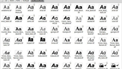
The world of monogram fonts offers a vast array of design aesthetics. Serif fonts, characterized by small decorative strokes at the ends of letters, often convey a sense of tradition and sophistication. Think of the timeless elegance of Garamond or the classic feel of Times New Roman, though adapted for monograms these would require specific adjustments. Sans-serif fonts, lacking these strokes, appear cleaner and more modern, often projecting a sense of minimalism and contemporary style.
Helvetica and Arial are prime examples of widely used sans-serif fonts, although their application in monograms would require careful consideration and possibly custom design. Script fonts, mimicking handwritten calligraphy, offer a romantic and personalized touch, perfect for invitations or personal branding. However, their legibility can be a concern if not carefully chosen. Modern fonts often blend elements from various styles, resulting in unique and often highly versatile designs.
Impact of Font Weight and Size
Font weight significantly impacts the overall feel of a monogram. A bold weight can project strength and confidence, while a lighter weight might appear more delicate and refined. The size of the monogram also plays a crucial role. A larger monogram commands attention, while a smaller one might be more subtle and understated. The ideal weight and size will depend heavily on the intended application and the overall design aesthetic.
For instance, a bold, large monogram might be suitable for a company logo, whereas a smaller, lighter weight monogram might be better suited for a subtle watermark on stationery.
Comparison of Monogram Font Styles
The following table compares three distinct monogram font styles, highlighting their key characteristics and ideal applications:
| Font Name (Illustrative Examples) | Style | Characteristics | Best Use Case |
|---|---|---|---|
| Traditional Serif (e.g., a modified Garamond) | Serif, Classic | Elegant, sophisticated, timeless, potentially less legible in smaller sizes | Formal invitations, logos for established businesses, classic branding |
| Modern Sans-serif (e.g., a custom design based on Helvetica) | Sans-serif, Minimalist | Clean, modern, versatile, highly legible | Corporate branding, contemporary logos, minimalist designs |
| Elegant Script (e.g., a custom calligraphic design) | Script, Calligraphic | Romantic, personalized, potentially less legible depending on the style | Wedding invitations, personal branding, artistic designs |
Exploring Font Styles and Their Applications: Best Monogram Fonts 2
Source: futurecdn.net
Choosing the right monogram font is crucial for creating a memorable and impactful brand identity. The style of your monogram directly influences how your brand is perceived, communicating everything from luxury and sophistication to casual approachability. This exploration delves into various font styles, their historical context, and their application in different branding scenarios.
Monogram fonts have evolved significantly over time, reflecting the changing tastes and trends of each era. Understanding this historical context helps us appreciate the nuances and connotations associated with different styles.
Classic Monogram Font Styles and Their Historical Context
Classic monogram styles often draw inspiration from historical lettering and calligraphy traditions. For example, serif fonts, with their small decorative flourishes at the ends of strokes, frequently evoke a sense of tradition and elegance. Think of the elegant, slightly italicized serifs often seen in formal invitations or the logos of established luxury brands. These styles often trace their roots back to the Renaissance or even earlier, reflecting the craftsmanship and attention to detail valued during those periods.
Conversely, simpler, sans-serif monograms, lacking these flourishes, can project a more modern and minimalist aesthetic, often associated with contemporary branding. The clean lines of a sans-serif monogram can be seen in many modern tech company logos, reflecting a sense of efficiency and innovation. Script fonts, mimicking handwritten calligraphy, lend a personal and often luxurious touch, frequently employed in high-end fashion or personalized stationery.
Suitability of Monogram Fonts for Different Branding Purposes
The choice of monogram font significantly impacts brand perception. Luxury goods often utilize elegant serif or sophisticated script fonts to convey exclusivity and high quality. Imagine the embossed, serif monogram on a high-end leather handbag, immediately signaling luxury. In contrast, casual apparel brands might opt for simpler sans-serif or playful script fonts to create a more approachable and relatable image.
A bold, sans-serif monogram on a t-shirt brand communicates a modern and accessible style. Formal invitations commonly feature elegant serif or script fonts, reflecting the formality of the occasion. The intricate details of a script font on a wedding invitation create a sense of romance and celebration.
Examples of Monogram Fonts Used in Logos and Branding
Many successful brands effectively utilize monogram fonts in their logos. The iconic Chanel logo, with its interlocking Cs, is a prime example of a sophisticated script monogram that instantly communicates luxury and timeless elegance. The simple, geometric sans-serif monogram of IBM conveys a sense of stability and technological prowess. Conversely, the slightly playful script monogram of a brand like Ralph Lauren successfully blends classic elegance with a touch of casual sophistication.
These examples demonstrate how the right font choice can significantly contribute to a brand’s overall identity and messaging.
Mock Monogram Logo Designs
Let’s visualize three different monogram logos, each showcasing a distinct font style and its associated brand personality.
Design 1: Luxury Perfume Brand
– A sophisticated serif font, reminiscent of Art Deco typography, is used to create an elegant and refined monogram. The letters are slightly italicized and feature subtle flourishes, enhancing the luxurious feel. The color palette consists of deep jewel tones, further reinforcing the sense of opulence and high quality. The overall impression is one of classic elegance and timeless sophistication.
Design 2: Modern Tech Startup
-A minimalist sans-serif font is employed, featuring clean lines and geometric shapes. The monogram is simple and uncluttered, reflecting the efficiency and innovation associated with the tech industry. The color scheme utilizes a bold primary color, creating a strong visual impact and conveying a sense of energy and modernity. The overall design communicates clarity, precision, and forward-thinking.
Design 3: Artisanal Coffee Roaster
-A slightly rustic serif font with a handcrafted feel is chosen. The monogram features subtle texture and imperfect lines, suggesting authenticity and a handcrafted approach. The color palette incorporates warm earthy tones, evoking a sense of comfort and natural goodness. The overall design communicates warmth, quality, and a connection to traditional craftsmanship.
Technical Aspects of Monogram Fonts
Creating a truly stunning monogram involves more than just picking a pretty typeface; it delves into the technical intricacies of typography. Understanding these aspects is crucial for achieving both aesthetically pleasing and functionally sound results. This section will explore the process of crafting custom monogram fonts, the importance of fine-tuning spacing, and common pitfalls to avoid.
Custom Monogram Font Creation
The creation of a custom monogram font is a multifaceted process, often requiring specialized software and a strong understanding of typography. It typically begins with sketching initial designs, exploring different stylistic approaches, and defining the overall aesthetic. Then, using vector-based software like Adobe Illustrator or FontLab Studio, the designer meticulously crafts each letterform, ensuring consistency in weight, stroke width, and overall style.
This involves careful consideration of letter connections, serifs (if applicable), and the overall visual harmony between letters. Once the individual characters are finalized, they are meticulously tested and adjusted within a font editor to ensure proper spacing and kerning. Finally, the font is exported in various formats (like OTF or TTF) for use in design software. The entire process is iterative, requiring numerous refinements and adjustments until the desired quality is achieved.
Kerning and Letter Spacing in Monogram Design
Kerning and letter spacing are critical for monogram legibility and visual appeal. Kerning refers to the adjustment of space between individual letter pairs, while letter spacing (tracking) adjusts the space between all letters in a word or phrase. In monogram design, precise kerning is especially important, as the close proximity of letters within a monogram can easily lead to visual crowding or awkward spacing if not carefully adjusted.
For example, the space between a tightly curved “C” and a straight “M” might need to be reduced to avoid an overly wide gap. Conversely, letters like “A” and “V” might require increased spacing to prevent them from appearing visually cramped. Mastering these adjustments ensures that the monogram is balanced, harmonious, and easily readable, even at small sizes.
Common Issues with Monogram Fonts
Despite their elegance, monogram fonts can present challenges. Legibility is often a primary concern, especially when using highly stylized or ornate designs. Excessively decorative fonts can make it difficult to distinguish between letters, especially in smaller sizes. Scalability is another key issue; a font that looks crisp at large sizes might become blurry or distorted when scaled down for use in small applications like website icons or social media profiles.
Finally, the limited character set of a monogram font (typically only containing uppercase letters and potentially some numerals) can restrict its applications compared to a full alphabet font. Careful consideration of these limitations is crucial for choosing and using monogram fonts effectively.
Resources for Finding High-Quality Monogram Fonts
Finding high-quality monogram fonts is relatively easy, with many options available both for free and at a cost.
- Free Resources: Websites like Google Fonts, Font Squirrel, and DaFont offer a selection of free monogram fonts, although the quality and variety can be limited. It’s important to carefully review licenses before using free fonts, as some have restrictions on commercial use.
- Paid Resources: Platforms like Creative Market, Etsy, and MyFonts offer extensive collections of high-quality monogram fonts, often created by professional designers. Paid fonts typically offer better quality, more extensive character sets, and often include commercial licenses.
- Font Foundries: Many independent font foundries specialize in creating custom fonts, including monograms. These often provide bespoke designs and high levels of customization, but come at a higher price point.
Remember to always preview fonts at various sizes and in different contexts before committing to a purchase to ensure they meet your specific needs.
Creative Applications Beyond Logos
Monogram fonts, while undeniably powerful in logo design, possess a versatility that extends far beyond corporate branding. Their elegant simplicity and inherent personalization make them ideal for a wide range of creative projects, adding a touch of sophistication and unique identity to various design applications. Let’s explore some exciting ways to utilize these fonts beyond the typical logo.
Monogram Fonts in Stationery and Wedding Invitations
The classic elegance of monogram fonts finds a natural home in stationery and wedding invitations. Imagine a crisp, minimalist business card featuring a subtly embossed monogram in a serif typeface like Didot or a playful, handwritten-style monogram on a brightly colored wedding invitation suite using a script font like Pacifico. The personalized touch instantly elevates the piece, adding a level of sophistication and distinction.
For stationery, a subtle monogram can be incorporated into letterheads, envelopes, and notecards, creating a cohesive and professional brand identity. Wedding invitations can utilize monograms prominently, perhaps incorporating them into the main design element or as a subtle detail on the RSVP card. The choice of font heavily influences the overall tone and style; a bold, geometric monogram projects a modern feel, while a delicate, flowing script creates a romantic ambiance.
Monogram Fonts in Packaging Design
Packaging design offers another fertile ground for creative monogram applications. Consider a luxury skincare brand using a refined, Art Deco-inspired monogram on its product packaging. The monogram could be embossed, foil-stamped, or simply printed, depending on the desired aesthetic and production budget. Similarly, a craft brewery might employ a rustic, hand-drawn monogram on its beer labels, conveying a sense of authenticity and handcrafted quality.
So, I’ve been obsessed with finding the best monogram fonts 2 lately – seriously, the possibilities are endless! I even found myself needing a little inspiration for creating engaging thumbnails, which led me to check out this awesome guide on getting it on with youtube for some video marketing tips. Turns out, good visuals are key, even for something as seemingly simple as monogram design.
Back to those fonts though – I think I’ve finally narrowed it down!
The monogram acts as a visual shorthand for the brand, instantly recognizable and memorable. Even simpler products can benefit; a small, elegant monogram on a bespoke candle or a handcrafted soap adds a touch of luxury and personality.
Monogram Fonts in Typography-Focused Artwork
Monogram fonts can be the star of the show in typography-focused artwork. Imagine a piece of art where the monogram itself is the central focus, perhaps manipulated and layered to create a visually striking effect. The artwork could utilize different sizes, weights, and colors of the same monogram, creating a sense of rhythm and visual interest. A simple, elegant monogram in a classic serif typeface could be beautifully rendered in a minimalist poster design.
Alternatively, a more complex, intricate monogram could form the basis of a more elaborate artwork, incorporating textures and gradients to enhance its visual appeal. The creative possibilities are virtually endless. One could even experiment with different techniques, such as letterpress printing or hand-lettering, to add unique texture and depth to the final piece.
Monogram Fonts in Website Design
Incorporating monogram fonts into website design requires careful consideration. Overuse can easily overwhelm the design. However, strategically placed, a monogram can add a touch of class and sophistication. A subtle monogram can be used as a favicon (the small icon displayed in browser tabs), or as a watermark on images. More prominently, it could be used as a logo, naturally, or as a subtle design element within the header or footer.
The key is to maintain balance and ensure the monogram complements the overall website design rather than competing with it. For example, a clean, modern website might use a minimalist geometric monogram, while a more traditional website might opt for a classic serif or script font. The choice of font should always align with the overall brand aesthetic and target audience.
Visual Representation of Creative Monogram Font Applications
Imagine three distinct visuals. First, a close-up shot of a luxurious wedding invitation suite. The main invitation features a delicate, script-style monogram in a deep burgundy ink, elegantly intertwined with floral elements, printed on thick ivory cardstock. Second, a photograph showcasing a range of artisanal soaps, each bearing a simple, embossed monogram in a classic serif typeface.
The monograms are subtly different in design for each soap’s unique scent, showcasing brand identity while maintaining consistency. Third, a digital mockup of a website homepage. The header subtly features a geometric monogram in a muted gold tone, acting as a refined brand identifier against a clean, minimalist background. The overall effect is sophisticated and memorable, showcasing the monogram’s subtle yet impactful role in the website’s design.
Font Compatibility and Usage
Choosing the perfect monogram font is only half the battle. Ensuring its seamless integration across different platforms and its legal usage are equally crucial for a successful project. This section delves into the practical aspects of font compatibility, licensing, and best practices for achieving optimal clarity and readability.
Monogram fonts, like all typefaces, aren’t universally compatible. Their rendering can vary depending on the operating system, software application, and even the device’s display settings. Licensing considerations are also paramount, especially for commercial use. Understanding these factors is vital for avoiding costly mistakes and ensuring a professional outcome.
Operating System and Software Compatibility
The compatibility of a monogram font hinges on the operating system’s font rendering engine and the software’s ability to interpret font data correctly. For example, a highly stylized font might render perfectly in Adobe Illustrator but appear distorted or pixelated in a basic word processor. Fonts designed for print may not translate well to screens, and vice-versa. Testing your chosen font across various platforms (Windows, macOS, iOS, Android) and software (Adobe Creative Suite, Microsoft Office, web browsers) is essential before finalizing its use.
Slight adjustments to kerning or tracking might be necessary to ensure consistent appearance across different environments. Furthermore, older operating systems may have limited support for newer font formats, potentially leading to display issues.
Licensing Implications for Commercial Projects
Using fonts in commercial projects requires careful attention to licensing. Most fonts fall under specific licenses, which dictate how they can be used. Free fonts often have restrictions on commercial use, while commercial fonts usually require purchasing a license. These licenses can vary, permitting use for personal projects, web use, print media, or embedding in software, with each usage type potentially having a different cost.
Ignoring licensing agreements can lead to copyright infringement, resulting in legal action and financial penalties. Always check the license agreement before using any font in a commercial project. Using a font without a proper license can result in significant legal and financial consequences. It’s crucial to obtain the appropriate license to avoid these issues.
Selecting Appropriate Monogram Fonts Based on Project Requirements, Best monogram fonts 2
The best monogram font for a project depends heavily on its intended application and target audience. A classic serif font might be suitable for a luxurious brand, while a modern sans-serif font could be better for a tech startup. Consider the overall aesthetic, brand identity, and readability requirements. For instance, a monogram intended for a wedding invitation will likely require a more elegant and refined typeface compared to a monogram for a sports team, which may benefit from a bolder, more impactful font.
The context and intended audience must always guide font selection. Simple, legible fonts are generally preferable for logos that will be used at small sizes or in various contexts.
Ensuring Clarity and Readability of Monograms
Clarity and readability are paramount for any monogram. The font’s weight, size, spacing, and kerning all play a role in its legibility. Overly ornate or complex fonts can be difficult to read, especially at smaller sizes. Testing the monogram at various sizes and resolutions is crucial to ensure it remains clear and easily recognizable. Sufficient spacing between letters (kerning) is essential to prevent letters from merging or appearing cramped.
Furthermore, the choice of background color and contrast also impact readability. A monogram placed on a busy background should have sufficient contrast to stand out effectively. In digital applications, the resolution of the image file is critical for ensuring that the monogram retains its crispness when scaled.
Closing Notes
Ultimately, selecting the “best” monogram font is a deeply personal journey, guided by your unique vision and project needs. This exploration of Best Monogram Fonts 2 has hopefully equipped you with the knowledge and inspiration to confidently navigate the world of monogram design. Remember to consider the context, your audience, and the overall message you want to convey.
With careful consideration and a touch of creativity, your monogram can become a timeless symbol of elegance and sophistication.
FAQ Insights
What’s the difference between serif and sans-serif monogram fonts?
Serif fonts have small decorative strokes at the ends of their letters, giving them a more classic and traditional feel. Sans-serif fonts lack these strokes, appearing cleaner and more modern.
Where can I find free monogram fonts?
Many websites offer free monogram fonts, but always check the licensing terms to ensure you can use them for your intended purpose. Google Fonts is a good starting point.
How do I ensure my monogram is legible at small sizes?
Choose a font with clear, well-defined letterforms. Avoid overly ornate or thin fonts that might lose detail when scaled down. Test your monogram at various sizes to ensure readability.
What is kerning, and why is it important in monogram design?
Kerning is the adjustment of space between individual letters to improve readability and visual appeal. Proper kerning is crucial for creating a balanced and professional-looking monogram.