Mobile UX Design Tips A User-Centric Approach
Mobile UX design tips are crucial for creating engaging and user-friendly mobile applications. In today’s mobile-first world, understanding user needs and designing intuitive interfaces is paramount. This isn’t just about making apps look pretty; it’s about crafting seamless experiences that delight users and drive engagement. We’ll dive into the key principles, from user research and mobile-first design to accessibility and performance optimization, to help you create truly exceptional mobile experiences.
We’ll explore the intricacies of navigation patterns, the power of micro-interactions, and the importance of visual design in conveying your brand effectively on a smaller screen. We’ll also discuss practical strategies for testing and iterating your designs based on real user feedback, ensuring your app continually evolves to meet user expectations and market demands. Get ready to unlock the secrets to creating mobile apps that users love!
Understanding User Needs in Mobile UX
Creating a successful mobile app hinges on deeply understanding the users who will interact with it. Ignoring user needs leads to frustrating, unusable, and ultimately unsuccessful applications. This section delves into the crucial aspects of understanding your target audience and incorporating their needs into the design process.
Designing a User Persona
A user persona is a fictional, yet realistic representation of your ideal user. It’s more than just demographics; it encapsulates their goals, motivations, frustrations, and technological proficiency. A well-defined persona helps designers empathize with their users and make informed design decisions. For example, a persona for a fitness tracking app might be “Sarah,” a 32-year-old marketing professional who values convenience and data visualization.
She’s tech-savvy but prefers simplicity over complexity. Sarah’s persona would inform design choices, prioritizing features like quick data entry, clear charts, and intuitive navigation. Creating several personas, representing different user segments, can provide a more comprehensive understanding of your user base.
The Importance of User Research in Mobile UX Design
User research is the cornerstone of effective mobile UX design. It’s the process of gathering and analyzing information about your target users to understand their needs, behaviors, and expectations. Without thorough research, design decisions are essentially guesses, leading to potential usability issues and low user satisfaction. By understanding user pain points and preferences, designers can create intuitive and engaging experiences that meet real user needs and ultimately drive app adoption and retention.
The investment in user research significantly outweighs the potential costs of redesigning a poorly conceived application.
User Research Methods for Mobile UX
Several research methods can be employed to gain insights into user behavior. These methods offer diverse perspectives and data types, contributing to a holistic understanding.
- Surveys: Surveys are a cost-effective way to gather quantitative data from a large number of users. They can be used to assess user preferences, satisfaction levels, and demographics. For example, a survey could ask users to rate the ease of use of specific app features.
- User Interviews: In-depth interviews allow researchers to gain qualitative insights into user motivations and experiences. These interviews provide rich, contextual data that can reveal underlying needs and pain points that might be missed in quantitative methods. For example, interviewing users about their frustrations with a specific app feature can uncover design flaws.
- Usability Testing: Observing users interacting with a prototype or the actual app allows designers to identify usability issues and areas for improvement. This method provides valuable insights into how users navigate the app and how effectively they complete tasks. Observing users struggling with a particular feature can lead to significant design improvements.
- A/B Testing: This method involves presenting users with two different versions of a design element (e.g., button placement, navigation structure) and measuring which version performs better. This data-driven approach helps optimize the user interface for maximum effectiveness.
Creating a User Journey Map for a Mobile Banking App
A user journey map visually represents the steps a user takes to achieve a specific goal within an app. It helps designers understand the user’s experience from beginning to end, identifying potential pain points and opportunities for improvement.Let’s consider a user journey map for a mobile banking app, focusing on the task of transferring money:
| Stage | Action | Thoughts & Feelings | Pain Points |
|---|---|---|---|
| Initiation | Opens the banking app | Needs to transfer money quickly. | App loading time is slow. |
| Navigation | Navigates to the transfer funds section | Hopes the process is intuitive. | Difficult to find the transfer option. |
| Input | Enters recipient details and amount | Wants to ensure accuracy. | Input fields are unclear or difficult to use. |
| Confirmation | Reviews transaction details | Wants to avoid mistakes. | Confirmation screen is confusing. |
| Completion | Completes the transfer | Relief at successful completion. | Confirmation message is unclear. |
This map highlights potential areas for improvement, such as optimizing app loading times, improving navigation, and clarifying input fields and confirmation messages. By addressing these pain points, the user experience can be significantly enhanced.
Mobile-First Design Principles

Source: behance.net
Designing for mobile devices isn’t just about shrinking a desktop website; it’s about prioritizing the mobile experience from the very beginning. This “mobile-first” approach offers significant advantages in creating user-friendly and efficient applications. By focusing on the core functionality and user experience on smaller screens, we can then seamlessly scale up to larger displays.Mobile-first design emphasizes simplicity, speed, and a clear focus on the essential features.
It’s about understanding that users often interact with mobile apps on the go, with limited attention spans and often sub-optimal network conditions. Therefore, a streamlined and efficient design is paramount.
Responsive vs. Adaptive Design
Responsive and adaptive design are often confused, but they represent distinct approaches to creating multi-device experiences. Responsive design utilizes flexible layouts and CSS media queries to adjust the website’s appearance based on the screen size. The content adapts seamlessly to different devices, often reflowing text and resizing images. Adaptive design, on the other hand, creates separate versions of the website tailored to specific device types (e.g., a dedicated mobile site and a separate desktop site).
Each version is optimized for its target device, offering a more tailored experience. Responsive design is generally preferred for its efficiency and ease of maintenance, while adaptive design might be considered when significant differences in content or functionality are needed across devices.
Best Practices for Mobile-First Design
Prioritizing mobile-first design requires a shift in mindset. Here are some key practices to ensure your design is optimized for mobile users:
- Prioritize Essential Content: Focus on the core functionality and most important information. Avoid cluttering the screen with unnecessary elements.
- Optimize for Touch Interaction: Design interactive elements large enough to be easily tapped with a finger. Avoid small buttons or links that are difficult to select.
- Utilize a Responsive Grid System: A responsive grid system allows your layout to adapt smoothly to different screen sizes. This ensures consistent spacing and alignment across all devices.
- Consider Loading Speed: Optimize images and minimize HTTP requests to ensure fast loading times, especially crucial on mobile networks.
- Test Across Devices: Thoroughly test your design on various mobile devices and screen sizes to ensure compatibility and optimal user experience.
Example Mobile Layout with Responsive Grid System
Let’s imagine a simple mobile layout for a news website. We can use a responsive grid system (like Bootstrap or similar) to create a layout that adapts to different screen sizes. Below is a simple HTML table illustrating a four-column responsive layout. Note that this is a simplified example and a real-world implementation would involve CSS for proper responsiveness.
| Headline | Image | Short Description | Read More |
|---|---|---|---|
| Breaking News | [Imagine a placeholder for a news image here. The image would be responsive and scale appropriately with the screen size. It might be a landscape or portrait image, adapting to the available space.] | Summary of the news story. | Read More |
| Local Events | [Imagine a placeholder for an image of a local event. This image would also be responsive and scale according to the available space.] | Information about upcoming local events. | View Events |
Navigation and Information Architecture
Designing intuitive navigation and a well-structured information architecture is crucial for a successful mobile app. Users should be able to easily find what they need without frustration. A poorly designed navigation system can lead to high bounce rates and ultimately, app abandonment. Therefore, understanding and implementing effective navigation patterns and information architecture is paramount.
Mobile Navigation Patterns
Choosing the right navigation pattern depends heavily on the app’s complexity and content. Several common patterns exist, each with its strengths and weaknesses. A poorly chosen pattern can significantly impact user experience.
- Tab Bar: Located at the bottom of the screen, tab bars provide quick access to major sections of the app. They are ideal for apps with a limited number of core functionalities (typically 3-5). Their persistent visibility ensures easy access, but adding too many tabs can become overwhelming.
- Hamburger Menu: This menu, often represented by three horizontal lines, hides navigation options behind a tap. It’s useful for apps with many sections, keeping the screen clutter-free. However, its hidden nature can make it less discoverable, potentially leading to users missing key features.
- Bottom Navigation: Similar to a tab bar, but can include more options and potentially sub-menus within each item, providing more flexibility for complex apps while maintaining accessibility.
- Side Drawer Navigation: This pattern slides in from the side of the screen, offering a more expansive menu than a hamburger menu. It’s useful for apps with numerous sections or settings. However, it can obscure the main content of the screen.
Comparing Navigation Methods, Mobile ux design tips
The effectiveness of each navigation method depends on context. Tab bars excel in simplicity and discoverability for apps with few core features, like a social media app focusing on home, notifications, and profile. Hamburger menus are better suited for apps with many features, like an e-commerce app with various product categories, but require careful design to ensure discoverability.
Bottom navigation offers a middle ground, balancing discoverability and functionality. Side drawers are useful for complex settings, but their accessibility can be less intuitive. Ultimately, user testing is key to determining the optimal approach.
Information Architecture Principles for Mobile
Effective information architecture (IA) ensures users can easily find what they need. Key principles include:
- Simplicity and Clarity: Avoid jargon and use straightforward language. Organize information logically and intuitively.
- Discoverability: Make it easy for users to find information through clear labeling, search functionality, and intuitive navigation.
- Efficiency: Minimize the number of steps required to complete a task. Reduce cognitive load by presenting information concisely.
- Consistency: Maintain a consistent design language and information structure throughout the app.
E-commerce App Sitemap
Below is a simplified sitemap for a hypothetical e-commerce app. This demonstrates how IA organizes information for easy navigation.
- Homepage: Featured products, categories, search bar
- Product Category Pages: Subcategories, filtering options, product listings
- Product Detail Pages: Product images, description, reviews, add to cart button
- Shopping Cart: Items in cart, quantity adjustment, checkout button
- Checkout: Shipping information, payment options, order confirmation
- Account: Profile, order history, settings
- Search: Search results page
Mobile Interaction Design
Mobile interaction design is the cornerstone of a positive user experience. Unlike desktop interfaces, mobile relies heavily on touch interactions, demanding a deep understanding of how users will physically engage with the app. Successful mobile interaction design translates user goals into intuitive and enjoyable experiences, fostering engagement and loyalty.
The unique characteristics of touchscreens—their size, sensitivity, and the inherent limitations of one-handed operation—require a different approach than traditional desktop design. Ignoring these aspects can lead to frustration, errors, and ultimately, app abandonment. Effective mobile interaction design considers these constraints and leverages the strengths of the touch interface to create a seamless and satisfying user journey.
The Importance of Touch Interactions in Mobile UX
Touch interactions are paramount in mobile UX. They are the primary, and often only, method of interacting with the interface. Every tap, swipe, pinch, and long-press must be considered carefully. The responsiveness of these interactions, their visual feedback, and their overall consistency directly impact the perceived quality and usability of the app. A sluggish response to a tap, for instance, can quickly frustrate a user.
Similarly, a lack of clear visual feedback after an action can leave the user unsure if their input was registered. Therefore, designing for smooth, responsive, and visually communicative touch interactions is crucial for a positive user experience.
Effective Micro-interactions in Mobile Apps
Micro-interactions are small, self-contained interactions that provide immediate feedback to the user’s actions. They are subtle yet powerful elements that enhance the overall experience. Effective micro-interactions improve usability, provide context, and add a touch of delight.
Consider the animation of a button press: a subtle change in color or a brief jiggle provides confirmation that the action has been registered. Another example is the progress indicator during a file upload, providing visual reassurance that the process is underway. These small details, carefully designed, make a big difference in user satisfaction.
Examples of effective micro-interactions include: a subtle animation when a button is pressed; a confirmation checkmark after an item is selected; a progress bar indicating the loading of data; a haptic feedback when a button is pressed (vibrating); a small animation indicating that an item has been added to a shopping cart; a subtle visual cue confirming a successful login.
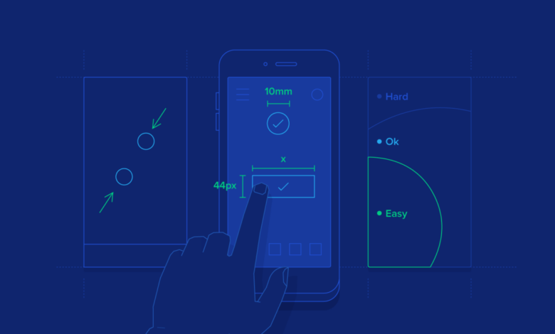
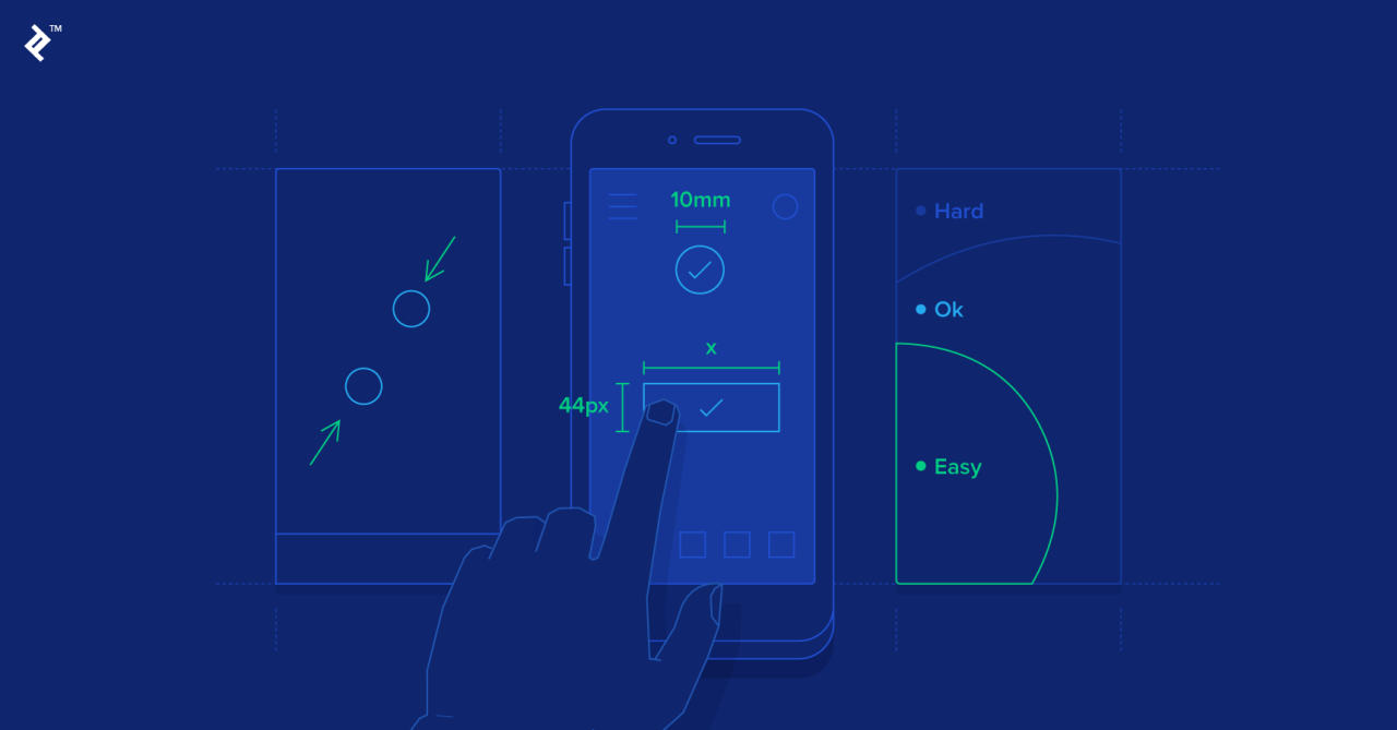
Design Considerations for Gestures and Touch Targets
Designing effective gestures and touch targets requires careful consideration of several factors. Touch targets should be large enough to be easily hit with a fingertip, accounting for varying finger sizes and potential user dexterity limitations. Gestures should be intuitive and consistent with common mobile interaction patterns.
Touch targets should be at least 48×48 pixels to ensure comfortable and accurate tapping, especially on smaller screens. The use of consistent gestures across the app reduces the learning curve and improves overall usability. For example, always using a left swipe to delete an item maintains consistency and avoids user confusion. Gestures should also be visually reinforced through clear visual cues and feedback.
Micro-interaction Design for a Specific Mobile App Feature
Let’s consider a “favorite” feature in a recipe app. The user taps a star icon next to a recipe to add it to their favorites.
Here’s a series of micro-interactions to enhance this feature:
- Tap: The star icon animates, changing from an empty star to a filled star, with a subtle glow effect. This provides immediate visual feedback.
- Haptic Feedback: A gentle vibration accompanies the animation, providing additional sensory feedback.
- Confirmation: A small “Added to Favorites” toast message briefly appears at the bottom of the screen, providing further confirmation.
- Removal: Tapping the filled star reverses the animation, returning to the empty star and removing the recipe from favorites, with corresponding haptic feedback and toast message (“Removed from Favorites”).
Visual Design and Branding: Mobile Ux Design Tips
Source: appverticals.com
Creating a visually appealing and on-brand mobile experience is crucial for user engagement and app success. A well-designed app not only looks good but also enhances usability and reinforces brand identity. This involves careful consideration of color palettes, typography, imagery, and overall visual hierarchy.Effective visual design principles translate seamlessly to mobile. Think clean layouts, strategic use of whitespace, and a focus on clear visual hierarchy to guide the user’s eye.
Overly complex designs quickly become overwhelming on smaller screens.
Typography and Color in Mobile UX
Typography and color play a significant role in establishing readability and brand personality within a mobile app. Legibility is paramount; choosing appropriately sized and weighted fonts ensures easy reading on various screen sizes. Consider using system fonts for consistency and accessibility. Color choices should align with the brand’s identity, employing a limited palette for visual clarity and avoiding jarring color combinations.
For example, a financial app might utilize a sophisticated palette of dark blues and greys to convey trust and stability, while a gaming app might opt for brighter, more vibrant colors to create excitement. Color should also be used strategically to highlight interactive elements and guide user flow.
Mood Board: A Fitness Tracking App
Imagine a fitness tracking app called “Peak Performance.” Its mood board would feature images of sleek, minimalist fitness equipment, vibrant sunrise scenes, strong athletic bodies in motion, and clean, geometric shapes. The color palette would consist of deep blues and greens representing health and vitality, accented with bright oranges and yellows to signify energy and motivation. The typography would be modern and sans-serif, emphasizing clarity and efficiency.
The overall style aims for a feeling of clean, modern sophistication, reflecting both the app’s functionality and the lifestyle it supports. The imagery avoids overly stylized or cliché representations of fitness, instead opting for realistic yet aspirational visuals.
Adapting Brand Identity to Mobile
Adapting a brand’s visual identity to a mobile environment requires careful consideration of scaling and simplification. Logo design, for example, may need to be simplified for smaller screen resolutions while maintaining brand recognition. Complex illustrations or detailed imagery might need to be replaced with cleaner, more concise alternatives. The brand’s color palette should remain consistent, but the application of those colors might need adjustments to maintain visual harmony on the smaller screen.
For instance, a brand known for its intricate patterns might need to use simplified versions or focus on key elements of the pattern for mobile. Maintaining consistency across platforms is essential to ensure brand recognition and user familiarity. A successful adaptation ensures that the mobile app reflects the brand’s core values and personality while optimizing the user experience for the mobile platform.
Crafting killer mobile UX designs requires understanding user behavior, and that includes how people consume video. For instance, optimizing for mobile viewing is crucial, and you can learn a lot about video optimization strategies by checking out this awesome guide on getting it on with youtube. Applying those principles, such as prioritizing clear calls to action and intuitive navigation, directly improves your app’s overall user experience.
Accessibility and Inclusivity
Creating truly user-centered mobile experiences necessitates a deep understanding of accessibility and inclusivity. Ignoring the needs of users with disabilities not only limits your potential audience but also undermines the principles of universal design, where products and environments are usable by all people, to the greatest extent possible, without the need for adaptation or specialized design. A well-designed mobile app should be usable by everyone, regardless of their abilities.Accessibility in mobile UX design is crucial for ensuring that everyone can access and use your app.
This means considering users with a wide range of disabilities, including visual, auditory, motor, and cognitive impairments. By prioritizing accessibility, you create a more inclusive and equitable digital experience, expanding your reach and demonstrating a commitment to social responsibility. Moreover, accessible design often improves the overall user experience for everyone, making your app more intuitive and easier to navigate.
WCAG Guidelines in Mobile UX
The Web Content Accessibility Guidelines (WCAG) provide a comprehensive set of recommendations for making web content accessible. These guidelines are internationally recognized and widely adopted as a best practice for creating accessible digital experiences. While primarily focused on web content, the principles of WCAG are directly applicable and highly relevant to mobile UX design. Adherence to WCAG ensures that your mobile app meets established standards for accessibility, promoting inclusivity and minimizing barriers for users with disabilities.
Key success criteria from WCAG 2.1, such as providing alternative text for images, ensuring sufficient color contrast, and offering keyboard navigation, are paramount in mobile app development. Following WCAG guidelines not only enhances the usability of your app for users with disabilities but also improves the overall user experience for all users.
Best Practices for Accessible Mobile Interfaces
Creating accessible mobile interfaces involves a multi-faceted approach. It’s not simply about adding features; it’s about integrating accessibility considerations throughout the entire design and development process.
- Sufficient Color Contrast: Ensure adequate color contrast between text and background to make it easily readable for users with low vision. Tools are readily available to test color contrast ratios against WCAG guidelines.
- Alternative Text for Images: Provide descriptive alternative text for all images. This allows screen readers to convey the image’s content to visually impaired users.
- Keyboard Navigation: Design the interface to be fully navigable using only a keyboard. This is essential for users who cannot use a mouse or touchscreen.
- Clear and Concise Language: Use simple, straightforward language to avoid confusing users with cognitive impairments.
- Large, Tappable Targets: Ensure interactive elements are large enough to be easily tapped by users with motor impairments or those using assistive technologies.
- Adjustable Text Size: Allow users to adjust the text size to their preferred level of readability.
- Screen Reader Compatibility: Test the app with screen readers to ensure that all information is accessible to visually impaired users.
- Closed Captions and Transcripts: Include closed captions for videos and transcripts for audio content to benefit users with hearing impairments.
Example of an Accessible Mobile Interface Design
Let’s consider a hypothetical mobile banking app. Designing this app with accessibility in mind would involve several key features:
- Voice Control Integration: Users could manage their accounts using voice commands, benefiting users with motor impairments.
- Customizable Font Sizes and Styles: Users can adjust text size and choose from a variety of fonts to enhance readability.
- High Contrast Mode: A dedicated high contrast mode would invert colors for improved visibility for users with low vision.
- Haptic Feedback: Subtle vibrations would provide feedback on button presses and other interactions, assisting users with visual impairments.
- Screen Reader Optimized Navigation: The app’s navigation would be logically structured and clearly labeled to allow screen readers to easily guide users through the interface.
- Descriptive Labels for Icons: All icons would have clear and concise labels that describe their function.
Testing and Iteration
Building a stellar mobile UX isn’t a one-and-done process; it’s an iterative journey fueled by user feedback and rigorous testing. Ignoring this crucial phase can lead to a frustrating and ultimately unsuccessful app. Testing allows you to identify pain points, refine interactions, and ensure your design meets user expectations. Iteration, driven by the results of testing, is what transforms a good design into a great one.
The iterative design process is a cyclical one. You start with a design, test it, gather feedback, refine the design based on that feedback, and then retest. This cycle repeats until you reach a satisfactory level of user satisfaction and app performance. This continuous improvement loop is vital for creating a truly user-centered mobile experience.
Mobile UX Testing Methods
Various methods exist for evaluating your mobile UX design, each offering unique insights. Choosing the right method(s) depends on your resources, project goals, and the stage of development.
For example, A/B testing allows you to compare two different versions of a design element (e.g., button placement, call-to-action wording) to see which performs better. Usability testing involves observing real users interacting with your prototype to identify usability issues and gather qualitative feedback. Remote usability testing, often conducted through platforms like UserTesting.com, allows you to reach a wider and more diverse user base.
Finally, beta testing allows you to release a near-final version of your app to a limited group of users for real-world testing and feedback before a full launch.
Iterating Based on User Feedback
Analyzing user feedback is crucial for effective iteration. This involves consolidating feedback from different sources (usability testing sessions, surveys, app store reviews, analytics data), identifying recurring themes and pain points, and prioritizing improvements based on their impact on the user experience.
For example, if usability testing reveals that users struggle to find the main navigation menu, you might redesign the menu for improved visibility and accessibility. Similarly, negative app store reviews highlighting slow loading times would indicate a need to optimize app performance. By systematically addressing these issues, you enhance the overall user experience and improve app satisfaction.
Key Metrics for Mobile UX Testing
Tracking specific metrics provides quantitative data to complement qualitative feedback. These metrics offer insights into user behavior and help measure the effectiveness of design changes.
Some crucial metrics include task completion rate (the percentage of users successfully completing key tasks), error rate (the number of errors users make while interacting with the app), time on task (the time it takes users to complete a specific task), bounce rate (the percentage of users leaving the app after viewing only one screen), and user engagement metrics such as session duration and frequency of use.
Analyzing these metrics alongside qualitative feedback offers a comprehensive understanding of user behavior and areas for improvement.
Interpreting User Feedback and Incorporating Design Improvements
User feedback comes in various forms, from direct comments during usability testing to indirect signals like high bounce rates. Effective interpretation involves identifying patterns and prioritizing issues based on their severity and impact on the overall user experience.
For instance, frequent complaints about a confusing onboarding process suggest a redesign is needed. A low task completion rate for a particular feature indicates usability problems that need addressing. After identifying these issues, designers can brainstorm and implement solutions, creating improved wireframes, mockups, and prototypes for retesting. This iterative process continues until the identified issues are resolved and the user experience is optimized.
Performance Optimization
In the world of mobile UX, a seamless and speedy experience is paramount. Users are notoriously impatient, and slow loading times or sluggish performance can quickly lead to app abandonment. Performance optimization isn’t just about aesthetics; it’s crucial for user retention, positive reviews, and ultimately, the success of your mobile application. This section will explore key techniques to ensure your app performs optimally.
Improving Mobile App Loading Speed
Optimizing loading speed involves a multi-pronged approach. Reducing the app’s initial download size is a critical first step. This can be achieved through code optimization, removing unnecessary assets, and employing efficient data structures. Furthermore, implementing lazy loading, where only necessary content loads initially, can dramatically improve perceived performance. For example, consider a news app; instead of loading all articles at once, only the articles on the first screen would load, with subsequent articles loading as the user scrolls.
Another effective strategy is using a content delivery network (CDN), which distributes your app’s content across multiple servers globally, reducing latency for users in different geographic locations. Think of it like having multiple copies of your app readily available closer to users, resulting in faster access.
Image Optimization Techniques
Images often represent a significant portion of an app’s size. Optimizing images is therefore vital for performance. Compressing images without significant loss of quality is key. Tools and techniques such as WebP format (offering superior compression compared to JPEG or PNG), lossy compression (accepting minor quality loss for significant size reduction), and resizing images to the appropriate dimensions for different screen sizes are all crucial.
For example, a large, high-resolution image displayed at a small size on a phone is inefficient. Resizing it beforehand dramatically reduces its file size. Furthermore, using image sprites, which combine multiple smaller images into a single larger image, reduces the number of HTTP requests, thus improving loading speed. This is like having a single large picture containing all the small icons instead of many individual icon files.
Minimizing Data Usage
Minimizing data usage is particularly important for users on limited data plans or in areas with poor network connectivity. Efficient data handling is key. This includes techniques like using efficient data formats (like JSON instead of XML), minimizing API calls (fetching only necessary data), and implementing caching mechanisms (storing frequently accessed data locally). For example, a social media app could cache recent posts, allowing users to view them offline or with minimal data usage.
Implementing background data synchronization only when necessary, instead of constantly updating in the background, also significantly reduces data consumption. Furthermore, offering users options to control data usage, such as choosing to download high-resolution images only on Wi-Fi, enhances the user experience.
Last Point
Source: toptal.io
Creating exceptional mobile UX isn’t a one-size-fits-all solution; it’s an iterative process of understanding your users, testing your designs, and constantly refining your approach. By prioritizing user needs, embracing mobile-first design principles, and paying close attention to detail, you can create mobile applications that are not only functional and aesthetically pleasing but also deeply engaging and user-friendly. Remember, the goal is to create a seamless and enjoyable experience that keeps users coming back for more.
So, put these tips into practice, and watch your app’s success soar!
Question & Answer Hub
What’s the difference between responsive and adaptive design?
Responsive design uses a single codebase that adapts to different screen sizes, while adaptive design uses different layouts for different devices.
How can I improve the loading speed of my mobile app?
Optimize images, minimize HTTP requests, use caching, and leverage code splitting.
What are some common accessibility issues in mobile UX?
Poor color contrast, lack of alt text for images, insufficient touch target sizes, and complex navigation.
What are micro-interactions, and why are they important?
Micro-interactions are small, delightful animations or feedback mechanisms that enhance the user experience, making the app feel more responsive and engaging.


