
How to Use Photography UI Design
How to use photography UI design? It’s more than just pretty pictures; it’s about crafting an intuitive experience that empowers users to unleash their inner photographer. We’ll dive into the core principles, explore the best apps, and uncover the secrets to designing a photography UI that’s both visually stunning and effortlessly user-friendly. Get ready to transform your understanding of how people interact with their photos!
This journey will cover everything from understanding fundamental UI/UX principles specifically for photography apps to exploring advanced concepts like AI integration and managing massive photo libraries. We’ll analyze successful apps, dissect their strengths and weaknesses, and learn how to design for different screen sizes and accessibility needs. Prepare to level up your design skills and create truly exceptional photography experiences.
Understanding Photography UI Design Principles
Crafting a compelling user experience for photography applications hinges on understanding and effectively implementing core UI design principles. A well-designed photography app seamlessly blends intuitive controls with powerful editing tools, empowering users to effortlessly capture and enhance their memories. This requires a deep understanding of visual hierarchy, efficient navigation, and a thoughtful selection of UI elements.
Core UI Design Principles in Photography Applications
Effective UI design in photography apps prioritizes ease of use and visual appeal. Key principles include consistency in design language, clear visual hierarchy guiding the user’s eye to important elements, and intuitive interactions that feel natural and predictable. Consider the popular photo editing app, Lightroom; its consistent use of panels, sliders, and toolbars creates a familiar and efficient workflow.
Conversely, a poorly designed app with inconsistent button styles and confusing navigation would frustrate users and hinder their creative process. The ultimate goal is to create a user experience that is both enjoyable and productive.
Visual Hierarchy and Intuitive Navigation
Visual hierarchy is crucial for guiding the user’s attention within the complex interface of a photography app. Important elements, such as the main image display and primary editing tools, should be prominently displayed and easily accessible. Less crucial elements, like advanced settings or metadata, can be tucked away in submenus or collapsible panels. Intuitive navigation relies on clear labeling, logical grouping of related functions, and predictable behavior of UI elements.
For example, a user should instinctively understand that clicking an icon representing “crop” will open the cropping tool. A well-designed navigation system minimizes cognitive load, allowing users to focus on their creative work rather than deciphering the app’s interface.
Sample User Flow for Uploading and Editing a Photograph
Let’s Artikel a typical user flow for uploading and editing a photo:
1. Import
The user selects a photo from their device’s gallery or cloud storage via a clear “Import” button or drag-and-drop functionality.
2. Preview
The imported image is displayed prominently, allowing the user to assess its quality.
3. Basic Editing
Common tools like cropping, rotation, and basic adjustments (brightness, contrast, saturation) are readily accessible. These are often presented as easily identifiable icons or sliders.
4. Advanced Editing
Access to more advanced tools, such as selective adjustments, layers, or filters, is available through a dedicated tab or menu, keeping the initial interface uncluttered.
5. Saving and Exporting
Clear “Save” and “Export” buttons allow the user to save their edited image to their device or share it directly to social media.This streamlined flow ensures a smooth and efficient editing experience.
Common UI Elements in Photography Applications
The effectiveness of a photography app significantly depends on the thoughtful implementation of its UI elements. Here are some common elements and their functions:
- Image Display Area: The primary area where the photograph is shown, often taking up a significant portion of the screen.
- Toolbars: Horizontal or vertical bars containing commonly used tools, accessible with a single click.
- Panels: Expandable sections containing detailed settings and advanced editing tools, organized categorically.
- Sliders: Interactive controls used to adjust parameters such as brightness, contrast, and saturation.
- Buttons: Used to trigger actions like saving, exporting, or applying filters.
- Menus: Hierarchical lists offering access to a wider range of options and settings.
- Filters: Preset effects that can be applied to images with a single click, offering stylistic options.
- Layers: Allow users to work with multiple image elements independently, enabling complex editing.
- History Panel: Tracks edits made to the image, allowing users to undo or redo actions.
Exploring Key Features and Functionality
Designing intuitive and powerful photography apps requires careful consideration of features and functionality. The user experience hinges on seamlessly integrating powerful editing tools with a clean and efficient interface. This section will delve into a comparative analysis of popular photography apps, discuss the design challenges of advanced editing tools, and explore effective visual feedback mechanisms.
Comparative Analysis of Photography App UIs
A comparative analysis of three popular photography apps – Adobe Lightroom, Snapseed, and VSCO – reveals distinct approaches to UI design, each with its strengths and weaknesses. Understanding these differences illuminates best practices and potential pitfalls in photography app development.
| App Name | Strengths | Weaknesses | Unique Features |
|---|---|---|---|
| Adobe Lightroom | Powerful non-destructive editing, extensive feature set, robust organizational tools, cross-platform synchronization. | Steeper learning curve, can feel overwhelming for beginners, subscription model. | Precise color grading tools, advanced masking capabilities, sophisticated lens corrections. |
| Snapseed | Intuitive interface, user-friendly for beginners, wide range of basic and advanced editing tools, free to use. | Lacks the organizational capabilities of Lightroom, fewer advanced features compared to Lightroom. | “Healing” tool for blemish removal, selective adjustments with precise brush control, double exposure feature. |
| VSCO | Stylish presets, strong community focus, film emulation tools, clean and minimalist interface. | Fewer advanced editing tools compared to Lightroom and Snapseed, less precise control over adjustments. | Curated collection of film-inspired presets, social sharing features integrated into the workflow. |
Design Considerations for Advanced Editing Tools
Implementing advanced editing tools like curves, layers, and masking requires careful consideration of usability. The goal is to make these powerful tools accessible to both novice and expert users. Clear visual representations, intuitive controls, and contextual help are crucial. For example, using color-coded masks to visually represent the area of effect can significantly improve the user experience. Interactive tutorials and tooltips can guide users through complex functionalities.
A well-designed interface will minimize the cognitive load associated with these tools. For instance, a clear visual representation of the curve adjustment, allowing users to intuitively manipulate points, is preferable to a purely numerical input system.
Effective Visual Feedback Mechanisms
Effective visual feedback is essential for a positive user experience. Progress indicators, such as loading bars or animated spinners, provide users with reassurance that the app is processing their actions. Confirmation messages, such as a pop-up window confirming a save operation or a subtle animation indicating a successful edit, provide reassurance and prevent accidental data loss. Visual cues, like highlighting the active tool or changing the cursor icon, can help users understand the current state of the app and avoid confusion.
For instance, a subtle highlight around the selected adjustment layer can improve the user’s awareness of their current actions.
UI Design for Different Screen Sizes and Resolutions
Designing for diverse screen sizes (desktop, mobile, tablet) requires a responsive design approach. Elements must adapt gracefully to different screen resolutions and aspect ratios. This often involves using flexible layouts, scalable graphics, and touch-optimized interfaces for mobile devices. The optimal placement of controls, the size of interactive elements, and the overall layout must be carefully considered for each screen size to ensure a consistent and intuitive user experience across platforms.
For example, a desktop version might allow for more detailed controls and a larger workspace, while a mobile version would prioritize streamlined navigation and touch-friendly interfaces.
User Experience (UX) in Photography Apps
Source: dribbble.com
A great photography app isn’t just about powerful editing tools; it’s about how easily users can access and utilize those tools. A seamless user experience (UX) is crucial for user satisfaction and retention. This section will explore key UX considerations in photography app design, focusing on onboarding, guided workflows, accessibility, and common usability issues.
Designing a killer photography UI involves understanding user workflows and visual hierarchy. Think about how you’d showcase your best shots – a clean, intuitive interface is key. To get your photography work seen by a wider audience, you might consider leveraging video tutorials, and that’s where learning getting it on with youtube comes in handy. Then, translate those video-editing skills back into crafting a seamless and engaging UI experience for your photography portfolio website.
User Onboarding Experience
A well-designed onboarding experience is vital for quickly familiarizing new users with the app’s core functionalities. Instead of overwhelming users with information upfront, a phased approach is recommended. The initial screen could showcase a captivating image edited within the app, immediately highlighting its potential. This could be followed by a brief tutorial showing the most important features – perhaps a quick swipe through the main editing tools and a demonstration of how to import a photo.
Subsequent screens could then progressively introduce more advanced features, allowing users to learn at their own pace. The entire process should be concise and visually appealing, with clear calls to action at each step. For example, after showcasing the main editing tools, a prompt like “Let’s edit your first photo!” could guide users towards importing an image.
This approach ensures a smooth transition from initial engagement to confident usage.
Step-by-Step Guide for Color Grading
Color grading is a popular editing task. Here’s a step-by-step guide for achieving a specific cinematic look, assuming the app provides common color grading tools:
- Import Image: Begin by importing the desired photograph into the app. This usually involves selecting the image from your device’s gallery or cloud storage.
- Adjust Exposure: Fine-tune the overall brightness using the exposure slider. Aim for a balanced exposure that doesn’t wash out highlights or crush shadows.
- White Balance: Correct the white balance to ensure accurate colors. This might involve adjusting temperature (cool to warm tones) and tint (green to magenta).
- Contrast Adjustment: Increase the contrast to enhance the image’s dynamic range and make details pop. Be careful not to over-do it, as this can lead to harshness.
- Selective Color Grading: Use split toning or selective color adjustments to add a cinematic feel. For example, a cool blue tint in the shadows and a warm orange tint in the highlights can create a classic cinematic look.
- Fine-tuning and Export: Review the adjustments, making subtle tweaks as needed. Once satisfied, export the image in the desired format and resolution.
Incorporating Accessibility Features
Accessibility ensures that the app is usable by everyone, including users with disabilities. Keyboard navigation allows users to control the app without a mouse, using only the keyboard’s arrow keys and enter key. This requires careful planning of the UI elements’ focus order. Screen reader compatibility means that the app’s content and functionality can be understood by screen readers, which convert digital text into audible or braille output.
This involves providing detailed labels and descriptions for all UI elements and using semantic HTML correctly. For example, using proper ARIA attributes to describe interactive elements and their states ensures screen readers can effectively convey information to visually impaired users. Consistent use of sufficient color contrast between text and background is another crucial aspect for users with low vision.
Potential Usability Issues and Solutions
A common usability issue in photography apps is the overwhelming number of tools and settings. Users can feel lost in a sea of options, making it difficult to find the specific tool they need. A solution to this is a more intuitive organization of tools and settings, perhaps categorized by function (e.g., basic adjustments, advanced edits, filters). Another common issue is the lack of clear visual feedback during editing.
Users might not immediately see the effects of their adjustments, leading to frustration. This can be solved by providing real-time previews of adjustments as they are made, allowing users to see the immediate impact of their actions. Finally, complex undo/redo functionality can be confusing. A clear and easily accessible undo/redo system with visual cues is crucial for a smooth user experience.
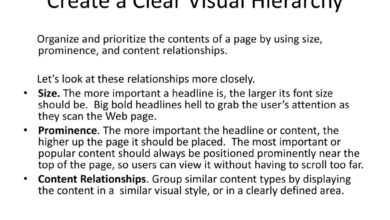
Visual Design and Aesthetics: How To Use Photography Ui Design

Source: webhombres.com
A photography app’s visual design is paramount; it’s the first impression, influencing user engagement and overall satisfaction. A well-crafted aesthetic not only makes the app visually pleasing but also enhances usability and functionality, guiding the user intuitively through the editing and sharing process. The visual elements work together to create a cohesive and enjoyable user experience.
Effective visual design in a photography app involves a careful consideration of color palettes, typography, iconography, whitespace, visual balance, and micro-interactions. Each element contributes to the overall mood and feel, reflecting the app’s brand and target audience. A consistent visual language throughout the app ensures a seamless and intuitive user experience.
Mood Board: Visual Styles for a Photography App UI
A mood board helps visualize different design directions. Here are three distinct styles, each with a unique rationale:
Style 1: Minimalist and Clean: Imagine a predominantly white background with subtle grey accents. Icons are simple, line-based, and highly legible. Typography is clean and modern, using a sans-serif font like Helvetica or Open Sans. This style evokes a sense of clarity and focus, ideal for users who prioritize functionality and ease of use. The imagery in this mood board would showcase simple, uncluttered compositions, emphasizing the clean aesthetic.
A single, muted color accent might be used sparingly to highlight key elements.
Style 2: Bold and Vibrant: This style uses a rich color palette, possibly inspired by a specific theme (e.g., nature, urban landscapes). Typography is bolder, perhaps using a geometric sans-serif or even a display font for headlines. Icons are more detailed and visually striking. The imagery would feature high-contrast images with saturated colors. This style creates a more energetic and expressive feel, appealing to users who appreciate visual excitement.
Style 3: Dark and Moody: A dark background with muted colors and high-contrast elements. Typography is clean but slightly heavier, perhaps using a serif font for a more classic feel. Icons are well-defined and easily distinguishable against the dark background. The imagery would feature darker, more dramatic photographs, highlighting shadows and textures. This style creates a sophisticated and professional feel, perfect for users who appreciate a more serious and artistic approach to photography.
Color Palettes, Typography, and Iconography
These three elements are fundamental to a visually appealing and consistent UI. The color palette sets the overall mood and tone, while typography ensures readability and brand consistency. Iconography provides visual shortcuts and enhances intuitive navigation. A cohesive approach is crucial; for instance, a minimalist app might use a limited color palette and simple sans-serif fonts, while a vibrant app might use a wider range of colors and bolder typography.
Whitespace and Visual Balance
Effective use of whitespace (negative space) is crucial for creating a clean and uncluttered interface. It prevents the UI from feeling overwhelming and allows the visual elements to breathe. Visual balance ensures that the elements are arranged harmoniously, preventing the UI from feeling lopsided or unbalanced. Consider the rule of thirds—a principle from photography—in arranging UI elements for a balanced and visually pleasing layout.
Examples include using symmetrical layouts or asymmetrical layouts that balance visual weight effectively.
Micro-interactions
Micro-interactions, such as subtle animations on button clicks or loading indicators, enhance user engagement and provide feedback. A well-designed loading indicator, for example, keeps the user informed about the app’s progress without being intrusive. Subtle animations on buttons provide a satisfying tactile response, making the interaction feel more natural and intuitive. These small details significantly improve the overall user experience and make the app feel more polished and professional.
Advanced UI Concepts in Photography Software
Designing intuitive and powerful photography software requires going beyond the basics. This involves incorporating advanced UI concepts that leverage cutting-edge technologies and cater to the increasingly sophisticated needs of photographers, both amateur and professional. This section delves into some key areas crucial for creating a truly exceptional photography application.
AI-Powered Features and Their UI Design Implications
The integration of artificial intelligence is revolutionizing photography software. Features like auto-enhance, object recognition, and scene detection are becoming increasingly common, requiring careful consideration in UI design. Auto-enhance, for example, should offer users clear control over the intensity of the effect, perhaps with a slider or preset options clearly labeled and visually distinct. Object recognition can be incorporated subtly, perhaps highlighting detected objects with a faint Artikel or providing contextual information on tap, avoiding overwhelming the user interface.
The UI should also clearly communicate when AI is being used and allow users to easily disable these features if desired. Consider a clear visual indicator, such as a small AI icon, that’s active only when AI-powered features are engaged.
Designing for Large Photo Libraries
Managing extensive photo libraries is a significant challenge for many photographers. The UI must facilitate efficient browsing, searching, and organization. A robust search function, supporting searches, date ranges, location data, and even image content recognition, is essential. A well-designed thumbnail view, allowing for easy scrolling and selection, is also crucial. Consider implementing a hierarchical folder system, mirroring common file management conventions, and allowing users to create custom tags and albums for enhanced organization.
Furthermore, lazy loading techniques can significantly improve performance when dealing with thousands of images, ensuring a smooth and responsive user experience. Visual cues, such as progress bars during loading or clear indicators of filter application, further enhance user experience.
Organizing and Presenting User Settings and Preferences
Effective management of user settings is critical. Different approaches exist, each with its strengths and weaknesses. A tabbed interface can be effective for organizing numerous settings into logical categories, such as camera controls, editing tools, and account preferences. A more advanced approach might use a collapsible sidebar or accordion menu, minimizing screen clutter while providing easy access to all settings.
Each setting should be clearly labeled and accompanied by a concise description or tooltip, if necessary. For more complex settings, visual representations, such as color pickers or sliders, are preferable to text-based input fields. Consistent use of visual language and terminology throughout the application is paramount for intuitive navigation.
Managing and Sharing Photos with Collaborators, How to use photography ui design
The ability to collaborate on photo projects is increasingly important. The UI should provide a seamless way for users to invite collaborators, manage permissions, and share photos securely. Consider a dedicated collaboration space within the application, allowing users to share specific albums or folders with selected collaborators. Clear visual indicators should show which photos have been shared and who has access.
Version control features, allowing users to track changes and revert to previous versions, are also valuable additions. The system should also support different levels of collaboration, from simple viewing to full editing privileges, ensuring users have fine-grained control over the access granted to their collaborators. Secure cloud storage integration is crucial for easy sharing and accessibility.
Conclusive Thoughts
Designing a killer photography UI isn’t just about aesthetics; it’s about understanding the user’s journey and creating a seamless, intuitive flow. By mastering the principles we’ve explored – from visual hierarchy and intuitive navigation to advanced features and accessibility considerations – you can craft a photography app that not only looks great but also empowers users to effortlessly capture, edit, and share their most precious memories.
So go forth, and create something amazing!
Essential Questionnaire
What are some common mistakes to avoid when designing a photography app UI?
Overly complex interfaces, inconsistent design elements, lack of visual feedback, and neglecting accessibility features are common pitfalls. Prioritize simplicity, consistency, and clear communication.
How can I test the usability of my photography app UI?
User testing is crucial! Conduct A/B testing, gather feedback through surveys and interviews, and observe real users interacting with your design to identify areas for improvement.
What are some trending UI design styles for photography apps?
Minimalist designs, dark modes, and neumorphism are currently popular, but the best style will depend on your app’s brand and target audience. Consider what feeling you want to evoke.
How important is color psychology in photography app UI design?
Very important! Color evokes emotions and influences user perception. Choose colors that align with your app’s brand and purpose, considering how different colors can affect mood and user engagement.


