Best PowerPoint Presentation Templates Your Guide
Best PowerPoint presentation templates aren’t just about pretty slides; they’re about crafting a compelling narrative. They’re the unsung heroes of effective communication, transforming data into digestible stories and complex ideas into easily understood concepts. Choosing the right template can elevate your presentation from drab to dazzling, leaving a lasting impression on your audience. This guide dives deep into selecting, using, and creating impactful presentations.
We’ll explore the key features of top-tier templates, different template types suited for various scenarios, the crucial role of visual elements, and how to prioritize accessibility and inclusivity. From understanding minimalist versus maximalist design to mastering color palettes and font choices, we’ll cover everything you need to know to create presentations that resonate.
Top Features of Popular PowerPoint Presentation Templates
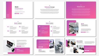
Choosing the right PowerPoint template can significantly impact the effectiveness of your presentation. A well-designed template provides a professional framework, allowing you to focus on your content rather than formatting. This section explores key features that distinguish high-quality templates and examines design philosophies to help you make informed decisions.
Key Features of High-Quality PowerPoint Templates
Several features consistently set apart superior PowerPoint templates. These features contribute to a visually appealing and easily digestible presentation.
- Professional Typography: High-quality templates utilize carefully selected fonts that are legible and enhance readability. They avoid clashing font pairings and maintain consistent font sizes throughout the presentation for optimal visual flow.
- Consistent Branding & Color Palette: A cohesive color palette and consistent branding elements (logo placement, color schemes) create a professional and memorable impression. Templates should allow for easy customization while maintaining a unified look.
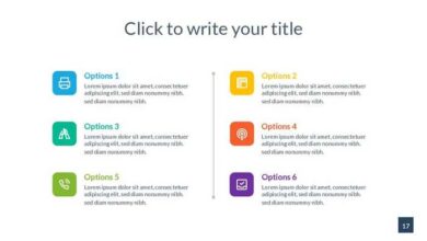
- Master Slides & Layouts: The use of master slides ensures consistency in design elements across all slides. Pre-designed layouts provide structure and save time, offering various options for different content types (titles, images, charts, etc.).
- High-Resolution Graphics & Visual Assets: High-quality templates include crisp, professional-looking graphics, charts, and icons that complement the presentation’s content without overwhelming it. These visuals should be easily editable and customizable.
- Accessibility Features: The best templates consider accessibility, ensuring sufficient color contrast for readability and providing alternative text for images, catering to users with visual impairments.
Minimalist vs. Maximalist Design Philosophies
Minimalist and maximalist templates represent contrasting design approaches. Minimalist templates prioritize simplicity, using clean lines, ample whitespace, and a limited color palette to create a clear and uncluttered presentation. Maximalist templates, conversely, embrace visual richness, employing intricate details, bold colors, and a variety of visual elements to create a dynamic and engaging experience. The choice between these styles depends on the presentation’s content and target audience.
A minimalist approach is often preferred for technical presentations or when conveying complex information, while a maximalist style might be better suited for creative presentations or product launches.
The Importance of Visual Hierarchy in Effective Template Design
Visual hierarchy is crucial for guiding the viewer’s eye through the presentation. Effective templates use size, color, contrast, and placement to establish a clear visual hierarchy, directing attention to the most important information first. This ensures that key messages are easily understood and remembered. For instance, a larger headline font size immediately communicates importance compared to smaller body text.
Effective Use of Whitespace and Negative Space
Whitespace, or negative space, is the empty area around design elements. It’s not just empty space; it provides visual breathing room, improving readability and preventing visual clutter. Many modern templates effectively utilize whitespace to create a clean and sophisticated look. For example, a template featuring a large central image with significant whitespace surrounding it allows the image to be the focal point, enhancing its impact.
Similarly, ample spacing between text blocks improves readability. Templates from companies like Slidesgo often showcase excellent use of whitespace.
Comparison of Popular PowerPoint Templates
The following table compares three popular PowerPoint presentation templates based on features, pricing, and user reviews (Note: Pricing and reviews are subject to change and are based on general observations at the time of writing).
| Feature | Template A (Example: Envato Elements Template) | Template B (Example: SlidesCarnival Template) | Template C (Example: Canva Pro Template) |
|---|---|---|---|
| Pricing | Subscription-based | Free/Premium options | Subscription-based |
| Number of Slides | 30+ | 20+ | Variable, depending on the chosen template |
| Customization Options | High | Medium | High |
| Visual Style | Modern and Minimalist | Versatile, various styles available | Wide range of styles available |
| User Reviews | Generally positive, praising ease of use and professional look | Positive, highlighting free options and quality | Positive, noting extensive library and ease of use within the Canva platform |
Template Types and Their Best Use Cases
Choosing the right PowerPoint template can significantly impact the effectiveness of your presentation. The visual style, layout, and overall feel of your template should directly support your message and resonate with your audience. Understanding the different types of templates and their ideal applications is crucial for creating a presentation that’s both visually appealing and highly effective.PowerPoint templates broadly fall into three categories: minimalist, corporate, and creative.
Each offers unique advantages depending on the context of your presentation.
Finding the best PowerPoint presentation templates can be a game-changer, especially when you’re aiming for that polished, professional look. But great visuals need a great platform, and that’s where mastering video comes in; check out this awesome guide on getting it on with YouTube to boost your reach. Ultimately, combining killer slides with a strong YouTube presence will take your presentations to the next level.
Minimalist Templates and Their Applications
Minimalist templates prioritize simplicity and clarity. They typically feature clean lines, a limited color palette, and ample white space. This design approach allows the content to take center stage, preventing visual distractions and ensuring the audience focuses on the key information. These templates are particularly effective for presentations where data visualization and clear communication of complex ideas are paramount.
For example, a minimalist template would be ideal for a scientific presentation detailing research findings, a business proposal emphasizing financial projections, or an educational presentation focusing on intricate concepts. The clean aesthetic ensures that charts, graphs, and data points remain easily digestible. A common visual element would be a single, bold headline on a slide with supporting data presented in a clear, uncluttered manner.
Corporate Templates and Their Applications
Corporate templates project professionalism and authority. They often incorporate sophisticated color schemes, high-quality imagery, and a structured layout that reflects a company’s brand identity. This style is best suited for formal presentations in business settings, such as board meetings, investor pitches, or client presentations. For instance, a presentation to secure funding for a new venture would benefit from a corporate template, conveying seriousness and credibility.
The use of consistent branding elements throughout the presentation further reinforces the company’s image and message. A typical slide might include a company logo, professional photography, and bullet points detailing key achievements or future plans.
Creative Templates and Their Applications
Creative templates utilize bold visuals, unique layouts, and unconventional typography to make a strong visual impact. They are best used for presentations where the goal is to inspire, engage, and leave a lasting impression. These templates are perfectly suited for marketing pitches, product launches, or presentations in creative industries like design or advertising. Imagine a presentation showcasing a new fashion line; a creative template with vibrant colors, striking imagery, and dynamic animations would effectively capture the essence of the brand.
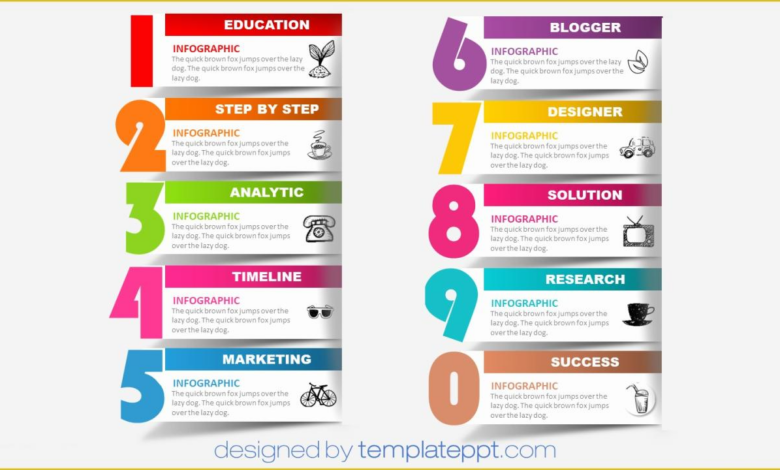
The visual richness of these templates can generate excitement and help the audience connect with the presented ideas on an emotional level. This style often uses illustrative graphics, infographics, and unconventional layouts to create a unique and memorable presentation.
Pre-designed versus Custom Designs: Advantages and Disadvantages, Best powerpoint presentation templates
Using pre-designed templates offers several advantages: They are readily available, saving significant time and effort in the design process. They often come with professionally designed layouts and color schemes, ensuring a polished and consistent look. However, pre-designed templates might lack the flexibility to fully reflect a unique brand identity or specific presentation needs. Custom designs offer greater control over the aesthetic and functionality, but require more time, resources, and design expertise.
The choice depends on the specific needs of the presentation and available resources.
Industries Benefiting Most from Pre-designed Templates
- Education: Pre-designed templates provide a consistent and professional look for lesson plans and presentations.
- Real Estate: Templates showcase property listings and investment opportunities effectively.
- Business Consulting: Templates offer a polished look for proposals and client presentations.
- Healthcare: Templates aid in creating informative presentations for patient education and staff training.
- Non-profit Organizations: Templates help communicate mission statements and fundraising goals clearly.
Impact of Visual Elements in PowerPoint Templates: Best Powerpoint Presentation Templates
PowerPoint presentations are more than just words on a slide; they’re a visual narrative. The careful selection and implementation of visual elements—color palettes, fonts, images, and consistent branding—significantly impact a presentation’s effectiveness, shaping audience perception and influencing message retention. A well-designed template acts as a foundation for this visual storytelling, ensuring consistency and professionalism.
Color Palettes and Presentation Mood
Color psychology plays a crucial role in establishing the mood and tone of a presentation. Warm colors like reds and oranges evoke energy and excitement, making them suitable for presentations focused on innovation or new product launches. Cool colors such as blues and greens project calmness and trustworthiness, ideal for presentations emphasizing data analysis or corporate stability. A well-chosen palette supports the overall message, creating an emotional connection with the audience.
For example, a presentation on environmental sustainability might effectively utilize calming greens and blues, while a presentation on a new gaming technology could benefit from vibrant, energetic reds and yellows. Using a limited color palette, perhaps three to five colors, maintains visual harmony and avoids overwhelming the viewer.
Font Choices and Readability
Font selection is paramount for readability and aesthetic appeal. Legible fonts like Arial, Calibri, or Helvetica are generally preferred for body text, ensuring clear communication. However, a presentation can also benefit from the strategic use of display fonts for headings and titles, to add visual interest and emphasis. The key is to strike a balance: using a variety of fonts can be distracting, while sticking to a single, monotonous font can be visually unappealing.
Consistency in font usage throughout the presentation is crucial, creating a professional and polished look. Consider using a serif font (like Times New Roman) for longer text blocks and a sans-serif font for headings to improve readability and visual distinction.
Best Practices for Incorporating Images and Graphics
High-quality images and graphics are essential for enhancing engagement and clarifying complex information. However, their inclusion requires careful consideration. Images should be high-resolution and professionally designed, avoiding pixelated or blurry visuals. They should directly relate to the content, supporting the message rather than distracting from it. Overuse of images can clutter a slide, while too few can make the presentation feel bland.
A good rule of thumb is to use images sparingly, strategically placing them to emphasize key points or illustrate complex concepts. Always ensure you have the rights to use any images you incorporate, respecting copyright laws.
Consistent Visual Branding
Maintaining consistent visual branding across a presentation template is vital for projecting professionalism and reinforcing brand identity. This involves using consistent color palettes, fonts, logos, and imagery throughout the presentation. This creates a cohesive and memorable experience for the audience, reinforcing brand recognition and recall. Consider using a company’s brand guidelines as a starting point for creating a consistent visual identity in your presentation.
This consistency helps in establishing credibility and trust with the audience, reinforcing the message being conveyed.
Compelling Visual Element: Animated Data Visualization
A compelling visual element that could significantly enhance a presentation is an animated data visualization. Imagine a bar chart that dynamically updates as you present each data point, highlighting key trends and figures. This visual representation would not only present the data clearly but also hold the audience’s attention by showcasing the data’s evolution and significance in a dynamic and engaging manner.
This could be a simple animation, perhaps bars growing in height as you mention the relevant statistics, or a more complex visualization, with color changes reflecting positive or negative trends. Such an animation effectively translates complex data into an easily understandable and memorable visual narrative, enhancing the presentation’s impact.
Accessibility and Inclusivity in Template Design
Creating PowerPoint presentations that are visually appealing is crucial, but equally important is ensuring they’re accessible to everyone, regardless of their abilities. A truly effective presentation reaches its audience; neglecting accessibility limits your reach and can even be discriminatory. Designing for accessibility isn’t just about following guidelines; it’s about creating a more inclusive and equitable experience for all.Designing accessible PowerPoint templates requires careful consideration of various factors, especially for those with visual impairments or cognitive differences.
A visually engaging template can be completely inaccessible to someone with color blindness, for example, rendering the entire presentation unusable. By proactively addressing accessibility, we ensure our message reaches a wider audience and fosters a more inclusive environment.
Color Contrast and Color Blindness
Sufficient color contrast between text and background is paramount for readability. Individuals with color blindness may struggle to distinguish between colors that appear distinct to those with normal vision. Tools like WebAIM’s Color Contrast Checker can help determine whether your color choices meet WCAG (Web Content Accessibility Guidelines) standards. Aim for a minimum contrast ratio of 4.5:1 for normal text and 3:1 for large text, according to WCAG guidelines.
For example, using dark text on a light background, or vice versa, ensures sufficient contrast. Furthermore, avoid relying solely on color to convey information; always use alternative cues such as shapes, patterns, or text labels.
Accessibility for Visual Impairments
For users with visual impairments, alternative text descriptions for images are essential. Screen readers rely on this alt text to convey the image’s content. Detailed and accurate descriptions are crucial; avoid vague phrases like “a picture of a graph.” Instead, provide specific information such as “A bar graph showing sales figures for Q1 2024, with a significant increase in sales of product X.” Similarly, provide clear and concise headings and subheadings throughout the presentation.
This structural organization allows screen readers to navigate the content efficiently. Using consistent formatting and clear language further enhances accessibility for all users.
Best Practices for Inclusive and Accessible PowerPoint Templates
Designing inclusive and accessible PowerPoint templates requires a multifaceted approach. Here are some key best practices:
- Use sufficient color contrast between text and background elements. Employ a color contrast checker to ensure compliance with WCAG guidelines.
- Provide alternative text (alt text) for all images, offering detailed and accurate descriptions.
- Use clear and concise headings and subheadings to improve navigation and screen reader compatibility.
- Avoid using color alone to convey information; use alternative cues like shapes, patterns, or text labels.
- Use sans-serif fonts like Arial or Calibri, as they are generally easier to read.
- Keep text concise and avoid excessive use of jargon or complex sentence structures.
- Use a consistent and logical layout to improve readability and navigation.
- Consider using larger font sizes for better visibility.
- Test your presentation with assistive technologies like screen readers to identify and address potential accessibility barriers.
Evaluating and Selecting the Right PowerPoint Template
Source: amazonaws.com
Choosing the perfect PowerPoint template can significantly impact the effectiveness of your presentation. A well-chosen template enhances readability, professionalism, and overall engagement, while a poor choice can distract your audience and undermine your message. This section will guide you through the process of selecting a template that best suits your needs.
Step-by-Step Template Evaluation
To ensure you select a suitable template, follow these steps: First, clearly define the purpose and overall tone of your presentation. Is it a formal business proposal, a casual team update, or an engaging academic lecture? Next, analyze your content. How much text will you use? Will you rely heavily on visuals, data charts, or images?
Finally, consider your target audience and the overall message you want to convey. A template that works well for a corporate presentation might be inappropriate for a creative portfolio.
Free vs. Paid PowerPoint Templates: A Comparison
The choice between free and paid templates involves weighing several factors. Free templates offer accessibility and convenience, allowing you to quickly find and implement a design without any financial commitment. However, free templates often lack customization options and may include watermarks or limited features. They may also be less unique, potentially resulting in a presentation that looks similar to many others.
Paid templates, on the other hand, typically offer superior quality, more customization options, and professional designs. They often come with extended support and may offer unique features not found in free templates. The investment in a paid template can be worthwhile if a high level of professionalism and customization is required.
Template Selection Based on Target Audience
Your audience significantly influences template selection. For a corporate audience, a clean, minimalist template with a professional color palette is usually preferred. For a younger, more creative audience, a more vibrant and visually stimulating template might be more appropriate. Consider the audience’s familiarity with the topic; a simpler template may be better for audiences less familiar with the subject matter to avoid overwhelming them with complex visual elements.
For example, a presentation on complex financial data to a board of directors would benefit from a clean, easily readable template, while a presentation on a new product to a younger, tech-savvy audience could utilize a more modern, visually dynamic design.
Checking PowerPoint Template Compatibility
Compatibility across different PowerPoint versions is crucial. Before committing to a template, check the provider’s specifications to ensure compatibility with the versions you and your audience will use. Older versions may not support all features of newer templates, leading to formatting issues or missing elements. Additionally, consider the file format (.pptx, .ppt) to ensure compatibility with all necessary software.
If you are unsure, test the template on the specific versions you plan to use before finalizing your presentation. Many template providers offer previews or trial versions to help assess compatibility before purchase.
Wrap-Up
Source: heritagechristiancollege.com
Ultimately, the best PowerPoint presentation template is the one that best serves your message and audience. By understanding the principles of effective design, considering accessibility, and carefully evaluating your options, you can create presentations that are not only visually appealing but also highly effective in communicating your ideas. Remember, a well-designed template is a powerful tool that can significantly enhance your communication and leave a lasting impact.
So go forth and create presentations that shine!
Helpful Answers
What file formats are PowerPoint templates typically available in?
PowerPoint templates are usually available in .pptx (PowerPoint Open XML Presentation) format, compatible with most modern versions of Microsoft PowerPoint. Some may also offer .potx (PowerPoint Open XML Template) files for creating master templates.
Can I edit the templates’ content and design after downloading?
Absolutely! The whole point of a template is its adaptability. You can change colors, fonts, images, layouts, and content to perfectly match your presentation’s needs.
Where can I find free PowerPoint templates?
Many websites offer free PowerPoint templates, including Microsoft’s own template library, Canva, and various design resource sites. However, be aware that free templates may have limitations in customization or design quality.
Are there templates specifically designed for specific industries?
Yes! Many template providers offer templates tailored for specific industries like marketing, education, finance, and healthcare, incorporating industry-specific imagery and layouts.