How to Create Wedding Invitations in Adobe Illustrator
How to create wedding invitation in Adobe Illustrator? Let’s dive into the enchanting world of designing your dream wedding invitations! This isn’t just about creating a pretty picture; it’s about crafting a keepsake that reflects your unique style and sets the tone for your special day. We’ll walk through each step, from setting up your Illustrator project to exporting a print-ready PDF, ensuring your invitations are as stunning as your love story.
This guide is perfect for couples who want to create personalized invitations without breaking the bank or compromising on quality. Whether you’re a design pro or a complete beginner, I’ll break down the process into manageable steps, providing tips and tricks along the way. Get ready to unleash your creativity and design wedding invitations that will wow your guests!
Setting Up Your Adobe Illustrator Project
Source: brandpacks.com
Designing wedding invitations in Adobe Illustrator can be a blast! From crafting elegant fonts to perfectly placing those intricate details, it’s all about precision. But if you want to share your design process and reach a wider audience, check out this awesome guide on getting it on with youtube – it’s seriously helpful for boosting your visibility.
Once you’ve mastered the YouTube game, you can showcase your stunning Adobe Illustrator wedding invitations to the world!
Creating stunning wedding invitations in Adobe Illustrator starts with a solid foundation. Proper project setup ensures a smooth design process and a print-ready file. This involves setting the correct dimensions, color mode, and resolution, and establishing a well-organized layer structure. Let’s dive into the specifics.
A well-structured project is key to efficient workflow. Think of it like building a house – you wouldn’t start constructing the roof before laying the foundation, would you? Similarly, a well-organized Illustrator file prevents design chaos and makes edits a breeze.
Standard Wedding Invitation Template Dimensions and Bleed
A standard wedding invitation size is 5″ x 7″. However, to account for potential printing variations and ensure no important design elements are cut off, we need to add bleed. Bleed is the extra area around your design that gets trimmed during printing. A standard bleed is 0.125 inches (1/8 inch) on all sides. Therefore, your Illustrator document should be 5.25″ x 7.25″ to accommodate this bleed.
Creating a New Adobe Illustrator Document
To begin, open Adobe Illustrator and select “New” from the File menu. For print, choose the “Print” preset. Set the width to 5.25 inches and the height to 7.25 inches. Crucially, select the CMYK color mode, as this is the standard for professional printing. Resolution should be set to 300 DPI (dots per inch), ensuring crisp, high-quality output.
Name your file something descriptive, like “WeddingInvitation_Design1”.
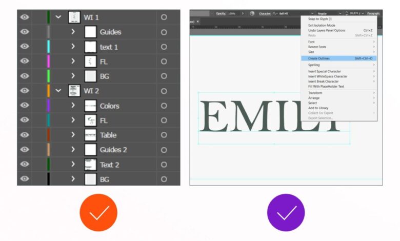
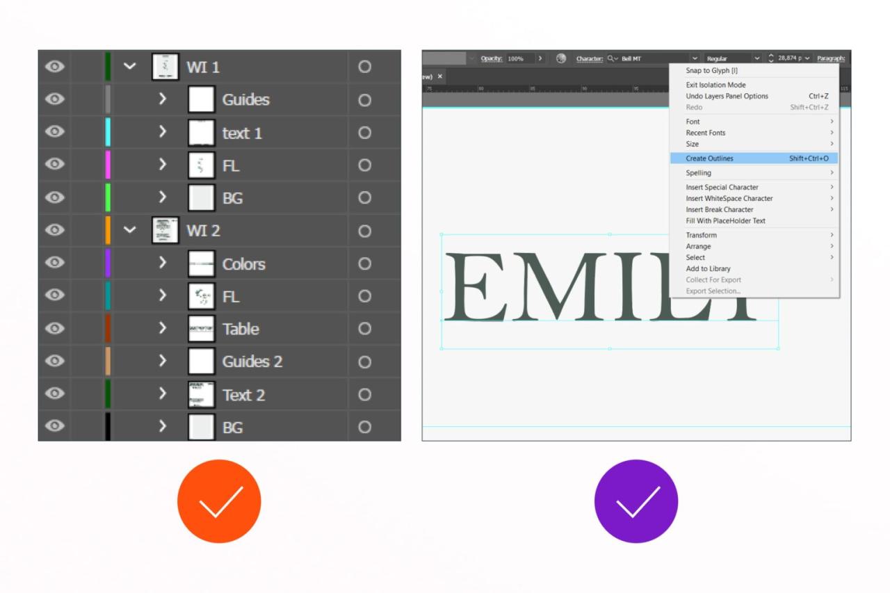
Layer Organization Strategies
Effective layer organization is paramount for managing a complex design. A disorganized file quickly becomes a nightmare to edit. Here’s a suggested layer structure:
- Background: This layer contains any background colors or images.
- Graphics: This layer houses all your design elements like illustrations, patterns, or decorative elements.
- Text: This layer holds all your text elements – invitation wording, names, date, etc. Consider sub-layers within this layer for different text blocks (e.g., names, date, RSVP info).
- Bleed: A separate layer for any elements extending into the bleed area. This helps visualize the bleed and ensures nothing crucial is accidentally trimmed.
This layered approach allows you to easily select, edit, and manipulate individual elements without affecting others. You can also use color-coding to further distinguish layers.
Using Guides and Grids for Precise Placement
Guides and grids are your best friends for accurate design. Guides are vertical and horizontal lines that help align elements precisely. Grids provide a structured framework for placing elements consistently. To set up guides, use the rulers (View > Rulers > Show Rulers) and drag guides from the rulers onto the artboard. To create a grid, go to View > Show Grid and adjust the grid settings (Edit > Preferences > Guides & Grid) to your desired spacing.
For a wedding invitation, using guides to center text, align images, and ensure even spacing between design elements is essential for a polished and professional look. The grid can help maintain consistency in the placement of smaller decorative elements.
Designing the Invitation Layout
Source: masterbundles.com
Creating a stunning wedding invitation in Adobe Illustrator involves more than just picking pretty fonts and colors. It’s about crafting a cohesive design that reflects the couple’s personality and sets the tone for their special day. This section will guide you through the process of designing a visually appealing and memorable invitation layout.
Layout Styles
The layout of your wedding invitation is crucial in conveying the overall aesthetic. Several popular styles exist, each offering a unique visual impact. Consider a classic and elegant layout, perhaps featuring a formal script font paired with a delicate floral illustration, enclosed within a tasteful frame. Alternatively, a modern and minimalist approach might use clean lines, a sans-serif typeface, and a simple geometric pattern as a background.
A rustic or bohemian style could incorporate watercolor textures, hand-drawn elements, and a more informal script. Finally, a playful and whimsical design might utilize bright colors, fun fonts, and quirky illustrations. The possibilities are endless, and the best style will depend on the couple’s preferences and the overall theme of the wedding.
Font Pairings
Choosing the right font pairing is essential for readability and visual harmony. A successful pairing often involves contrasting styles, such as a sophisticated serif font (like Garamond or Didot) paired with a clean sans-serif font (like Helvetica or Futura) for body text. This combination provides elegance and readability. Alternatively, you could pair a script font (like Brush Script MT or Pacifico) with a simple serif or sans-serif font for a more romantic or informal feel.
However, avoid pairing two very similar fonts, as this can lead to a monotonous and visually unappealing result. Always consider the legibility of the chosen fonts, especially for smaller text sizes.
Creating a Monogram or Custom Illustration
A monogram or custom illustration adds a personal touch to the invitation. A simple monogram can be created by combining the couple’s initials. For instance, for a couple with initials “A” and “B,” you could overlap or intertwine the letters, creating a visually appealing design. Experiment with different font styles, sizes, and letter arrangements to achieve the desired effect.
You can further enhance the monogram by adding decorative elements such as flourishes or a subtle texture. For a custom illustration, consider incorporating elements that represent the couple’s hobbies, interests, or the wedding theme. This could be anything from a simple floral design to a more complex illustration representing a significant location or event. Illustrator’s drawing tools make creating such elements relatively straightforward.
Incorporating Decorative Elements
Frames and borders can significantly enhance the overall design. A simple, elegant frame can provide structure and visual balance. Consider using a subtle border to define the invitation’s edges, or a more elaborate frame to add a touch of formality. The choice of frame style should complement the overall design aesthetic. For a modern invitation, a geometric frame might be suitable, while a classic invitation could benefit from a more ornate, decorative frame.
You can create custom frames in Illustrator using the shape tools and customize their appearance using strokes, fills, and effects. Remember that decorative elements should enhance, not overpower, the overall design.
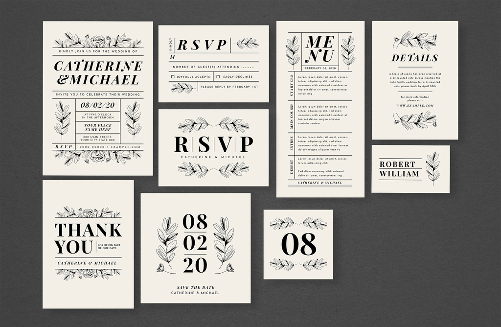
Incorporating Text and Typography: How To Create Wedding Invitation In Adobe Illustrator
Crafting the perfect wedding invitation involves more than just pretty pictures; the typography is equally crucial in setting the tone and conveying essential information. A well-designed typography scheme elevates your invitation from simple announcement to a cherished keepsake. Let’s explore how to achieve this in Adobe Illustrator.
Your typography choices should reflect the overall style of your wedding. A formal affair might call for elegant serif fonts, while a rustic celebration could benefit from a more casual, handwritten script. Consistency is key – stick to a limited palette of fonts (usually 2-3 maximum) to avoid a cluttered look. Establish a clear visual hierarchy, using different font weights, sizes, and styles to guide the reader’s eye through the important information.
Couple’s Names, Date, Time, and Location Layout Options
This section is the heart of your invitation, so clear and elegant presentation is vital. Here are three layout options for displaying the couple’s names, date, time, and location, presented in a table for easy comparison. Remember to adjust spacing and font sizes to fit your chosen design.
| Layout Option | Couple’s Names | Date & Time | Location |
|---|---|---|---|
| Option 1: Vertical Stack |
[Couple’s Names in a large, elegant script font] |
[Date] at [Time] |
[Location] |
| Option 2: Horizontal Arrangement |
[Couple’s Names in a large, elegant serif font] |
[Date] at [Time] |
|
| Option 3: Layered Approach |
[Couple’s Names in a large, elegant script font overlaid on a decorative element] |
[Date] at [Time] |
RSVP Information Formatting
Clear and concise RSVP information is essential. Avoid ambiguity and provide all necessary details. This includes the deadline, preferred method of response (e.g., online form, phone call, mail), and contact information.
Consider using a smaller font size for this section, as it’s less prominent than the main invitation details. A simple, clean layout, perhaps within a separate box or frame, helps to visually separate it.
Example: “Kindly RSVP by [Date] to [Phone Number] or [Email Address].”
Creating Elegant Text Effects
Adding subtle text effects can significantly enhance the visual appeal of your invitation. Drop shadows, for instance, can add depth and sophistication without overwhelming the design. In Adobe Illustrator, you can achieve this by duplicating your text layer, slightly offsetting it, and applying a darker fill color to the duplicated layer. Experiment with the opacity and blur settings to fine-tune the effect.
Alternatively, you could explore other effects like glows, bevels, or embossing to create a unique look. Remember to maintain readability – overly dramatic effects can make the text difficult to read.
Adding Images and Illustrations
Bringing your wedding invitation to life involves incorporating compelling visuals. High-quality images and illustrations add personality and enhance the overall aesthetic appeal, making your invitation truly memorable. This section focuses on seamlessly integrating images and illustrations into your Adobe Illustrator design, optimizing them for print, and exploring different visual styles.
Image Placement and Sizing
Strategic placement and appropriate sizing are crucial for a balanced design. For a couple’s photograph, consider a prominent placement, perhaps spanning the top half of the invitation. To achieve this, import your high-resolution image (ideally at 300 DPI) into Illustrator. Use the Selection tool (V) to position the image. The Scale tool (S) allows precise resizing while maintaining aspect ratio; hold down Shift while dragging a corner handle to prevent distortion.
Experiment with different sizes to find the perfect balance between prominence and readability of the accompanying text. A good rule of thumb is to leave ample white space around the image to avoid a cluttered look. Consider cropping the image within Illustrator to focus on a specific detail or composition that complements the overall design.
Creating a Simple Floral Illustration
Let’s add a touch of elegance with a simple floral illustration. Begin by using the Ellipse Tool (L) to create the basic shapes of petals. Experiment with varying sizes and overlapping ellipses to create depth and realism. The Pen Tool (P) offers greater control for creating more intricate petal shapes. Use the Direct Selection Tool (A) to fine-tune individual anchor points and curves.
For stems and leaves, utilize the Pencil Tool (N) for a more organic, hand-drawn feel. Employ the Stroke panel to adjust the weight and color of your lines. Add subtle shading using the Gradient Tool (G) to give the flowers a three-dimensional effect. Remember to use a limited color palette that complements the overall invitation theme and the couple’s photograph.
A cohesive color scheme enhances visual harmony.
Optimizing Images for Print, How to create wedding invitation in adobe illustrator
Optimizing images for print is crucial for achieving high-quality results. Ensure your images are high-resolution (at least 300 DPI) to avoid pixelation. Use a CMYK color profile for print, converting from RGB if necessary. This ensures accurate color reproduction during printing. Overly large image files can lead to slow processing times and potential printing issues.
Save your images as high-quality JPEGs or TIFFs to maintain image integrity. Before sending your design to print, always request a proof to verify color accuracy and image quality.
Image Styles and Their Impact
Different image styles evoke different moods and aesthetics. A classic black and white photograph conveys a timeless elegance. A vibrant, brightly colored image creates a lively and energetic feel. A soft, pastel-toned image provides a romantic and gentle atmosphere. A painterly or textured image adds a unique artistic touch.
The choice of image style significantly influences the overall tone and mood of your wedding invitation, aligning with the couple’s personalities and the wedding theme. For example, a rustic wedding might benefit from a slightly desaturated, vintage-style photograph, whereas a modern wedding might suit a sharp, contemporary image.
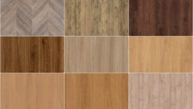
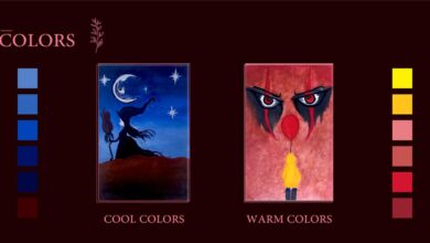
Color Palette and Theme
Choosing the right color palette is crucial for setting the mood and tone of your wedding invitation. It’s more than just picking pretty colors; it’s about creating a visual narrative that reflects the style and personality of the couple. A well-chosen palette can evoke feelings of romance, elegance, playfulness, or sophistication, instantly capturing the essence of your special day.
Color Harmony Principles
Creating a cohesive color scheme relies on understanding color harmony principles. These principles guide the selection of colors that work well together, preventing a clash of colors and ensuring a visually pleasing result. Several key harmonies exist, each offering a distinct aesthetic. For instance, analogous harmonies use colors that sit next to each other on the color wheel, creating a sense of calm and unity.
Complementary harmonies use colors opposite each other on the wheel, offering a vibrant and energetic contrast. Triadic harmonies use three colors evenly spaced on the wheel, resulting in a balanced and visually striking combination. Split-complementary harmonies offer a variation on complementary, using the color and the two colors adjacent to its complement, achieving a balanced vibrancy.
Examples of Wedding Color Palettes
Let’s explore some examples. A rustic wedding might utilize earthy tones like deep browns, muted greens, and creamy ivories, evoking a sense of warmth and natural beauty. Imagine a deep burgundy, blush pink, and dusty rose combination for a romantic and sophisticated feel. A beach wedding could incorporate soft blues, sandy beiges, and coral accents, reflecting the calming atmosphere of the ocean.
A modern wedding might use bold jewel tones like emerald green, sapphire blue, and ruby red for a dramatic and luxurious effect. Finally, a whimsical garden wedding could employ pastel shades of lavender, mint green, and soft yellow, creating a light and airy feel.
Color Combinations and Their Effects
The following table illustrates various color combinations and their associated moods and atmospheres. Remember that the perception of color is subjective, but these are general guidelines.
| Color Combination | Mood/Atmosphere | Wedding Theme Example | Illustrative Description |
|---|---|---|---|
| Ivory, blush pink, gold | Romantic, elegant, classic | Traditional wedding | The creamy ivory provides a base of sophistication, the soft blush pink adds a touch of romance, and the gold accents create a sense of luxury. Imagine delicate floral patterns in blush pink against an ivory background, with gold lettering adding a touch of opulence. |
| Navy blue, blush pink, gold | Elegant, sophisticated, timeless | Formal wedding | The deep navy blue adds a touch of formality and richness, while the blush pink softens the overall feel. Gold accents add a touch of glamour. This combination works well with clean lines and elegant typography. |
| Sage green, dusty rose, terracotta | Rustic, bohemian, earthy | Rustic outdoor wedding | The muted sage green, dusty rose, and terracotta create a warm and inviting palette reminiscent of nature. Imagine a watercolor effect with soft brushstrokes, reflecting the natural beauty of the setting. |
| Coral, turquoise, beige | Beachy, vibrant, playful | Beach wedding | The bright coral and turquoise evoke the energy of the ocean, while the beige adds a touch of softness and neutrality. This palette is ideal for a more casual and fun wedding invitation. |
Exporting and Preparing for Print
Getting your beautifully crafted wedding invitation ready for the printer is the final, crucial step. A poorly exported file can lead to disappointing results, so taking the time to do this correctly is essential. This section details the process of preparing your Adobe Illustrator file for professional printing, ensuring your invitations look exactly as envisioned.
Exporting as a High-Resolution PDF
Exporting your design as a high-resolution PDF is paramount for achieving crisp, clean prints. Within Illustrator, select “File” > “Export” > “Export As…”. Choose “Adobe PDF (Print)” as the file type. In the export settings, it’s crucial to select the appropriate “Marks and Bleeds” options. Bleeds are the extra area around your design that extends beyond the final trim size.
This ensures that no white edges appear after the printer trims the paper. Typically, a 1/8-inch (3mm) bleed is standard. Register marks, color bars, and crop marks are helpful for the printer to accurately align and trim your invitations. For the best quality, choose a high-resolution PDF/X-1a compliant file. This ensures consistent color across different systems.
Also, ensure that your PDF is set to CMYK color mode, as this is the standard for professional printing.
Color Profiles and Their Impact on Print Quality
Color profiles act as a translation system between your screen and the printer. Your monitor displays colors using RGB (Red, Green, Blue), while printers use CMYK (Cyan, Magenta, Yellow, Key/Black). Without a proper color profile, the colors you see on screen might differ significantly from the printed output. Using a standard CMYK profile like “US Web Coated (SWOP) v2” or “Coated GRACoL 2006 (ISO 12647-2:2004)” ensures a consistent color representation across various printing processes.
Working in CMYK mode from the start is recommended to avoid potential color discrepancies.
Preparing Files for Different Printing Methods
Offset printing and digital printing have different requirements. Offset printing, suitable for large quantities, usually requires high-resolution PDF/X-1a files with bleeds and proper color profiles. Digital printing, ideal for smaller runs, might have less stringent requirements, but still benefits from high-resolution files and accurate color profiles. Always confirm the specific requirements with your chosen printer. They can provide detailed guidelines on file formats, resolutions, and bleed specifications.
For example, a local print shop might request a specific PDF/X version or might require a different bleed setting.
Print-Ready Checklist
Before sending your files to the printer, review this checklist:
- Is your file in CMYK mode?
- Do you have the correct bleed settings (e.g., 1/8 inch)?
- Are all fonts embedded?
- Have you checked for any spelling or grammatical errors?
- Have you reviewed the final design at 100% zoom to check for any pixelation or issues?
- Is your file a high-resolution PDF/X-1a compliant file?
- Have you confirmed the file specifications with your printer?
Following these steps will ensure your wedding invitations are printed to the highest possible standard, matching your vision perfectly.
Final Summary
Creating your wedding invitations in Adobe Illustrator might seem daunting at first, but with a little patience and creativity, you can design something truly special. Remember, the key is to plan your design, choose your fonts and colors carefully, and optimize your images for print. Following these steps will ensure your invitations are not only beautiful but also professionally printed.
So, get started, have fun, and create invitations that perfectly capture the essence of your wedding!
Essential Questionnaire
What file type should I save my design as for printing?
Save your design as a high-resolution PDF (at least 300 DPI) in CMYK color mode for optimal print quality.
How do I add bleed to my design?
In Illustrator, add extra space (usually 0.125 inches or 3mm) around the edges of your design. This bleed area ensures that your design doesn’t have any white borders after trimming.
What are some good font pairings for wedding invitations?
Classic pairings like serif and sans-serif fonts work well. Consider elegant options like Garamond with Helvetica or Playfair Display with Open Sans.
Can I use free images for my invitation?
Be sure to check the license of any free images you use. Some require attribution, while others have restrictions on commercial use. Always double-check before incorporating them into your design.