Marble Background in Digital and Print Design
Marble background in digital and print design: It’s more than just a pretty picture! This versatile design element adds a touch of luxury and sophistication, but mastering its use requires understanding its nuances in both digital and print mediums. From website interfaces to high-end brochures, the right marble texture can elevate your designs, but the wrong one can easily overwhelm.
We’ll delve into the best practices, software, and techniques to make this classic pattern work for you.
This post explores the exciting world of marble backgrounds, covering everything from software choices and file formats to printing techniques and accessibility considerations. We’ll look at how different marble colors and patterns can evoke specific moods and brand identities, and how to seamlessly integrate them with other design elements. Whether you’re a seasoned designer or just starting out, this guide provides valuable insights and practical tips to help you harness the power of marble backgrounds in your next project.
Digital Applications of Marble Backgrounds

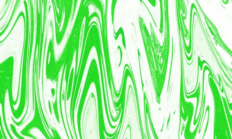
Source: vecteezy.com
Marble backgrounds, with their elegant swirls and timeless appeal, have transcended their traditional use in architecture and sculpture to become a popular design element in the digital world. Their versatility allows them to enhance websites, user interfaces, and various digital assets, adding a touch of sophistication and luxury. This section delves into the practical applications of marble backgrounds in digital design, covering the software used, design principles, file formats, and considerations for resolution.
Software for Creating Marble Backgrounds
Several software programs facilitate the creation and manipulation of marble background designs. Adobe Photoshop, with its robust layer management and filter options, remains a popular choice. Its powerful tools allow designers to create realistic marble textures from scratch or modify existing images. Other options include GIMP (a free and open-source alternative to Photoshop), Affinity Photo (a professional-grade photo editor), and even vector-based programs like Adobe Illustrator, which can be used to create stylized marble patterns.
The choice of software depends on the designer’s skill level, budget, and desired level of realism or artistic control.
Marble Backgrounds in Website Design and User Experience
The incorporation of marble backgrounds in website design requires careful consideration of user experience (UX). A well-implemented marble background can enhance the aesthetic appeal of a website, contributing to a feeling of luxury or sophistication. However, an improperly implemented one can negatively impact readability and usability. For instance, a website featuring a high-contrast marble background might pair well with dark text for optimal readability.
Conversely, a website using a light-colored marble might require dark text for contrast. The key is to maintain a balance between visual appeal and functional clarity. A subtly textured marble background can create visual interest without distracting from the website’s content. Conversely, using a highly detailed marble image as a background might overwhelm the design and make it difficult for users to focus on important elements.
Design Principles for Incorporating Marble Backgrounds in User Interfaces
Successful integration of marble backgrounds into user interfaces hinges on several key design principles. First, consider the overall design style and brand identity. A marble background might be perfectly suited for a luxury brand but less appropriate for a tech startup. Second, prioritize readability and accessibility. Ensure sufficient contrast between the background and foreground elements (text, buttons, images) to maintain legibility.
Third, utilize appropriate transparency or blending modes. This allows the background to subtly enhance the design without overwhelming it. Fourth, consider the level of detail in the marble texture. Highly detailed textures might be suitable for large hero images but could be too distracting in smaller areas. Finally, always test the design across different devices and screen sizes to ensure consistent appearance and usability.
File Formats for Digital Marble Backgrounds
Several file formats are suitable for digital marble backgrounds, each with its own advantages and disadvantages. JPEG (JPG) is a widely used format offering a good balance between image quality and file size compression, making it suitable for web use. PNG (Portable Network Graphics) supports lossless compression, preserving image quality, and is ideal for images with sharp lines or transparent areas.
SVG (Scalable Vector Graphics) is a vector-based format that renders images at any size without loss of quality, making it a good choice for logos or designs that need to be scaled across different applications. The choice of file format often depends on the specific use case and desired balance between image quality and file size.
Marble Texture Resolution in Digital Design
The resolution of a marble texture significantly impacts its visual quality and performance in digital design. Higher resolutions generally offer greater detail and sharper images but result in larger file sizes, potentially impacting website loading times. Lower resolutions might be suitable for smaller applications or situations where file size is a major concern, but they may appear blurry or pixelated when viewed at larger sizes.
| Resolution | Pros | Cons | Best Use Cases |
|---|---|---|---|
| Low (e.g., 500×500 pixels) | Small file size, fast loading | Can appear blurry or pixelated at larger sizes, limited detail | Small website elements, social media thumbnails |
| Medium (e.g., 1500×1500 pixels) | Good balance between detail and file size | May still be too small for very large displays or print | Most website backgrounds, desktop wallpapers |
| High (e.g., 3000×3000 pixels or higher) | Crisp detail, suitable for large displays and print | Large file size, slower loading times | Large hero images, print media, high-resolution displays |
Print Applications of Marble Backgrounds
The elegant and versatile nature of marble makes it a highly sought-after design element, and its translation to print offers a plethora of creative opportunities across various marketing and design projects. From luxurious brochures to eye-catching posters, the right application of a marble background can significantly elevate the perceived value and aesthetic appeal of a printed piece. Understanding the nuances of print techniques and material choices is crucial to achieving the desired effect.
Considerations for Printing Marble Backgrounds on Various Materials
The choice of printing substrate significantly impacts the final look and feel of a marble background. Paper, fabric, and vinyl each present unique challenges and opportunities. Paper, for instance, offers a wide range of weights and finishes, from the smooth matte of coated stock ideal for crisp detail to the textured surface of uncoated stock which can subtly alter the perception of the marble pattern.
Fabric printing, often used for banners or high-end packaging, requires specialized inks and techniques to ensure vibrant color and durability. Vinyl, commonly used for stickers, signage, and wall decals, demands durable inks that resist fading and scratching. The printing method itself must be selected carefully; for example, high-resolution inkjet printing might be suitable for paper, while screen printing could be more appropriate for fabric or vinyl, depending on the desired quantity and finish.
Examples of Successful Print Applications of Marble Backgrounds in Marketing Materials
Imagine a high-end cosmetics brochure featuring a subtle, light grey marble background, allowing the product photography and brand messaging to stand out. The luxurious feel of the marble subtly enhances the perception of product quality. Conversely, a poster advertising a contemporary art exhibition might utilize a bold, dark marble pattern, creating a dramatic and sophisticated backdrop for the artwork details.
A minimalist design featuring only the exhibition title and dates, set against this rich background, could be highly impactful. Think also of a wine label, where a veined marble texture subtly suggests the age and complexity of the wine. The key is to choose a marble pattern that complements and enhances the overall design aesthetic, rather than overpowering it.
Color Profiles and Printing Techniques for Optimal Marble Texture Rendering
Accurate color reproduction is paramount when printing marble backgrounds. Using a calibrated color profile tailored to the specific printing process and substrate ensures consistency and fidelity to the original design. CMYK color profiles are standard for most print applications, but careful consideration of individual color values is crucial to capture the subtle variations in tone and shade that define marble’s unique visual character.
Techniques like spot UV coating can be employed to enhance specific areas of the marble design, adding texture and depth. High-resolution digital printing, often using inkjet technology, generally offers the best results for complex marble patterns, while screen printing can be a cost-effective solution for simpler designs and larger quantities.
Marble Backgrounds in High-End versus Budget-Friendly Print Projects
High-end print projects often utilize premium materials like thick, textured paper stock or luxurious fabrics, coupled with advanced printing techniques like embossing or foil stamping, to create a truly opulent effect. The marble background in these projects might be intricately detailed and printed with specialized inks to achieve a high level of realism. Budget-friendly projects, on the other hand, might opt for more economical paper types and simpler printing methods, such as standard offset printing.
The marble background in such projects may be less detailed, potentially using a simpler pattern or a lower resolution image to keep costs down. However, even budget projects can benefit from a well-chosen marble background, adding a touch of sophistication without excessive expense.
Factors Affecting the Cost of Printing Marble Background Designs on Different Substrates
The cost of printing marble backgrounds varies greatly depending on several key factors:
- Substrate Choice: Premium papers, fabrics, and specialty vinyl are significantly more expensive than standard options.
- Printing Technique: High-end methods like embossing or foil stamping add considerable cost compared to standard offset or digital printing.
- Ink Type: Specialized inks, such as those offering superior durability or vibrant color, are pricier than standard inks.
- Print Resolution: High-resolution printing requires more time and resources, leading to higher costs.
- Quantity: While economies of scale apply to printing, very small print runs often incur higher per-unit costs.
- Design Complexity: Intricate marble patterns require more time and skill to prepare for printing, thus increasing the overall cost.
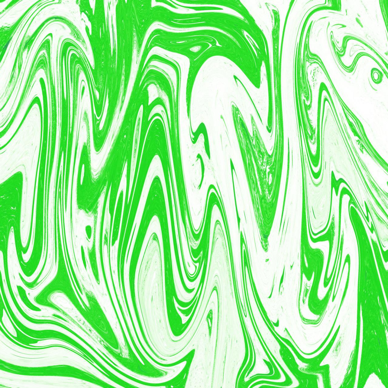
Aesthetic and Design Trends
Source: thehungryjpeg.com
Marble, once a symbol of classical opulence, has experienced a remarkable resurgence in contemporary design, transcending its traditional associations to become a versatile and highly sought-after aesthetic element. Its inherent beauty, coupled with its adaptability to various styles, makes it a compelling choice for both digital and print applications. This section will explore current trends in marble background usage, examining its impact on mood, branding, and overall design composition.Current trends showcase a move beyond simple, static marble backgrounds.
Designers are increasingly incorporating creative manipulations, such as texturing, color grading, and overlaying other elements, to create dynamic and visually arresting results. The use of marble is no longer limited to luxury brands; it’s finding its place in diverse sectors, from tech startups to eco-conscious businesses, each adapting its application to reflect their specific brand identity.
Marble Colors and Patterns and Their Associated Moods
Different marble colors and patterns evoke distinct emotional responses and align with specific brand identities. Cool-toned marbles, such as grey or white Carrara, often convey a sense of sophistication, minimalism, and cleanliness, making them ideal for brands focused on luxury, technology, or healthcare. Warmer tones, like beige or brown marble, create a more grounded and natural feel, suitable for brands associated with earthiness, sustainability, or handcrafted products.
Veined marbles, with their intricate patterns, can add a touch of drama and visual interest, while simpler, less veined marbles project a sense of calm and order. For example, a brand aiming for a sophisticated and minimalist aesthetic might opt for a white Carrara marble background, while a brand promoting natural products might choose a warm beige marble with subtle veining.
Combining Marble Backgrounds with Other Design Elements
The effectiveness of a marble background is significantly enhanced when skillfully combined with other design elements. Typography plays a crucial role; a bold, sans-serif font can create a striking contrast against a subtle marble background, while a delicate script font might complement a more ornate marble pattern. Imagery can be layered over a marble background to create depth and visual complexity.
For instance, a photograph of a product could be subtly overlaid on a marble background, allowing both elements to maintain visual prominence. Alternatively, abstract shapes or graphic elements can be used to complement the organic flow of the marble veining, creating a visually harmonious composition. The key is to ensure a balance between the marble background and the other design elements, preventing either from overpowering the other.
Mood Board: Emotional Responses to Marble Designs
Imagine a mood board divided into sections, each representing a different marble type and its associated emotional response. One section features a cool-toned, grey marble, evoking feelings of sophistication, calm, and professionalism. Next to it, a warmer, beige marble creates a sense of warmth, comfort, and naturalness. A section dedicated to a dramatically veined marble showcases feelings of luxury, drama, and intrigue.
Finally, a section with a simple, white marble projects feelings of purity, minimalism, and serenity. Each section includes swatches of the marble alongside textual descriptions of the emotions it evokes, creating a visual representation of the emotional impact of different marble designs.
Scale and Placement of Marble Backgrounds
The scale and placement of marble backgrounds significantly impact the overall design composition. A large-scale marble background can create a dramatic and impactful statement, drawing the viewer’s attention immediately. Conversely, a smaller-scale marble pattern can provide a subtle textural element without overwhelming the other design components. The placement of the marble background is also critical; centering it can create a sense of balance and symmetry, while off-centering it can add visual interest and dynamism.
For example, a full-bleed marble background might be used for a hero image on a website, while a smaller marble pattern might be used as a subtle background texture for a blog post. Careful consideration of scale and placement ensures the marble background complements the overall design rather than detracting from it.
Creating Marble Backgrounds
Generating realistic and visually appealing marble textures is a crucial skill for designers working across digital and print media. Whether you’re crafting website banners, designing brochures, or creating artwork, understanding the various methods for creating marble backgrounds can significantly enhance your design capabilities. This section explores different techniques, software options, and resources for achieving stunning marble effects.
Digital Methods for Generating Marble Textures
Several digital methods exist for creating convincing marble textures. Software like Adobe Photoshop, Affinity Photo, GIMP (GNU Image Manipulation Program), and even specialized 3D modeling software can be utilized. Techniques range from using filters and blending modes to employing procedural generation algorithms. Photoshop, for instance, offers a variety of filters, such as the “Clouds” filter combined with adjustments to levels and curves, to create a basic marble effect.
More advanced techniques involve using custom brushes and layer styles for greater control and realism. Procedural generation, often found in 3D software, allows for the creation of highly detailed and unique marble patterns based on mathematical algorithms.
Marble backgrounds are hugely popular right now, adding a touch of luxury to everything from websites to brochures. I’ve been experimenting with different marble textures lately, and to share my progress, I’ve been creating tutorials – check out my tips on video editing for a polished look in this helpful guide on getting it on with youtube.
Then, you can use those skills to showcase your own stunning marble background designs!
Creating a Simple Marble Background in Photoshop
Let’s create a simple marble background using Adobe Photoshop. This step-by-step guide will demonstrate a basic technique using the “Clouds” filter and blending modes:
1. Create a new document
Open Photoshop and create a new document with your desired dimensions. Fill the background layer with a neutral color like light gray.
2. Generate clouds
Go to Filter > Render > Clouds. This creates a black and white cloud pattern.
3. Apply a color overlay
Duplicate the cloud layer. Change the blending mode of the top layer to “Soft Light.” Add a color overlay to this layer using a subtle marble-like color scheme (e.g., light beige and dark gray). Adjust the opacity to fine-tune the effect.
4. Refine the texture
Use the “Blur” filter (Filter > Blur > Gaussian Blur) subtly to soften the edges and create a smoother transition between colors. Experiment with different blur radii.
5. Add detail (optional)
Use a soft brush with a low opacity to add subtle variations in color and shading. This step helps to break up any uniformity in the pattern.
Stock Marble Images vs. Custom Designs
Using stock marble images offers speed and convenience. High-quality images are readily available from various stock photography websites. However, this approach limits originality and might result in designs that lack uniqueness. Creating custom designs provides complete creative control and allows for unique marble textures tailored to specific design requirements. The disadvantage is that custom creation requires more time, skill, and potentially software investment.
Manipulating Existing Marble Textures
Modifying existing marble textures involves using various image editing techniques. Adjusting brightness, contrast, and saturation can significantly alter the overall appearance. Applying filters like “Liquify” can distort and warp the texture for abstract effects. Using masks and blending modes allows for selective application of adjustments, creating highlights, shadows, and other interesting visual effects. For instance, a vignette can be added to draw attention to the center of the design.
Resources for High-Quality Marble Textures, Marble background in digital and print design
Finding high-quality marble textures is crucial for both digital and print applications.
- Stock Photo Websites: Sites like Shutterstock, iStock, Adobe Stock, and Unsplash offer a vast library of marble textures. Many offer both free and paid options.
- Texture Websites: Specialized texture websites often curate high-resolution textures, including marble. These sites may offer both free and premium subscriptions.
- 3D Modeling Software: Programs like Blender and Cinema 4D can generate highly realistic marble textures using procedural generation techniques.
Accessibility and Inclusivity
Using marble backgrounds, while aesthetically pleasing, presents accessibility challenges if not carefully considered. The inherent complexity of marble patterns, with their variations in color and texture, can significantly impact the readability of overlaid text and other crucial visual elements. Ignoring accessibility risks excluding users with visual impairments, reducing the overall inclusivity of your design.
Color contrast is paramount when using marble backgrounds. Insufficient contrast between the background and foreground elements makes text and images difficult or impossible to read for individuals with low vision or color blindness. This significantly impacts usability and can render the design inaccessible.
Color Contrast and Readability
Maintaining sufficient color contrast is crucial for accessibility. WCAG (Web Content Accessibility Guidelines) provides specific guidelines for contrast ratios, recommending a minimum contrast ratio of 4.5:1 for normal text and 3:1 for large text. Tools like WebAIM’s Contrast Checker can help designers quickly assess the contrast ratio between any two colors. To ensure sufficient contrast with a marble background, consider using a text color that stands out distinctly from the lightest and darkest areas of the marble pattern.
Alternatively, carefully select a marble image with sufficient inherent contrast to facilitate readability. For example, a marble with a predominantly light background and dark veining would be easier to work with than a marble with highly varied and muted tones.
Modifying Marble Backgrounds for Accessibility
Several methods can improve the accessibility of marble backgrounds. One approach involves reducing the opacity of the marble image, allowing the underlying page color or a contrasting background layer to subtly show through. This can effectively improve the overall contrast. Another technique involves strategically placing a semi-transparent overlay with a solid color over the marble, enhancing the contrast of the text or other content.
This method allows the marble texture to be visible while ensuring readability. Finally, consider using a marble image with less complex patterns, favoring simpler, less busy designs.
Inclusive Design Practices
Inclusive design considers the needs of all users. When incorporating marble backgrounds, ensure alternative text descriptions are provided for all images, using screen readers to describe the aesthetic quality of the marble for visually impaired users. Furthermore, provide clear visual cues and sufficient spacing around elements to enhance readability. Consider using a consistent font style and size that are easily readable against the background.
Employing sufficient white space between elements is crucial to avoid visual clutter and enhance accessibility. For example, a website using a marble background might incorporate larger font sizes for headings and body text, alongside generous spacing between paragraphs and images, creating a visually clear and easy-to-navigate experience.
Challenges and Solutions with Complex Marble Patterns
Complex marble patterns present a significant challenge to accessibility. The high level of detail and variation in color can make it difficult to ensure sufficient contrast and readability for all users. One solution is to strategically crop or edit the marble image to reduce the complexity and improve the contrast. Another approach is to use the marble image as a subtle background texture, reducing its opacity and ensuring it does not interfere with the readability of the main content.
For instance, instead of using a highly detailed marble image as a full-page background, it could be used as a subtle watermark or pattern on a solid color background, creating a balanced design that is both aesthetically pleasing and accessible.
Accessibility Checklist for Marble Backgrounds
Before finalizing a design that uses a marble background, review this checklist:
- Color Contrast: Verify that the contrast ratio between the background and foreground elements meets WCAG guidelines (4.5:1 for normal text, 3:1 for large text).
- Readability Testing: Test the design with users who have varying visual abilities to identify any readability issues.
- Alternative Text: Provide descriptive alternative text for all images, especially the marble background itself.
- Font Selection: Choose clear, easily readable fonts with sufficient size and weight.
- Spacing and Layout: Ensure ample spacing between elements to avoid visual clutter.
- Opacity Adjustment: Consider reducing the opacity of the marble background to improve contrast.
- Overlay Techniques: Explore using semi-transparent overlays to enhance contrast.
- Image Selection: Opt for marble images with simpler patterns where possible.
Final Thoughts: Marble Background In Digital And Print Design
So, whether you’re aiming for a sleek, modern look or a more classic, opulent feel, remember that the key to successful marble background design lies in careful consideration of context, color, and accessibility. From the initial design phase to the final print, understanding the interplay between digital and print applications is crucial for achieving a truly stunning and impactful result.
Don’t be afraid to experiment, and let the inherent beauty of marble inspire your next creative masterpiece!
General Inquiries
What’s the best resolution for a marble background?
It depends on the application! High-resolution (300 DPI or higher) is ideal for print, while lower resolutions might suffice for web (72-150 DPI).
Can I use free marble textures without copyright issues?
Many free resources exist, but always check the license! Some require attribution, while others have restrictions on commercial use.
How do I ensure my marble background is accessible?
Prioritize sufficient color contrast between the background and foreground elements. Test your design with various assistive technologies.
What file formats are best for marble backgrounds?
PNG for web (supports transparency), JPG for web and print (smaller file size), SVG for scalable vector graphics (best for logos and illustrations).