Neon Space Gradients Tutorial A Cosmic Design Guide
Neon Space Gradients Tutorial: Dive into the electrifying world of cosmic design! This tutorial isn’t just about creating pretty pictures; it’s about mastering the art of blending vibrant neons with the ethereal beauty of space. We’ll explore color theory, practical techniques in software like Photoshop and GIMP, and even delve into advanced effects to make your gradients truly shine.
Get ready to launch your creativity into the stratosphere!
We’ll cover everything from choosing the perfect neon palette to adding realistic textures like nebulae and starfields. Think shimmering planets, glowing spacecraft, and breathtaking nebula clouds – all rendered in dazzling neon hues. Whether you’re a seasoned designer or just starting out, this guide will equip you with the skills and inspiration to create stunning, otherworldly artwork.
Introduction to Neon Space Gradients
Neon space gradients are a captivating trend in digital art, blending the vibrant energy of neon colors with the vast, mysterious allure of space. This combination creates visually striking pieces that are both futuristic and dreamy, often evoking feelings of wonder and exploration. The intense, saturated hues of neon against the deep blacks and subtle color shifts of space create a dynamic contrast that is both visually arresting and emotionally resonant.
This style is popular in everything from website design and app interfaces to album art and social media graphics.The successful creation of neon space gradients relies heavily on understanding basic color theory. Specifically, mastering complementary colors (colors opposite each other on the color wheel, like blue and orange, or pink and green) is key to achieving that vibrant, eye-catching effect.
The juxtaposition of these contrasting colors creates visual excitement and energy. Furthermore, understanding color temperature (the warmth or coolness of a color) is vital. Using a mix of warm and cool colors can add depth and dimension to the gradient, preventing it from looking flat. Finally, experimenting with different blending modes within your chosen software can significantly impact the final look, allowing for softer transitions or more intense color clashes.
Software Options for Creating Neon Space Gradients
Choosing the right software is crucial for achieving your desired results. Several applications offer robust tools and features for creating gradients, each with its own strengths and weaknesses.
| Software Name | Features | Pros | Cons |
|---|---|---|---|
| Adobe Photoshop | Advanced gradient tools, layer styles, extensive blending modes, powerful adjustment layers. | Industry standard, unparalleled control and flexibility, vast resource library. | Expensive subscription, steep learning curve. |
| Adobe Illustrator | Vector-based, scalable graphics, precise control over shapes and colors, mesh gradients. | Creates crisp, clean graphics, ideal for print and web, easily scalable without loss of quality. | Less intuitive for photo manipulation, expensive subscription. |
| GIMP | Free and open-source, gradient tools, layers, blending modes, comparable to Photoshop in many aspects. | Free to use, large community support, constantly improving. | Steeper learning curve than some commercial options, fewer readily available plugins. |
Color Palette Selection and Generation
Creating compelling neon space gradients hinges on choosing the right color palette. The vibrant, almost electric nature of neon requires careful consideration to avoid palettes that clash or appear muddy. Successful palettes will balance energy with visual harmony, creating a sense of depth and atmosphere within the gradient.Effective neon color palettes often utilize a limited number of colors, focusing on strategic contrasts and complementary shades to maximize visual impact.
This approach prevents the gradient from becoming overly saturated or chaotic. We can achieve this through several methods, each offering unique creative possibilities.
Methods for Choosing Effective Neon Color Palettes
Several approaches exist for selecting harmonious and visually striking neon color palettes. Understanding color theory is fundamental. Complementary colors (those opposite each other on the color wheel) often create a high-contrast, energetic feel, while analogous colors (adjacent on the color wheel) produce a more harmonious and subtle effect. Experimentation is key.
Examples of Successful Neon Space Gradient Color Combinations
Many successful examples showcase the power of strategic color pairings. For instance, a gradient transitioning from a deep, electric blue (#0000FF) to a vibrant pink (#FF00FF) evokes a sense of cosmic energy. The contrast is striking, yet the colors remain visually related. Another compelling combination might use a bright lime green (#00FF00) transitioning into a glowing orange (#FFA500), suggesting a fiery nebula.
The key is finding colors that complement each other while maintaining a sense of futuristic vibrancy.
Three Distinct Neon Space Gradient Palettes
Below are three distinct palettes, each offering a unique visual experience. Hexadecimal color codes are provided for each color, allowing for easy implementation in your design software.
| Palette Name | Color 1 | Color 2 | Color 3 |
|---|---|---|---|
| Cosmic Nebula | #29ABE2 | #FFC85E | #FF5733 |
| Cyberpunk Cityscape | #00FF7F | #800080 | #FF00FF |
| Alien Planet | #00FFFF | #FF69B4 | #8B008B |
Gradient Creation Techniques: Neon Space Gradients Tutorial
Creating stunning neon space gradients involves mastering several techniques. Understanding the differences between linear, radial, and freeform gradients, and knowing how to leverage the tools in your chosen software, is crucial for achieving the desired effect. This section will explore these techniques and demonstrate a step-by-step process using Adobe Photoshop.
Linear Gradients
Linear gradients offer a smooth transition between two or more colors along a straight line. This is perfect for creating simple, yet effective, backgrounds or highlights. The direction of the line dictates the gradient’s orientation. In Photoshop, you can adjust the angle, scale, and color stops to fine-tune the gradient’s appearance. For a neon space effect, you might use a linear gradient to represent a streak of light or a distant nebula.
Radial Gradients
Radial gradients transition colors from a central point outwards, creating a circular or elliptical effect. This technique is excellent for simulating light sources, planets, or starbursts. The gradient’s shape and size can be adjusted, and multiple color stops allow for complex transitions. A radial gradient could be used to create the glow of a distant star or the core of a vibrant nebula in your neon space design.
Freeform Gradients
Freeform gradients, also known as mesh gradients, offer the most control. They allow for complex color transitions across irregularly shaped areas, creating highly organic and dynamic effects. This is particularly useful for simulating intricate nebula formations or other complex cosmic phenomena. In Photoshop, you would use the mesh gradient tool to create and manipulate the gradient’s shape and color distribution.
Freeform gradients are more advanced but allow for the greatest creative freedom.
Gradient Tool Comparisons
Various design software packages offer different gradient tools with varying levels of control and features. Photoshop, Illustrator, and GIMP all provide robust gradient tools. Photoshop, for example, offers a comprehensive set of gradient presets and allows for precise control over color stops, transparency, and blending modes. Illustrator’s gradient mesh offers unparalleled control for creating complex shapes, while GIMP provides a simpler, yet effective, gradient tool suitable for beginners.
The choice of software depends on your skill level and project requirements.
Creating a Neon Space Gradient in Photoshop
Let’s create a neon space gradient in Photoshop. We’ll use a combination of radial and linear gradients to achieve a dynamic effect.
1. Create a New Document
Open Photoshop and create a new document with a suitable size (e.g., 1920 x 1080 pixels). Fill the background with a dark, almost black, blue (#0A0A2B).
2. Radial Gradient Layer
Create a new layer. Select the radial gradient tool. Choose a vibrant pink (#F72585) as the starting color and a deep purple (#430089) as the ending color. Create a large radial gradient centered roughly in the middle of the canvas. Adjust the opacity to around 70% for a subtle glow.
The visual result will be a circular pink-purple gradient radiating outwards from the center.
3. Linear Gradient Layer
Create another new layer. Select the linear gradient tool. Choose a bright teal (#13EAC9) and a bright orange (#FFC75F) as your colors. Create a long, slightly angled linear gradient that stretches across the canvas, intersecting the radial gradient. Lower the opacity of this layer to about 50%.
The linear gradient will create streaks of teal and orange, adding contrast and depth.
4. Blending Modes
Experiment with blending modes (like Overlay, Soft Light, or Screen) for both gradient layers to achieve the desired neon glow and color interactions. This will affect how the gradients blend together, creating different neon space effects. The interplay of colors will produce a vibrant, almost ethereal result.
5. Refinement and Details
Add more gradient layers with different colors and opacities to create depth and complexity. You can use smaller radial gradients to simulate distant stars or add subtle noise to create a more realistic cosmic texture.
Adding Depth and Texture
Flat neon gradients, while visually striking, often lack the realism and complexity found in actual space imagery. To elevate your designs and create truly captivating neon space scenes, incorporating depth and texture is crucial. This involves layering elements, manipulating blending modes, and strategically applying noise and texture effects.Adding depth and dimension to your neon space gradients transforms them from simple color blends into dynamic, believable environments.
We’ll explore various techniques to achieve this, focusing on the practical application of overlays, blending modes, and the integration of realistic textures.
Overlay Layers and Blending Modes
Overlaying additional layers allows for the introduction of subtle details and variations in brightness and color. Experimenting with different blending modes dramatically impacts how these overlays interact with the base gradient. For example, using a soft, blurred layer of a darker color set to “Multiply” blending mode will darken and deepen the recesses of your gradient, creating the illusion of depth.
Conversely, a brighter layer set to “Screen” will illuminate specific areas, highlighting details and creating highlights. Imagine a vibrant pink neon gradient representing a nebula. Layering a slightly darker, desaturated version of the same pink on top, set to “Multiply,” will instantly add depth, suggesting areas of greater density within the nebula. The same pink, but brighter, used with “Screen” blending mode could represent a star cluster shining through the nebula.
Noise Effects
Subtle noise effects can simulate the chaotic and unpredictable nature of space. Adding a low-opacity layer of noise, particularly a Perlin noise effect, can add a subtle texture that enhances the realism of your gradient without being overly distracting. This technique is particularly effective when applied subtly to the darker areas of your gradient, mimicking the subtle variations in density found in nebulae or dust clouds.
The amount of noise should be carefully controlled to avoid making the gradient appear overly grainy or unrealistic. Too much noise will detract from the overall aesthetic; a touch of subtle noise, however, will greatly improve the realism.
Texture Integration: Nebula and Starfield Textures
Integrating realistic textures like nebulae and starfields is a powerful technique to add realism and complexity to your neon gradients. Consider a high-resolution nebula image, adjusted to a low opacity and set to a blending mode like “Overlay” or “Soft Light.” This will subtly introduce the texture and color variations of the nebula into your neon gradient, adding depth and visual interest.
Similarly, overlaying a high-resolution starfield texture can add a sense of scale and realism, especially if the stars are subtly blurred to mimic distance and atmospheric perspective. The key here is to choose textures that complement the color palette of your neon gradient and use opacity adjustments to ensure the texture enhances, rather than overpowers, the overall effect.
Example: Creating a Neon Space Gradient with Added Texture
Let’s envision a neon space gradient featuring a primary color scheme of electric blue and vibrant pink. First, create a base gradient blending these two colors smoothly. Next, create a new layer and fill it with a low-opacity, desaturated version of the gradient, set to “Multiply” blending mode. This instantly adds depth. On another layer, add a subtle Perlin noise effect with a low opacity, focusing it more on the darker blue areas.
Then, import a high-resolution nebula texture (imagine swirling blues and purples), reduce its opacity to around 30%, and set the blending mode to “Overlay.” Finally, import a high-resolution starfield texture, slightly blur it, and set its opacity to 15%, placing it above all other layers. The result is a vibrant, realistic neon space gradient that features depth, texture, and a captivating sense of space.
The interplay of the neon gradient, the subtly darkened areas, the gentle noise, the nebula texture, and the starfield creates a visually stunning and immersive scene. The blending modes ensure a seamless integration of all elements, resulting in a cohesive and compelling final image.
Incorporating Elements
Adding elements to your neon space gradient is where the real fun begins! It’s the stage where a simple, albeit striking, background transforms into a fully realized scene, bursting with personality and depth. The right elements can elevate your design from good to unforgettable.We’ll explore various elements you can incorporate and then design a specific scene to illustrate these techniques.
Think of this as building a cosmic diorama, carefully arranging each piece to create a cohesive and visually captivating composition.
Neon Space Gradient Scene Elements
Several elements can significantly enhance a neon space gradient. Stars, in varying sizes and intensities, add sparkle and realism. Planets, with their distinct color palettes and atmospheric effects, provide focal points and visual interest. Nebulas, swirling clouds of gas and dust, introduce texture and depth, adding a sense of vastness to the scene. Finally, spacecraft, whether sleek and futuristic or retro and classic, can inject narrative and a sense of scale.
These are just a few examples; your creativity can lead you to many other interesting elements.
Example Neon Space Gradient Scene
Imagine a gradient transitioning from a deep, vibrant purple at the top to a bright, electric blue at the bottom. Three key elements enhance this base:First, a large, gaseous planet, reminiscent of Jupiter, is positioned slightly off-center, towards the bottom. Its surface is a swirling blend of oranges, yellows, and browns, with subtle hints of neon pink in its atmospheric bands.
The planet’s size dominates a significant portion of the scene, acting as the central visual anchor.Second, a cluster of smaller, sparkling stars are scattered across the upper portion of the gradient, concentrated around the top-left corner. These stars vary in size and brightness, creating a sense of distance and depth. Their color palette consists primarily of white, with a few subtle hints of pale blue and yellow, maintaining visual harmony with the gradient.Finally, a stylized, futuristic spacecraft, reminiscent of a sleek fighter jet, is positioned near the bottom-right corner, angled slightly upwards as if ascending through the gradient.
The spacecraft is rendered in bright neon pinks and purples, echoing the colors of the gradient while still maintaining a distinct visual identity. Its sharp lines contrast with the soft, swirling forms of the planet and nebula.
Resources for Space-Themed Assets, Neon space gradients tutorial
Finding high-quality assets is crucial for creating stunning neon space gradients. Here are some resources to explore:
- Stock Photo Websites: Sites like Unsplash, Pexels, and Pixabay offer a wealth of free and royalty-free space-themed images, including nebulae, planets, and stars. Remember to always check the license before using any image.
- Vector Graphics Websites: Websites like Vecteezy and Freepik provide vector graphics, which are scalable without loss of quality, ideal for creating crisp and detailed elements in your designs.
- NASA Image Archives: NASA’s website offers a vast collection of stunning high-resolution images of space. These images can provide realistic textures and details for your designs.
- Space-Themed Asset Packs: Many online marketplaces offer curated packs of space-themed assets, including textures, brushes, and vector graphics, often bundled together for convenience and cost-effectiveness.
Advanced Techniques
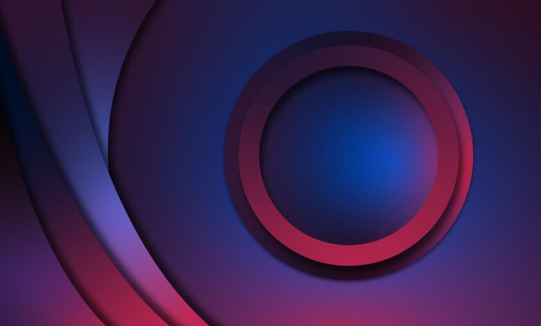
Source: pngtree.com
Taking your neon space gradients to the next level involves mastering techniques that add depth, realism, and a polished professional look. This section explores advanced methods using masking and layer styles to refine your designs, create convincing glowing effects, and build incredibly complex and visually stunning compositions.
Refining your neon gradients often requires precise control over the blend of colors and the shapes they occupy. This is where masking and layer styles become invaluable tools.
Masking and Layer Styles for Refinement
Masking allows you to selectively reveal or hide portions of a layer, providing intricate control over the gradient’s shape and interaction with other elements. For instance, you could use a layer mask to create a jagged, imperfect neon edge, simulating a broken or damaged light source. Layer styles, on the other hand, add effects like inner shadows, outer glows, bevels, and embossing, all of which can significantly enhance the three-dimensionality and realism of your neon gradients.
By combining masks and layer styles, you can achieve incredibly nuanced effects, creating gradients that appear to be embedded within the scene rather than simply overlaid. Imagine a neon sign partially obscured by a futuristic building – masking allows you to perfectly blend the neon glow with the building’s geometry.
Creating a Glowing Effect
Achieving a convincing glow requires understanding how light interacts with surfaces. The key is to use a combination of techniques. Start with a base neon gradient. Then, create a new layer above it, filled with a slightly brighter, less saturated version of your neon color. Apply a Gaussian blur to this layer, adjusting the radius until you achieve the desired glow intensity.
Experiment with layer blending modes (like “Screen” or “Add”) to further enhance the effect. For an even more advanced glow, you can create multiple glow layers with varying blur radii and opacities, layering them to build up a more complex and realistic glow. Consider adding subtle color variations within the glow to simulate light scattering. For example, a blue neon might have a slightly greener glow at its edges, adding depth and visual interest.
Complex Neon Space Gradient Design Example
Let’s envision a design featuring a nebula-like gradient, composed of swirling blues, purples, and pinks. The central focus is a spaceship, rendered with metallic textures and subtle reflections. The spaceship’s neon lights are not simply flat gradients; they incorporate multiple layers. A base layer establishes the neon color, followed by a layer mask to define the precise shape of the lights.
So you’re diving into neon space gradients tutorials? Awesome! Creating those vibrant visuals is a blast, and if you want to share your creations, you’ll need to know how to get your videos seen. That’s where checking out this guide on getting it on with youtube comes in handy. Once you’ve mastered the YouTube game, you can show off your amazing neon space gradient skills to the world!
Subsequent layers, using the glowing technique described above, add depth and intensity to the neon glow. Finally, layer styles such as an inner glow and a subtle outer glow are applied to create a three-dimensional, almost luminous effect. The nebula itself is built with multiple gradient layers, each with a slightly different color and opacity, blended using layer masks to create a sense of depth and movement.
The overall composition utilizes masking extensively to blend the spaceship seamlessly into the nebula, creating a sense of unity and depth. The background utilizes a subtle radial gradient to add a sense of distance and perspective. The entire scene is meticulously crafted with layer masks to control every aspect of the color blend and lighting. This layered approach allows for precision and flexibility, leading to a visually stunning and complex result.
Application and Examples
Neon space gradients, with their vibrant hues and ethereal quality, offer a versatile design element applicable across numerous digital platforms. Their striking visual appeal makes them ideal for grabbing attention and creating a memorable user experience. Let’s explore some practical applications and design considerations.
The beauty of neon space gradients lies in their adaptability. They can be subtle and atmospheric or bold and dramatic, depending on the color palette and application. From website backgrounds to app interfaces and digital artwork, these gradients provide a dynamic and visually engaging backdrop or stylistic element.
Examples of Neon Space Gradient Designs in Different Contexts
Imagine a website showcasing futuristic technology. A deep purple to electric blue gradient, subtly textured with faint nebulae-like patterns, could create an immersive and technologically advanced feel. Alternatively, a mobile app focused on relaxation might employ a soft, pastel gradient transitioning from a calming lavender to a serene mint green, promoting a sense of tranquility. In digital art, a vibrant gradient could form the backdrop for a cyberpunk cityscape, with neon signs and flying vehicles contrasting against the gradient’s glow.
Applications and Design Considerations for Neon Space Gradients
The following table summarizes various applications and the associated design considerations. Remember, careful consideration of color contrast and legibility is crucial to ensure a user-friendly experience.
| Application | Design Considerations | Color Palette Example | Visual Description |
|---|---|---|---|
| Website Background | Ensure sufficient contrast for text and other UI elements. Consider the overall website theme and branding. | Deep Teal to Electric Pink | A smooth transition from a dark, mysterious teal to a vibrant, energetic pink creates a sophisticated yet playful atmosphere. |
| Mobile App Interface | Prioritize readability and accessibility. Use gradients subtly, avoiding overly distracting effects. | Soft Lavender to Pale Mint Green | A gentle gradient evoking calmness and serenity, ideal for a wellness or meditation app. |
| Digital Art | Experiment with texture and blending modes. Consider the overall composition and subject matter. | Bright Orange to Deep Purple with subtle noise texture | A bold gradient provides a striking backdrop for futuristic or fantasy art, the noise texture adding depth and a slightly grainy feel. |
| Video Game Backgrounds | Optimize for performance. Consider parallax effects for depth and movement. | Cyberpunk themed: Electric Blue to Vivid Magenta | A high-contrast gradient perfectly complements a cyberpunk aesthetic, providing a visually exciting backdrop for gameplay. |
Adapting Neon Space Gradients to Different Screen Resolutions and Aspect Ratios
To ensure your neon space gradients look stunning across various devices, responsive design principles are essential. Avoid fixed pixel dimensions; instead, use percentage-based widths and heights to allow the gradient to scale proportionally. For different aspect ratios, consider using flexible gradient generation techniques that adapt to the screen’s dimensions. This might involve generating the gradient dynamically based on the viewport’s width and height, ensuring consistent visual appeal regardless of the device or screen size.
Using vector-based graphics (like SVG) is also highly recommended for scalable and sharp results.
Last Word
Source: dribbble.com
Creating neon space gradients is more than just a technical exercise; it’s a journey into a vibrant, imaginative landscape. By mastering the techniques Artikeld in this tutorial, you’ll not only craft breathtaking visuals but also unlock a new level of creative expression. So go forth, experiment, and let your cosmic designs illuminate the digital world! Remember to share your creations – I’d love to see what you come up with!
Commonly Asked Questions
What file formats are best for saving neon space gradient artwork?
PNG is ideal for preserving transparency and vibrant colors. For web use, JPG is also a good option, but PNG generally offers better quality.
Can I use these techniques with other software besides Photoshop and GIMP?
Absolutely! The core principles of color theory and gradient creation apply across various design programs. The specific tools might differ, but the underlying concepts remain the same.
Where can I find free space textures for my designs?
Websites like Unsplash, Pexels, and Pixabay offer a wealth of free high-resolution space textures. Always check the license before using them in your projects.
How do I avoid making my neon gradients look too harsh or over-saturated?
Use blending modes (like Overlay or Soft Light) to subtly blend your neon colors. Consider adding subtle shadows and highlights to create depth and prevent a flat look. Experiment with different opacity levels to find the right balance.