Web Design Resources for Web Professionals
Web design resources for web professionals are crucial for staying ahead in this ever-evolving field. This post dives deep into the tools, frameworks, and principles that every pro needs to master, from choosing the right software to understanding UX design and implementing cutting-edge techniques. We’ll explore the best resources to keep your skills sharp and your projects stunning.
Whether you’re a seasoned veteran or just starting, this comprehensive guide covers everything from essential software like Figma and Adobe XD to mastering responsive design and leveraging the power of CSS frameworks like Bootstrap and Tailwind CSS. We’ll also look at how to stay updated with the latest trends and technologies, ensuring you remain a top-tier web design professional.
Top Web Design Tools & Software
Choosing the right tools is crucial for efficient and effective web design. The landscape is vast, offering a range of software catering to different skill levels and project needs. This overview explores some of the most popular options, highlighting their strengths and weaknesses to help you make informed decisions.
Top Ten Web Design Software Applications
Selecting the perfect web design software depends heavily on your specific needs and skillset. Below is a table outlining ten popular choices, considering factors like ease of use, feature richness, and pricing.
| Name | Description | Key Features | Pricing Model |
|---|---|---|---|
| Adobe Photoshop | Industry-standard raster graphics editor. | Image manipulation, retouching, design, and compositing. | Subscription |
| Adobe Illustrator | Vector graphics editor for creating scalable illustrations and logos. | Vector drawing, typography, illustration, and logo design. | Subscription |
| Figma | Collaborative web-based design tool. | UI/UX design, prototyping, vector graphics, and real-time collaboration. | Freemium (with team and organization plans) |
| Sketch | Mac-based vector graphics editor for UI/UX design. | UI/UX design, prototyping, vector editing, and plugin ecosystem. | One-time purchase or subscription |
| Adobe XD | UI/UX design and prototyping software. | Wireframing, prototyping, user testing, and collaboration features. | Subscription |
| Webflow | No-code website builder with powerful design capabilities. | Visual website building, CMS, hosting, and e-commerce features. | Subscription |
| WordPress | Open-source content management system (CMS). | Website building, blogging, e-commerce, and extensive plugin ecosystem. | Freemium (with premium themes and plugins) |
| Squarespace | User-friendly website builder with a focus on design aesthetics. | Website building, blogging, e-commerce, and responsive templates. | Subscription |
| Wix | Drag-and-drop website builder with a large template library. | Website building, blogging, e-commerce, and app market. | Subscription |
| Affinity Designer | Vector graphics editor offering a powerful alternative to Illustrator. | Vector drawing, raster editing, typography, and design tools. | One-time purchase |
Advantages and Disadvantages of Web Design Software
Each software application offers unique strengths and weaknesses. For example, Adobe Photoshop excels in raster image editing but lacks the vector capabilities of Illustrator. Figma’s collaborative features are a significant advantage, but its reliance on a stable internet connection can be a drawback. Similarly, while WordPress offers unparalleled flexibility through its plugin ecosystem, it can have a steeper learning curve than some website builders.
A thorough understanding of these pros and cons is vital for making the right choice.
Comparison of Wix, Squarespace, and Webflow
These three website builders represent popular choices for different user needs.
| Feature | Wix | Squarespace | Webflow |
|---|---|---|---|
| Ease of Use | Very easy, drag-and-drop interface | Easy, intuitive interface | Moderate, requires some design knowledge |
| Design Flexibility | High, extensive customization options | Moderate, pre-designed templates with limited customization | High, code-free visual design and complex interactions |
| Pricing | Various plans, some with limitations | Various plans, generally higher priced | Various plans, offers more features in higher tiers |
| Capabilities | Good, with built-in tools | Good, with built-in tools | Excellent, offers advanced controls |
| E-commerce Features | Good, with integrated e-commerce solutions | Good, with integrated e-commerce solutions | Excellent, powerful e-commerce features |
Essential Web Design Resources
Source: markup.io
Building robust and visually appealing websites requires more than just creativity; it demands leveraging powerful tools and resources. This section delves into the indispensable world of front-end frameworks and JavaScript libraries, crucial components for efficient and effective web development. Mastering these tools significantly streamlines the design process, leading to cleaner code, improved performance, and a more enjoyable development experience.
Essential Front-End Frameworks
Choosing the right framework can drastically impact your project’s success. The following five frameworks represent some of the most popular and versatile options available, each with its strengths and specific use cases.
- React: A JavaScript library for building user interfaces (UIs), React is known for its component-based architecture, virtual DOM for efficient updates, and large, active community support. It’s ideal for complex single-page applications (SPAs) and dynamic interfaces, as seen in many modern web applications.
- Angular: A comprehensive framework for building complex web applications, Angular provides a structured approach with features like two-way data binding, dependency injection, and a robust routing system. It’s a good choice for large-scale projects requiring a highly organized and maintainable codebase, like enterprise-level applications.
- Vue.js: A progressive framework, Vue.js offers a gentle learning curve while providing powerful features. Its flexibility allows for incremental adoption, making it suitable for both small and large projects. Its ease of use and versatility have contributed to its growing popularity, especially among developers who value simplicity and efficiency.
- Svelte: Unlike other frameworks that run in the browser, Svelte compiles your code into small, highly optimized vanilla JavaScript at build time. This results in smaller bundle sizes and faster performance. It’s a great option when performance is paramount, particularly for mobile applications or projects with limited bandwidth.
- Ember.js: A framework focused on ambitious web applications, Ember.js provides a convention-over-configuration approach, leading to a consistent and predictable development experience. Its strong emphasis on structure and maintainability makes it a good choice for large, long-term projects requiring a well-defined architecture, similar to Angular but potentially with a steeper initial learning curve.
CSS Frameworks: Bootstrap and Tailwind CSS
CSS frameworks significantly accelerate the front-end development process by providing pre-built components and styling utilities. Bootstrap and Tailwind CSS are two prominent examples, each with a distinct approach.Bootstrap offers a comprehensive collection of pre-designed components like buttons, navigation bars, and grids, providing a ready-made visual style. Its ease of use makes it ideal for rapid prototyping and projects requiring a consistent, pre-defined look and feel.
However, customization can sometimes be challenging due to its opinionated nature.Tailwind CSS, conversely, provides a highly customizable utility-first approach. Instead of pre-built components, it offers a vast library of individual CSS utility classes that can be combined to create any design. This offers unmatched flexibility but requires a deeper understanding of CSS and may involve writing more code initially.
The trade-off is ultimate control and a highly tailored design.
JavaScript Libraries for Interactive Elements, Web design resources for web professionals
JavaScript libraries enhance website interactivity, adding dynamic features and enriching user experience.
| Library | Application in Web Design | Example |
|---|---|---|
| jQuery | DOM manipulation, AJAX requests, animations | Creating smooth transitions and animations, handling user interactions, making AJAX calls for dynamic content updates without full page reloads. |
| React (as a library) | Building reusable UI components, managing state, handling events | Creating interactive forms, dynamic data visualizations, and complex user interfaces within a larger application. |
| Three.js | 3D graphics rendering | Creating interactive 3D models, animations, and visualizations for websites. Think interactive product showcases or immersive virtual tours. |
| D3.js | Data visualization | Generating charts, graphs, and other data representations, allowing for interactive exploration of datasets. |
| GSAP (GreenSock Animation Platform) | Advanced animations and transitions | Creating complex and highly performant animations, including scroll-triggered effects and intricate interactions. |
Mastering Web Design Principles: Web Design Resources For Web Professionals
Source: website-files.com
Building a successful website requires more than just technical proficiency; it demands a deep understanding of fundamental design principles. These principles guide the creation of websites that are not only visually appealing but also highly effective in achieving their intended purpose. Ignoring these principles can lead to a website that is difficult to navigate, unattractive, and ultimately, unsuccessful.
This section will explore some key aspects of mastering these crucial principles.
Responsive Web Design
Responsive web design ensures a website adapts seamlessly to various screen sizes and devices. This is crucial in today’s multi-device world, where users access websites from desktops, laptops, tablets, and smartphones. A non-responsive website will likely appear cramped or distorted on smaller screens, leading to a frustrating user experience and potentially impacting search engine rankings. Creating responsive websites involves using flexible layouts, CSS media queries, and fluid grids.
For example, a website might use a three-column layout on a desktop but switch to a single-column layout on a mobile phone, ensuring all content remains accessible and easy to read. Another example would be the use of flexible images that resize proportionally to fit the available screen space, preventing distortion or unnecessary whitespace. Effective use of media queries allows the application of different styles based on screen size, orientation, and resolution, ensuring optimal viewing on any device.
User Experience (UX) Design
User experience (UX) design focuses on creating websites that are intuitive, enjoyable, and efficient to use. It encompasses all aspects of a user’s interaction with a website, from the initial impression to the completion of their task. Good UX design leads to increased user engagement, higher conversion rates, and improved brand loyalty. Conversely, poor UX design can result in frustrated users, high bounce rates, and lost business.
For example, a website with a cluttered layout, confusing navigation, or slow loading times will likely have a negative impact on user experience. In contrast, a website with clear calls to action, intuitive navigation, and fast loading speeds will create a positive user experience. Consider the difference between a website with a complex checkout process and one with a streamlined, simple process – the latter provides a superior UX.
Visual Hierarchy
Visual hierarchy is the arrangement of elements on a webpage to guide the user’s eye and emphasize important information. It involves using visual cues such as size, color, contrast, and whitespace to create a clear visual path for the user. A well-designed visual hierarchy ensures users can quickly scan the page and find the information they need. For example, using larger headings and bold text for key information, strategically placing images and calls to action, and using ample whitespace to separate elements all contribute to a strong visual hierarchy.
Conversely, a website with inconsistent font sizes, cluttered layouts, and a lack of visual emphasis can confuse users and make it difficult to find important information. Effective visual hierarchy prioritizes information, making the website more efficient and engaging. Think of a newspaper layout: large headlines draw the eye, followed by smaller subheadings and body text. This creates a natural flow for the reader.
Advanced Web Design Techniques
Source: googleapis.com
Taking your web design skills to the next level involves mastering advanced techniques that elevate user experience and create truly memorable online interactions. This goes beyond basic layout and design; it’s about crafting a seamless and engaging experience through subtle details and strategic optimization. We’ll explore some key areas that can significantly impact your website’s success.
Micro-interactions for Enhanced User Engagement
Micro-interactions are those small, delightful animations and feedback mechanisms that subtly enhance user engagement. They’re the little things that make a website feel responsive and alive. A well-placed micro-interaction can significantly improve user satisfaction and create a more memorable experience. For example, a subtle animation when a button is clicked, or a progress bar showing the loading status of an image, can greatly improve perceived performance and user satisfaction.Here’s an example of a simple micro-interaction using CSS and JavaScript to create a button hover effect:
/* CSS
-/
.button
  background-color: #4CAF50;
  border: none;
  color: white;
  padding: 15px 32px;
  text-align: center;
  text-decoration: none;
  display: inline-block;
  font-size: 16px;
  transition: transform 0.3s; /* Add transition for smooth effect
-/


.button:hover
  transform: scale(1.05); /* Scale up slightly on hover
-/
  box-shadow: 0 0 10px rgba(0,0,0,0.2); /* Add a subtle shadow
-/


/* JavaScript (optional, for more complex interactions)
-/
// Add JavaScript code here for more advanced micro-interactions
This code provides a simple scaling effect and a subtle shadow when hovering over a button. More complex micro-interactions can be achieved using JavaScript libraries like GreenSock (GSAP) for advanced animations and transitions.
Creating Custom Illustrations Using Vector Graphics
Custom illustrations can significantly enhance a website’s visual appeal and brand identity. Vector graphics, unlike raster images (like JPEGs), are resolution-independent, meaning they can be scaled to any size without losing quality. This makes them ideal for web design, where images are often used at various sizes.
Finding the right web design resources for web professionals can be a challenge, especially with so much information out there. But building a strong online presence isn’t just about websites; it’s about leveraging all platforms, which is why I recently dove into getting it on with youtube to learn effective video marketing. Ultimately, combining top-notch web design with a killer YouTube strategy is key to success for any web professional.
The process typically involves these steps:
- Concept and Sketching: Begin by sketching your illustration idea on paper or using a digital sketching tool. This helps refine the concept before moving to the digital design phase.
- Vector Software Selection: Choose a vector graphics editor. Popular options include Adobe Illustrator, Affinity Designer, and Inkscape (a free and open-source alternative).
- Digital Creation: Using your chosen software, create the illustration using vector tools. This involves using shapes, paths, and other vector-based elements to build your design. Experiment with color palettes and styles to match your website’s overall aesthetic.
- Exporting for Web: Once the illustration is complete, export it in a suitable web format, such as SVG (Scalable Vector Graphics) for optimal scalability and flexibility, or PNG for better compatibility with older browsers.
For example, a website promoting eco-friendly products might use custom vector illustrations of plants and nature scenes, ensuring a consistent and high-quality visual experience regardless of screen size.
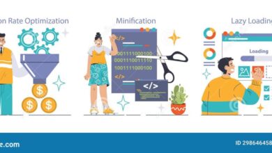
Optimizing Website Performance and Loading Speed
Website performance is critical for user experience and . Slow loading times lead to high bounce rates and poor search engine rankings. Optimizing images is a key aspect of improving performance.
Several techniques can significantly reduce image file sizes:
- Compression: Use image optimization tools to compress images without significant loss of quality. Tools like TinyPNG, ImageOptim, and ShortPixel offer various compression options.
- Format Selection: Choose the right image format. WebP offers superior compression compared to JPEG and PNG, but browser support might vary. Consider using next-generation image formats like AVIF for even better compression.
- Resizing: Resize images to the exact dimensions needed on your website. Avoid uploading oversized images that require the browser to scale them down.
- Lazy Loading: Implement lazy loading to defer the loading of images until they are visible in the viewport. This significantly improves initial page load time.
For instance, a large e-commerce site could drastically improve its loading speed by using WebP format images, lazy loading, and compressing images before uploading. This results in faster page load times, improved user experience, and better search engine rankings.
Staying Updated in Web Design
The web design landscape is in constant flux. What’s cutting-edge today can be outdated tomorrow. To remain competitive and deliver exceptional user experiences, continuous learning and adaptation are paramount for any web design professional. Staying abreast of emerging trends, mastering new tools, and refining existing skills are crucial for long-term success.
The pace of innovation in web design is relentless, demanding a proactive approach to professional development. Ignoring this dynamic environment risks becoming stagnant and irrelevant in a field that thrives on creativity and technological advancement. This section will explore key trends and valuable resources to help you navigate this exciting and ever-evolving field.
Key Trends Shaping the Future of Web Design
Three significant trends are currently reshaping the web design landscape: the increasing importance of accessibility, the rise of artificial intelligence (AI) in design processes, and the continued evolution of immersive experiences.
Accessibility is no longer a “nice-to-have” but a fundamental requirement. Web designers must prioritize inclusivity by creating websites that are usable by people with disabilities. This involves adhering to WCAG (Web Content Accessibility Guidelines) standards, using semantic HTML, providing alternative text for images, and ensuring sufficient color contrast. For example, consider a website using ARIA attributes to improve navigation for screen reader users, or one that employs keyboard navigation effectively, allowing users to interact without a mouse.
AI is rapidly transforming the design process. AI-powered tools can automate tasks such as image generation, content creation, and even design layout suggestions. While not replacing human designers, AI acts as a powerful assistant, streamlining workflows and enabling faster iteration. For example, tools like Midjourney or Dall-E 2 can generate unique visuals based on text prompts, significantly speeding up the design process and offering new creative avenues.
Furthermore, AI-driven personalization engines allow for dynamic website content tailored to individual user preferences.
Immersive experiences, such as virtual reality (VR) and augmented reality (AR), are becoming increasingly integrated into web design. These technologies offer users engaging and interactive experiences that go beyond traditional two-dimensional interfaces. For example, imagine a real estate website that allows potential buyers to take a virtual tour of a property using VR, or an e-commerce platform that lets users try on clothes virtually using AR.
These technologies significantly enhance user engagement and provide unique opportunities for brand interaction.
Reputable Online Resources for Web Design Professionals
Staying current requires consistent engagement with reputable online resources. The following represent a selection of valuable sources:
- A List Apart: A highly respected web design magazine featuring insightful articles on various aspects of web design and development.
- Smashing Magazine: Another leading resource providing in-depth articles, tutorials, and insights from industry experts.
- CSS-Tricks: A website focused on CSS, offering practical tips, tutorials, and articles on the latest CSS techniques and trends.
- Webdesigner Depot: A resource covering a wide range of web design topics, including tutorials, inspiration, and industry news.
- The Web Dev Podcast: A podcast that discusses the latest trends, techniques, and challenges in web development.
The Importance of Continuous Learning and Professional Development
Continuous learning is not merely beneficial; it’s essential for long-term success in web design. The field is constantly evolving, with new technologies, frameworks, and design principles emerging regularly. By consistently updating your skills and knowledge, you can remain competitive, adapt to changing industry demands, and deliver high-quality work. This commitment to ongoing professional development ensures that you remain at the forefront of innovation, capable of leveraging the latest tools and techniques to create exceptional user experiences.
Investing time in courses, workshops, conferences, and self-directed learning is an investment in your career and your future success.
Epilogue
Mastering web design is a journey, not a destination. By leveraging the resources and techniques discussed here, you’ll not only elevate your skills but also create truly exceptional web experiences. Remember to continuously learn, adapt to new trends, and always prioritize user experience. The web design landscape is dynamic; stay curious, keep experimenting, and watch your creativity flourish!
Q&A
What’s the difference between Figma and Adobe XD?
Figma is browser-based and collaborative, ideal for teamwork. Adobe XD is powerful but requires a subscription and is less collaborative in its free version. The best choice depends on your workflow and budget.
How important is learning JavaScript for web design?
While not strictly required for all designs, JavaScript is essential for creating interactive elements and dynamic website features. A basic understanding significantly expands your capabilities.
Where can I find free high-quality stock photos?
Unsplash, Pexels, and Pixabay offer vast libraries of free, high-resolution images perfect for web design projects.
What are some good resources for learning UX design?
Interaction Design Foundation (IxDF), Nielsen Norman Group, and various UX courses on platforms like Coursera and Udemy are excellent resources.

