What is Brutalism Style in Web and Graphic Design?
What is brutalism style in web and graphic design? It’s a question that’s increasingly popping up as this raw, unapologetically functional aesthetic makes a comeback. Forget sleek minimalism; brutalism embraces the bold, the unconventional, and the undeniably powerful. Think stark concrete structures translated into digital form – a design philosophy that prioritizes functionality over ornamentation. We’ll delve into the core principles, explore its unique visual characteristics, and uncover why this seemingly austere style is captivating designers and audiences alike.
From its origins in architecture, brutalism’s raw, unrefined aesthetic has found a surprising home in the digital world. This style isn’t about pretty pictures; it’s about stark functionality, unconventional layouts, and a powerful, often unsettling, visual impact. We’ll examine how typography, color palettes, and overall layout contribute to this distinctive look, showcasing examples of websites and graphic designs that perfectly capture the essence of brutalism.
Get ready to rethink your design sensibilities!
Defining Brutalism in Web and Graphic Design
Brutalism, a style initially born in architecture, has found a surprising and compelling resurgence in the digital world. It’s a style that embraces raw functionality and rejects superficial ornamentation, prioritizing honesty of material and structure. This translates beautifully to web and graphic design, offering a refreshing alternative to overly polished and minimalist aesthetics.
Core Principles of Brutalism and their Digital Translation
Brutalism in architecture is characterized by its massive, imposing forms, exposed concrete, and a rejection of decorative elements. The emphasis is on functionality and the inherent beauty of the materials used. In digital design, this translates to a focus on utilitarian layouts, a raw aesthetic, and a prioritization of content over visual embellishments. The emphasis shifts from sleek minimalism to a bold, unapologetic presentation of information.
Think less about polished perfection and more about honest, functional design. Instead of delicate lines and gradients, we see stark contrasts and strong geometric shapes.
Visual Characteristics of Brutalism in Web Design
Brutalism in web design is instantly recognizable. Typography often features bold, sans-serif fonts, sometimes in unconventional pairings or sizes. Color palettes are typically limited, often relying on muted tones, grays, and concrete-like textures. Layouts are frequently asymmetrical and grid-based, but can be deliberately rough and unrefined. Whitespace is used strategically, sometimes sparingly, to highlight key elements and avoid visual clutter, but often embraces a more dense layout.
The overall effect is a raw, powerful, and unpretentious aesthetic that stands in stark contrast to many contemporary design trends.
Examples of Brutalist Web Design and Graphic Design
The following table showcases examples of websites and graphic design that effectively utilize Brutalist principles:
| Website Name | Designer (if known) | Brutalism Elements |
|---|---|---|
| Brutalism.co | Unknown | Uses a stark, monochromatic color palette, a grid-based layout, and a heavy, sans-serif typeface to create a powerful and functional design. The website itself serves as a showcase of Brutalist design principles. |
| The New York Times’ experimental projects (various) | The New York Times Design Team | Certain experimental projects from The New York Times have incorporated Brutalist elements, such as bold typography, asymmetrical layouts, and a focus on functionality, to create impactful presentations of news and information. |
| (Example fictional website) “Concrete Jungle” Portfolio Site | (Fictional Designer) Anya Petrova | Features a limited color palette of grays and muted blues, a rough, asymmetrical layout, and a bold, sans-serif font. The design prioritizes the showcasing of the designer’s work, presented in a raw and unpolished manner. |
| (Example fictional graphic design piece) “Urban Decay” Poster | (Fictional Designer) Mark Olsen | Utilizes a bold, sans-serif typeface, a limited color palette of blacks, grays, and a single accent color, and a stark, geometric composition. The poster’s design evokes the raw texture of concrete and urban environments. |
Typography in Brutalist Web Design
Brutalism, with its raw, functional aesthetic, finds a surprising partner in typography. The right fonts can amplify the movement’s core principles: honesty, functionality, and a rejection of ornamentation. Typography in brutalist web design isn’t about pretty aesthetics; it’s about clear communication and a deliberate, almost confrontational, visual impact.The chosen typefaces directly reflect the movement’s utilitarian nature. Forget delicate scripts or playful embellishments; brutalist typography is all about stark clarity and readability.
This focus on function over form allows the content to take center stage, unburdened by superfluous visual elements.
Font Choices in Brutalism
The selection of fonts plays a crucial role in establishing the brutalist aesthetic. Monospace and sans-serif fonts are the cornerstones of this style, offering a clean, unadorned look. Monospace fonts, with their uniform character widths, evoke a sense of order and technical precision, reminiscent of early computer interfaces and typewriters. Sans-serif fonts, lacking the decorative flourishes of their serif counterparts, contribute to the minimalist, no-frills feel.
Specific examples include Courier New (monospace), Roboto (sans-serif), and Source Code Pro (monospace), each contributing a distinct, yet consistent, brutalist vibe. These fonts, with their straightforward nature, prioritize readability and convey a sense of unpretentious functionality. The absence of decorative elements reinforces the core principles of brutalism.
Sample Typography Scheme for a Brutalist Website
Let’s imagine a website for a minimalist architecture firm. The design would benefit from a typographic scheme that reflects both the firm’s aesthetic and the brutalist principles.
This typography scheme prioritizes readability and impact. The bold headings create a strong visual hierarchy, while the monospace body copy provides a clean, uncluttered reading experience. The limited color palette reinforces the minimalist ethos of the design. The contrast between the header and body text ensures readability at various screen sizes.
| Element | Font Family | Size | Weight | Color |
|---|---|---|---|---|
| Headings (H1-H3) | Roboto Condensed | H1: 3rem, H2: 2.5rem, H3: 2rem | 700 (Bold) | #222 |
| Body Copy (Paragraphs) | Source Code Pro | 1rem | 400 (Regular) | #333 |
| Links | Source Code Pro | 1rem | 400 (Regular) | #007bff |
Color Palettes and Imagery in Brutalism
Brutalism in web design, while seemingly austere, relies heavily on the strategic use of color and imagery (or the deliberate lack thereof) to create its distinctive impact. The color palettes employed aren’t arbitrary; they contribute significantly to the overall mood and functionality of the site. Similarly, the choice – or absence – of imagery is a key element in defining the Brutalist aesthetic.The raw, functional nature of Brutalism dictates its visual choices.
This design philosophy prioritizes content and functionality over decorative elements, resulting in a very specific approach to both color and imagery.
Common Brutalism Color Palettes
Brutalism often favors a limited, often monochromatic color palette. This isn’t about a lack of creativity; rather, it’s a conscious decision to emphasize clarity and readability. Think of the functionality of a well-designed machine – the colors are there to support the function, not to distract from it. Common palettes include variations of grayscale, incorporating shades of gray, black, and white, sometimes accented with a single, bold color like a deep teal, ochre, or burnt orange.
These accents, when used, are applied sparingly and purposefully, highlighting important calls to action or key information. The overall effect is one of stark simplicity and utilitarian functionality.
Typical Imagery (or Lack Thereof) in Brutalism
Brutalism’s visual language often features a minimalist approach to imagery. Many Brutalist websites eschew imagery altogether, focusing solely on typography and layout to convey information. When imagery is used, it tends to be highly functional, serving a direct purpose rather than a decorative one. Think of a simple, high-contrast photograph of a product or a clearly labeled diagram illustrating a process.
The imagery is never superfluous; it directly supports the website’s content and purpose. This deliberate restraint underscores the movement’s emphasis on functionality and content over stylistic flourishes.
Visual Impact of a Monochromatic Color Palette
Imagine a Brutalist website built around a deep charcoal gray. The background is this dark gray, providing a solid, unassuming canvas. The text, perhaps in a lighter gray or crisp white, stands out sharply, ensuring readability. Links might be subtly highlighted with a slightly darker shade of gray or a pop of a contrasting color, like a muted orange.
This monochromatic palette creates a sense of seriousness and professionalism, lending an air of authority and credibility to the website’s content. The lack of vibrant colors avoids distractions, keeping the user’s focus firmly on the information presented. The overall effect is clean, uncluttered, and powerfully effective in conveying information clearly and concisely. The stark simplicity creates a strong visual impact, leaving a lasting impression on the viewer.
The monochromatic approach isn’t about dullness; instead, it’s a calculated use of contrast and simplicity to achieve maximum impact.
Layout and Functionality in Brutalism
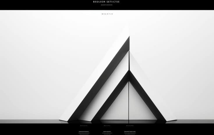
Source: visitorplugin.com
Brutalism in web design isn’t about pretty aesthetics; it’s about a deliberate rejection of them. This stark approach directly influences the layout and functionality of a Brutalist website, prioritizing function over form in a way that can be both striking and effective, albeit potentially challenging for users accustomed to more visually appealing interfaces. The underlying principle is to present information directly and without embellishment, stripping away unnecessary elements to expose the core functionality.The layout of a Brutalist website is typically characterized by a grid-based structure, often with a stark, unadorned aesthetic.
Navigation is straightforward, usually employing a simple menu system with clear, concise labels. There’s a focus on functionality, prioritizing ease of access to information rather than creating a visually engaging experience. This often results in a minimalist layout with ample white space, or at least a consistent, uncluttered arrangement of elements. The use of grids provides a structured and easily digestible framework, even though the visual style might be considered harsh or unconventional.
Brutalism’s Impact on Website Navigation
Brutalism emphasizes directness and efficiency in navigation. Users are presented with clear pathways to access information, with minimal distractions. This can lead to a faster, more efficient user experience for those seeking specific information. However, the lack of visual cues or engaging elements can also make navigation feel less intuitive for users accustomed to more visually rich and guided experiences.
For instance, a Brutalist website might use a simple, unstyled horizontal menu at the top of the page, contrasting sharply with a website employing a visually complex and interactive navigation system with animations and hover effects. The difference is a trade-off between efficiency and engagement.
User Experience Comparison: Brutalism vs. Other Styles
The user experience of a Brutalist website differs significantly from that of websites employing other design styles, such as minimalism, maximalism, or skeuomorphism. A minimalist website, while also emphasizing simplicity, often incorporates subtle visual elements and a more refined aesthetic. Maximalist designs, on the other hand, are characterized by a visual abundance, often overwhelming the user with information and elements.
Skeuomorphic designs mimic real-world objects, providing a more familiar and intuitive user experience, but can be visually cluttered. A Brutalist website, in contrast, presents a raw, functional approach, focusing on the efficient delivery of information with little concern for visual appeal beyond a structured layout. This can lead to a more efficient, albeit potentially less engaging, experience for the user.
Consider the difference between a meticulously crafted, minimalist e-commerce site with high-quality product photography and a Brutalist e-commerce site featuring simple product listings and minimal descriptions; the latter prioritizes speed and information delivery over visual appeal.
Minimalist Functionality in Brutalist Aesthetics, What is brutalism style in web and graphic design
The minimalist approach to functionality is crucial to the Brutalist aesthetic. By stripping away unnecessary features and interactions, the core functionality of the website becomes the primary focus. This emphasis on essential functions contributes to the overall feeling of rawness and functionality that defines the Brutalist style. For example, a Brutalist blog might only include essential features like posting, commenting, and searching, omitting features such as social media integration or sophisticated tagging systems that might be found on other blogs.
This stripped-down approach enhances the sense of directness and honesty that characterizes the Brutalist design philosophy. The website’s purpose is clear, and the means of achieving that purpose are equally clear and unadorned.
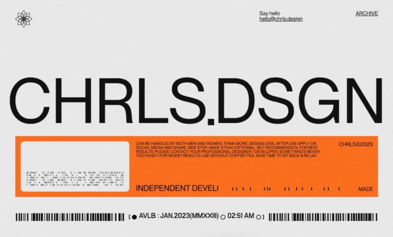
Brutalism’s Evolution and Modern Interpretations
Source: pinimg.com
Brutalism, in its early web design iterations, was a raw, uncompromising aesthetic. Think stark functionality, minimal ornamentation, and a reliance on grids and basic typography. It was a reaction against the overly ornate and often cluttered designs prevalent at the time, a deliberate stripping back to essentials. However, the style has undergone a significant evolution, adapting to contemporary design trends and user expectations while retaining its core principles.Early Brutalist websites often felt austere, even unfriendly.
Navigation could be challenging, and the focus was heavily on content delivery over visual appeal. This was a conscious choice, reflecting the philosophy of the movement. Modern interpretations, however, strive for a balance between functionality and user experience. The raw, unpolished feel remains, but it’s often tempered with a greater emphasis on usability and visual hierarchy.
While the core principles persist—the rejection of unnecessary embellishment and a focus on functionality—modern designers are finding creative ways to integrate these elements with contemporary design trends.
Modern Reinterpretations of Brutalism
Contemporary Brutalist design retains the core principles of its predecessor: raw functionality, stark minimalism, and a rejection of superfluous elements. However, modern interpretations often incorporate subtle refinements. For example, while early Brutalist sites often used harsh color palettes and limited imagery, modern versions may employ muted colors or carefully selected photography to soften the overall effect. The emphasis remains on functionality, but the user experience is significantly improved through better navigation and a more intuitive layout.
Modern designers have also begun to experiment with incorporating micro-interactions and subtle animations to enhance engagement without compromising the fundamental ethos of the style. This allows for a more refined and user-friendly experience without sacrificing the core principles of Brutalism.
Examples of Blended Brutalist Styles
The beauty of Brutalist design lies in its adaptability. It serves as a strong foundation upon which other design styles can be layered, creating unique and compelling aesthetics. Many websites effectively blend Brutalist elements with other approaches, resulting in innovative and engaging user experiences.
- Brutalism + Minimalism: This combination emphasizes clean lines, negative space, and a focus on essential content. Imagine a website with a stark, grid-based layout, featuring a limited color palette and a strong emphasis on typography. The overall effect is sophisticated and uncluttered, with a focus on conveying information clearly and efficiently.
- Brutalism + Material Design: This blend incorporates the clean lines and functionality of Brutalism with the depth and dimension of Material Design. Think of a website that utilizes a grid-based layout and a restrained color palette, but incorporates subtle shadows and elevation effects to create a more three-dimensional and engaging visual experience. This approach adds a layer of visual richness without compromising the core principles of Brutalist design.
- Brutalism + Geometric Design: This combination utilizes bold geometric shapes and patterns within the framework of a Brutalist layout. Imagine a website that uses strong geometric forms to organize content and create visual interest, while still maintaining the core principles of functionality and minimalism. The result is a striking and visually arresting website that is both functional and aesthetically pleasing.
The Impact and Appeal of Brutalism
Brutalism in web and graphic design, while undeniably divisive, holds a unique appeal for designers and brands seeking to break away from conventional aesthetics. Its raw, unapologetic approach can be incredibly effective, but it’s crucial to understand both its potential benefits and drawbacks before embracing this bold style. The success of a Brutalist design hinges on its careful application and a clear understanding of its target audience.The stark functionality and minimalist approach of Brutalism offer several advantages.
It prioritizes content clarity, forcing designers to focus on essential elements and stripping away unnecessary ornamentation. This can lead to a more efficient and user-friendly experience, particularly for websites focused on delivering information quickly and effectively. However, the very simplicity that makes it appealing can also be a drawback. The lack of visual embellishments might be perceived as cold, uninviting, or even off-putting to some users accustomed to more visually rich designs.
The potential for accessibility issues also needs careful consideration; certain Brutalist design choices, if not implemented thoughtfully, can hinder users with visual impairments or other disabilities.
Benefits of Brutalist Design
Brutalism’s strength lies in its ability to convey a sense of authenticity and honesty. The rejection of superfluous elements creates a feeling of raw, unfiltered communication. This resonates particularly well with brands that value transparency, functionality, and a direct approach. Think of a non-profit organization dedicated to environmental conservation – a Brutalist website would reflect their commitment to clear communication and efficient resource allocation, avoiding distracting visuals and focusing on impactful data presentation.
Conversely, a fashion brand seeking to project an image of high-end luxury might find Brutalism’s starkness jarring and unsuitable.
Target Audience and Brand Personalities
Brands that benefit most from a Brutalist approach tend to be those that prioritize functionality and clear communication over visual embellishment. These include technology companies emphasizing innovation and efficiency, government agencies requiring straightforward information delivery, and non-profits focused on delivering impactful data and calls to action. Brands with a minimalist or industrial aesthetic also often find Brutalism’s raw, functional beauty appealing.
Conversely, brands reliant on emotional engagement through visually rich aesthetics (such as luxury brands or those targeting younger demographics sensitive to visual trends) might find Brutalism too austere.
Effective Brutalist Design Scenario
Imagine a website for a city’s open data initiative. The goal is to provide residents with easy access to vast amounts of information regarding city budgets, infrastructure projects, and public services. A Brutalist design would be highly effective in this context. The site could use a grid-based layout to organize the complex data clearly and efficiently. A limited color palette, perhaps using shades of gray and a single accent color, would further enhance readability and focus the user’s attention on the information itself.
The absence of distracting visuals ensures that the data remains the central focus, making it easy for users to navigate and find the information they need quickly. The raw, functional aesthetic would reflect the transparency and efficiency of the initiative itself, building trust and reinforcing the city’s commitment to open governance. This scenario perfectly illustrates how Brutalism can excel when the primary goal is clear, efficient communication of factual information.
Brutalism in web design, characterized by its raw, utilitarian aesthetic, is a bold choice. Learning how to effectively promote your brutally honest designs is key, and that’s where understanding YouTube marketing comes in – check out this guide on getting it on with youtube to boost your reach. Mastering this platform is crucial for showcasing the unique impact of brutalist design and finding your audience.
Final Wrap-Up

Source: hubspot.com
Brutalism in web and graphic design, while initially appearing austere, offers a unique opportunity to create powerful and memorable designs. By embracing raw functionality and unconventional aesthetics, designers can forge a bold and impactful visual identity. While it might not be suitable for every brand or project, the intentional rawness of brutalism offers a refreshing counterpoint to the often overly polished designs dominating the digital landscape.
Its resurgence proves that sometimes, less is truly more – or rather, sometimes,
-more* is more.
Answers to Common Questions: What Is Brutalism Style In Web And Graphic Design
Is brutalism only for specific industries?
No, while it might seem niche, brutalism can work surprisingly well for diverse brands. It’s particularly effective for those wanting to project an image of strength, authority, or innovation.
Is brutalism user-friendly?
That depends on the implementation. Poorly executed brutalism can be confusing. However, a well-planned site with clear hierarchy and intuitive navigation can be perfectly user-friendly, even with its unconventional approach.
How can I incorporate brutalist elements subtly?
Start by incorporating a limited brutalist palette or using a bold, sans-serif typeface. You can also experiment with unconventional layouts, but maintain clear navigation to avoid alienating users.
What are some common mistakes to avoid when designing with brutalism?
Overusing it, neglecting usability, and failing to create a clear visual hierarchy are key pitfalls. Remember, brutalism is about controlled rawness, not chaotic mess.