Why Use Motion in Your Designs?
Why use motion in your designs? It’s a question that’s been buzzing in my head lately, and honestly, the answer is more exciting than you might think! Motion design isn’t just about flashy animations; it’s a powerful tool to elevate user experience, improve readability, and even build a stronger brand identity. Think subtle animations guiding users through complex forms, or micro-interactions that add a touch of delight to everyday tasks.
We’ll explore how strategic motion can transform your designs from merely functional to truly engaging.
From enhancing navigation with smooth transitions to using animation to highlight key information and evoke specific emotions, the possibilities are endless. We’ll delve into practical examples, explore different animation styles, and uncover how motion can help you create designs that are not only beautiful but also effective and memorable. Get ready to rethink how you approach design – motion is about to become your new best friend!
Enhancing User Experience with Motion
Motion design isn’t just about flashy animations; it’s a powerful tool for improving the usability and enjoyment of digital products. Subtle, well-placed animations can significantly enhance the user experience, making interactions feel more intuitive and rewarding. By carefully considering how motion guides the user’s eye and provides feedback, designers can create interfaces that are both efficient and delightful.
Effective motion design is about more than just adding visual flair; it’s about strategically using animation to improve clarity, provide feedback, and ultimately, make the user’s journey smoother and more enjoyable. It’s about creating a harmonious relationship between visual cues and user actions, resulting in a more intuitive and satisfying experience.
Subtle Animations for Improved Navigation
Subtle animations can dramatically improve navigation within a user interface. For example, a simple fade-in effect on menu items as they appear, or a smooth slide-out transition for a navigation drawer, can significantly enhance the perceived speed and responsiveness of the interface. These micro-interactions, rather than being disruptive, subtly guide the user’s attention and provide visual feedback, making the navigation process feel more natural and less jarring.
Consider a website’s main navigation bar subtly expanding on hover, revealing sub-menus with a smooth animation. This subtle animation provides clear visual feedback and improves the overall navigation experience. Similarly, a progress bar subtly animating to reflect loading status offers immediate and non-intrusive visual feedback to the user.
Micro-interactions Increase User Engagement and Satisfaction
Micro-interactions are small, focused animations that respond directly to user actions. These small details can have a surprisingly large impact on user engagement and satisfaction. A simple “like” button animation, for example, with a subtle heart icon appearing and then fading slightly, can create a small moment of positive reinforcement. Similarly, a checkmark appearing after a successful form submission provides clear visual confirmation, reducing user anxiety and increasing confidence.
The key is to keep these micro-interactions brief, relevant, and visually appealing, avoiding anything that could feel distracting or overwhelming. A well-designed micro-interaction can add a layer of personality and delight to an interface, making the overall experience more memorable and enjoyable.
Guiding Users Through Complex Processes with Motion
Complex processes, such as filling out a lengthy form or completing a multi-step checkout, can often feel daunting to users. Motion design can help guide users through these processes by providing clear visual cues and feedback at each stage. Progress indicators, animated transitions between steps, and subtle animations highlighting active elements can all help to break down the complexity and make the process feel more manageable.
For example, a step-by-step wizard with animated transitions between steps provides clear visual cues about the user’s progress and reduces the perceived cognitive load. Similarly, a form with subtly animating input fields indicating validation status (correct or incorrect) can greatly improve user experience by providing immediate feedback.
Comparison of User Experience With and Without Motion Design
| Feature | With Motion | Without Motion | User Feedback |
|---|---|---|---|
| Navigation | Intuitive, smooth transitions, clear feedback | Clunky, abrupt transitions, lack of feedback | “Navigation was much easier and more enjoyable with the animations.” |
| Form Completion | Clear progress indicators, immediate feedback on input, reduced errors | No visual progress cues, delayed feedback, higher error rate | “The animations made filling out the form much less frustrating.” |
| Loading Indicators | Provides visual reassurance, reduces perceived wait time | Leaves user wondering if the application is working | “I appreciated the loading animations; it made the wait feel shorter.” |
| Micro-interactions | Enhances engagement, adds personality, provides subtle positive reinforcement | Feels sterile and less engaging | “The little animations made the app feel more fun and interactive.” |
Improving Visual Hierarchy and Readability: Why Use Motion In Your Designs
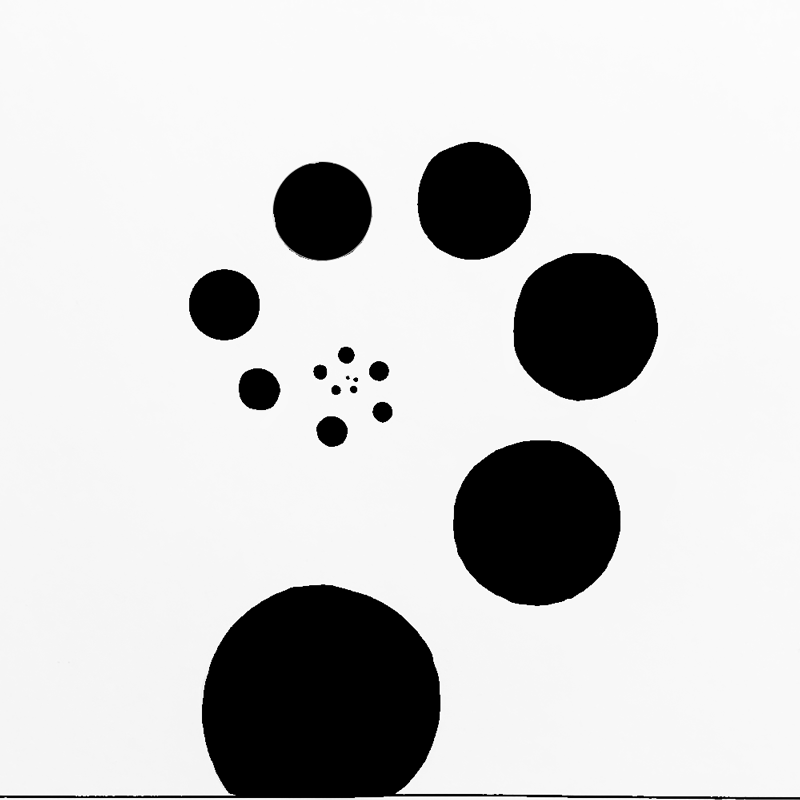
Source: behance.net
Motion design isn’t just about making things pretty; it’s a powerful tool for guiding the user’s eye and improving the overall comprehension of information presented on a screen. By strategically employing animation, we can enhance visual hierarchy and make content significantly more readable, leading to a more intuitive and enjoyable user experience. Clever use of motion helps users quickly grasp the most important information and navigate complex layouts with ease.Strategic use of motion can significantly enhance the visual hierarchy of a webpage or application.
Think of it as a silent conductor, subtly guiding the user’s gaze to the key elements. Instead of relying solely on size and color, motion adds another layer of emphasis, making important calls-to-action, crucial data points, or interactive elements immediately stand out. This controlled attention management reduces cognitive load and improves the efficiency of information processing.
Highlighting Important Elements
Subtle animations can draw attention to key elements without being distracting. For example, a gentle pulse effect on a button can subtly signal interactivity, while a smooth highlight animation can emphasize a newly updated section of a dashboard. Imagine a news website using a subtle zoom-in animation on breaking news headlines – this immediately grabs the user’s attention and prioritizes the most time-sensitive information.
This approach is far more effective than simply relying on bold text or color alone. The user’s eye is naturally drawn to movement, creating a more intuitive and efficient navigation experience.
Improving Content Scannability
Animation can dramatically improve the scannability of content, allowing users to quickly grasp the essence of a page without painstakingly reading every word. Micro-interactions, such as expanding accordions or smoothly appearing content blocks, help users digest information in digestible chunks. Consider a product catalog with a carousel that smoothly transitions between different product categories. The smooth, visual flow of the carousel makes it easy to quickly scan and identify items of interest, instead of scrolling through a dense, static list.
This approach respects the user’s time and preferences, recognizing that not everyone will read every detail.
Directing User Eye Flow
Motion can effectively guide the user’s eye flow through a design. A well-placed animation can lead the user from one section to another, creating a clear and logical path through the interface. Imagine a website onboarding process where arrows smoothly animate to guide the user through each step. This intuitive guidance eliminates confusion and improves the user’s overall understanding of the platform.
Similarly, progress bars with subtle animations can keep the user informed about the status of a task, fostering engagement and providing a sense of accomplishment.
Improving Complex Data Visualizations
Motion excels at clarifying complex data visualizations. Animated charts and graphs can reveal trends and patterns that are difficult to discern in static representations. For instance, an animated line chart showing sales figures over time allows users to easily identify peaks and valleys, highlighting seasonal changes or the impact of specific marketing campaigns. This dynamic presentation makes data more accessible and understandable, transforming potentially overwhelming information into an engaging and insightful experience.
Imagine a map visualizing real-time traffic flow; the animation of changing colors and densities instantly communicates traffic congestion and helps users make informed decisions about their route.
Creating Engaging and Memorable Designs
Motion design isn’t just about making things move; it’s about crafting experiences that resonate with users on a deeper level. By strategically incorporating animation, we can transform otherwise static designs into captivating narratives that leave a lasting impression. This goes beyond simple visual appeal; it’s about creating an emotional connection that fosters brand loyalty and product engagement.
The power of motion lies in its ability to guide attention, tell stories, and even evoke specific emotions. A well-crafted animation can make a complex product feature easily understandable, while a subtle micro-interaction can add a touch of delight to the user experience. This section will explore how motion design contributes to creating engaging and memorable designs.
Showcase Product Features Through Animation
Imagine showcasing a new smartphone. Instead of just showing static images of its features, we can use animation to demonstrate its capabilities. A short animation could show the phone unlocking smoothly with a fingerprint sensor, highlighting the speed and security. Another could illustrate the clarity of the camera by smoothly zooming in on a detailed image, emphasizing the image quality.
A third could depict the seamless transition between apps, showcasing the phone’s responsiveness. These animations not only illustrate features but also create a more immersive and engaging experience for the potential buyer. Each animation should be concise, focusing on a single key feature, and visually appealing to maintain user interest.
Motion Design and Emotional Response
Motion can subtly influence user emotions. For example, smooth, flowing animations often evoke feelings of calmness and serenity, while more energetic, dynamic animations can generate excitement and enthusiasm. A website for a spa might utilize slow, gentle transitions and fades, creating a relaxing atmosphere. Conversely, a gaming website might use fast-paced, bold animations to convey energy and thrill. Consider the brand and target audience; the choice of animation style should align with the desired emotional response.
Motion Design and Brand Identity
Consistent use of motion design elements can reinforce brand identity. Think of the instantly recognizable bounce of a certain popular messaging app’s logo. This simple animation, consistently used across all platforms, contributes significantly to brand recognition and memorability. Similarly, a company known for its sleek, minimalist design could incorporate subtle animations that maintain this aesthetic, reinforcing their brand personality.
The style of animation should reflect the brand’s values and personality, creating a cohesive and memorable brand experience.
Animation Styles and Their Impact on User Engagement
Different animation styles cater to different needs and evoke different responses. Choosing the right style is crucial for effective communication and engagement.
- Kinetic Typography: Animating text to emphasize key words or phrases. This style is effective for highlighting important information and creating a dynamic reading experience. For example, a headline might animate letter by letter to draw attention.
- Micro-interactions: Small, subtle animations that provide feedback to user actions, such as button clicks or form submissions. These animations enhance usability and provide a sense of responsiveness. A simple loading indicator could be a subtle spinning icon.
- Parallax Scrolling: Creating a sense of depth and immersion by layering elements that move at different speeds as the user scrolls. This style is particularly effective for showcasing products or landscapes, creating an engaging visual journey. Imagine scrolling through a product showcase where background images move at a slower pace than foreground elements.
- Character Animation: Using animated characters to guide users through a process or tell a story. This style is highly engaging and memorable, but requires more resources and expertise to implement effectively. A cartoon character could guide a user through a complex onboarding process.
Providing Feedback and Confirmation
Motion design isn’t just about aesthetics; it plays a crucial role in enhancing user experience by providing clear and immediate feedback. Subtle animations can significantly improve the usability and satisfaction of any digital product, guiding users through interactions and confirming their actions. This makes the digital world feel more responsive and intuitive, mirroring the tactile feedback we get from the physical world.
Adding motion to your designs grabs attention and boosts engagement – it’s a key element in creating truly memorable visuals. Think about how much more impactful your YouTube thumbnails could be with a subtle animation; check out this guide on getting it on with YouTube to learn more about optimizing your channel. Ultimately, incorporating motion is about making your designs more dynamic and ultimately, more effective.
Effective feedback mechanisms using motion are essential for a seamless user experience. They bridge the gap between a user’s action and the system’s response, creating a sense of connection and control. Conversely, poorly designed feedback can lead to confusion, frustration, and ultimately, a negative user experience. The key is to use motion purposefully and subtly, avoiding overly complex or distracting animations that detract from the core functionality.
Subtle Animations for Visual Feedback
Subtle animations can transform simple interactions into engaging experiences. For example, a button click might be accompanied by a subtle scale-down animation, a slight change in color, or a brief ripple effect. These micro-interactions provide instant visual confirmation that the user’s action has been registered. Think of the satisfying “click” sound on a physical button – motion design replicates this in the digital realm, making the experience more intuitive and rewarding.
This immediate feedback prevents users from second-guessing their actions, ensuring they feel confident and in control.
Motion Design for Task Completion Confirmation
Confirming successful task completion is another area where motion design excels. Instead of a simple text message, consider a more visually appealing confirmation. A checkmark animation appearing smoothly, a progress bar filling up completely, or a celebratory confetti explosion (used judiciously!) can create a more memorable and positive user experience. These animations don’t just convey information; they celebrate the user’s achievement and reinforce positive behavior.
The key is to tailor the animation to the context – a subtle animation for a minor task, and something more celebratory for a significant accomplishment.
Examples of Effective and Ineffective Feedback Mechanisms, Why use motion in your designs
A well-designed loading animation, such as a smoothly rotating spinner or a progressively filling progress bar, keeps users informed and engaged. This is far more effective than a blank screen, which can create anxiety and uncertainty. On the other hand, an overly complex or distracting loading animation, perhaps with flashing colors or jarring movements, can be irritating and counterproductive.
Similarly, a simple checkmark appearing after a successful form submission is effective, while a lengthy, drawn-out animation could be perceived as slow and inefficient.
Comparison of Feedback Animation Types
Choosing the right animation type is crucial for effective feedback. The table below compares different animation types based on their use cases, advantages, and disadvantages.
| Animation Type | Use Case | Pros | Cons |
|---|---|---|---|
| Micro-interactions (e.g., button press highlight) | Confirming single actions, providing immediate feedback | Subtle, non-intrusive, provides immediate confirmation | Might be too subtle for some users, requires careful design |
| Progress indicators (e.g., loading bars, progress circles) | Showing the progress of a task | Keeps users informed, reduces anxiety, provides a sense of control | Can be visually distracting if not designed well, might not be suitable for all tasks |
| Success/failure animations (e.g., checkmark, error message) | Confirming task completion or indicating errors | Clear visual feedback, reinforces positive/negative behaviors | Can be repetitive if overused, requires careful design to avoid being jarring |
| Transitions (e.g., page transitions, modal window openings) | Guiding users between different sections or views | Creates a smooth and intuitive flow, enhances navigation | Can be visually distracting if not well-designed, might slow down the experience if overused |
Illustrating Complex Information
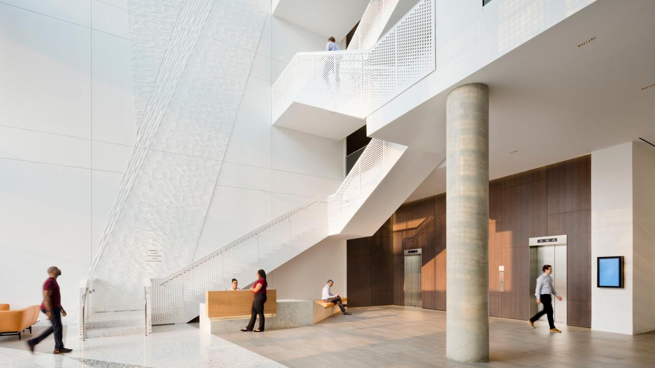
Source: gensler.com
Motion design possesses a unique ability to transform complex information into easily digestible and engaging content. Static visuals often struggle to convey intricate processes or relationships between data points, leaving the audience feeling overwhelmed or confused. However, by strategically incorporating animation, we can simplify the narrative, making even the most challenging concepts readily understandable.Motion design excels at clarifying intricate processes by breaking them down into smaller, manageable steps.
The visual flow guides the viewer’s eye, establishing a clear sequence of events and highlighting key interactions. This sequential unfolding allows for a gradual understanding, avoiding the cognitive overload that static representations often cause.
Data Visualization Through Animation
Effective data visualization requires more than just presenting numbers; it demands revealing the story hidden within those numbers. Motion can illuminate trends, patterns, and correlations that are often invisible in static charts and graphs. For example, imagine a bar chart illustrating sales figures over time. A simple animation could smoothly transition between bars, visually representing the growth or decline in sales over each period.
This dynamic display is far more intuitive than simply observing static bar heights. Furthermore, using color changes or size adjustments synchronized with data fluctuations adds another layer of clarity, instantly highlighting periods of significant change or stagnation. Another example could be visualizing network data; the connections between nodes could dynamically light up or pulse to show traffic flow or connection strength, providing a much more insightful view than a static network diagram.
Illustrating Product Lifecycle
Let’s consider a detailed animation illustrating the lifecycle of a hypothetical smartphone, from concept to end-of-life.The animation begins with a brainstorming session, visualized as swirling ideas coalescing into a single, refined design concept. This transitions to the manufacturing phase, represented by a series of interconnected gears smoothly operating to assemble the phone’s components. Next, the launch is depicted with a vibrant explosion of light and color, symbolizing the phone’s entry into the market.
The sales phase follows, with animated graphs illustrating sales figures rising and falling over time, possibly with color-coding to represent different geographical regions. As the phone approaches obsolescence, the animation shows a gradual decrease in the speed of the gears and a dimming of the light, symbolizing the decline in demand and eventual discontinuation. Finally, the animation concludes with a depiction of responsible recycling, showcasing the phone’s components being separated and repurposed, emphasizing environmental sustainability.
Each stage is clearly defined, with smooth transitions highlighting the natural progression from one phase to the next. The animation would utilize a consistent visual language throughout, reinforcing the unity of the lifecycle and simplifying comprehension. The color palette could also shift subtly from bright and energetic during the launch phase to muted and more environmentally conscious towards the end.
Building Brand Identity Through Motion
Source: cdn-si-edu.com
Motion design isn’t just about making things move; it’s a powerful tool for crafting a memorable and consistent brand experience. A well-executed motion strategy can subtly reinforce your brand’s personality, values, and overall aesthetic, leaving a lasting impression on your audience far beyond a static logo. It’s about creating a visual language that speaks volumes about who you are and what you stand for.Consistent motion design reinforces a brand’s visual identity by establishing a unique visual vocabulary.
Think of it as a brand’s signature style, but in motion. This consistency, whether it’s in the use of specific transitions, animations, or color palettes, creates a sense of familiarity and recognition. Over time, viewers begin to associate these specific motion characteristics with your brand, building instant recall and brand recognition. This cohesive approach strengthens brand recall and helps differentiate your brand from competitors in a crowded digital landscape.
Motion Design’s Role in Unique Brand Experiences
Motion design offers a unique opportunity to create a truly immersive and engaging brand experience. Static elements, no matter how well-designed, lack the dynamic quality that motion brings. By incorporating motion, brands can guide users through their websites, apps, or marketing materials in a way that feels intuitive and delightful. Consider the subtle animations that guide a user’s eye across a website, or the satisfying micro-interactions that provide feedback after a button click.
These small details, when thoughtfully designed, contribute to a holistic brand experience that is both memorable and effective. The use of carefully crafted motion can elevate a simple interaction into a moment of delight, reinforcing positive associations with the brand.
Examples of Brands Utilizing Motion Design Effectively
Many brands successfully leverage motion design to enhance their brand identity. For example, Airbnb’s use of smooth, fluid animations in their app creates a sense of ease and comfort, aligning perfectly with their brand’s focus on travel and relaxation. Conversely, a brand like Nike often uses sharp, energetic motion to convey speed, power, and athleticism. These examples demonstrate how the style of motion can directly reflect and reinforce a brand’s core values and target audience.
Apple’s clean, minimalist animations, with their focus on smooth transitions and subtle effects, are another excellent example of how motion can perfectly complement a brand’s overall aesthetic.
Motion Design Styles and Associated Brand Personalities
The following mood board illustrates different motion design styles and their potential association with various brand personalities. The style of motion chosen directly impacts the perception of the brand.
| Motion Style | Description | Brand Personality | Visual Example (Descriptive) |
|---|---|---|---|
| Minimalist | Clean lines, subtle animations, focus on simplicity and elegance. | Sophisticated, modern, premium | Imagine a website loading with a simple, smoothly expanding circle, then fading into the main content. No jarring movements, just elegant simplicity. |
| Kinetic Typography | Text-based animations, often used to emphasize key messages or create a dynamic visual experience. | Energetic, innovative, forward-thinking | Visualize words appearing one by one, perhaps bouncing into place or swirling together, creating a sense of excitement and energy. |
| Flat Design with Micro-interactions | Simple, two-dimensional animations with small, delightful interactions that provide visual feedback to user actions. | Friendly, approachable, playful | Picture a button that gently bounces when hovered over, and then subtly changes color when clicked. A small, satisfying animation that adds personality without being overwhelming. |
| Geometric and Abstract | Use of geometric shapes and abstract forms in animation, often creating a sense of modernity and innovation. | Modern, artistic, experimental | Imagine a series of geometric shapes morphing and flowing into each other, creating a visually stimulating and abstract experience. |
| Hand-drawn/Sketchy | Animations that resemble hand-drawn sketches or paintings, creating a more personal and relatable feel. | Authentic, relatable, down-to-earth | Visualize a logo that seems to be drawn in real time, with slightly wobbly lines and imperfect shapes, giving a sense of warmth and authenticity. |
Final Wrap-Up
So, there you have it – a glimpse into the transformative power of motion design. By strategically incorporating animation into your designs, you can create experiences that are not only visually stunning but also incredibly user-friendly and memorable. Remember, motion is more than just aesthetics; it’s a powerful tool to enhance usability, improve understanding, and build a stronger connection with your audience.
So go forth and animate! Your users (and your brand) will thank you for it.
FAQ Section
What are some common mistakes to avoid when using motion in design?
Overusing motion, creating distracting animations, and neglecting accessibility are major pitfalls. Keep it subtle, purposeful, and ensure your animations work well for users with disabilities.
What software is best for creating motion designs?
There’s a wide range! Popular choices include After Effects, Principle, Figma, and Adobe XD, each with its own strengths and weaknesses. The best choice depends on your skill level and project needs.
How can I ensure my motion designs are accessible?
Prioritize clear visual cues, provide alternative text for screen readers, and ensure animations don’t cause seizures (epilepsy considerations). Test your designs with users with disabilities.