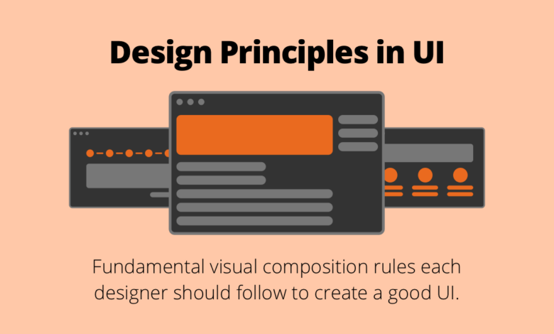
10 Fundamental UI Design Principles You Need To Know
10 fundamental ui design principles you need to know – 10 Fundamental UI Design Principles You Need To Know: Ever wondered what makes a website or app truly
-user-friendly*? It’s not just about pretty pictures; it’s about understanding the psychology behind how people interact with digital interfaces. This post dives deep into ten core principles, from understanding your users to iterating and testing your designs, helping you create experiences that are not only beautiful but also intuitive and effective.
Get ready to level up your UI game!
We’ll explore the importance of user research, the power of simplicity, the need for consistency, and the crucial role of accessibility. We’ll also delve into visual hierarchy, efficient user flows, error prevention, and the ever-important practice of responsive design. By mastering these principles, you can create interfaces that are not only visually appealing but also incredibly user-friendly, leading to higher engagement and satisfaction.
Understanding the User

Source: website-files.com
Building a successful UI is not about creating something visually appealing; it’s about creating something genuinely useful and enjoyable for the people who will use it. This hinges entirely on a deep understanding of the user. Ignoring this fundamental truth leads to frustrating, inefficient, and ultimately, unsuccessful interfaces. Understanding your users is the bedrock upon which all effective UI design is built.User research is the process of gathering information about your target audience to understand their needs, behaviors, and motivations.
This research informs every aspect of the design process, from the initial concept to the final polish. Without it, you’re essentially designing in the dark, guessing at what users want rather than knowing.
User Research Methods and Their Application
Effective user research employs a variety of methods, each offering unique insights. These methods are not mutually exclusive; a comprehensive approach often combines several techniques for a holistic understanding.
- Surveys: Surveys are a cost-effective way to gather quantitative data from a large number of users. They can be used to understand demographics, preferences, and attitudes towards specific features. For example, a survey could reveal that 70% of your target audience prefers a dark mode interface.
- User Interviews: In-depth interviews provide qualitative data, offering rich insights into user motivations and behaviors. These interviews allow for follow-up questions, providing a deeper understanding than a simple survey. For instance, an interview might uncover why a user finds a particular feature confusing, revealing usability issues.
- Usability Testing: This involves observing users as they interact with a prototype or live product. It helps identify pain points and areas for improvement. Observing users struggling with a navigation menu, for example, highlights a critical design flaw.
- A/B Testing: This method compares two versions of a design element to determine which performs better. For example, A/B testing might compare two different button designs to see which one leads to a higher click-through rate.
Creating User Personas and Use Cases
User personas are fictional representations of your ideal users, based on research data. They provide a concrete picture of who you are designing for, helping to guide design decisions. A persona might include details like age, occupation, tech-savviness, and goals when using your product.Use cases describe how a user interacts with your product to achieve a specific goal.
They Artikel the steps a user takes and the expected outcome. For example, a use case might detail how a user searches for a specific product on an e-commerce website and adds it to their cart. Creating user personas and use cases helps ensure that the design meets the user’s needs and expectations.
Examples of Poor UI Design Due to Ignoring User Needs
Many websites and applications suffer from poor UI design because they failed to prioritize user research. A classic example is a website with cluttered navigation, forcing users to hunt for information. This is often the result of not understanding how users typically search for information on similar sites. Another example is an app with overly complex features that overwhelm the user, ignoring the principle of simplicity.
This reflects a lack of understanding of the user’s technical skills and time constraints. Failing to consider accessibility needs, like sufficient color contrast for visually impaired users, is another common example of neglecting user needs. In essence, a failure to understand the user results in a product that is difficult, frustrating, and ultimately, unusable for its intended audience.
Consistency and Standards
Maintaining a consistent design across a user interface is paramount for creating a positive user experience. Inconsistent design elements confuse users, disrupt their workflow, and ultimately damage the credibility of your product or service. A unified experience, on the other hand, fosters trust, improves usability, and enhances overall satisfaction. Think of it like a well-designed building – a mismatch of architectural styles would be jarring and unsettling, just as inconsistent UI elements can be for a user.Consistency ensures that users can easily navigate and understand your interface, regardless of the specific page or feature they’re using.
It reduces the cognitive load required for users to interact with your product, allowing them to focus on their tasks rather than deciphering conflicting design cues. This translates directly to increased efficiency and user satisfaction.
Design Systems and Their Benefits
Different design systems offer various approaches to achieving consistency. A design system is a collection of reusable components, guidelines, and documentation that ensures consistency across all aspects of a digital product. Material Design, for example, is a comprehensive design system developed by Google, offering a vast library of pre-built components and detailed guidelines for their usage. This allows developers to quickly create consistent and visually appealing interfaces, saving time and effort.
In contrast, a smaller company might develop its own internal design system, tailored specifically to its brand and product needs. This bespoke approach allows for greater control and customization but requires significant upfront investment in design and documentation. The benefits of utilizing a well-defined design system, regardless of its scale, include reduced development time, improved design consistency, enhanced brand identity, and increased maintainability.
Creating and Maintaining a Style Guide
A style guide serves as the central repository for all design decisions within a UI. It acts as a single source of truth, defining everything from typography and color palettes to button styles and spacing conventions. A comprehensive style guide should include detailed specifications for each UI element, accompanied by visual examples and clear usage guidelines. This ensures that all designers and developers adhere to the same standards, preventing inconsistencies and maintaining a unified visual language.
Regular updates and maintenance are crucial to keep the style guide relevant and accurate, reflecting any changes or additions to the design system. Without a well-maintained style guide, a design system quickly becomes unwieldy and loses its effectiveness.
Identifying and Improving Inconsistent Interfaces
Let’s imagine a sample e-commerce website. Inconsistencies might include using different button styles across various pages (some rounded, some square, some with varying colors), inconsistent spacing between elements, and a mismatch of fonts throughout the site. These inconsistencies create a disjointed experience, confusing users and potentially hindering their ability to complete purchases. Improvements would involve standardizing button styles (e.g., consistently using rounded buttons with a specific color scheme), establishing a consistent grid system for spacing, and selecting a unified font family throughout the site.
Implementing these changes, guided by a well-defined style guide, would result in a much more user-friendly and visually appealing experience.
Accessibility and Inclusivity
Designing inclusive user interfaces isn’t just a matter of good practice; it’s a fundamental ethical and business imperative. A truly accessible UI ensures that everyone, regardless of their abilities, can seamlessly interact with your product. Ignoring accessibility not only excludes a significant portion of potential users but also risks legal repercussions and damages your brand reputation. This section explores the crucial aspects of designing for accessibility and inclusivity.
The importance of designing for users with disabilities cannot be overstated. A significant portion of the population experiences some form of disability, whether visual, auditory, motor, cognitive, or a combination thereof. Excluding these users means losing out on a vast market and failing to uphold principles of equal access and opportunity. Furthermore, many accessibility features benefit all users, improving the overall user experience.
WCAG Guidelines and Their Application to UI Design
The Web Content Accessibility Guidelines (WCAG) are internationally recognized standards for web accessibility. These guidelines provide a framework for creating content that is usable by people with a wide range of disabilities. They are organized into four principles: Perceivable, Operable, Understandable, and Robust. In UI design, adhering to WCAG ensures that your interface is usable by people with visual, auditory, motor, and cognitive impairments.
So you’re diving into UI design? Mastering the 10 fundamental UI design principles is crucial, and understanding visual hierarchy is key. To really see these principles in action, check out how effective YouTube’s interface is – it’s a masterclass in user experience; learn more about optimizing your own YouTube presence by reading this great guide on getting it on with youtube.
Then, you can apply those same design principles to your own projects and create truly intuitive interfaces.
For example, providing alternative text for images (Perceivable) ensures screen readers can describe the image content to visually impaired users. Using keyboard navigation (Operable) allows users with motor impairments to navigate the interface without a mouse. Clear and concise language (Understandable) ensures that everyone can easily comprehend the information presented. Finally, using semantic HTML (Robust) makes the content more compatible with assistive technologies and future updates.
Accessible Design Elements for Different Disabilities, 10 fundamental ui design principles you need to know
Implementing accessible design requires considering the specific needs of different user groups. Here are some examples:
- Visual Impairments: High contrast color schemes, clear and concise text, alternative text for images (alt text), sufficient text size options, and keyboard navigation are crucial. Screen readers rely heavily on well-structured HTML and alt text to convey information.
- Auditory Impairments: Captions and transcripts for videos and audio content are essential. Visual cues and animations can supplement auditory information. Clear visual notifications are important for alerts and warnings.
- Motor Impairments: Large interactive elements, keyboard navigation, sufficient time limits for tasks, and avoidance of time-sensitive interactions are vital. Voice control and assistive technologies should be considered.
- Cognitive Impairments: Simple and clear language, consistent layout and navigation, and minimal use of complex animations are crucial. Chunking information into smaller, manageable units can improve comprehension.
Example of a Fully Accessible Form Element
Consider a simple contact form. To make it accessible to users with visual and motor impairments, several elements are necessary:
The form should utilize semantic HTML5 elements such as <form>, <label>, <input>, and <button>. Each input field (name, email, message) should have a clearly associated label using the for attribute on the label and the id attribute on the input. This ensures screen readers can correctly associate labels with their corresponding fields. The form should be navigable entirely via keyboard, with clear tab order.
Sufficient spacing between elements should be provided for ease of use. Error messages should be clear, concise, and visually distinct. For visually impaired users, sufficient color contrast between text and background is essential. For motor-impaired users, larger input fields and buttons may be beneficial. Finally, appropriate ARIA attributes can be added to further enhance accessibility for assistive technologies.
For example, the aria-describedby attribute can be used to associate error messages with specific fields.
Feedback and Control: 10 Fundamental Ui Design Principles You Need To Know

Source: talentlms.com
Effective UI design hinges on keeping users informed and in control. A well-designed interface provides clear and immediate feedback for every user action, building trust and confidence. Without this crucial element, users become frustrated and uncertain, leading to a negative user experience and potentially abandoned tasks. This section will explore the importance of feedback mechanisms and how to implement them effectively.Providing clear and immediate feedback to user actions is paramount for a positive user experience.
This means letting users know that their actions have been registered and what the outcome is. This can range from a simple visual cue to a more complex confirmation message. The key is to make the feedback relevant, timely, and easily understood. A lack of feedback leaves users guessing, leading to anxiety and uncertainty about whether their actions have been processed correctly.
Visual Feedback Mechanisms
Visual feedback is the most immediate and effective way to communicate with users. It leverages the user’s visual sense to instantly convey information about the state of the interface and the results of their actions. Effective visual feedback can significantly reduce cognitive load and improve the overall user experience. Examples include loading indicators, progress bars, and subtle animations.
Examples of Effective Feedback
Consider a button click. A simple change in color, a subtle animation, or a brief visual confirmation (like a checkmark) immediately informs the user that the button has been pressed. Similarly, when submitting a form, a progress bar shows the upload progress, providing reassurance that the process is underway. Error messages should be clear, concise, and actionable, guiding the user on how to correct the mistake.
A well-designed autocomplete feature provides suggestions as the user types, aiding in efficient data entry.
Visual Design Example: Button Feedback
Imagine a simple blue button labeled “Submit.” When the user clicks the button:
1. Initial State
The button is a solid blue, with white text.
2. Click State
Upon clicking, the button briefly changes to a slightly darker shade of blue, indicating the click has registered. A subtle animation, such as a slight scale-down effect, could be added for extra feedback.
3. Processing State
If the submission takes longer than a fraction of a second, a small loading spinner appears within the button, replacing the text.
4. Success State
Once the submission is successful, the button briefly changes to green and displays a checkmark icon before returning to its original blue state.
5. Error State
If an error occurs, the button turns red and displays an exclamation mark icon, alerting the user to the problem. A tooltip could then appear, providing a detailed error message.This multi-stage feedback system provides clear and timely information to the user at every step of the process, enhancing the user experience and building confidence in the system. The color changes, animations, and icons all work together to convey information efficiently and intuitively.
Efficiency and Usability
Creating a user-friendly interface isn’t just about making things look pretty; it’s about making them easy and efficient to use. Efficiency and usability are intertwined; a usable interface is inherently more efficient, and an efficient interface is inherently more usable. This means minimizing the steps required to complete a task and ensuring the user experience is intuitive and straightforward.A key concept here is user flow, which essentially maps out the steps a user takes to achieve a goal within your application or website.
Understanding user flow is critical for optimizing the user experience and identifying potential pain points. A well-designed user flow leads to increased user satisfaction, higher conversion rates, and ultimately, a more successful product.
User Flow and its Importance in UI Design
User flow diagrams visually represent the path a user takes through a system. These diagrams can be simple, showing a linear progression, or complex, showcasing branching paths based on user choices. By analyzing user flow, designers can identify areas of friction, unnecessary steps, or confusing navigation. For example, a poorly designed e-commerce checkout process might lead to abandoned carts, highlighting a need for simplification and optimization of the user flow in that specific section.
A well-defined user flow helps ensure a smooth and logical journey for the user, making the process intuitive and minimizing frustration. A poorly designed user flow, on the other hand, can lead to user confusion, task abandonment, and a negative user experience.
Methods for Optimizing User Workflows
Several methods can be employed to optimize user workflows. These include streamlining processes, reducing the number of steps required to complete tasks, improving navigation, and using clear and concise language. For instance, implementing a progress bar during a lengthy process provides users with feedback and reduces perceived wait time. Similarly, using clear and consistent labels on buttons and forms helps users understand their function and reduces errors.
Another powerful technique is A/B testing different workflows to identify which performs best. This data-driven approach allows for continuous improvement and refinement of the user experience.
Effective Use of Navigation and Information Architecture
Effective navigation and information architecture are crucial for efficient user workflows. A well-structured sitemap, clear labeling, and intuitive search functionality allow users to quickly find what they need. Consider the example of a large online retailer. A poorly structured site might force users to navigate through multiple pages to find a specific product, leading to frustration and potentially abandoning the purchase.
However, a well-designed site with clear categories, subcategories, and a robust search function allows users to quickly locate products, improving their overall experience and increasing the likelihood of a purchase. Consistent use of visual cues, such as breadcrumbs, also aids navigation.
Example of a Logical and Efficient User Flow: Online Clothing Purchase
The following steps illustrate a logical and efficient user flow for purchasing clothing online:
- Browse the website’s clothing categories.
- Select desired items and add them to the shopping cart.
- Review items in the shopping cart and make any necessary changes.
- Proceed to checkout.
- Enter shipping and billing information.
- Select a payment method.
- Review the order summary and confirm the purchase.
- Receive an order confirmation email.
This streamlined process minimizes steps and ensures a smooth and efficient purchasing experience. Any deviation from this logical flow could lead to user frustration and potentially abandoned purchases.
Visual Hierarchy
Creating a user-friendly interface hinges on effectively guiding the user’s eye. Visual hierarchy, the arrangement of elements to indicate importance and reading order, is crucial for this. A well-designed hierarchy ensures users can quickly find what they need, understand the information presented, and complete their tasks efficiently. Poor visual hierarchy, conversely, leads to confusion and frustration.Visual hierarchy is achieved through the strategic manipulation of visual elements.
It’s not about randomly placing elements; it’s about consciously arranging them to create a clear path for the user’s gaze. This allows for a logical flow of information and a more intuitive user experience.
Techniques for Creating Visual Hierarchy
Effective visual hierarchy relies on several key techniques working in concert. These techniques leverage the inherent ways our brains process visual information. By skillfully combining these, designers create a clear and compelling visual narrative.
- Size: Larger elements naturally draw more attention than smaller ones. A large headline, for example, immediately establishes its importance compared to smaller body text.
- Color: Color is a powerful tool. Using contrasting colors can highlight key elements and create visual separation between different sections of the interface. Bright colors tend to attract more attention than muted tones.
- Contrast: High contrast between elements—such as dark text on a light background—increases readability and makes key information stand out. This is particularly important for accessibility.
- Whitespace: Strategic use of whitespace (empty space) creates visual breathing room and separates different sections, guiding the eye and preventing visual clutter. Whitespace helps prioritize elements by providing visual separation.
- Typography: Font choices, weight, and style contribute to visual hierarchy. Bold headings and italicized emphasis guide the user through the text.
- Proximity: Grouping related elements together visually reinforces their connection and improves scannability. This creates visual “chunks” of information, making the interface easier to digest.
- Position: Elements placed higher on the page or screen tend to receive more attention than those placed lower. Similarly, elements positioned centrally are usually noticed first.
Examples of Effective Visual Hierarchy
Consider a typical e-commerce product page. The product image is usually the largest element, immediately grabbing attention. Below, the product title is a prominent heading, followed by a concise description and key features in slightly smaller text. The price is often displayed in a bold, contrasting color, and the “Add to Cart” button is large and clearly positioned.
This arrangement uses size, color, contrast, and position to guide the user through the information in a logical order. A well-designed news website will similarly use large headlines for important articles, with smaller headlines and summaries for less crucial news items. This allows users to quickly scan and identify stories of interest.
Guiding the User Through a Complex Interface
Imagine a complex online form for a job application. The form has several sections: personal information, work experience, education, and skills. To guide the user, we can use visual hierarchy to clearly delineate each section.Each section would begin with a bold, large heading (e.g., “Work Experience”). The fields within each section would be grouped closely together, using whitespace to separate sections.
Required fields could be marked with a distinctive asterisk (*) in a contrasting color (e.g., red). Progress indicators (e.g., a progress bar) could visually represent the user’s completion rate, providing a sense of accomplishment and reducing anxiety. The “Submit” button would be clearly positioned at the bottom, with a size and color that makes it stand out.
Finally, the overall form layout would be clean and uncluttered, with ample whitespace to avoid overwhelming the user. This combination of visual cues ensures a smooth and efficient completion of the form.
Error Prevention and Recovery
Designing user interfaces that anticipate and gracefully handle errors is crucial for a positive user experience. A well-designed system minimizes the chances of mistakes and provides clear, helpful guidance when they do occur. This prevents frustration and encourages users to continue interacting with the application. The goal is to make the system resilient and forgiving, guiding users towards successful completion of their tasks.Error prevention focuses on proactively designing the interface to reduce the likelihood of errors.
This involves careful consideration of input fields, clear instructions, and visual cues that guide users towards correct actions. Effective error handling, on the other hand, involves providing clear and informative messages when errors do occur, along with suggestions for resolution. A combination of both strategies is key to creating a robust and user-friendly system.
Techniques for Preventing User Errors
Preventing errors is always preferable to dealing with them after they occur. This can be achieved through several techniques. Careful consideration of input types and constraints is paramount. For example, using a date picker instead of a free-form text field for dates prevents users from entering invalid date formats. Similarly, using dropdown menus for selecting options from a predefined list reduces the chances of typos or incorrect entries.
Clear and concise instructions, accompanied by visual aids such as tooltips or interactive tutorials, can significantly improve user understanding and reduce errors. Furthermore, employing visual cues like color-coding, highlighting, and clear labeling can guide users through the process and prevent them from making mistakes.
Providing Clear and Helpful Error Messages
When errors inevitably occur, the system should provide clear and helpful messages that guide the user towards a solution. Vague error messages, such as “Error 404,” are unhelpful and frustrating. Instead, error messages should be specific, explaining the nature of the problem in plain language. They should also provide concrete suggestions for resolution, avoiding technical jargon that the average user might not understand.
For example, instead of “Invalid input,” a better message might be “Please enter a valid email address. Email addresses must contain the ‘@’ symbol.” The tone of the error message should also be helpful and supportive, avoiding accusatory or condescending language.
Examples of Effective Error Handling in UI Design
Many successful applications demonstrate excellent error handling. Consider a password field that provides real-time feedback as the user types, indicating password strength or highlighting missing requirements like uppercase letters or numbers. This prevents errors before the user submits the form. Another example is a form that validates input as the user types, providing immediate feedback on invalid entries.
This allows users to correct mistakes instantly, without having to wait until the form submission. Furthermore, applications that allow users to undo or redo actions provide a safety net against accidental errors, allowing for easy recovery. Finally, well-designed progress indicators, showing the steps of a complex task, minimize errors by providing context and visibility.
Designing a Form That Minimizes Potential Errors
Let’s design a simple registration form to illustrate error prevention. This form will request a username, email address, and password.
| Field | Input Type | Validation | Error Message |
|---|---|---|---|
| Username | Text input | Minimum length: 5 characters, alphanumeric characters only | “Username must be at least 5 characters long and contain only letters and numbers.” |
| Text input | Valid email format | “Please enter a valid email address (e.g., [email protected]).” | |
| Password | Password input | Minimum length: 8 characters, at least one uppercase letter, one lowercase letter, one number, one special character | “Password must be at least 8 characters long and contain at least one uppercase letter, one lowercase letter, one number, and one special character.” |
This table shows how each field uses appropriate input types and validation rules to minimize errors. Clear and specific error messages guide users if they make a mistake. The combination of input validation and clear error messages ensures a smooth and efficient user experience.
Responsiveness and Adaptability
Source: uxhints.com
In today’s multi-device world, creating websites and applications that seamlessly adapt to different screen sizes and orientations is no longer a luxury—it’s a necessity. Responsiveness ensures a consistent and positive user experience, regardless of whether someone is browsing on a desktop computer, a tablet, or a smartphone. Ignoring this crucial aspect can lead to frustrated users, lost conversions, and a damaged brand reputation.Responsive design ensures your website or app looks great and functions flawlessly across all devices.
This isn’t just about shrinking content; it’s about strategically adapting the layout and functionality to optimize the user experience for each screen size. A poorly designed responsive site can be just as frustrating as a non-responsive one. We need to focus on providing a tailored experience for each device type.
Fluid Grids and Flexible Images
Fluid grids are a cornerstone of responsive design. Instead of using fixed-width columns, fluid grids utilize percentages or relative units (like `em` or `rem`) to allow the layout to dynamically adjust to the available screen width. This means columns will resize proportionally, ensuring content remains legible and well-organized across various devices. Flexible images, similarly, scale proportionally with the surrounding layout, preventing distortion and maintaining visual appeal.
This approach avoids the need for multiple separate designs for different devices, simplifying maintenance and development.
Examples of Effective Responsive Design Implementations
Many popular websites excel at responsive design. Consider the website of a major e-commerce platform. Their product pages adapt seamlessly from a detailed view on a desktop to a concise and easily navigable display on a smartphone. Images scale appropriately, and the navigation remains intuitive across all screen sizes. Another excellent example is a popular news website; its articles reflow beautifully on smaller screens, prioritizing readability and minimizing scrolling.
The use of fluid grids and flexible images ensures the content remains clear and engaging across various devices. These examples highlight the importance of prioritizing content structure and user experience over a fixed layout.
Responsive Webpage Layout Mock-up
Let’s imagine a simple e-commerce product page. On a large desktop screen, the page displays a large hero image of the product on the left, alongside a detailed description, specifications, and customer reviews on the right. These elements are arranged in two equal-width columns using a fluid grid system.As the screen size decreases (e.g., on a tablet), the two columns stack vertically.
The hero image remains at the top, followed by the description, specifications, and reviews in that order. The layout prioritizes the most important information—the product image and description—first.On a small smartphone screen, the layout further simplifies. The hero image is still at the top, but the description, specifications, and reviews are collapsed into expandable sections, minimizing scrolling. Navigation buttons are made larger and more prominent to improve usability with touchscreens.
The entire design emphasizes clear visual hierarchy and easy navigation, ensuring a consistent and pleasant experience across all screen sizes. The use of flexible images prevents distortion, and the font sizes adjust to maintain readability. The color scheme and overall style remain consistent across all devices, reinforcing brand identity.
Iteration and Testing
Building a truly great user interface isn’t a one-and-done process. It’s a journey of continuous improvement, fueled by user feedback and iterative design cycles. Ignoring this crucial aspect can lead to a product that misses the mark, frustrating users and hindering adoption. Iteration and testing are the cornerstones of a successful UI design, ensuring the final product aligns perfectly with user needs and expectations.User testing is paramount in UI design because it provides invaluable insights directly from the target audience.
Instead of relying on assumptions or personal preferences, designers gain objective data on how users interact with the interface, identifying pain points, areas for improvement, and ultimately, opportunities for optimization. This data-driven approach allows for the creation of a more intuitive, efficient, and enjoyable user experience.
User Testing Methods and Their Benefits
Several methods exist for gathering user feedback, each offering unique advantages. Choosing the right method depends on factors like budget, time constraints, and the specific information needed.
- A/B Testing: This involves presenting two variations of a design element (e.g., button placement, color scheme) to different user groups and measuring which performs better based on metrics like click-through rates and task completion times. This method is particularly effective for comparing specific design choices and quantifying their impact.
- Usability Testing: This involves observing users as they complete specific tasks within the interface. Researchers can note where users struggle, get confused, or abandon tasks, providing direct evidence of usability issues. This method offers rich qualitative data, allowing for a deeper understanding of the user experience.
- Surveys and Questionnaires: These can be used to gather broader feedback on user satisfaction, preferences, and overall perceptions of the interface. While less detailed than usability testing, surveys can reach a larger audience and provide valuable quantitative data on user opinions.
- Card Sorting: This method helps to organize information architecture by having users categorize content into groups that make sense to them. This can be incredibly helpful in improving navigation and information findability.
Examples of User Feedback Improving UI Design
Imagine an e-commerce website with a complex checkout process. User testing might reveal that users are abandoning their carts due to confusing navigation or excessive form fields. This feedback would prompt designers to simplify the process, perhaps breaking it down into smaller steps or using a more intuitive visual layout. The result? A higher conversion rate and happier customers.
Similarly, a social media app might discover, through A/B testing, that a redesigned notification system significantly increases user engagement. These examples highlight the power of user feedback in driving tangible improvements.
Iterative UI Design Process
An iterative design process is cyclical, involving several stages of design, testing, and refinement.
- Planning and Research: Define goals, target audience, and gather initial user research.
- Initial Design: Create a first version of the UI based on research and best practices.
- Testing: Conduct user testing to identify usability issues and gather feedback.
- Refinement: Revise the design based on the testing results. This may involve iterations of the design process.
- Repeat: Repeat steps 3 and 4 until the desired level of usability and user satisfaction is achieved.
This cyclical approach ensures that the final product is well-tested, user-friendly, and meets its intended purpose. It’s a continuous process of learning and improvement, leading to a superior user experience.
Conclusion
So, there you have it – ten fundamental UI design principles that are essential for creating truly exceptional user experiences. Remember, it’s not about following rules blindly, but about understanding the
-why* behind each principle and applying them creatively to your specific project. By prioritizing user needs, striving for simplicity and clarity, and continuously iterating based on feedback, you can craft digital interfaces that are not only functional but also delightful to use.
Now go forth and design something amazing!
Query Resolution
What’s the difference between UI and UX design?
UI (User Interface) design focuses on the visual elements and interactivity of a product, while UX (User Experience) design encompasses the overall user journey and satisfaction.
How can I learn more about user research methods?
There are tons of resources online! Check out Nielsen Norman Group, UX Collective, and various online courses on platforms like Coursera and Udemy.
What are some common accessibility mistakes to avoid?
Ignoring alt text for images, using insufficient color contrast, and neglecting keyboard navigation are all common pitfalls.
How often should I conduct user testing?
Ideally, throughout the entire design process, from early prototypes to final releases. Regular testing helps catch issues early and ensures continuous improvement.
What tools can help with responsive design?
Browser developer tools, responsive design checkers, and various CSS frameworks (like Bootstrap or Tailwind CSS) are incredibly helpful.

