


Posted inPhotography and Visual Media
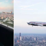
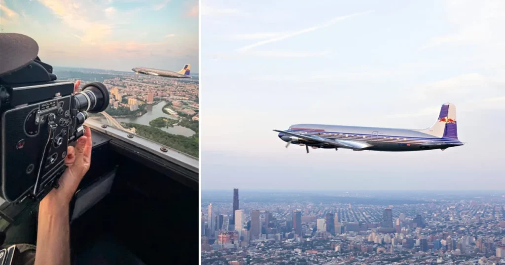
Vintage Wings Over Manhattan Red Bull Aviation Returns Historic DC-6B to American Skies Using Era-Appropriate Bolex Cinematography
The return of the Douglas DC-6B to the United States marks a significant milestone in aviation heritage, as the historic aircraft, a cornerstone of Red Bull’s Flying Bulls collection, touched…


