Trendy Website Design In or Out?
Trendy website design in or out – Trendy website design: in or out? That’s the million-dollar question, isn’t it? We’re constantly bombarded with new design trends, making it hard to know what’s truly effective and what’s just fleeting hype. This post dives deep into the current landscape of web design, exploring what’s hot, what’s not, and how to create a website that’s both stylish and user-friendly.
We’ll look at everything from color palettes and typography to micro-interactions and accessibility, helping you navigate the ever-changing world of online aesthetics.
From understanding the key characteristics of a “trendy” website to mastering visual hierarchy and incorporating subtle animations, we’ll unpack the elements that contribute to a successful online presence. We’ll also examine the importance of responsive design and accessibility, ensuring your website is inclusive and reaches a wider audience. Get ready to revamp your website design knowledge and create something truly special!
Defining “Trendy” in Website Design
Defining what constitutes “trendy” in website design is a constantly evolving challenge. What’s considered cutting-edge today might feel dated tomorrow. This fluidity is driven by technological advancements, shifting user preferences, and the ever-present desire for innovation in the digital landscape. Understanding these factors is key to creating websites that not only look good but also effectively engage their target audience.
Trendy website design isn’t just about aesthetics; it’s about a holistic approach that blends visual appeal with user experience and functionality. Outdated websites, on the other hand, often lack this cohesive approach, prioritizing outdated design elements over modern usability and accessibility standards.
Key Characteristics of Trendy Website Design
Five key characteristics currently define trendy website design. These are not mutually exclusive and often work synergistically to create a compelling online experience. A website might heavily emphasize one characteristic while subtly incorporating others, depending on its specific purpose and target audience.
- Emphasis on Motion and Micro-interactions: Subtle animations, smooth transitions, and responsive elements create a dynamic and engaging experience. This contrasts with outdated static websites that feel unresponsive and dull.
- Prioritization of User Experience (UX): Intuitive navigation, clear calls to action, and a focus on accessibility are paramount. Outdated websites often prioritize visual flair over usability, resulting in a frustrating user experience.
- Asymmetrical Layouts and Bold Typography: Modern designs often break free from rigid grids, embracing asymmetry and creative whitespace usage. Bold, unique fonts are used to enhance readability and visual impact, unlike the often-uniform and predictable typography of older sites.
- Immersive Visual Storytelling: High-quality visuals, including videos and illustrations, are used to create an engaging narrative, drawing users in and fostering emotional connections. Outdated websites frequently rely on static images and text-heavy content, lacking the visual dynamism to capture attention.
- Dark Mode and Minimalist Aesthetics: The rise of dark mode offers a visually appealing alternative and often reduces eye strain. Minimalist design emphasizes clean lines, ample whitespace, and a focus on essential content, contrasting with the cluttered and visually overwhelming designs of the past.
Hypothetical Trendy Website: “Artisan Coffee Roasters”
Imagine a website for “Artisan Coffee Roasters,” a small-batch coffee company. This website would incorporate the trendy elements discussed above to create a sophisticated and engaging online experience.
The visual style would be minimalist, featuring a dark mode option with subtle animations on hover effects. High-quality images of coffee beans, brewing processes, and the company’s team would be prominently displayed. Asymmetrical layouts would showcase product information and blog posts in a visually appealing way. The typography would use a bold serif font for headings and a clean sans-serif font for body text.
So, is that minimalist website design still trendy, or are we moving on? Honestly, trends are fickle! But no matter the aesthetic, getting your content seen is key, and that’s where mastering video marketing comes in – check out this great guide on getting it on with youtube to boost your visibility. Ultimately, a killer website design needs a killer marketing strategy to truly shine, regardless of current trends.
A short, high-quality video would play automatically on the homepage, showcasing the coffee roasting process and the company’s commitment to quality. Micro-interactions would be incorporated throughout the site, such as subtle animations on button clicks and smooth scrolling transitions. The navigation would be intuitive and user-friendly, with clear calls to action for purchasing coffee and subscribing to the newsletter.
The website would be fully responsive, ensuring a seamless experience across all devices.
Micro-interactions and User Experience
Micro-interactions are the small, often overlooked details in a website’s design that significantly impact the overall user experience. They’re the subtle animations, feedback mechanisms, and visual cues that provide a sense of responsiveness and delight, transforming a mundane interaction into a satisfying one. In today’s fast-paced digital world, these seemingly insignificant moments are crucial for building a positive and memorable user experience, especially for trendy websites aiming to stand out from the crowd.
A well-designed micro-interaction can subtly reinforce brand identity and enhance the user’s confidence in the website’s functionality.In a trendy website, the user expects a level of polish and sophistication that goes beyond mere functionality. Micro-interactions are a key ingredient in achieving this. They add a layer of personality and responsiveness that makes the website feel more engaging and intuitive.
By providing immediate visual and tactile feedback, micro-interactions prevent user frustration and enhance the overall perception of quality. They’re not just about aesthetics; they are crucial for building trust and fostering a positive emotional connection with the user. Think of it like this: a perfectly executed micro-interaction is like a small, well-placed compliment—it makes the user feel valued and appreciated.
Examples of Effective Micro-Interactions and Their Impact
Effective micro-interactions are often subtle but powerfully effective. A simple button press, for example, shouldn’t just disappear; it should provide visual feedback, perhaps a slight change in color or a subtle animation, confirming the action. This seemingly small detail significantly impacts the user’s perception of the website’s responsiveness. Another example is the loading animation; instead of a generic spinner, a creatively designed animation related to the website’s theme can keep users engaged and reassure them that the system is processing their request.
This helps maintain a positive experience even during moments of inactivity. Finally, consider progress bars that provide visual cues of loading progress; this provides transparency and reassurance to the user, reducing anxiety and improving the overall user experience.
Types of Micro-Interactions and Their Applications
The following table illustrates various types of micro-interactions and their applications in website design, demonstrating how they benefit the user.
| Interaction Type | Description | Example | User Benefit |
|---|---|---|---|
| Button Feedback | Visual cue confirming a button press (e.g., color change, subtle animation). | A button changing color briefly upon being clicked, then returning to its original state. | Confirmation of action, increased confidence in the system. |
| Loading Animations | Visual representation of a loading process. | A creative animation related to the website’s theme displayed while content loads. | Reduced perceived wait time, improved engagement during loading. |
| Progress Indicators | Visual representation of progress in a task (e.g., uploading a file, completing a form). | A progress bar showing the percentage of completion. | Transparency, reduced anxiety, improved understanding of the process. |
| Tooltips and Hints | Providing brief explanations or instructions on hover or click. | A small box appearing when hovering over an icon, explaining its function. | Improved understanding of website functionality, reduced learning curve. |
Visual Hierarchy and Layout
A trendy website isn’t just about eye-catching visuals; it’s about guiding the user effortlessly through the information. Visual hierarchy is the key to achieving this seamless experience, ensuring users intuitively understand what’s important and where to find it. A well-structured layout, driven by a strong visual hierarchy, makes navigation intuitive and enjoyable, ultimately boosting user engagement and conversion rates.Visual hierarchy uses visual cues like size, color, contrast, and placement to prioritize information.
By strategically arranging elements, designers create a clear path for the user’s eye, leading them to the most important information first. This is crucial in today’s fast-paced digital world where users have short attention spans and expect immediate gratification. Ignoring visual hierarchy results in a cluttered, confusing website that frustrates users and drives them away.
Examples of Effective Visual Hierarchy
Several successful websites masterfully employ visual hierarchy to enhance usability. Consider Mailchimp’s landing pages: their use of bold headlines, clear calls to action (CTAs), and strategically placed images immediately communicates their value proposition. The size and color contrast of the headline immediately draws the eye, while the CTA button is prominently displayed, encouraging immediate action. Similarly, websites like Apple showcase their products with large, high-quality images, emphasizing their visual appeal while using minimal text to maintain a clean and focused design.
The simplicity and strategic use of white space creates a strong visual hierarchy, guiding the user’s attention effortlessly. In contrast, a poorly designed website might bury important information within blocks of text, resulting in low engagement and missed opportunities.
Website Layout Demonstrating Effective Visual Hierarchy
This layout prioritizes clear communication and intuitive navigation.
- Hero Section (Top): A large, captivating image or video immediately grabs attention. This section concisely introduces the brand and its key value proposition. The headline is large and bold, while a concise sub-headline provides further context. A prominent CTA button encourages immediate engagement.
- Feature Section (Below Hero): This section showcases key features using a grid layout. Each feature is represented by an icon and a short, descriptive title. The icons are visually distinct and easily recognizable, enhancing scannability. This section uses a consistent color scheme and spacing to maintain visual harmony.
- Testimonial Section (Mid-Page): Customer testimonials build trust and credibility. These are presented as concise quotes with accompanying user images, emphasizing authenticity. The quotes are placed within visually appealing boxes to separate them from the surrounding content. This section employs a lighter color palette than the previous sections to create visual contrast.
- Call to Action Section (Near Bottom): This section reiterates the primary CTA, reinforcing the desired user action. The button is visually prominent, using a contrasting color and size to stand out from the surrounding content. A secondary CTA, perhaps for signing up for a newsletter, is also included, but it’s less prominent to avoid overwhelming the user.
- Footer (Bottom): This section contains essential information like copyright, contact details, and links to relevant pages. The font size is smaller than the rest of the website to de-emphasize this section, ensuring it doesn’t distract from the main content.
Color Palettes and Typography
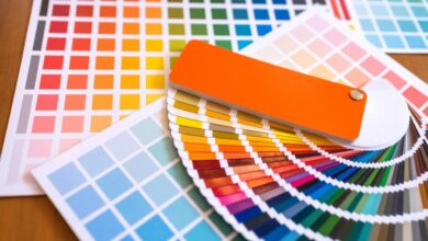
Choosing the right color palette and typography is crucial for creating a trendy and effective website. These elements work in tandem to establish a website’s visual identity, influencing user perception and ultimately, engagement. A well-chosen combination can evoke specific emotions, guide the user’s eye, and reinforce the brand’s message. Conversely, a poorly chosen combination can confuse or even repel visitors.Color palettes and typography are deeply intertwined.
The colors chosen will often dictate the types of fonts that work best alongside them, ensuring visual harmony and readability. For instance, a bold, vibrant color scheme might pair well with a strong, geometric sans-serif font, while a softer, pastel palette might be better suited to a more delicate, script-style font.
Current Trends in Color Palettes
Currently, we’re seeing a move away from overly saturated, bright colors towards more muted and sophisticated palettes. Earthy tones, pastel shades, and deep jewel tones are all highly popular. The use of contrasting colors is still important for creating visual interest and hierarchy, but the contrast is often more subtle and nuanced than in previous years. Think less jarring neon combinations and more harmonious blends of complementary shades.
The trend leans towards palettes that feel calming and sophisticated, reflecting a desire for more minimalist and user-friendly designs.
Comparison of Three Color Palette Approaches
We can examine three distinct color palette approaches and their associated emotional impacts:
- Monochromatic Palettes: These use variations of a single color, creating a sense of unity and sophistication. Think of different shades and tints of a deep teal, ranging from a dark navy to a light, almost aqua blue. This approach feels calming and elegant, suitable for brands aiming for a sense of luxury or tranquility. For example, a spa or high-end jewelry website might utilize this approach.
- Complementary Palettes: These use colors opposite each other on the color wheel, such as blue and orange or purple and yellow. This creates a high level of contrast, making the design visually striking and energetic. However, it’s crucial to use these colors thoughtfully to avoid overwhelming the user. A website using a complementary palette might aim for a bold and memorable impression, perhaps for a tech startup or a vibrant fashion brand.
A well-balanced complementary palette can be extremely effective in drawing attention to key elements.
- Analogous Palettes: These use colors that are adjacent to each other on the color wheel, creating a harmonious and cohesive feel. For example, shades of green, blue-green, and blue would form an analogous palette. This approach is calming and visually pleasing, often used for websites focusing on nature, wellness, or sustainability. The resulting design often feels peaceful and approachable.
Popular Fonts in Trendy Website Design, Trendy website design in or out
The choice of font significantly impacts a website’s readability and overall aesthetic. Here are five popular fonts currently used in trendy website design:
- Montserrat: A geometric sans-serif font, Montserrat is highly versatile and legible, suitable for body text and headlines. Its clean lines and neutral feel make it appropriate for a wide range of websites.
- Open Sans: Another popular sans-serif font, Open Sans is known for its excellent readability and wide character support. Its friendly and approachable feel makes it a good choice for websites aiming for a welcoming and inclusive atmosphere.
- Lato: A humanist sans-serif font, Lato strikes a balance between modernity and approachability. Its slightly rounded forms offer a softer aesthetic compared to purely geometric sans-serif fonts, enhancing readability and creating a more welcoming feel.
- Playfair Display: A serif font with elegant and classic features, Playfair Display is often used for headlines and titles. Its refined look lends itself to websites aiming for a sophisticated or luxurious feel.
- Poppins: A geometric sans-serif font with a contemporary feel, Poppins offers excellent readability and is suitable for both body text and headings. Its clean and modern aesthetic makes it a popular choice for various website styles.
Animation and Motion Design
Subtle animation and motion design are no longer a luxury in website design; they’re a necessity for creating engaging and memorable user experiences. In today’s fast-paced digital world, captivating visuals are key to grabbing attention and keeping visitors on your site. Well-executed animation can guide users, highlight important information, and ultimately, boost conversions.Animation, when used thoughtfully, adds a layer of personality and interactivity that static designs simply can’t match.
It’s about enhancing the user journey, making navigation intuitive and enjoyable, and leaving a lasting positive impression. Overused or poorly implemented animation, however, can be distracting and detrimental, so a delicate balance is crucial.
Examples of Effective Website Animation
The effectiveness of animation hinges on its purpose and execution. It shouldn’t be flashy for the sake of it; instead, it should serve a clear function within the overall user experience. Consider these examples:Airbnb utilizes subtle animations on hover effects for their property listings. As a user mouses over a listing, a subtle zoom effect occurs, drawing the eye to the image and creating a more engaging browsing experience.
This enhances user interaction without being distracting. The animation is directly tied to user interaction, providing immediate visual feedback.Another example is the loading animations often found on websites. Instead of a static loading bar, many sites now use creative animations – perhaps a spinning icon or a progress circle that fills with color. This replaces a potentially frustrating wait with a visually appealing and reassuring experience.
The animation provides feedback on the progress of a task, reducing user anxiety.
Website Animation Example: An E-commerce Product Page
Let’s imagine an e-commerce website selling handcrafted jewelry. We can incorporate animation to elevate the user experience on a product page:* Type of Animation: Parallax scrolling effect on the product image, subtle animations on hover for the “Add to Cart” button, and a smooth transition animation when a user clicks on different product images in a gallery.
Triggers
Parallax scrolling is triggered by the user scrolling down the page. The button animation is triggered by hovering the mouse over the button. Image transitions are triggered by clicking on a thumbnail in the product image gallery.
Impact on User Experience
The parallax scrolling creates a sense of depth and visual interest, drawing the user’s attention to the product’s details. The button animation provides visual feedback and encourages interaction. The smooth image transitions provide a polished and professional feel, making browsing the product images a more enjoyable experience. The overall effect enhances engagement and encourages purchases.
Responsiveness and Accessibility
Source: bizcaboom.com
In today’s multi-device world, a website’s success hinges on its ability to adapt seamlessly to various screen sizes and user capabilities. Ignoring responsiveness and accessibility is not just bad design; it’s bad business. A website that’s difficult to navigate or inaccessible to a significant portion of the population is missing out on a huge audience and potentially damaging its brand reputation.Responsiveness ensures a positive user experience by automatically adjusting the layout and content to fit the device being used, whether it’s a desktop computer, a tablet, or a smartphone.
Accessibility, on the other hand, focuses on making the website usable by people with disabilities, encompassing visual, auditory, motor, and cognitive impairments. Both are crucial for creating a truly inclusive and user-friendly online experience.
Responsive Design Implementation
Responsive design relies primarily on flexible layouts, using CSS media queries to apply different styles based on screen size. For example, a website might display a three-column layout on a desktop, but switch to a single-column layout on a mobile phone, ensuring readability and ease of navigation. Fluid grids and flexible images (using percentage-based widths instead of fixed pixels) are also essential components.
Consider the popular e-commerce site, Amazon. Its website effortlessly adapts to various screen sizes, maintaining a consistent user experience regardless of the device used. The navigation remains intuitive, product images adjust proportionally, and the checkout process remains smooth across all platforms. This is a prime example of effective responsive design.
Accessibility Features and Considerations
Designing accessible websites involves adhering to guidelines like WCAG (Web Content Accessibility Guidelines). Key considerations include providing alternative text for images (so screen readers can describe them to visually impaired users), using sufficient color contrast between text and background (to improve readability for users with low vision), ensuring keyboard navigation is fully functional (for users who cannot use a mouse), and providing captions and transcripts for videos and audio content.
Furthermore, structured HTML and semantic markup are vital for screen readers to properly interpret the website’s content. For instance, using heading tags (
to
) not only improves but also provides a clear structure for assistive technologies. A website that fails to meet these standards excludes a substantial segment of its potential audience.
Example Website Incorporating Responsiveness and Accessibility
Example Website Incorporating Responsiveness and Accessibility
Imagine an online bookstore website. On a desktop, it displays a three-column layout: a navigation bar, a main content area showcasing featured books and genres, and a sidebar with recommendations and user reviews. On a tablet, it collapses into a two-column layout, merging the sidebar with the main content area. On a smartphone, it becomes a single-column layout, prioritizing clear navigation and easy access to book details.To ensure accessibility, all images include descriptive alt text, color contrast ratios meet WCAG standards, keyboard navigation is fully functional, and all videos have captions.
The website also uses ARIA attributes (Accessible Rich Internet Applications) to enhance the accessibility of interactive elements. The site’s font size is adjustable, and users can easily change the color scheme to improve readability. This design ensures that all users, regardless of their abilities or devices, can easily browse, search for, and purchase books. The clear and logical information architecture, combined with thoughtful accessibility features, creates a welcoming and inclusive online experience.
Illustrations and Imagery
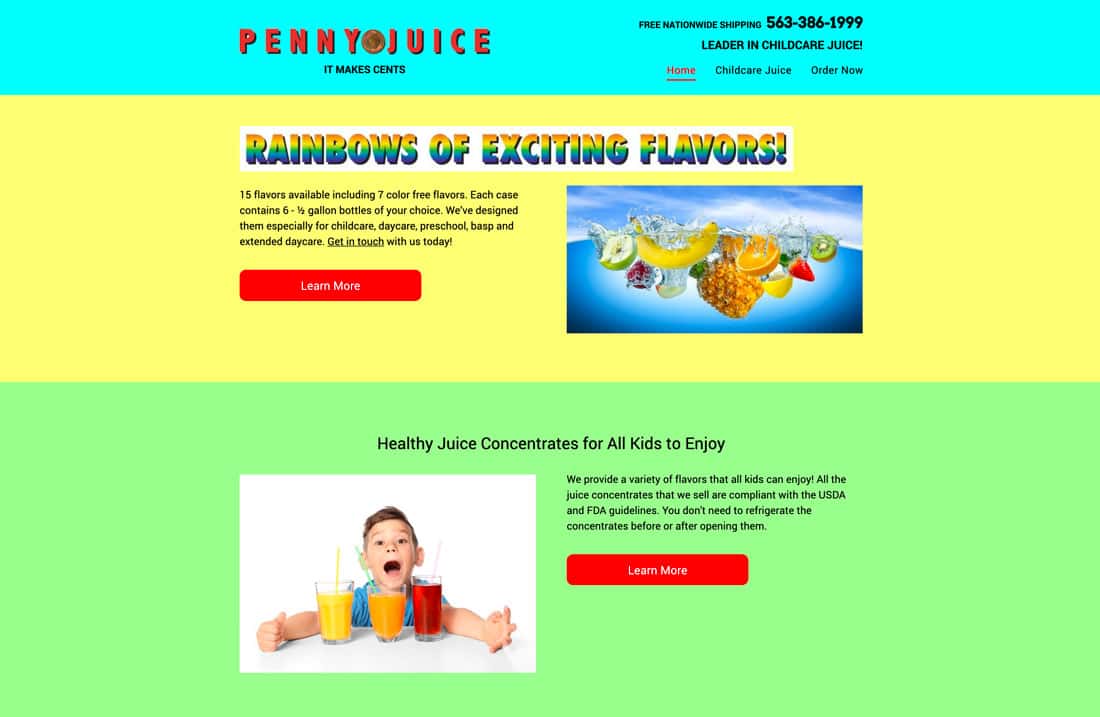
Source: designshack.net
Illustrations and imagery are no longer mere decorative elements on websites; they’re powerful tools shaping user experience, brand identity, and overall aesthetic appeal. The right visuals can instantly communicate a brand’s personality, values, and even its message, making them crucial in today’s competitive digital landscape. Choosing the right style and imagery is key to creating a website that resonates with its target audience.
Current Illustration Styles in Website Design
Three distinct illustration styles currently dominate trendy website design, each offering a unique aesthetic and communicative potential. These styles often blend and evolve, but understanding their core characteristics helps designers make informed choices.
- Flat Illustration: Characterized by its minimalist approach, flat illustrations use solid colors, clean lines, and lack of shading or texture. Color palettes are often bold and vibrant, or conversely, muted and pastel. Line weights are generally consistent and thin, creating a sense of simplicity and clarity. The overall aesthetic is modern, clean, and easily digestible, perfect for conveying information quickly and efficiently.
Think of apps like Slack or early versions of Airbnb – their use of flat illustrations is iconic.
- Isometric Illustration: This style utilizes a three-quarter perspective, giving a sense of depth and dimension without the complexity of full 3D rendering. Isometric illustrations often employ a limited color palette, sometimes sticking to a single dominant color with subtle variations or accents. Line weights can vary to create emphasis, but generally maintain a clean and consistent feel. The aesthetic is playful yet sophisticated, lending itself well to tech-focused websites or those aiming for a friendly, approachable feel.
Think of many SaaS company websites which leverage this to show interconnected systems or workflows.
- Hand-drawn Illustration: This style embraces a more organic and personal feel. Hand-drawn illustrations can range from loose and sketchy to more refined and detailed, but always retain a sense of human touch. Color palettes are often warm and inviting, or expressive and bold, depending on the desired mood. Line weights are variable and expressive, reflecting the natural flow of hand-drawn lines.
The overall aesthetic is authentic, relatable, and emotionally engaging, making it suitable for brands emphasizing craftsmanship, creativity, or a personal connection with their audience. Consider websites showcasing handmade goods or artistic portfolios as examples.
Imagery’s Contribution to Mood and Brand Identity
Imagery significantly impacts a website’s overall mood and brand identity. High-quality, well-chosen photographs or illustrations can evoke specific emotions, reinforce brand messaging, and create a cohesive visual experience. For instance, a website using dark, moody imagery might project an air of sophistication or mystery, while a site filled with bright, cheerful images might convey playfulness and optimism. The consistency of the imagery style – whether it’s photorealistic, abstract, or illustrative – directly contributes to a strong brand identity.
Using a diverse range of inconsistent imagery can dilute the overall brand message and create a confusing experience for users.
Illustrative Concept for a Hypothetical Website
Let’s imagine a website for a sustainable coffee company, “Bean There, Grown That.” The website would use a hand-drawn illustration style, incorporating elements of nature and coffee production. The illustrations would depict coffee beans growing on plants, hands harvesting coffee cherries, and the brewing process, all rendered in a warm, earthy color palette dominated by greens, browns, and creams, with accents of deep reds and oranges.
Line weights would be varied to create a sense of movement and dynamism, while retaining a rustic and handmade aesthetic. The purpose of these illustrations is to convey the company’s commitment to ethical sourcing, sustainable practices, and the craft of coffee making, creating a visual narrative that aligns perfectly with their brand values. The overall effect would be inviting, authentic, and visually appealing, drawing the user into the brand’s story.
Navigation and Information Architecture: Trendy Website Design In Or Out
Designing a website’s navigation and information architecture (IA) is crucial for a positive user experience. A well-structured site allows users to easily find what they need, reducing frustration and improving engagement. Poor IA, on the other hand, leads to high bounce rates and lost conversions. Essentially, it’s about making your website’s content logically organized and easily accessible.Effective website navigation and information architecture hinge on several key principles.
Firstly, clarity is paramount; users should instantly understand the site’s structure and how to navigate it. Secondly, consistency is key; navigation elements should be placed consistently across all pages, creating a predictable and familiar experience. Thirdly, efficiency is vital; users should be able to reach their desired information with minimal clicks or steps. Finally, discoverability ensures users can find unexpected content or features, encouraging exploration.
Mega Menu versus Hamburger Menu
Mega menus and hamburger menus represent two popular approaches to website navigation. A mega menu displays all navigation options in a large, expandable panel, often showcasing subcategories and visual elements. A hamburger menu, on the other hand, uses a three-line icon to conceal a dropdown navigation menu.Mega menus offer the advantage of immediate visibility. Users can quickly scan and select their desired page.
However, they can become cluttered and overwhelming if poorly designed, especially on smaller screens. Furthermore, they can significantly increase page load times if not optimized properly.Hamburger menus, conversely, are space-saving and clean, especially beneficial for mobile devices. They maintain a minimal visual footprint. The downside is that the navigation is hidden, requiring an extra click to access.
This can lead to a less intuitive experience, particularly for users unfamiliar with this type of navigation. The effectiveness of a hamburger menu depends heavily on clear labeling and intuitive organization within the dropdown menu. Consider using icons in conjunction with text for enhanced clarity.
Example Sitemap: Hypothetical E-commerce Website for Sustainable Goods
A well-structured sitemap is essential for organizing content and ensuring logical navigation. Below is an example sitemap for a hypothetical e-commerce website selling sustainable goods:
- Homepage
- Featured Products
- New Arrivals
- About Us
- Sustainability Initiatives
- Shop
- Clothing
- Men’s
- Women’s
- Children’s
- Home Goods
- Beauty Products
- Accessories
- Clothing
- Blog
- Sustainable Living Tips
- Product Spotlights
- Behind the Scenes
- Account
- Login/Register
- Order History
- Saved Items
- Contact Us
Final Conclusion

Source: wixstatic.com
So, is trendy website design “in” or “out”? The answer, as with most things, is nuanced. Blindly following trends is a recipe for disaster; instead, focus on creating a website that aligns with your brand identity, caters to your target audience, and provides a seamless user experience. By understanding the principles of effective design – from visual hierarchy and color palettes to animation and accessibility – you can create a website that’s not only stylish but also functional and engaging.
Remember, it’s about striking a balance between current aesthetics and timeless design principles. Let’s get designing!
FAQ Section
What’s the difference between UI and UX design?
UI (User Interface) design focuses on the visual aspects and interaction elements of a website, while UX (User Experience) design focuses on the overall user journey and satisfaction.
How often should I update my website’s design?
There’s no set timeframe. Update when your brand evolves, your target audience changes, or your website’s functionality needs improvement. Small tweaks are often better than complete overhauls.
Should I use a website builder or hire a professional designer?
It depends on your budget, technical skills, and design needs. Website builders are great for simple sites, but professional designers offer more customization and expertise.
What are some free resources for learning about web design?
Many online courses, tutorials, and blogs offer free web design education. Sites like YouTube, Skillshare (often offers free trials), and various design blogs are excellent starting points.

