5 Great Seasonal Infographics Design & Ideas
5 Great Seasonal Infographics – that’s what we’re diving into today! Think vibrant spring blooms bursting onto the page, sun-drenched summer vacations, the cozy hues of autumn harvests, and the crisp winter wonderland of holiday cheer. We’ll explore how to design stunning infographics that capture the essence of each season, using data visualization to tell compelling stories and engage your audience.
From choosing the perfect color palettes to selecting the most effective chart types, we’ll cover everything you need to know to create infographics that are not only visually appealing but also informative and impactful. We’ll look at examples, brainstorm ideas, and even delve into the psychology of seasonal color choices to help you create truly memorable visuals.
Introduction

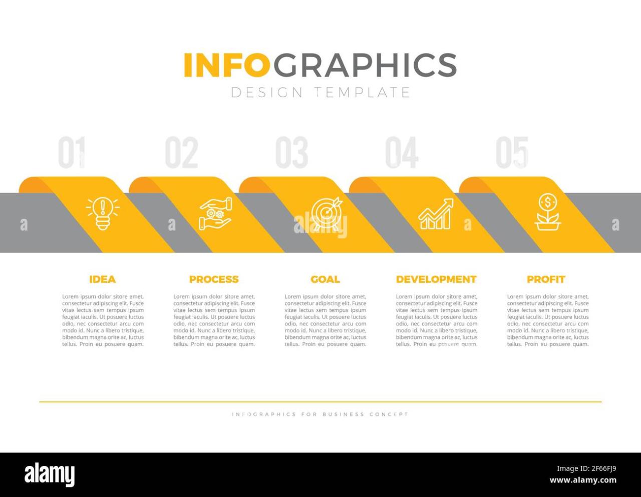
Source: alamy.com
Seasonal infographics are visually engaging data representations designed to communicate information relevant to a specific time of year. Their purpose is to present complex data in a clear, concise, and memorable way, making it easily digestible for a wide audience. They leverage the power of visuals to capture attention and enhance understanding, especially during periods when specific seasonal information is highly relevant.Well-designed seasonal infographics offer several advantages.
They can significantly improve information retention compared to text-heavy reports. The use of compelling visuals, such as charts, graphs, and icons, makes data more accessible and interesting, leading to increased engagement and understanding. This can be particularly crucial for conveying complex information, such as weather patterns or holiday shopping trends, in a way that is easily grasped by the general public.
A successful infographic can drive action, whether it’s encouraging consumers to purchase a product, preparing for a seasonal event, or taking precautions against seasonal hazards.
Types of Seasonal Infographics
Seasonal infographics encompass a wide variety of topics and formats. They can be categorized based on their subject matter and intended audience.
- Holiday-themed infographics often present data related to holiday spending, travel trends, or popular gift ideas. For example, an infographic could show the projected increase in online shopping during the holiday season, comparing it to previous years and highlighting the most popular product categories. A visual representation of this data, using a bar chart comparing year-over-year sales, would be far more impactful than a simple paragraph of text.
- Weather-related infographics provide information on seasonal weather patterns, temperature forecasts, or safety tips. Imagine an infographic displaying the average snowfall in different regions during winter, accompanied by a map highlighting areas at higher risk of blizzards. This visually communicates potential hazards and necessary preparations much more effectively than a lengthy weather report.
- Event-focused infographics can highlight key data about upcoming seasonal events, such as festivals, concerts, or sporting events. For instance, an infographic could showcase the schedule of a summer music festival, highlighting the different stages, performers, and ticket prices. A clear visual timeline, combined with icons representing different musical genres, would make the information immediately accessible and engaging.
Infographic Design Principles for Seasonal Themes
Creating effective seasonal infographics requires a thoughtful approach to design, ensuring the visual elements seamlessly blend with the thematic essence of the season. A well-designed infographic not only presents information clearly but also evokes the appropriate emotional response, immersing the viewer in the seasonal spirit. This involves a strategic use of color, compelling imagery, and a clear visual hierarchy.
Color Palettes for Seasonal Feelings
The selection of a color palette is paramount in establishing the mood and atmosphere of a seasonal infographic. Colors are powerful tools for triggering emotional responses and associations. For example, warm, earthy tones like burnt orange, deep reds, and golden yellows are immediately evocative of autumn, while cool blues and greens are strongly associated with winter. A vibrant, bright palette might be suitable for spring, contrasting with the more subdued tones of a winter infographic.
The strategic use of color can significantly enhance the impact and memorability of the infographic. Consider using analogous color schemes (colors adjacent on the color wheel) for a harmonious feel, or complementary color schemes (colors opposite each other on the color wheel) for a more striking contrast.
Visual Hierarchy in Seasonal Infographics
Visual hierarchy guides the viewer’s eye through the infographic, ensuring key information is readily apparent. This is achieved through the strategic use of size, color, font, and placement. Larger, bolder text and images draw attention to the most important information, while smaller, less prominent elements provide supporting details. Think of it as a visual roadmap, leading the viewer on a clear path through the data.
Using white space effectively can also significantly improve readability and visual clarity. Avoid overcrowding the design; allow sufficient breathing room between elements to prevent visual clutter. For a fall-themed infographic, for instance, you might use a large, central image of falling leaves, with supporting data points arranged in a visually pleasing and logical manner around it.
Sample Fall-Themed Color Palette, 5 great seasonal infographics
A suitable color palette for a fall-themed infographic could include:
- Deep Burnt Orange (#CC5500): This rich, warm tone captures the essence of autumn leaves.
- Rustic Brown (#A0522D): Represents the earthy tones of the season, grounding the palette.
- Golden Yellow (#FFD700): Adds a touch of brightness and warmth, reminiscent of falling leaves in sunlight.
- Dark Olive Green (#808000): Provides a subtle contrast and complements the other colors, suggesting nature’s abundance.
- Creamy Beige (#F5F5DC): Acts as a neutral background, allowing the other colors to pop and enhancing readability.
This palette offers a visually appealing combination of warm and earthy tones, perfectly capturing the spirit of autumn. Remember that slight variations in shade and saturation can create a more nuanced and sophisticated look. The key is to maintain a balance and ensure the colors work harmoniously together.
Five Great Seasonal Infographic Ideas
Infographics are a powerful way to communicate complex data in a visually appealing and easily digestible format. Seasonal themes offer a particularly engaging context, allowing for the creation of infographics that are both informative and relevant to current events or personal experiences. By focusing on data visualization principles and a clear understanding of the target audience, we can create infographics that are not only beautiful but also highly effective.
Seasonal Infographic Concepts
Below are five infographic concepts, each representing a different season or holiday, detailing the data to be visualized, the target audience, and their likely interest. These examples highlight the diverse applications of seasonal infographics across various topics and audiences.
| Season/Holiday | Data Visualized | Target Audience | Audience Interest |
|---|---|---|---|
| Spring | Average temperatures and rainfall across different regions of a country, alongside blooming periods of various common flowers. This could include a comparison year-over-year to show trends in climate change. A map could visually represent the data, with color-coding representing temperature and rainfall, while a separate chart would show the blooming periods. | Gardeners, hikers, tourists, weather enthusiasts | Planning outdoor activities, understanding seasonal changes, tracking climate patterns. |
| Summer | Popularity of different vacation destinations based on booking data from travel agencies, showing the peak seasons and average cost per trip. A bar chart could represent the popularity, with a supplementary pie chart displaying the cost breakdown. | Travel agencies, potential vacationers, travel bloggers | Planning summer getaways, comparing destination costs, identifying popular travel trends. |
| Autumn | Leaf color change progression across different tree species, correlated with average temperatures and daylight hours. A timeline could track the leaf color change, with supplementary charts showing temperature and daylight trends. Images of the leaves in their various colors could enhance the visual appeal. | Nature enthusiasts, photographers, botanists, students | Understanding the autumnal process, appreciating the beauty of fall foliage, observing natural phenomena. |
| Winter | Comparison of snowfall amounts across various ski resorts, incorporating data on average snowfall, peak season, and resort amenities. A bar chart could visually compare snowfall, while a table could list amenities and peak seasons. Images of snow-covered landscapes could be included to enhance the visuals. | Skiers, snowboarders, winter sports enthusiasts, travel planners | Planning winter vacations, comparing resort options, understanding snowfall patterns. |
| Halloween | Popularity of different Halloween costumes over the past decade, analyzed from online sales data and social media trends. A line graph could show the trend of costume popularity over time, with a separate chart representing the most popular costumes for each year. | Costume designers, retailers, event planners, Halloween enthusiasts | Identifying trending costumes, understanding consumer preferences, planning Halloween events. |
Data Visualization Techniques for Seasonal Data

Source: behance.net
Choosing the right chart type is crucial for effectively communicating seasonal data. Different chart types highlight different aspects of the data, making some more suitable than others depending on the story you want to tell. Understanding these nuances allows you to create infographics that are not only visually appealing but also insightful and easy to interpret.Visualizing seasonal trends requires careful consideration of the data’s characteristics and the message you aim to convey.
The goal is to create a clear, concise, and visually engaging representation that facilitates understanding at a glance. By using appropriate techniques, you can transform complex seasonal data into compelling narratives.
Comparison of Chart Types for Seasonal Data
Bar charts, line graphs, and pie charts are common choices for visualizing data, each with strengths and weaknesses when applied to seasonal data. Bar charts excel at comparing values across different seasons or months. For example, a bar chart could clearly show sales figures for each quarter of the year, allowing for immediate comparison of performance across those periods.
Line graphs, on the other hand, are ideal for showcasing trends over time. They effectively illustrate the rise and fall of sales throughout the year, highlighting seasonal peaks and troughs. A line graph would be perfect for displaying monthly website traffic over a year, demonstrating seasonal fluctuations. Pie charts, while useful for showing proportions, are less effective for seasonal data unless you are comparing the proportion of sales attributed to different productswithin* a single season.
For example, a pie chart could show the breakdown of sales across different product lines during the holiday season.
Best Chart Type for Illustrating Seasonal Sales Trends
Line graphs are generally the most suitable for illustrating seasonal sales trends. Their ability to smoothly connect data points across time clearly reveals the cyclical nature of seasonal sales patterns. The visual representation of the upward and downward trends makes it easy to identify peak seasons, low seasons, and the overall trajectory of sales over the year. For instance, a line graph showing ice cream sales would dramatically illustrate the increased sales during summer months and the decline in colder seasons.
While bar charts can show sales figures for each season, they lack the visual flow that a line graph provides to highlight the continuous trend.
Using Icons and Illustrations to Enhance Seasonal Infographics
Icons and illustrations significantly improve the visual appeal and understanding of seasonal data. They add a layer of context and engagement, making the infographic more memorable and easier to comprehend. For example, depicting summer with a sun icon and winter with a snowflake next to relevant data points instantly establishes the season and context. Similarly, using icons representing products or services alongside sales figures helps viewers quickly grasp the data’s meaning.
Illustrations can be even more powerful, adding a visual narrative that complements the data. A charming illustration of a family enjoying a summer picnic could accompany data on peak summer tourism, adding emotional resonance to the numbers.
Appropriate Data Visualization Methods for Various Seasonal Trends
The choice of visualization method depends heavily on the specific seasonal trend being illustrated.
- For showing sales figures across different seasons: Bar charts are effective for direct comparison.
- For illustrating the trend of sales over time: Line graphs best show the continuous fluctuation and peaks.
- For comparing the proportion of sales from different product categories within a season: Pie charts are appropriate for displaying relative proportions.
- For highlighting key seasonal events and their impact on sales: Annotated line graphs or bar charts with callouts can effectively pinpoint specific events.
- For showing the correlation between weather patterns and sales: Scatter plots can visually represent the relationship between temperature, rainfall, and sales figures.
Illustrative Examples of Seasonal Infographics
Creating effective seasonal infographics requires a thoughtful approach to both design and data representation. The following examples demonstrate how different visual elements and data visualization techniques can be employed to effectively communicate seasonal information across various themes. Each example focuses on a specific season and topic, highlighting the unique opportunities presented by each.
Spring Plant Growth Stages Infographic
This infographic visually charts the life cycle of a common spring plant, perhaps tulips or daffodils. The color scheme would be bright and cheerful, utilizing various shades of green, yellow, and light pink or purple, reflecting the vibrant colors of springtime. Each stage of growth – from seed to sprout to bud to bloom – would be represented by a simple, yet detailed, illustration.
Icons depicting sunlight, water droplets, and soil could be used to highlight essential growth factors. A timeline running horizontally would visually represent the progression of time, with clear labels indicating each stage’s duration. The overall style would be clean and uncluttered, emphasizing clarity and ease of understanding.
Summer Vacation Destinations Infographic
This infographic focuses on popular summer vacation spots, potentially categorized by region or type of destination (beach, mountains, city). A world map would serve as the central visual element, with different colored pins or icons indicating various locations. The size of each pin could represent the popularity of the destination, based on data such as tourist numbers or online search volume.
A legend would clearly define the color-coding system. Additional data, such as average temperatures or typical weather conditions, could be incorporated using small charts or graphs next to each location marker. The color palette would consist of warm, inviting colors associated with summer, such as blues, greens, yellows, and oranges.
Autumn Harvest Yields Infographic
This infographic illustrates harvest yields for various autumn crops, like pumpkins, apples, and corn. A warm, earthy color scheme would be used, featuring shades of orange, brown, red, and gold, reflecting the autumnal palette. Data could be presented using bar charts, comparing the yields of different crops across different regions or years. Pie charts could also be incorporated to show the proportion of each crop within the overall harvest.
Illustrations of the different crops, realistically rendered, would be strategically placed throughout the infographic to enhance visual appeal and reinforce the topic. The overall design would convey a sense of abundance and the bounty of the harvest season.
So I’ve been working on these 5 great seasonal infographics, and honestly, the design process has been a blast! To get them out there effectively, though, I’ve been diving into video marketing, and check out this awesome guide on getting it on with youtube – it’s seriously helped me level up my YouTube game. Back to those infographics – I can’t wait to share the final versions!
Winter Holiday Shopping Trends Infographic
This infographic would depict trends in holiday shopping, focusing on data such as spending habits, popular gift categories, and online versus in-store purchases. Line charts would be ideal for showing trends over time, perhaps comparing spending data across several years. Bar charts could be used to illustrate the popularity of different gift categories. A color scheme of cool blues, greens, and silvers, along with festive reds and golds, would create a visually appealing contrast.
Visual elements like gift boxes, shopping bags, and Christmas trees could be subtly incorporated to reinforce the holiday theme. The data used would be sourced from reputable market research firms and consumer spending reports.
Last Point
Source: shutterstock.com
Creating effective seasonal infographics isn’t just about pretty pictures; it’s about leveraging visual storytelling to connect with your audience on an emotional level. By understanding your target audience, selecting appropriate data visualization techniques, and paying attention to design details, you can craft infographics that resonate deeply and leave a lasting impression. So, get inspired, get creative, and start visualizing the seasons!
Q&A: 5 Great Seasonal Infographics
What software can I use to create seasonal infographics?
Many options exist! Popular choices include Canva, Adobe Illustrator, and Piktochart. Each offers different features and levels of complexity.
How can I ensure my infographics are accessible to everyone?
Use clear fonts, sufficient color contrast, and alt text for images. Consider different learning styles and keep your information concise and easy to understand.
Where can I find data for my seasonal infographics?
Government websites, industry reports, and market research firms are great sources. Don’t forget to cite your sources properly!


