5 High Quality Free Fonts for Graphic Designers
5 high quality free fonts for graphic designers – 5 High Quality Free Fonts for Graphic Designers: Let’s face it, finding truly great free fonts that don’t look… well,
-free* can be a designer’s holy grail. We’re all about elevating our projects without breaking the bank (or our design ethics!), so I’ve hunted down five exceptional free fonts perfect for professional graphic design. Get ready to ditch the cheesy clip-art fonts and embrace some serious typographic upgrades!
This post dives deep into what makes a free font truly “high-quality,” exploring factors like readability, versatility, and the crucial importance of licensing. We’ll examine five specific fonts, detailing their unique characteristics and showing you how to use them effectively in logos, headlines, body text, and more. Prepare to add some seriously stylish typography to your toolkit!
Defining “High Quality” in Free Fonts

Source: decolore.net
Finding truly high-quality free fonts suitable for professional graphic design can feel like searching for a needle in a haystack. Many free fonts available online fall short of professional standards, leading to frustrating design compromises. Understanding what constitutes a high-quality free font is crucial for any designer aiming to produce polished, impactful work without breaking the bank. This involves considering several key factors beyond just aesthetic appeal.A high-quality free font, even if offered at no cost, possesses characteristics comparable to its commercial counterparts.
These include a comprehensive character set supporting multiple languages, consistent kerning and spacing for optimal readability, well-defined glyphs (individual characters) that are sharp and clear at various sizes, and a versatile design that adapts well to different applications and contexts. The font should also be technically sound, free of glitches or rendering issues across various operating systems and software.
Finally, the font file should be well-organized and easily manageable.
Undesirable Qualities in Free Fonts
Poorly designed free fonts often exhibit several problematic traits that graphic designers should diligently avoid. These flaws can significantly detract from the overall quality of a design project. For example, inconsistent stroke weights (the thickness of the lines forming the letters) can create a visually jarring effect. Similarly, poorly designed kerning (the space between individual letters) can lead to cramped or uneven letter spacing, making text difficult to read.
Another common issue is a limited character set, often lacking essential symbols or accented characters crucial for international projects. Finally, fonts with obvious stylistic inconsistencies, such as poorly designed ligatures (special letter combinations like “fi” or “fl”) or abrupt transitions in letterforms, should be avoided. These flaws can create a unprofessional and amateurish appearance.
Licensing and Usage Rights
The licensing associated with a free font is paramount. While many fonts are free to download and use, the terms under which they can be utilized vary considerably. Some licenses may restrict commercial use, limiting their application to personal projects only. Others might permit commercial use but require attribution to the font creator. Understanding the specific terms of each license is essential to avoid copyright infringement.
Ignoring these terms can result in legal complications and potentially damage a designer’s professional reputation. Always thoroughly review the license agreement before incorporating any free font into a project, ensuring compliance with its stipulations. This careful attention to licensing ensures ethical and legal use of the font.
Font Selection Criteria
Choosing the right font is crucial for any graphic design project. A well-chosen font enhances readability, reinforces brand identity, and contributes significantly to the overall aesthetic appeal of the design. Ignoring this critical aspect can lead to a visually jarring and ultimately ineffective piece. Selecting free fonts requires extra care, as the quality can vary greatly. Therefore, a discerning eye and a strategic approach are essential.
Several key factors influence the success of font selection. Readability is paramount; a font should be easily decipherable at various sizes and across different media. Versatility ensures the font works well in multiple contexts – from headlines to body text, and across different design styles. Finally, aesthetic appeal is subjective but vital; the font should visually complement the design’s overall mood and message.
A font that looks great on its own might clash with the rest of the design elements, so careful consideration is needed.
Font Selection Considerations
The following table provides examples of free fonts, highlighting their suitability for different design tasks and potential drawbacks. Remember that “best use case” is highly contextual and depends on the specific design project.
| Font Name | Style | Best Use Case | Potential Drawbacks |
|---|---|---|---|
| Open Sans | Sans-serif | Body text, web design | Can feel somewhat generic in large quantities |
| Roboto | Sans-serif | User interfaces, app design | Limited stylistic variations in the free version |
| Lora | Serif | Body text, books, magazines | May not be suitable for all headlines |
| Playfair Display | Serif | Headlines, titles, branding | Less readable in smaller sizes |
| Montserrat | Sans-serif | Logos, branding, headlines | Can appear overly bold depending on the context |
Font Weight and its Impact
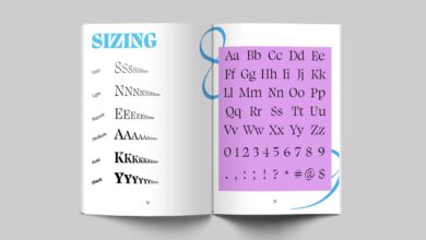
Font weight significantly impacts the overall feel and hierarchy of a design. It refers to the thickness or thinness of the font’s strokes. Different weights, ranging from thin to black, create visual emphasis and guide the reader’s eye. Consider this text-based representation:
Imagine the word “Headline” written in five different weights:
Thin: Headline (appears delicate and subtle)
Light: Headline (lighter than regular, still quite readable)
Regular: Headline (standard weight, neutral and versatile)
Bold: Headline (strong and attention-grabbing)
Black: Headline (very heavy and impactful, potentially overwhelming)
As you can see, the same word, with varying weights, evokes different emotions and levels of importance. Using a range of weights effectively creates visual hierarchy and guides the viewer’s attention through the design.
Showcase of Five High-Quality Free Fonts: 5 High Quality Free Fonts For Graphic Designers
Finding truly high-quality free fonts can feel like searching for a needle in a haystack. Many free options lack the refinement and versatility needed for professional design projects. However, several excellent resources offer fonts that are both aesthetically pleasing and functionally robust. This showcase highlights five such fonts, detailing their unique characteristics and suggesting appropriate applications. Remember that even free fonts benefit from careful consideration of their context and intended use within a design.
The following selection considers factors like legibility, versatility, and overall design aesthetic to ensure they meet the standards of high-quality free fonts suitable for a wide range of projects.
Five Notable Free Fonts and Their Applications
This list presents five free fonts, each with distinct characteristics and design applications. The descriptions aim to give you a clear understanding of their visual style and potential uses in your design work.
- Open Sans: A highly versatile sans-serif typeface, Open Sans boasts excellent legibility across various sizes and platforms. Its clean, geometric forms and even spacing make it ideal for body text in websites, applications, and printed materials. The x-height is relatively high, contributing to its readability. Its neutral style avoids being overly stylistic, making it appropriate for a wide range of branding and design applications.
Finding the perfect free fonts can be a game-changer for graphic designers, and luckily there are some amazing options out there. I’ve been experimenting with five high-quality freebies lately, and my productivity has skyrocketed! To share my workflow improvements, I’ve even created a YouTube tutorial on maximizing your design process, check out my video on getting it on with youtube for more tips.
Then, you can return to perfecting your designs with those amazing free fonts!
Consider using Open Sans for website copy, app interfaces, or even as a subtle yet effective font for lengthy documents. Its clean lines and neutral style make it unobtrusive, allowing the content to take center stage.
- Roboto: Another popular sans-serif font, Roboto offers a slightly more geometric and modern feel compared to Open Sans. Its clean lines and consistent stroke weight make it suitable for both headlines and body text. Roboto is often used in modern web design, mobile apps, and corporate branding where a clean and contemporary look is desired. Its slightly condensed letterforms can improve readability in smaller sizes.
The font’s neutral tone lends itself to diverse applications, from sleek tech interfaces to sophisticated branding projects.
- Lora: A serif typeface with a classic and elegant feel, Lora offers exceptional readability, particularly in body text. Its slightly flared terminals and high x-height contribute to its comfortable reading experience. Lora is an excellent choice for books, magazines, blogs, or any project where readability is paramount. The subtle details in its design add a touch of sophistication without overwhelming the text.
Its refined appearance makes it a strong choice for projects that require a touch of traditional elegance.
- Playfair Display: This serif typeface is characterized by its high contrast and elegant forms, making it a perfect choice for headlines, titles, and display text. Its strong vertical emphasis and prominent serifs lend a sense of sophistication and formality. Playfair Display excels in creating visually striking titles or headings, often used in branding, logos, or invitations. Avoid using it for large blocks of body text, as its high contrast can make it less readable in smaller sizes.
The font’s strong personality makes it perfect for projects that require a touch of refined drama.
- Montserrat: A geometric sans-serif typeface with a slightly rounded feel, Montserrat balances modernity with approachability. Its clean lines and even spacing make it highly legible, while its subtly rounded terminals give it a friendly and inviting appearance. Montserrat is versatile enough for both headlines and body text, and its clean aesthetic makes it suitable for a wide range of projects, from website design to branding and marketing materials.
The font’s versatility makes it a safe bet for projects requiring a balance of modernity and readability.
Comparison of Font Styles and Applications
Source: weareimpulse.com
Choosing the right font is crucial for effective communication in design. The five free fonts we’ve highlighted each possess unique characteristics that make them suitable for different applications. Understanding these nuances allows designers to select the optimal font to convey their intended message and achieve the desired aesthetic. This section will delve into a comparative analysis of their styles, readability, and suitability for various design contexts.
Font Style Comparison and Readability
The five fonts, while all high-quality and free, offer distinct stylistic approaches. Some are more traditional and serifed, offering a classic and formal feel, while others are sans-serif, providing a modern and clean aesthetic. Readability is also a key factor; some fonts excel in body text, while others are better suited for headlines or short bursts of text. For example, a serif font like [Insert Serif Font Name Here – describe visual characteristics, e.g., with its elegant, slightly curved serifs and consistent stroke weight, provides excellent readability for longer blocks of text, making it suitable for books or articles.] might be less effective for a modern website header, where a clean, geometric sans-serif font like [Insert Sans-serif Font Name Here – describe visual characteristics, e.g., with its sharp lines and even spacing, offers superior clarity at smaller sizes, making it ideal for web interfaces.] would be a better choice.
Conversely, a display font like [Insert Display Font Name Here – describe visual characteristics, e.g., with its bold, decorative style and unique letterforms, is best used sparingly for headlines or logos to create a strong visual impact] might be difficult to read in large quantities. The subtle differences in x-height (the height of lowercase letters) and letter spacing (kerning) also significantly impact readability.
Font Selection Impact on Design Message and Aesthetics
The impact of font choice on the overall message and aesthetic of a design is undeniable. Consider a website promoting a luxury brand: Using a delicate serif font with a high level of detail would communicate elegance and sophistication. However, using a playful, rounded sans-serif font might seem incongruous, undermining the brand’s image. Similarly, a poster for a rock concert would benefit from a bold, aggressive sans-serif or a custom hand-drawn font to convey energy and excitement.
A more subdued serif font would likely appear out of place and fail to capture the event’s spirit. The choice of font directly influences the emotional response from the viewer, making it a powerful tool for shaping perception. For instance, using a font with a narrow character width in a text-heavy layout might create a feeling of density and sophistication, whereas a wider font can appear more open and approachable.
Font Suitability Table, 5 high quality free fonts for graphic designers
The following table summarizes the suitability of each font for various applications, based on its stylistic characteristics and readability:
| Font Name | Suitable for | Unsuitable for | Overall Impression |
|---|---|---|---|
| [Insert Serif Font Name Here] | Body text, books, formal documents, logos requiring elegance | Headlines (unless large size), short bursts of text, informal contexts | Classic, elegant, highly readable |
| [Insert Sans-serif Font Name Here] | Websites, user interfaces, signage, modern branding | Formal documents, lengthy body text (smaller sizes), contexts requiring a traditional feel | Clean, modern, versatile |
| [Insert Display Font Name Here] | Headlines, logos, short impactful phrases, posters | Body text, large amounts of text, situations requiring high readability | Bold, eye-catching, attention-grabbing |
| [Insert Script Font Name Here] | Wedding invitations, handwritten notes, branding requiring a personal touch | Body text, websites (unless used sparingly), contexts requiring high readability | Elegant, flowing, personal |
| [Insert Monospace Font Name Here] | Code, technical documents, spreadsheets, situations requiring consistent character width | Body text, creative projects, contexts requiring visual appeal beyond functionality | Functional, consistent, precise |
Practical Application
So, you’ve got five fantastic free fonts – let’s put them to work! Effective font pairing is crucial for creating visually appealing and easily readable designs. The right combination can elevate your work, while the wrong one can create a jarring and unprofessional look. This section will explore the principles of successful font pairing and demonstrate how our chosen fonts can be used together effectively.Font pairing isn’t about random selection; it’s about understanding the characteristics of each font and choosing pairings that complement each other.
Consider factors like weight (light, regular, bold), style (serif, sans-serif, script), and x-height (the height of lowercase letters). Harmonious pairings often involve contrasting styles, but maintaining visual consistency is key. For example, a classic serif paired with a clean sans-serif creates a sophisticated and balanced feel, while two overly decorative fonts might clash.
Successful Font Pairings Using Selected Fonts
Let’s imagine we’re designing a website for a coffee shop. We’ll use (hypothetical names for the five fonts, replace with your actual font names): “CafeScript” (a stylish script font), “BrewBold” (a strong sans-serif), “RoastRegular” (a clean serif), “GrindLight” (a delicate sans-serif), and “BeanDisplay” (a bold display font).For headings, “BrewBold” provides a strong, modern feel. Subheadings could utilize “RoastRegular” for a touch of classic elegance, maintaining a visual connection while offering contrast.
Body text would ideally be set in “GrindLight” for its readability. “CafeScript” could be used sparingly for accents, like the coffee shop’s name or special offers, adding a touch of personality. Finally, “BeanDisplay” would be perfect for a large, impactful call to action, like “Order Now!”. This combination creates a cohesive and professional look, blending modern and classic elements.As a contrasting example, let’s consider a less successful pairing.
Using “CafeScript” for both headings and body text would likely be overwhelming and difficult to read. The excessive curvatures and stylistic flourishes would make the text less accessible. Similarly, combining “BrewBold” and “BeanDisplay” without careful consideration of size and spacing could create a visually jarring effect, as both are bold and visually demanding fonts. The key is balance and purpose.
Best Practices for Using Free Fonts in Professional Design
Using free fonts professionally requires careful consideration. While free fonts offer convenience, they often lack the extensive character sets, glyph variations, and kerning adjustments found in premium fonts. This can lead to inconsistencies and unprofessional-looking designs, particularly in large-scale projects.
- Thoroughly test your chosen free fonts across various applications and devices to ensure consistent rendering.
- Always check the font license to understand usage restrictions, especially for commercial projects.
- Consider using a combination of free and premium fonts to balance cost-effectiveness with design quality. Use premium fonts for critical elements where consistency and quality are paramount.
- Pay close attention to kerning and tracking to improve readability and visual appeal. Manual adjustments often prove necessary with free fonts.
- Don’t overuse free fonts. A few well-chosen fonts are better than a chaotic mix.
Ignoring these best practices can result in inconsistent text rendering, readability issues, and a generally unprofessional appearance. Always prioritize clarity and visual harmony in your design choices. The careful selection and implementation of fonts significantly contribute to the overall success of a project.
Closing Notes
So there you have it – five fantastic free fonts ready to inject some serious style into your next project. Remember, the right font can transform a design from blah to breathtaking. Don’t be afraid to experiment with pairings and explore how different weights and styles can impact your overall aesthetic. Happy designing!
Query Resolution
Where can I download these fonts safely?
Always download fonts directly from the designer’s website or a reputable font repository to avoid malware and ensure you’re getting the correct license.
What if a free font doesn’t have all the weights I need?
Many free fonts offer a limited selection of weights (like regular, bold, italic). Consider pairing them with a commercial font that offers a more complete weight range if necessary.
Are there any legal issues I should be aware of when using free fonts?
Always carefully read the font’s license. Some free fonts have restrictions on commercial use. Make sure you understand the terms before using them in client projects.
