5 Reasons Your Design Falls Flat and How to Fix It
5 Reasons Your Design Falls Flat and How to Fix It – Ever wondered why your designs aren’t quite hitting the mark? Maybe your website feels clunky, your branding feels inconsistent, or your message just isn’t connecting. This post dives into five common design pitfalls – from unclear purpose and poor user experience to neglecting accessibility – and offers practical solutions to elevate your work.
We’ll explore how to define your target audience, improve navigation, master visual communication, establish a strong brand identity, and create inclusive designs that resonate with everyone.
We’ll break down each problem with real-world examples and actionable steps, so you can identify weaknesses in your own designs and transform them into something truly exceptional. Get ready to level up your design game!
Lack of Clear Purpose and Target Audience: 5 Reasons Your Design Falls Flat And How To Fix It
A design’s success hinges on a clear understanding of its purpose and the audience it aims to reach. Without this foundational knowledge, even the most aesthetically pleasing design will fall flat, failing to connect with its intended users and achieve its objectives. A poorly defined purpose leads to a disjointed, confusing, and ultimately ineffective design.Poorly defined purpose often manifests in three key design flaws: inconsistent messaging, irrelevant features, and a lack of user-centered design.
Inconsistent messaging confuses the user, leading to frustration and disengagement. Irrelevant features bloat the design, making it cumbersome and difficult to navigate. A lack of user-centered design means the design doesn’t consider the user’s needs, preferences, and behaviors, resulting in a poor user experience. For example, a website selling high-end handcrafted jewelry that uses a playful, cartoonish design aesthetic would be a stark mismatch between purpose and execution.
The target audience expects sophistication and elegance, not a whimsical cartoon.
Examples of Target Audience Impact on Design Choices
A clearly defined target audience significantly influences every design decision, from color palette and typography to layout and functionality. Consider a mobile app designed for senior citizens versus one designed for teenagers. The app for senior citizens would prioritize large, easily readable fonts, simple navigation, and high contrast colors to improve accessibility. The app for teenagers, on the other hand, might incorporate trendy visuals, interactive elements, and a more playful interface.
Understanding your audience allows you to tailor the design to their specific needs and preferences, maximizing engagement and usability. A children’s book, for instance, would employ bright, bold colors and simple illustrations, whereas a legal document would prioritize clear, concise language and a formal layout.
Hypothetical Scenario: Clear vs. Unclear Purpose
Imagine two websites selling handmade pottery. Website A, designed with a clear purpose and target audience (affluent art collectors), features high-quality photography, detailed product descriptions, and a sophisticated layout. It clearly communicates the artistry and value of the pottery. Website B, lacking a defined purpose and audience, features inconsistent imagery, unclear product information, and a cluttered layout. It fails to communicate a clear brand identity or value proposition.
Website A effectively targets its audience, leading to higher conversions and brand loyalty. Website B, on the other hand, confuses and frustrates visitors, resulting in low engagement and poor sales.
Methods for Conducting Thorough Audience Research
Effective audience research is crucial for informed design decisions. This involves gathering data through various methods such as surveys, interviews, focus groups, and analyzing user data from existing platforms. Surveys can efficiently collect quantitative data on user demographics and preferences. Interviews provide in-depth qualitative insights into user needs and motivations. Focus groups facilitate discussions and identify common pain points.
Analyzing existing user data reveals usage patterns and identifies areas for improvement. Combining these methods provides a comprehensive understanding of the target audience.
Comparison of Designs Targeting Different Demographics
| Demographic | Design Element | Rationale | Result |
|---|---|---|---|
| Young Adults (18-25) | Bold colors, minimalist layout, interactive elements | Appeals to their preference for modern aesthetics and dynamic experiences. | Increased engagement and brand affinity. |
| Professionals (30-45) | Clean design, professional typography, clear call-to-actions | Communicates credibility and efficiency, catering to their time constraints. | Higher conversion rates and trust. |
| Senior Citizens (65+) | Large fonts, high contrast colors, simplified navigation | Improves accessibility and usability for users with visual impairments. | Enhanced user experience and satisfaction. |
| Children (5-12) | Bright colors, playful illustrations, intuitive interface | Caters to their cognitive development and attention spans. | Increased engagement and enjoyment. |
Poor User Experience (UX) and Navigation

Source: tsp.li
A poorly designed user experience (UX) can quickly derail even the most visually stunning website or app. Navigation is a cornerstone of UX, and if users can’t easily find what they need, they’ll bounce – and that’s bad for business. This section will delve into common navigation pitfalls and provide practical solutions to create a seamless and enjoyable user journey.
Usability Issues Hindering User Experience
Three significant usability issues that often cripple user experience are unclear information architecture, inconsistent navigation patterns, and a lack of visual cues. Unclear information architecture leaves users lost in a maze of pages, unable to find the information they seek. Inconsistent navigation patterns confuse users who expect similar controls and layouts across different sections of a website or app.
Finally, the absence of visual cues, like clear headings, buttons, and breadcrumbs, makes it difficult for users to understand the structure and relationships between different parts of the site. These issues collectively lead to frustration, abandonment, and a negative perception of your brand.
Best Practices for Intuitive Navigation Design
Intuitive navigation should be consistent across all platforms. On websites, a clear and concise main menu is crucial, often supplemented by a search bar and prominent calls to action. Internal linking should be logical and descriptive, using anchor text that clearly indicates the destination page. For mobile apps, consider utilizing a hamburger menu for secondary navigation, keeping the primary navigation at the bottom for easy thumb access.
Consistent iconography and visual language further enhances usability across platforms. For example, a shopping cart icon should consistently represent the shopping cart function, whether on a website or a mobile app.
Impact of Visual Hierarchy on User Navigation and Information Processing
Visual hierarchy guides the user’s eye through the design, highlighting important elements and creating a clear path through the information. This is achieved through the strategic use of size, color, contrast, whitespace, and typography. Larger and bolder headings attract attention first, followed by subheadings, body text, and supporting visuals. This ordered presentation helps users quickly scan and understand the information presented, reducing cognitive load and improving navigation efficiency.
For example, using a contrasting color for call-to-action buttons immediately draws the user’s attention, guiding them towards the desired action.
Conducting Usability Testing to Identify and Fix Navigation Problems
Usability testing involves observing real users interacting with your design to identify pain points. This can be done through moderated sessions where a researcher observes users completing specific tasks, or unmoderated remote testing using tools like UserTesting.com. By analyzing user behavior, including mouse movements, scroll patterns, and task completion times, you can pinpoint areas of friction in the navigation.
For example, observing users repeatedly clicking on the wrong link reveals a problem with labeling or placement. These insights inform design iterations and lead to a more user-friendly experience.
Step-by-Step Guide for Improving Website Navigation
Improving website navigation is an iterative process. First, conduct a thorough audit of your current navigation, identifying any inconsistencies or areas of confusion. Next, create a sitemap visualizing the information architecture and relationships between pages. Then, redesign the navigation based on best practices, ensuring clarity and consistency. Implement clear visual cues to guide users.
Finally, conduct usability testing to validate the improvements and iterate further based on user feedback. For instance, if your initial usability test reveals that users struggle to find the contact page, you might reposition the contact link in the main menu or add a prominent contact button to the homepage.
Ineffective Visual Communication
A design’s visual elements are crucial; they’re the first things a user sees and interact with. Poor visual communication can lead to confusion, frustration, and ultimately, a failure to connect with the audience. Effective visual communication, on the other hand, guides the user seamlessly through the design, enhancing understanding and engagement. This section will explore key aspects of visual communication and how to master them.
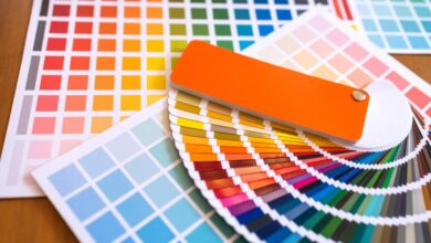
Color Palette Effectiveness
Effective color palettes evoke specific emotions and create visual harmony. For example, a website for a calming spa might use soft blues and greens, while a website for a gaming company might use vibrant reds and blacks. Ineffective color palettes, however, can clash, distract, or even be inaccessible to users with visual impairments. Consider the use of high contrast between text and background for readability.
A website using clashing neon colors, for example, would be visually jarring and unappealing. Conversely, a website using a carefully selected palette of complementary colors, like blues and oranges, would be more visually pleasing and professional. The selection of a color palette should always align with the brand identity and target audience.
Typography and Readability
Typography significantly impacts readability. Effective typography uses clear, legible fonts, appropriate font sizes, and sufficient spacing between lines (leading) and characters (kerning). For instance, using a serif font like Times New Roman for body text can improve readability, while a sans-serif font like Arial might be better suited for headings. Ineffective typography might use overly decorative fonts that are difficult to read, inconsistent font sizes, or insufficient spacing, leading to a cluttered and unpleasant reading experience.
Poor kerning can make words appear cramped and difficult to decipher, while inconsistent font sizes can create visual disharmony.
Visual Balance and Design Perception, 5 reasons your design falls flat and how to fix it
Visual balance is about distributing visual weight evenly across a design. Effective visual balance creates a sense of harmony and stability, making the design feel well-composed and professional. This can be achieved through symmetrical or asymmetrical balance. Symmetrical balance uses mirroring elements, while asymmetrical balance uses different elements of varying visual weight to create equilibrium. Ineffective visual balance, on the other hand, creates a sense of imbalance and instability, making the design feel chaotic and unprofessional.
A website with images clustered on one side and empty space on the other would lack visual balance. In contrast, a website with images and text evenly distributed would appear balanced and harmonious.
Whitespace and Visual Clarity
Whitespace, or negative space, is the empty area around design elements. Effective use of whitespace improves visual clarity and focus by preventing elements from feeling cluttered. It allows the eye to rest and guides the user’s attention to important elements. Ineffective use of whitespace can lead to a cluttered and overwhelming design, making it difficult to find information.
A webpage with too much text crammed together will be difficult to read, while the same content with appropriate whitespace will be much easier to digest. Strategic use of whitespace can highlight key information and improve the overall user experience.
Example of Excellent Visual Communication
Imagine a website for a high-end jewelry brand. The background is a subtle, textured cream color. The typography uses a sophisticated serif font for headings and a clean sans-serif font for body text. High-quality images of jewelry are strategically placed, each with ample whitespace surrounding it. A muted gold color is used sparingly as an accent, highlighting key calls to action.
The overall effect is one of elegance, sophistication, and clarity. The images are large and high-resolution, showcasing the details of the jewelry. The color palette is calming and luxurious, reflecting the brand’s image. The whitespace allows each element to breathe, preventing the page from feeling cluttered. The clear hierarchy of information guides the user through the website effortlessly.
Inconsistent Branding and Style Guide
A strong brand identity is the bedrock of any successful design. Consistency in branding isn’t just about aesthetics; it’s about building trust, recognition, and ultimately, a loyal customer base. When your branding is inconsistent across different platforms and touchpoints, it creates confusion and dilutes the impact of your message. This inconsistency can severely undermine your design’s effectiveness, leaving users feeling disoriented and potentially distrustful of your brand.Inconsistent branding negatively impacts user perception and trust by creating a fragmented brand experience.
Imagine visiting a website with a vibrant, modern logo, only to be greeted by outdated, pixelated images and a confusing layout. This jarring experience immediately diminishes the credibility and professionalism of the brand. Conversely, a consistent brand identity provides a seamless and positive user experience, reinforcing trust and encouraging engagement. A lack of consistency can lead users to question the brand’s professionalism and competence, potentially driving them away to competitors who present a more cohesive and trustworthy image.
For example, a company using different fonts, color schemes, and logos across its website, social media, and print materials will appear disorganized and unprofessional. This inconsistency can damage its reputation and affect its ability to build a strong brand identity.
Methods for Creating and Maintaining a Brand Style Guide
Creating and maintaining a comprehensive style guide is crucial for ensuring consistent branding across all design projects. This involves documenting all aspects of your brand identity, from logo usage to typography and color palettes. Regular updates and adherence to the style guide by all designers and stakeholders are essential to maintain consistency over time. This process requires clear communication and collaboration amongst the design team, marketing team, and any other relevant stakeholders.
Version control software can be helpful in managing updates and ensuring everyone is working from the most current version of the style guide. Regular reviews and updates are essential to reflect changes in the brand’s identity or evolving design trends.
Key Components of a Successful Brand Style Guide
A successful brand style guide should include detailed specifications for all aspects of the brand’s visual identity. This includes, but isn’t limited to, logo usage guidelines, color palettes with specific hex codes and their applications, typography specifications including font families, sizes, and weights, image style guidelines, and a clear explanation of the brand’s voice and tone. It’s important to provide clear examples and usage scenarios for each element to prevent misinterpretations and maintain consistency.
The guide should be easily accessible and regularly updated to reflect any changes to the brand’s identity.
Hypothetical Brand Style Guide: “Coffee Corner”
Let’s create a hypothetical brand style guide for a coffee shop called “Coffee Corner.” Logo Specifications: The logo is a stylized coffee bean with a simple, friendly font that says “Coffee Corner” underneath. The logo should always maintain a minimum size of 1 inch in width and should never be distorted or altered in any way. It should be placed consistently in the top left corner of all marketing materials.
Color Palette:
- Primary: #A0522D (Sienna)
-Used for headings, primary calls to action, and logo accents. - Secondary: #F5F5DC (Beige)
-Used for backgrounds, body text, and secondary elements. - Accent: #8B4513 (Saddle Brown)
-Used sparingly for highlighting specific elements.
Typography Guidelines:
- Heading Font: Playfair Display (serif)
-Used for main headings and titles. - Body Font: Open Sans (sans-serif)
-Used for body text and smaller text elements.
The style guide would also include detailed guidelines on image usage, maintaining a consistent style of photography that evokes a feeling of warmth and comfort. It would specify the appropriate use of each color and font, ensuring consistency across all platforms. For instance, the Sienna color would be prominently used in website buttons and headers, while the Beige color would be used for the website’s background and body text.
The Saddle Brown color would be used sparingly, perhaps to highlight special offers or promotions.
Neglecting Accessibility and Inclusivity

Source: thelist.com
In today’s diverse digital landscape, neglecting accessibility and inclusivity in design is not just ethically questionable, it’s also bad for business. A design that excludes users with disabilities limits your potential audience and can damage your brand reputation. Creating truly inclusive designs ensures everyone can access and enjoy your work, leading to a wider reach and a more positive user experience.
Common Accessibility Issues in Web and Graphic Design
Three prevalent accessibility issues frequently encountered in web and graphic design are insufficient color contrast, lack of alternative text for images, and poor keyboard navigation. Insufficient color contrast makes it difficult for users with visual impairments, particularly those with color blindness, to distinguish between elements on a page or graphic. The absence of alternative text (alt text) for images renders them inaccessible to screen reader users, who rely on textual descriptions to understand the content of images.
So you’re struggling with your design? My post, “5 reasons your design falls flat and how to fix it,” dives into common pitfalls, like ignoring your target audience or neglecting user experience. But killer visuals need killer promotion! That’s where understanding video marketing comes in, and that’s why I highly recommend checking out this awesome guide on getting it on with youtube to boost your reach.
Back to design, remember consistent branding is key – it ties everything together and makes your message unforgettable.
Poor keyboard navigation prevents users who cannot use a mouse, due to motor impairments, from fully interacting with the design. These issues significantly impact the usability and inclusivity of a design.
Designing for Users with Disabilities
Designing for users with visual, auditory, and motor disabilities requires a multifaceted approach. For users with visual impairments, ensuring sufficient color contrast, providing alternative text for images, and using clear and concise language are crucial. For users with auditory impairments, providing captions and transcripts for audio content is essential. For users with motor impairments, designing for keyboard navigation, ensuring sufficient target sizes for interactive elements, and avoiding reliance on hover effects are vital considerations.
Considering these diverse needs fosters a more inclusive and equitable user experience.
Techniques for Creating Accessible Content
Creating accessible content involves implementing specific techniques. Alt text provides a textual description of an image, conveying its meaning to screen reader users. For example, instead of just “image.jpg,” the alt text could be “A smiling woman holding a coffee cup.” Keyboard navigation allows users to navigate a website or graphic using only a keyboard, bypassing the need for a mouse.
This requires careful structuring of HTML elements and ensuring that all interactive elements can be accessed via keyboard shortcuts. WCAG (Web Content Accessibility Guidelines) provides detailed recommendations for creating accessible content, offering a comprehensive framework for designers to follow.
Examples of Inclusive Design Practices
Inclusive design goes beyond meeting minimum accessibility standards; it’s about proactively creating experiences that are welcoming and engaging for everyone. For example, offering multiple input methods, such as voice control or gesture recognition, can enhance accessibility for users with motor impairments. Providing clear and concise instructions, using simple language, and avoiding jargon are crucial for users with cognitive disabilities.
Designing with flexible layouts that adapt to different screen sizes and devices ensures accessibility across various platforms. These inclusive design practices improve user experience for everyone, regardless of their abilities.
Accessibility Checklist for Designers
Before launching any design project, it’s essential to conduct a thorough accessibility review. This checklist can help guide the process:
- Color Contrast: Ensure sufficient color contrast between text and background.
- Alternative Text: Provide descriptive alt text for all images.
- Keyboard Navigation: Verify that all interactive elements are accessible via keyboard.
- Captioning/Transcriptions: Include captions and transcripts for audio and video content.
- Font Size and Readability: Use legible fonts and allow users to adjust font size.
- Clear and Concise Language: Use simple language and avoid jargon.
- ARIA Attributes: Utilize appropriate ARIA attributes to enhance accessibility for assistive technologies.
- Form Accessibility: Ensure forms are accessible to users with disabilities, using clear labels and instructions.
- Testing: Conduct thorough testing with assistive technologies and users with disabilities.
Closing Summary
Ultimately, successful design isn’t about following trends; it’s about understanding your audience, creating a seamless user experience, and communicating your message effectively. By addressing the five key areas we’ve discussed – purpose, UX, visual communication, branding, and accessibility – you can create designs that not only look great but also achieve their intended goals. Remember, continuous learning and iteration are crucial; don’t be afraid to test, refine, and evolve your approach.
Your designs will thank you for it!
FAQ Insights
What if my target audience is too broad?
Try segmenting your audience into smaller, more specific groups. This allows for more tailored design choices that resonate with each segment’s unique needs and preferences.
How much usability testing is enough?
It depends on your project’s complexity and budget. Start with a small number of users and iterate based on their feedback. Even a few tests can reveal significant usability issues.
What are some free tools for creating a style guide?
Google Docs, Canva, and Figma offer excellent free options for creating and sharing style guides. Many free templates are available online as well.
How can I ensure my designs are accessible to users with cognitive disabilities?
Focus on clear and concise language, simple layouts, and consistent navigation. Avoid using flashing animations or excessive multimedia elements.