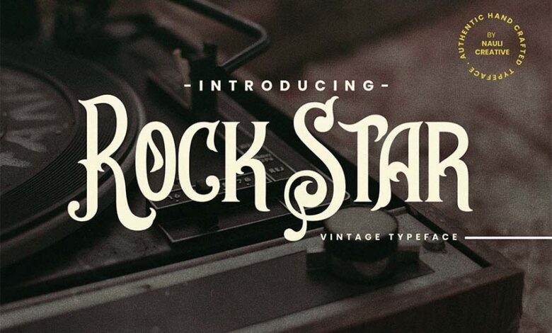
Free & Premium Vintage Fonts A Designers Guide
Free and premium vintage fonts: They’re everywhere, whispering tales of bygone eras and adding a touch of timeless elegance to modern designs. But what’s the real difference between a freebie and a premium package? This post dives deep into the world of vintage fonts, exploring their aesthetics, practical applications, and the crucial considerations of licensing and usage.
We’ll uncover the unique characteristics that set free and premium options apart, examining licensing nuances, comparing support levels, and showcasing the stunning aesthetic styles that define vintage fonts. From Art Deco’s geometric precision to the flowing elegance of script fonts, we’ll explore how these styles impact branding, readability, and overall design impact. Get ready to discover your next favorite font!
Defining “Free and Premium” in the Context of Vintage Fonts
The world of vintage fonts offers a delightful blend of nostalgia and modern design. However, navigating the landscape of available fonts can be confusing, particularly when distinguishing between “free” and “premium” options. Understanding the key differences between these categories is crucial for any designer or individual seeking to incorporate these aesthetically pleasing typefaces into their projects. This exploration will clarify the distinctions, helping you make informed decisions based on your needs and project requirements.
The primary difference between free and premium vintage fonts lies in their licensing, features, and support. Free fonts, as the name suggests, are available for download and use at no cost. However, this often comes with restrictions on their usage. Premium fonts, on the other hand, require a purchase and typically offer a broader range of features, licensing options, and support services.
This investment often reflects a higher level of quality, craftsmanship, and legal protection for both the font creator and the user.
Licensing Differences Between Free and Premium Vintage Fonts
Free vintage fonts usually operate under open-source licenses like the SIL Open Font License (OFL) or similar agreements. These licenses typically grant permission for personal and commercial use, but often with limitations. For example, redistribution of the font itself might be restricted, or modifications might require attribution. Premium fonts, conversely, usually come with more flexible and comprehensive licenses, often offering a range of options depending on the intended usage (e.g., web use, print use, embedding in software).
These licenses are typically more clearly defined and provide greater legal protection to the user. A common example is the Extended Commercial License, offering broader rights for commercial projects.
Features Commonly Found Only in Premium Vintage Fonts
Premium vintage fonts frequently boast superior features not typically found in their free counterparts. These features can significantly enhance the design process and final product.
Consider these examples:
- Expanded Glyph Sets: Premium fonts often include a much wider range of glyphs, including stylistic alternates, ligatures, and international characters, offering greater design flexibility and enabling more nuanced typographic choices. A free font might offer only basic characters, while a premium version includes numerous stylistic alternatives for the same letter, allowing for a more unique and refined aesthetic.
- Higher Resolution and Quality: Premium fonts are often created at higher resolutions, resulting in crisper, clearer rendering, especially at larger sizes. This is crucial for print projects where high fidelity is essential. Free fonts, especially older ones, may exhibit pixelation or other artifacts at higher resolutions.
- Advanced OpenType Features: Premium fonts may leverage OpenType features to a greater extent, providing advanced typographic controls like contextual alternates, discretionary ligatures, and stylistic sets. These features allow for more sophisticated and refined typography, adding a level of professional polish that’s often missing in free fonts.
Support for Free Versus Premium Vintage Fonts, Free and premium vintage fonts
The level of support offered significantly differentiates free and premium fonts. Free fonts usually come with limited or no support. If you encounter problems or have questions, you’re often left to resolve them independently. Premium fonts, however, typically include access to customer support channels, such as email or online forums, where you can seek assistance from the font creator or their team.
This direct access to support can be invaluable when troubleshooting issues or seeking clarification on licensing or usage. This can save significant time and frustration compared to navigating the challenges of using a free font without any direct support mechanism.
Exploring the Aesthetics of Vintage Fonts
Source: din-studio.com
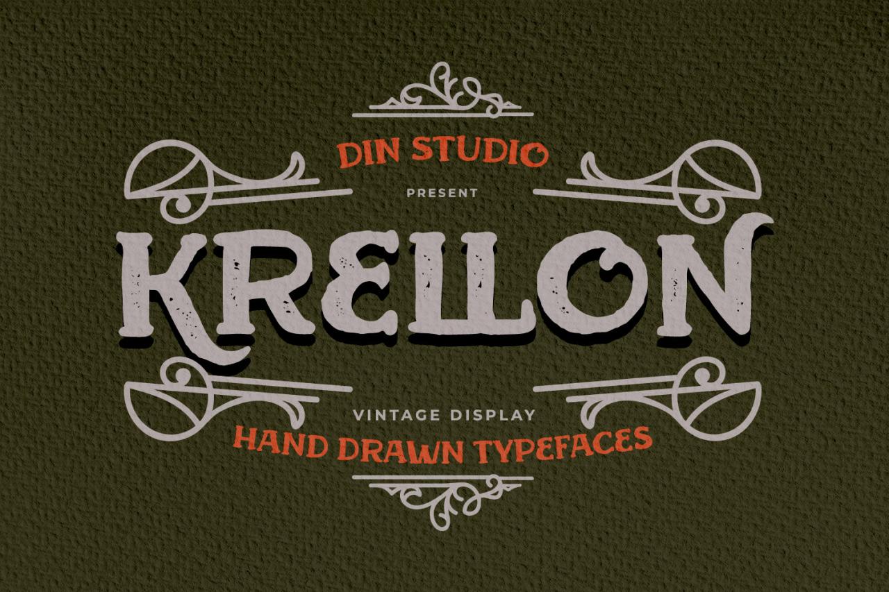
Vintage fonts offer a captivating blend of history and style, transporting us to bygone eras with their unique character. Their aesthetic appeal lies not only in their visual charm but also in the cultural and historical contexts from which they emerged. Understanding these aesthetics allows designers to harness the power of vintage fonts effectively, adding depth and authenticity to their projects.
So you’re diving into the world of free and premium vintage fonts – a total rabbit hole, I know! But to really make them shine, you need killer video editing skills, which is why I highly recommend checking out this awesome guide on getting it on with youtube to boost your content. After all, what good are those gorgeous fonts if nobody sees your amazing designs?
Then get back to those vintage fonts and create something amazing!
Art Deco Typography
Art Deco, flourishing in the 1920s and 30s, was a design movement characterized by geometric shapes, streamlined forms, and a sense of opulence. Its influence on typography is undeniable, resulting in fonts that are bold, elegant, and often feature strong vertical and horizontal lines. The cultural context of the era, marked by technological advancements and a newfound sense of optimism following World War I, is reflected in the clean lines and confident strokes of Art Deco fonts.
This style often incorporated stylized geometric patterns and a sense of luxury, mirroring the architectural and decorative arts of the period.
Grotesque (or Sans-Serif) Fonts
Grotesque fonts, despite their name, represent a significant departure from the ornate styles of earlier eras. Emerging in the mid-19th century, these sans-serif fonts were initially met with resistance, considered too plain and lacking in character. However, their clean lines and legibility quickly gained traction, particularly for practical applications. The Industrial Revolution and the rise of mass printing contributed to the popularity of these fonts, as their straightforward nature was well-suited for large-scale reproduction and readability.
The cultural shift towards practicality and functionality is mirrored in the understated elegance of Grotesque fonts.
Script Fonts
Script fonts, with their flowing, cursive-like forms, evoke a sense of elegance, personality, and often, a touch of nostalgia. Their origins can be traced back to the development of handwriting styles, evolving through centuries of calligraphy and penmanship. The romanticism and expressiveness of script fonts are deeply rooted in their connection to personal expression. Their use frequently reflects a desire for a more personalized and handcrafted feel, in contrast to the more mechanical aesthetics of other vintage styles.
Different periods influenced their styles, from the ornate flourishes of Victorian scripts to the more streamlined elegance of mid-century scripts.
| Font Style | Key Characteristics | Typical Use Cases | Example Font Names |
|---|---|---|---|
| Art Deco | Geometric shapes, strong vertical/horizontal lines, bold strokes, stylized ornamentation | Logos, posters, packaging for luxury goods, Art Deco-themed projects | Adelle, Bebas Neue, Anton |
| Grotesque (Sans-Serif) | Clean lines, lack of serifs, high legibility, simple forms | Body text, signage, headlines requiring clarity, modern applications with a vintage feel | Helvetica, Futura, Gill Sans |
| Script | Cursive-like forms, flowing strokes, elegant appearance, often includes flourishes | Invitations, wedding stationery, logos requiring a personalized touch, handwritten-style text | Great Vibes, Sacramento, Pacifico |
Practical Applications of Vintage Fonts: Free And Premium Vintage Fonts
Source: googleapis.com
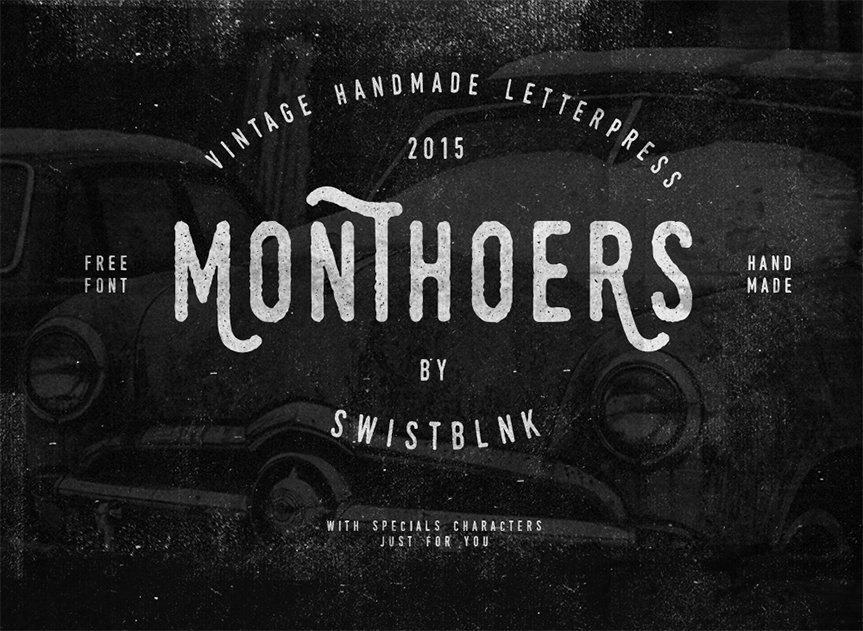
Vintage fonts, with their nostalgic charm and timeless appeal, offer a unique opportunity to elevate branding and design across various media. Their ability to evoke specific eras and emotions makes them a powerful tool for conveying brand personality and creating memorable visual experiences. Understanding how to effectively utilize these fonts is key to harnessing their potential.Vintage fonts offer more than just aesthetic appeal; they contribute significantly to the overall effectiveness of a design.
The right vintage font can dramatically enhance readability, depending on its style and application, while the wrong choice can lead to illegibility and detract from the overall message. This delicate balance between visual impact and practical usability requires careful consideration of context and audience.
Vintage Fonts in Branding and Logo Design
A well-chosen vintage font can be the cornerstone of a successful brand identity. For example, a company aiming for a retro, handcrafted feel might use a serif font reminiscent of the Art Deco era, such as a stylized version of Garamond or a bolder, Art Deco inspired geometric sans-serif. This choice immediately communicates a sense of tradition, quality, and perhaps even luxury.
Conversely, a tech startup attempting to use a heavily distressed, overly ornate vintage font might appear incongruous and confusing to its target audience. The key is aligning the font’s personality with the brand’s values and target market. A successful implementation seamlessly integrates the font into the overall brand aesthetic, creating a cohesive and memorable visual identity. An unsuccessful implementation, however, can create a jarring disconnect, undermining the brand’s message.
Vintage Fonts and Readability Across Different Contexts
The effectiveness of a vintage font is heavily dependent on its application. In large-scale applications like posters, a bold, easily legible vintage font can create a striking visual impact while maintaining clarity. However, the same font used in small print on a website might be difficult to read, especially on smaller screens. For website use, a more streamlined, less ornate vintage font, perhaps a slightly modified version of a classic sans-serif, might be a more appropriate choice.
Packaging design requires a similar careful consideration of size and legibility. A vintage font used on a product label needs to be clear enough to be easily read from a distance, but also aesthetically pleasing up close.
Impact of Font Choice on Brand Perception
Consider Coca-Cola’s iconic Spencerian script logo. Its elegant curves and flowing letters evoke a sense of tradition, happiness, and nostalgia, perfectly reflecting the brand’s image and long history. This successful implementation has become synonymous with the brand itself. In contrast, imagine a modern tech company attempting to use the same font. The incongruity between the font’s old-fashioned feel and the company’s modern image would likely confuse and alienate consumers.
This highlights the importance of selecting a vintage font that aligns perfectly with the brand’s overall message and target audience.
Diverse Applications of Vintage Fonts
The versatility of vintage fonts extends across various design disciplines. Here are five diverse examples:
- Branding (Coffee Shop): A slightly distressed serif font like Playfair Display evokes a feeling of warmth, tradition, and artisanal craftsmanship, ideal for a coffee shop aiming for a rustic, cozy atmosphere. The font’s slightly imperfect character adds to the handmade feel.
- Website (Vintage Clothing Store): A clean, Art Deco-inspired geometric sans-serif like Bebas Neue provides a modern yet retro feel, appealing to a younger audience interested in vintage fashion. Its clarity ensures readability on screens of all sizes.
- Poster (Music Festival): A bold, slightly grunge-style serif font like Lobster creates a visually striking and energetic effect, capturing the spirit of a music festival. Its rugged character enhances the event’s rebellious vibe.
- Packaging (Craft Beer): A classic serif font with a slightly vintage feel, such as Didot, lends an air of sophistication and tradition, reflecting the quality and craftsmanship associated with craft beer. Its elegant design enhances the premium image of the product.
- Logo (Bookstore): A refined, slightly italicized serif font like Garamond conveys a sense of elegance, learning, and sophistication, suitable for a bookstore aiming to project a refined and intellectual image. Its timeless appeal creates a sense of enduring quality.
Finding and Utilizing Vintage Fonts
So, you’ve fallen in love with the charm of vintage fonts – that aged, slightly imperfect look that adds so much character to a design. Now the real work begins: finding the perfect font and knowing how to use it effectively. This section will guide you through the process, from sourcing fonts to understanding licensing and finally, applying them to your projects.
Reliable Sources for Vintage Fonts
Finding high-quality vintage fonts is easier than you might think. Many websites offer both free and premium options, catering to different needs and budgets. Remember to always check the license before downloading and using any font.
Here are a few reputable sources:
- Google Fonts: While not exclusively vintage, Google Fonts offers a curated selection of free fonts, some with a vintage aesthetic. They are well-vetted and readily available for web and print projects. The licensing is clear and straightforward, making them a safe bet for beginners.
- Creative Market: This marketplace boasts a vast collection of premium fonts, including many with vintage styles. You’ll find a wide range of choices, from Art Deco to grunge-inspired fonts, but be prepared to pay for the higher quality and unique designs.
- Fontbundles.net: This site offers bundles of fonts at discounted prices, often including vintage styles. This is a great way to expand your font library without breaking the bank. Always check the individual font licenses within the bundle.
- Dafont.com: This is a large repository of free fonts, including many vintage styles. However, be extra cautious about license agreements as the quality and licensing of fonts on this site can vary greatly.
Installing and Using Vintage Fonts in Design Software
Installing and using vintage fonts is a relatively straightforward process, though it might differ slightly depending on your design software (Adobe Photoshop, Illustrator, InDesign, etc. or even simpler programs like Canva).
The general steps are as follows:
- Download the font file: After purchasing or downloading a free font, you’ll typically receive a file (usually .ttf or .otf).
- Locate the font folder: On Windows, this is usually located in C:\Windows\Fonts. On macOS, it’s typically in /Library/Fonts or ~/Library/Fonts.
- Install the font: Double-click the font file. Your operating system should automatically install it. Alternatively, you can drag and drop the font file into the fonts folder.
- Open your design software: Once installed, the font should appear in your software’s font list.
- Select and use the font: Choose the vintage font from the dropdown menu and start designing!
Understanding Font Licensing Agreements
Before using any font, especially in commercial projects, thoroughly review the licensing agreement. This document Artikels the permitted uses of the font. Using a font without the proper license can lead to legal issues and financial penalties. Common license types include:
- Free for personal use: This means you can use the font for personal projects, but not for commercial purposes.
- Commercial license required: This indicates that you need to purchase a commercial license to use the font in projects that generate revenue.
- Open-source licenses (e.g., SIL Open Font License): These licenses generally permit both personal and commercial use, often with certain conditions (like attribution).
Incorporating a Vintage Font into a Simple Graphic Design Project
Let’s imagine we’re designing a poster for a vintage-style coffee shop.
Step 1: We select a suitable vintage serif font, perhaps one reminiscent of Art Deco or early 20th-century typography. Let’s call this font “RetroCafe”.
Step 2: We create a simple layout in our design software. We’ll use a muted background color, perhaps a warm beige, to complement the vintage aesthetic.
Step 3: We add a central graphic element, maybe a stylized coffee cup illustration. We use the “RetroCafe” font for the coffee shop’s name (“The Daily Grind”) and its tagline (“Your Daily Dose of Delight”).
Step 4: We carefully consider the kerning and tracking of the text to ensure readability and visual appeal. We might add a subtle drop shadow to the text for emphasis.
Step 5: The final design showcases a warm, inviting poster with a vintage feel, enhanced by the carefully chosen font. The color palette, the illustration, and the typography all work together to create a cohesive and appealing design.
The Future of Vintage Fonts
Source: idevie.com
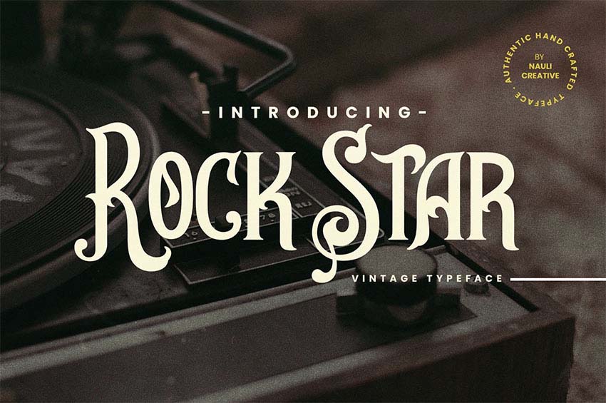
The enduring appeal of vintage fonts suggests a bright future, but one shaped by evolving design trends and technological advancements. We’re not simply seeing a continuation of past styles; instead, a dynamic interplay between tradition and innovation is creating exciting new possibilities. The digital age is both a catalyst and a canvas for reinterpreting and expanding the vintage aesthetic.
The fusion of old and new is at the heart of this evolution. While the core principles of vintage design – legibility, character, and a sense of history – remain important, we’re witnessing a shift towards more nuanced interpretations. This includes exploring less-explored vintage eras, incorporating diverse cultural influences, and pushing the boundaries of what constitutes “vintage” itself.
Emerging Trends in Vintage Font Design and Usage
Current trends indicate a move beyond simple recreations of classic typefaces. Designers are increasingly experimenting with hybrid styles, blending elements from different vintage periods and design movements. For example, we’re seeing fonts that combine the Art Deco elegance of the 1920s with the geometric precision of the Bauhaus style, resulting in unique and contemporary interpretations. Another notable trend is the incorporation of hand-drawn or handcrafted elements, giving digital fonts a more authentic, artisanal feel.
This is particularly prevalent in branding and packaging design, where a sense of authenticity and handcrafted quality is highly valued.
Technology’s Impact on Vintage Font Creation and Accessibility
Technological advancements have dramatically altered the landscape of vintage font creation and accessibility. Sophisticated font creation software allows designers to meticulously recreate the nuances of historical typefaces with unprecedented accuracy. Moreover, vector graphics and digital distribution platforms have made these fonts readily available to a global audience. Open-source initiatives further democratize access, empowering independent designers and hobbyists.
This increased accessibility has led to a surge in creative experimentation, pushing the boundaries of vintage font design and application.
New Interpretations and Styles of Vintage Fonts
The future of vintage fonts involves reinterpreting existing styles and creating entirely new ones inspired by historical precedents. We might see a resurgence of less-represented vintage styles, such as those from specific regional or cultural contexts. Imagine fonts inspired by the typography of 19th-century Japanese woodblock prints or the lettering found on vintage Mexican posters. Furthermore, designers are likely to experiment with incorporating vintage aesthetics into unconventional formats, such as three-dimensional typography or interactive font experiences.
The possibilities are vast and constantly evolving.
Hypothetical Scenario: A Future Design Project
Imagine a designer working on a branding project for a new sustainable coffee company. They create a custom vintage-inspired typeface, drawing inspiration from 1950s mid-century modern design but incorporating subtle elements of Art Nouveau flourishes. The font, named “Bean Blossom,” features rounded, organic forms and a slightly irregular baseline, giving it a handcrafted, artisanal feel. This font is then used across all branding materials – from the coffee packaging and website design to social media graphics and in-store signage.
The typeface’s unique blend of nostalgia and modern aesthetics perfectly complements the company’s commitment to both quality and sustainability, creating a strong and memorable brand identity.
Final Review
So, whether you’re a seasoned designer or just starting out, understanding the world of free and premium vintage fonts is key to creating truly impactful designs. Remember to always check licensing agreements, explore the diverse aesthetic styles available, and let the historical richness of these fonts elevate your creative projects. Happy designing!
Helpful Answers
Where can I find trustworthy sources for vintage fonts?
Look for reputable font foundries like Creative Market, Fontbundles, and Google Fonts (for free options). Always check reviews before downloading.
What’s the difference between a “web font” and a “desktop font”?
Web fonts are optimized for online use and are usually embedded in websites. Desktop fonts are installed on your computer for use in design software like Photoshop or Illustrator.
How do I install a font on my computer?
It depends on your operating system, but generally, you double-click the font file, and your system will guide you through the installation process.
Can I use free vintage fonts for commercial projects?
Always check the font’s license! Some free fonts have restrictions on commercial use. Premium fonts usually have clearer commercial licenses.
