Navigation Clear Links in Your Website Design
Navigation clear links in your website design are crucial for a positive user experience. A well-structured site, with clearly visible and intuitively placed links, dramatically improves usability and accessibility. Think about it: a frustrating navigation experience can send visitors packing faster than you can say “404 error!” This post dives deep into crafting seamless navigation, ensuring your visitors find what they need effortlessly, leading to increased engagement and conversions.
We’ll cover everything from the visual appeal of your links – color choices, font sizes, and strategic placement – to the underlying architecture of your site’s information. We’ll also explore accessibility best practices, ensuring your site welcomes everyone, regardless of ability. Finally, we’ll look at testing methods and iterative improvements, so you can continuously optimize your navigation for peak performance.
Importance of Clear Navigation

Source: amazonaws.com
A website’s navigation is its skeleton, silently guiding users through the digital landscape you’ve created. Without clear, intuitive navigation, even the most stunning visuals and compelling content will be lost in a sea of confusion, leading to frustrated users and a diminished online presence. A well-designed navigation system is paramount for a positive user experience and successful online engagement.Intuitive website navigation directly impacts user experience by facilitating efficient exploration and information retrieval.
When users can easily find what they’re looking for, their satisfaction increases, leading to longer session durations, higher conversion rates, and ultimately, a more successful website. Conversely, poor navigation frustrates users, causing them to abandon the site before achieving their goals. This translates to lost opportunities and a negative impact on your brand’s reputation.
Impact of Clear Links on Website Usability and Accessibility
Clear links are crucial for both usability and accessibility. Usability focuses on how easily users can interact with and navigate your website. Clear, concise, and descriptive link text helps users understand where a link will take them before they click. This reduces uncertainty and improves the overall user experience. Accessibility, on the other hand, ensures your website is usable by people with disabilities.
Screen readers rely on link text to convey information, so descriptive link text is essential for visually impaired users. Furthermore, using sufficient color contrast between link text and background improves accessibility for users with low vision. Poorly designed links, such as using generic phrases like “click here” or employing insufficient color contrast, hinder both usability and accessibility.
User Flow Diagram Example
Imagine a website for an online bookstore. The user flow would start at the homepage, featuring a prominent search bar, clear category links (e.g., Fiction, Non-Fiction, Children’s Books), and a link to their account/login page. From the category pages, users can browse books by subcategories (e.g., Science Fiction, Fantasy, Mystery within Fiction), refine their search using filters (e.g., price, author, publication date), and view individual book pages with detailed information, reviews, and an “Add to Cart” button.
The shopping cart leads to a checkout page, followed by order confirmation. Throughout the process, a consistent navigation bar remains visible, providing easy access to the homepage, categories, search, and account. This consistent and logical flow ensures smooth navigation for the user. The diagram would visually represent this flow using boxes and arrows, demonstrating the path a user takes to complete a task (e.g., purchasing a book).
Examples of Websites with Poor Navigation, Navigation clear links in your website design
Some websites overload users with an excessive number of menu items, making it difficult to find what they need. Others use confusing or inconsistent labeling, leading to disorientation. Websites with cluttered layouts, lacking visual hierarchy and clear visual cues, also suffer from poor navigation. For example, a website with a single, massive menu containing hundreds of items makes it almost impossible to find anything quickly.
Another example is a site that uses vague link text like “Learn More” without specifying what users will learn. These poor design choices create frustration and deter users from exploring the site further.
Designing Clear Links

Source: nexevo.in
Creating clear and effective links is crucial for a positive user experience. A well-designed link seamlessly guides users through your website, improving navigation and encouraging engagement. Poorly designed links, on the other hand, can lead to frustration and ultimately, lost visitors. This section explores best practices for designing links that are both visually appealing and easily understood.
Beyond simply making links functional, we need to consider how they contribute to the overall aesthetic and usability of the website. The goal is to create links that are not only easily clickable but also blend seamlessly into the design while still standing out enough to be noticed.
Visual Cues for Link Design
Effective link design relies on a combination of visual cues to signal their interactive nature. These cues help users quickly identify and interact with links without having to actively search for them. Key elements include color, size, typography, and visual styling.
Using a consistent style across your website establishes a visual language that users quickly learn to recognize. This consistency ensures a predictable and intuitive user experience.
Color, Size, and Typography for Link Clarity
Color is a powerful tool for highlighting links. A contrasting color against the surrounding text is generally recommended. However, avoid using colors that clash with your website’s overall theme or are difficult for users with color vision deficiencies to distinguish. For example, a dark blue link on a light background is generally a good choice. Similarly, avoid using colors that are too close to the background color.
A subtle hover effect (a change in color or style when the mouse hovers over the link) can further improve clickability.
Size and typography also play a role. Links should be large enough to be easily read and clicked, especially on mobile devices. Using a slightly different font weight or style (e.g., underlined text or bold text) can further enhance their visibility. However, overuse of bold or underline can detract from the overall design, so use these sparingly.
Link Style Comparison
| Link Style | Visual Cues | Clickability | Accessibility Considerations |
|---|---|---|---|
| Underlined Text (Default) | Underlining, often a different color | Generally good, well-established convention | Can be difficult for users with low vision; ensure sufficient color contrast |
| Bold Text | Bold font weight, often a different color | Good, easily identifiable | Ensure sufficient color contrast; may be less distinct for users with certain cognitive impairments |
| Colored Text | Distinct color from surrounding text | Good, if color contrast is sufficient | Must have sufficient color contrast to meet WCAG guidelines; test with various color blindness simulators |
| Button-Style Links | Rectangular shape, distinct background color, potentially hover effects | Excellent, clearly indicates interactivity | Ensure sufficient color contrast; use appropriate ARIA attributes for screen readers |
Effective Anchor Text for Link Context
Anchor text, the clickable text of a hyperlink, should accurately reflect the destination page’s content. Vague anchor text like “click here” provides no context for the user and hinders understanding. Instead, use descriptive anchor text that clearly indicates the target page’s topic. For example, instead of “Learn more,” use “Learn more about sustainable practices.” This improves both and user experience.
Clear navigation is crucial for a good user experience; visitors shouldn’t get lost trying to find what they need. Think of it like a well-produced YouTube video – you need a clear structure to keep viewers engaged, just like how getting it on with youtube teaches you. Similarly, intuitive website navigation, with clearly labeled links, ensures visitors can easily find their way around your site and ultimately convert.
Clear, concise, and relevant anchor text is key to guiding users effectively.
Information Architecture and Navigation Structure: Navigation Clear Links In Your Website Design
Crafting a website’s information architecture (IA) is crucial for a seamless user experience. A well-structured IA ensures users can easily find what they need, reducing frustration and improving engagement. This involves carefully planning the organization of content and how users navigate through it. Think of it as the blueprint for your website’s usability.
Effective IA relies heavily on a clear navigation structure. This structure dictates how users move between different sections of your website. A well-defined hierarchy, visualized through a sitemap, is the foundation of a successful navigation system. This hierarchy guides users intuitively, making their journey through your website logical and predictable.
Sitemap and Hierarchical Organization
A sitemap is a visual representation of your website’s structure. It shows the relationships between different pages and sections, outlining the hierarchical levels. For example, a simple e-commerce site might have a top level with categories like “Men’s Clothing,” “Women’s Clothing,” and “Accessories.” Each of these categories would then branch out to subcategories (e.g., “Men’s Shirts,” “Men’s Pants”), and finally, individual product pages.
This hierarchical structure is vital for clear navigation. The sitemap helps you plan this hierarchy effectively, ensuring a logical flow of information.
Optimal Number of Navigation Items
The number of navigation items should be optimized for different screen sizes to prevent clutter and improve usability. On larger screens (desktops), you can accommodate more navigation items without sacrificing readability. However, smaller screens (mobile phones) require a more concise approach. For mobile, a streamlined navigation with fewer, more broadly categorized items is generally preferred. A good rule of thumb is to limit mobile navigation to around 5-7 main items, potentially using sub-menus or expandable lists to reveal more options.
Desktop navigation can handle a larger number, but aiming for under 10 is usually recommended for optimal usability.
Navigation Patterns: Mega Menus, Breadcrumbs, and Hamburger Menus
Various navigation patterns exist, each with its own strengths and weaknesses. Choosing the right pattern depends on your website’s content and target audience.
- Mega Menus: These expansive menus offer extensive sub-navigation options within a single dropdown. Pros: Display large amounts of information at once, ideal for sites with many categories. Cons: Can be slow to load and visually overwhelming on smaller screens.
- Breadcrumbs: These navigational aids show users their current location within the website’s hierarchy. Pros: Provide context and allow users to easily navigate back up the hierarchy. Cons: Least effective for sites with flat, non-hierarchical structures.
- Hamburger Menus: These menus hide navigation items behind an icon (the “hamburger” icon), usually used on mobile devices. Pros: Conserves screen space on smaller devices. Cons: Hides navigation, requiring an extra click to access, which can be detrimental to usability if not implemented carefully.
Examples of Effective Information Architecture
Amazon’s website is a prime example of effective IA. Its clear categorization, robust search functionality, and well-structured product pages allow users to easily find and purchase items. The use of filters, customer reviews, and recommendations further enhances the user experience. In contrast, a poorly designed website might have confusing categories, inconsistent labeling, and a lack of clear pathways, leading to user frustration and potentially lost sales.
Consider a website with pages scattered haphazardly; finding specific information becomes a frustrating scavenger hunt rather than a straightforward process. This highlights the critical role of a well-defined IA in creating a user-friendly online experience.
Accessibility Considerations for Links
Creating clear navigation is crucial, but it’s equally vital to ensure that navigation is accessible to everyone, including users with disabilities. This means designing links that are easily understood and usable by individuals who rely on assistive technologies like screen readers. Ignoring accessibility not only excludes a significant portion of your audience but also violates web accessibility guidelines, potentially leading to legal ramifications.
Accessible link design goes beyond simply making links visually clear. It involves employing specific techniques and adhering to established standards to make your website inclusive and usable for everyone.
ARIA Attributes for Links
Appropriate use of ARIA (Accessible Rich Internet Applications) attributes enhances the accessibility of links for users of assistive technologies. ARIA attributes provide additional semantic information to screen readers and other assistive technologies, clarifying the purpose and context of links. For example, the `aria-label` attribute allows you to provide a descriptive label for a link, which is particularly helpful for links with purely decorative or ambiguous text.
Using `aria-describedby` can link the link to a more detailed description elsewhere on the page. These attributes help screen reader users understand the link’s destination and context, improving their navigation experience. Incorrect or missing ARIA attributes can lead to confusion and hinder navigation for users of assistive technologies. For instance, a link with only an image and no text or ARIA label would be inaccessible to a screen reader user.
WCAG Guidelines for Accessible Navigation
Designing a navigation system that adheres to WCAG (Web Content Accessibility Guidelines) ensures your website is usable by people with a wide range of disabilities. WCAG provides specific success criteria related to navigation, including making links distinguishable from surrounding content, providing clear and concise link text, and ensuring that navigation is consistent throughout the website. For example, WCAG Success Criterion 2.4.4, “Link Purpose (In Context)”, requires that the purpose of each link can be determined from the link text alone or from the link text together with its programmatically determined label.
This means avoiding vague link text like “click here” and instead using descriptive text that clearly indicates the link’s destination. Furthermore, WCAG guidelines encourage the use of keyboard navigation, ensuring users can access all links using only a keyboard.
Best Practices for Alt Text for Links
Alt text (alternative text) is crucial for making links accessible to visually impaired users who rely on screen readers. Alt text describes the image or other non-text content associated with a link. When writing alt text for links, it’s essential to be concise and descriptive, accurately reflecting the link’s destination and purpose. Avoid using generic alt text like “image” or “link.” Instead, provide specific information about the image and its relation to the link.
For example, if a link contains an image of a shopping cart, appropriate alt text might be “Proceed to checkout.” Accurate and descriptive alt text ensures that screen reader users can understand the link’s function and decide whether to follow it. Vague or missing alt text can lead to a confusing and frustrating user experience.
Testing and Iteration
Building a website with intuitive navigation isn’t a one-and-done process; it requires ongoing testing and refinement. Effective navigation is crucial for user experience, and continuous improvement ensures your website remains user-friendly and achieves its goals. This iterative process involves testing various aspects of your navigation, analyzing the results, and making adjustments to optimize the user journey.Testing the effectiveness of website navigation involves a multi-faceted approach, combining quantitative and qualitative data to gain a comprehensive understanding of user behavior.
This ensures that improvements are data-driven and result in a demonstrably better user experience. Ignoring this crucial step can lead to a website that’s difficult to navigate, frustrating users, and ultimately hindering your website’s success.
User Testing Methods
User testing is invaluable for identifying navigation problems. Observing real users interacting with your website provides direct insights into their experiences. Methods include:
- Think-aloud protocols: Users verbalize their thoughts while navigating, revealing their thought processes and highlighting areas of confusion.
- Eye-tracking studies: These studies track users’ eye movements to pinpoint areas of focus and identify where users struggle to find information.
- A/B testing: Comparing different navigation designs allows you to measure which version performs better in terms of task completion rates and user satisfaction.
- Usability testing sessions: Moderated sessions where users complete specific tasks while observers note their difficulties and successes.
These methods provide qualitative data, revealing thewhy* behind user behavior. Combining these observations with quantitative data from analytics provides a complete picture.
Analytics Data Analysis
Website analytics tools, such as Google Analytics, provide valuable quantitative data on user behavior. Analyzing this data reveals patterns in user navigation:
- Bounce rate: A high bounce rate on a specific page suggests navigation issues or problems with the page content itself.
- Clickstream analysis: Tracking the sequence of pages users visit reveals common paths and areas where users get lost or abandon their tasks.
- Heatmaps: Visual representations of user interaction on a page can highlight areas that attract or repel attention, revealing navigation design flaws.
- Conversion rates: Tracking the percentage of users who complete desired actions (e.g., making a purchase) reveals how effectively the navigation guides users towards those goals.
Analyzing this data helps identify quantitative patterns that, when combined with qualitative user testing feedback, provide a holistic view of navigation effectiveness.
Iterative Improvement Plan
Based on the data gathered from user testing and analytics, an iterative improvement plan can be implemented. This plan involves a cycle of testing, analysis, and refinement:
- Gather data: Conduct user testing and analyze website analytics data to identify areas for improvement.
- Prioritize issues: Focus on addressing the most critical navigation problems based on their impact on user experience and business goals. For example, a high bounce rate on a key landing page should be addressed before a minor issue on a less important page.
- Implement changes: Make adjustments to the website navigation based on the identified issues. This might involve reorganizing content, improving link clarity, or redesigning the navigation menu.
- Retest and re-analyze: After implementing changes, repeat the testing and analysis process to measure the effectiveness of the improvements. For example, compare the bounce rate before and after implementing a navigation change.
- Repeat: Website navigation is an ongoing process. Regular testing and iteration ensure the website remains user-friendly and effective.
This continuous cycle of improvement ensures that the website’s navigation is constantly optimized for user experience. Remember that a single iteration is rarely enough; continuous monitoring and adjustment are key.
Visual Representation of Navigation

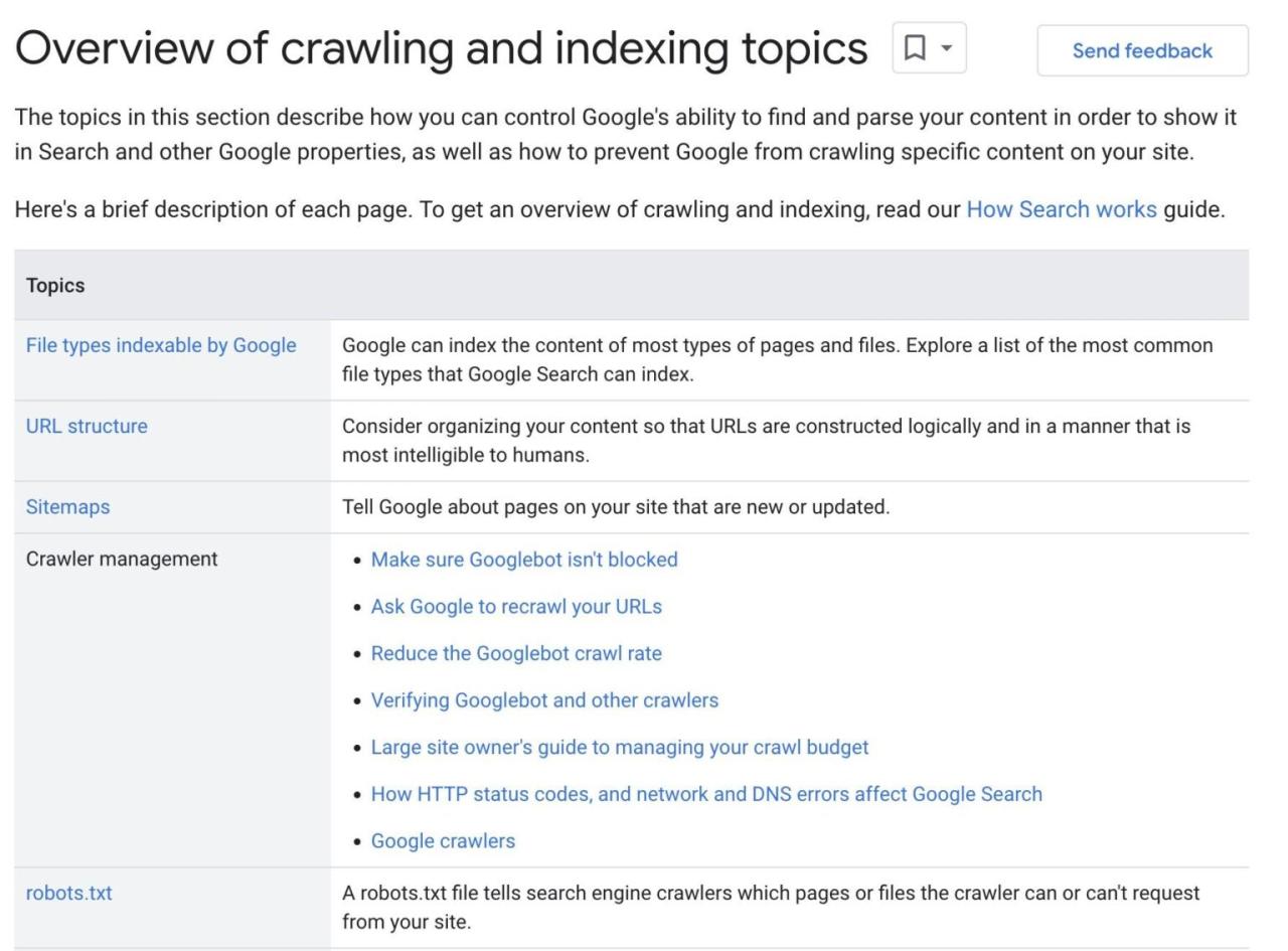
Source: ahrefs.com
Effective website navigation isn’t just about clear links; it’s about guiding the user visually. A well-designed visual hierarchy, strategic use of whitespace, and consistent visual cues significantly impact user experience and the overall effectiveness of your website’s navigation. A visually appealing and intuitive navigation system makes finding information effortless and enjoyable.Visual design elements play a crucial role in creating clear navigation.
These elements work together to create a hierarchy of importance, leading the user’s eye to the most relevant information first. Consider the size, color, weight, and placement of elements to guide users smoothly through the website.
Visual Hierarchy and Whitespace
Effective visual hierarchy guides the user’s attention. Larger, bolder text and prominent placement indicate more important links or sections. Conversely, less prominent elements are relegated to secondary or tertiary importance. Whitespace, or negative space, is equally critical. It prevents visual clutter and allows elements to breathe, improving readability and overall aesthetic appeal.
Proper use of whitespace can create visual breathing room, allowing users to easily scan and identify important navigation elements. Think of it like a well-designed city map—clear paths and open spaces make it easy to navigate.
Visual Cues and Mock-up
Visual cues, such as arrows, icons, and color coding, provide immediate visual clues to users, improving the intuitiveness of navigation. For example, a prominent “Home” button, usually larger and more visually distinct, helps users quickly return to the homepage. Below is a description of a mock-up illustrating effective use of visual cues:Imagine a website header with a clean, minimalist design.
The main navigation menu is centrally located, with each link represented by a clean, sans-serif font in a dark grey. The “Home” link is slightly larger and bolder than the other menu items, and is colored a slightly brighter shade of grey. Sub-menus appear upon hovering over a main navigation item, sliding down smoothly with a subtle animation.
These sub-menus are offset from the main menu with a subtle background color, providing visual separation. Throughout the site, consistently sized and styled breadcrumbs appear below the header, indicating the user’s current location within the site’s hierarchy. This consistent use of visual cues provides clear feedback and helps users understand their position and navigate easily.
Comparison of Navigation Menu Styles
Different visual styles for navigation menus cater to various website aesthetics and target audiences. Horizontal menus are classic and space-efficient, often seen in corporate websites. Vertical menus, common in blogs and sidebars, are suitable for websites with extensive content. Mega-menus, expansive drop-down menus, work well for sites with many categories and subcategories. Each style has advantages and disadvantages concerning space utilization, user experience, and overall aesthetic appeal.
The best choice depends on the website’s content and design philosophy.
Maintaining Visual Consistency Across Pages
Maintaining a consistent visual navigation experience across all pages is crucial for a seamless user experience. This means using the same fonts, colors, sizes, and spacing for all navigation elements throughout the website. Consistent branding, including logo placement and overall style, reinforces the website’s identity and contributes to a cohesive and professional look and feel. Think of it like a well-designed book—consistent typography and layout make for a more enjoyable reading experience.
Inconsistent design elements, conversely, disrupt the user’s flow and create a disjointed experience.
Wrap-Up
Ultimately, clear navigation isn’t just about aesthetics; it’s about creating a user-friendly experience that keeps visitors engaged and coming back for more. By focusing on clear links, intuitive site structure, and accessibility considerations, you can transform your website from a confusing maze into a welcoming and easily navigable space. Remember, user-friendly design isn’t just a nice-to-have; it’s a must-have in today’s competitive online landscape.
So, take the time to carefully plan and implement your navigation – your users (and your bottom line) will thank you for it!
Helpful Answers
What are the most common mistakes people make with website navigation?
Common mistakes include burying important information too deep, using unclear or inconsistent link labels, neglecting mobile responsiveness, and failing to prioritize accessibility features.
How often should I test my website’s navigation?
Regular testing is key. Start with user testing during development and then conduct periodic checks (e.g., quarterly) using analytics and feedback forms to identify areas for improvement.
What tools can I use to analyze my website’s navigation?
Google Analytics provides valuable data on user behavior, including bounce rates and time spent on pages. Heatmap tools can visualize user clicks and scrolling patterns.
How can I make my navigation more accessible to users with screen readers?
Use descriptive link text, proper ARIA attributes (like `aria-label`), and ensure sufficient color contrast. Regularly test your navigation with screen readers to identify any accessibility issues.


