Spacing or White Space Within Website Design
Spacing or white space within website design isn’t just empty space; it’s the unsung hero of a great user experience. Think of it as the air between musical notes – essential for creating harmony and preventing a chaotic jumble. Properly utilized whitespace guides the user’s eye, improves readability, and even contributes to a strong brand identity. This post delves into the art of whitespace, exploring its various forms, applications, and the impact it has on both aesthetics and accessibility.
We’ll cover different types of spacing like margins, padding, and gutters, and how they work together to create visual hierarchy. We’ll also look at how responsive design impacts spacing and how to maintain consistency across different devices. Beyond the technical aspects, we’ll discuss the psychological effects of whitespace and its crucial role in accessibility for users with disabilities. Get ready to discover how mastering whitespace can transform your website from cluttered to captivating!
The Importance of Spacing in Website Design
Whitespace, often overlooked, is a crucial element in effective website design. It’s not just about the absence of content; it’s a powerful tool that significantly impacts user experience and the overall aesthetic appeal of a website. Proper use of spacing creates visual hierarchy, improves readability, and enhances the overall usability of a site, leading to increased user engagement and satisfaction.
Conversely, neglecting whitespace can result in a cluttered, confusing, and ultimately frustrating user experience.Whitespace’s psychological impact on users is profound. It provides visual breathing room, preventing information overload and allowing the eye to rest. This reduces cognitive strain, making it easier for users to process information and navigate the site. A well-spaced website feels clean, professional, and inviting, fostering a positive user experience.
Conversely, cramped layouts create a sense of chaos and overwhelm, driving users away. The impact is akin to the difference between a neatly organized room and a cluttered one – one feels calm and inviting, the other stressful and off-putting.
Examples of Effective and Ineffective Use of Spacing
Effective use of whitespace is evident in websites like Apple’s website. Their minimalist design emphasizes clean lines, ample spacing between elements, and a clear visual hierarchy. The result is a sophisticated and user-friendly experience. The generous use of white space allows the high-quality product images and concise text to truly shine, creating a premium feel. In contrast, a website overloaded with images, text, and various design elements, lacking sufficient spacing, can feel overwhelming and unprofessional.
Imagine a website with tiny fonts, images crammed together, and navigation elements jumbled – this is a prime example of ineffective spacing. The user experience suffers due to the difficulty in finding information and navigating the site. The overall impression is one of amateurishness and lack of attention to detail.
Visual Impact of Different Spacing Techniques, Spacing or white space within website design
Understanding the difference between margins and padding is crucial for effective whitespace management. Margins control the space outside an element, while padding controls the spaceinside* an element. This distinction allows for precise control over the layout and visual hierarchy. Different spacing techniques contribute to the overall visual impact, creating different moods and user experiences.
| Spacing Technique | Description | Visual Impact | Example |
|---|---|---|---|
| Margins | Space outside an element. | Creates separation between elements, improves readability, and establishes visual hierarchy. | Large margins around a heading create visual emphasis. |
| Padding | Space inside an element. | Provides breathing room within elements, improves readability of text within boxes, and creates visual balance. | Padding around a button makes it easier to click. |
| Line Height | Space between lines of text. | Enhances readability and improves scannability. Too little line height makes text cramped, while too much makes it feel sparse. | Appropriate line height makes long paragraphs easier to read. |
| Gutter Space | Space between columns or rows in a grid layout. | Organizes content, improves visual flow, and enhances readability within a grid structure. | Sufficient gutter space between columns prevents a cluttered look. |
Types of Spacing and Their Applications
Whitespace isn’t just empty space; it’s a powerful design tool that dictates how users perceive and interact with your website. Mastering the different types of spacing is crucial for creating a visually appealing and user-friendly experience. Understanding how margins, padding, gutters, and line height work together allows for precise control over the layout and readability of your content.
Margins
Margins define the space outside an element, separating it from surrounding elements. Think of it as the buffer zone around a box. Proper margin usage prevents elements from feeling cramped and allows for visual breathing room. For example, a large margin around a hero image can draw attention to it and make it stand out, creating a visual hierarchy where the image takes center stage.
Conversely, small margins between paragraphs can create a more compact and dense reading experience, suitable for short, impactful content.
- Headers: Use generous top and bottom margins to separate headers from other content, emphasizing their importance.
- Paragraphs: Moderate margins between paragraphs improve readability and prevent text blocks from merging together.
- Images: Margins around images provide visual separation and help them stand out from the surrounding text.
Padding
Padding, unlike margins, defines the spaceinside* an element’s border. It’s the space between the content and the element’s edge. Using padding effectively creates a clean, organized feel within individual elements. For instance, adding padding to a button makes it more clickable and visually appealing, preventing the text from feeling cramped against the button’s edges. Consistent padding across similar elements creates a sense of visual harmony and uniformity throughout the website.
- Buttons: Sufficient padding ensures buttons are easily clickable and the text is clearly visible.
- Forms: Padding around form fields enhances usability and readability, preventing labels from overlapping with input fields.
- Navigation Menus: Padding between menu items ensures they are easily distinguishable and prevents accidental clicks.
Gutters
Gutters refer to the space between columns or rows in a grid-based layout. They are crucial for creating a balanced and organized layout. Well-defined gutters improve readability and prevent columns from feeling cluttered. Consider a website showcasing product images: sufficient gutters between the images create a cleaner look, preventing visual fatigue, and allowing users to easily scan and focus on individual products.
- Grid Layouts: Consistent gutters between columns and rows create a visually appealing and organized layout.
- Image Galleries: Appropriate gutters prevent images from appearing overcrowded and improve visual hierarchy.
- Blog Posts with Sidebars: Gutters between the main content and the sidebar create a clear separation and improve readability.
Line Height
Line height, also known as leading, refers to the vertical space between lines of text. It significantly impacts readability. A good line height allows for comfortable reading and prevents text from feeling cramped or dense. For example, a larger line height is beneficial for body text, making it easier to scan and read long articles. Conversely, a smaller line height can be used for headings or short captions where brevity is key.
- Body Text: Sufficient line height improves readability, especially for longer articles.
- Headings: Line height can be adjusted to create a visually appealing hierarchy between headings and subheadings.
- Captions: Line height can be used to ensure captions are easily readable and complement the image.
Spacing and Visual Hierarchy: Spacing Or White Space Within Website Design
Source: ux360.design
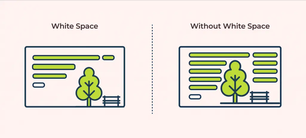
Whitespace isn’t just empty space; it’s a powerful design tool that dictates how users perceive and interact with your website. Effective use of spacing creates a visual hierarchy, guiding the user’s eye through the content in a logical and intuitive manner, ultimately improving user experience and achieving design goals. Proper spacing ensures that important elements stand out, while less critical information recedes into the background.Spacing directly influences visual hierarchy by controlling the prominence of different elements.
Larger spaces create visual separation, emphasizing the importance of an element. Conversely, smaller spaces group elements together, suggesting a relationship or similarity. This careful manipulation of space allows designers to create a clear path for the user, leading them seamlessly through the information presented on the page. Think of it as a silent director, subtly guiding the user’s gaze to the key points you want them to see.
Whitespace and Call-to-Action Emphasis
Consider a landing page promoting a new software product. The page features a headline, a brief description, some screenshots, and, crucially, a “Try it Free” call-to-action button. To emphasize this button, we’ll use ample whitespace. Imagine a clean, minimalist design. The headline and description are positioned near the top, with generous space above and below.
The screenshots are arranged neatly, again with significant spacing between them and the other elements. Finally, the “Try it Free” button is placed centrally towards the bottom of the page, surrounded by a considerable amount of white space. This isolation makes the button the clear focal point, drawing the user’s eye and encouraging a click. The generous margins around the button provide visual breathing room, preventing it from feeling cramped or lost among other elements.
The overall effect is clean, uncluttered, and highly effective in directing user attention to the desired action. The strategic use of whitespace here transforms a simple button into a powerful conversion tool.
Impact of Inconsistent Spacing on Visual Hierarchy
Inconsistent spacing throws off the carefully constructed visual hierarchy, leading to a disjointed and confusing user experience. Imagine the same landing page, but this time, the elements are haphazardly placed with varying amounts of space between them. The headline might be crammed against the description, the screenshots are awkwardly close together, and the call-to-action button is squashed into a corner.
This inconsistent spacing creates visual clutter, making it difficult for the user to identify the key information or understand the flow of the content. The user’s eye jumps erratically from element to element, never settling on a single focal point. This lack of visual clarity undermines the overall message and diminishes the effectiveness of the page. The result is a frustrating and unproductive user experience, potentially leading to decreased engagement and conversions.
Consistent and deliberate spacing is crucial for a positive user experience.
Responsive Design and Spacing
Creating a visually appealing and user-friendly website is challenging enough on a single screen size. But in today’s multi-device world, ensuring consistent spacing across desktops, tablets, and smartphones is crucial for a positive user experience. Inconsistent spacing can lead to a broken layout, impacting readability and overall aesthetics, ultimately frustrating your visitors. This section explores the complexities of responsive spacing and effective strategies to overcome them.
Maintaining consistent spacing across various screen sizes presents unique challenges. Smaller screens require a more compact layout, while larger screens can accommodate more expansive spacing. Simply using fixed pixel values for margins and padding will result in a broken layout as the screen size changes. Elements might overlap, text might become unreadable, and the overall design will appear unprofessional and disjointed.
The goal is to create a fluid layout that adapts gracefully to any screen size, maintaining visual harmony and usability.
Methods for Achieving Responsive Spacing
Several methods exist for creating responsive spacing, each with its own strengths and weaknesses. The choice depends on the specific design requirements and the complexity of the layout.
Percentages are a simple and effective method for creating responsive spacing, particularly for elements within containers. If you set a margin or padding to a percentage of the parent element’s width or height, the spacing will scale proportionally as the screen size changes. For example, a margin of 5% will always maintain a 5% margin relative to its parent container, regardless of the container’s size.
However, percentages can be less predictable when dealing with absolute positioning or complex layouts. They are best suited for situations where relative spacing is desired.
Viewport units, such as vw (viewport width) and vh (viewport height), provide a more direct relationship between spacing and the browser window’s dimensions. 1vw equals 1% of the viewport width, and 1vh equals 1% of the viewport height. This offers greater control over absolute spacing, making them useful for consistent spacing across different devices.
However, they might not always be the best choice for situations where relative spacing to parent elements is more important.
Media queries allow for conditional styling based on screen size. This is crucial for implementing different spacing rules for different devices. By using media queries, you can define specific spacing values for desktops, tablets, and mobile devices, ensuring the layout adapts optimally to each screen size. This provides the most control but requires more code and careful planning.
It’s often the most robust solution for complex layouts.
Responsive Spacing and User Experience
The following table demonstrates how adjusting spacing improves user experience across different devices. Note that this is a simplified example; real-world scenarios might require more nuanced adjustments.
| Device | Spacing Adjustments |
|---|---|
| Desktop (Large Screen) | Larger margins and padding between elements; more spacious layout for improved readability and visual comfort. Example: 20px margins, 15px padding. |
| Tablet (Medium Screen) | Moderate margins and padding; balance between visual appeal and screen real estate. Example: 10px margins, 10px padding. |
| Mobile (Small Screen) | Smaller margins and padding; compact layout to optimize screen space. Example: 5px margins, 5px padding. Consider using more vertical spacing to avoid horizontal scrolling. |
Whitespace and Accessibility
Source: wixstatic.com
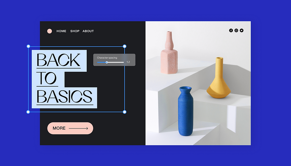
Whitespace, often overlooked, plays a crucial role in creating accessible and user-friendly websites. Proper spacing isn’t just about aesthetics; it’s a fundamental element of usability, significantly impacting the experience of users with disabilities. By strategically employing whitespace, we can enhance readability, comprehension, and overall navigation for a broader audience.Adequate spacing improves the overall accessibility of a website for users with a wide range of disabilities.
It directly addresses challenges faced by individuals with visual, cognitive, and motor impairments, fostering a more inclusive online experience.
Whitespace and Visual Impairments
Sufficient whitespace dramatically enhances readability for users with visual impairments, such as low vision or macular degeneration. Larger text sizes, increased line spacing (leading), and generous margins create a less cluttered visual field. This reduces eye strain and allows for easier tracking of text across lines and paragraphs. For example, a website with cramped text and minimal spacing can be extremely difficult for someone with low vision to decipher, while the same content with appropriate whitespace becomes significantly more manageable.
Imagine trying to read a dense block of text versus the same text broken into shorter paragraphs with ample space between each. The difference is clear. The use of high contrast between text and background also aids readability, but sufficient whitespace complements this, creating a less overwhelming experience.
Whitespace and Cognitive Disabilities
Users with cognitive disabilities, such as dyslexia or ADHD, often benefit from clear visual organization. Whitespace helps to break down complex information into digestible chunks. Well-spaced content reduces cognitive overload, allowing users to focus on individual elements without feeling overwhelmed by a dense layout. For instance, a page with a clear hierarchy, achieved through headings, subheadings, and generous spacing, will be easier to navigate and understand for someone with a cognitive disability compared to a cluttered page with information crammed together.
This structured approach allows for easier scanning and comprehension, promoting better information processing.
Whitespace and Motor Impairments
Even users with motor impairments benefit from well-placed whitespace. Larger clickable elements, such as buttons and links, with ample space surrounding them, are easier to target with a mouse or other assistive devices. This reduces the risk of accidental clicks or missed targets, enhancing the overall user experience for those with limited motor control. Imagine a user with tremors trying to click on a tiny button nestled between other elements.
The increased likelihood of error is significant. However, if that button had sufficient whitespace around it, the user would have a much greater chance of accurately selecting it. This simple design choice can dramatically improve the usability of a website for this user group.
Spacing and Branding
Consistent spacing isn’t just about aesthetics; it’s a fundamental element of brand building. A well-defined spacing system reinforces your brand’s personality and ensures a cohesive user experience across all platforms. Think of it as the invisible glue holding your brand’s visual identity together, creating a sense of unity and professionalism.The strategic use of spacing directly impacts how users perceive your brand.
It influences readability, guides the eye, and ultimately, affects how memorable your brand is. Inconsistent spacing, on the other hand, can create a cluttered and unprofessional appearance, undermining your brand’s credibility and weakening its message.
Whitespace in Minimalist and Maximalist Branding
Minimalist brands often employ generous amounts of whitespace. This creates a clean, uncluttered look that emphasizes simplicity and sophistication. Think of the Apple website – its spacious layout allows the product to take center stage, highlighting its elegance and premium quality. The whitespace acts as a visual breathing room, allowing the user’s eye to rest and focus on key elements.
In contrast, maximalist brands embrace a more densely populated design. They use a variety of elements, textures, and colors, often employing smaller spacing to create a vibrant and energetic feel. This approach works well for brands that want to convey a sense of excitement and abundance. Consider a fashion brand showcasing a wide range of products; the tighter spacing can highlight the diversity and vibrancy of their offerings.
However, even in maximalist design, careful attention to spacing is crucial to avoid overwhelming the user. A well-structured layout, even with more elements, ensures the visual hierarchy remains clear.
Design Guidelines for Consistent Spacing
Maintaining consistent spacing across a website requires a well-defined design system. This system should specify spacing units (e.g., pixels, ems, rems) and define standard spacing values for different elements. For example, a brand aiming for a modern and minimalist aesthetic might use a modular scale based on a primary spacing unit of 8 pixels. This would mean all margins, padding, and gutters are multiples of 8 pixels (e.g., 8px, 16px, 24px, 32px).
- Establish a Base Unit: Choose a base unit (e.g., 8px, 10px, 16px) and use multiples of this unit for all spacing. This ensures consistency and scalability.
- Define Spacing Values for Different Elements: Create a style guide specifying spacing values for headings, paragraphs, images, buttons, and other elements. For instance, headings might have a top margin of 32px, while paragraphs might have a top and bottom margin of 16px.
- Use a Design System Tool: Utilize design system tools or style guides to document and maintain your spacing system. This helps ensure consistency across the website and makes it easier for designers and developers to collaborate.
- Prioritize Readability: Ensure sufficient spacing between lines of text (leading) and between paragraphs to improve readability. This is especially crucial for maintaining accessibility.
- Test Across Devices: Thoroughly test your website’s spacing on different devices and screen sizes to ensure it remains consistent and user-friendly across all platforms.
By following these guidelines, you can create a website that not only looks great but also reflects your brand’s identity consistently and professionally. The result is a more cohesive and memorable brand experience for your users.
Tools and Techniques for Managing Spacing
Source: elementor.com
Mastering whitespace in web design isn’t just about aesthetics; it’s about creating a user-friendly and visually appealing experience. This requires a robust understanding of the tools and techniques available to precisely control spacing. Fortunately, we have powerful CSS properties and design tools at our disposal to achieve consistent and effective spacing across our projects.
CSS Properties for Spacing Control
CSS provides a suite of properties specifically designed for managing spacing. `margin`, `padding`, and `line-height` are the fundamental tools in our arsenal. Understanding their differences and how they interact is crucial for precise control. `margin` controls the space
- outside* an element, affecting its relationship to surrounding elements. `padding` controls the space
- inside* an element, between the element’s content and its border. `line-height` adjusts the vertical spacing between lines of text within an element.
For example, to add space below a paragraph, you would use the `margin-bottom` property. To add space around the text within a button, you would use `padding`. Consider the following CSS snippet:
p margin-bottom: 20px;
button padding: 10px 20px;
This code adds 20 pixels of space below each paragraph and 10 pixels of padding on the top and bottom, and 20 pixels on the left and right of each button. Experimentation and understanding of the box model are key to mastering these properties.
CSS Frameworks and Preprocessors for Simplified Spacing
Managing spacing manually across a large website can be tedious and error-prone. This is where CSS frameworks and preprocessors shine. Frameworks like Bootstrap, Tailwind CSS, and Foundation provide pre-defined classes for common spacing values, significantly reducing the amount of custom CSS needed. These classes often use a consistent scaling system, ensuring visual harmony across the site.
For instance, Bootstrap offers classes like .m-3 (margin of 3 units) and .p-2 (padding of 2 units), where the unit size is determined by the framework’s default settings. Tailwind CSS takes a more granular approach, allowing developers to specify precise spacing values directly in the HTML using classes like mt-4 (margin-top of 4 units) and px-8 (padding-x of 8 units).
Preprocessors like Sass and Less offer variables and mixins, enabling the creation of reusable spacing styles. This allows developers to define a set of spacing variables (e.g., $spacing-unit: 10px;) and then use these variables consistently throughout their CSS. This approach promotes consistency and simplifies updates; changing a single variable automatically updates all instances of that spacing value across the project.
Design Tools for Spacing Planning and Consistency
Design tools like Figma and Sketch provide features that facilitate precise spacing management. These tools often include grid systems and spacing guides, allowing designers to plan and maintain consistent spacing during the design phase. This visual planning translates directly to the front-end development, minimizing discrepancies between design and implementation.
Features such as auto layout in Figma allow designers to create responsive layouts with consistent spacing that automatically adjusts to different screen sizes. The ability to define and reuse styles and components ensures that spacing remains consistent across the entire design. By leveraging these design tools effectively, developers can ensure that the final product accurately reflects the designer’s intent and maintains a cohesive visual experience.
Good website design hinges on strategic use of whitespace; it’s not just empty space, but a powerful tool for guiding the eye. Think of it like editing a YouTube video – you need breathing room for impact, just like in a well-designed website. Learning to master visual hierarchy, as explained in this great article on getting it on with youtube , translates directly to creating a more user-friendly and visually appealing website experience through effective whitespace management.
Proper spacing makes all the difference in clarity and overall aesthetic.
Ultimate Conclusion
Mastering whitespace is more than just aesthetics; it’s about crafting a user experience that’s both beautiful and functional. By understanding the different types of spacing, their impact on visual hierarchy, and the importance of responsive design, you can create websites that are not only visually appealing but also accessible and user-friendly. So, go forth and embrace the power of the blank canvas – let your whitespace breathe!
Q&A
What’s the difference between margin and padding?
Margin refers to the space outside an element, while padding is the space inside an element, between the content and its border.
How much whitespace is too much?
There’s no magic number. It depends on your design, content, and brand. Too little makes it cramped; too much can feel empty. Aim for a balanced, visually appealing layout.
How can I ensure consistent spacing across my entire website?
Use CSS variables or a CSS framework to define spacing units and apply them consistently. Design systems and style guides are also helpful.
What tools can help me manage whitespace effectively?
Design tools like Figma and Sketch allow for precise control over spacing. CSS preprocessors like Sass can streamline the process.

