The History Behind the Gucci Logo
The history behind the Gucci logo is a fascinating journey through the evolution of a global brand. From its humble beginnings to its iconic status today, the Gucci logo has undergone a series of transformations, each reflecting the changing times and the brand’s evolving identity. This exploration delves into the design elements, symbolism, and cultural impact of this instantly recognizable emblem, revealing the creative minds and historical context that shaped its journey.
We’ll trace the logo’s evolution chronologically, examining key design changes and the inspirations behind them. We’ll uncover the symbolism embedded within the logo and how its meaning has shifted over the decades, mirroring cultural trends and Gucci’s marketing strategies. Finally, we’ll explore the logo’s enduring influence on fashion, popular culture, and the brand’s overall success.
The Origin of the Gucci Logo
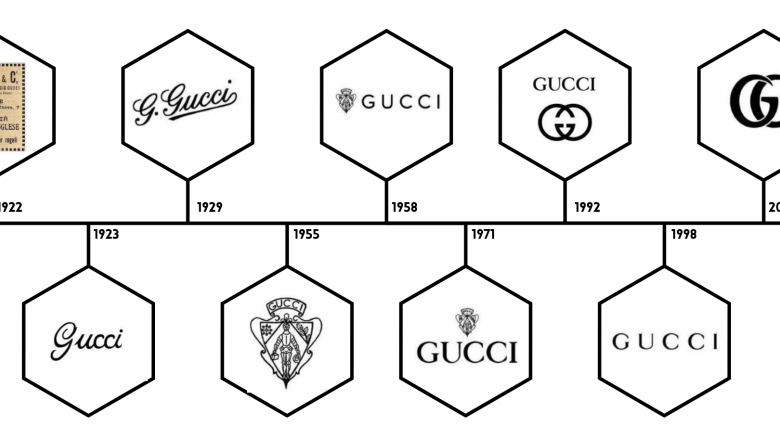
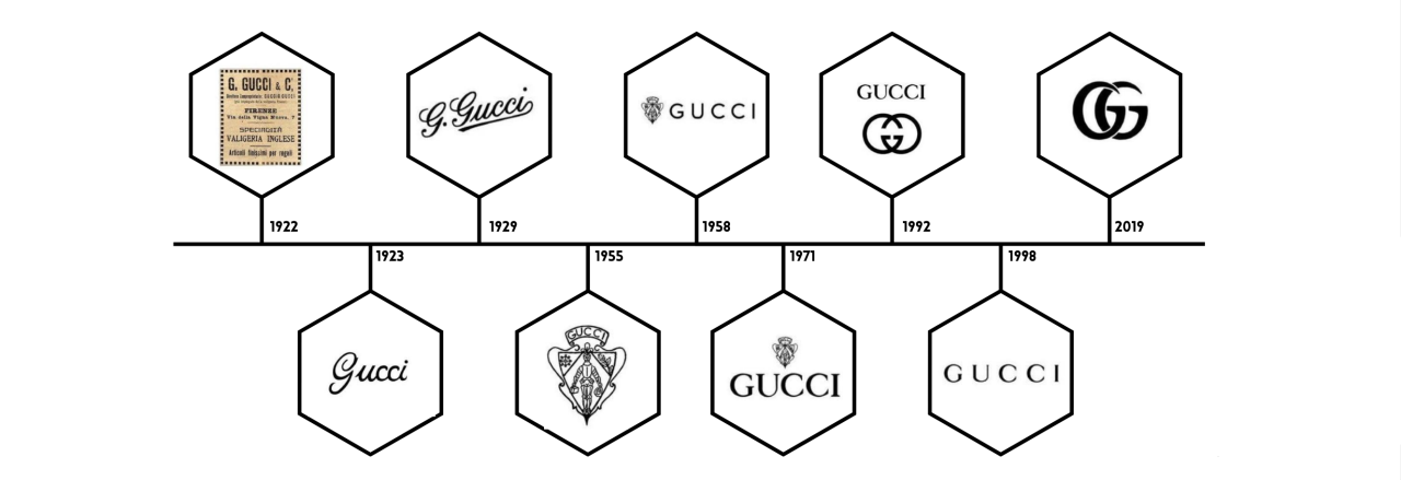
Guccio Gucci’s iconic logo, a symbol of luxury and Italian craftsmanship, hasn’t always looked the way it does today. Its evolution reflects the changing styles and brand direction over nearly a century, a journey from humble beginnings to global recognition. This visual timeline traces the key transformations of the Gucci logo, highlighting the design choices and the cultural context behind them.
A Visual Timeline of the Gucci Logo
The Gucci logo’s journey is a fascinating study in branding evolution. Understanding its development provides insight into the brand’s identity and its adaptation to different eras. The following table details significant periods in the logo’s history, showcasing its transformation through the years.
| Era | Year | Key Features | Designer Influence & Color Palette/Font Style |
|---|---|---|---|
| Early Logo (Pre-1920s) | Pre-1921 | The earliest iterations of the Gucci logo are largely undocumented, but likely consisted of simple lettering indicating “Gucci” possibly with a location identifier. Imagine a simple, elegant serif typeface, perhaps inspired by Art Nouveau or Art Deco styles prevalent at the time. The color palette was likely restrained, possibly using black or dark brown ink on a lighter background. | Guccio Gucci’s initial vision; influenced by the prevailing typographic styles of the time. Likely monochromatic, possibly using deep browns and blacks to evoke a sense of tradition and quality. Serif typeface. |
| The “GG” Monogram (1920s-1950s) | 1921-1950s | The iconic interlocking “GG” monogram emerges, initially appearing within a rectangular frame. The “G”s are designed with a distinct, slightly rounded serif typeface, creating a balanced and symmetrical design. The monogram is often presented on a solid background, enhancing its visual impact. | The interlocking “GG” monogram is believed to have been inspired by the design of the Gucci family crest. The initial color palette was likely simple, focusing on green and red (colors that were often associated with equestrian and luxury goods), later expanding to include other colors such as beige and brown. A classic serif typeface is used. |
| The Simplified “GG” (1960s-1980s) | 1960s-1980s | The rectangular frame around the “GG” monogram is removed, allowing the monogram to stand alone. The “G”s themselves become slightly more streamlined, suggesting a move towards a more modern aesthetic. The logo’s color palette remains relatively consistent, but bolder variations emerge. | Aldo Gucci’s influence is apparent in this simplification, reflecting a move towards a more contemporary brand image. The logo is used in a variety of color combinations, but green and red remain prominent. The typeface remains a classic serif, though potentially slightly more condensed. |
| Modern Gucci Logo (1990s-Present) | 1990s-Present | The “GG” monogram remains central, but undergoes subtle refinements in proportion and spacing. The typeface maintains its classic feel but might show minor adjustments for improved readability and consistency across different media. The logo is often presented with a clean, minimalist approach. | Tom Ford and subsequent creative directors refined the logo, maintaining its heritage while adapting it to contemporary design sensibilities. The color palette continues to utilize green and red, often in sophisticated variations. The typeface remains a classic serif, meticulously refined for optimal legibility and visual appeal. |
Initial Inspiration for the Logo’s Design Elements, The history behind the gucci logo
The initial inspiration for the Gucci logo’s design elements stems from a combination of factors. The interlocking “GG” monogram is widely believed to be inspired by the Gucci family crest, linking the brand directly to its origins and heritage. The choice of green and red, colors often associated with equestrian and aristocratic symbolism, further reinforced the brand’s aspirational positioning within the luxury market.
The use of a classic serif typeface contributed to the logo’s sophisticated and timeless aesthetic, echoing the craftsmanship and quality associated with the Gucci brand. The initial design choices were strategically chosen to convey a sense of tradition, quality, and heritage.
The Symbolism and Meaning Behind the Gucci Logo
Source: logojoy.com
The Gucci logo, seemingly simple in its design, carries a rich history of evolving symbolism that mirrors the brand’s journey from a Florentine leather goods shop to a global luxury powerhouse. Its meaning hasn’t remained static; instead, it has adapted and expanded to reflect changing cultural trends and Gucci’s strategic repositioning throughout its decades-long existence. Understanding this evolution provides a deeper appreciation for the brand’s identity and its enduring appeal.The initial design, a simple monogram, focused on the founder’s initials and the quality of craftsmanship associated with the brand’s early leather goods.
This implied a sense of exclusivity and bespoke artistry. Over time, the logo’s visual prominence and interpretations shifted, reflecting changing marketing strategies and broader cultural movements. The minimalist elegance of the early years gave way to bolder, more experimental designs as Gucci embraced contemporary art and fashion trends.
The Logo’s Visual Elements and Brand Identity
The interlocking “G” monogram, the core of the Gucci logo, has always represented the brand’s initials and heritage. However, its visual treatment has undergone significant changes. The early iterations emphasized a classic, almost austere elegance, perfectly reflecting the brand’s initial focus on high-quality, understated luxury. Later periods saw the monogram become more stylized, bolder, and occasionally incorporated into larger, more complex designs, reflecting Gucci’s embrace of more flamboyant and maximalist aesthetics.
The typeface used alongside the monogram also shifted, reflecting the prevailing design trends of each era. For example, a clean, sans-serif font might be paired with a minimalist logo in one period, while a more ornate, decorative typeface could be used alongside a more elaborate logo design in another. This constant interplay between the monogram and its accompanying typography helped to visually communicate the evolving brand identity.
The Logo as a Reflection of Gucci’s Historical Periods
To illustrate the evolution of the logo’s symbolism, consider a visual representation: a triptych. The left panel depicts the original, simpler, almost austere interlocking “G”s, rendered in a subtle, perhaps embossed, leather-like texture. This represents the early years, emphasizing the craftsmanship and understated elegance that defined the brand’s initial success. The central panel features a more stylized and bolder version of the monogram, perhaps incorporating a vibrant color or a more contemporary font.
This reflects the periods of experimentation and bolder designs under creative directors like Tom Ford, highlighting the brand’s embrace of modern trends and a more overt sense of luxury. The right panel showcases a contemporary interpretation, perhaps a minimalist rendering of the monogram, subtly integrated into a broader design element. This could represent Gucci’s recent emphasis on a more streamlined and sophisticated aesthetic, emphasizing a blend of heritage and modernity.
Did you know the Gucci logo’s iconic double G is a nod to Guccio Gucci’s initials? It’s a fascinating piece of brand history, and learning about it got me thinking about visual branding in general. To really understand how a brand image impacts viewers, I dove into this great article on getting it on with youtube and how effective video marketing can be.
Coming back to Gucci, that logo’s simple elegance speaks volumes – a lesson in visual communication that extends far beyond just fashion.
This triptych visually communicates the logo’s journey from a symbol of quiet luxury to a powerful statement of brand identity and cultural influence. The changing visual weight, color palettes, and overall style of the logo within this imagined triptych would clearly illustrate the shifts in brand strategy and the corresponding evolution of the logo’s symbolism.
The Role of the Logo in Gucci’s Brand Identity
The Gucci logo, a simple yet elegant emblem, has played a pivotal role in establishing the brand’s global recognition and unparalleled prestige. Its consistent use across decades, coupled with shrewd marketing strategies, has cultivated a strong sense of brand loyalty and a distinct consumer perception associated with luxury, Italian craftsmanship, and timeless style. The logo’s impact extends beyond mere identification; it acts as a powerful symbol of aspirational status and enduring quality.The Gucci logo’s contribution to brand recognition is undeniable.
Its consistent presence on products, packaging, and marketing materials has created an immediate and universally understood association with the brand. This visual consistency has been crucial in building brand awareness and recall, particularly in the competitive luxury goods market. The sophisticated design, characterized by its clean lines and classic typography, projects an image of understated elegance that resonates with the brand’s target audience.
This consistent visual identity has fostered trust and reliability, crucial components in building lasting brand loyalty among discerning consumers. The logo’s simple yet refined aesthetic ensures it remains timeless and adaptable to evolving design trends.
Logo Usage in Marketing Campaigns and Product Designs
The Gucci logo’s versatility has allowed for its creative integration into a wide array of marketing campaigns and product designs. Early campaigns focused on showcasing the logo prominently, often in conjunction with high-quality product photography emphasizing the craftsmanship and materials. More recent campaigns have adopted a more subtle approach, integrating the logo seamlessly into the overall aesthetic, allowing the brand’s heritage and quality to speak for themselves.
For example, a recent campaign featuring minimalist imagery and a muted color palette relied on the subtle placement of the logo to maintain brand recognition without overwhelming the visual impact. The effectiveness of these strategies lies in their ability to cater to the evolving tastes of consumers while maintaining brand consistency. On products, the logo’s placement is often strategically considered, appearing subtly on leather goods or more prominently on ready-to-wear items depending on the specific design and intended message.
This careful consideration ensures the logo remains an integral part of the brand’s overall aesthetic without detracting from the product itself.
Effectiveness of Logo Use Across Decades
The impact of the Gucci logo’s usage has varied across different decades, reflecting evolving marketing strategies and consumer preferences.
- 1920s-1950s: The logo’s initial use focused on establishing brand recognition. The relatively simple design, easily recognizable even in early print media, helped build a strong foundation for brand awareness among a growing clientele. The impact was primarily focused on building brand recognition within Italy and slowly expanding into international markets.
- 1960s-1980s: The logo became a powerful symbol of status and luxury. Its prominent placement on iconic products like the Jackie bag contributed to the brand’s association with glamour and sophistication. This period saw a significant expansion of the brand’s global reach and cemented its position as a leading luxury brand. The impact was a significant rise in brand prestige and a loyal following amongst the jet-set.
- 1990s-2000s: The logo’s use was refined and often incorporated into more contemporary designs. While maintaining its classic elegance, the logo adapted to reflect changing fashion trends, ensuring its continued relevance. The impact was maintaining brand recognition during periods of stylistic change and preventing the logo from appearing dated.
- 2010s-Present: The logo’s use has become more nuanced and often integrated subtly into designs. This approach reflects a shift towards a more minimalist aesthetic, allowing the brand’s heritage and quality to speak for themselves. The impact has been a strengthening of the brand’s identity as a timeless and sophisticated luxury house, appealing to a broader and more discerning clientele.
The Designers and Artists Behind the Gucci Logo’s Evolution
The Gucci logo, a symbol of luxury and Italian craftsmanship, hasn’t remained static throughout its history. Its evolution reflects changing design trends and the creative visions of various individuals who shaped the brand’s visual identity. While pinpointing specific artists for each iteration is difficult due to the lack of publicly available detailed archival information, we can examine the key periods and the likely influences that contributed to the logo’s transformation.
The story is one of subtle shifts, refinements, and a consistent pursuit of elegant simplicity.The evolution of the Gucci logo is less about radical overhauls and more about a gradual refinement of its core elements. This subtle evolution reflects Gucci’s commitment to its heritage while adapting to contemporary design sensibilities. Understanding the stylistic shifts requires looking at the broader design movements of each era and the designers responsible for overseeing the brand’s image.
Key Individuals and Their Contributions to the Gucci Logo
The following table Artikels the key periods and the likely influences on the Gucci logo’s design, acknowledging that detailed attribution to specific individual artists for each iteration is often unavailable. The table focuses on the overall stylistic shifts and the designers responsible for the brand’s direction during those periods.
| Individual/Period | Contribution & Design Style |
|---|---|
| Guccio Gucci (1921-1953) | Founder; Initial logo design likely reflected the Art Deco influences prevalent in the 1920s and 30s. The early logo likely featured a simple, elegant typeface reflecting the brand’s focus on high-quality leather goods. His style was understated elegance, reflecting the craftsmanship of the products. |
| Aldo Gucci & Family (1953-1980s) | Guccio’s sons continued the brand’s legacy, overseeing the logo’s subtle refinements. The design remained largely consistent, focusing on maintaining a classic, timeless aesthetic. This period emphasizes the continuation of the established style, with perhaps minor adjustments in typography or spacing to reflect evolving printing technologies. |
| Tom Ford (1990s – 2004) | While not directly involved in redesigning the logo, Ford’s tenure marked a period of significant brand revitalization. His focus on a more overtly sensual and glamorous aesthetic indirectly influenced the perception and presentation of the logo, enhancing its association with a more modern, high-fashion image. |
| Frida Giannini (2006-2014) | Similar to Ford, Giannini’s influence was less about direct logo alteration and more about how the logo was presented and integrated into the brand’s overall marketing and design strategy. Her emphasis on sophisticated femininity likely influenced the context in which the logo appeared. |
| Alessandro Michele (2015-Present) | Michele’s approach has been characterized by a more eclectic and romantic aesthetic. While the core logo remains unchanged, its presentation and integration within his collections reflects this distinct stylistic direction. He often uses the logo in unexpected ways, sometimes subtly incorporated into designs, showcasing a more playful and less rigidly formal approach. |
Significant Collaborations and Partnerships
While specific collaborations directly impacting the Gucci logo’s design are not widely documented, the brand’s collaborations with artists and designers on broader campaigns and collections have indirectly influenced how the logo is perceived and used. These partnerships, while not directly altering the logo itself, have helped shape its overall brand image and context. For instance, collaborations with contemporary artists could potentially influence the stylistic presentation of the logo in advertising or limited-edition product lines.
The cumulative effect of these collaborations contributes to the evolution of the logo’s visual identity within the broader context of the brand’s image.
The Logo’s Impact on Fashion and Popular Culture
Source: shopify.com
The Gucci logo, with its interlocking Gs, transcends its function as a simple brand identifier. It has become a potent symbol, deeply embedded in the fabric of fashion and popular culture, influencing design trends, inspiring artistic expression, and shaping perceptions of luxury and status. Its impact extends far beyond the realm of high fashion, permeating various aspects of society and leaving an undeniable mark on the cultural landscape.The distinctive design of the interlocking Gs has proven incredibly versatile and adaptable, inspiring countless imitations and reinterpretations.
Its elegant simplicity and inherent sophistication have made it a coveted motif for both high-fashion designers and streetwear brands alike. The logo’s power lies in its ability to instantly communicate luxury, heritage, and a certain level of aspirational status. This inherent brand recognition has allowed Gucci to command significant influence within the fashion industry and beyond.
The Gucci Logo’s Influence on Fashion Design
The Gucci logo’s impact on fashion design is multifaceted. Its clean lines and minimalist aesthetic have influenced countless designers, inspiring similar logo designs and impacting overall brand aesthetics. The iconic interlocking Gs have been subtly incorporated into clothing designs, accessories, and packaging, often appearing as a discreet yet recognizable emblem of quality and sophistication. Many brands have adopted similar interlocking letter designs, demonstrating the logo’s enduring influence on visual branding within the fashion world.
The enduring appeal of the Gucci logo’s simplicity has also led to its incorporation into diverse design styles, from minimalist to maximalist approaches, further showcasing its adaptability and widespread influence.
The Gucci Logo in Art, Music, and Film
The Gucci logo’s cultural permeation extends beyond fashion. Its appearance in various artistic mediums underscores its status as a recognizable and powerful symbol. For example, the logo has been featured in contemporary art installations, often used to comment on consumerism and the cult of luxury brands. In music videos, the logo’s presence frequently signifies opulence and high-status lifestyles, reinforcing its association with wealth and exclusivity.
Similarly, films often utilize the Gucci logo to establish a character’s social standing or to convey a specific aesthetic. The use of the Gucci logo in these contexts demonstrates its transition from a simple brand marker to a significant cultural icon.
A Timeline of the Gucci Logo’s Cultural Appearances
The Gucci logo’s cultural impact can be traced through a timeline of its appearances in different media and cultural moments.
1921-1950s: The logo’s initial creation and establishment within the high-fashion world. Its presence was largely confined to Gucci’s own products and marketing materials, gradually building brand recognition among affluent consumers.
1960s-1980s: The logo gains wider recognition as Gucci’s popularity expands globally. Its association with Hollywood glamour and celebrity endorsements solidifies its position as a status symbol.
1990s-2000s: The logo becomes a significant element in popular culture, appearing in music videos, films, and art. Its use transcends its original function as a brand identifier, becoming a recognizable cultural signifier.
2010s-Present: The logo continues to be a powerful symbol, influencing design trends and appearing in various forms of media. Its adaptability and enduring appeal ensure its continued relevance in the contemporary cultural landscape. The logo’s frequent use in social media further cements its status as a recognizable and influential symbol of luxury and style.
Closure: The History Behind The Gucci Logo
The Gucci logo’s journey is more than just a visual timeline; it’s a reflection of Gucci’s own remarkable story. From its initial design to its current iteration, the logo has consistently captured the essence of the brand, evolving alongside its identity and resonating with consumers across generations. Its enduring impact on fashion and popular culture solidifies its place as a true icon, a testament to the power of effective branding and timeless design.
Expert Answers
What is the original Gucci logo?
The earliest Gucci logo was a much simpler design, often featuring the brand name in a straightforward font without the now-iconic interlocking Gs.
Who designed the interlocking G logo?
While the exact origins are debated, the interlocking G logo is widely associated with Aldo Gucci, who played a significant role in the brand’s expansion.
Has the Gucci logo ever been significantly redesigned?
Yes, the Gucci logo has undergone several revisions throughout its history, adapting to changing aesthetic trends and brand strategies. Some iterations involved variations in font, color palette, and overall design.
Why is the interlocking G so iconic?
The interlocking G’s simplicity, elegance, and immediate brand recognition have made it one of the most successful logos in the fashion world. It’s easily recognizable and instantly conveys luxury and sophistication.