The Dinner Ladies, a cornerstone of Australia’s convenience food landscape, has unveiled a comprehensive rebrand designed to celebrate its rich origin story while modernizing its visual and verbal identity. This strategic overhaul, executed in collaboration with design agency Universal Favourite, aims to align the company’s outward presentation with its significant growth and enduring commitment to providing wholesome, homely meals for busy Australian families. The rebrand encompasses everything from their website and packaging to their overall brand messaging, signaling a new era for the nation’s "tastiest frozen meal service."

From Backyard Shed to National Staple: The Dinner Ladies’ Journey
The story of The Dinner Ladies began in 2007, not in a sterile corporate kitchen, but in a humble Sydney-side backyard shed. Founded by two enterprising women, the company was born out of a shared understanding of the daily dinner-time chaos faced by families and a desire to inject ease and deliciousness back into this essential routine. Their initial focus was on creating ready-to-heat comfort meals that were not only convenient but also met the discerning standards of a home-cooked meal – the kind that would earn a "mum’s tick of approval."

Over the past seventeen years, The Dinner Ladies have cultivated a loyal customer base, filling freezers, bellies, and hearts across Australia. Their success can be attributed to a deep-seated empathy for their customers’ needs, particularly for time-poor individuals and families seeking simple, genuinely good, homemade meals. In a market often saturated with generic messaging and clichés, The Dinner Ladies have consistently distinguished themselves through their "flavour-stacked service that takes care of dinner, so you can focus on doing life."

Addressing Market Saturation with Authenticity and Attitude
The pre-prepared meal delivery sector is a highly competitive arena. Many services tout health benefits, ultimate convenience, or unparalleled deliciousness, often resulting in a sea of sameness. These brands frequently lack a distinct personality and struggle to forge a genuine connection with their audience. The Dinner Ladies, however, have always thrived on a unique proposition: an unexpected, no-nonsense, and refreshingly audacious approach. This attitude, a reflection of both their wholesome offerings and the spirit of their founders, has been a key differentiator.
However, after seventeen years and multiple brand iterations, the visual identity of The Dinner Ladies had become somewhat diluted. It had lost some of its initial "attitudinal punch," necessitating a significant reinvigoration to ensure it accurately represented the brand’s current standing and future aspirations. The goal of the rebrand was to harness the best elements of their history and "turn up the heat across the board," boldly announcing to the nation that they mean serious business in the meal delivery sector.

A Deep Dive into Brand Heritage and Modern Evolution
The rebranding process was characterized by a deep immersion into the brand’s narrative. Universal Favourite meticulously explored past website designs, unearthed hand-drawn logos sketched on napkins, and visited both the original backyard shed and the now-thriving factory. This hands-on approach allowed them to identify and leverage the strongest existing brand elements. Notably, early illustrations with a traditional tattoo-esque aesthetic and the brand’s inherent "counter-mumsy" stereotype were identified as potent assets.
The vision was to evolve these elements into a modern, cohesive identity. The core ethos of "Food from the Heart" became the guiding principle, with each component of the visual identity designed to communicate the brand’s essence and its "no-BS confidence." This confidence stems from a service that genuinely alleviates the stress associated with preparing dinner, allowing individuals and families to reclaim their evenings.
Refining the Logo: Flexibility and Artistic Collaboration
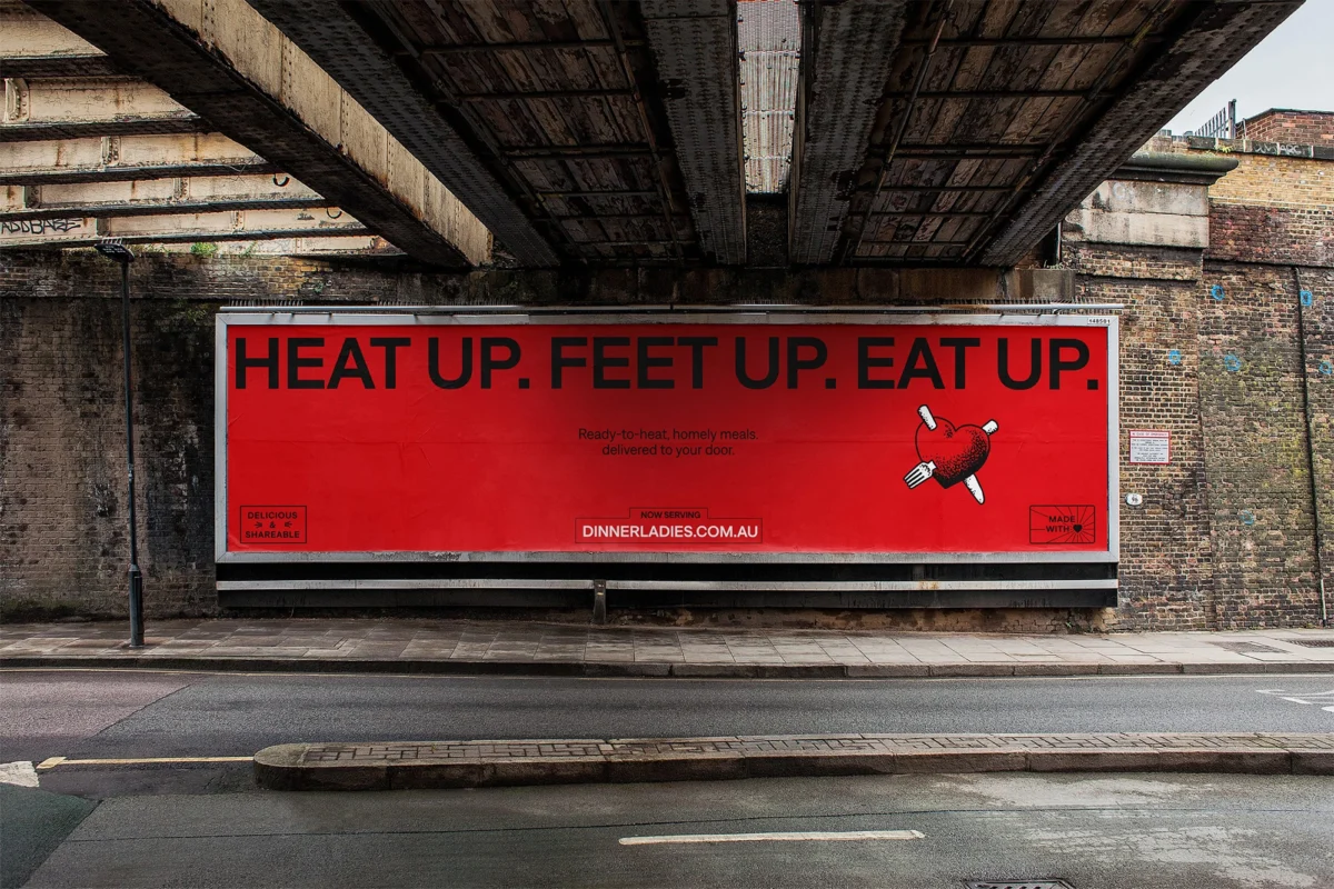
A critical first step in the rebrand was the refinement of The Dinner Ladies’ logo. The previous iteration, while recognizable, lacked the flexibility required for a modern, multi-platform brand. Universal Favourite’s solution involved decoupling the heart symbol from the script wordmark. This strategic move enhanced readability across all touchpoints and allowed for greater scalability, ensuring the logo functioned effectively on everything from small packaging labels to large digital banners.

The custom heart logo was designed in-house, and subsequently, this element, along with the wordmark, was handed over to acclaimed illustrator Jake Foreman. Foreman, known for his distinctive texture and gritty stipple technique, was tasked with redrawing and personalizing these core assets. His artistic contribution infused the logo with a unique character that pays homage to the brand’s early, hand-crafted feel while elevating it to a contemporary standard. The result is a logo that is both iconic and adaptable, embodying the brand’s history and its forward-looking vision.

A Palette That Pops: Color and Typography
The existing brand color, a distinct red, was retained as the hero hue. However, it was refined with a brighter, more modern twist to enhance its impact within the competitive food service market. This primary red is now complemented by a secondary palette that balances warm, approachable, and subtly retro hues. This carefully curated palette allows for a range of interesting and vibrant combinations, proving particularly effective across digital applications where dynamic visual engagement is crucial.

The choice of typeface was equally important in conveying the brand’s personality. Universal Favourite selected the ‘Denim’ typeface by Displaay Type Foundry. This choice was driven by its ability to showcase the brand’s confident personality while maintaining practicality and legibility. ‘Denim Wide’ is employed for headings and call-to-action elements, commanding attention with its bold presence. Its regular cut counterpart offers a friendly, clean, and legible option for subheadings and body copy. The subtle details within the Denim typeface allow it to function as an attention-grabbing hero element that supports the brand’s bold tone of voice, while also harmonizing with more expressive visual moments.

Crafting a Voice: Joyful, Cheeky, and Authentically Real
The tone of voice for The Dinner Ladies was a crucial element in bridging their heritage with their modern identity. The objective was to capture the brand’s inherent joyfulness, cheeky spirit, and comforting nature, while rigorously avoiding patronizing "mumsy" tropes and stereotypes that often plague the industry. To achieve this, they collaborated with copywriter Cat Wall.

Together, they developed a verbal identity that masterfully balances an empathetic caregiver persona with the charmingly rebellious tone of the brand’s founders. In a market often characterized by over-sincerity and manufactured friendliness, The Dinner Ladies’ new tone offers a refreshing sprinkle of irreverence. It presents a straightforward, "bull-free" reflection of their audience and their genuine needs, resonating with customers seeking authenticity and a touch of playful rebellion in their everyday lives.

Photography: Celebrating the Authentic Messiness of Life
The visual storytelling for the rebrand emphasizes the authentic, often messy, reality of dinnertime. The photography captures raw, unscripted moments – the lingering remnants of a delicious meal, the anticipation of a new dish being served, or even a child with a face full of bolognese. These candid scenes are juxtaposed with the inherent joy of sharing generous, mouth-watering food.

The creative team behind the photography shoot included Alana Dimou (photography), Jerrie-Joy Redman-Lloyd (styling), Oriana De Luca (wardrobe), Gavin Anesbury (hair and makeup), and Michaela Le (production). Their collaborative efforts resulted in imagery characterized by warm, natural lighting, quirky styling choices, pops of color and pattern, and an intentional embrace of "chaos." This approach creates a homely and inviting scene, infused with a subtle yet powerful pinch of rebellion, perfectly encapsulating the brand’s ethos.

Illustration: Bringing Personality and Narrative to the Forefront
Illustration has always been a significant component of The Dinner Ladies’ brand identity, and this was a key element to be carried forward into the rebrand. The original illustrations, with their punk-like, rough-around-the-edges flair, drew inspiration from traditional tattoo artistry. This aesthetic has been thoughtfully evolved.

Further collaboration with illustrator Jake Foreman resulted in a suite of illustrations that serve a dual purpose: as personality-rich storytelling devices and as functional brand elements. Smaller scenes and spot illustrations highlight specific product offerings and brand narratives, while a central hero illustration encapsulates the love and care infused into every Dinner Ladies dish, as well as the comforting, shared experiences that unfold around the dinner table. These illustrations are further supported by a collection of "type-furniture" elements, which not only complement the main design components but also add significant character to any layout.

Packaging: Legibility and Differentiation for Freezer-Friendly Meals
For a product often stored in the freezer and grabbed in a rush, legibility and easy differentiation are paramount. The packaging design addresses this need through a simple, effective color-coded system. This system allows customers to distinguish between different protein groups at a glance, making it quick and effortless to locate the ideal crowd-pleasing meal ready to save the day. This practical approach ensures that the brand’s visual appeal translates directly into a user-friendly experience at the point of purchase and consumption.

Implications and Future Outlook
The comprehensive rebrand positions The Dinner Ladies for continued success, providing them with a dynamic and robust brand identity that honors their seventeen-year legacy while equipping them for future growth. The flexible design system, coupled with a punchy and authentic tone of voice, pays tribute to their tenacious beginnings, the formidable founding ladies, and their enduring mission to bring joy back into dinnertime. With this revitalized brand, The Dinner Ladies can now stand confidently and proudly, their visual and verbal identity a true reflection of their readiness to serve delicious dinners to an entire nation. The successful integration of heritage elements with contemporary design principles ensures that The Dinner Ladies remain not just a convenience service, but a cherished part of Australian households.

Leave a Reply