Posted inWeb Development
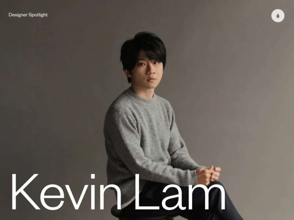
Kevin Lam, Known as ‘urfd,’ Transforms Brand Narratives into Soulful Digital Experiences from Brisbane
Brisbane, Australia – Kevin Lam, a distinguished brand and digital designer known online as "urfd" (short for "Ur Friend"), is making significant strides in the design industry by transforming conventional…