

While Adobe After Effects has long been established as the industry standard for motion graphics and visual effects, its capabilities regarding audio processing remain a critical yet often underutilized component of the post-production pipeline. For many motion designers, the software is primarily viewed through the lens of visual manipulation; however, the integration of sound is fundamental to the efficacy of any digital narrative. Professional editors and motion artists recognize that audio constitutes approximately fifty percent of the viewer’s experience, providing the emotional resonance and rhythmic pacing that visual elements alone cannot achieve. This comprehensive guide examines the technical architecture of audio tools within After Effects, offering a detailed analysis of workflow optimization, interface management, and advanced synchronization techniques.
The Technical Evolution of Audio in Motion Graphics
The history of Adobe After Effects, which debuted in 1993 under the Company of Science and Art (CoSA), was initially focused on layering and compositing. As the software evolved through its acquisition by Aldus and eventually Adobe, the demand for sophisticated audio handling grew in tandem with the rise of digital video. Today, while After Effects is not a Digital Audio Workstation (DAW) like Adobe Audition, it provides a robust set of tools designed to facilitate "visual-to-audio" synchronization.
In the contemporary media landscape, where short-form content for social media and high-impact commercial trailers dominate, the ability to manipulate sound directly within the composition environment is a prerequisite for efficiency. Industry data suggests that a significant majority of motion designers—estimated at over 70%—utilize the Creative Cloud ecosystem, making the interoperability between After Effects and other audio-centric applications a cornerstone of modern production.

Navigating the Audio Interface and Control Panels
Effective audio management in After Effects begins with a mastery of its specific interface elements. Unlike video editing software that prioritizes a horizontal timeline for audio tracks, After Effects treats audio files as individual layers within a composition, requiring a different organizational mindset.
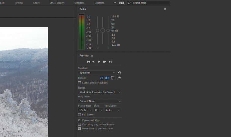
The primary control center for sound is the Audio panel, accessible via the Window menu. This panel functions as a visual monitor, displaying the decibel (dB) levels during playback. It is important to note that the Audio panel serves two distinct purposes: monitoring and localized volume adjustment. The slider within this panel affects only the preview levels, allowing an editor to lower the volume during a session without altering the actual output levels of the final render.
Complementing the Audio panel is the Preview panel. This is where the technical parameters of the "RAM Preview" are defined. Users must ensure that the audio icon is active within this panel to hear sound during playback. A common technical hurdle for beginners is the absence of sound during previews, which is almost always a result of disabled audio settings in the Preview panel or a mismatch in the hardware’s audio output preferences.
Chronology of an Optimized Audio Workflow
A professional workflow in After Effects follows a logical progression to ensure that sound and vision remain in perfect alignment. This chronology is essential for maintaining project integrity, especially as compositions grow in complexity.
- Asset Importation and Layering: Audio files, typically in WAV or MP3 format, are imported into the project bin and dragged into the composition. Professionals recommend using uncompressed WAV files (48kHz, 24-bit) to avoid the synchronization drift sometimes associated with compressed formats.
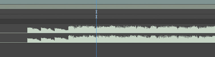
- Visualizing the Waveform: Once the layer is in the timeline, the "LL" keyboard shortcut is used to reveal the waveform. This visualization is the most critical step for precision editing.
- Marker Placement: Editors often play the audio and tap the "*" (asterisk) key on the numeric keypad to drop markers on the beat. This creates a visual roadmap for timing visual transitions.
- Volume Normalization and Fading: Using the "L" shortcut, editors access the Audio Levels property to set keyframes for fades and balancing.
- Final Synchronization Check: Using specific preview modes to ensure that the visual effects trigger at the exact millisecond of the audio peak.
Essential Shortcuts for Efficient Sound Design
In high-pressure production environments, speed is dictated by the use of keyboard shortcuts. After Effects provides several commands that are specific to audio playback and visualization:
- Spacebar: The standard shortcut for a cached preview. If the green bar (RAM cache) is not full, the audio may stutter or play at an incorrect speed.
- Numeric Keypad 0: Initiates a full RAM Preview, which renders both video and audio frames into the system’s memory for real-time playback.
- Numeric Keypad Decimal (.): This is the "Audio Only" preview shortcut. It allows the editor to listen to the soundscape without the overhead of rendering complex visual layers, which is invaluable for checking the rhythm of a voiceover or a music track.
- LL (Double L): Instantly expands the selected layer to show the audio waveform. Seeing the peaks and valleys of the sound wave allows for "eyes-on" editing, which is often more accurate than relying on auditory feedback alone due to potential hardware latency.
The Waveform Methodology: Precision Over Audition
A significant challenge when working in After Effects is the inherent latency of the software. Because After Effects renders frames on the fly, audio playback can occasionally fall out of sync with the visual display if the computer’s RAM is overtaxed. Consequently, industry experts advocate for the "Waveform Methodology."
Instead of adjusting the timing of a visual effect while listening to the audio, editors are encouraged to align keyframes with the physical peaks in the waveform display. This ensures that even if the preview lags, the mathematical relationship between the visual frame and the audio sample remains perfect. This approach is particularly vital when creating "kinetic typography" or beat-matched transitions where a single frame of misalignment can be jarring to the viewer.
Audio Effects and Signal Processing
While After Effects offers a suite of internal audio effects located under the Effects > Audio menu, they are generally intended for minor adjustments rather than comprehensive mixing.
- Bass & Treble: Useful for quick tonal shifts to make a voiceover more prominent.
- Reverb: Can be used to create a sense of space, such as making a sound feel as though it is occurring in a large hall to match a visual environment.
- Stereo Mixer: Allows for basic panning between the left and right channels, which can be keyframed to follow the movement of an object across the screen.
However, for complex tasks like noise reduction, multi-band compression, or spectral frequency display editing, the "Edit in Adobe Audition" command is the preferred professional route. This dynamic link allows for non-destructive editing in a dedicated audio environment, with changes reflecting back in the After Effects timeline automatically.
Advanced Automation: Converting Audio to Keyframes
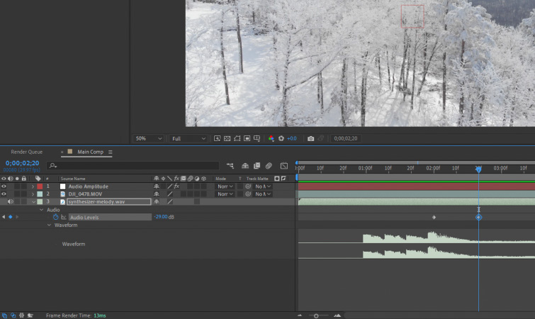
One of the most powerful features in After Effects is its ability to bridge the gap between sound and motion through data conversion. By right-clicking an audio layer and selecting Keyframe Assistant > Convert Audio to Keyframes, the software analyzes the amplitude of the audio signal and generates a "Null Object" containing the data.
This Null Object, typically named "Audio Amplitude," contains sliders for the Left Channel, Right Channel, and Both Channels. These sliders represent the volume of the audio as a numerical value between 0 and 100 (or higher, depending on the peak). Motion designers can then use "Expressions"—small snippets of code—to link visual properties like scale, opacity, or blur intensity to these sliders. This technique allows for the creation of organic, reactive animations that "dance" to the music with mathematical precision.
Industry Implications and Market Trends
The demand for integrated audio-visual skills is reflected in current employment data. According to the U.S. Bureau of Labor Statistics, the demand for special effects artists and animators is projected to grow 8% through 2032. Employers increasingly seek "T-shaped" professionals—those who have deep expertise in motion graphics but also possess functional knowledge of sound design and audio engineering.
The integration of AI-driven tools within the Adobe Creative Cloud is further transforming this landscape. Features such as "Enhance Speech" and "Auto-Ducking" are beginning to migrate from Premiere Pro and Audition into the broader ecosystem, suggesting a future where After Effects may handle audio with even greater automation.
Conclusion and Best Practices
In conclusion, while After Effects is fundamentally a visual tool, its audio capabilities are robust enough to handle the requirements of high-end motion design when utilized correctly. The key to success lies in understanding the software’s limitations—such as preview latency—and leveraging its strengths, particularly the waveform visualization and the conversion of audio data into keyframes.
For professionals aiming to produce cinematic quality content, the following best practices are recommended:
- Always edit audio-visual sync based on the waveform peaks.
- Use the "Audio Only" preview to verify the pacing of the edit.
- Utilize Null Objects and Audio Amplitude for reactive animations.
- Offload complex sound mixing to Adobe Audition via Dynamic Link.
By mastering these techniques, motion designers can ensure that their work not only looks visually stunning but also carries the professional auditory impact necessary for modern digital storytelling. As the industry continues to evolve, the fusion of sound and motion will remain the hallmark of high-quality production, making these skills indispensable for any serious artist in the field.


