Best Rock and Roll Fonts A Visual Journey
Best rock and roll fonts – they’re more than just letters; they’re the visual soundtrack to rebellion, energy, and raw emotion. From the gritty textures of grunge to the swirling psychedelia of the 60s, fonts have played a crucial role in shaping the identity of rock and roll. This post dives deep into the world of typographic rock, exploring the history, styles, and practical applications of these iconic fonts.
We’ll uncover how different fonts capture the spirit of various rock subgenres, from classic rock’s bold statements to punk’s aggressive simplicity.
We’ll journey through decades of musical history, examining how font choices have reflected the evolving sounds and attitudes of each era. Get ready to rock your design projects with the perfect font, understanding the impact of typography on a band’s overall visual identity, from album covers to logos. We’ll even look at where to find these awesome fonts and how to use them legally!
Defining “Rock and Roll” Font Aesthetics
Rock and roll font aesthetics are a fascinating blend of rebellion, energy, and a touch of nostalgia. They visually capture the spirit of the music, reflecting its evolution across decades and subgenres. These fonts often evoke a sense of raw power, individuality, and a slightly rebellious attitude, mirroring the very essence of rock and roll itself.
Visual Characteristics of Rock and Roll Fonts
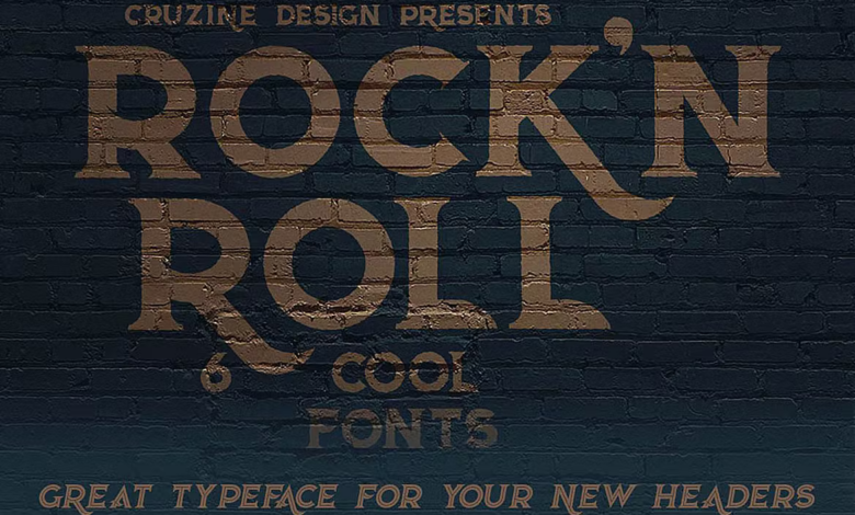
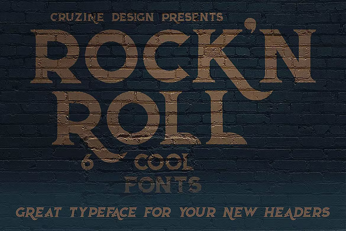
Several visual cues consistently appear in fonts associated with rock and roll. These fonts frequently feature strong, bold strokes, often with a slightly distressed or textured appearance to suggest age and wear. Think of the chipped paint on a vintage guitar amplifier or the faded posters from a legendary concert. Many rock fonts incorporate sharp angles and jagged edges, adding to their aggressive and dynamic feel.
Others might use a more playful, almost cartoonish style, reflecting the lighter side of the genre. Examples include fonts like “Metal Mania,” which embodies a heavy metal aesthetic with its sharp serifs and aggressive letterforms, and “Rockwell,” a classic bold serif font that evokes a sense of vintage Americana often associated with early rock and roll. Conversely, fonts like “Impact” convey a powerful, direct message, often seen in concert posters and album art.
Historical Context and Font Design
The design of rock and roll fonts is intrinsically linked to the historical evolution of the music itself. Early rock and roll, heavily influenced by blues and country, often used fonts that reflected a simpler, more hand-drawn aesthetic. Think of the fonts used on early blues records – often bold sans-serifs, easily readable even from a distance. As rock and roll evolved into its various subgenres – from the psychedelic rock of the 60s to the punk and new wave movements of the 70s and 80s – font styles adapted accordingly.
Psychedelic rock posters, for example, frequently employed ornate, swirling fonts reflecting the mind-bending visuals of the era. Punk rock, in contrast, favored stark, minimalist fonts, reflecting the genre’s anti-establishment ethos. Heavy metal, with its aggressive sound, often uses fonts with sharp, jagged edges and exaggerated features to mirror the music’s intensity.
Serifs versus Sans-Serifs in Rock and Roll Font Design
The choice between serif and sans-serif fonts significantly impacts the overall aesthetic of a rock and roll design. Serif fonts, characterized by small decorative strokes at the ends of letters (like Rockwell or Playfair Display), often convey a sense of tradition and classicism, sometimes used to evoke a vintage feel, particularly when referencing earlier eras of rock and roll.
Sans-serif fonts, lacking these strokes (like Impact or Bebas Neue), tend to project a more modern, clean, and often aggressive image, fitting the aesthetic of punk, new wave, and many heavy metal subgenres. The contrast between these styles is striking: serifs often create a more sophisticated and sometimes nostalgic feel, while sans-serif fonts often feel more raw, direct, and contemporary.
The choice depends heavily on the specific subgenre and the desired mood or message.
Categorizing Rock and Roll Fonts by Style
Rock and roll music, with its diverse subgenres and rebellious spirit, has always had a strong visual identity. This is reflected in the fonts used to represent bands, albums, and concert posters. Categorizing these fonts helps us understand the visual evolution of the genre and the stylistic choices made to reflect its different moods and eras. This categorization isn’t rigid; many fonts blend styles, but it provides a useful framework for appreciating the visual landscape of rock and roll.
Different eras and subgenres of rock and roll have favored distinct font styles. Understanding these visual preferences offers insight into the evolution of the genre’s aesthetic and the way designers used typography to capture its essence. The relationship between font choice and musical genre is strong, with certain styles becoming synonymous with specific sounds and attitudes.
Rock and Roll Font Styles by Category
The following table categorizes several rock and roll font styles, illustrating the diversity within the genre’s visual representation. Note that many fonts bridge categories, showcasing the fluid nature of artistic expression.
| Vintage | Grunge | Psychedelic | Heavy Metal |
|---|---|---|---|
|
Fonts reminiscent of classic rock posters and album art from the 50s-70s. Often characterized by bold serifs, Art Deco influences, or a slightly distressed look. Examples include fonts resembling those used on early Elvis Presley or Chuck Berry album covers. |
Fonts with a raw, distressed, and often illegible appearance. They evoke a sense of rebellion and raw energy. Think of fonts used on Nirvana or Soundgarden album art, often featuring scratches, rips, and a general sense of chaos. |
Fonts inspired by the psychedelic art of the 60s. These are often highly stylized, featuring swirling patterns, distorted lettering, and vibrant colors. Imagine fonts that would suit a Jimi Hendrix or Jefferson Airplane album cover. |
Fonts that are aggressive, bold, and often angular. They convey power and intensity, mirroring the sound of the music. Examples include fonts that would be suitable for Metallica or Slayer album art, often featuring sharp lines and heavy weight. |
| Example: A font with strong serifs and a slightly condensed letter spacing. | Example: A font with irregular letterforms, a distressed texture, and possibly some splatter effects. | Example: A font with swirling, psychedelic elements incorporated into the letterforms. | Example: A font with sharp angles, heavy weight, and possibly incorporating metal-like textures. |
Evolution of Rock and Roll Font Styles
The visual representation of rock and roll has evolved significantly over time, reflecting changes in musical styles, artistic trends, and technological advancements. The following is a description of this evolution, highlighting key design elements that changed across different eras.
Early rock and roll (50s-60s) often featured clean, bold fonts with a strong emphasis on readability. Think of the simple, yet impactful lettering used on early rock and roll singles and posters. The 60s saw the rise of psychedelic rock, and with it, a shift towards more elaborate, swirling, and often distorted fonts, reflecting the mind-altering nature of the music.
The 70s brought a more diverse range of styles, including classic rock fonts that often borrowed from vintage styles, while the punk and new wave scenes of the late 70s and 80s favoured raw, often hand-drawn fonts that reflected the DIY ethos of the movements. The grunge movement of the 90s further emphasized this raw aesthetic, incorporating distressed and illegible elements into font design.
More recent rock subgenres continue to build upon these established visual traditions, sometimes blending elements from different eras or creating entirely new styles.
So you’re digging for the best rock and roll fonts for your band’s logo? Finding the perfect typeface is crucial, and that extends to your online presence too. To really make your band’s YouTube channel scream rock ‘n’ roll, check out this awesome guide on getting it on with YouTube for tips on branding and promotion.
Once you’ve got your YouTube strategy nailed, you can focus on getting that killer font to complete the look!
Font Style and Rock and Roll Genre
The relationship between font style and rock and roll genre is intrinsically linked. The visual representation often reinforces and reflects the musical style’s overall mood and message.
Classic rock often uses fonts that evoke a sense of nostalgia and tradition, borrowing from vintage styles. Think of the classic serif fonts or slightly distressed lettering often found on classic rock album art. In contrast, punk rock frequently employs raw, hand-drawn, or highly stylized fonts that reflect the rebellious and anti-establishment nature of the music. Heavy metal uses aggressive, bold, and often angular fonts to reflect the intensity and power of the music.
Each subgenre develops its own visual language, making font choice an essential part of the genre’s identity.
For instance, a classic rock band like The Rolling Stones might utilize a font with a vintage feel, possibly incorporating Art Deco elements. A punk band like The Ramones might use a simple, bold sans-serif font, possibly with a slightly distressed look. A heavy metal band like Black Sabbath might use a sharp, angular font with a dark and aggressive aesthetic.
Practical Applications of Rock and Roll Fonts: Best Rock And Roll Fonts
Rock and roll fonts, with their rebellious spirit and bold aesthetics, aren’t just visually striking; they’re powerful tools in branding and marketing, particularly for music-related businesses. Their ability to evoke specific emotions and instantly communicate a brand’s personality makes them highly effective in creating memorable and impactful designs. Let’s explore how these fonts are used to build strong brand identities and connect with target audiences.
Rock and Roll Fonts in Music Branding and Marketing
The raw energy and rebellious attitude inherent in rock and roll music translate seamlessly into font choices. Many iconic bands and music-related businesses leverage this visual language to reinforce their brand image. For example, the logo for the band AC/DC uses a bold, heavily stylized typeface that screams power and intensity. The font is heavily condensed, with sharp angles and a slightly distressed look, perfectly capturing the band’s hard-rocking image.
Imagine a similar approach for a new heavy metal band – a custom font with sharp serifs and a distressed texture would instantly communicate aggression and power. Conversely, a band aiming for a more classic rock sound might choose a font with a vintage feel, perhaps a slightly rounded sans-serif with a retro color palette, to evoke nostalgia and timeless quality.
Think of a logo reminiscent of 70s rock posters. This careful selection of typography contributes significantly to brand recognition and memorability.
Effectiveness of Rock and Roll Fonts in Conveying Moods and Messages, Best rock and roll fonts
The choice of font significantly impacts how a brand is perceived. A gritty, hand-drawn font suggests authenticity and a DIY ethos, perfect for a garage rock band or independent record label. This contrasts sharply with a sleek, modern sans-serif font that might be chosen by a more polished, commercially successful artist. The font’s weight also plays a crucial role: a thin, delicate font conveys fragility or a more introspective sound, whereas a thick, bold font projects strength and aggression.
For instance, a punk rock band might opt for a stark, condensed sans-serif with a rough, unfinished look to reflect their raw, uncompromising music. This contrasts with a psychedelic rock band that might use a more ornate, swirling font reflecting the trippy, experimental nature of their music. The skillful use of font style, weight, and texture can effectively communicate the nuances of a band’s sound and personality.
Resources for Finding and Downloading Rock and Roll Fonts
Several online platforms offer a vast selection of rock and roll fonts, but it’s crucial to understand licensing and usage rights. Many free fonts are available under open-source licenses, allowing for personal and commercial use with certain conditions. However, some fonts require purchasing a license for commercial applications. Sites like Google Fonts offer a curated collection of free fonts, many of which could be adapted for a rock and roll aesthetic.
Creative Market and Font Squirrel are other popular marketplaces with a wide range of both free and paid fonts, offering diverse styles and levels of customization. Always carefully review the license agreement before using any font in your projects to avoid copyright infringement. Remember to check the license details for each font; some might have restrictions on commercial use or require attribution.
The Impact of Typography on Rock and Roll Visual Identity

Source: masterbundles.com
Typography is far more than just choosing a font; it’s a crucial element in crafting a band’s visual identity, working in harmony with other design aspects to create a cohesive and memorable image. The right font can instantly communicate a band’s genre, attitude, and even their musical style, reinforcing the overall message conveyed through their music.The interplay between typography and other visual elements is vital.
A strong rock and roll visual identity typically involves a specific color palette, often incorporating bold colors like deep reds, blacks, and whites, or perhaps vibrant, almost psychedelic hues for more experimental rock subgenres. Imagery, ranging from gritty photographic realism to surreal and abstract designs, further contributes to the overall aesthetic. Fonts must complement these elements, either echoing their boldness or providing a contrasting element that adds visual interest and sophistication.
For instance, a sharp, angular font might be perfect for a hard rock band using dark, high-contrast photography, while a more stylized, almost hand-drawn font could suit a psychedelic rock band with swirling, colorful artwork.
Rock and Roll Font Evolution in Album Art
The evolution of typography in rock album art mirrors the evolution of the genre itself. Early rock and roll album covers, often from the 50s and 60s, frequently featured simple, bold sans-serif fonts, reflecting a straightforward, energetic aesthetic. Think of the clean, impactful typography on many early Elvis Presley albums. The 70s saw a rise in more elaborate designs, often incorporating psychedelic influences and more complex typography.
Bands like Pink Floyd experimented with unusual typefaces and layouts, reflecting their more experimental musical styles. The punk rock era of the late 70s and 80s favored a raw, DIY aesthetic, often using simple, almost crude fonts to convey a rebellious attitude. Think of the stark, minimalist designs of many punk albums. Later decades saw a greater diversity of styles, with bands drawing on various typographic traditions to create unique visual identities.
Grunge in the 90s, for example, often featured fonts that were less polished and more grungy, reflecting the raw emotion of the music.
Mock Album Cover Design
Let’s imagine a mock album cover for a fictional band called “Renegade Rhythm.” The album title is “Chrome Hearts.” The design aims for a blend of classic rock and modern grit.The album cover features a central image: a close-up shot of a vintage motorcycle engine, heavily textured and slightly blurred to create a sense of movement and raw power.
The background is a deep, metallic grey, suggesting the chrome mentioned in the album title. The band’s name, “Renegade Rhythm,” is rendered in a bold, condensed sans-serif font reminiscent of classic rock logos but with a slightly modernized, sharper edge. This font, a custom creation based on a combination of classic and modern influences, is in a deep crimson red, creating a strong contrast against the grey background.
The album title, “Chrome Hearts,” is placed below the band name in a smaller, yet still bold, sans-serif font in a lighter, gunmetal grey. This creates a visual hierarchy, making the band name the primary focus. The overall layout is clean and uncluttered, allowing the powerful imagery and typography to take center stage. A subtle, distressed texture is applied to the entire background, adding a gritty, vintage feel that enhances the overall aesthetic.
The color palette is deliberately limited to the metallic grey, deep crimson red, and gunmetal grey to maintain a consistent, powerful visual identity. The overall effect is a classic rock feel updated with a modern, gritty edge. The combination of the strong imagery and carefully selected typography effectively communicates the band’s genre and attitude, creating a compelling and memorable album cover.
Concluding Remarks
Source: imgur.com
So, whether you’re designing an album cover, a band logo, or just want to add a touch of rock and roll to your personal projects, understanding the power of fonts is key. Remember, the right font isn’t just about aesthetics; it’s about communicating the spirit and energy of the music. From vintage vibes to modern grit, the world of rock and roll fonts offers a vast and exciting landscape for creative expression.
Now go forth and rock!
FAQ Resource
What software can I use to work with these fonts?
Most standard graphic design software like Adobe Photoshop, Illustrator, and InDesign, as well as free options like GIMP and Inkscape, will work perfectly.
Are there any free rock and roll fonts available?
Yes, many websites offer free rock and roll fonts, but always check the licensing terms to ensure you’re using them legally.
How do I choose the right font for my specific rock subgenre?
Consider the overall feel of the music. Heavy metal might call for bold, aggressive fonts, while folk rock might suit more delicate, hand-drawn styles.
Can I use these fonts commercially?
Always check the license of the specific font you’re using. Some fonts are free for personal use only, while others allow commercial use.