
Digital marketing and search engine optimization have entered a transformative era where appearing on the first page of Google no longer guarantees a brand’s presence in the conversational answers provided by Large Language Models. This disconnect stems from a sophisticated background process known as query fan-out, a mechanism used by advanced artificial intelligence systems to construct comprehensive, multi-dimensional responses to user inquiries. As systems like ChatGPT, Perplexity, and Google AI Overviews become the primary entry points for information, the traditional focus on keyword rankings is being superseded by a need for coverage, retrievability, and topical authority.
The Mechanism of Query Fan-Out
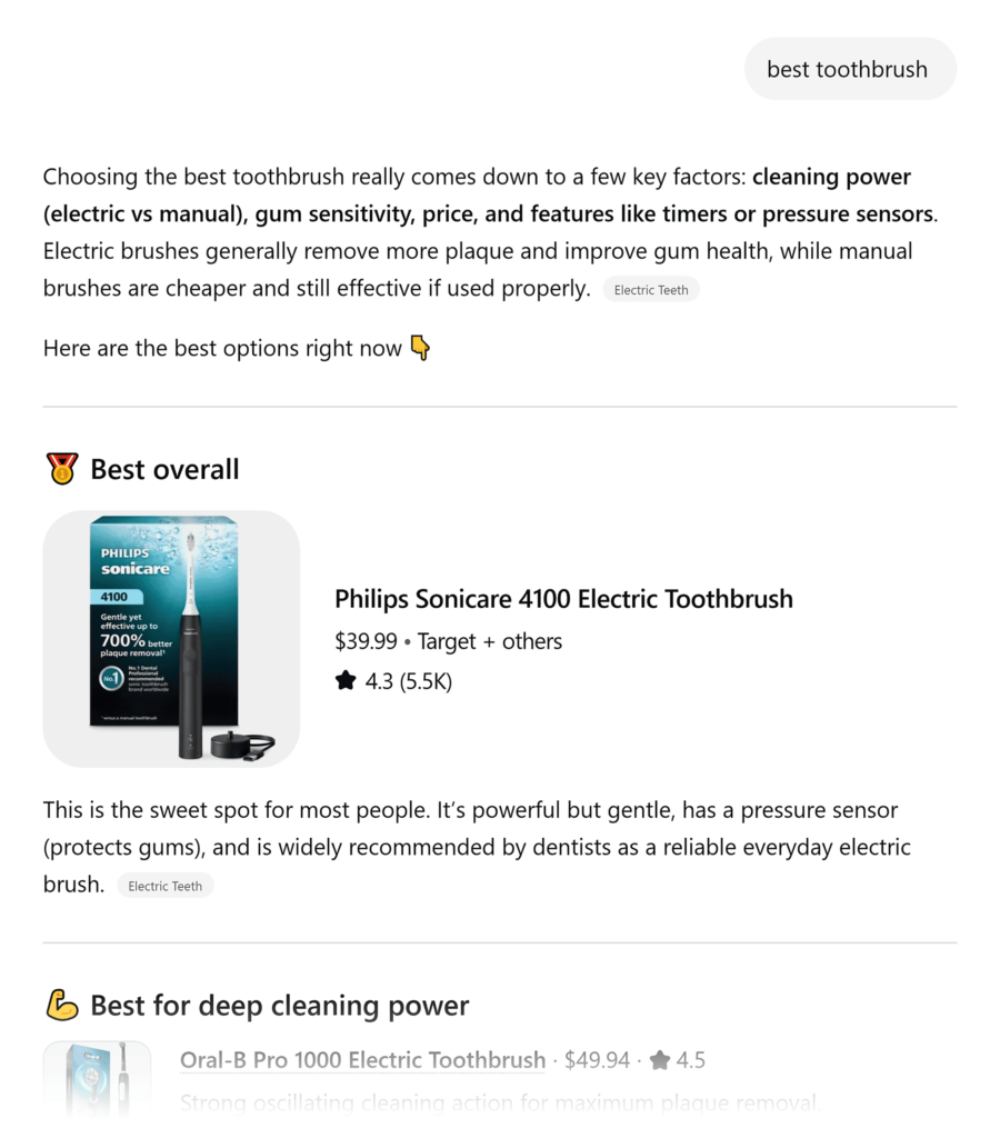
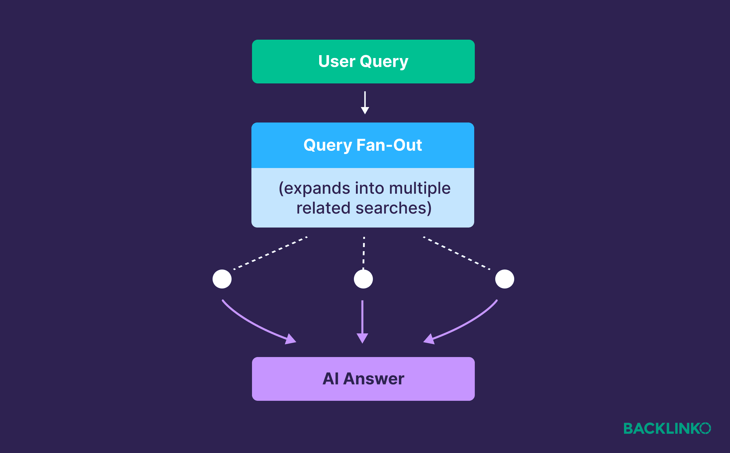
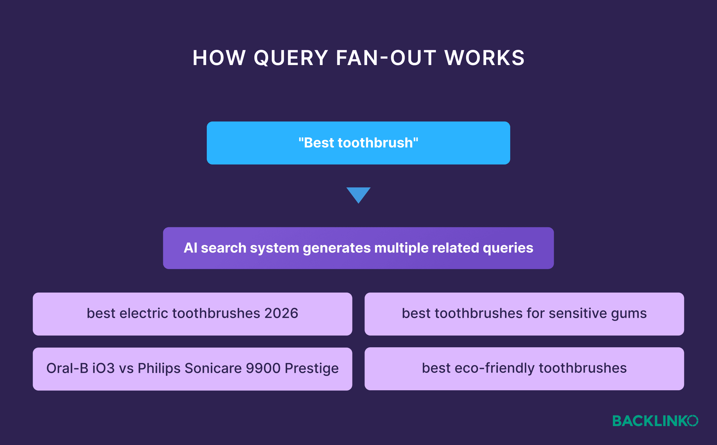
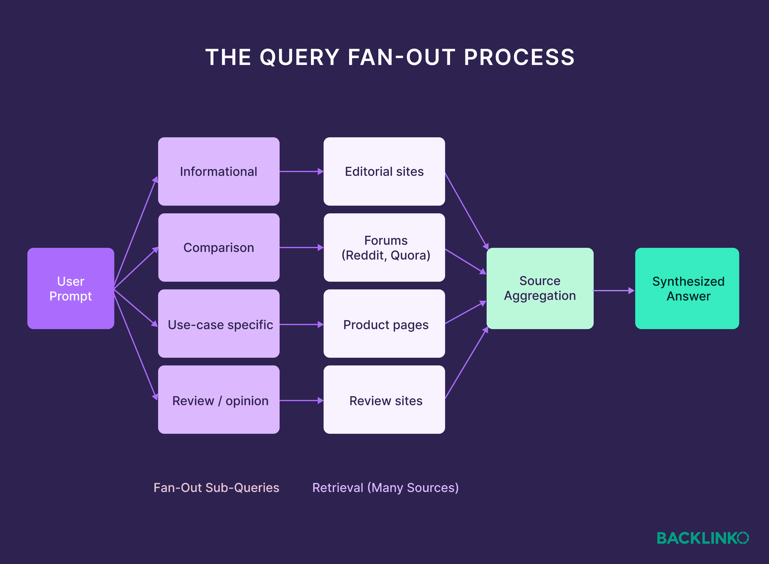
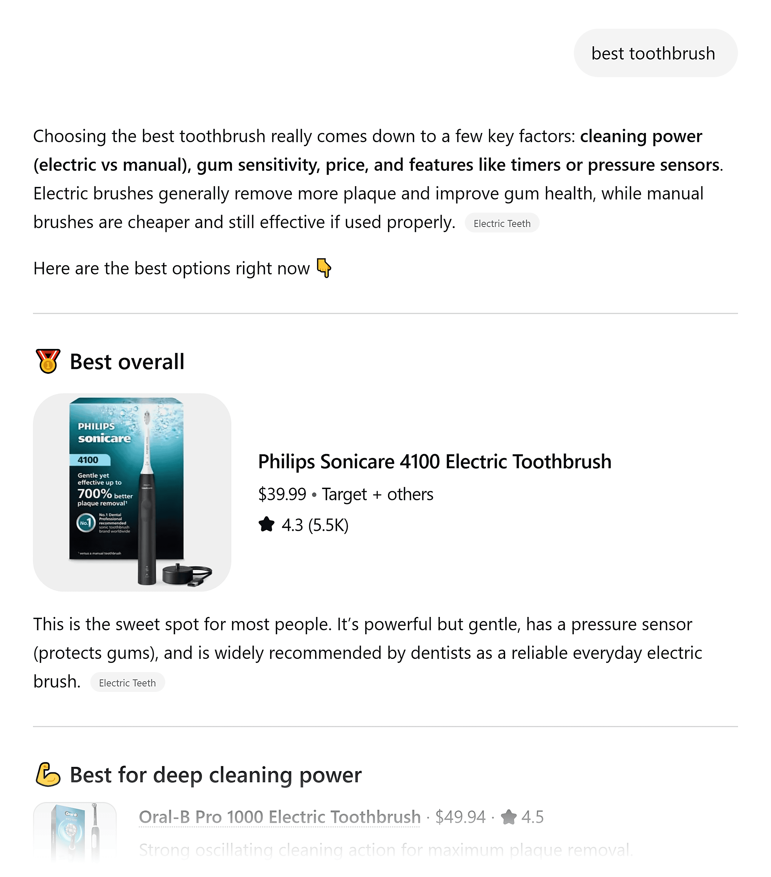
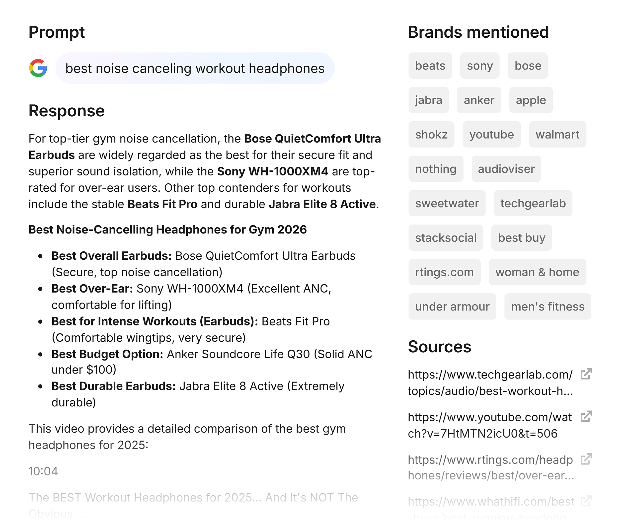
Query fan-out is a computational process wherein an AI search system decomposes a single user prompt into a series of related sub-queries. This "fanning" allows the AI to gather data from diverse segments of the web—including editorial reviews, forum discussions, technical specifications, and user-generated content—to synthesize a singular, authoritative answer. For example, a basic search for the "best noise-canceling headphones" does not simply return a list of products; the AI system generates sub-queries behind the scenes to investigate specific use cases, such as "headphones for air travel," "durable options for students," or "battery life comparisons between Sony and Bose."
This process ensures that the AI provides a response that anticipates the user’s secondary and tertiary needs. By pulling information from multiple sources regardless of their traditional search engine result page (SERP) position, AI systems prioritize the most relevant and reliable data points over the most optimized landing pages. Consequently, a brand may rank first on Google for a primary keyword but remain entirely absent from an AI’s synthesized response if its content does not satisfy the specific sub-queries generated during the fan-out process.
Statistical Realities of the AI Search Era
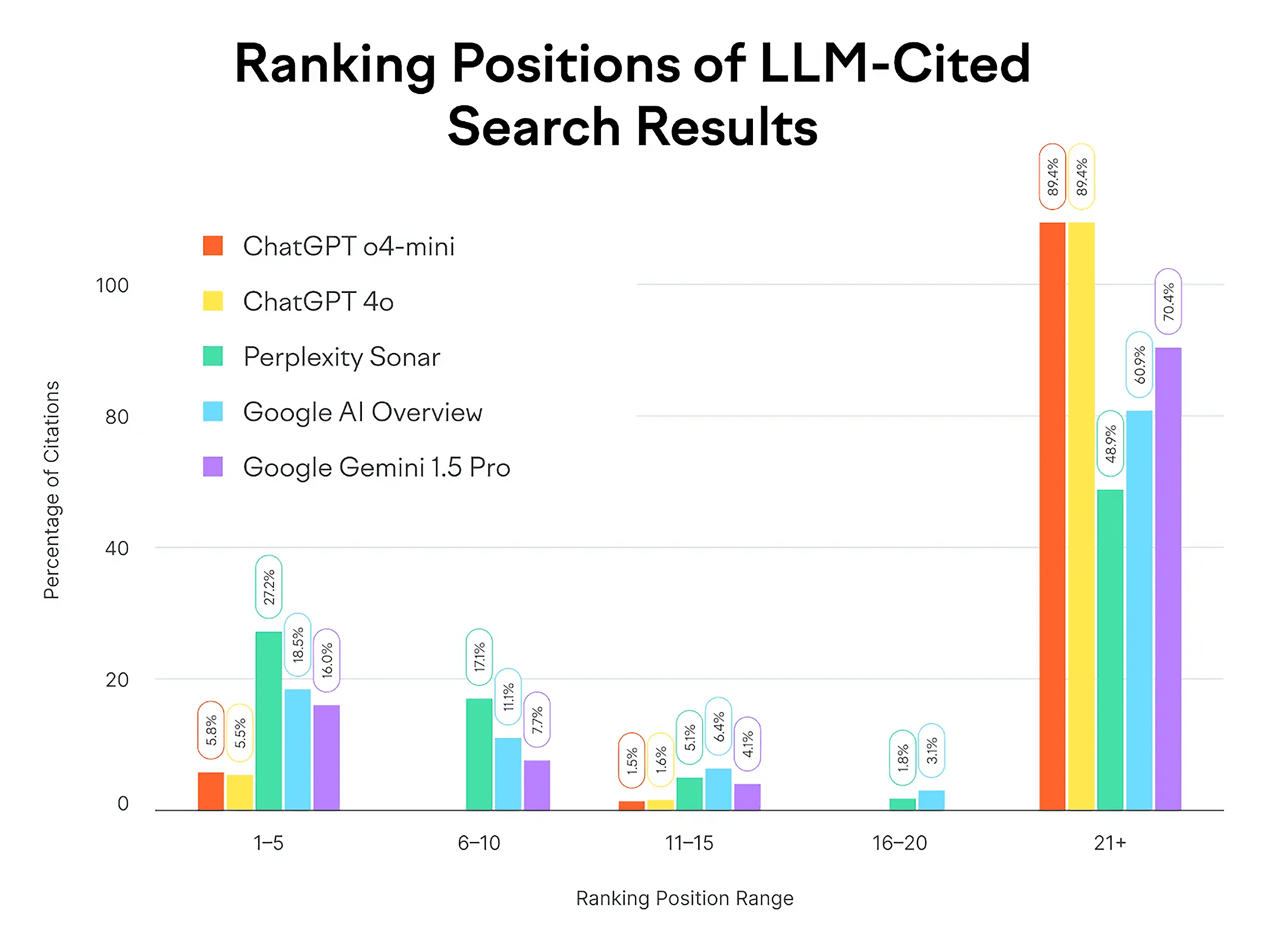
Recent industry studies highlight a significant shift in how information is retrieved and cited. Data from a comprehensive Semrush study indicates that ChatGPT cites pages appearing in Google positions 21 or lower nearly 90% of the time. This suggests that AI systems are not tethered to the traditional "top 10" results that have dominated SEO strategy for two decades. Instead, these systems scan for the most informative passages that directly resolve a specific sub-query.
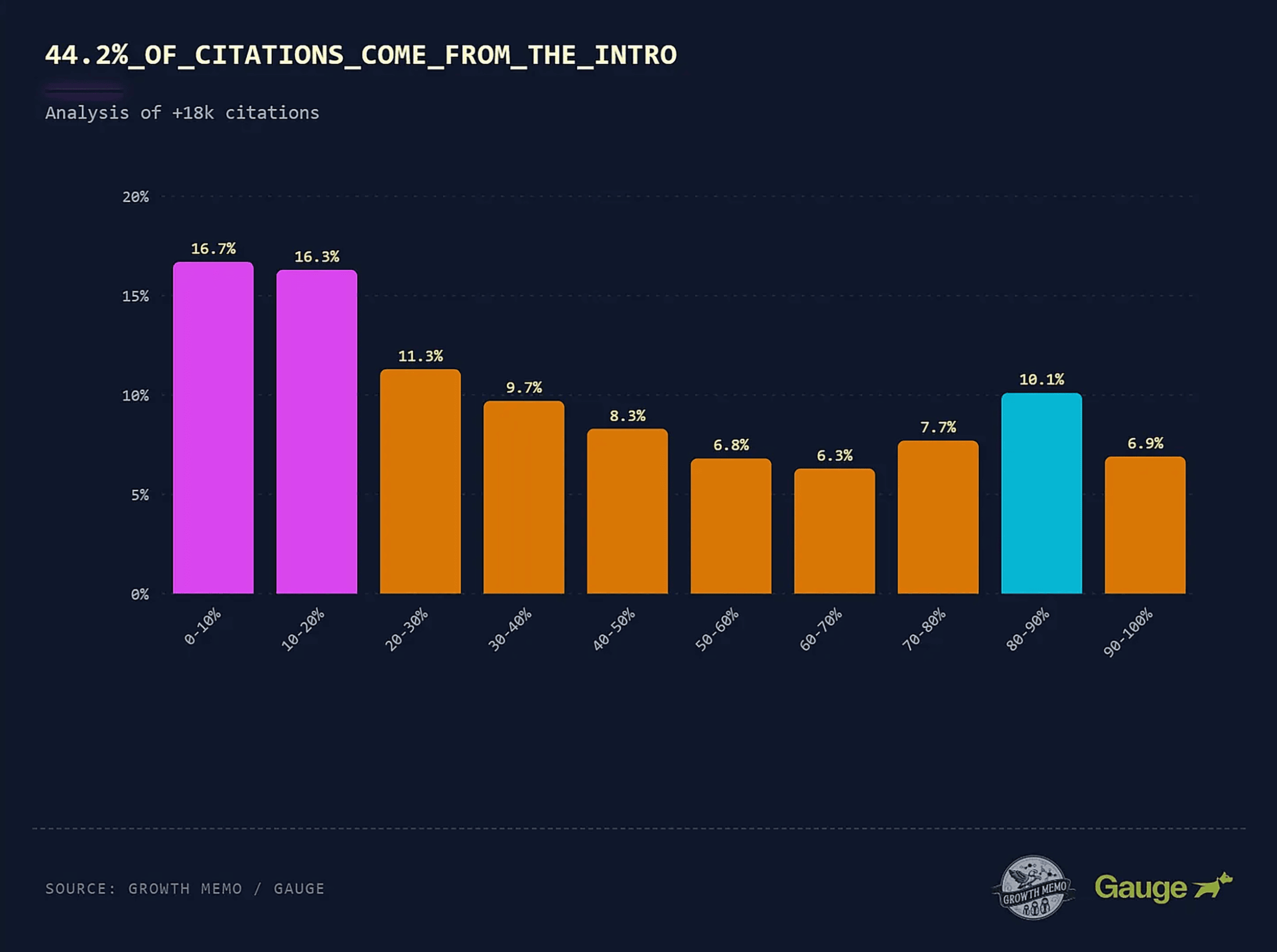
Furthermore, the placement of information within a document has become a critical factor for AI retrievability. An analysis of 1.2 million ChatGPT responses conducted by industry experts found that 44.2% of citations are pulled from the first 30% of a web page. In contrast, only 24.7% of citations come from the final third of the content. This "front-loading" requirement indicates that AI attention is highly concentrated on introductory sections and executive summaries, where claims are stated clearly and concisely.
The Strategic Shift: From Keywords to Money Prompts
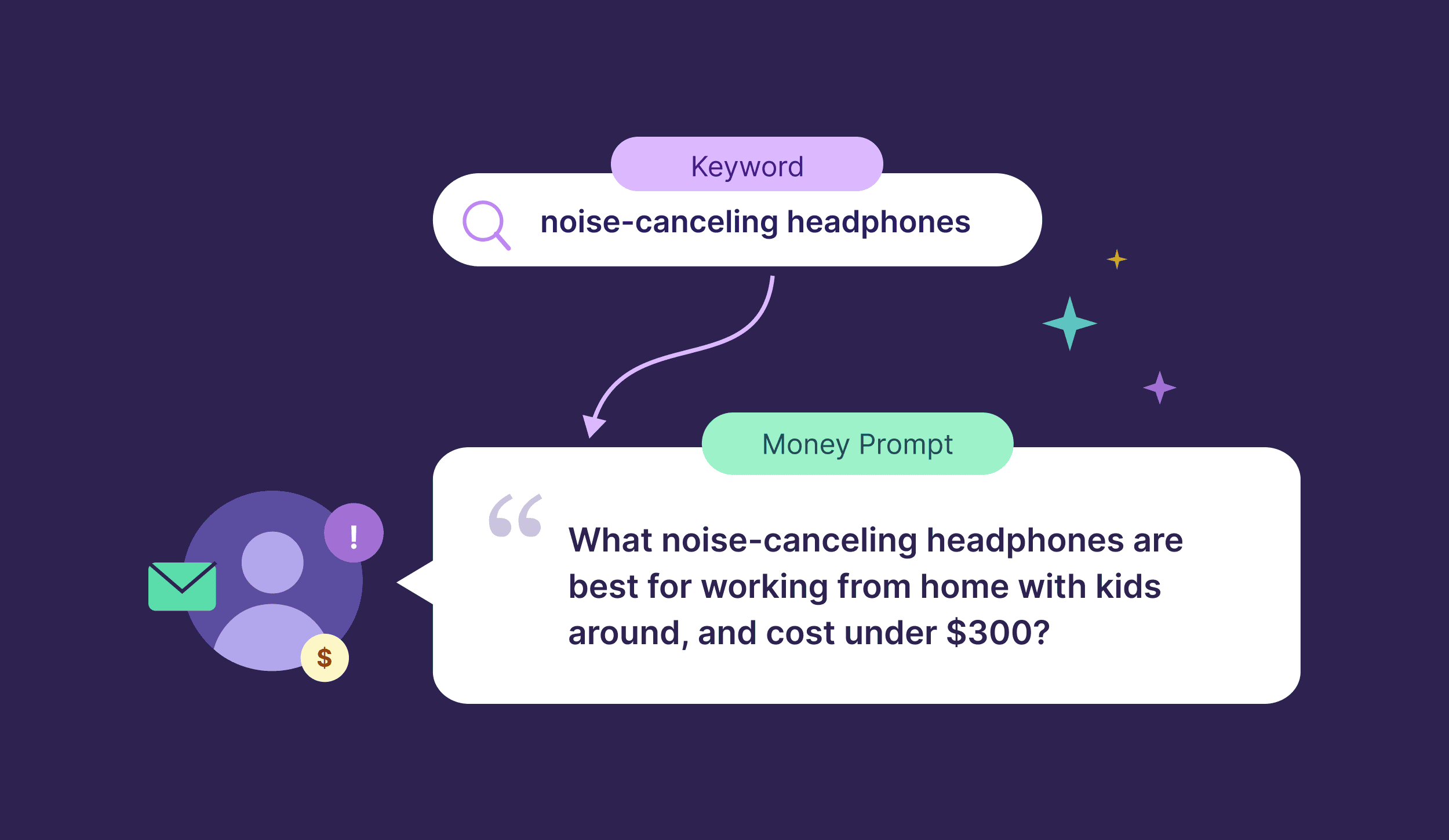
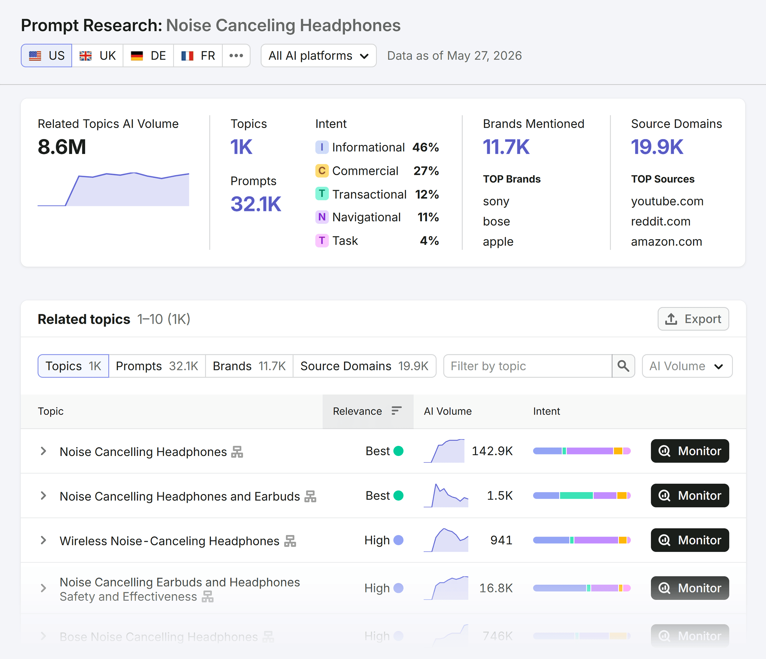
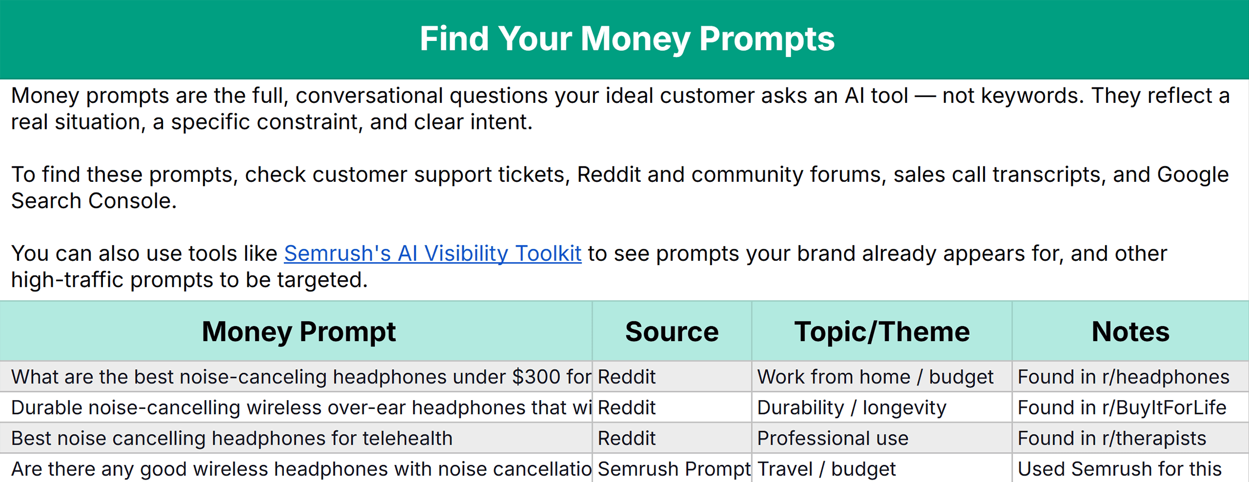
The transition from traditional search to AI discovery requires a fundamental change in how marketing teams identify opportunities. The industry is moving away from "money keywords"—high-volume terms with commercial intent—toward "money prompts." These are the specific, conversational questions that a high-value customer is likely to ask an AI tool when seeking a solution to a problem.
Identifying these prompts involves analyzing user behavior on platforms where natural language is the norm, such as Reddit, Quora, and customer support transcripts. For a consumer electronics brand, a money keyword might be "wireless earbuds," but a money prompt would be: "What are the best wireless earbuds for someone with small ears who runs in the rain and wants to spend less than $150?" Successfully targeting the latter requires content that addresses the intersection of ergonomics, weatherproofing, and price-to-performance ratios—elements that an AI will look for during a query fan-out.
A Six-Step Workflow for AI Visibility
To navigate this new landscape, digital strategists are adopting a structured workflow designed to align content with AI retrieval patterns.
1. Identifying Money Prompts
The process begins with the discovery of the conversational phrases used by the target audience. This involves utilizing AI visibility toolkits and social listening tools to determine which prompts are currently triggering AI responses that mention competitors or related products.
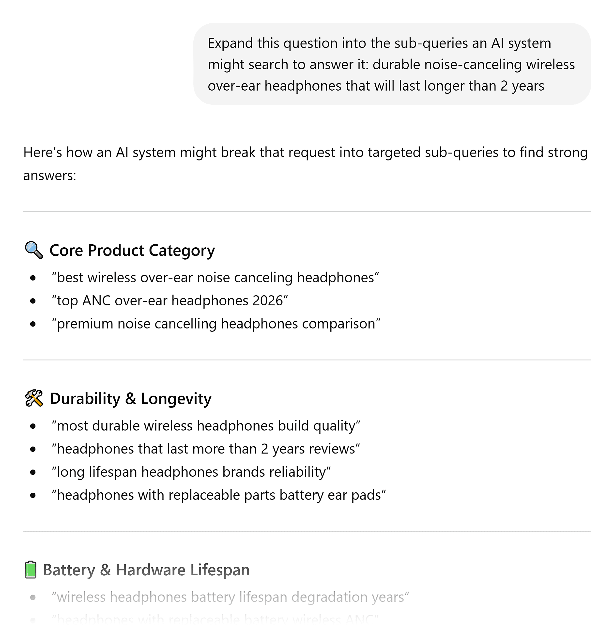
2. Generating the Fan-Out Set
Once a primary prompt is identified, marketers must determine how an AI will decompose it. This can be achieved through manual testing across different LLMs or by using specialized browser extensions that capture the internal sub-queries run by systems like ChatGPT. Understanding these sub-queries reveals the "hidden" questions a brand must answer to stay relevant.

3. Intent Bucketing
Sub-queries are typically categorized by intent: definitions, comparisons, use-case recommendations, troubleshooting, or pricing. By bucketing these queries, content teams can determine the ideal format for their response, whether it be a technical table, a head-to-head comparison, or a "how-to" guide.

4. Content Gap Auditing
Brands must perform a rigorous audit of their existing digital footprint to see where they fail to address these sub-queries. A "site:" search on Google for specific sub-query topics often reveals that while a brand covers a broad topic, it lacks the granular, self-contained answers that AI systems prefer to extract.
5. Structural Optimization for Extraction
Creating content is insufficient if the AI cannot parse it. Structural optimization involves front-loading claims, using descriptive H2 and H3 subheadings that mirror the sub-queries, and employing structured data such as comparison tables and bulleted lists. This "scannability" allows the AI to pull specific passages for use in its synthesized answer without needing to process the entire page’s context.
6. Performance Tracking and Sentiment Analysis
Finally, brands must track their "AI Visibility Score"—a metric that measures how often they are cited in LLM responses compared to their competitors. Advanced tracking tools also monitor brand sentiment, allowing companies to see if they are being described favorably or if the AI is highlighting specific weaknesses, such as a lack of certain features or poor user reviews on third-party sites.
Platform-Specific Nuances in Query Fan-Out
Not all AI platforms handle query fan-out in the same manner. Understanding these differences is vital for a multi-platform strategy.
- ChatGPT: Utilizes a "reasoning" phase where it determines if it needs to run a live web search. It tends to pull from a wide variety of third-party sources, making topical authority across the web (not just on the brand’s own site) essential.
- Perplexity: Operates as a real-time search engine, combining conversational context with immediate web retrieval. It often runs multiple layers of fan-out, including an internal check of the user’s previous questions to personalize the results.
- Claude: Takes a more interactive approach, often asking clarifying questions before searching. This necessitates content that is highly specific to well-defined use cases.
- Google AI Overviews: Synthesizes Google’s massive web index into condensed summaries. Because it is built on the existing Google search infrastructure, traditional SEO factors like backlinks and site speed still play a secondary role, but the focus remains on passage-level relevance.
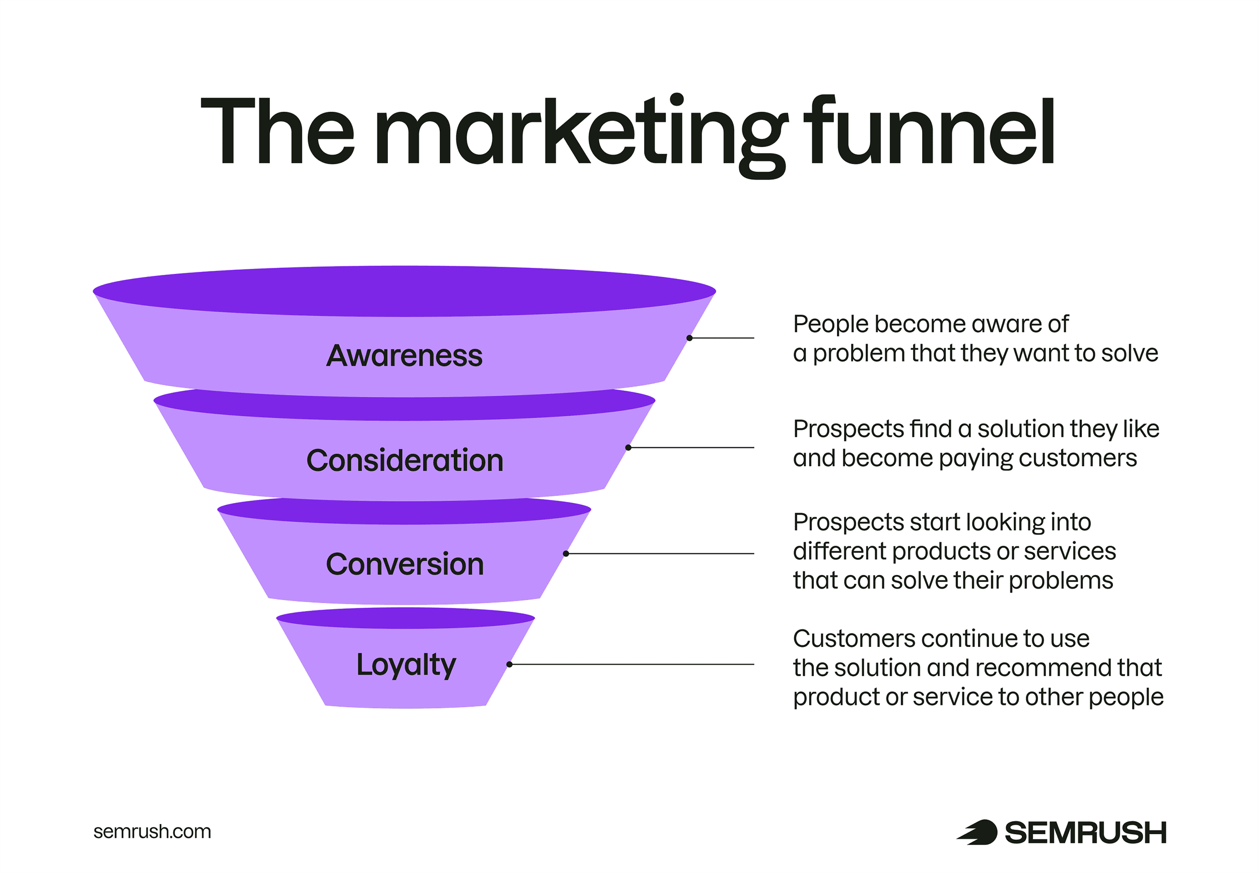
The Collapse of the Marketing Funnel
Perhaps the most significant implication of query fan-out is the collapse of the traditional, linear marketing funnel. Historically, a consumer moved through stages of awareness, consideration, and decision over multiple sessions and searches. In the AI search environment, these stages occur simultaneously within a single interaction.
When a user asks for a product recommendation, the AI’s fan-out process retrieves awareness-level context (what the product is), consideration-level data (how it compares to others), and decision-level specifics (price and where to buy). Consequently, a brand’s content must be "full-funnel" in nature. Every page must be capable of serving as an entry point, a comparison tool, and a closing argument.
Conclusion and Future Outlook
The rise of query fan-out marks the end of the "keyword-first" era of digital marketing. As AI systems become more adept at synthesizing information from across the web, the competitive advantage will shift to brands that prioritize comprehensive topical coverage and technical retrievability. Organizations that fail to adapt to these background processes risk becoming invisible in the conversational interface, regardless of their standing in traditional search rankings. The future of digital visibility lies in the ability to anticipate the sub-queries of the machine as much as the primary questions of the human user.


