
The world of design lost one of its most prolific and influential figures on June 26, 2025, when Jim Parkinson, a master of lettering, type design, and fine art, died at his home in Oakland, California. His passing follows a protracted struggle with Alzheimer’s disease, a period during which he was supported by his wife, book artist Dorothy A. Yule. Parkinson leaves behind an indelible mark on the landscape of visual communication, having spent over five decades refining the way the public reads the news, listens to music, and experiences commercial branding.
A Life Defined by Letters
Born on October 23, 1941, in Oakland, California, Parkinson’s fascination with typography was not merely academic; it was atmospheric. He grew up in the orbit of Abraham Lincoln Paulsen, a local artisan known as the "Wizard Penman." Paulsen was famous for his ability to execute complex calligraphy, including writing the Gettysburg Address in reverse and upside down using only the numeral "2." This early exposure to the mechanics of the pen sparked a lifelong obsession.
Parkinson’s formal education began at the California College of Arts and Crafts, where he studied painting and design, graduating in 1963. Shortly thereafter, he relocated to Kansas City, Missouri, to join the creative staff at Hallmark Cards. While he initially struggled to find his footing in illustration, his transfer to the lettering department proved to be a turning point. It was here that he realized the commercial power of bespoke letterforms. By the time he returned to the Bay Area to launch his independent career, he had transitioned from a corporate artist to a freelance powerhouse whose work would eventually appear on the covers of the most prominent publications in the world.
A Career of Prolific Output
Parkinson’s professional trajectory was defined by his ability to bridge the gap between historical lettering styles and modern design requirements. His career spanned the transition from manual, analog lettering to the digital era, and he navigated both with remarkable fluidity.

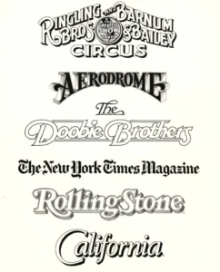
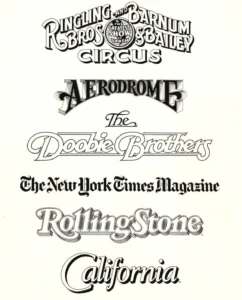
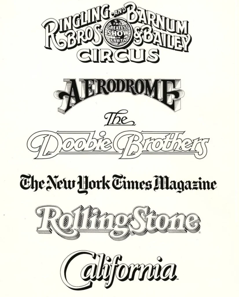
His portfolio serves as a visual history of 20th and 21st-century American culture. Among his most recognizable contributions are the mastheads for Rolling Stone and the Los Angeles Times. His work extended into the entertainment and commercial sectors, where he crafted iconic logos for the Doobie Brothers and the Ringling Bros. and Barnum & Bailey Circus. Unlike many designers who specialized in a single niche, Parkinson’s expertise was broad. He was equally adept at creating comprehensive retail typefaces as he was at developing custom logos that required a deep understanding of brand psychology and legibility.
Chronology of a Master Craftsman
- 1941: Born in Oakland, California.
- 1963: Graduated from the California College of Arts and Crafts.
- 1964–1968: Worked in the lettering department at Hallmark Cards in Kansas City.
- 1970s–1980s: Established himself as a premier freelance letterer, contributing to major national magazines.
- 1990s: Began a transition into digital font design, maintaining his reputation for high-quality, historically informed typefaces.
- 2000s–2020s: Continued to produce custom work while expanding his artistic pursuits into painting, specifically capturing vintage neon signage.
- 2025: Passed away in Oakland following a long battle with Alzheimer’s.
The Intersection of Art and Industry
In his later years, Parkinson channeled his technical proficiency into fine art, focusing on the preservation of visual history through his paintings of American neon signage. These works were not merely decorative; they were a continuation of his interest in the "letter as object." By documenting the decay and aesthetic character of vintage signs across the American West, he preserved a facet of Americana that is rapidly disappearing.
Colleagues and historians often point to Parkinson’s humility as his most defining trait. Despite his status as an industry titan, he famously adhered to the mantra of ballerina Margot Fonteyn: "Take your work seriously, but never yourself." This philosophy allowed him to maintain a collaborative spirit throughout his career, opening his home and his archives to students, researchers, and fellow designers who sought to learn from his extensive collection of ephemera.
Broader Impact and Industry Legacy
The influence of Jim Parkinson on contemporary typography cannot be overstated. In an era when font generation is increasingly automated, his work stands as a testament to the power of the human hand and the deliberate, calculated nature of fine lettering. Art directors across the United States frequently turned to him to refresh aging publications, knowing that his ability to modernize a masthead while retaining its historical soul was unparalleled.
Industry observers note that Parkinson was a "bridge" designer. He carried the traditions of 19th-century showcard lettering into the modern, high-speed digital publishing environment. His work for the Los Angeles Times, for instance, required a delicate balance of tradition and readability, demonstrating a grasp of how letterforms interact with print technology and human perception.

A Final Testament: The Forthcoming Memoir
The design community will have one final opportunity to engage with Parkinson’s perspective through his memoir, which is scheduled for publication by the Letterform Archive in 2026. Given his reputation as a gifted storyteller, the book is expected to serve as both a historical record of the lettering craft and a personal narrative of a life lived in the service of design.
Stephen Coles, a longtime friend and colleague who worked closely with Parkinson, noted that the upcoming publication will be essential for those who did not have the privilege of meeting him in person. The archive’s decision to publish the work reflects the widespread recognition that Parkinson’s insights into the craft were as valuable as the work itself.
Tributes and Memorials
The news of Parkinson’s death has prompted an outpouring of condolences from the design community. Professionals who grew up studying his logos and typefaces have taken to social media and professional forums to share memories of his generosity and his infectious enthusiasm for his craft.
In response to his passing, a memorial service is being planned for the fall, with details to be announced by his family. In a reflection of his own charitable spirit and the struggles he faced in his final years, the family has requested that, in lieu of flowers, donations be directed to the Alzheimer’s Association to support ongoing research and patient care.
Jim Parkinson’s legacy remains visible every time someone picks up a magazine or glances at a historic newspaper masthead. He was, in the words of his peers, a master of his craft who never lost his sense of wonder, leaving behind a body of work that will continue to educate and inspire designers for generations to come. His death marks the end of an era, but his influence is permanently etched into the visual culture of the modern world.