Conversion Rate Optimization for Web Design
Conversion rate optimization for web design isn’t just about making your website pretty; it’s about turning visitors into customers. It’s a deep dive into understanding user behavior, optimizing design elements, and crafting a seamless online experience that encourages conversions. Think of it as a carefully orchestrated dance between your website and your ideal customer – every click, scroll, and interaction is a step in the process.
This journey involves analyzing user patterns, A/B testing different layouts and calls to action, and continuously refining your website based on data-driven insights. We’ll explore how to design effective landing pages, optimize forms, and leverage the power of personalization to create a truly engaging and profitable online presence. Get ready to transform your website from a passive display into a high-converting machine!
Understanding Website User Behavior
Optimizing your website for conversions isn’t about guesswork; it’s about understanding how real users interact with your site. By analyzing user behavior, you can identify friction points, improve navigation, and ultimately boost your conversion rates. This involves looking beyond simple metrics like bounce rate and digging into the “why” behind those numbers.
Common user patterns often reveal a lot about the effectiveness of your website design and its ability to guide visitors towards desired actions. For example, users tend to follow an “F-shaped” pattern when scanning web pages, focusing more heavily on the top left and then down the left side. Understanding this means placing crucial information like your call to action (CTA) prominently in these areas.
Conversely, a high bounce rate might indicate a poor first impression, confusing navigation, or slow loading times. Analyzing these patterns provides crucial insights into what’s working and what’s not.
Website Navigation’s Impact on User Journeys and Conversion Rates
Effective website navigation is paramount to a successful user journey. A clear and intuitive navigation structure guides users effortlessly to the information they seek, increasing the likelihood of conversion. Conversely, a confusing or cluttered navigation system can frustrate users, leading them to abandon their task and leave the website. Consider the impact of a poorly structured menu, broken links, or a lack of clear visual cues.
These can significantly hinder a user’s progress and directly impact your conversion rates. A well-designed navigation system, featuring clear labels, logical categorization, and prominent search functionality, ensures users can easily find what they need and complete their desired actions. For instance, a website selling electronics could categorize products by type (laptops, smartphones, etc.) and brand, allowing users to quickly locate specific items.
The Importance of User Testing in Identifying Conversion-Hindering Friction Points
User testing is an invaluable tool for identifying and addressing friction points that hinder conversions. By observing real users interacting with your website, you gain firsthand insights into their experiences, identifying areas of confusion, frustration, or difficulty. This might involve watching users navigate your site, completing tasks, and providing feedback. For instance, observing a user struggle to find a specific product or complete a purchase form highlights areas that need improvement.
User testing can be conducted in various ways, from moderated sessions with individual users to unmoderated remote testing using tools that track user behavior.
Heatmaps and User Session Recordings in Conversion Rate Optimization
Heatmaps and user session recordings offer powerful visual representations of user behavior, providing valuable data for CRO. Heatmaps visually illustrate where users click, scroll, and focus their attention on a webpage. A heatmap showing low engagement in a specific area suggests that content or design elements in that region may need to be improved or repositioned. For example, a heatmap might reveal that your call to action button is poorly positioned, resulting in low click-through rates.
User session recordings provide even more detailed insights, allowing you to watch users interact with your website in real-time. This allows you to identify specific actions or behaviors that lead to drop-offs or incomplete conversions. For instance, you might observe users abandoning their shopping cart due to a complex checkout process. By analyzing these recordings, you can pinpoint exactly where users are encountering problems and implement targeted improvements.
Improving Website Design for Conversions
Optimizing your website’s design for conversions is crucial for business success. A well-designed website not only looks appealing but also guides users seamlessly towards desired actions, like making a purchase or signing up for a newsletter. This involves a deep understanding of user behavior and the strategic implementation of design principles to enhance the user experience and ultimately drive conversions.
We’ll explore key aspects of design that directly impact conversion rates.
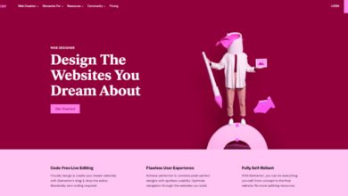
Landing Page Layout for Conversions
A high-converting landing page needs a clear and concise message focused on a single product or service. Imagine a landing page for a new noise-canceling headphone. The hero image should prominently feature the headphones, showcasing their sleek design and highlighting key features like noise cancellation. Below, a compelling headline like “Silence the Noise, Amplify Your Focus” should grab attention.
Then, concise bullet points detail the benefits (e.g., superior sound quality, all-day comfort, long battery life). A strong call to action button, like “Buy Now,” should be visually prominent, perhaps with a contrasting color to stand out. Avoid cluttering the page with unnecessary information; the focus should remain on the product and the immediate conversion goal.
Designing Effective Forms
Minimizing form abandonment requires careful design considerations. Shorter forms generally perform better. Only request essential information; avoid unnecessary fields. Use clear and concise labels, and ensure the form is easy to navigate. Consider progressive profiling, where information is collected gradually over multiple interactions, reducing initial friction.
Progress bars can also help users understand how much of the form they’ve completed. Furthermore, using input masks for fields like phone numbers or dates can improve accuracy and reduce errors. Finally, clearly displaying a privacy policy reassures users about the security of their data.
Visual Hierarchy and Whitespace
Visual hierarchy guides the user’s eye through the page, leading them to the conversion points. This is achieved through strategic use of size, color, contrast, and whitespace. Larger headlines and images draw attention first, followed by subheadings and supporting text. Whitespace, or negative space, is crucial for breathing room and readability. It prevents the page from feeling cluttered and allows elements to stand out.
By strategically placing elements and using whitespace, you can create a visual pathway that directs the user’s attention towards the call-to-action button or form. For example, using a contrasting color for the CTA button makes it instantly recognizable.
Website Layouts and Conversion Rates
The layout of a website significantly impacts conversion rates. Different layouts cater to different user needs and preferences. Below is a comparison of several common layouts and their effects:
| Layout Type | Conversion Rate (Example) | Pros | Cons |
|---|---|---|---|
| Single-Column | 5-10% (Example) | Simple, easy to navigate, good for mobile | Can feel monotonous, less visually appealing for complex content |
| Two-Column | 8-15% (Example) | Good balance of content and visual appeal, effective for showcasing products | May be less effective on smaller screens |
| Three-Column | 10-18% (Example) | Can accommodate more content, useful for comparison pages | Can be overwhelming if not designed carefully |
| Asymmetrical | 12-20% (Example) | Visually engaging, unique and memorable | Requires careful planning and design expertise |
*Note: Conversion rates are illustrative examples and vary greatly depending on factors like industry, target audience, and overall website design.*
Optimizing Calls to Action (CTAs)

Source: dreamstime.com
Your website might be stunning, your content might be engaging, but without effective calls to action (CTAs), all that effort is wasted. CTAs are the crucial bridge connecting your website visitors to desired actions, whether it’s making a purchase, signing up for a newsletter, or downloading a resource. Optimizing your CTAs is therefore paramount to boosting your conversion rates.
A well-crafted CTA guides users towards the next step in their journey, transforming passive viewers into active participants.
Compelling and Clear Calls to Action
The effectiveness of a CTA hinges on its clarity and persuasiveness. A muddled or unclear CTA will confuse users and lead to inaction. Conversely, a compelling CTA motivates users to click. This requires a focused approach, emphasizing the benefit to the user and employing strong action verbs. For example, instead of a vague “Learn More,” consider a more specific and enticing CTA like “Download Your Free Guide Now” or “Get Started with a Free Trial.” The key is to clearly communicate the value proposition and make the next step incredibly easy for the user.
CTA Button Design and Click-Through Rates, Conversion rate optimization for web design
The design of your CTA button significantly influences click-through rates. Several factors play a critical role:
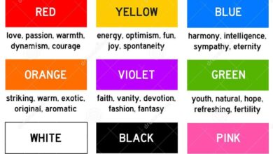
- Color: Studies have shown that certain colors evoke specific emotions and responses. For instance, a red button often conveys urgency, while a green button might suggest growth or environmental friendliness. The optimal color, however, depends on your brand and target audience. A/B testing different colors is crucial to determine which performs best.
- Size: A larger button is generally more noticeable and easier to click, particularly on mobile devices. However, excessively large buttons can look out of place. Finding the right balance is key.
- Placement: Strategic placement maximizes visibility. Ideally, your CTA should be prominently displayed above the fold and in areas where users naturally focus their attention. Consider using contrasting colors to make it stand out.
For example, a study by HubSpot found that changing the color of their CTA button from blue to green resulted in a 21% increase in click-through rate. Another example would be placing the CTA button immediately after a compelling piece of content or at the end of a blog post.
Effective CTA Copywriting Techniques
Effective CTA copywriting encourages immediate action. Several techniques can significantly improve performance:
- Use strong action verbs: Instead of “Learn more,” use “Get started,” “Download now,” or “Claim your offer.”
- Highlight the benefit: Focus on what the user gains, not what you gain. Instead of “Sign up for our newsletter,” try “Get exclusive discounts and updates.”
- Create a sense of urgency: Phrases like “Limited-time offer” or “Don’t miss out” can motivate immediate action.
- Use clear and concise language: Avoid jargon and overly complex sentences.
For instance, instead of “Submit your information,” a more effective CTA could be “Unlock Your Free Consultation Now!” This concise, benefit-driven CTA clearly communicates the value proposition and encourages immediate action.
A/B Testing for CTA Optimization
A/B testing is essential for optimizing CTA performance. By creating two versions of your CTA (A and B), you can test different design elements, such as color, size, placement, and copy. You then track which version performs better based on metrics like click-through rates and conversions. This data-driven approach allows you to continuously refine your CTAs and maximize their effectiveness.
For example, you might test a green button against a red button to see which color generates more clicks. Or you could test different copy variations to see which message resonates best with your target audience. The key is to systematically test variations and track the results to identify the top-performing CTA.
Enhancing Website Speed and Performance
Website speed is a critical factor influencing user experience and, ultimately, your conversion rates. A slow-loading website frustrates visitors, leading to higher bounce rates and lost conversions. Conversely, a fast website creates a positive user experience, encouraging visitors to explore your content and complete desired actions. In short, speed isn’t just a nice-to-have; it’s a conversion essential.A slow website directly impacts user experience and bounce rates.
Studies consistently show a strong correlation between loading times and conversions. Users are impatient; a site that takes too long to load will likely see users abandoning it before they even see your compelling content or engaging call to action. This leads to a higher bounce rate – the percentage of visitors who leave your site after viewing only one page.
The longer the load time, the higher the bounce rate, resulting in fewer conversions. For example, a study by Google showed that even a one-second delay in page load time can result in a 7% reduction in conversions.
Image Optimization Techniques
Optimizing images is crucial for improving website speed. Large, unoptimized images are significant contributors to slow loading times. Several techniques can significantly reduce image file sizes without sacrificing visual quality. These include using appropriate image formats (like WebP for superior compression), compressing images using tools, and resizing images to the dimensions actually needed on the website, avoiding unnecessarily large files.
For instance, a high-resolution image intended for a small thumbnail is wasteful and impacts loading time. Consider using responsive images, which automatically adjust to different screen sizes, preventing the downloading of unnecessarily large images on smaller screens.
Code Minification Strategies
Code minification involves removing unnecessary characters from your HTML, CSS, and JavaScript code without affecting its functionality. This reduces the size of your files, leading to faster loading times. Minification removes whitespace, comments, and unnecessary characters, resulting in smaller file sizes that are downloaded and processed more quickly. This process is usually automated using tools or plugins during the website build process.
For example, minifying a large JavaScript file can significantly reduce its size, resulting in a noticeable improvement in page load speed.
Tools for Measuring Website Performance
Several tools are available to measure website performance and identify areas for improvement. These tools provide insights into page load times, identify bottlenecks, and suggest optimization strategies. Using these tools is essential for a data-driven approach to website optimization.
- Google PageSpeed Insights: This free tool analyzes your website’s performance and provides suggestions for improvement, including scores for mobile and desktop performance.
- GTmetrix: GTmetrix offers detailed performance reports, including waterfall charts to visualize the loading process, helping pinpoint specific issues.
- Pingdom Website Speed Test: This tool provides a quick overview of your website’s loading speed, along with suggestions for optimization.
- WebPageTest: WebPageTest provides more in-depth performance analysis, allowing you to test from different locations and browsers.
Mobile Optimization for Conversions
In today’s mobile-first world, neglecting mobile optimization is like leaving money on the table. A significant portion of your website traffic likely comes from smartphones and tablets, and if your site isn’t optimized for these devices, you’re losing potential conversions. A seamless mobile experience is crucial for keeping visitors engaged and guiding them towards desired actions.Responsive web design is the cornerstone of a successful mobile strategy.
It ensures your website adapts seamlessly to different screen sizes and orientations, providing a consistent and user-friendly experience across all devices. Without it, visitors face frustrating navigation, slow loading times, and a generally poor user experience, all leading to higher bounce rates and lost conversions.
Responsive Web Design Implementation
Implementing responsive design involves using flexible layouts, flexible images, and media queries. Flexible layouts allow content to reflow and rearrange itself based on the screen size. Flexible images resize proportionally to avoid distortion or excessive whitespace. Media queries allow you to apply different styles based on screen size, orientation, and other device characteristics. For example, a large hero image might be displayed prominently on a desktop but reduced or even replaced with a smaller image or video on a mobile device to improve load times and usability.
Consider using a CSS framework like Bootstrap or Tailwind CSS to streamline the process.
Challenges of Mobile Conversion Optimization
Optimizing websites for mobile conversions presents unique challenges. Smaller screens mean less space to display information, requiring careful prioritization of content and clear calls to action. Touchscreen interactions differ from mouse clicks, necessitating larger tap targets and simplified navigation. Furthermore, mobile users often have shorter attention spans and are more likely to abandon a website if it’s not immediately engaging or easy to navigate.
Slow loading speeds are particularly detrimental on mobile, where data connections can be less reliable.
Mobile-Friendly Design Elements
Several design elements contribute to a positive mobile user experience and improved conversion rates. Large, easily tappable buttons for calls to action are essential. Clear and concise language avoids overwhelming users with excessive text. Prioritizing above-the-fold content ensures crucial information is visible immediately without requiring scrolling. Using a clean, uncluttered layout with ample white space improves readability and reduces visual fatigue.
Implementing a smooth, intuitive navigation system helps users easily find what they need. Consider the use of carousels for showcasing multiple products or services in a compact manner, but use them sparingly to avoid overwhelming users.
Best Practices for Optimizing Mobile Conversion Rates
Before listing best practices, it’s important to understand that consistent testing and analysis are key to continuous improvement. What works for one website might not work for another, and user preferences are constantly evolving. Regularly track key metrics such as bounce rate, conversion rate, and average session duration to identify areas for improvement.
- Prioritize mobile-first design: Design and develop your website with mobile devices in mind first, then adapt for larger screens.
- Optimize images for mobile: Use compressed images and responsive image formats like WebP to reduce loading times.
- Simplify forms: Reduce the number of fields in your forms to minimize friction and improve completion rates.
- Ensure fast loading speeds: Optimize your website’s code, images, and other assets to minimize loading time.
- Use clear and concise language: Avoid jargon and use language that is easily understood by your target audience.
- Implement a user-friendly navigation system: Make it easy for users to find what they’re looking for.
- Test and iterate: Regularly test different design elements and A/B test variations to identify what works best.
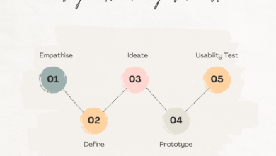
Analyzing and Interpreting Conversion Data
Understanding your website’s conversion data is crucial for optimizing its performance. Without this crucial step, all your design improvements and CTA tweaks might be shooting in the dark. Analyzing conversion data allows you to pinpoint what’s working, what’s not, and most importantly, where to focus your future efforts for maximum impact.
Effective analysis involves tracking key metrics, interpreting the results through the lens of your business goals, and then using those insights to drive data-backed improvements. This iterative process of testing, measuring, and refining is the heart of successful CRO.
Website Conversion Tracking Methods
Several methods exist for meticulously tracking website conversions. Choosing the right method or combination of methods depends on your specific goals and the complexity of your website. A robust tracking strategy provides a comprehensive picture of user behavior and conversion pathways.
Common methods include:
- Google Analytics Goals: This is a fundamental tool for tracking various conversions, from form submissions to purchases. You define specific goals within Google Analytics, and the system then tracks how often users complete those actions.
- Event Tracking: This allows for more granular tracking of specific user interactions, such as button clicks, video plays, or file downloads. This level of detail provides insights into user engagement beyond simple goal completions.
- E-commerce Tracking: For online stores, e-commerce tracking automatically monitors sales, revenue, and other key metrics related to transactions. This provides a clear picture of your sales performance.
- Custom Conversion Tracking: For more unique conversions not easily captured by standard methods, custom conversion tracking allows you to create bespoke tracking solutions tailored to your specific needs.
Identifying High and Low Converting Pages
Once you’ve implemented conversion tracking, you can leverage analytics tools like Google Analytics to identify your website’s top and bottom performers. This involves analyzing the conversion rate for each page, revealing which pages effectively guide users towards your desired actions and which ones are falling short.
Within Google Analytics, navigate to the “Behavior” section, then “Site Content,” and finally “All Pages.” This report displays the conversion rate for each page on your website, allowing for a quick identification of high and low performers. Further analysis can delve into the reasons behind these variations.
Segmenting Conversion Data
Analyzing conversion data in isolation provides only a partial picture. Segmenting your data allows for a deeper understanding of user behavior and the factors driving conversions. By segmenting, you can identify specific user groups or behaviors that contribute disproportionately to your conversion rate.
Examples of useful segmentation include:
- Demographic Segmentation: Analyze conversions based on factors like age, gender, location, and device type to identify patterns in how different demographics interact with your website.
- Behavioral Segmentation: Group users based on their actions on your website, such as the pages they visit, the time spent on each page, and the number of sessions. This reveals patterns in user journeys that lead to conversions.
- Acquisition Source Segmentation: Analyze conversions based on the source of traffic (e.g., organic search, paid advertising, social media). This helps determine which marketing channels are most effective in driving conversions.
Using Conversion Data for Website Improvements
The ultimate goal of conversion data analysis is to inform website improvements. By identifying patterns and trends, you can make data-driven decisions to optimize your website for higher conversion rates.
Strategies for using conversion data include:
- A/B Testing: Use conversion data to inform A/B tests, comparing different versions of your website to determine which performs better in driving conversions. For example, you might test different headlines, button colors, or page layouts.
- Content Optimization: Analyze which pages have low conversion rates and identify areas for improvement. This might involve enhancing content clarity, improving website navigation, or adding more compelling calls to action.
- Technical Improvements: Conversion data can highlight technical issues, such as slow page load times or broken links, that negatively impact user experience and conversion rates. Addressing these issues can significantly boost performance.
A/B Testing and Experimentation
A/B testing is the cornerstone of data-driven website optimization. It allows you to systematically test different versions of your website elements to determine which performs best in achieving your conversion goals. By comparing variations, you can make informed decisions, eliminating guesswork and maximizing your return on investment. This process is crucial for continuous improvement and staying ahead of the curve in the ever-evolving digital landscape.A/B testing involves creating two or more versions (A, B, C, etc.) of a webpage or element and then showing each version to a statistically significant sample of your website traffic.
You then analyze the results to see which version performs better based on your chosen key performance indicator (KPI), such as conversion rate, click-through rate, or average order value. The winning variation is then implemented across the entire site.
Designing and Conducting A/B Tests
The process begins with identifying a specific area for improvement. This could be anything from a headline to a button color. Next, you create variations of the chosen element, ensuring only one element is changed at a time to isolate the impact of each modification. This is then followed by implementing the test using an A/B testing platform, directing traffic to each version.
The test runs until sufficient data is gathered to reach statistical significance, allowing for confident conclusions. Finally, the results are analyzed, and the winning variation is implemented. For example, you might test two different headlines on a landing page to see which one leads to a higher conversion rate. One headline might focus on the benefits of the product, while the other might highlight a specific feature.
Elements That Can Be Tested
Many website elements can be tested using A/B testing methodologies. Here are a few examples:
- Headlines: Testing different headlines to see which one captures attention and drives engagement more effectively. For instance, comparing a benefit-driven headline like “Boost Your Productivity Today!” to a more direct headline like “Get Our Productivity Software.”
- Images: Testing different images to determine which one resonates best with your target audience and improves click-through rates. For example, comparing a professional photograph of a product to a more lifestyle-oriented image showing the product in use.
- Calls to Action (CTAs): Testing different button colors, text, and placement to optimize conversions. An example might be comparing a green “Buy Now” button to a red “Shop Now” button, or testing different button sizes and placements on the page.
- Form Fields: Testing the number of fields in a form to minimize friction and increase completion rates. Reducing the number of fields required to complete a form often leads to higher conversion rates.
- Website Layout: Testing different page layouts to see which one improves user experience and leads to higher conversions. This could involve testing different placements of key elements or altering the overall structure of the page.
Statistical Significance in A/B Testing
Reaching statistical significance is crucial for ensuring the results of your A/B test are reliable and not due to random chance. Statistical significance indicates that the observed difference between variations is unlikely to be due to random variation. This usually involves calculating a p-value, which represents the probability of observing the results if there were no actual difference between the variations.
A p-value of less than 0.05 is generally considered statistically significant, meaning there is less than a 5% chance that the observed difference is due to chance. Without statistical significance, any conclusions drawn from the A/B test are unreliable.
Conversion rate optimization (CRO) in web design is all about maximizing your website’s effectiveness. A key element often overlooked is driving traffic from other platforms; check out this awesome guide on getting it on with youtube to learn how YouTube can boost your website visits. Once that traffic is flowing, you can refine your CRO strategies to ensure those visitors convert into customers.
A/B Testing Tools and Their Functionalities
Several tools facilitate A/B testing. These tools often provide features like:
- Visual Editor: Allows for easy creation and modification of A/B test variations without needing coding skills.
- Traffic Allocation: Controls the percentage of traffic directed to each variation.
- Statistical Analysis: Provides statistical analysis to determine the significance of results.
- Reporting and Analytics: Offers comprehensive reporting and analytics dashboards to monitor test performance and identify winning variations.
Examples of such tools include Optimizely, VWO (Visual Website Optimizer), Google Optimize, and AB Tasty. Each offers slightly different functionalities and pricing plans. The choice of tool depends on the specific needs and budget of the website owner.
Personalization and Targeted Messaging
In today’s digital landscape, generic marketing approaches are becoming increasingly ineffective. Consumers crave personalized experiences, and websites that cater to individual needs are far more likely to convert visitors into customers. Personalization goes beyond simply addressing a user by name; it’s about tailoring the entire website experience to resonate with their specific interests, preferences, and behaviors. This leads to increased engagement, higher conversion rates, and ultimately, a stronger bottom line.Personalization improves conversion rates by fostering a sense of connection and relevance.
When users see content specifically tailored to their needs, they feel understood and valued. This leads to increased engagement, longer website visits, and a greater likelihood of completing a desired action, such as making a purchase or signing up for a newsletter. Targeted messaging, a key component of personalization, ensures that the right message reaches the right person at the right time, maximizing the impact of marketing efforts.
Strategies for Targeting Different User Segments
Effective personalization requires segmenting your audience into distinct groups based on shared characteristics. This could involve demographic data (age, location, gender), behavioral data (past purchases, website activity), or psychographic data (interests, lifestyle). Once segmented, you can craft tailored messaging and content that resonates with each group’s unique needs and preferences. For example, a clothing retailer might segment its audience into “budget-conscious shoppers,” “fashion-forward individuals,” and “luxury buyers,” each receiving different product recommendations and promotional offers.
This targeted approach significantly increases the likelihood of converting visitors within each segment.
Examples of Effective Personalization Techniques
Numerous techniques can be employed to personalize the website experience. One common approach is personalized product recommendations, where users are shown items based on their browsing history or past purchases. Imagine an e-commerce site suggesting complementary products based on items already in a user’s cart. Another powerful technique is personalized email marketing, sending targeted messages based on user behavior or preferences.
For example, a welcome email could offer a discount code specifically for new customers, while follow-up emails could promote products relevant to their browsing history. Finally, dynamic content, which changes based on user attributes, can personalize the website’s overall look and feel, making it more engaging and relevant. For instance, a travel website could display different destinations based on a user’s stated travel preferences.
Implementing Personalized Recommendations on an E-commerce Website
To implement personalized recommendations on an e-commerce website, a multi-step plan is required. First, gather user data through various methods such as cookies, browsing history, purchase history, and explicit user preferences. Second, use this data to segment your customer base into distinct groups based on their purchasing behavior, browsing patterns, and demographic information. Third, integrate a recommendation engine into your website.
This engine can use algorithms to analyze user data and suggest relevant products. Fourth, continuously monitor and optimize the recommendation system. Analyze user engagement with the recommendations and refine the algorithms to improve their accuracy and effectiveness over time. For instance, if users frequently ignore recommendations from a specific category, the algorithm should adjust its weighting to prioritize other product categories.
Finally, A/B test different recommendation strategies to identify what resonates best with your target audience. A successful implementation will significantly boost sales by suggesting relevant products that customers are more likely to purchase.
End of Discussion: Conversion Rate Optimization For Web Design

Source: dreamstime.com
Ultimately, conversion rate optimization for web design is an ongoing process of learning, adapting, and refining. By understanding your users, testing different approaches, and consistently analyzing your results, you can create a website that not only looks great but also delivers exceptional results. Remember, it’s a marathon, not a sprint, so embrace the iterative nature of optimization and watch your conversion rates soar!
Top FAQs
What is the difference between conversion rate and bounce rate?
Conversion rate measures the percentage of visitors who complete a desired action (e.g., purchase, sign-up), while bounce rate measures the percentage of visitors who leave your site after viewing only one page.
How often should I A/B test my website?
There’s no magic number, but regularly testing – at least once a month – different elements allows for continuous improvement. Prioritize testing high-impact areas like your headlines, CTAs, and forms.
What are some free tools for conversion rate optimization?
Google Analytics provides invaluable data for tracking conversions. There are also free options for heatmap tools and A/B testing (though limited in features compared to paid versions).
How can I measure the success of my CRO efforts?
Track key metrics like conversion rate, bounce rate, average session duration, and customer acquisition cost (CAC). Compare these metrics before and after implementing CRO changes to gauge success.