
Naming is a fundamental yet notoriously difficult challenge in software development, user interface design, and product management. The terminology used within a team acts as the bedrock for conceptual alignment; when the language used to describe colors, icons, components, and features is inconsistent, the resulting fragmentation often leads to technical debt, poor user adoption, and operational inefficiency. Whether developers are struggling with CSS class nomenclature, or product managers are debating the label for a new dashboard feature, the inability to settle on a common vocabulary creates "dialect silos" where designers, engineers, and stakeholders speak past one another.

The Linguistic Challenge of Digital Architecture
The difficulty of naming stems from the balance between abstraction and specificity. A name that is too generic—such as "container" or "button"—fails to provide sufficient context, leading to ambiguity in large-scale applications. Conversely, names that are overly specific—such as "red-top-navigation-bar-v2"—create brittle systems that lack the flexibility required for scaling or rebranding.
Industry analysts have long observed that poor naming conventions are a primary contributor to the decay of design systems. When a system lacks a clear, hierarchical taxonomy, the cost of maintenance increases exponentially as the product grows. This is particularly evident in large-scale enterprise environments where multiple teams contribute to a single, monolithic codebase. Research suggests that teams spend approximately 20% of their development time deciphering legacy naming patterns, a figure that highlights the economic necessity of adopting rigorous, standardized nomenclature early in the product lifecycle.

Establishing Foundational Naming Conventions
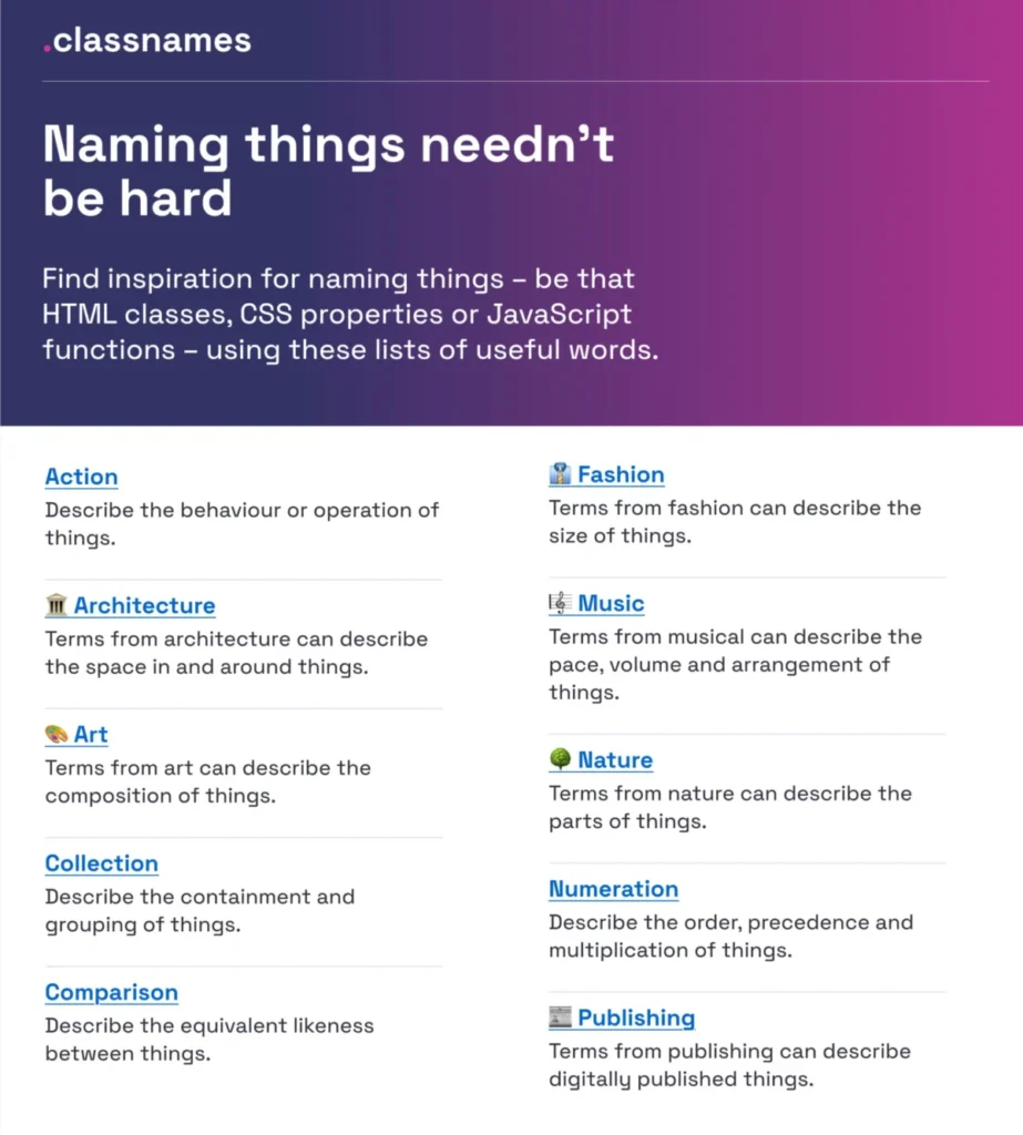
To combat the "naming crisis," several industry-standard resources have emerged. For instance, the Classnames resource provides a structured repository of thematic word lists designed to push developers toward more expressive and intentional naming. By moving away from purely functional names, teams can adopt taxonomies rooted in nature, art, architecture, or music, which can provide better mental models for complex UI structures.
The methodology behind effective naming relies on a clear, logical structure that prioritizes intent over visual representation. Javier Cuello, a prominent design systems strategist, emphasizes that a high-quality name must be short, meaningful, and strictly decoupled from visual properties. A name like "primary-button" is superior to "blue-button" because it describes the role of the component rather than its current aesthetic. This distinction is vital; if the design team decides to change the button color to green in a future iteration, a "blue-button" class name becomes a legacy liability that can mislead future developers.

The Taxonomy of Design Tokens
Design tokens have become the industry standard for managing design decisions across multi-brand and multi-product ecosystems. At companies like Intuit, the challenge of managing a diverse portfolio—including QuickBooks, TurboTax, and Mailchimp—required a sophisticated approach to token taxonomy. The resulting system moved beyond simple brand themes to create a hierarchical architecture that supports global, semantic, and component-level tokens.
This evolution is documented in case studies showing that a robust token system requires four distinct layers:

- Primitive Tokens: Global values such as color hex codes or spacing units.
- Semantic Tokens: Descriptive names that represent intent, such as "background-error" or "text-primary."
- Component Tokens: Values specific to a single UI element, such as "button-hover-color."
- Contextual Tokens: Page or layout-specific overrides that allow for high-level customization.
By mapping these layers, organizations like Vodafone UK have developed "Variables Taxonomy Maps" that enable teams to trace a token’s lineage from its primitive source to its final implementation. This traceability is essential for maintaining consistency across complex, responsive web applications.
Bridging the Gap Between Design and User Perception
A critical, often overlooked aspect of naming is the relationship between technical documentation and the end-user. When features suffer from low adoption rates, the root cause is frequently a "naming disconnect." If a feature is named using internal engineering jargon rather than the vocabulary of the user, the product’s discoverability and utility are diminished.

Practical research into feature adoption underscores the "Job-to-be-Done" (JTBD) framework for naming. Designers are encouraged to conduct ethnographic research—asking users to describe the function of a feature in their own words—and then adopting that language for the interface. A feature labeled "Data Aggregation Module" might be far less effective than one labeled "Report Summary," simply because the latter maps directly to the user’s mental model of their professional tasks.
Resources for Standardization and Consistency
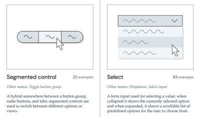
To streamline the process of naming, the industry has seen an influx of specialized tools and inventories. The Component Gallery, maintained by Iain Bean, serves as an essential reference point, cataloging how various major design systems label common UI patterns. By comparing how industry leaders name an "accordion" or a "visually hidden" element, teams can align themselves with community standards, which reduces the learning curve for new hires and external contributors.
Furthermore, tools like the Design Token Naming Guide and various Figma-based taxonomy kits provide interactive frameworks for teams to build their own internal documentation. These tools do not dictate a single "correct" way to name things, but rather offer a structured environment to define categories, states, and roles. This inventory-based approach allows organizations to treat their terminology as a living document, subject to review and iterative improvement.
Broader Implications for Product Strategy
The cumulative effect of poor naming is a decline in team velocity and a rise in cross-functional frustration. When the designer calls an element a "card," the developer calls it a "container," and the product manager refers to it as a "widget," the resulting confusion leads to inevitable bugs and design drift.

Professional design organizations are now moving toward "Unified Naming Protocols," which are treated with the same importance as security compliance or accessibility standards. This shift is not merely aesthetic; it is a strategic business decision. Standardized language reduces the "translation cost" between departments and ensures that the digital product remains scalable.
Future Directions in Interface Design
As the industry pivots toward AI-driven interfaces and increasingly complex digital experiences, the importance of clear, human-centric naming will only grow. The rapid adoption of AI has introduced a new set of naming challenges—how does one name an "agent," a "prompt," or a "model output" in a way that is accessible to non-technical users?

Vitaly Friedman, a noted expert in UX and UI design, argues that the next phase of design system maturity will involve integrating AI-ready terminology into our core naming taxonomies. This requires a proactive approach, where naming is considered during the initial design phase rather than as an afterthought during implementation.
Conclusion: The Cost of Ambiguity
The evidence is clear: the names we assign to our UI components and design tokens are more than just labels; they are the architectural blueprints of our digital products. A well-defined naming system reduces cognitive load, improves accessibility, and facilitates smoother collaboration across multidisciplinary teams. Organizations that invest the time to curate their vocabulary and establish a shared, logical taxonomy will find themselves better positioned to maintain, scale, and evolve their products in an increasingly complex technical landscape.

By utilizing existing resources—such as the Component Gallery, color naming repositories, and established design token frameworks—teams can avoid the pitfalls of ad-hoc naming. Ultimately, the most successful systems are those that recognize that language is a tool for connection. When that tool is sharp, precise, and universally understood, the entire product ecosystem thrives. Addressing naming conflicts in the backlog and prioritizing semantic clarity are not optional tasks; they are fundamental requirements for building resilient, future-proof digital experiences.