Logo Trends That Are Making Their Return
Logo trends that are making their return are breathing new life into branding! We’re seeing a fascinating blend of nostalgic styles and modern interpretations, a delightful mix of the familiar and the fresh. From the bold graphics of the 70s and 80s to the minimalist elegance of recent years, and the ever-growing popularity of hand-drawn designs, this resurgence offers a rich tapestry of visual possibilities for businesses looking to make a statement.
Get ready to explore the exciting world of retro revivals, minimalist masterpieces, and the artistic charm of hand-drawn logos – the trends that are shaping modern design.
Retro Revival
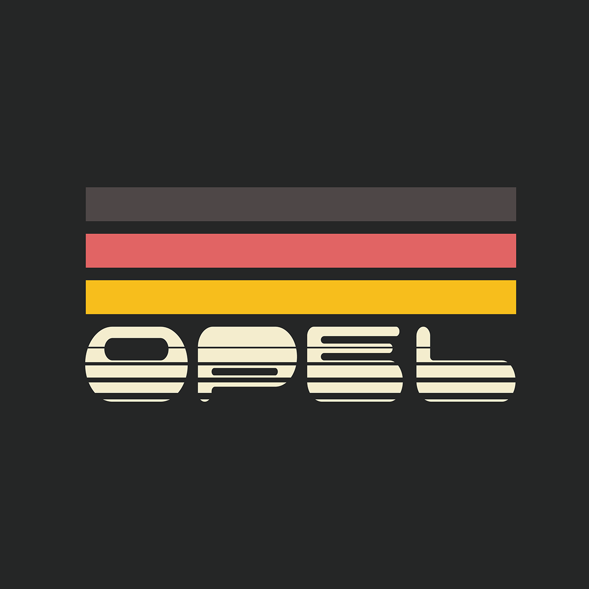
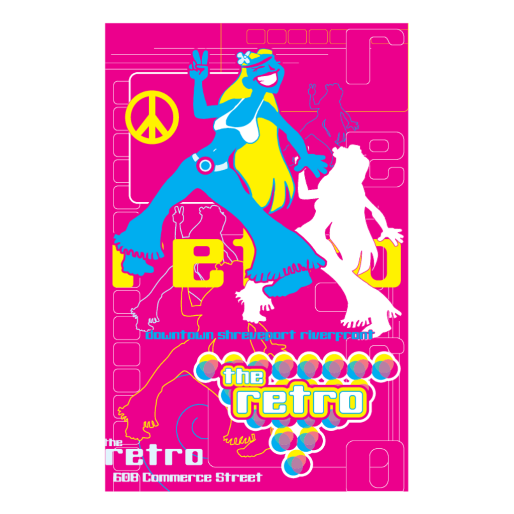
The 70s, 80s, and 90s are back, baby! Not just in our music playlists and fashion choices, but also in logo design. A wave of nostalgia is sweeping through the branding world, with designers rediscovering the bold aesthetics and playful spirit of these iconic decades. This isn’t simply a replication of the past, however; modern designers are skillfully blending retro elements with contemporary sensibilities, creating logos that feel both familiar and fresh.Retro aesthetics in modern branding differ significantly from their original context.
While the original styles often reflected the socio-political climate of their time, their modern interpretations are primarily driven by a desire for authenticity and a reaction against overly minimalist or digital trends. Today’s designers use retro styles to evoke a sense of nostalgia, build brand personality, and stand out in a crowded marketplace. The key difference lies in the level of refinement and sophistication; while original retro designs might have been somewhat rough around the edges, modern interpretations are often more polished and refined, leveraging advanced design software and techniques.
Retro Logo Design Characteristics by Decade, Logo trends that are making their return
The resurgence of retro styles offers a diverse palette for logo creation. Below is a comparison of three distinct retro aesthetics and their common logo design features:
| Style | Color Palette | Typography | Shape/Iconography |
|---|---|---|---|
| 70s Groovy | Earthy tones (browns, oranges, greens), mustard yellows, burnt oranges, sometimes incorporating psychedelic hues. | Rounded, playful fonts like script styles, or bold sans-serif with rounded edges. Think of fonts reminiscent of album art from the era. | Abstract shapes, swirling patterns, peace signs, floral motifs, and organic forms. Often incorporating hand-drawn or slightly imperfect elements to maintain an authentic feel. |
| 80s Neon | Bright, bold, and often contrasting colors. Think neon pink, electric blue, vibrant yellow, and shocking purple. High saturation is key. | Geometric sans-serif fonts, often bold and condensed. Think of fonts used in movie posters or arcade game titles. Sometimes incorporating a slight 3D effect. | Geometric shapes (squares, triangles, circles), bold lines, and sharp angles. Often combined with bright, bold colors to create a striking visual impact. Think of bold stripes and strong geometric patterns. |
| 90s Grunge | Muted tones, faded colors, and distressed effects. Think of dark greens, browns, greys, and muted blues. Often incorporating a faded or washed-out look. | Distressed fonts, often sans-serif with a slightly rough or imperfect appearance. Think of fonts that look like they’ve been hand-painted or distressed. A slightly rough texture is key. | Rough textures, distressed imagery, and hand-drawn elements. Often incorporates a sense of imperfection and rawness, reflecting the aesthetic of the era. Think of ripped paper effects or slightly blurry graphics. |
Minimalism’s Resurgence: Logo Trends That Are Making Their Return
The design world is experiencing a fascinating return to its roots, with minimalism once again taking center stage. After a period dominated by complex designs and maximalist aesthetics, the clean lines and uncluttered simplicity of minimalist logos are proving incredibly appealing to both designers and consumers. This resurgence isn’t just a fleeting trend; it reflects a deeper shift in how brands communicate and connect with their audiences in our increasingly saturated digital landscape.Minimalist logo design prioritizes simplicity and clarity, focusing on conveying a brand’s core message through the most essential elements.
This approach offers significant advantages, including improved memorability, versatility across various platforms (from tiny app icons to large billboards), and a timeless quality that avoids looking dated quickly. However, the very simplicity that makes minimalism effective also presents challenges. The risk of oversimplification is real; a logo that’stoo* simple can lack personality or fail to effectively differentiate the brand from competitors.
Finding the perfect balance between simplicity and impact is the key to successful minimalist branding.
Examples of Successful Minimalist Logos
Several major brands have successfully harnessed the power of minimalist logo design. Their success highlights the effectiveness of this approach when executed thoughtfully. The Apple logo, for instance, is an iconic example. The simple, clean apple silhouette is instantly recognizable worldwide, communicating innovation and user-friendliness without needing any superfluous details. Similarly, the Nike swoosh is a masterclass in minimalist design, effectively conveying movement, speed, and dynamism through a single, elegant curve.
Finally, the Mastercard logo, with its interlocking circles, represents global connection and financial security in a visually striking yet understated way. The effectiveness of these logos lies in their memorability, versatility, and ability to transcend cultural boundaries.
Minimalist Logo Concepts for a Fictional Company
Let’s imagine a fictional company called “Zenith,” a provider of sustainable energy solutions. We can create three minimalist logo concepts, each using a different primary shape:
Concept 1: Circle The logo features a simple, unbroken circle, representing the cyclical nature of renewable energy and the infinite potential of sustainable solutions. A subtle gradient from green to blue could be incorporated to visually represent the transition to clean energy. The color palette evokes feelings of nature, growth, and calmness. The overall impression is one of reliability, continuity, and environmental consciousness.
Concept 2: Square A square logo, with slightly softened corners, symbolizes stability and reliability. A simple, stylized sun graphic within the square could represent solar energy, a core aspect of Zenith’s business. The color scheme could use earthy tones like beige and brown, reflecting a connection to the earth and sustainability. This design communicates a sense of groundedness, trustworthiness, and commitment to sustainable practices.
Concept 3: Triangle A triangle, pointing upwards, signifies growth, progress, and ambition. The triangle could be subtly textured to resemble solar panels, subtly incorporating the company’s focus. A vibrant green color, symbolizing environmental friendliness, would further enhance this meaning. This design choice projects a forward-looking, innovative, and environmentally responsible image.
The Rise of Hand-Drawn and Organic Aesthetics

Source: behance.net
There’s a palpable shift happening in logo design, a return to the handcrafted and the imperfect. After years of sleek minimalism and digitally perfect imagery, we’re seeing a resurgence of logos that embrace the charm of hand-drawn elements and organic forms. This trend reflects a broader societal desire for authenticity and a connection to something genuine, something that feels less manufactured and more human.
The imperfections become part of the brand’s unique identity, adding a layer of warmth and personality that digitally-perfect logos often lack.This preference for hand-drawn aesthetics isn’t just a fleeting trend; it speaks to a deeper longing for connection and individuality in a world increasingly dominated by digital perfection. The imperfections inherent in hand-drawn work lend a unique charm and character, conveying a sense of authenticity that resonates deeply with consumers.
This approach allows brands to project a more approachable and relatable image, fostering a stronger emotional connection with their audience.
So, you’re seeing a resurgence of retro-inspired logos everywhere, right? It’s a fascinating trend, and I’ve been thinking about how to best leverage these styles for my own brand. To get a better handle on visual marketing in general, I’ve been diving into some resources, like this great article on getting it on with youtube , which has given me fresh ideas for promoting my work.
Ultimately, understanding effective online promotion is key to showcasing these returning logo trends effectively.
Hand-Drawn Logo Examples and Their Impact
The impact of hand-drawn logos compared to their digitally created counterparts is significant. Digitally-created logos often exude a sense of precision and professionalism, but they can sometimes feel sterile or impersonal. Hand-drawn logos, on the other hand, possess a tangible sense of craftsmanship and a unique human touch. This perceived “human touch” is incredibly powerful in building brand trust and fostering a connection with the audience.
The visible strokes, subtle variations in line weight, and the occasional imperfection all contribute to a feeling of authenticity and originality that is hard to replicate digitally.
A Collection of Hand-Drawn Logo Examples
Below are five examples illustrating the diverse techniques and aesthetic impact of hand-drawn logos. The choice of medium—watercolor, ink, pencil—significantly impacts the overall feel and message of the brand.
- Example 1: A Coffee Shop Logo using Watercolor. Imagine a logo featuring a coffee cup rendered in soft, blended watercolor washes. The slightly uneven edges and subtle color variations create a sense of warmth and approachability, perfect for a cozy coffee shop aiming for a relaxed and inviting atmosphere. The technique evokes a feeling of handcrafted quality and artistry.
- Example 2: A Bookstore Logo using Ink. This logo could feature a stylized open book, rendered with bold, expressive ink lines. The confident strokes and variations in line weight communicate a sense of intelligence and creativity, reflecting the intellectual nature of a bookstore. The slightly rough texture of the ink adds to the logo’s unique character.
- Example 3: A Bakery Logo using Pencil Sketch. A simple, charming sketch of a loaf of bread, done with light pencil strokes, creates a feeling of homeliness and artisanal quality. The delicate lines and subtle shading convey a sense of care and attention to detail, ideal for a bakery that emphasizes handcrafted goods. The lightness of the pencil creates a sense of delicacy and warmth.
- Example 4: A Brewery Logo using Charcoal. A logo depicting a hop plant rendered in charcoal, with its strong, dark lines and textured shading, could project a rugged, authentic feel, fitting for a craft brewery. The use of charcoal conveys a sense of boldness and earthiness, reinforcing the brand’s connection to nature and traditional brewing methods.
- Example 5: A Floral Design Company Logo using Fine Liner Pen. A logo incorporating delicate floral illustrations, created with precise fine liner pen strokes, can create an elegant and sophisticated look. The clean lines and intricate details showcase the precision and artistry involved in floral design, reflecting the company’s attention to detail and commitment to quality.
Geometric Precision

Source: logotypes101.com
Geometric logos have an enduring appeal because of their inherent clarity, simplicity, and versatility. They transcend fleeting trends, offering a timeless quality that resonates with audiences across generations. The clean lines and precise shapes create a sense of order, professionalism, and sophistication, making them ideal for a wide range of brands seeking to project a strong and memorable image.
Their adaptability allows for both minimalist and complex designs, offering a spectrum of possibilities for visual expression.Geometric shapes are powerful tools for conveying brand messages and values. The choice of shape itself contributes significantly to the overall perception of the brand. For instance, circles often symbolize unity, completeness, and infinity, while squares represent stability, security, and reliability. Triangles, on the other hand, can evoke dynamism, progress, and ambition.
The combination of shapes, their size, color, and arrangement all contribute to the nuanced message the logo communicates.
Geometric Shape Usage in Logo Design
The strategic use of geometric shapes allows for a highly effective visual communication strategy. Squares and rectangles, with their structured nature, are often used in logos for companies associated with stability and reliability, such as financial institutions or construction firms. Circles, representing wholeness and continuity, are frequently seen in logos for companies focused on community, global reach, or technology, emphasizing connectivity and seamlessness.
Triangles, with their dynamic and pointed structure, are often utilized to convey concepts of growth, innovation, and forward momentum, making them suitable for technology startups or progressive organizations.
Examples of Geometric Logos Across Industries
Here are three conceptual logo designs, each using only geometric shapes, to represent different industries:
Technology: Imagine a logo formed by two overlapping, slightly asymmetrical squares. One square is a deep blue, representing stability and trust. The other, a vibrant teal, is slightly larger and rotated slightly, symbolizing innovation and dynamism. The overlap suggests the integration of established technology with cutting-edge advancements. The overall impression is one of reliability and forward-thinking progress.
Food: Consider a logo based on a stylized circle, subtly flattened at the bottom to resemble a plate. The circle is divided into segments of varying shades of orange, yellow, and red, representing different fruits and vegetables. The color palette suggests freshness, vibrancy, and natural ingredients. The plate-like shape directly relates to the food industry, while the segmented circle subtly conveys a sense of variety and abundance.
Fashion: Visualize a logo built around an elongated, stylized triangle, its apex pointing upwards. The triangle is a sleek, dark gray, suggesting sophistication and elegance. A thin, golden line runs along its edge, adding a touch of luxury and refinement. The upward-pointing triangle symbolizes ambition and aspiration, fitting for a fashion brand aiming for high-end status. The sharp lines create a sense of modernity and precision.
Embracing Bold Typography
Bold typography is making a significant comeback in logo design, proving that sometimes, less is more. A well-chosen typeface can convey a brand’s personality and message with striking simplicity, often surpassing the need for complex imagery. This trend focuses on the power of a strong, memorable font to create a lasting visual impact. Think less about intricate illustrations and more about the inherent visual weight and character of the lettering itself.A well-designed typographic logo can be incredibly versatile, scaling effectively across various applications from business cards to billboards.
The strategic use of kerning, spacing, and font weight allows for subtle adjustments to optimize readability and aesthetic appeal. This direct and impactful approach is particularly effective for brands seeking a clean, modern, or even edgy feel.
Serif and Sans-Serif Fonts in Logo Design
Serif and sans-serif fonts represent two fundamental categories in typography, each carrying distinct visual characteristics and conveying different brand messages. Serif fonts, characterized by small decorative strokes (serifs) at the ends of letterforms, often project a sense of tradition, elegance, and sophistication. They can feel more established and trustworthy, suitable for brands aiming for a classic or timeless image.
Sans-serif fonts, lacking these decorative strokes, tend to appear more modern, clean, and minimalist. They’re often associated with technology, innovation, and a contemporary aesthetic. The choice between serif and sans-serif significantly impacts the overall perception of a brand. A serif font might suggest stability and heritage for a law firm, while a sans-serif font could signify innovation for a tech startup.
Comparison of Font Styles Suitable for Logo Design
The selection of a typeface is crucial in logo design. Different font styles evoke different emotions and associations. Below is a table comparing five font styles frequently used in logo design, highlighting their characteristics and suitability for specific industries.
| Font Name | Style Characteristics | Suitable Industries | Example Logo Description |
|---|---|---|---|
| Playfair Display | Elegant serif, high contrast, classic feel | Luxury goods, publishing, high-end brands | Imagine a logo for a high-end jewelry brand, using Playfair Display in a sophisticated script style, with subtle embellishments. The font’s elegance would perfectly complement the brand’s image. |
| Montserrat | Geometric sans-serif, clean, modern, versatile | Technology, finance, startups | A tech company logo featuring Montserrat in a bold, uppercase style. The clean lines and geometric structure of the font would communicate innovation and efficiency. |
| Oswald | Bold sans-serif, strong, slightly condensed | Sports, music, entertainment | A logo for a rock band using Oswald in a large, impactful size. The font’s bold nature would reflect the band’s energetic music style. |
| Lato | Clean sans-serif, friendly, approachable | Education, healthcare, non-profits | A logo for a children’s hospital using Lato in a slightly rounded, softer style. The font’s approachable nature would create a feeling of comfort and trust. |
| Merriweather | Transitional serif, legible, versatile | Publishing, blogging, education | A logo for a literary magazine using Merriweather in a refined, slightly italicized style. The font’s readability and elegance would suit the publication’s sophisticated content. |
Conclusion

Source: behance.net
So, there you have it – a whirlwind tour of the logo trends making a comeback! Whether you’re drawn to the vibrant nostalgia of retro styles, the clean lines of minimalism, the handcrafted charm of organic designs, the precision of geometric shapes, or the power of bold typography, there’s a perfect approach waiting to elevate your brand. Remember, the best logo is one that authentically reflects your brand’s identity and resonates with your target audience.
Embrace the trends, but always infuse your own unique personality and creativity!
Query Resolution
What’s the difference between a retro logo and a vintage logo?
While often used interchangeably, “retro” implies a stylistic revival of a past era, while “vintage” refers to something genuinely from that era. A retro logo is inspired by a past style, whereas a vintage logo is actually from that period.
Can I use a minimalist logo for a complex business?
Yes! Minimalist logos force you to distill your brand essence to its core, which can be surprisingly effective even for complex businesses. The key is to choose a symbol or typography that represents the core value proposition.
How can I ensure my hand-drawn logo is scalable?
Work with a skilled designer who can vectorize your hand-drawn design. This process converts the artwork into scalable vector graphics (SVGs), ensuring it looks sharp at any size, from business cards to billboards.
