Art Deco Graphic Design A Visual Feast
Art Deco graphic design, a dazzling explosion of geometric shapes and vibrant colors, captivated the world between the wars. This design movement, born from a desire for modernity and elegance, left an indelible mark on everything from posters and packaging to architecture and furniture. Its influence continues to resonate today, inspiring contemporary designers with its bold aesthetic and sophisticated simplicity.
Prepare to be swept away by the glamour and geometric precision of this iconic style!
We’ll explore the defining characteristics of Art Deco, examining its historical context and the key elements that made it so unique. From its striking color palettes and distinctive typography to its use of geometric forms and patterns, we’ll delve into the details that make Art Deco instantly recognizable. We’ll also look at how it manifested across different media, showcasing its versatility and enduring appeal.
Defining Art Deco Graphic Design
Art Deco graphic design, a vibrant and influential style, emerged in the 1920s and 30s, reflecting the optimism and technological advancements of the era. Its bold geometry, luxurious materials, and streamlined elegance captured the spirit of modernity, leaving a lasting impact on visual culture. Understanding its key characteristics, historical context, and relationship to other design movements provides a deeper appreciation for its enduring appeal.Art Deco’s visual language is characterized by strong geometric forms, often incorporating stylized representations of nature and machinery.
Think sharp angles, zigzags, stepped motifs, and sunbursts. Symmetry and balance are paramount, creating a sense of order and sophistication. Rich color palettes, frequently featuring metallic golds, deep blues, and vibrant reds, further enhance the luxurious feel. The use of sans-serif typefaces, often in bold weights, contributes to the clean and modern aesthetic. Intricate patterns and repeating designs, inspired by ancient civilizations, machine age aesthetics, and exotic cultures, added a layer of visual complexity and richness.
Historical Context and Influences
Art Deco’s development was intrinsically linked to the socio-political climate of the interwar period. The post-World War I era saw a surge in technological innovation, industrialization, and a newfound faith in progress. This optimism is reflected in Art Deco’s celebration of modernity and its embrace of streamlined forms inspired by new technologies like automobiles and airplanes. The 1925 Exposition Internationale des Arts Décoratifs et Industriels Modernes in Paris, from which the style derives its name, served as a crucial launching pad, showcasing the design’s elegance and sophistication to a global audience.
Influences also stemmed from Cubism, Futurism, and Constructivism, borrowing their emphasis on geometric abstraction and bold compositions. Ancient Egyptian art, with its geometric patterns and stylized figures, also played a significant role, particularly evident in the use of stepped forms and sun motifs.
Comparison with Other Design Movements
While sharing some common ground with other contemporary movements, Art Deco possessed a distinct character. Unlike the purely abstract and often austere qualities of Constructivism, Art Deco retained a degree of ornamentation and a focus on luxury. It differed from the more organic and flowing forms of Art Nouveau, opting instead for geometric precision and streamlined elegance. Futurism’s emphasis on dynamism and speed is reflected in Art Deco’s streamlined forms, but Art Deco avoided Futurism’s aggressive rejection of tradition.
The elegance and sophistication of Art Deco set it apart from the more playful and whimsical aspects of some other contemporary design styles.
Iconic Art Deco Graphic Design Pieces
Several iconic pieces exemplify the style’s distinctive features. For example, the posters of A.M. Cassandre, renowned for his stylized typography and dynamic compositions, epitomize Art Deco’s ability to capture the spirit of travel and modern life. His posters for the Normandie ocean liner and various railway companies are instantly recognizable examples of his masterful use of form and color.
Another significant figure is Paul Colin, whose theatrical posters, with their bold silhouettes and expressive use of color, captured the energy and excitement of the Parisian nightlife. The work of these designers, along with countless others, cemented Art Deco’s place as a major design force. The geometric patterns and stylized imagery found in the packaging designs of many luxury goods from the period also vividly demonstrate the application of Art Deco principles to commercial contexts.
These designs, often featuring metallic inks and bold typography, emphasized the high quality and prestige of the products they advertised.
Geometric Forms and Patterns in Art Deco
Art Deco graphic design is instantly recognizable for its bold use of geometric shapes and patterns. This deliberate stylistic choice wasn’t merely decorative; it reflected the era’s fascination with technology, industrial progress, and a sense of order and modernity. The clean lines and precise forms contributed significantly to the overall aesthetic, creating a feeling of sophistication and elegance.Geometric shapes and patterns are fundamental building blocks of Art Deco’s visual language.
They provided a framework for designers to create striking compositions, often incorporating symmetry and repetition to achieve a sense of balance and harmony. The use of these elements wasn’t arbitrary; specific shapes often carried symbolic weight, adding layers of meaning to the designs. The impact of these forms extends beyond mere visual appeal; they contributed to the style’s overall sense of dynamism and energy.
Geometric Forms in Art Deco Graphic Design
The following table details some of the most common geometric forms used in Art Deco, their symbolic associations (where applicable), and examples of their use in iconic Art Deco works. Note that symbolic meanings were often context-dependent and not always rigidly defined.
| Geometric Form | Symbolic Meaning (if any) | Art Deco Example |
|---|---|---|
| Sunbursts/Radiating Lines | Energy, dynamism, modernity, progress. Often associated with the sun and its life-giving power. | Numerous posters and advertisements from the period feature sunburst motifs to convey a sense of optimism and forward momentum. Think of the radiant energy depicted in many travel posters. |
| Zigzags | Movement, energy, modernity, a sense of speed and dynamism. | Frequently used in borders and patterns to create a feeling of kinetic energy, often seen in fabric designs and architectural ornamentation. |
| Triangles | Stability, strength, and sometimes, spiritual symbolism (depending on orientation). | Used extensively in building designs and often incorporated into repeating patterns in graphic works. |
| Rectangles and Squares | Order, stability, structure, rationality. Reflects the era’s emphasis on functionality and efficiency. | The grid-like structure of many Art Deco buildings and posters directly utilizes the rectangle and square to create a sense of balance and order. |
| Circles and Ovals | Completeness, wholeness, infinity, and sometimes, celestial themes. | Often used as decorative elements or to frame central images, symbolizing harmony and unity. |
A Simple Art Deco-Inspired Geometric Pattern
Imagine a pattern composed of overlapping squares and triangles. The squares, in a deep navy blue, are arranged in a grid. Overlapping these squares are golden-yellow triangles, their points facing upwards, creating a dynamic, almost stepped effect. The contrast between the sharp angles of the triangles and the solidity of the squares provides visual interest. This simple design, with its repeating motif, embodies the core principles of Art Deco’s geometric aesthetic: precision, symmetry, and a sense of dynamic energy.
The pattern could be easily repeated to fill a larger space, illustrating its adaptability for various design applications.
Color Palettes and Typography in Art Deco
Source: justtheskills.com
Art Deco’s visual impact hinges not just on its geometric forms but also on its bold and sophisticated use of color and typography. These elements worked in concert to create a sense of luxury, modernity, and dynamism, reflecting the spirit of the era. The careful selection of color palettes and typographic styles was crucial in establishing the distinctive aesthetic of Art Deco graphic design.
The color palettes employed in Art Deco were often rich and saturated, favoring strong contrasts and harmonious combinations. While specific palettes varied depending on the project and designer, certain color combinations became strongly associated with the style. The interplay between these colors was key to evoking particular moods and atmospheres.
Art Deco Color Palettes
Art Deco designers frequently utilized a range of palettes, often drawing inspiration from the natural world and the emerging industrial landscape. Deep jewel tones like emerald green, sapphire blue, and ruby red were popular choices, often paired with metallic golds, silvers, and blacks for a luxurious effect. Conversely, lighter, more pastel shades were also used, especially in conjunction with brighter accents, to create a sense of elegance and sophistication.
Think of the subtle interplay of cream, pale rose, and a vibrant turquoise. These choices weren’t random; they contributed significantly to the overall message and feeling of the design. For example, a poster advertising a luxury cruise might utilize deep blues and golds to evoke feelings of opulence and travel, while a poster for a modern dance performance might employ brighter, more contrasting colors to convey energy and excitement.
The Role of Color in Conveying Mood and Atmosphere
Color in Art Deco wasn’t merely decorative; it played a vital role in shaping the overall mood and atmosphere of a design. Bold, saturated colors like crimson and gold often conveyed luxury, power, and excitement, perfectly suited for advertising high-end products or glamorous events. Conversely, softer pastels could create a sense of serenity and elegance, ideal for designs promoting beauty products or high-fashion.
The strategic use of color contrast – for example, juxtaposing a deep navy blue with a bright, sunny yellow – could create visual interest and draw the eye to specific elements within the design. The contrast also created a sense of dynamism and movement, reflecting the energy of the Art Deco era.
Common Art Deco Typographic Styles and Fonts
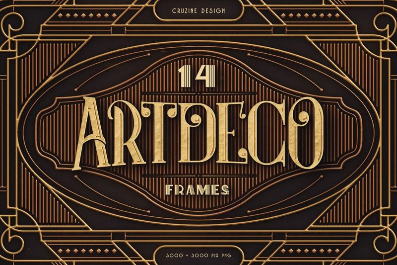
Art Deco typography is characterized by its geometric forms, bold strokes, and often stylized lettering. Fonts with strong vertical and horizontal lines, such as sans-serif styles with clean lines and sharp angles, were frequently used. Examples include fonts inspired by Egyptian hieroglyphs or Art Nouveau’s flowing curves, but often rendered with a geometric precision. The use of uppercase letters was common, adding to the overall sense of boldness and formality.
Art Deco graphic design, with its bold geometric shapes and luxurious feel, is a timeless aesthetic. I’ve been experimenting with incorporating these principles into my YouTube channel thumbnails, and to help with that, I’ve been diving deep into this excellent guide on getting it on with YouTube. The sleek lines and vibrant colors of Art Deco translate surprisingly well to the digital space, adding a sophisticated touch to my video content.
I’m really excited about how this will elevate my channel’s visual identity.
Serif fonts were sometimes employed, but they tended to have a more geometric and less ornate feel than their traditional counterparts. Think of fonts that feature strong, clean serifs, lacking the elaborate flourishes seen in earlier styles. The choice of typeface significantly influenced the overall mood and readability of the design.
Interaction of Color and Typography
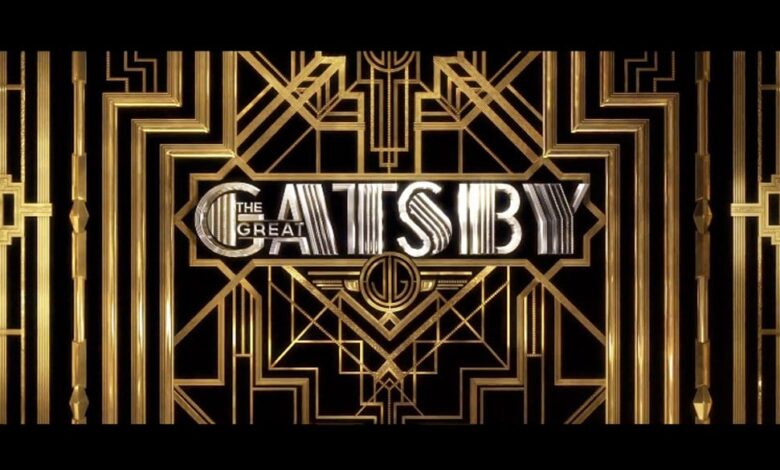
The interaction between color and typography in Art Deco was crucial in achieving visual harmony. Bold, contrasting colors were often used to highlight important text elements, drawing the viewer’s eye to key information. For instance, a gold or silver typeface might be used against a deep blue or black background to create a sense of elegance and luxury, immediately drawing attention to the brand or message.
Similarly, the use of color could complement the shape and form of the typography. A geometric sans-serif font might be paired with a palette of similarly geometric shapes and colors, creating a unified and cohesive visual experience. The overall effect was a sophisticated and visually arresting design, perfectly embodying the spirit of the Art Deco movement.
Art Deco in Different Media
Art Deco’s influence wasn’t confined to a single medium; its elegant geometry and luxurious aesthetic permeated various forms of visual communication and design. The adaptability of Art Deco principles allowed for striking stylistic variations depending on the chosen medium, showcasing its versatility and enduring appeal. This section explores how Art Deco manifested across different media, highlighting the unique design choices driven by the medium’s inherent properties and intended function.
The inherent characteristics of each medium – from the limitations of print to the possibilities of three-dimensional sculpture – dictated the specific application of Art Deco’s core principles. For instance, the flat surface of a poster lent itself to bold geometric patterns and simplified forms, while the packaging of a luxury item demanded a more tactile and refined approach, incorporating materials and textures that enhanced the overall experience.
Art Deco Posters
Art Deco posters, often used for advertising travel, entertainment, or consumer products, utilized the medium’s expansive surface to showcase bold graphics and typography. The clean lines, geometric shapes, and vibrant color palettes of Art Deco created impactful and memorable designs. The posters’ purpose was to grab attention and convey a message quickly and effectively, so simplification and strong visual impact were prioritized.
Art Deco Packaging
Art Deco packaging design exemplified the movement’s focus on luxury and craftsmanship. Designers utilized high-quality materials, such as metallic inks, embossed textures, and rich colors, to create packaging that reflected the premium nature of the product within. The design often incorporated stylized geometric patterns and streamlined forms, echoing the overall aesthetic of the Art Deco movement while also considering the practical requirements of protecting and showcasing the product.
The shape and size of the packaging itself were often considered an integral part of the design, adding to the overall visual appeal.
Art Deco Advertising
Art Deco’s influence extended to various forms of advertising, including print advertisements in magazines and newspapers, as well as early forms of broadcast advertising. Print advertisements employed the same bold graphic elements and streamlined typography seen in posters, while early radio advertising capitalized on the movement’s emphasis on sophistication and modernity to create a sense of luxury and desirability for the products being promoted.
The goal was to present products as modern, stylish, and aspirational.
Art Deco in Other Media
Art Deco’s impact extended beyond posters, packaging, and advertising. Its stylistic influence can be seen in various other media:
- Architecture: The Chrysler Building in New York City, with its tiered setbacks and stylized ornamentation, is a prime example of Art Deco architecture. The building’s exterior showcases the movement’s characteristic streamlined forms and geometric details, creating a visually striking and imposing structure.
- Furniture: Art Deco furniture often featured sleek lines, geometric shapes, and luxurious materials such as chrome, lacquer, and exotic woods. Pieces were designed to be both functional and aesthetically pleasing, reflecting the movement’s emphasis on elegance and modernity.
- Jewelry: Art Deco jewelry frequently incorporated geometric motifs, bold colors, and precious stones. The designs were often highly stylized and visually striking, showcasing the movement’s appreciation for luxury and craftsmanship.
- Textiles: Art Deco textiles featured bold geometric patterns, stylized floral designs, and rich colors. These patterns were often used in clothing, upholstery, and other decorative fabrics.
The Legacy of Art Deco Graphic Design
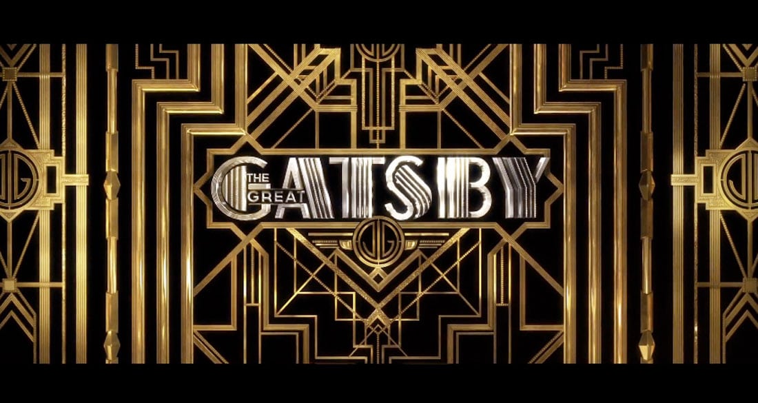
Source: designshack.net
Art Deco’s influence extends far beyond its heyday in the 1920s and 30s. Its distinctive style, characterized by geometric precision, luxurious materials, and a sense of streamlined modernity, continues to resonate with designers and audiences alike, proving its enduring relevance in contemporary design. The legacy of Art Deco is not merely nostalgic; it’s a testament to the power of timeless design principles.Art Deco’s enduring appeal stems from its inherent versatility and adaptability.
Its geometric forms and bold color palettes translate seamlessly across various media, from packaging and posters to architecture and fashion. The elegance and sophistication associated with the style continue to hold a strong allure, making it a popular choice for brands seeking to project a sense of luxury and refinement. This enduring appeal isn’t just a matter of aesthetics; it’s a reflection of the era’s optimistic spirit and its celebration of technological advancement, themes that still hold relevance today.
Modern Applications of Art Deco Principles
Contemporary designers frequently draw inspiration from Art Deco’s core elements. We see its influence in the clean lines and geometric patterns of modern logos, the stylized typography of magazine layouts, and the bold color combinations used in website design. Think of the sleek, geometric fonts used in many corporate identities – often echoing the sans-serif typefaces popular during the Art Deco period.
Similarly, the use of rich, jewel-toned colors in contemporary branding often reflects the luxurious palettes favored by Art Deco designers. Even the use of metallic accents and textured surfaces in modern product design is a nod to the materiality and craftsmanship emphasized in the Art Deco era. The Chrysler Building, a prime example of Art Deco architecture, continues to inspire awe and serves as a potent symbol of the era’s design aesthetic.
Its distinctive stepped crown and sunburst motifs have been reinterpreted countless times in contemporary architecture and graphic design, demonstrating the enduring power of its iconic form.
Art Deco’s Continued Resonance with Audiences
The enduring appeal of Art Deco transcends mere nostalgia. Its inherent elegance and sophistication continue to resonate with audiences who appreciate its timeless qualities. The style’s emphasis on geometric precision and bold graphic elements provides a sense of order and clarity, a welcome contrast to the often-overwhelming visual noise of the modern world. This clarity and visual impact make Art Deco a powerful tool for communication, whether in branding, advertising, or editorial design.
The resurgence of interest in vintage aesthetics, combined with the style’s inherent adaptability, ensures its continued relevance in the 21st century. The resurgence of Art Deco in popular culture, evident in film, fashion, and product design, reflects its enduring ability to capture the imagination and appeal to a diverse audience. For example, the recent popularity of geometric patterns and metallic accents in fashion design showcases the style’s continued relevance.
Incorporation of Art Deco Elements into Current Design Trends, Art deco graphic design
Art Deco’s influence is subtly yet powerfully present in contemporary design trends. The symmetrical balance and geometric precision of Art Deco are mirrored in minimalist design, often seen in the clean layouts of websites and mobile applications. The use of bold, contrasting colors – reminiscent of Art Deco palettes – remains prevalent in branding and advertising, creating visually striking and memorable designs.
Moreover, the incorporation of stylized geometric patterns, inspired by Art Deco motifs, is frequently seen in textile designs, wallpaper, and even packaging. The emphasis on high-quality materials and craftsmanship, a defining characteristic of Art Deco, is also reflected in the current trend towards sustainable and ethically sourced materials in design. The enduring appeal of Art Deco lies in its ability to seamlessly integrate with contemporary design sensibilities, creating designs that are both modern and timeless.
Analyzing a Specific Art Deco Design
For this analysis, we’ll delve into the iconic poster designed by A.M. Cassandre for the Normandie ocean liner. This poster, created in 1935, perfectly encapsulates the dynamism and elegance characteristic of Art Deco graphic design, serving as an excellent example for understanding the movement’s principles.The poster depicts a stylized image of the Normandie, a majestic ocean liner that was, at the time, the epitome of luxury and technological advancement.
The ship itself is rendered in a streamlined, almost aerodynamic form, emphasizing its speed and modernity. The colors and composition are meticulously chosen to evoke a sense of both sophistication and motion.
Color Palette and Typography
Cassandre masterfully utilizes a limited but impactful color palette. Deep blues and blacks dominate, representing the ocean and the ship’s powerful presence. Accents of gold and silver add a touch of luxury and sophistication, reflecting the Normandie’s reputation as a premier vessel. The typography is equally striking. A bold, sans-serif typeface, typical of Art Deco, is used for the ship’s name, “Normandie,” creating a strong visual focal point.
The lettering is elegant yet powerful, mirroring the ship’s design. Smaller text provides additional information, maintaining a clear hierarchy and readability.
Composition and Intended Audience
The composition is dynamic and directional. The ship is positioned at a slight angle, creating a sense of movement and forward momentum. The use of strong diagonals and geometric shapes further enhances this feeling of speed and energy. The intended audience was clearly the affluent traveler, someone seeking luxury and adventure. The poster aimed to convey the Normandie’s status as a symbol of speed, elegance, and sophisticated travel.
It wasn’t just about transportation; it was about an experience, a journey into the height of modern luxury.
Impact within the Art Deco Movement
Cassandre’s Normandie poster is a prime example of the stylistic features that defined Art Deco graphic design. Its streamlined forms, bold typography, and use of color to create a sense of dynamism and luxury are all hallmarks of the era. The poster’s success in conveying a clear message and captivating its intended audience solidified its place within the broader context of the Art Deco movement, demonstrating the power of graphic design to promote and embody the spirit of a particular era.
The poster’s enduring popularity and its frequent use in design history textbooks and exhibitions are a testament to its lasting impact and significance. It continues to inspire designers today, showcasing the timeless appeal of Art Deco aesthetics.
Ultimate Conclusion: Art Deco Graphic Design
Art Deco graphic design, with its timeless elegance and bold geometric forms, remains a powerful influence on modern design. Its legacy is undeniable, a testament to its ability to capture the spirit of a bygone era while remaining remarkably relevant today. From the subtle echoes in contemporary logos to the full-blown revival in certain design trends, the spirit of Art Deco continues to inspire and captivate.
So next time you see a striking geometric pattern or a sophisticated color palette, take a moment to appreciate the enduring influence of this remarkable design movement.
FAQ Summary
What are some common misconceptions about Art Deco graphic design?
A common misconception is that Art Deco is solely characterized by its use of gold and black. While these colors were frequently used, Art Deco embraced a wide range of vibrant hues.
How can I incorporate Art Deco elements into my own designs?
Start by experimenting with geometric shapes, bold colors, and elegant typography. Look for inspiration in classic Art Deco posters and packaging for color palettes and layout ideas.
Are there any contemporary designers who are inspired by Art Deco?
Many contemporary designers draw inspiration from Art Deco. Look for designers who use geometric shapes, bold colors, and streamlined forms in their work.
Where can I find more resources to learn about Art Deco graphic design?
Explore online museums, design blogs, and books dedicated to Art Deco. Many excellent resources are available both online and in print.

