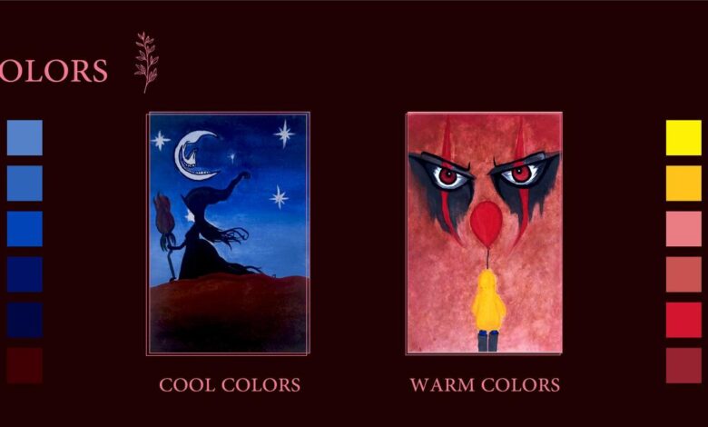
Basic Elements and Principles of Design
Basic elements and principles of design: Ever wondered what makes a design truly captivating? It’s not magic, but a masterful blend of fundamental elements and principles. This journey explores the building blocks of visual communication – from the subtle power of line and the vibrant impact of color to the sophisticated interplay of balance and hierarchy. We’ll unpack these concepts, showing you how to create designs that are not just visually appealing, but also effective and impactful.
We’ll delve into the core elements: line, shape, form, value, color, and texture, exploring how each contributes to the overall aesthetic and functionality of a design. Then, we’ll examine the principles that guide their arrangement: balance, emphasis, proportion, rhythm, unity, and variety. Understanding these principles is key to creating designs that are both visually pleasing and effectively communicate their intended message.
We’ll also touch on the crucial roles of space, proximity, and typography in shaping the viewer’s experience. Finally, we’ll see how these principles translate across different design fields, from graphic design and web design to user interface (UI) design.
Line, Shape, Form, Value, Color, Texture: Basic Elements And Principles Of Design
The basic elements and principles of design work together to create visually appealing and effective compositions. Understanding these fundamental building blocks is crucial for any designer, regardless of their chosen medium. This section delves into the individual roles of line, shape, form, value, color, and texture, exploring their impact on visual communication.
Line
Lines are the foundation of any design. They guide the viewer’s eye, create structure, and establish visual pathways. A single line can convey a multitude of meanings, from delicate grace to bold strength, depending on its weight, length, and direction. Horizontal lines often suggest stability and calmness, while vertical lines communicate strength and height. Diagonal lines, on the other hand, can create a sense of movement and dynamism.
Consider the difference between the delicate lines of a botanical illustration and the bold, thick lines of a graphic novel – both use lines effectively, but to completely different ends.
Shape and Form
Shape refers to two-dimensional areas defined by lines or changes in color. Circles, squares, and triangles are basic shapes that carry inherent symbolic meanings. Form, however, is three-dimensional; it possesses volume and depth. A circle becomes a sphere, a square a cube. The interplay of shapes and forms creates visual interest and contributes to the overall composition.
For example, a design might use a variety of geometric shapes to create a modern and structured feel, while organic forms could evoke a more natural and flowing aesthetic. The contrast between a sharp triangular shape and a soft, rounded form adds visual tension and dynamism.
Value
Value refers to the lightness or darkness of a color or tone. It plays a crucial role in creating depth, dimension, and contrast within a design. By skillfully manipulating value, designers can create a sense of three-dimensionality on a two-dimensional surface. For instance, using a range of values from light to dark can create the illusion of shadows and highlights, giving a sense of volume and form to an object.
The interplay of light and shadow is vital in creating realistic portrayals or adding dramatic effect. A high-contrast image with stark light and dark areas will have a completely different feel than one with subtle value shifts.
Color
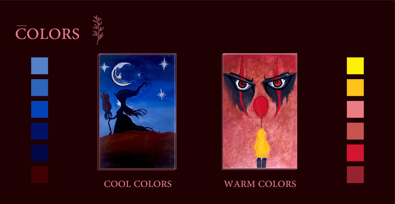
Color is arguably the most impactful element in design, evoking strong emotional responses and shaping the overall mood and atmosphere. Color theory provides a framework for understanding how colors interact and influence each other. Complementary colors, situated opposite each other on the color wheel (e.g., red and green, blue and orange), create vibrant contrast when placed side-by-side. Analogous colors, located next to each other on the color wheel (e.g., blue, blue-green, and green), create a harmonious and soothing effect.Here’s a sample color palette demonstrating both:Complementary: #FF0000 (Red) and #008000 (Green)Analogous: #007FFF (Azure), #00FFFF (Cyan), #3CB371 (MediumSeaGreen)
Texture
Texture refers to the surface quality of an object, both visually and tactilely. Visual texture is what we perceive through sight, while tactile texture is experienced through touch. The use of texture adds depth and visual interest to a design. A rough texture might suggest ruggedness or antiquity, while a smooth texture might convey elegance or sophistication.
| Texture Type | Visual Effect | Example | Application in Design |
|---|---|---|---|
| Rough | Creates a sense of ruggedness, age, or rusticity | Bark on a tree | Background texture for a rustic-themed website |
| Smooth | Conveys elegance, sophistication, or modernity | Polished marble | Background for a luxury brand’s website |
| Patterned | Adds visual interest and complexity | Woven fabric | Repeating pattern on wallpaper or textiles |
| Simulated | Creates the illusion of texture through visual means | A digitally painted wood grain | Creating a realistic-looking wood texture in a digital illustration |
Principles of Design
Source: behance.net
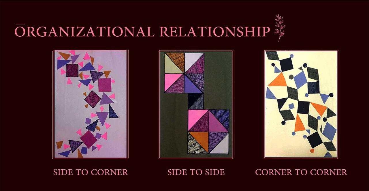
Understanding the basic elements of design is only half the battle; mastering the principles is where the magic truly happens. These principles guide how we arrange and combine the elements to create effective and aesthetically pleasing compositions. Think of the elements as the building blocks, and the principles as the architectural blueprint. Let’s delve into these crucial design principles.
Balance, Basic elements and principles of design
Balance refers to the visual weight distribution in a design. It creates a sense of stability and harmony. There are three main types: symmetrical, asymmetrical, and radial.Symmetrical balance, also known as formal balance, is achieved when elements are mirrored on either side of a central axis. Imagine a perfectly balanced scale; each side holds equal weight. A visual example would be a logo with identical shapes and colors arranged symmetrically around a vertical line.
This type of balance is often associated with formality and tradition.Asymmetrical balance, or informal balance, achieves equilibrium through the use of different elements with unequal visual weight. It’s like balancing a scale with objects of different sizes and shapes, where the visual weight is carefully distributed to maintain equilibrium. A design might feature a large, dark shape on one side balanced by several smaller, lighter shapes on the other.
This type of balance often feels more dynamic and modern.Radial balance emanates from a central point, like spokes on a wheel. Imagine a sunflower; its petals radiate outwards from the center, creating a sense of movement and focus. This type of balance is often used to create a strong focal point and a sense of order.
Emphasis
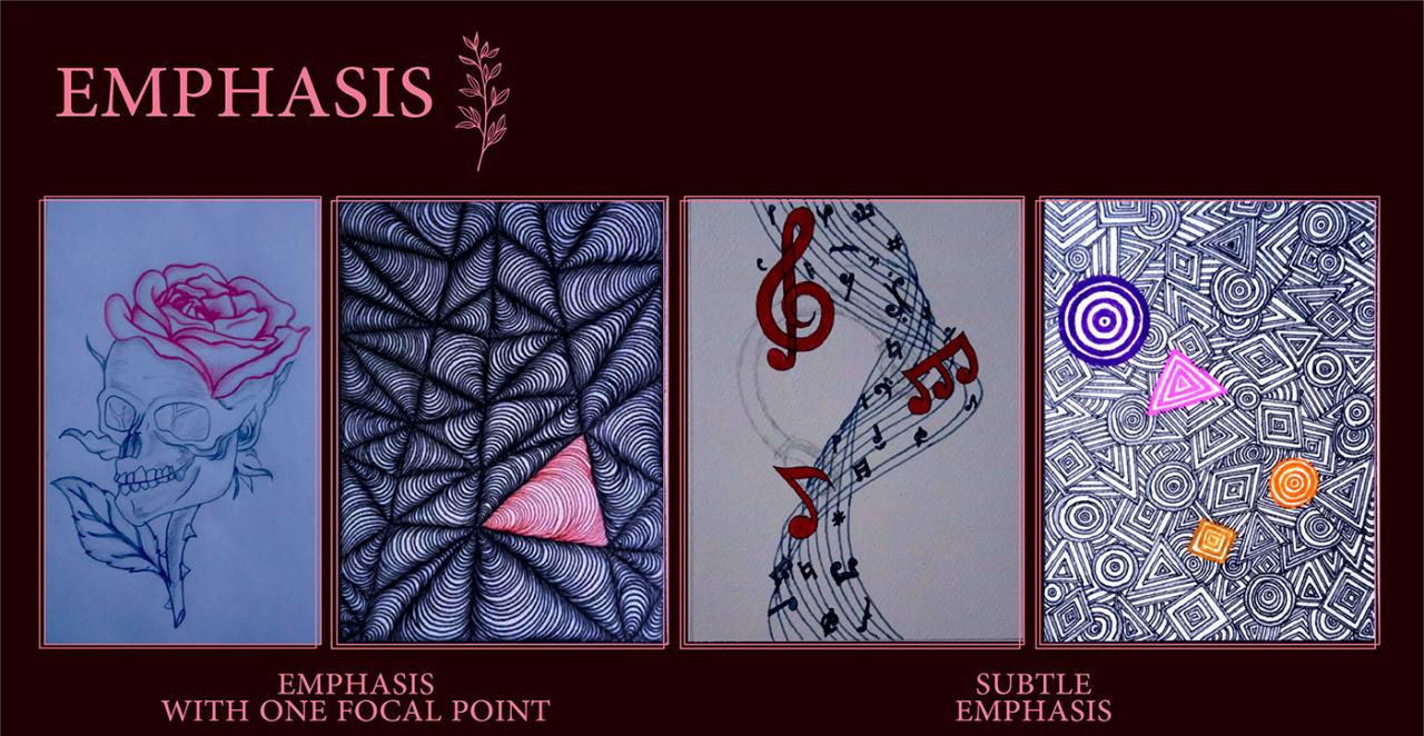
Emphasis, or focal point, is the element or area that immediately grabs the viewer’s attention. It’s the star of the show, the element that guides the viewer’s eye through the design. Several methods can be used to create emphasis: contrast (using different colors, sizes, or shapes), isolation (placing an element apart from others), placement (positioning an element strategically), and directional lines (using lines to draw the eye to a specific point).Let’s consider a hypothetical design: a website landing page for a new coffee shop.
The emphasis could be placed on a high-quality image of a steaming cup of coffee, significantly larger than other elements, placed centrally and surrounded by a lighter color background. This creates contrast in size, color, and placement, effectively drawing the viewer’s eye to the coffee.
Proportion and Scale
Proportion and scale relate to the size and relative dimensions of elements within a design. Proportion refers to the relationship between the sizes of different parts of a design, while scale refers to the size of an object in relation to its surroundings or other objects. Good proportion and scale create harmony and visual appeal. A poorly proportioned design can feel unbalanced and awkward.
For instance, a website with disproportionately large text compared to images will feel jarring. Conversely, a well-proportioned website maintains a consistent visual hierarchy, ensuring elements are sized appropriately relative to each other.
Rhythm and Repetition
Rhythm and repetition create visual flow and movement in a design. Rhythm is the repetition or alternation of elements to create a sense of movement and visual interest. Repetition is the use of the same element multiple times, creating a sense of pattern and unity. Consider the stripes on a shirt or the repeated arches in a Roman aqueduct; both use repetition to establish a clear visual rhythm.
The consistent repetition of elements guides the viewer’s eye through the design, creating a sense of visual flow and energy.
Unity and Variety
Unity and variety work together to create a cohesive yet engaging design. Unity refers to the feeling that all the elements of a design belong together and work as a whole. Variety introduces differences and keeps the design interesting. A design that is too unified can be boring; a design with too much variety can be chaotic. The key is to strike a balance between these two principles.
Think of a well-designed magazine spread: it has a consistent style and color palette (unity), but also features diverse images, typography, and layout elements (variety) to keep the reader engaged.
Space and Proximity
Space and proximity are fundamental design elements that significantly impact a design’s visual appeal and effectiveness. They are not merely empty areas, but active participants in shaping the overall message and guiding the viewer’s eye. Understanding how to utilize positive and negative space, along with the principles of proximity, is crucial for creating clear, organized, and aesthetically pleasing designs.Positive space refers to the areas occupied by visual elements like text, images, or shapes, while negative space, also known as white space, is the empty area surrounding these elements.
Both are equally important in achieving a balanced and effective design. Poor use of space can lead to cluttered and confusing layouts, hindering communication and creating a negative user experience.
Positive and Negative Space in Design
The interplay between positive and negative space is crucial for visual hierarchy and readability. Positive space holds the focal points, while negative space provides breathing room, preventing visual overload. Consider a website layout: a page crammed with text and images will be overwhelming, making it difficult for users to find the information they need. In contrast, a page with ample white space around text blocks and images will feel cleaner, more organized, and significantly improve readability.
The white space allows the eye to rest, making it easier to scan and process information. For example, imagine a magazine layout. A page packed with text and images would feel chaotic and hard to read. However, if the same content is organized with strategic white space, the design would be more appealing and easier to navigate. The white space helps to visually separate different sections, highlighting important information and guiding the reader’s eye.
Proximity in Grouping Elements and Creating Visual Hierarchy
Proximity refers to the arrangement of elements based on their relationship. Elements placed close together are perceived as belonging to a group, while those further apart are seen as separate entities. This principle is essential for establishing visual hierarchy and guiding the viewer’s eye through the design. Effective use of proximity creates visual order and enhances readability. For instance, grouping related items in a menu or navigation bar improves usability by establishing clear relationships between options.
A poorly designed menu with items scattered randomly will confuse users and make navigation difficult. A well-designed menu will group related options closely, making it easy to scan and find the desired item.
Example of Effective Proximity
Imagine a brochure promoting a new restaurant. The layout could effectively utilize proximity to organize information. The restaurant’s logo and name could be placed closely together at the top, forming a clear visual identity. The menu items could be grouped by category (appetizers, entrees, desserts), with each category clearly labeled and its items positioned close together. Customer testimonials could be grouped separately, visually distinct from the menu, but still clearly associated with the restaurant.
Contact information, like the address and phone number, could be grouped together at the bottom of the brochure. This strategic use of proximity creates a clear and logical flow of information, enhancing the brochure’s overall effectiveness. The careful placement of these elements, using proximity to group related information, creates a visually appealing and easily understandable layout.
Typography and Visual Hierarchy
Typography and visual hierarchy are fundamental aspects of design that significantly impact how a viewer interacts with and understands a piece of work. Choosing the right fonts and structuring information effectively ensures readability and guides the viewer’s eye, ultimately leading to a more engaging and successful design. These elements work in tandem to create a cohesive and communicative visual experience.
Font selection plays a crucial role in determining the overall aesthetic and readability of a design. The typeface itself—serif, sans-serif, script, or display—immediately sets a tone. Serifs, with their small flourishes, often convey a sense of tradition and formality, while sans-serif fonts tend to feel modern and clean. Script fonts add elegance and personality, but are generally less suitable for large blocks of text due to lower readability.
Display fonts, often highly stylized, are best used sparingly for headlines or accents, as their primary purpose is to make a visual statement.
Understanding basic elements and principles of design, like color theory and composition, is crucial for any visual medium. To really see these principles in action, check out this awesome guide on getting it on with youtube , which shows how even simple design choices can make a huge impact on viewer engagement. Applying these design fundamentals will elevate your YouTube presence and ultimately, help you create more effective videos.
Font Selection and Readability
Readability is paramount. Factors like x-height (the height of lowercase letters), kerning (the space between individual letters), and leading (the space between lines) all affect how easily text can be read. A font with a larger x-height and appropriate kerning and leading will be more legible, particularly in body text. Conversely, poorly chosen fonts with cramped spacing or unusual letterforms can lead to eye strain and comprehension difficulties.
Consider the context: a website requires highly legible fonts, while a poster might utilize a more stylized font for impact, but only for short bursts of text.
Visual Hierarchy and Guidance of the Viewer’s Eye
Visual hierarchy is the arrangement of elements in a design to guide the viewer’s eye through the information in a specific order. This is achieved through various techniques, including size, weight, color, and placement. The most important elements should be visually dominant, while less important elements recede into the background. This deliberate arrangement ensures that the viewer processes the information in the intended sequence.
Example of Visual Hierarchy Using Typography
Imagine a poster advertising a concert. The band’s name would be the largest and boldest element, perhaps in a stylized display font. The concert date and venue would follow, in a slightly smaller, but still prominent, sans-serif font. Supporting information, like ticket prices and website details, would be presented in a smaller, lighter sans-serif font. This creates a clear visual hierarchy, guiding the viewer’s eye from the most important information (band name) to the less important details.
For instance: Imagine a headline “SUMMER CONCERT SERIES” in a large, bold, sans-serif font (e.g., Arial Black, size 48pt). Below it, the band name “The Electric Echoes” in a slightly smaller, but still bold, sans-serif font (e.g., Arial Bold, size 36pt). Then, the date and venue information “July 21st, City Park Amphitheater” in a regular weight sans-serif font (e.g., Arial, size 24pt).
Finally, ticket details like “Tickets: $25” in a smaller, lighter sans-serif font (e.g., Arial, size 16pt).
Typography to Convey Mood and Message
Different typefaces evoke different emotions and suit various purposes. A playful script font might be perfect for a children’s book, while a serious serif font might be more appropriate for a legal document. A bold, sans-serif font can project confidence and modernity, while a delicate script font might convey elegance and sophistication. The choice of font should always align with the overall message and tone of the design.
Practical Application in Different Design Fields
Source: behance.net
The fundamental elements and principles of design—line, shape, form, value, color, texture, space, proximity, and typography—aren’t merely abstract concepts; they’re the building blocks of effective visual communication across various design disciplines. Understanding how these elements interact and influence each other is crucial for creating designs that are not only aesthetically pleasing but also functional and communicative. Their application varies depending on the specific design field, but the underlying principles remain consistent.
Graphic Design Applications
Graphic design leverages these elements to create visually compelling and informative materials. Think of a company logo: a strong shape, perhaps incorporating symbolic lines, conveys the brand’s identity. The choice of color evokes specific emotions and associations. The typography chosen impacts readability and reflects the brand’s personality. Consider a poster advertising a concert: a dynamic composition, using contrast in value and color, draws the viewer’s eye to the key information—date, time, and venue.
The skillful use of space creates visual hierarchy, guiding the viewer’s gaze. Texture, even simulated, can add depth and interest, making the design more engaging. In essence, graphic designers meticulously orchestrate these elements to achieve specific communication goals.
Web Design Applications
Web design shares many similarities with graphic design, but the interactive nature of the medium introduces unique considerations. The principles of proximity and visual hierarchy are paramount in guiding users through the website’s information architecture. Clear typography ensures readability on various screen sizes. Color palettes are chosen not only for aesthetic appeal but also to enhance usability and reflect the brand’s identity.
White space (negative space) is crucial for creating a clean and uncluttered interface, improving the user experience. Responsive design, adapting to different screen sizes, requires careful consideration of how elements scale and maintain their visual harmony. The use of subtle animations and micro-interactions can enhance engagement, but must be used judiciously to avoid distraction.
User Interface (UI) Design Applications
UI design focuses specifically on the interactive elements of a digital product, aiming for intuitive and efficient user interaction. Here, the principles of proximity and visual hierarchy are especially critical. Buttons, menus, and other interactive elements must be clearly defined and easily accessible. Color is used to indicate functionality and status—for instance, green for “go” and red for “stop.” Typography is crucial for readability and clarity in conveying information.
Feedback mechanisms, such as animations and loading indicators, use visual cues to inform the user about the system’s status. The overall goal in UI design is to create a seamless and enjoyable user experience, achieved through careful consideration and application of the fundamental design elements and principles.
Outcome Summary
Source: behance.net
Mastering the basic elements and principles of design isn’t about memorizing rules, but about understanding the underlying principles that govern visual communication. By understanding how line, shape, color, and other elements interact, and by applying principles like balance, hierarchy, and unity, you can create designs that are both aesthetically pleasing and highly effective. This journey through the fundamentals empowers you to craft designs that resonate with your audience, whether you’re a seasoned designer or just starting out.
So go forth and create!
FAQ Explained
What’s the difference between symmetrical and asymmetrical balance?
Symmetrical balance is mirror-like; elements are evenly distributed on either side of a central axis. Asymmetrical balance achieves equilibrium through different weights and elements, creating a more dynamic feel.
How do I choose the right font for my design?
Consider readability, the overall mood you want to convey, and the context of your design. Experiment with different fonts and see what works best!
What is negative space and why is it important?
Negative space (or white space) is the empty area around elements in a design. It’s crucial for readability, visual breathing room, and highlighting key elements.
How can I create a strong visual hierarchy?
Use size, color, contrast, and placement to guide the viewer’s eye. The most important information should be the most prominent.
