Best Black Friday Landing Pages That Convert
Best Black Friday landing pages that convert aren’t just about flashy graphics; they’re a carefully crafted blend of design, copy, and user experience. This year, more than ever, maximizing your Black Friday sales hinges on creating a landing page that grabs attention, builds trust, and guides visitors effortlessly towards a purchase. We’ll dive into the key elements that make these pages tick, from compelling visuals and persuasive copy to optimizing for mobile and leveraging social proof.
Think of your Black Friday landing page as your storefront on the busiest shopping day of the year. A poorly designed page is like a cluttered store with confusing signage – customers will get frustrated and leave. A well-designed page, however, is like a beautifully organized boutique, inviting customers in and guiding them to exactly what they want.
We’ll explore the strategies to create that kind of irresistible online shopping experience, focusing on practical tips and actionable advice you can implement immediately.
High-Converting Design Elements: Best Black Friday Landing Pages That Convert
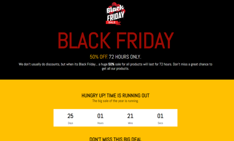
Source: vecteezy.com
Crafting a high-converting Black Friday landing page requires a strategic approach to design. It’s not just about showcasing products; it’s about creating a compelling user experience that guides visitors towards a purchase. This involves careful consideration of layout, visuals, and color psychology, all working in harmony to create a sense of urgency and excitement.
Landing Page Layout and Value Proposition
A successful Black Friday landing page prioritizes clarity. The value proposition – the core benefit of purchasing – should be immediately apparent above the fold. This means a concise headline and subheadline that clearly communicate the deal’s attractiveness (e.g., “Up to 70% Off Everything!”). Below this, high-quality product images and concise descriptions should be featured prominently. A strong call to action (CTA) button, such as a brightly colored “Shop Now” button, should be strategically placed for easy visibility and accessibility.
The layout should be clean and uncluttered, guiding the user’s eye naturally towards the CTA. Consider using a single-column layout for simplicity, or a two-column layout for showcasing multiple product categories. Avoid overwhelming the page with excessive text or elements.
Visual Hierarchy and Use of Whitespace
Effective visual hierarchy directs the user’s attention to the most important elements. This is achieved through size, color, and placement. The headline should be the largest and most prominent element, followed by the subheadline, product images, and then the CTA button. Whitespace is crucial for creating a breathable and visually appealing design. It prevents the page from feeling cluttered and allows users to focus on key information.
Strategic use of whitespace can also help to segment different sections of the page, improving readability and overall user experience. For example, ample white space could separate a hero section with a large banner image from a section showcasing specific product deals.
Compelling Visuals
High-quality visuals are essential for captivating users and conveying the quality of the products. Product photography should be professional, well-lit, and showcase the product’s features clearly. For example, a close-up shot of a pair of designer boots highlighting the stitching and material texture would be far more effective than a blurry, poorly lit image. Lifestyle imagery, showing people enjoying the products in a relatable setting, can further enhance the appeal.
For instance, an image of a family happily using a new smart home device could create a positive emotional connection with the product. Avoid using too many images, focusing instead on a selection of high-quality, impactful visuals that complement the overall design.
Color Psychology and Urgency, Best black friday landing pages that convert
Color psychology plays a vital role in creating a sense of urgency and excitement. Red is often associated with urgency and sales, making it a popular choice for CTA buttons and sale banners. Black and gold, frequently associated with luxury and exclusivity, can create a sophisticated feel. Combining these colors strategically can create a visually striking and effective design.
The contrast between these colors helps to draw attention to key elements, further enhancing the overall effectiveness of the page. For instance, a black background with gold text and a red “Shop Now” button can be highly effective in conveying a sense of urgency and sophistication.
Header Styles and Conversion Rates
The header style significantly impacts the user experience and conversion rates. Different styles can evoke different feelings and influence user behavior.
| Header Style | Description | Impact on Conversion | Example |
|---|---|---|---|
| Minimalist | Clean and simple, focusing on logo and navigation. | Can improve conversion by reducing distractions. | A small logo and a simple navigation menu at the top of the page. |
| Prominent Banner | Large banner image or video showcasing the Black Friday deal. | High impact, can attract attention but may overwhelm if not done well. | A full-width banner showcasing a diverse selection of products on sale, with a clear call to action. |
| Sticky Header | Header remains visible as the user scrolls down the page. | Improved navigation and visibility of CTA, particularly on long pages. | A header that stays at the top of the page even when scrolling, containing the logo, navigation, and search bar. |
| Mega Menu | Extensive dropdown menu with various product categories. | Improved navigation and product discovery, but can be overwhelming if poorly designed. | A header with a dropdown menu that expands to show a wide range of products organized by category, making navigation easier. |
Effective Copywriting Techniques
Crafting compelling copy is crucial for a high-converting Black Friday landing page. Your words need to not only highlight the amazing deals but also create a sense of urgency and excitement, persuading visitors to take action before it’s too late. The right copy can transform casual browsers into eager buyers.
Compelling Headline Options
Effective headlines are concise and immediately grab the reader’s attention. They should clearly communicate the core offer – significant Black Friday discounts – and instill a sense of scarcity to encourage immediate action. Here are some examples:
- Black Friday Blowout Sale: Up to 70% Off!
- Don’t Miss Out! Black Friday Deals End Soon!
- Black Friday Madness: The Biggest Sale of the Year!
- Limited Time Only: Grab Your Black Friday Steals Now!
These headlines employ strong action verbs and numbers to highlight the magnitude of the savings and the limited-time nature of the offers. Notice how they all create a sense of urgency and FOMO (fear of missing out).
Benefits of Black Friday Purchases
Clearly articulating the benefits of buying during Black Friday is essential for converting visitors. Highlighting value and savings will resonate with price-conscious shoppers.
A well-structured bullet point list can effectively communicate these benefits:
- Unbeatable Prices: Save up to 70% on your favorite products.
- Exclusive Deals: Access limited-time offers not available anywhere else.
- Free Shipping: Enjoy free delivery on all orders.
- Limited-Quantity Items: Secure your desired products before they sell out.
- Gift Ideas: Find the perfect gifts for loved ones at incredible prices.
These bullet points focus on the tangible advantages, making the offer irresistible. Remember to tailor these points to your specific products and target audience.
Customer Testimonials and Social Proof
Including customer testimonials and social proof builds trust and credibility. Positive reviews from satisfied customers can significantly influence purchasing decisions.
Showcase testimonials in a visually appealing and easily digestible format. For example:
“I was amazed by the quality of the product and the incredible Black Friday discount! I highly recommend this store.”
Jane Doe
“The customer service was outstanding, and the shipping was super fast. I’ll definitely be shopping here again!”
John Smith
These testimonials should be genuine and reflect real customer experiences. Consider including star ratings or other visual cues to further enhance their impact.
Strong Calls to Action (CTAs)
Your CTA is the final push to convert visitors into customers. It needs to be clear, concise, and compelling.
Examples of effective CTAs include:
- Shop Now!
- Get Your Deal Now!
- Claim Your Discount!
- Add to Cart!
These CTAs are action-oriented and use strong verbs that encourage immediate engagement. Ensure your CTA button is visually prominent and easy to find.
Showcasing Pricing and Discounts
The way you present pricing and discounts significantly impacts conversion rates. Different approaches can be used, each with its own advantages and disadvantages.
Consider these options:
| Approach | Advantages | Disadvantages |
|---|---|---|
| Original Price Strikethrough with Discounted Price | Clearly shows savings | Can look cluttered if not designed well |
| Percentage Discount Displayed Prominently | Immediately highlights the savings | May not be as effective for smaller discounts |
| “Was $XX, Now $YY” Format | Simple and easy to understand | Less visually striking than percentage discounts |
The best approach depends on the specific discount and the overall design of your landing page. A/B testing different approaches can help you determine which performs best.
User Experience (UX) Optimization
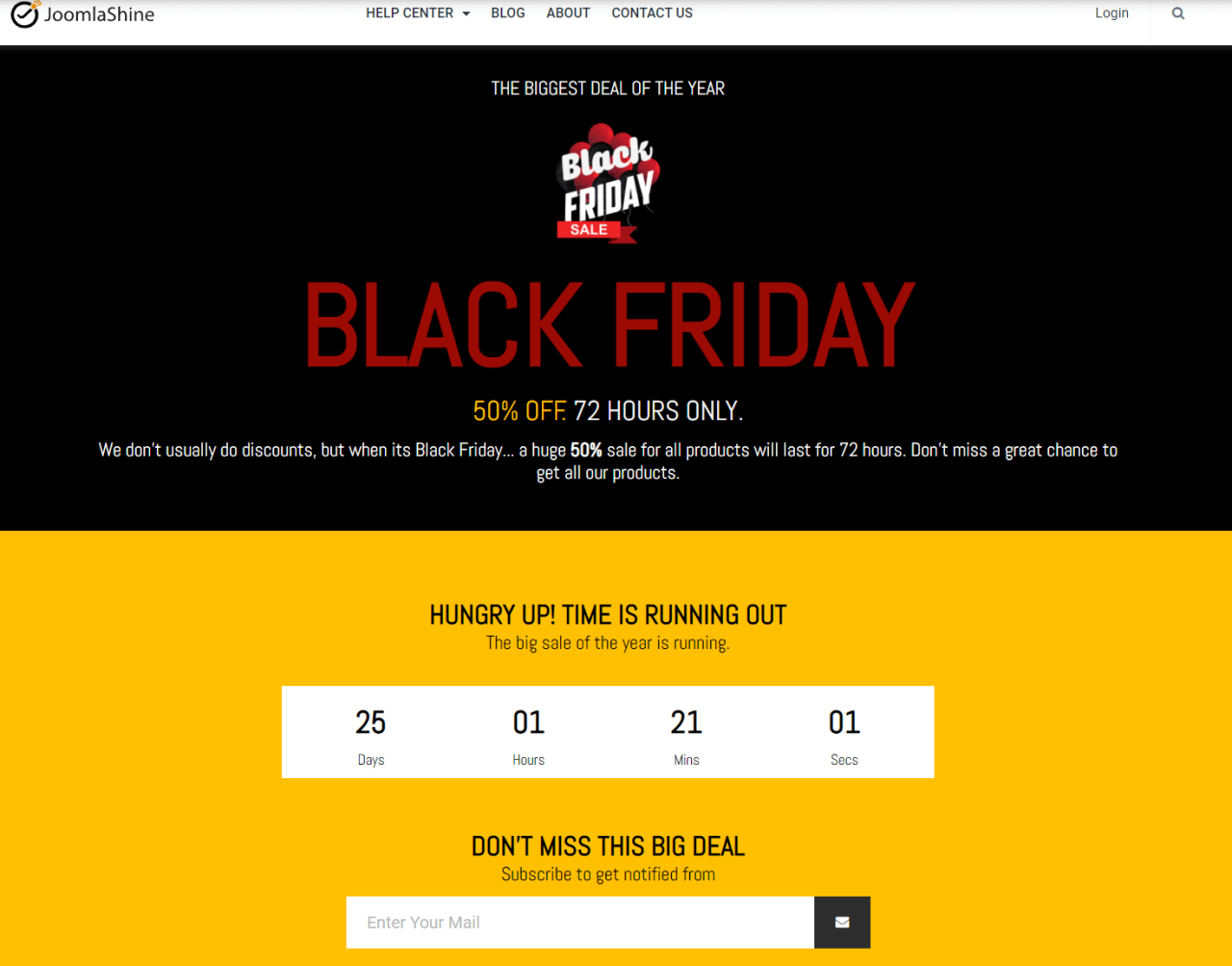
Source: learnworlds.com
A killer Black Friday landing page isn’t just about flashy graphics and compelling copy; it’s about providing a seamless and enjoyable user experience. A positive UX directly translates to higher conversion rates, leading to a more successful Black Friday campaign. Ignoring UX best practices is like leaving money on the table.
Mobile-Responsive Design
Mobile shopping is king, especially during Black Friday’s frantic sales rush. A non-responsive design means a frustrating experience for a significant portion of your potential customers, leading to immediate bounce rates. Your landing page must adapt flawlessly to various screen sizes (smartphones, tablets, desktops) ensuring consistent readability, navigation, and button functionality across all devices. Imagine a customer trying to navigate a tiny, unreadable button on their phone – they’ll likely abandon their purchase attempt.
A responsive design prevents this, offering a smooth and accessible experience regardless of the device used.
Checkout Process Simplification
A cumbersome checkout process is a major contributor to cart abandonment. Every extra step, form field, or confusing instruction increases the likelihood of a potential customer abandoning their purchase. Streamlining the checkout is crucial. Minimize the number of required fields (name, email, payment details are generally sufficient), offer guest checkout options, and clearly display the total cost upfront.
Consider integrating a one-click checkout option for returning customers to further speed up the process. Think of Amazon’s one-click purchase; it’s a prime example of UX optimization at its finest. The simpler the process, the more likely customers are to complete their purchases.
Page Load Speed Optimization
In today’s fast-paced digital world, nobody has time to wait. Slow loading times are a major conversion killer. Even a delay of a few seconds can significantly impact your conversion rates. Optimize images (compress them without sacrificing quality), leverage browser caching, and utilize a Content Delivery Network (CDN) to distribute your content across multiple servers, ensuring faster loading times for users in different geographic locations.
Tools like Google PageSpeed Insights can help you identify areas for improvement. A study by Akamai showed that even a one-second delay in page load time can result in a 7% reduction in conversions.
Website Accessibility and Inclusivity Best Practices
Creating an inclusive and accessible website is not only ethically sound but also expands your potential customer base. This involves ensuring your landing page is usable by people with disabilities. This includes:
- Using sufficient color contrast between text and background.
- Providing alternative text for images (alt text).
- Ensuring keyboard navigation works flawlessly.
- Using proper heading structure (H1, H2, etc.).
- Following WCAG (Web Content Accessibility Guidelines) standards.
Ignoring accessibility can result in legal issues and lost revenue. Consider using accessibility testing tools to identify and fix potential problems.
A/B Testing Methodology
A/B testing allows you to compare two versions of your landing page (A and B) to see which performs better. This data-driven approach helps optimize your page for maximum conversions. Here’s a step-by-step guide:
- Define your goal: What do you want to improve? (e.g., conversion rate, click-through rate).
- Identify the element to test: Choose a specific element to modify (e.g., headline, button color, call-to-action).
- Create variations: Design variations of the chosen element.
- Set up the test: Use A/B testing software (e.g., Google Optimize, Optimizely) to split traffic between the original and variations.
- Monitor the results: Track key metrics and let the test run for a sufficient duration to gather statistically significant data.
- Analyze and implement: Analyze the results and implement the winning variation.
A/B testing is an iterative process. Continuously test and refine your landing page to achieve optimal performance.
Leveraging Social Proof and Trust Signals
Building trust is paramount for converting Black Friday shoppers. In the whirlwind of deals, consumers need reassurance that your brand is legitimate, reliable, and offers genuine value. Social proof and trust signals act as powerful shortcuts, instantly boosting confidence and encouraging purchases. By strategically incorporating these elements, you can significantly increase your landing page’s conversion rate.
Customer Reviews and Ratings Display
Prominently showcasing positive customer reviews and ratings is a highly effective way to build trust. Instead of simply stating “great product,” let your satisfied customers speak for you. Consider visually appealing displays. For example, you could feature a carousel showcasing star ratings and short excerpts from recent reviews, or a dedicated section highlighting top-rated products with a large, clear star rating immediately visible.
Another option is to integrate a dynamically updating review feed from a platform like Trustpilot or Yelp, showcasing the volume and recency of positive feedback. This demonstrates ongoing customer satisfaction and actively combats potential skepticism. For example, imagine a carousel displaying five-star reviews with snippets like, “Exceeded my expectations!” or “Best Black Friday deal I’ve found!” alongside customer profile pictures.
This creates a more personal and relatable experience.
Trust Badges and Security Seals
Trust badges, such as those from McAfee Secure, Norton Secured, or VeriSign, immediately communicate security and legitimacy. These visually recognizable symbols reassure visitors that their personal and financial information is safe. Similarly, displaying badges indicating secure payment gateways (e.g., PayPal, Stripe) further enhances trust. These badges should be clearly visible, preferably near the checkout button or in the footer.
Imagine a small, clearly identifiable McAfee Secure logo nestled next to your payment options, instantly reassuring visitors about the security of their transaction. The placement is key; it should be easily spotted but not intrusive.
Social Media Integration for Engagement
Integrating social media feeds, particularly those showcasing user-generated content (UGC), can significantly boost engagement. This could include a live Instagram feed showing users enjoying your products, or a Twitter feed highlighting positive mentions and reviews. This creates a sense of community and authenticity, reinforcing the positive perception of your brand. For example, displaying a visually appealing Instagram feed showcasing customers using your products in creative ways, along with positive comments, generates a sense of social proof and encourages others to join the community.
This creates a dynamic, engaging element on the landing page, moving beyond static content.
Influencer Marketing Integration
Partnering with relevant influencers can lend significant credibility to your Black Friday campaign. Features showcasing influencer testimonials or product reviews can be highly effective. For example, you could feature a short video of a popular lifestyle influencer showcasing your product and sharing their positive experience, or include quotes from their reviews within the product descriptions. This leverages the influencer’s established audience and trust to boost your own credibility.
Choosing influencers whose values align with your brand is crucial for maintaining authenticity and avoiding negative associations. For instance, an eco-conscious brand could partner with an environmentally aware influencer.
Live Chat Feature Implementation
A live chat feature allows for immediate interaction with potential customers, addressing concerns and guiding them through the purchase process. The availability of instant support significantly reduces friction and increases conversion rates. The ability to answer questions in real-time demonstrates responsiveness and care, building trust and encouraging immediate purchase. For example, a customer hesitant about shipping times can have their question answered instantly, resolving their concern and leading to a sale.
The visible presence of the live chat option itself acts as a trust signal, showing that you are accessible and ready to help.
Analyzing and Improving Performance
Creating a high-converting Black Friday landing page isn’t a set-it-and-forget-it process. Continuous monitoring and optimization are crucial for maximizing your return on investment. By implementing a robust system for tracking key metrics and analyzing user behavior, you can identify areas for improvement and consistently refine your page for better performance.Analyzing your landing page’s performance involves more than just glancing at the overall conversion rate.
A deeper dive into the data reveals valuable insights that can significantly boost your results. This involves setting up tracking mechanisms, interpreting the data, and using that information to make strategic improvements.
Crafting killer Black Friday landing pages that convert requires a multi-pronged approach. Driving traffic is key, and that’s where smart YouTube marketing comes in; check out this awesome guide on getting it on with YouTube to learn how to boost your visibility. Once you’ve got that traffic flowing, your high-converting Black Friday landing pages will do the rest, ensuring a successful sales season.
Key Metrics Tracking
To effectively analyze your landing page’s performance, you need a system for tracking essential metrics. This involves integrating analytics tools like Google Analytics and potentially heatmap software. Key metrics to focus on include conversion rate (the percentage of visitors who complete your desired action, such as making a purchase), bounce rate (the percentage of visitors who leave your page after viewing only one page), and average time on page (the average amount of time visitors spend on your landing page).
By monitoring these metrics over time, you can identify trends and areas needing attention. For instance, a consistently high bounce rate might indicate a problem with your headline or overall page design, while a low average time on page could suggest a lack of engaging content.
Identifying and Addressing Areas for Improvement
Once you’ve collected data on your key metrics, the next step is to identify areas for improvement. A significant drop in conversion rate, for example, might warrant a closer examination of your call-to-action (CTA) button. Is it clearly visible? Is the copy compelling? Is the button design effective?
Similarly, a high bounce rate might point to problems with your page’s loading speed, confusing navigation, or irrelevant content. Analyzing the data in conjunction with heatmaps can pinpoint exactly where users are clicking, scrolling, and abandoning the page.
Regularly Updating and Optimizing the Landing Page
Optimizing a landing page is an iterative process. Based on your data analysis, you should regularly update and A/B test different versions of your page. For example, if your analysis reveals a low click-through rate on your CTA button, you might test different button colors, sizes, or copy. These A/B tests allow you to compare the performance of different versions and identify which elements are most effective.
Remember to track your results and continue to iterate based on what you learn. This continuous optimization process is essential for maintaining a high-performing landing page.
Audience Segmentation and Personalization
Segmenting your audience and personalizing the landing page experience can significantly improve conversion rates. Instead of presenting a generic message to all visitors, you can tailor your content to specific segments based on demographics, behavior, or interests. For example, you might create different landing pages for returning customers versus first-time visitors, offering personalized discounts or promotions. This targeted approach can lead to a more engaging and relevant experience, increasing the likelihood of conversion.
Using Heatmaps and Other Analytics Tools
Heatmaps provide a visual representation of user behavior on your landing page. They show you where users are clicking, scrolling, and hovering their mouse, revealing areas of interest and areas that are being ignored. By examining heatmaps alongside your other analytics data, you can gain a deeper understanding of user engagement and identify areas for improvement. Other tools, such as session recordings, allow you to watch how users interact with your page, providing even more insights into their behavior.
This combination of data-driven analysis and visual tools allows for a comprehensive understanding of user experience and effective optimization strategies.
Ending Remarks
Creating a high-converting Black Friday landing page is an investment, not an expense. By focusing on the user experience, leveraging compelling visuals and copy, and strategically using social proof, you can dramatically increase your chances of turning browsers into buyers. Remember, it’s not just about the deals; it’s about creating an engaging and seamless journey for your customers. So, take the time to refine your landing page, track your results, and prepare for a successful Black Friday!
FAQ Resource
What’s the ideal length for a Black Friday landing page?
There’s no magic number, but keep it concise and focused. Prioritize above-the-fold content and ensure easy navigation. Long pages can hurt conversion rates if not well-structured.
How important are A/B tests for Black Friday landing pages?
Crucial! A/B testing allows you to identify what resonates best with your audience – from headlines and images to calls to action and page layout. Continuously test and optimize based on data.
Should I offer free shipping on Black Friday?
It depends on your business model and profit margins. Free shipping can significantly boost conversions, but weigh the cost against the potential increase in sales.
What if my website isn’t mobile-friendly?
You’re losing a huge chunk of potential customers. Mobile responsiveness is essential. Ensure your landing page is optimized for all devices.