Best Circle Monogram Fonts A Designers Guide
Best circle monogram fonts aren’t just about pretty letters; they’re about crafting a unique visual identity. This post dives deep into the world of elegant monograms, exploring different styles, design techniques, and the best places to find the perfect font for your next project. Whether you’re designing wedding invitations, logos, or stationery, finding the right font can elevate your design to a whole new level of sophistication.
We’ll cover everything from understanding the key characteristics of a great circle monogram font (think readability, elegance, and versatility) to mastering the art of creating your own stunning designs. Get ready to discover the secrets to creating memorable monograms that truly stand out!
Defining “Best” in Circle Monogram Fonts
Choosing the “best” circle monogram font is subjective, depending heavily on the intended use and personal aesthetic. However, several key criteria consistently contribute to a font’s overall effectiveness and appeal in this specific context. A truly excellent circle monogram font balances readability, elegance, versatility, and a degree of historical resonance, all while maintaining a cohesive design within the circular constraint.Defining “best” involves considering how well a font fulfills its purpose.
A monogram, by nature, aims for concise and memorable representation. Within a circle, this need for clarity is amplified. Therefore, a font’s readability, even at small sizes, is paramount. Elegance, often achieved through refined details and balanced proportions, adds a touch of sophistication. Versatility ensures the monogram works well across various applications – from formal invitations to personal branding.
Finally, a subtle nod to historical lettering styles can lend a sense of tradition and timelessness.
Readability and Legibility in Circle Monograms
Readability is critical; a beautifully designed but illegible monogram is ultimately a failure. The letterforms should be clear, distinct, and easily identifiable, even when constrained within the circle. Spacing between letters should be carefully considered to prevent crowding or awkward gaps. Fonts with thick, bold strokes often fare better in small sizes or when reduced for reproduction.
For instance, a font like “Didot” (though not strictly designed for monograms), with its high contrast between thick and thin strokes, would likely perform well in a circle, provided the letters are carefully kerned (adjusted for spacing). Conversely, a very thin, delicate script might be less legible within the confines of a small circle.
Elegant Styles and Their Characteristics
Elegance is often associated with classic serif fonts, which possess small decorative flourishes (serifs) at the ends of their strokes. These serifs, when subtly incorporated, can add a touch of sophistication. However, sans-serif fonts, characterized by their clean lines and lack of serifs, can also be elegant, particularly those with carefully crafted letterforms and balanced proportions. Consider the font “Playfair Display,” a transitional serif font with graceful curves and delicate serifs, or “Lora,” a serif font with a more modern feel but still maintaining elegance.
These are both highly versatile and readable. Conversely, a geometric sans-serif font like “Montserrat” can offer a clean and modern elegance, though its suitability for a monogram depends on the design’s specific needs.
Versatility Across Applications
A versatile circle monogram font should adapt gracefully to various applications. It needs to look equally good on a business card, a wedding invitation, or a website logo. This adaptability often hinges on the font’s weight and style. A font with multiple weights (light, regular, bold, etc.) provides greater flexibility. For example, a light weight might suit a subtle watermark, while a bold weight could be more impactful on a business card.
The font’s ability to scale well without losing clarity is also crucial. A font that maintains its legibility at both large and small sizes is highly versatile.
Historical Context and Traditional Monogram Styles
Many elegant circle monogram fonts draw inspiration from historical lettering styles. These historical references often imbue the font with a sense of tradition and sophistication. Old-style serif fonts, such as those inspired by Renaissance or Baroque lettering, often possess a timeless quality. A font with subtle influences from these periods can add a touch of classical elegance to a monogram.
While not directly historical, many modern fonts intentionally evoke the feel of these older styles, offering a balance between classic aesthetics and contemporary usability.
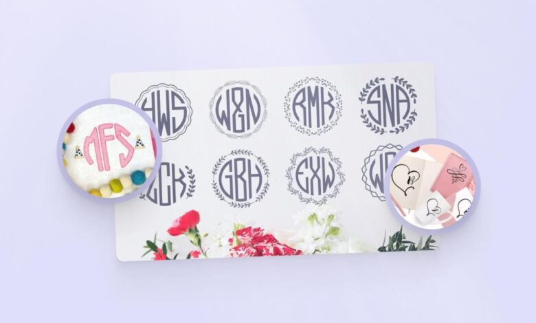
Popular Circle Monogram Font Styles
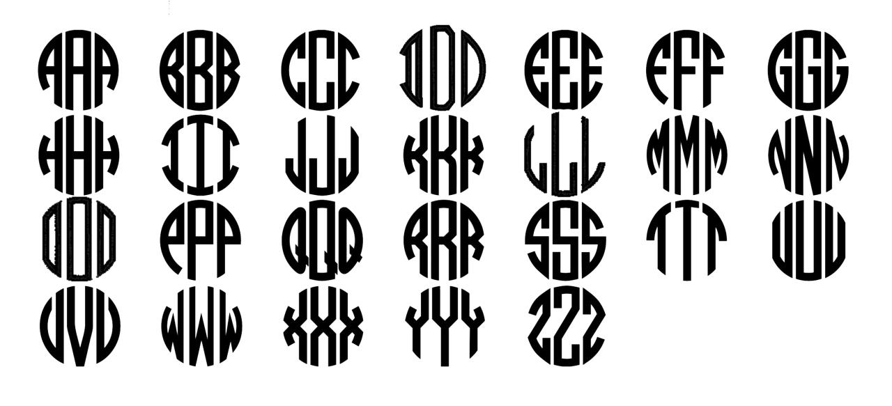
Source: bigcommerce.com
Circle monograms are a timeless design element, offering a sophisticated and personalized touch to various applications. Their enduring appeal lies in their ability to blend elegance with practicality, making them suitable for everything from formal wedding invitations to modern brand logos. Understanding the different styles available is key to choosing the perfect font for your project.
Categorization of Popular Circle Monogram Font Styles
Popular circle monogram font styles can be broadly categorized based on their design elements: stroke weight, the presence of flourishes, and overall aesthetic (modern versus classic). These elements work together to create distinct visual impressions, guiding the selection process based on the desired level of formality and visual impact.
Comparison of Circle Monogram Font Styles
The following table compares four distinct circle monogram font styles, highlighting their key features and suggesting suitable applications.
| Style | Key Features | Suitable Applications | Example |
|---|---|---|---|
| Classic Serif | Thick, even strokes; traditional serif typeface; often incorporates subtle flourishes. | Wedding invitations, formal stationery, classic logos, crests. | Imagine a monogram where the letters are in a traditional serif font like Times New Roman, but slightly condensed to fit within the circle. The letters are a consistent weight, and perhaps a small, delicate flourish is present at the junction of the letters. The overall feel is refined and timeless. |
| Modern Sans-Serif | Thin to medium strokes; clean, minimalist sans-serif typeface; often geometrically precise. | Modern logos, branding for tech companies, minimalist stationery, contemporary wedding invitations. | Picture a monogram where the letters are in a font like Helvetica or Arial, but slightly bolder and more condensed. The circle itself might be a perfect geometric circle, and the letters are precisely aligned. The overall feel is sleek and contemporary. |
| Decorative Script | Variable stroke weight; flowing script typeface; elaborate flourishes and swirls. | Wedding invitations (especially those with a romantic or whimsical theme), personalized gifts, feminine branding. | Visualize a monogram where the letters are in a cursive script font, with significant variation in stroke weight – thick downstrokes and thin upstrokes. Large, ornate flourishes intertwine between the letters, creating a sense of movement and elegance. The overall feel is romantic and artistic. |
| Art Deco | Geometric shapes; strong, bold strokes; often incorporates geometric patterns within the circle. | Logos for luxury brands, vintage-inspired designs, Art Deco-themed events. | Envision a monogram where the letters are in a bold, geometric sans-serif font, possibly with sharp angles and straight lines. The circle itself might be adorned with geometric patterns or lines, reflecting the style of the 1920s and 30s. The overall feel is sophisticated and glamorous. |
Effective Use of Circle Monogram Font Styles in Design Contexts
The effective use of circle monogram font styles depends on careful consideration of the overall design aesthetic and intended audience. For instance, a classic serif monogram would be perfectly suited for a formal wedding invitation, conveying a sense of tradition and elegance. In contrast, a modern sans-serif monogram might be a better choice for a tech startup’s logo, projecting a sense of innovation and minimalism.
The decorative script style could enhance the romantic feel of a wedding invitation, while the Art Deco style would lend a touch of vintage glamour to a luxury brand’s packaging. Choosing the right style ensures that the monogram complements the design, rather than clashing with it.
Creating Circle Monograms with Different Fonts: Best Circle Monogram Fonts
Designing a circle monogram involves more than just throwing letters into a circle; it’s about achieving visual harmony and balance. The choice of font significantly impacts the final aesthetic. Serif and sans-serif fonts, with their distinct characteristics, lend themselves to different approaches and results. Let’s explore how to create compelling monograms using both.
Creating a Circle Monogram with a Serif Font
Serif fonts, with their small flourishes (serifs) at the ends of strokes, often project a classic, elegant feel. Creating a monogram with a serif font requires careful consideration of letter spacing, as the serifs can easily overcrowd the design if not managed properly.Imagine we’re using the initials “J.S.” First, select a serif font like Garamond or Times New Roman.
Then, experiment with different letter sizes and spacing in a design program (such as Adobe Illustrator or Canva) until the letters fit comfortably within the circle without appearing cramped or stretched. The goal is to maintain an even distribution of space around the letters and between the letters themselves. If one letter is significantly larger than the other, you might need to adjust the scaling of each to achieve balance.
For “J.S.”, the “J” might need to be slightly smaller than the “S” to achieve a harmonious composition within the circle. Finally, refine the kerning (the space between individual letters) to create a visually pleasing arrangement. The overall effect should be one of refined elegance, reflecting the inherent sophistication of the serif typeface.
Creating a Circle Monogram with a Sans-Serif Font
Sans-serif fonts, lacking the serifs, generally present a cleaner, more modern look. Creating a monogram with a sans-serif font often requires a different approach compared to using a serif font. Because there are no serifs to contend with, the focus shifts to the overall shape and weight of the letters.Let’s use the same initials, “J.S.”, but this time with a sans-serif font like Helvetica or Arial.
The design process is similar: place the letters within the circle in your design program. However, the lack of serifs means you can often place the letters closer together than with a serif font. The focus becomes balancing the visual weight of each letter within the circle. With sans-serif fonts, slight adjustments in letter spacing might have a more pronounced impact on the overall balance.
Careful consideration should be given to the negative space within the circle. A balanced monogram will use this negative space effectively. The final result should feel clean, modern, and uncluttered.
Comparing Serif and Sans-Serif Circle Monograms
The resulting monograms will have distinct visual personalities. The serif monogram will exude a traditional, perhaps more formal, elegance, thanks to the delicate flourishes of the typeface. The sans-serif monogram, on the other hand, will project a contemporary, minimalist aesthetic. The difference lies not only in the presence or absence of serifs but also in the subtle adjustments needed during the design process to achieve balance.
The tighter letter spacing often possible with sans-serif fonts creates a more compact design, while the serifs in a serif font demand more breathing room to prevent a cluttered appearance. The choice between the two ultimately depends on the desired style and brand identity.
Illustrating Circle Monogram Font Usage
Source: etsystatic.com
Circle monograms offer a versatile design element, capable of conveying sophistication and personality across various applications. Their compact nature makes them ideal for branding and personal stationery, while the customizable font choices allow for a wide range of stylistic interpretations. Let’s explore some examples.
Logo Design Incorporating a Sans-Serif Circle Monogram, Best circle monogram fonts
Imagine a logo for a modern architecture firm. The monogram features the firm’s initials, “AB,” elegantly intertwined within a clean, minimalist circle. A sans-serif font, like Futura or Helvetica, is chosen for its modern and geometric feel, perfectly complementing the architectural theme. The color palette is restrained, using a deep charcoal grey for the monogram itself, set against a crisp white background.
A subtle accent of a bright, almost electric blue is used as a secondary color, perhaps incorporated into the firm’s tagline or website design, providing a pop of color that maintains the overall sophisticated and professional aesthetic. The overall effect is clean, professional, and memorable, instantly communicating the firm’s commitment to modern design principles.
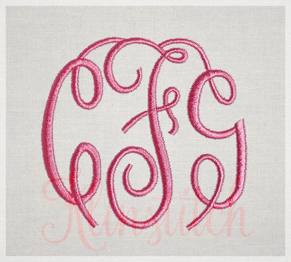
Wedding Invitation Featuring a Script Circle Monogram
For a romantic wedding invitation, a script font within a circle monogram creates a beautiful and timeless effect. Imagine the couple’s initials, “J&M,” artfully entwined in a flowing script font like Pacifico or Great Vibes, nestled within a delicate circle. The invitation itself is printed on luxurious ivory textured paper, using a letterpress printing method to create a subtle, embossed effect.
The script font lends an air of elegance and romance, while the letterpress adds a touch of old-world charm. The overall visual effect is refined and sophisticated, perfectly reflecting the couple’s style and the special occasion. A delicate blush pink or soft sage green could be used as an accent color, subtly printed on the invitation’s edges or incorporated into the design’s decorative elements.
Design Projects Benefiting from Circle Monogram Fonts
Circle monograms offer a broad appeal across diverse design projects. Here are three examples illustrating their versatility:
The use of a specific font style is crucial for each project to achieve the desired aesthetic and effectively communicate the intended message. Choosing the right font style is key to creating a visually appealing and effective design.
- Branding for a Coffee Shop: A playful, slightly rounded sans-serif font like Montserrat or Open Sans within a circle monogram would create a friendly and approachable brand identity. The circular shape suggests wholeness and community, while the font choice adds a touch of modernity and approachability, perfect for a modern coffee shop.
- Personal Stationery: A classic serif font like Garamond or Times New Roman in a circle monogram would create an elegant and timeless look for personal stationery, such as letterheads or business cards. The serif font provides a sense of sophistication and tradition, suitable for formal correspondence or professional use.
- Logo for a Yoga Studio: A flowing script font like Allura or Sacramento within a circle monogram would evoke a sense of serenity and balance, ideal for a yoga studio. The circular shape symbolizes wholeness and interconnectedness, perfectly aligning with the principles of yoga. The script font adds a touch of elegance and fluidity, reflecting the graceful movements of yoga practice.
Resources for Finding Circle Monogram Fonts
Finding the perfect circle monogram font can feel like searching for a needle in a haystack, but with a little guidance, you can navigate the vast world of typography and discover stunning fonts that perfectly complement your design projects. This section will explore reputable online resources and provide practical advice on font licensing and installation.
Reputable Websites and Platforms for Circle Monogram Fonts
Several online platforms offer a wide selection of high-quality fonts, some free and others requiring purchase. Choosing the right platform depends on your budget, design needs, and the specific license requirements for your project. It’s crucial to understand the licensing terms before downloading any font.
Finding the best circle monogram fonts for your YouTube channel is key to creating a consistent brand identity. I’ve been experimenting lately, and to help with the overall channel aesthetic, I’ve been learning a lot from this awesome guide on getting it on with YouTube ; it’s packed with tips! Back to fonts though, the right monogram can really elevate your intro sequences and thumbnails, making them instantly recognizable.
- Creative Market: This platform hosts a curated collection of fonts from independent designers, offering a wide variety of styles, including many suitable for circle monograms. Many fonts are offered as individual purchases or as part of bundles.
- Fontbundles.net: Similar to Creative Market, Fontbundles offers a vast library of fonts, often at discounted prices, especially during sales. They also offer bundles, making it a cost-effective option for designers needing multiple fonts.
- Google Fonts: While not exclusively focused on circle monogram fonts, Google Fonts provides a free and open-source library of fonts that are readily available for both personal and commercial use. You might need to experiment to find fonts that work well within a circle monogram design, but the accessibility is a huge plus.
- Dafont.com: Dafont is a vast resource offering a wide range of fonts, many of which are free for personal use. However, it’s crucial to carefully check the licensing information for each font before using it in a commercial project. The quality and consistency of fonts on Dafont can vary, so careful previewing is recommended.
Font Licensing: Free vs. Paid
Understanding font licensing is crucial to avoid legal issues. Free fonts often come with restrictions on commercial use, meaning they might be suitable for personal projects but not for clients or products you intend to sell. Paid fonts, conversely, usually come with broader commercial licenses, allowing for wider use. Always read the license agreement carefully before using any font.
Ignoring license agreements can result in copyright infringement, leading to legal consequences and financial penalties. The cost of a paid font is often justified by the higher quality, broader license, and support provided by the font creator.
Installing Newly Downloaded Fonts
The process of installing a font varies slightly depending on your operating system, but the general steps are similar. For Windows, you typically double-click the downloaded font file (.ttf or .otf), which opens the Font installer. From there, you can select to install the font. For macOS, you can typically drag and drop the font file into the Fonts folder located within the Library folder.
After installation, the font will be available in your design software. Always restart your design software after installing a new font to ensure it’s correctly recognized. If you encounter problems, consult the documentation for your specific operating system or design software.
Closing Summary

Source: masterbundles.com
From classic serifs to modern sans-serifs, the world of circle monogram fonts offers endless possibilities. By understanding the nuances of different font styles and design techniques, you can create truly unique and memorable designs. Remember to consider the overall aesthetic, the context of your project, and the licensing of your chosen font. So, go forth and create stunning monograms that leave a lasting impression!
FAQ Resource
What’s the difference between serif and sans-serif circle monogram fonts?
Serif fonts have small decorative strokes at the ends of letters, giving them a more traditional and elegant feel. Sans-serif fonts lack these strokes, appearing cleaner and more modern.
Where can I find free circle monogram fonts?
Many websites offer free fonts, but always check the license to ensure you’re using them legally. Be cautious of fonts with overly restrictive licenses.
How do I install a new font on my computer?
The process varies slightly depending on your operating system, but generally involves double-clicking the font file and selecting “Install”. Check your operating system’s help documentation for detailed instructions.
Can I use a circle monogram font for a business logo?
Absolutely! Circle monograms can be incredibly effective in logo design, particularly for businesses wanting a classic or sophisticated brand image. Choose a font that reflects your brand’s personality.