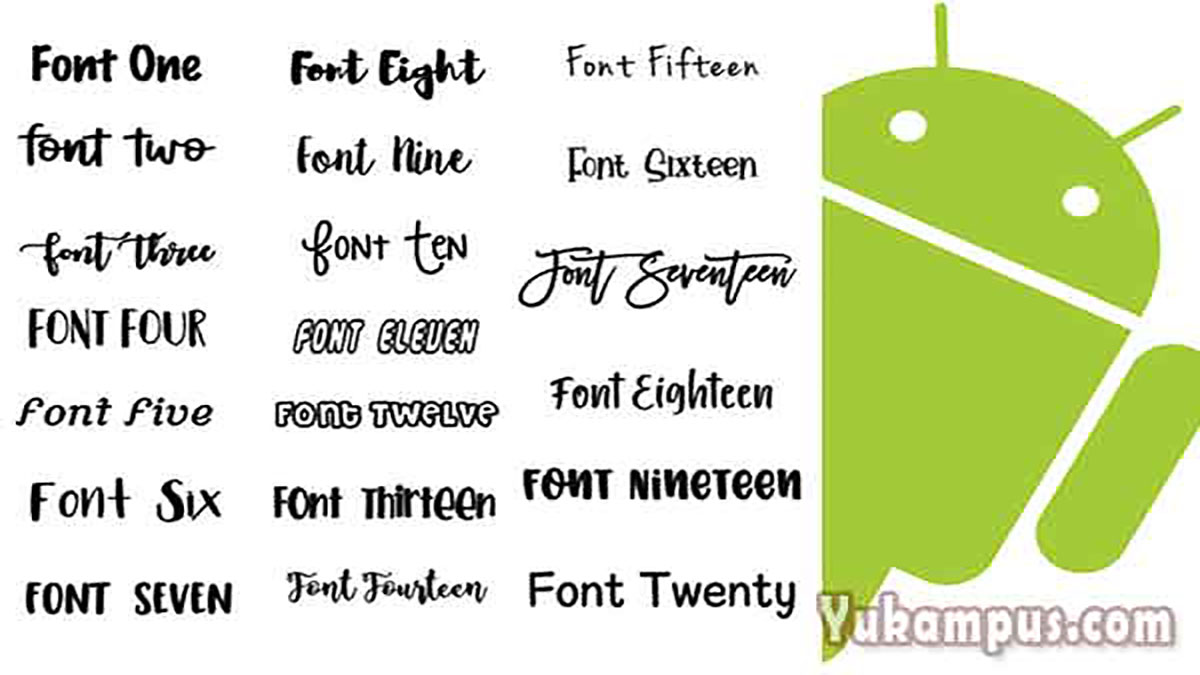
Best Cute Fonts for Android A Sweet Selection
Best cute fonts for Android? Let’s dive into the wonderfully whimsical world of typography! Finding the perfect font can totally transform the look and feel of your Android phone, adding a touch of personality and charm to everything from your home screen to your favorite apps. We’ll explore what makes a font “cute,” discover some top contenders, and even tackle the practicalities of finding and installing them.
Get ready to unleash your inner font fanatic!
This post isn’t just about pretty pictures; we’ll also cover the crucial balance between cute aesthetics and readability. After all, a font that’s adorable but impossible to read defeats the purpose! We’ll discuss font weights, letter spacing, and how different styles impact the overall user experience. Plus, we’ll delve into the important topic of font licensing to ensure you’re using your favorite fonts legally and ethically.
Defining “Cute” in Typography: Best Cute Fonts For Android
Defining “cute” in typography is surprisingly complex. It’s a subjective feeling, deeply rooted in cultural associations and personal preferences, yet certain visual characteristics consistently contribute to a font’s perceived cuteness. These aren’t hard and fast rules, but rather tendencies that designers exploit to evoke that feeling of playful charm.The design elements that create a cute typeface often involve a delicate balance of familiarity and novelty.
It’s a feeling that taps into a sense of childlike wonder and innocence, often achieved through specific visual cues. These cues are not necessarily mutually exclusive, and designers frequently combine several approaches for a more pronounced effect.
Visual Characteristics of Cute Fonts
Rounded shapes are a cornerstone of cute typography. Think of the gentle curves in fonts like Comic Sans or the softer edges of many script fonts. Sharp angles and harsh lines tend to be avoided, replaced instead with smooth transitions and flowing forms. The overall impression is one of softness and approachability. The absence of harshness makes the font appear less aggressive and more inviting.
Consider, for example, a font with heavily rounded terminals (the end of strokes) – these contribute significantly to a softer, friendlier look. Conversely, a font with sharp, angular terminals would appear more severe and less “cute.”
The Role of Playful Serifs and X-Height
Playful serifs, when present, are often short, subtly rounded, and integrated seamlessly into the letterforms, rather than being prominent or decorative. They add a touch of detail without disrupting the overall sense of softness. Conversely, heavy or ornate serifs would generally detract from the “cute” aesthetic. The x-height, the distance between the baseline and the mean line of lowercase letters, also plays a crucial role.
A relatively high x-height contributes to a friendly, approachable look. Lowercase letters appear larger and more dominant, lending a sense of openness and playfulness. This is in contrast to fonts with a low x-height, which often appear more formal and less approachable.
Stylistic Approaches to Achieving Cuteness
Several stylistic approaches can be used to achieve a cute aesthetic. One common method is the use of exaggerated features. This might involve disproportionately large ascenders or descenders, or unusually rounded terminals. Another approach involves incorporating playful details, such as hearts, stars, or other decorative elements subtly integrated into the letterforms. These small touches add personality and whimsy, enhancing the overall cute effect.
A third approach uses a playful contrast between thick and thin strokes, creating a sense of movement and energy. However, this contrast must be carefully balanced; too much contrast can make the font feel chaotic rather than cute. The key is subtlety and restraint, avoiding an overly cluttered or busy appearance.
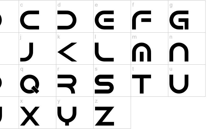
Popular Cute Font Styles for Android
Source: receh.net
Choosing the right font can dramatically impact the overall aesthetic of an Android app, especially when aiming for a cute and charming design. The right typeface can evoke feelings of playfulness, warmth, and friendliness, making the user experience more enjoyable. This section explores some popular font families that effectively achieve this “cute” look and feel.
Several factors contribute to a font’s perceived “cuteness.” These include the font weight (often lighter weights appear more delicate and friendly), the presence of rounded letterforms (as opposed to sharp, angular ones), and the overall spacing between letters (increased letter-spacing can enhance a playful feel).
Examples of Cute Font Families on Android
Here are five popular font families frequently used to create cute designs in Android apps, along with a discussion of their characteristics and why they work so well.
- Bubblegum Sans: This font family is characterized by its rounded, bubbly letterforms and slightly condensed letter spacing. The light weight often used gives it a playful, almost childlike quality. Its soft curves and gentle shapes contribute to its overall “cute” aesthetic. Think of the playful feel of a cartoon character’s font.
- Pacifico: Known for its handwritten-style script, Pacifico’s irregular letterforms and slightly uneven baseline create a charming, informal look. The thick strokes and thin connecting lines add to its personality and whimsical appeal. It’s often used in apps targeting a younger audience or those wanting a handcrafted, personal touch.
- Amatic SC: This font possesses a hand-drawn quality, with variations in stroke thickness and slightly irregular letterforms. It often features playful curves and rounded shapes, making it ideal for creating a fun and approachable design. Its informal nature adds a sense of warmth and friendliness.
- Indie Flower: Similar to Amatic SC, Indie Flower is a playful script font with a distinctly hand-lettered appearance. The whimsical curves and exaggerated letterforms lend themselves perfectly to cute designs. Its slightly condensed spacing further enhances its approachable and friendly feel. The overall aesthetic is reminiscent of handmade cards or personalized notes.
- Architects Daughter: This font features a unique combination of elegant curves and playful elements. While not as overtly childish as some other options, its delicate strokes and rounded letterforms contribute to its overall charming and approachable nature. The slight variation in stroke weight adds character and prevents it from appearing too stiff or formal.
Android Apps Utilizing Cute Fonts Effectively
Many apps leverage cute fonts to enhance their branding and user experience. Analyzing these examples helps illustrate how font choice contributes to the overall design.
- A hypothetical journaling app: Imagine a journaling app using a font like Pacifico or Indie Flower. The handwritten-style script creates a sense of intimacy and encourages personal expression. The casual and friendly nature of the font aligns perfectly with the app’s purpose.
- A children’s game: A children’s game app might use a font like Bubblegum Sans or Amatic SC. The rounded shapes and playful feel of these fonts directly appeal to a younger audience, creating a visually engaging and age-appropriate experience. The design is inviting and fun.
- A social media app focusing on positivity: An app focused on sharing positive messages or encouraging self-care might use a font like Architects Daughter. Its delicate curves and charming nature create a calming and uplifting atmosphere. The refined yet approachable style matches the app’s tone.
Legibility and Readability of Cute Fonts
Choosing a cute font for your Android device often involves a trade-off. While we love the whimsical charm of these fonts, it’s crucial to remember that prioritizing aesthetics alone can significantly impact readability. A font might look adorable, but if it’s difficult to read, its charm quickly fades. Finding the sweet spot between visual appeal and ease of reading is key to a positive user experience.
The balance between aesthetic appeal and readability in cute fonts is a delicate one. Highly stylized fonts, while visually interesting, can sacrifice clarity. Think of fonts with excessively ornate flourishes or extremely thin strokes – these details, while cute, can blur together, making text difficult to decipher, especially at smaller sizes. Conversely, a font that’s too simplistic might lack the charming personality you’re looking for.
The goal is to find a font that is both visually appealing and easy to read for extended periods.
Cute Font Legibility at Different Sizes, Best cute fonts for android
The following table compares the legibility of five popular cute fonts at different point sizes. Legibility is subjective, but this assessment considers factors like stroke weight, letter spacing, and overall clarity.
| Font Name | Legibility at 12pt | Legibility at 16pt | Legibility at 24pt |
|---|---|---|---|
| Bubblegum Sans | Fair (Slightly cramped at this size) | Good (Improved spacing makes it more readable) | Excellent (Very clear and easy to read) |
| Candy Hearts | Poor (Ornate details blur together) | Fair (Slightly improved, but still cluttered) | Good (Readability significantly improves at larger size) |
| Lollipop Script | Poor (Difficult to distinguish letters) | Fair (Slightly better, but still challenging) | Good (Clearer at this size, but still retains a script-like challenge) |
| Strawberry Fields | Good (Clear and easy to read, even at small size) | Excellent (Very clear and comfortable to read) | Excellent (Maintains excellent readability) |
| Cute Kitten | Good (Slightly playful, but still readable) | Excellent (Optimal readability) | Excellent (Maintains excellent readability) |
Impact of Font Weight and Letter Spacing on Readability
Font weight and letter spacing are crucial factors affecting the readability of cute fonts. A font that is too light (thin strokes) can appear faint and difficult to read, especially on screens. Conversely, a font that is too bold can appear overwhelming and less “cute.” Similarly, letter spacing (tracking) plays a vital role. Tightly spaced letters in a cute font with intricate details can lead to a cluttered appearance and reduced readability.
Conversely, overly wide spacing can make the text appear disjointed and less visually appealing. Finding the right balance between weight and spacing ensures both visual appeal and ease of reading.
Finding and Installing Cute Fonts on Android
So you’ve found the perfect cute font for your Android device – now what? Installing custom fonts on Android isn’t as straightforward as it is on a desktop computer, but it’s definitely manageable. This guide will walk you through the process, providing reliable sources and tips for a smooth experience.
The process of installing custom fonts on Android varies slightly depending on your device and Android version. However, the core steps remain consistent. Generally, you’ll need to download a font file (usually in .ttf or .otf format), and then use a font manager app or a built-in system function (if available) to install it.
Methods for Installing Custom Fonts
There are several ways to add custom fonts to your Android phone or tablet. The most common methods involve using a dedicated font manager app or leveraging your device’s built-in settings (if supported).
- Using a Font Manager App: Many apps on the Google Play Store specialize in managing fonts. These apps typically provide a user-friendly interface for browsing, downloading, and installing fonts. They often offer a wide selection of fonts, including many cute options. The app handles the technicalities of font installation, making the process simple and intuitive. After installing the app, you simply browse their library, select the font you like, and tap the “install” button.
The app will then handle the integration with your device’s system.
- Using Built-in System Functionality (if available): Some Android devices and custom ROMs offer built-in support for installing custom fonts directly through the system settings. This method typically involves navigating to the display or personalization settings, locating an option to add custom fonts, and then selecting the font file from your device’s storage. However, this feature isn’t universally available across all Android versions and devices.
Reliable Sources for Downloading Cute Fonts
When searching for cute fonts, it’s crucial to use trustworthy sources to avoid malware or low-quality fonts. Here are a few places to find high-quality, cute fonts:
- Google Fonts: Google Fonts offers a vast library of free, open-source fonts, many of which have a cute or playful aesthetic. They are well-vetted and reliable.
- Creative Market: This platform hosts a curated collection of fonts from independent designers. While many fonts are paid, you can find a selection of high-quality cute fonts that are worth the investment.
- Font Squirrel: Font Squirrel is another excellent resource for free fonts. They offer a variety of styles, including many cute and quirky options, often with clear licensing information.
Managing and Organizing Downloaded Fonts
Once you start accumulating cute fonts, organizing them becomes important. Effective font management ensures you can easily locate your favorite fonts and avoid duplicates.
Creating dedicated folders on your device’s storage for different font categories (e.g., “Cute Fonts,” “Script Fonts,” “Handwritten Fonts”) can significantly improve organization. This allows for easy retrieval when you need a specific style. Furthermore, regularly reviewing your font collection and deleting unused fonts can help free up valuable storage space.
Creative Applications of Cute Fonts
Source: technclub.com
Cute fonts aren’t just for whimsical greeting cards; they’re powerful tools for crafting engaging and memorable user experiences in Android apps. The right font can significantly enhance an app’s overall aesthetic, aligning perfectly with its brand and target audience. Choosing the right font involves considering legibility, brand identity, and the app’s overall purpose.
So, I’ve been obsessed with finding the best cute fonts for Android lately – it’s amazing how much a font can change the look of your phone! But then I realized I need to up my YouTube game to showcase these adorable fonts, which is why I’ve been diving into this awesome guide on getting it on with YouTube to improve my video quality.
Once my videos look great, I can really show off those cute fonts!
The strategic use of cute fonts can transform ordinary Android apps into delightful, personalized experiences. By carefully selecting fonts that complement the app’s design and functionality, developers can create a more appealing and user-friendly interface.
Cute Font Applications in Different Android App Designs
The versatility of cute fonts allows for creative applications across various Android app categories. Let’s explore how they can enhance the user experience in different contexts.
A calendar app featuring a rounded, playful script font like “Pacifico” paired with a pastel color palette would create a cheerful and inviting atmosphere. The font’s gentle curves and friendly nature would soften the often-strict structure of a calendar, making it more appealing to users. Important dates could be highlighted using a slightly bolder version of the same font or a complementary sans-serif font.
A note-taking app could benefit from a font like “Bangers” for titles, offering a bold and playful contrast to a more legible sans-serif font like “Roboto” used for the body text. This combination provides visual interest without sacrificing readability, making it easy to organize and browse notes. Different colors could be assigned to different note categories, further enhancing visual organization.
For a social media app, a font like “Indie Flower” could be used for usernames and short captions, adding a touch of personality and warmth. The font’s organic feel would create a friendlier, less corporate vibe, while a cleaner sans-serif font would be used for longer posts and comments to ensure readability. This creates a balance between visual appeal and functionality.
Visual Descriptions of Android App Interfaces Using Cute Fonts
Let’s imagine three different apps and how cute fonts could shape their interfaces.
App 1: “Cute Critters Calendar”: This calendar app uses a pastel color scheme of peach, mint green, and lavender. The main font is “Amatic SC,” a playful script font, used for displaying dates and events. A slightly bolder sans-serif font like “Roboto” is used for event details to maintain readability. Small, illustrated animal icons accompany each event, adding to the app’s overall charming aesthetic.
The overall feeling is light, airy, and fun.
App 2: “Whimsical Notes”: This note-taking app utilizes a combination of “Dancing Script” for titles and “Open Sans” for the body text. The color palette is a sophisticated yet playful mix of muted blues, greens, and creams. Users can choose from various decorative dividers and background textures to further personalize their notes. The design prioritizes clarity and visual appeal without being overwhelming.
App 3: “Bubblegum Social”: This social media app employs a bright and bold color palette with pops of pink, orange, and turquoise. “Creepster” is used for usernames, adding a quirky and friendly touch. “Lato” is used for posts and comments, ensuring readability amidst the vibrant colors. Rounded shapes and playful icons throughout the app reinforce the bubbly and energetic aesthetic.
Influence of Font Choice on User Experience in Cute-Themed Apps
The choice of font significantly impacts the user experience in a cute-themed Android app. A well-chosen font contributes to the app’s overall tone and atmosphere, influencing user perception and engagement. For example, a font that is too childish might alienate older users, while a font that is too formal could undermine the app’s intended playful nature. The balance between visual appeal and readability is crucial.
A cute font that is difficult to read will negate its positive aesthetic impact, leading to frustration and a negative user experience. Therefore, careful consideration must be given to both the visual charm and the practical usability of the chosen font.
Licensing and Usage Rights of Fonts
Choosing the perfect cute font for your Android device is only half the battle. Understanding the legal side of font usage is equally crucial to avoid potential copyright infringement and other legal issues. Ignoring font licensing can lead to unexpected consequences, so let’s delve into the importance of knowing your font’s terms of use.Font licensing agreements dictate how you can legally use a specific typeface.
These agreements Artikel the permitted uses, such as personal projects, commercial ventures, or embedding fonts in software. Failure to adhere to these terms can result in legal action from the font’s copyright holder, potentially leading to hefty fines or lawsuits. Understanding these agreements protects you and ensures you’re using fonts legally and ethically.
Font Licensing Models
Different font licensing models exist, each with its own set of permissions and restrictions. Choosing the right font license is essential to avoid legal complications.
- Open-Source Licenses: These licenses, such as the SIL Open Font License (OFL) or Apache License 2.0, grant broad usage rights, often allowing for commercial use, modification, and redistribution. Popular open-source fonts are often freely available for download and use, making them a great option for personal and commercial projects. However, it’s always crucial to review the specific terms of the license as minor variations exist.
- Commercial Licenses: These licenses typically require payment for usage, and the terms often restrict how the font can be used. For instance, a commercial license might permit use in a single project, or it might limit the number of copies that can be distributed. The price and restrictions vary widely depending on the font and the licensing agreement.
Commercial licenses provide a reliable way to obtain fonts for professional projects but often come at a cost.
- Free for Personal Use Licenses: Many fonts are offered with a “free for personal use” license. This usually means you can use the font for non-commercial projects like creating personal documents or designing websites for your own use. However, using these fonts in commercial projects or distributing them is usually strictly prohibited, and you may need to purchase a commercial license for such use.
This type of license provides a balance between free access and protecting the font creator’s rights.
Consequences of Improper Font Usage
Using fonts without proper licensing can have serious repercussions. Copyright infringement is a legal offense, and the penalties can be substantial. This can include:
- Legal Action: Copyright holders can sue for infringement, leading to expensive legal fees and potential financial penalties.
- Cease and Desist Letters: You might receive a cease and desist letter demanding you stop using the font and potentially pay compensation.
- Reputational Damage: Using unlicensed fonts can damage your reputation, especially if you’re a business.
Ending Remarks
Source: amazonaws.com
So, there you have it – a whirlwind tour of the best cute fonts for Android! From understanding the elements that create a “cute” aesthetic to mastering the art of font installation and appreciating the importance of licensing, we’ve covered a lot of ground. Remember, the perfect font is subjective, so experiment, have fun, and find the ones that best reflect your personal style.
Happy customizing!
FAQ Guide
Can I use any font I find online on my Android?
Not necessarily. Many fonts have specific licensing agreements that restrict their use. Always check the license before downloading and using a font.
How do I know if a font is high-quality?
Look for fonts from reputable sources and check user reviews. High-quality fonts usually have smooth curves, consistent kerning (spacing between letters), and clear glyphs (characters).
What if a cute font is hard to read?
Prioritize readability! Consider using a cute font for headings or smaller text elements, and a more legible font for body text.
Where can I find more cute fonts?
Many websites offer free and paid fonts. Google Fonts is a great free resource, while sites like Creative Market and Font Squirrel offer a wide selection of commercial fonts.