Best Fonts for Blogs A Guide to Typography
Best fonts for blogs? Finding the perfect font is more than just aesthetics; it’s about creating a reading experience that keeps your audience engaged. This post dives deep into the world of blog typography, exploring legibility, visual appeal, and how to choose fonts that perfectly reflect your brand and resonate with your readers. We’ll cover everything from web-safe fonts and accessibility to creating stunning font pairings that make your blog visually stunning and easy to read.
We’ll explore the crucial aspects of font selection, including the importance of legibility across various devices and screen sizes. We’ll also delve into how font choices can significantly impact your blog’s branding and overall visual appeal. We’ll cover practical tips on font pairing, web-safe fonts, and accessibility considerations, ensuring your blog is both beautiful and user-friendly. Get ready to transform your blog’s typography and elevate your reader’s experience!
Legibility and Readability
Choosing the right font for your blog is crucial for a positive reader experience. A poorly chosen font can lead to eye strain, fatigue, and ultimately, readers abandoning your content before they’ve even finished a paragraph. This section focuses on the importance of font legibility and readability, providing practical tips and examples to help you select the perfect typeface for your blog.
Legibility refers to how easily individual letters and characters can be distinguished from one another. Readability, on the other hand, encompasses the overall ease with which a block of text can be read and understood. Both are vital for a successful blog, especially when considering the diverse range of devices and screen sizes your readers will be using.
Font Legibility Across Different Screen Sizes
The importance of font legibility extends beyond just aesthetics. On smaller screens like smartphones, a poorly chosen font can become nearly impossible to read. Conversely, a font that looks great on a large desktop monitor might appear cramped and blurry on a smaller tablet. Therefore, selecting fonts with clear, well-defined characters and sufficient x-height (the height of the lowercase ‘x’) is essential for ensuring readability across all devices.
Serif fonts, traditionally favored for print, can sometimes appear cluttered on screens, while sans-serif fonts often provide better clarity on digital displays. However, this is not a hard and fast rule, and careful consideration of individual font characteristics is crucial.
Examples of Readable Fonts
Several fonts are renowned for their excellent readability both on screens and in print. These fonts generally feature clear letterforms, consistent stroke weights, and good spacing between characters. Examples include:
- Open Sans: A popular sans-serif font known for its clean design and excellent readability across various platforms.
- Lato: Another highly versatile sans-serif font with a friendly and approachable feel.
- Roboto: A geometric sans-serif font developed by Google, often praised for its clarity and modern appearance.
- Georgia: A transitional serif font offering a good balance between readability on screen and the classic elegance of serif typefaces.
- Times New Roman: A classic serif font that remains a widely used and readable option, although it can sometimes appear less crisp on screens compared to modern alternatives.
Best Practices for Font Sizes and Line Heights
Choosing appropriate font sizes and line heights is just as crucial as selecting the right font family. Small font sizes can strain the eyes, while excessively large sizes can make the text look overwhelming and disrupt the overall layout. Similarly, cramped line spacing makes text difficult to read, while overly generous spacing can create a visually jarring effect.
A good rule of thumb is to use a font size that’s comfortable to read on different devices, and adjust the line height (leading) to improve readability.
For blog posts, a font size between 16px and 18px is generally recommended. The line height should be approximately 1.5 to 1.7 times the font size. For example, if your font size is 16px, a line height of 24px (16px
– 1.5) would be suitable. Experimentation and testing on various devices are key to finding the optimal balance for your specific blog design.
Comparison of Highly Legible Fonts
The following table compares five highly legible fonts based on their x-height, weight, and character spacing. These metrics contribute significantly to a font’s overall readability.
| Font | X-Height (approx.) | Weight | Character Spacing (approx.) |
|---|---|---|---|
| Open Sans | 50% | Regular | Normal |
| Lato | 52% | Regular | Normal |
| Roboto | 48% | Regular | Normal |
| Georgia | 55% | Regular | Slightly Condensed |
| Times New Roman | 50% | Regular | Slightly Condensed |
Visual Appeal and Branding: Best Fonts For Blogs

Source: bloggingguide.com
Choosing the right font isn’t just about readability; it’s a crucial element in crafting a blog’s visual identity and communicating its brand personality. The fonts you select significantly impact the overall aesthetic, influencing how readers perceive your content and, ultimately, your brand. A well-chosen font can elevate your blog from simply informative to visually engaging and memorable.Font styles directly reflect a blog’s brand personality.
A playful blog might use a whimsical script font, while a professional blog would likely opt for a clean, modern serif or sans-serif typeface. Consistency in font choices across your blog reinforces brand recognition and creates a cohesive user experience. The wrong font can clash with your brand image, making your blog look unprofessional or even amateurish.
Font Choice and Brand Personality
The relationship between font and brand personality is incredibly powerful. Consider the difference between a blog using a playful script like Pacifico for headings and a blog using a bold sans-serif like Montserrat. Pacifico suggests creativity and fun, while Montserrat conveys a sense of strength and modernity. A minimalist blog might choose a simple, geometric sans-serif like Lato, prioritizing clean lines and readability.
The right font selection can subtly, yet effectively, communicate the essence of your blog’s content and target audience. For example, a fashion blog might use elegant serif fonts to project sophistication, while a tech blog might leverage a clean, modern sans-serif for a sense of efficiency and innovation.
Examples of Effective Font Usage
While I can’t provide specific visual examples here, let’s consider hypothetical examples. Imagine a food blog, “The Culinary Canvas,” using a slightly rounded sans-serif font like Open Sans for body text, creating a friendly and approachable feel. For headings, they might use a more elegant serif like Playfair Display, adding a touch of sophistication to complement the delicious food photography.
This contrast creates visual interest without sacrificing readability. Alternatively, a minimalist design blog, “Form & Function,” might use a geometric sans-serif like Futura for both headings and body text, emphasizing clean lines and a focus on functionality, reflecting the blog’s content perfectly.
Choosing the best fonts for blogs is crucial for readability and aesthetic appeal. I’ve been experimenting lately, and to be honest, my video editing skills need a boost, which is why I’ve been diving into resources like this excellent guide on getting it on with youtube to improve my YouTube presence. After all, great visuals are only half the battle; clear, easy-to-read fonts are just as important for blog success.
Font Descriptions and Suitability
Let’s explore five fonts and their suitability for different blog styles:
- Open Sans: A versatile, clean sans-serif font. Its neutral appearance makes it suitable for a wide range of blogs, from personal diaries to corporate news sites. It’s highly readable and doesn’t distract from the content.
- Playfair Display: An elegant serif font with high contrast and distinctive details. Ideal for blogs that prioritize sophistication and a classic aesthetic, such as fashion, lifestyle, or literary blogs. Use it sparingly, perhaps for headings or titles.
- Montserrat: A geometric sans-serif with a modern and slightly bolder feel. Perfect for blogs related to technology, design, or business, where a sense of strength and confidence is desired.
- Lato: A clean and friendly sans-serif font. Its approachable nature makes it a good choice for blogs targeting a broad audience, including personal blogs, travel blogs, or food blogs. Its readability is excellent.
- Pacifico: A playful script font with a handwritten feel. Best suited for blogs with a fun and quirky personality, such as creative arts blogs, handmade craft blogs, or personal blogs with a lighthearted tone. Use it sparingly, perhaps for titles or accents.
Font Pairing and Combinations
Choosing the right fonts is crucial for a blog’s success, but it’s not just about selecting a single, beautiful typeface. Effective font pairing—strategically combining different fonts—elevates the overall design, enhancing both readability and visual appeal. This involves considering how different typefaces work together to create a harmonious and engaging reading experience.Font pairing goes beyond simply picking fonts you like; it’s about understanding their characteristics and how they interact.
A successful pairing creates a visual hierarchy, guiding the reader’s eye through the content effortlessly. This is achieved by using distinct fonts for headings, body text, and calls to action, each playing a specific role in the overall design.
Strategies for Font Pairing
Effective font pairing involves considering the contrast and harmony between fonts. A common strategy is to pair a serif font (with small decorative strokes at the ends of letters) for body text with a sans-serif font (without these strokes) for headings. This creates a clear distinction between the main content and the titles, improving readability. Another approach is to use fonts with different weights (e.g., a light weight for body text and a bold weight for headings) within the same font family for a cohesive yet varied look.
Alternatively, you might pair a script font for a more elegant touch (perhaps in a logo or a short section) with a clean sans-serif for the majority of the text. The key is to maintain balance and avoid overwhelming the reader with too much visual noise.
Pitfalls to Avoid When Combining Fonts
Several common pitfalls can sabotage even the most well-intentioned font pairings. Using fonts that are too similar can lead to a monotonous and unengaging design. Conversely, pairing fonts that are drastically different can create a jarring and unprofessional look. Poor readability is another significant concern; combining fonts with highly contrasting weights or styles can make the text difficult to read.
Furthermore, choosing fonts with conflicting personalities (e.g., a playful script font paired with a severe, geometric sans-serif) can result in an inconsistent and confusing design. Finally, ensure that your chosen fonts are web-safe, meaning they are widely available and render consistently across different browsers and devices.
Examples of Effective Font Pairings
Many successful blogs demonstrate the power of effective font pairing. For example, pairing Lato (a clean sans-serif) with Merriweather (a legible serif) is a popular choice, often using Lato for headings and Merriweather for body text. This combination provides a strong visual hierarchy while maintaining readability. Another excellent example is pairing Playfair Display (an elegant serif) with Open Sans (a versatile sans-serif), with Playfair Display used for titles and Open Sans for the main content.
This combination provides a touch of sophistication while ensuring the content remains easy to read.
Visual Representation of a Harmonious Font Pairing
Imagine a blog post layout. The main title, “The Art of Sustainable Living,” is set in Playfair Display, a classic serif font, in a bold, large size (size 48px). This font’s elegant curves and strong verticality convey a sense of sophistication and authority. The body text uses Lato, a clean sans-serif font (size 16px), which is highly readable and comfortable for extended periods of reading.
Finally, the call to action button, “Learn More,” uses Montserrat, a geometric sans-serif (size 14px, bold), providing a clear visual contrast that draws the reader’s eye. The Montserrat font’s modern feel complements the overall design, while its bold weight ensures the button stands out clearly. The combination of these three fonts creates a visually appealing and functional hierarchy, guiding the reader smoothly through the content.
The contrast between the serif title and the sans-serif body text is subtle yet effective, preventing visual overload while maintaining an air of elegance and professionalism. The bold Montserrat button serves as a clear and engaging invitation to action.
Web-Safe Fonts and Accessibility
Source: jukeboxprint.com
Choosing the right font for your blog is crucial for both aesthetic appeal and reader experience. However, the quest for the perfect typeface needs to balance design with functionality, especially considering the diverse range of browsers, devices, and user capabilities accessing your content. This section focuses on web-safe fonts and the importance of accessibility in font selection.Web-safe fonts guarantee consistent rendering across different platforms and browsers, preventing frustrating display issues for your readers.
Using a font that’s not installed on a user’s system leads to a fallback, often resulting in a jarring change in typography that disrupts the reading flow and diminishes the overall aesthetic quality of your blog. Prioritizing web-safe fonts ensures a predictable and consistent reading experience for everyone, regardless of their device or browser.
Web-Safe Font Options
Selecting from a range of popular web-safe fonts ensures your blog looks great across various devices. These fonts are pre-installed on most operating systems, eliminating the need for font downloads and ensuring consistent display.
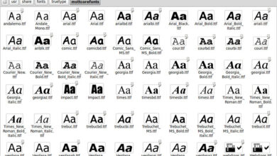
- Arial: A classic sans-serif font, known for its clean and legible design.
- Times New Roman: A widely used serif font, offering a more traditional and formal feel.
- Verdana: Another popular sans-serif font, often praised for its excellent readability on screens.
- Georgia: A serif font designed specifically for on-screen readability, providing a good balance of elegance and clarity.
- Tahoma: A sans-serif font similar to Verdana, known for its clean lines and readability.
- Trebuchet MS: A versatile sans-serif font suitable for both headings and body text.
Accessibility Considerations for Font Selection
Accessibility is paramount. Choosing fonts with good readability and contrast is crucial for users with visual impairments. Factors like font size, weight, and color contrast significantly impact the reading experience for everyone, especially those with low vision or dyslexia.
Implementing CSS for Font Rendering and Accessibility, Best fonts for blogs
CSS provides the tools to control font rendering and ensure accessibility. By specifying fonts and their properties, you can create a visually appealing and inclusive reading experience.
For example, to ensure the main text uses a web-safe font and meets accessibility guidelines, you could use the following CSS:
body font-family: Arial, sans-serif; /* Arial is the primary font, sans-serif is the fallback - / font-size: 16px; /* A good base font size for readability - / line-height: 1.5; /* Improves readability by adding space between lines - / color: #333; /* Dark text color for good contrast - / background-color: #fff; /* Light background for good contrast - /
This CSS snippet selects Arial as the primary font. If Arial is not available, it falls back to a generic sans-serif font. It also sets a suitable font size, line height, and color contrast for optimal readability and accessibility. Remember to adjust these values to fit your blog’s design and target audience. Consider using a larger font size for headings and a bolder weight for important information to further enhance readability.
Last Point
Choosing the right fonts for your blog is a journey, not a destination. It’s about finding the perfect balance between readability, visual appeal, and brand identity. By understanding the principles of typography and applying the strategies Artikeld in this post, you can create a blog that is not only informative and engaging but also a visual delight for your readers.
Remember to always prioritize readability and accessibility, and don’t be afraid to experiment and find what works best for your unique style and audience. Happy blogging!
Q&A
What is x-height and why is it important?
X-height refers to the height of the lowercase ‘x’ in a font. A larger x-height generally improves readability, as it makes the text appear more open and less cramped.
How can I check if my fonts are web-safe?
Most modern browsers support a wide range of fonts. However, to ensure consistent display across all browsers and devices, stick to commonly supported fonts like Arial, Times New Roman, Verdana, or use a web font service.
What are some good resources for finding new fonts?
Websites like Google Fonts, Adobe Fonts, and Font Squirrel offer vast libraries of free and paid fonts suitable for web use.
How do I choose fonts that are accessible to users with visual impairments?
Prioritize sufficient font size (at least 16px), good color contrast between text and background, and sans-serif fonts for improved readability.
