Best Fonts for Book Covers A Designers Guide
Best fonts for book covers? It’s more than just picking a pretty typeface; it’s about crafting a visual identity that screams your genre, captivates readers, and ultimately sells your book. From the subtle elegance of a serif font whispering romance to the bold, stark lines of a sans-serif shouting thriller, the right font can make or break your cover.
This post dives deep into the world of typography, exploring genre conventions, readability, font pairings, and the impact of style on mood and tone – all to help you choose the perfect font for your masterpiece.
We’ll explore the nuances of serif and sans-serif fonts, delve into the dramatic flair of script fonts, and discover how font weight and style can subtly (or dramatically!) shift the overall feel of your book cover. We’ll even touch on modern trends and, crucially, accessibility considerations to ensure your cover is as inclusive as it is stunning. Get ready to unlock the power of typography and create a cover that truly shines!
Genre & Font Style
Choosing the right font for your book cover is crucial; it’s the first visual cue readers get, influencing their perception of the story within. Genre plays a significant role in this selection process, as different genres evoke different feelings and aesthetics. Understanding the visual language of fonts and how they align with genre conventions is key to creating a compelling and effective book cover.
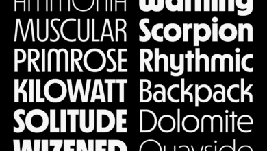
Serif and sans-serif fonts offer distinct visual impacts. Serif fonts, characterized by small decorative strokes at the ends of letters (like Times New Roman or Garamond), often convey a sense of tradition, elegance, or classicism. They’re frequently used for literary fiction, historical novels, and fantasy books aiming for a more timeless feel. Sans-serif fonts, lacking these strokes (like Arial or Helvetica), generally project a modern, clean, and sometimes minimalist aesthetic.
They’re popular choices for thrillers, sci-fi, contemporary romance, and non-fiction, where a sense of immediacy and contemporary relevance is desired. The choice between serif and sans-serif often hinges on the desired tone and target audience.
Serif and Sans-serif Font Comparison in Book Cover Design
The visual impact of serif and sans-serif fonts dramatically alters the overall impression of a book cover. Serif fonts, with their intricate details, can create a sense of sophistication and authority, ideal for genres that demand a more established or traditional feel. Conversely, sans-serif fonts, with their clean lines, can offer a modern and accessible look, often preferred for genres that aim for a contemporary or cutting-edge feel.
The weight and style of the font within each category also contribute to the overall effect; a bold serif font can appear powerful and dramatic, while a thin sans-serif font might convey a sense of fragility or mystery.
Script Fonts and Genre Suitability
Script fonts, mimicking handwritten calligraphy, bring a unique personality to book covers. However, their use requires careful consideration. Overuse can make the cover look cluttered or difficult to read, especially for longer titles. They’re best used sparingly, often as a secondary font for author names or a tagline, rather than the main title. Their suitability depends heavily on the genre and the desired emotional tone.
| Font Name | Genre Suitability | Visual Impact Description | Example Book Cover Style |
|---|---|---|---|
| Edwardian Script ITC | Romance, Historical Fiction | Elegant, flowing, evokes a sense of classic romance and timeless beauty. | A cover featuring a softly lit couple, perhaps with vintage-style illustrations. |
| Great Vibes | Contemporary Romance, Young Adult | Playful, slightly whimsical, conveys a lighthearted and approachable feel. | A brightly colored cover with a modern design, possibly featuring a stylized illustration or a bold color scheme. |
| Brush Script MT | Fantasy, Children’s Literature | Casual, hand-drawn feel, suitable for whimsical or magical themes. | A cover with a hand-painted or sketched aesthetic, possibly incorporating fantasy elements like mythical creatures or enchanted landscapes. |
| Pacifico | Mystery, Thriller | Relaxed, slightly informal, can add a touch of intrigue without overwhelming the design. Often used as a secondary font. | A cover with a dark and mysterious color palette, possibly featuring a shadowy figure or a cryptic symbol. |
Readability & Legibility at Different Sizes

Source: masterbundles.com
Choosing the right font for your book cover is crucial, but its effectiveness hinges on how well it’s read at various sizes. From the tiny thumbnail on a website to the full-sized glory on a printed book, your font needs to remain clear and inviting. Poor readability can mean lost sales – no one wants to struggle to decipher a title or author’s name! This section will explore how font choices impact readability at different viewing scales and offer some helpful guidelines.
Readability and legibility are often used interchangeably, but they have subtle differences. Readability refers to how easily a text can be read in a longer passage, while legibility focuses on the clarity of individual letters and words. For book covers, both are paramount. A beautiful font might look stunning at a large size, but if it becomes illegible when shrunk down for online listings, its aesthetic appeal becomes moot.
Font Weight, Size, and Readability at Different Scales
The impact of font weight and size on readability varies dramatically depending on the viewing context. A font that’s perfectly legible on a printed book might be a blurry mess as a thumbnail. Therefore, careful consideration of different display sizes is crucial. The following table demonstrates this. Note that the perceived readability can also be affected by the specific font chosen, its x-height (the height of lowercase letters), and the overall design of the letters.
| Font Weight | Size (px) – Thumbnail | Size (px)
|
Size (px)
|
|---|---|---|---|
| Light | Poor – often illegible | Fair – needs sufficient contrast | Good – elegant and refined |
| Regular | Fair – can be difficult to read | Good – versatile and widely legible | Excellent – balance of clarity and style |
| Bold | Good – easily identifiable | Excellent – strong and attention-grabbing | Very Good – but can appear heavy |
| Black | Good – but can appear overly heavy | Very Good – impactful, but may be overwhelming | Good – best used sparingly |
Fonts Maintaining Legibility at Small Sizes
Several font families are designed with small-size readability in mind. These fonts typically have a high x-height, open counters (the spaces inside letters like ‘a’ and ‘e’), and clear letterforms. For example, fonts like Garamond and Times New Roman, while classic, maintain readability even at smaller sizes due to their well-defined serifs (the small decorative strokes at the ends of letters) and consistent stroke weights.
Sans-serif fonts such as Open Sans or Lato, with their clean lines and even spacing, are also good choices. Their simple forms translate well across different resolutions. These fonts often prioritize legibility over highly stylistic features, which can be lost at smaller sizes. The key is to strike a balance between readability and visual appeal, ensuring the cover remains engaging even at thumbnail size.
Font Weight & Style Impact on Mood & Tone
Choosing the right font for a book cover is crucial; it’s the first visual impression a potential reader receives, instantly setting the tone and influencing their perception of the story within. Font weight and style play a significant role in conveying the book’s genre and mood, subtly communicating the narrative’s emotional landscape before a single word is read. A heavy, bold font might suggest power or intensity, while a delicate, light font could indicate a more gentle or whimsical tale.Font weight and style directly influence the mood and tone projected by a book cover.
Different weights—light, regular, bold, black—and styles—italic, condensed, extended—evoke distinct emotional responses. A heavier weight often conveys strength, seriousness, or even menace, while lighter weights can suggest delicacy, fragility, or mystery. Similarly, stylistic choices like italics can add a sense of elegance or urgency, while condensed fonts might create a feeling of claustrophobia or intensity. Extended fonts, conversely, can communicate openness or expansiveness.
Font Weight’s Influence on Genre and Emotion
The weight of a font dramatically alters the perceived mood. Consider these examples:
- A fantasy novel cover featuring a bold, black typeface for the title might suggest epic battles and dark magic. The stark weight emphasizes the power and gravity of the narrative. Imagine a cover with the title “Shadowbane” rendered in a thick, black font, immediately communicating a sense of foreboding and intense conflict.
- Conversely, a romance novel might utilize a lighter, more delicate font weight. A title like “Whispers of the Heart” in a light italic script would evoke a sense of intimacy and tenderness, aligning perfectly with the genre’s romantic undertones. The delicate weight suggests a gentler, more emotional story.
- A thriller might use a regular or medium weight font for the title, maintaining a balance between readability and a sense of suspense. A title like “The Silent Witness” in a clean, regular font might hint at a sense of urgency and intrigue without being overly aggressive.
Stylistic Choices and Their Impact
Font styles further refine the emotional impact.
- Italic fonts often suggest elegance, sophistication, or a sense of urgency. Imagine a mystery novel cover with the title rendered in a stylish italic font; it subtly hints at intrigue and a hidden narrative.
- Condensed fonts can create a feeling of confinement or intensity. A horror novel using a condensed font for its title might heighten the feeling of claustrophobia and impending doom.
- Extended fonts, on the other hand, can suggest openness, expansiveness, or even a sense of freedom. A travelogue or adventure novel might benefit from a title in an extended font, visually representing the vastness of the journey.
Conveying Specific Emotions Through Font Choices
The careful selection of font weight and style is crucial for conveying specific emotions.
- Suspense: A slightly condensed, medium-weight font in a dark color can effectively create a sense of unease and anticipation, hinting at the thrilling aspects of the story.
- Joy: A light, playful font with a slightly rounded or script style can evoke feelings of happiness and lightheartedness, perfectly suitable for children’s books or lighthearted romances.
- Mystery: A thin, slightly italicized font in a dark, muted color can subtly suggest secrets and intrigue, setting the stage for a captivating mystery novel.
Modern & Classic Font Trends
Source: theme-junkie.com
The world of book cover design is a dynamic blend of tradition and innovation. Font choices play a crucial role in conveying genre, mood, and ultimately, attracting readers. Understanding current trends in typography, and the interplay between modern and classic styles, is essential for creating compelling book covers. This exploration delves into the characteristics of both, highlighting their strengths and weaknesses, and showing how to successfully integrate modern aesthetics while staying true to genre conventions.The selection of a typeface significantly impacts the overall aesthetic appeal and marketability of a book.
Modern trends often favor clean lines and minimalist designs, while classic styles rely on established readability and a sense of timelessness. The key lies in finding the right balance to resonate with the target audience.
Modern Font Trends in Book Cover Design
Modern book cover typography often leans towards geometric sans-serif fonts, characterized by their clean lines and unadorned letterforms. These fonts project a sense of modernity, minimalism, and often, sophistication. Think of fonts like Montserrat, Open Sans, and Lato—all incredibly popular choices for contemporary fiction, non-fiction, and even some science fiction titles. Their versatility allows for easy readability at smaller sizes, crucial for spine text, and their clean aesthetic allows for impactful cover art to take center stage.
However, overusing these fonts can lead to a homogenized look, potentially making a cover blend into the crowd.
The clean lines of a sans-serif font like Montserrat lend themselves well to minimalist cover designs, allowing the cover art to truly shine. Imagine a vibrant abstract painting for a contemporary romance novel, paired with a simple, elegant Montserrat title. The simplicity of the font doesn’t detract from the artwork; rather, it complements it.
Classic Font Trends in Book Cover Design, Best fonts for book covers
Classic fonts, conversely, often feature serifs—the small strokes at the ends of letters. These fonts evoke a sense of tradition, authority, and sometimes, even nostalgia. Times New Roman, Garamond, and Baskerville are prime examples, frequently used in literary fiction, historical novels, and academic publications. Their readability, particularly at smaller sizes, is a significant advantage, ensuring the title remains clear even on a densely packed bookshelf.
However, over-reliance on classic fonts can make a cover appear dated or lack the visual punch needed to stand out in a competitive market.
A serif font like Garamond, with its elegant curves and subtle details, might be perfect for a historical fiction novel set in the Victorian era. The font’s inherent sophistication perfectly complements the historical setting and contributes to the book’s overall aesthetic.
Incorporating Modern Trends While Maintaining Genre Appropriateness
Successfully integrating modern font trends requires careful consideration of the genre. While a minimalist sans-serif font might work beautifully for a contemporary thriller, it might feel jarring on a fantasy novel cover. The key is to find a balance between the modern aesthetic and the genre’s established visual cues. For instance, a slightly more stylized sans-serif could introduce a modern touch to a fantasy novel without sacrificing the genre’s overall tone.
Similarly, incorporating a modern color palette or a textured background can update a classic font, giving it a fresh, contemporary feel.
Consider a fantasy novel cover featuring a bold, slightly geometric sans-serif for the title, juxtaposed with a more traditional serif font for the author’s name. This approach combines modern boldness with a touch of classic elegance, creating a visually compelling and genre-appropriate cover.
Choosing the best fonts for book covers is crucial; the right typeface can make or break your book’s appeal. I’ve been experimenting lately, and to get the word out about my new designs, I’m learning more about effective marketing, which is why I’ve been checking out resources like this great article on getting it on with youtube to promote my work.
Ultimately, though, it all comes back to finding that perfect font to perfectly represent the story within.
Accessibility Considerations: Best Fonts For Book Covers

Source: cloudfront.net
Choosing the right font for your book cover isn’t just about aesthetics; it’s crucial for accessibility, ensuring your book is enjoyable and readable for everyone, including those with visual impairments. A poorly chosen font can create significant barriers for readers with conditions like dyslexia or low vision, impacting their overall reading experience and potentially preventing them from engaging with your work.
Prioritizing accessibility demonstrates inclusivity and expands your potential readership.Font selection directly impacts readability and legibility, especially at smaller sizes often seen on online platforms or in promotional materials. Fonts with clear letterforms, consistent spacing, and minimal ornamentation are vital for ease of reading. Consider the impact of your choice on individuals with various visual challenges, ensuring your cover design is both beautiful and inclusive.
Accessible Font Examples
Selecting fonts with high contrast and clear, easily distinguishable letterforms is paramount for accessible book covers. Below are some examples of fonts known for their legibility and accessibility features. These fonts often feature distinct letter shapes, avoiding stylistic flourishes that might confuse readers with visual impairments. They also typically have a good x-height (the height of lowercase letters), making them easier to read.
- Arial: A widely used sans-serif font, Arial is known for its clean lines and excellent readability. Its consistent letter spacing and clear letterforms make it suitable for readers with visual impairments. The large x-height further enhances readability.
- Verdana: Another popular sans-serif font, Verdana is designed for on-screen readability. Its high x-height and open counters (the spaces inside letters like ‘o’ and ‘e’) improve legibility, particularly at smaller sizes. It also features excellent spacing between letters and lines.
- OpenDyslexic: Specifically designed for readers with dyslexia, OpenDyslexic features slightly altered letterforms and increased spacing between letters and words. This helps to reduce visual confusion and improve reading fluency for individuals with dyslexia. The unique design elements aid in distinguishing similar-looking letters.
- Calibri: A modern sans-serif font, Calibri offers a good balance between modern aesthetics and readability. Its clean lines and well-defined letterforms contribute to its accessibility. The consistent weight and spacing across the alphabet are helpful for visual clarity.
Color Contrast for Readability
Color contrast plays a vital role in the accessibility of book covers. Insufficient contrast between the text and the background can make the text difficult or even impossible to read for individuals with low vision or color blindness. High contrast ensures that the text is clearly visible against the background, regardless of the reader’s visual capabilities. Using a tool that measures color contrast ratios (WCAG guidelines recommend a minimum contrast ratio of 4.5:1 for normal text) is highly recommended during the design process.The choice of color combinations directly impacts the overall readability of the cover.
For instance, pairing dark text on a light background (like black text on a white or cream background) generally offers the highest contrast and is often considered the most accessible choice. However, exploring various color palettes and using a color contrast checker will help ensure optimal readability for all potential readers. Avoid using similar colors for text and background, as this severely reduces contrast and impacts accessibility.
Ultimate Conclusion
Choosing the best font for your book cover is a journey, not a destination. It’s about understanding the interplay of genre, readability, visual hierarchy, and mood. By carefully considering these elements and experimenting with different font pairings, you can create a cover that not only looks amazing but also effectively communicates the essence of your story. Remember, your cover is the first impression – make it count! Now go forth and design!
Query Resolution
What’s the difference between serif and sans-serif fonts?
Serif fonts have small decorative strokes at the ends of their letters (like Times New Roman), often conveying a classic or traditional feel. Sans-serif fonts lack these strokes (like Arial), generally appearing more modern and clean.
How can I ensure my cover is accessible to all readers?
Use high contrast between text and background colors, choose fonts with clear, easily readable letterforms, and consider using fonts specifically designed for accessibility. Test your design at different sizes to ensure legibility.
Should I use a script font for every genre?
No, script fonts work best for genres that lend themselves to a more elegant or whimsical feel (romance, fantasy, historical fiction). They can be less effective for genres requiring a bolder or more aggressive look (thriller, sci-fi).
Where can I find free fonts for my book cover?
Many websites offer free fonts, but be sure to check the license to ensure you’re allowed to use them commercially. Google Fonts is a great resource.