Best Fonts for Books A Designers Guide
Best fonts for books aren’t just about aesthetics; they’re crucial for readability and overall reader experience. Choosing the right font can significantly impact how your book is perceived, from its genre to its brand identity. This exploration delves into the world of typography, examining factors like legibility, aesthetic appeal, technical considerations, historical influences, and accessibility, helping you make informed decisions for your next project.
We’ll cover everything from the subtle nuances of x-height and ascender/descender relationships to the broader implications of font licensing and compatibility across various platforms. We’ll also look at how different fonts evoke specific moods, aligning perfectly with the genre and tone of your story. Prepare to discover the fonts that will elevate your book from good to unforgettable!
Legibility and Readability
Choosing the right font for a book is crucial; it directly impacts the reader’s experience and overall enjoyment. A poorly chosen font can lead to eye strain, fatigue, and ultimately, a less satisfying reading experience. Conversely, a well-selected font enhances readability and makes the text inviting and accessible. This section delves into the key factors that contribute to legibility and readability in book design.
Factors Influencing Font Legibility
Several factors interplay to determine a font’s legibility. Text size is paramount; smaller sizes require fonts with clearer letterforms to avoid ambiguity. Line spacing (leading) is equally important; insufficient leading crowds the lines, making the text difficult to follow. Conversely, excessive leading creates gaps that disrupt the visual flow. The overall typeface design, including the contrast between thick and thin strokes, also plays a significant role.
Fonts with excessively thin strokes can be difficult to read, especially at smaller sizes. Finally, the choice between serif and sans-serif fonts influences legibility, with personal preferences and reading material often dictating the best choice.
Examples of Highly Readable Fonts
Many fonts are renowned for their excellent readability. Among serif fonts, Times New Roman, Garamond, and Georgia are frequently used in books due to their classic design and high legibility. Times New Roman’s versatility and familiarity make it a staple, while Garamond offers a more elegant and refined feel. Georgia, designed specifically for screen readability, boasts excellent clarity even at smaller sizes.
In the realm of sans-serif fonts, Calibri, Arial, and Verdana stand out. Arial’s clean lines and simple design make it highly accessible, while Verdana, also optimized for screens, offers excellent readability across various devices and sizes. Calibri, with its slightly more modern feel, provides a good balance between legibility and contemporary aesthetics.
Visual Impact of X-Height, Ascenders, and Descenders
The x-height (the height of lowercase ‘x’), ascenders (the parts of letters like ‘h’ and ‘b’ that extend above the x-height), and descenders (the parts of letters like ‘g’ and ‘p’ that extend below the x-height) significantly impact reading comfort. A larger x-height generally improves readability, as it makes the body of the lowercase letters more prominent and easier to distinguish.
Well-proportioned ascenders and descenders provide visual rhythm and aid in differentiating letters. Conversely, excessively tall ascenders or descenders can create a cluttered appearance, while a small x-height can make the text appear cramped and harder to read.
Comparison of Fonts for Readability
| Font Name | Serif/Sans-serif | X-Height | Readability Assessment |
|---|---|---|---|
| Times New Roman | Serif | Medium | Excellent; classic and widely used |
| Garamond | Serif | Medium | Excellent; elegant and refined |
| Georgia | Serif | Large | Excellent; designed for screen readability |
| Arial | Sans-serif | Medium | Good; clean and simple |
| Verdana | Sans-serif | Large | Good; optimized for screen readability |
Aesthetic Considerations

Source: behance.net
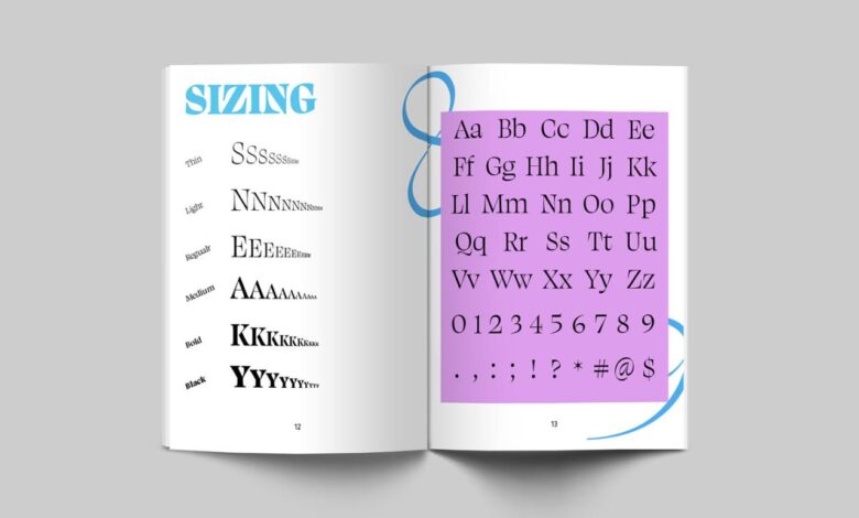
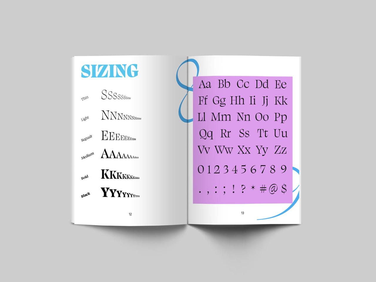
Choosing the right font isn’t just about readability; it’s about crafting a visual experience that complements the story and resonates with the reader. The aesthetic impact of a font can significantly influence how a book is perceived, shaping its overall mood and genre expectations. A well-chosen font can elevate a book from simply readable to truly captivating.Font choice plays a crucial role in establishing a book’s visual identity and brand.
Choosing the best fonts for books is crucial for readability; you want something elegant yet easy on the eyes. But even the most perfectly chosen typeface needs the right platform to shine, which is why I’ve been diving into video marketing lately, checking out resources like this awesome guide on getting it on with youtube to promote my book design work.
Ultimately, though, the font selection remains key to a successful book, impacting how readers engage with the story itself.
It’s a subtle yet powerful tool that contributes to the overall design, creating a consistent and memorable impression on the reader. Think of it as the visual equivalent of the book’s voice – it speaks volumes before a single word is read.
Font Selection and Genre
Different genres often benefit from specific font styles. For instance, a fantasy novel might use a font with elegant flourishes or a medieval feel, while a thriller might opt for a sharper, more modern typeface to reflect the intensity of the narrative. Romance novels often utilize fonts with softer curves and delicate serifs, while science fiction might employ sleek, futuristic fonts.
The font’s aesthetic qualities should directly align with the book’s tone and atmosphere, enhancing the reader’s immersion in the story.
Font Pairing for Harmonious Design
The relationship between heading and body fonts is critical for a visually pleasing and easy-to-read book. A strong contrast can create visual hierarchy, guiding the reader’s eye effortlessly through the text. However, the fonts should also complement each other, maintaining a cohesive design. A bold, slightly condensed serif font for headings paired with a clean, legible sans-serif font for the body text is a classic and effective combination.
The key is to find a balance – enough contrast to be noticeable, but enough harmony to avoid jarring the reader.
Fonts Suitable for Different Book Genres, Best fonts for books
The selection of fonts significantly impacts the reader’s experience. Consider the following examples:
- Fantasy: Fonts like Trajan Pro (evokes a classical, epic feel), Goudy Old Style (adds a touch of old-world charm), or even custom-designed fonts mimicking medieval scripts can enhance the magical atmosphere. These fonts often feature elegant serifs and high contrast.
- Romance: Fonts like Playfair Display (elegant and refined), Baskerville (classic and timeless), or even a slightly rounded sans-serif like Lato can create a romantic and sophisticated feel. These fonts often possess softer curves and a more delicate appearance.
- Thriller: Fonts like Impact (bold and attention-grabbing), Bebas Neue (modern and edgy), or even a condensed sans-serif like Montserrat can heighten the tension and suspense. These fonts often prioritize readability at a glance and have a strong visual impact.
- Science Fiction: Fonts like Futura (geometric and futuristic), Roboto (clean and modern), or even fonts with a technological aesthetic can convey a sense of the future. These fonts often feature clean lines and a minimalist approach.
- Mystery: Fonts like Garamond (classic and mysterious), Didot (elegant and sophisticated), or even a slightly distressed serif can enhance the intrigue and suspense. These fonts often have a slightly more formal and traditional appearance.
Technical Aspects

Source: behance.net
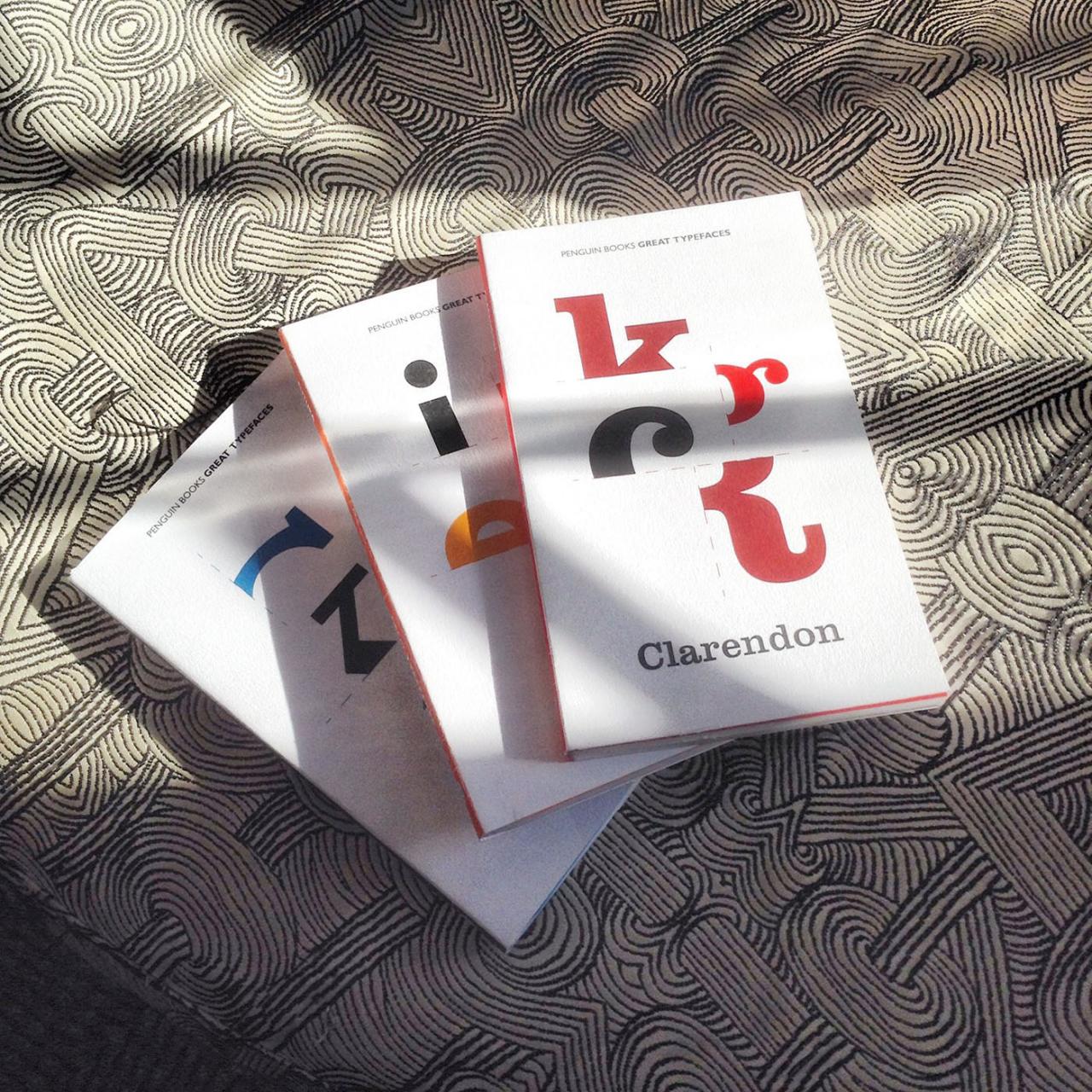
Choosing the right font for your book isn’t just about aesthetics; it’s a deeply technical process impacting readability, accessibility, and even the final cost. Ignoring these technical considerations can lead to significant problems down the line, from frustrating readers to costly reprint runs. This section delves into the crucial technical aspects of font selection for book publishing.
Potential Issues with Unusual or Obscure Fonts
Using unusual or obscure fonts in book publishing presents several challenges. Firstly, readability suffers. Unfamiliar fonts can slow down reading speed and increase eye strain, leading to a less enjoyable reading experience. Secondly, these fonts might not be available on all e-readers or printing devices, causing rendering issues. Imagine your beautifully designed novel appearing as a jumble of boxes on a Kindle! Thirdly, obscure fonts may lack the necessary character sets for all languages or special symbols required in your book, resulting in missing characters or glyphs.
Finally, the lack of widespread support can make it difficult for professional typesetters and printers to work efficiently with the chosen font, potentially increasing production costs and delays. For example, a highly stylized font designed for display purposes might look great on a cover but be completely unsuitable for the body text.
Font Compatibility with E-readers and Printing Methods
Selecting fonts compatible across different platforms is crucial. E-readers like Kindles, Kobo, and others utilize different rendering engines. Fonts optimized for print might not display well on screen, and vice versa. Similarly, different printing methods (offset printing, digital printing, on-demand printing) have varying requirements regarding font resolution and embedding. A font that works flawlessly in high-resolution offset printing might appear pixelated or blurry in a lower-resolution digital print.
Therefore, prioritizing widely supported fonts like Times New Roman, Garamond, or Georgia for body text ensures compatibility across a range of devices and printing processes. For cover design, you have slightly more flexibility, but even then, sticking to well-supported fonts is generally recommended.
Font Licensing and Copyright Implications
Copyright and licensing issues surrounding fonts are often overlooked but incredibly important. Many fonts are not free for commercial use. Using a font without a proper license can lead to significant legal problems and financial penalties. Always check the font license before using it in your book project. Some licenses allow for personal use only, while others permit commercial use with specific limitations (e.g., a limit on the number of copies printed or restrictions on embedding the font in the final document).
Ignoring these terms can result in expensive legal battles and damage your book’s reputation. Choosing fonts with clear and permissive licenses, or purchasing commercial licenses for fonts you intend to use, is vital to avoid such complications.
Sample Book Cover Designs Using Different Font Pairings
Let’s illustrate font pairing with two examples. Example 1: A fantasy novel cover might pair a bold, slightly gothic serif font (like Trajan Pro) for the title with a more elegant, flowing script font (like Edwardian Script ITC) for the author’s name. The Trajan Pro, with its strong vertical strokes, evokes a sense of power and history, suitable for a fantasy setting.
The Edwardian Script ITC adds a touch of sophistication and elegance, creating a visually appealing contrast. The combination conveys a sense of classic fantasy while remaining modern. Example 2: A contemporary romance novel cover could utilize a clean, modern sans-serif font (like Helvetica Neue) for the title and a simpler, slightly rounded sans-serif font (like Open Sans) for the author’s name.
Helvetica Neue’s geometric precision projects a sense of clarity and modernity, fitting for a contemporary romance. Open Sans’s friendly, slightly rounded forms provide a softer counterpoint, creating balance and readability. This pairing projects a clean, accessible feel appropriate for the genre.
Historical and Cultural Context

Source: behance.net
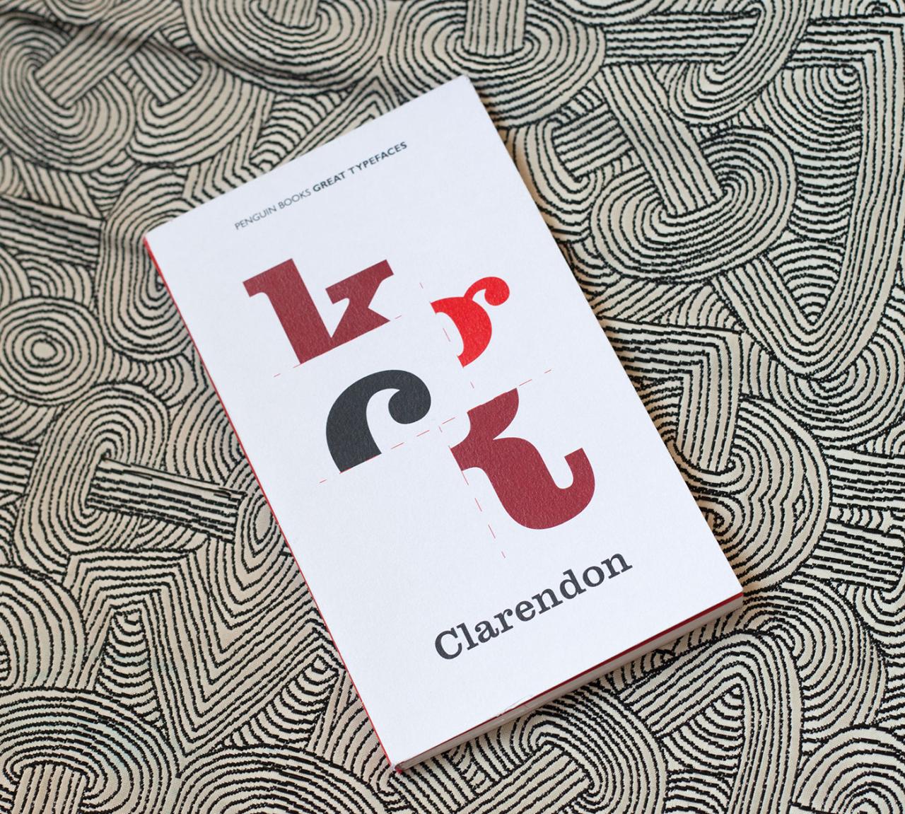
The history of book fonts is a fascinating journey reflecting societal shifts, technological advancements, and evolving aesthetic sensibilities. From the elegant serifs of early printing to the clean lines of modern digital typefaces, the choices made in book design have profoundly impacted how we read and experience literature. Understanding this historical context enriches our appreciation for the art of typography and its role in shaping cultural narratives.
The evolution of book fonts is intrinsically linked to the development of printing technologies. Early printing presses, using typefaces like Blackletter (or Gothic), were limited in their capabilities, leading to designs that were often ornate and highly decorative. As technology improved, so did the range of typographic possibilities, resulting in a diverse array of styles that continue to inspire designers today.
Classic Book Fonts and Their Lasting Influence
Classic book fonts, such as Caslon, Baskerville, and Garamond, represent pivotal moments in typographic history. William Caslon’s typeface, developed in the early 18th century, is characterized by its sturdy serifs and even stroke weight, offering a balance between legibility and visual appeal. It became immensely popular and influenced countless subsequent designs. John Baskerville’s typeface, known for its elegant transitions and high contrast between thick and thin strokes, represents a move towards a more refined and sophisticated aesthetic.
Claude Garamond’s designs, dating back to the 16th century, are characterized by their delicate serifs and refined elegance, and remain highly regarded for their readability and timeless appeal. These fonts’ lasting influence is evident in their continued use in contemporary book design and their enduring presence in digital font libraries. Their adaptability across various genres and styles speaks volumes about their inherent quality and enduring aesthetic appeal.
Stylistic Features of Fonts Across Historical Periods
Different historical periods are associated with distinct typographic styles. The early printing era favored Blackletter, with its angular forms and complex details, reflecting the Gothic architectural style of the time. The Renaissance saw the rise of Roman typefaces, characterized by their upright serifs and greater legibility, mirroring the classical revival in art and architecture. The 18th and 19th centuries brought about transitional and modern typefaces, showcasing a progressive shift towards greater clarity and simplicity.
The 20th century witnessed the rise of sans-serif typefaces, often associated with modernism and its emphasis on functionality and clean aesthetics. Each period’s stylistic choices in typography reflected prevailing artistic and cultural trends, impacting the visual language of books and shaping readers’ experiences.
Cultural Significance of Specific Fonts
Certain fonts have become strongly associated with specific literary movements or styles. For example, the use of Blackletter in medieval manuscripts and early printed books reflects the cultural context of the time. Similarly, the adoption of simpler, more readable typefaces during the Enlightenment era aligns with the movement’s emphasis on reason and clarity. The rise of sans-serif fonts in the 20th century mirrors the modernist movement’s focus on functionality and minimalist aesthetics.
These associations highlight the close relationship between typography and broader cultural trends, shaping the perception and interpretation of literary works.
Timeline of Popular Book Fonts
The following timeline showcases the evolution of popular book fonts, illustrating the shifts in design and the reflection of cultural influences over time.
| Period | Font Examples | Key Characteristics | Cultural Context |
|---|---|---|---|
| 15th-16th Centuries | Blackletter, Textura | Angular, ornate, highly decorative | Medieval and Renaissance periods |
| 17th-18th Centuries | Garamond, Caslon | Transitional, refined serifs, improved legibility | Baroque and Enlightenment |
| 19th Century | Baskerville, Didot | High contrast, elegant, refined | Neoclassicism and Romanticism |
| 20th-21st Centuries | Times New Roman, Helvetica, Garamond (revivals) | Modern, sans-serif options, diverse styles | Modernism, Postmodernism, Digital Age |
Accessibility and Inclusivity
Choosing the right font for a book isn’t just about aesthetics; it’s about ensuring the text is accessible and enjoyable for everyone, regardless of their visual abilities or learning differences. A thoughtfully chosen typeface can significantly impact a reader’s experience, making the difference between a comfortable and engaging read, and a frustrating and potentially inaccessible one. This section will delve into the crucial role of font selection in promoting accessibility and inclusivity in book design.
Selecting fonts that prioritize accessibility directly translates to a wider and more inclusive readership. For many individuals, particularly those with visual impairments or dyslexia, the right font can be the key to unlocking the joy of reading. Ignoring accessibility in font selection limits the potential audience and undermines the book’s potential impact.
Fonts for Visual Impairments
For readers with low vision, visual impairments like macular degeneration, or other conditions affecting sight, clear and distinct font characteristics are paramount. Fonts with high contrast between the characters and the background, ample spacing between letters (kerning) and lines (leading), and a consistent stroke weight are crucial. Serif fonts, with their small decorative flourishes at the ends of strokes, can sometimes improve readability for some individuals with visual impairments by providing visual cues for letter recognition.
However, this is not universally true and sans-serif fonts, with their clean lines, are often preferred due to their clarity and simplicity. The size of the font is, of course, a critical factor and should be easily adjustable by the reader.
Fonts for Dyslexia
Dyslexia is a learning difference that affects reading and spelling. Individuals with dyslexia often struggle with letter and word recognition, particularly with similar-looking letters like “b” and “d” or “p” and “q.” Dyslexia-friendly fonts are designed to mitigate these challenges. Key characteristics of these fonts often include: increased letter spacing, distinct letterforms to reduce ambiguity, and a slightly altered letter shape to aid recognition.
OpenDyslexic is a well-known example of a typeface designed specifically to address the needs of dyslexic readers. Its unique design elements help improve reading fluency and comprehension.
Resources for Accessible Fonts
Several resources are available to help designers find fonts that meet accessibility standards. Websites specializing in font design often categorize their offerings by accessibility features, allowing for easy filtering and selection. Additionally, organizations dedicated to accessibility and inclusive design frequently provide recommendations and guidelines on font selection. These resources can offer valuable insights into font characteristics that support accessibility and inclusivity.
Criteria for Inclusive Font Selection
Choosing fonts that promote inclusivity requires careful consideration of several factors. Here’s a list of criteria to guide your selection:
- Legibility: The font should be easily recognizable and distinguishable, even at smaller sizes.
- Readability: The font should be comfortable to read for extended periods, with appropriate letter spacing and line height.
- Contrast: Sufficient contrast between the text and background is essential for visual accessibility.
- Weight Consistency: A consistent stroke weight across all letters improves readability.
- x-height: A taller x-height (the height of the lowercase ‘x’) can improve readability, particularly for those with visual impairments.
- Dyslexia-friendliness: Consider using fonts specifically designed to support dyslexic readers.
- Font Size Flexibility: The font should scale well to various sizes, accommodating different reading preferences and visual needs.
Wrap-Up: Best Fonts For Books
Selecting the perfect font for your book is a journey, a careful balancing act between aesthetics and functionality. It’s about understanding the nuances of typography, considering your target audience, and aligning your font choices with the overall narrative and brand. By thoughtfully weighing legibility, visual appeal, technical compatibility, and accessibility, you can create a reading experience that is not only enjoyable but also inclusive and impactful.
So, dive into the world of fonts and find the perfect voice for your story!
Q&A
What is x-height and why is it important?
X-height refers to the height of the lowercase ‘x’ in a font. A larger x-height generally improves readability, making the text appear more open and less cramped.
How do I choose fonts that work well together?
Consider contrasting styles (e.g., serif and sans-serif) but maintain visual harmony. Test different pairings on sample text to ensure readability and aesthetic balance.
Are there free fonts suitable for book publishing?
Yes, many free fonts offer good readability, but always check the license to ensure they’re appropriate for commercial use. For large projects, investing in professional fonts is often recommended.
What are some common pitfalls to avoid when selecting fonts?
Avoid overly decorative or difficult-to-read fonts, especially for body text. Ensure your chosen fonts are compatible with all intended publishing platforms (print, ebook, etc.). Always check font licensing to avoid copyright issues.