Best Fonts for PowerPoint A Visual Guide
Best fonts for PowerPoint presentations are crucial! Choosing the right typeface dramatically impacts how your audience receives your message. A well-chosen font enhances readability, making your points clear and easily digestible. Conversely, a poorly chosen font can lead to confusion and even make your presentation look unprofessional. This post dives into the world of PowerPoint fonts, helping you select the perfect typefaces to make your presentations shine.
We’ll explore both serif and sans-serif fonts, examining their strengths and weaknesses in different presentation contexts. We’ll cover everything from selecting fonts for headings versus body text to understanding visual hierarchy and ensuring accessibility for all viewers. Get ready to level up your PowerPoint game!
Introduction to PowerPoint Font Selection
Choosing the right font for your PowerPoint presentation is crucial for effective communication. It’s more than just aesthetics; the font you select directly impacts how easily your audience can read and understand your message, ultimately influencing their engagement and retention of your key points. A poorly chosen font can lead to strained eyes, distraction, and a less impactful presentation, while a well-chosen font can enhance clarity and leave a lasting positive impression.The impact of readability and visual appeal on audience engagement is undeniable.
A clear, easy-to-read font minimizes cognitive load, allowing your audience to focus on your content rather than struggling to decipher your text. Visually appealing fonts, used appropriately, can enhance the overall aesthetic quality of your presentation, making it more engaging and memorable. Conversely, a jarring or inappropriate font choice can create a sense of unprofessionalism and detract from your message.
Consider the impact of a presentation with a Comic Sans font on a serious business proposal versus a presentation using a clean, modern sans-serif font. The difference is immediately apparent.
Factors to Consider When Selecting Fonts
Selecting the right font involves careful consideration of several key factors tailored to your specific presentation. The type of presentation, your target audience, and the overall message you aim to convey all play a role in determining the most effective font choices.
- Presentation Type: A formal business presentation will likely benefit from a professional and sophisticated font like Times New Roman or Calibri, emphasizing credibility and authority. In contrast, a more casual or creative presentation, perhaps for a design team or marketing campaign, might utilize a more playful or modern font like Open Sans or Montserrat to reflect the brand’s personality.
The context dictates the appropriate level of formality.
- Target Audience: Consider the age and background of your audience. Older audiences might find smaller font sizes or overly stylized fonts difficult to read. Younger audiences might be more receptive to modern and trendier fonts. Understanding your audience’s demographics and preferences is crucial for selecting fonts that resonate with them.
- Message Conveyed: The overall tone and message of your presentation should influence font selection. A presentation on a serious topic, such as climate change, would benefit from a serious and authoritative font. A presentation on a fun topic, such as a product launch for a new toy, might use a more playful and energetic font. The font should reinforce the message and create a consistent brand identity.
Best Serif Fonts for PowerPoint
Serif fonts, with their elegant flourishes, bring a touch of sophistication and readability to PowerPoint presentations, particularly when aiming for a formal or classic feel. Choosing the right serif font can significantly enhance the professionalism and impact of your slides. Let’s explore some top contenders.
Top Serif Fonts for Formal Presentations
Selecting the perfect serif font hinges on several factors, including the presentation’s topic, your target audience, and the overall aesthetic you want to project. Here are five excellent choices for formal presentations, along with their strengths and weaknesses:
- Times New Roman: A classic and widely available option, Times New Roman offers excellent readability even in smaller sizes. Its familiar appearance lends itself well to traditional presentations, but it can sometimes feel a bit dated in modern contexts.
- Garamond: Known for its elegance and readability, Garamond provides a sophisticated look without being overly fussy. Its slightly more modern feel than Times New Roman makes it suitable for a wider range of presentations, from academic to corporate.
- Georgia: Designed for screen readability, Georgia is a highly versatile serif font that works well both in print and on digital displays. Its slightly bolder strokes ensure excellent legibility, even on smaller screens or projectors.
- Book Antiqua: This font offers a balanced blend of tradition and modernity. Its slightly condensed design allows for more text on a single line without sacrificing readability. Book Antiqua works well for presentations with significant textual content.
- Didot: A more dramatic and high-contrast serif, Didot is perfect for creating a luxurious or sophisticated feel. However, its high contrast makes it less suitable for large blocks of text; use it sparingly for headings or key phrases.
Situations Where Serif Fonts Excel
Serif fonts are particularly effective in situations that demand a formal, authoritative, or traditional tone. They work exceptionally well for:
- Academic presentations: The classic and refined appearance of serif fonts aligns perfectly with the scholarly context of academic work.
- Corporate presentations: Serif fonts project professionalism and trustworthiness, making them ideal for presentations to clients or investors.
- Presentations with substantial textual content: The enhanced readability of serif fonts ensures that your audience can easily absorb the information, even with significant amounts of text on a slide.
- Presentations requiring a sense of tradition or heritage: Serif fonts effectively communicate a sense of history and established credibility.
Sample Slide Design Using Garamond
Let’s imagine a slide presenting key financial projections for a new business venture. I would choose Garamond for its elegance and readability. The slide’s background would be a clean, off-white color to complement the font’s dark grey. The title, “Projected Financial Performance,” would be in a larger, bold Garamond size (perhaps 48pt), centered at the top. Below, key data points (revenue, expenses, profit) would be presented in a clear, concise table using a smaller Garamond size (around 24pt) with clear column headings.
Charts visualizing the data would use a consistent color scheme, avoiding anything too jarring that would detract from the Garamond’s refined appearance. The overall design would prioritize simplicity and clarity, letting the data speak for itself, while the Garamond font provides a professional and polished presentation.
Best Sans-Serif Fonts for PowerPoint
Source: pinimg.com
Sans-serif fonts, with their clean lines and modern aesthetic, are increasingly popular for PowerPoint presentations. Their versatility makes them suitable for a wide range of topics and styles, from corporate reports to creative pitches. Choosing the right sans-serif font can significantly enhance the readability and overall impact of your presentation.
Selecting a sans-serif font requires considering factors like readability at various sizes, legibility for diverse audiences, and the overall tone you want to convey. While many options exist, some stand out for their clarity and visual appeal.
Five Highly Readable Sans-Serif Fonts for Modern Presentations
The following five sans-serif fonts offer excellent readability and a contemporary feel, making them ideal choices for modern PowerPoint presentations. Their versatility allows them to adapt to various presentation styles and content.
- Open Sans: A highly versatile and widely used font known for its clean lines and excellent readability. It’s a great all-around choice for most presentations.
- Lato: Lato boasts a friendly and approachable feel, making it suitable for presentations targeting a broad audience. Its slightly rounded letterforms enhance readability.
- Roboto: Developed by Google, Roboto is a geometric sans-serif font with a clean and modern aesthetic. Its consistent letter spacing contributes to its readability.
- Montserrat: This geometric sans-serif font offers a contemporary and sophisticated look. Its slightly condensed character width makes it suitable for presentations with a lot of text.
- Calibri: A default font in many Microsoft Office applications, Calibri is a familiar and widely accessible option. Its clean design and good readability make it a reliable choice.
A Comparison of Roboto and Open Sans
Roboto and Open Sans are both excellent choices for PowerPoint presentations, but they offer subtly different visual impacts. Roboto, with its geometric shapes and tighter letter spacing, projects a more modern and minimalist feel. Open Sans, on the other hand, has a slightly warmer and more approachable feel due to its slightly rounded letterforms and more generous spacing.
The choice between them depends on the overall tone of your presentation. For a sleek, high-tech presentation, Roboto might be the better option. For a more friendly and accessible presentation, Open Sans could be a more suitable choice. The difference is subtle but impactful in setting the overall mood.
Comparison of Five Sans-Serif Fonts
This table summarizes the characteristics and suitability of five popular sans-serif fonts for PowerPoint presentations. Consider these factors when selecting a font for your next presentation.
| Font Name | Characteristics | Suitability |
|---|---|---|
| Open Sans | Versatile, clean, highly readable | General presentations, reports, educational materials |
| Lato | Friendly, approachable, slightly rounded | Presentations targeting a broad audience, informal settings |
| Roboto | Geometric, modern, minimalist | Technical presentations, corporate reports, modern designs |
| Montserrat | Geometric, sophisticated, slightly condensed | Presentations requiring a high level of visual impact, marketing materials |
| Calibri | Familiar, widely accessible, clean | General presentations, situations requiring broad compatibility |
Fonts for Headings vs. Body Text in PowerPoint
Source: theme-junkie.com
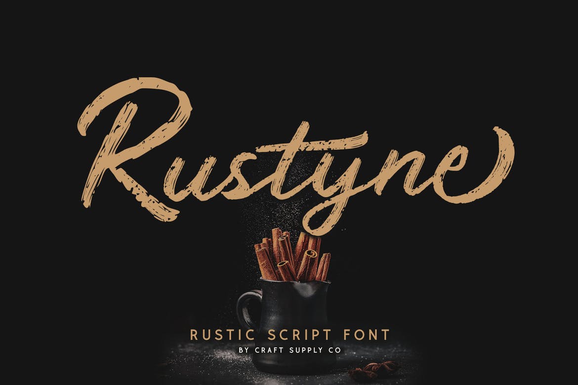
Choosing the right fonts for your PowerPoint presentation is crucial for effective communication. While we’ve already explored the best overall font choices, understanding the nuances of pairing fonts for headings and body text is key to creating a visually appealing and easily digestible presentation. The right font combination enhances readability and reinforces your message’s hierarchy, guiding the audience’s eye effortlessly through your slides.The principle behind using different fonts for headings and body text lies in establishing a clear visual hierarchy.
This hierarchy guides the viewer’s attention, ensuring they understand the relative importance of each piece of information. Headings should immediately grab attention, while body text should be easily readable and support the heading’s message. This is achieved through careful consideration of font weight, size, and style, creating a visual distinction that enhances comprehension.
Choosing the best fonts for PowerPoint presentations is crucial for readability and visual appeal. But equally important is getting your message out there, which is why I’ve been diving into video marketing lately – check out this great resource on getting it on with youtube to boost your reach. Ultimately, strong visuals, whether in a slide deck or a YouTube video, rely on clear and engaging typography, so nail those PowerPoint fonts!
Font Weight and Size Differences
The most straightforward way to establish visual hierarchy is through differences in font weight and size. Headings typically utilize bolder weights (like Bold or Semi-Bold) and larger font sizes than body text. This immediate visual distinction helps the audience quickly grasp the structure and main points of your presentation. For example, a presentation on marketing strategies might use a bold, large sans-serif font like Montserrat for headings, clearly separating them from the supporting details presented in a lighter weight, smaller size of the same font or a complementary serif font like Lora.
The contrast ensures that the key marketing concepts stand out while the supporting data remains easily readable.
Effective Font Pairings, Best fonts for powerpoint
Selecting complementary fonts for headings and body text is vital for a cohesive and professional look. Generally, you want to avoid pairing fonts that are too similar or too drastically different. A good rule of thumb is to pair a strong, impactful font for headings with a legible, easily readable font for body text.Here are some examples of effective font pairings:
- Heading: Montserrat (Sans-serif) Body: Lato (Sans-serif)
-This pairing offers a modern and clean look, with Montserrat’s strong geometric forms providing visual impact for headings, while Lato’s slightly rounded forms ensure readability for the body text. - Heading: Playfair Display (Serif) Body: Open Sans (Sans-serif)
-This combination provides a classic yet contemporary feel. Playfair Display’s elegant serifs add sophistication to the headings, while Open Sans’s clean lines ensure the body text remains easy to read. - Heading: Roboto Condensed (Sans-serif) Body: Roboto (Sans-serif)
-This example demonstrates the effective use of a single font family with variations in weight and condensation. The condensed heading font provides a striking visual contrast while maintaining a consistent brand identity with the body text.
Remember that consistency is key. Once you’ve chosen a font pairing, stick to it throughout your entire presentation to maintain a unified and professional aesthetic. Avoid using more than two fonts, unless absolutely necessary, to prevent visual clutter and confusion.
Using Fonts to Enhance Visual Appeal
Choosing the right font is only half the battle; mastering its application is key to creating truly impactful PowerPoint presentations. Font weight, size, and color, when used strategically, can dramatically elevate the visual appeal and readability of your slides, transforming them from dull presentations into engaging visual narratives. Effective use of these elements ensures your message is not only understood but also remembered.Font weight, size, and color work in concert to create visual hierarchy and guide the viewer’s eye.
Think of it as a visual orchestra; each element plays a crucial role in creating a harmonious and impactful presentation. A well-chosen combination of these aspects can dramatically improve the overall aesthetic quality and communicative power of your slides.
Font Weight and Size for Visual Hierarchy
Strategic use of font weight (bold, regular, light) and size creates a visual hierarchy, directing the audience’s attention to the most important information. Larger, bolder fonts naturally draw the eye, making them ideal for titles and main points. Subheadings and supporting details can then be presented in smaller, lighter fonts. For example, a presentation on marketing strategies could use a bold, large font for the main strategy title, a slightly smaller, regular weight font for sub-strategies, and an even smaller, lighter weight font for supporting data.
This layered approach makes the information easier to digest and follow. Avoid using too many different font weights and sizes; consistency is key.
Using Font Variations for Emphasis
Font variations, such as bold, italic, and underline, are powerful tools for emphasizing key points and adding visual interest. Bold text immediately draws attention to crucial information, while italics can be used to highlight definitions or important quotes. Underlining, while less common in modern presentations, can still be effective for specific uses, such as URLs or particularly important phrases.
Overuse of these variations, however, can be counterproductive, making the presentation look cluttered and confusing. Employ them sparingly, using them only where absolutely necessary to emphasize critical information. For example, a financial presentation could use bold text for key financial figures, and italics for clarifying footnotes or explanations.
Best Practices for Font Style in PowerPoint
Effective use of font styles requires careful consideration and planning. Here’s a list of best practices to guide your choices:
- Limit your font choices: Stick to one or two complementary fonts—one for headings and another for body text. Too many fonts create visual chaos.
- Prioritize readability: Choose fonts that are easy to read, even at smaller sizes. Avoid overly decorative or unusual fonts that might hinder comprehension.
- Use color strategically: Use color to enhance readability and add visual interest, but avoid clashing colors or using too many different colors. Ensure sufficient contrast between text and background colors for optimal readability.
- Maintain consistency: Use the same font styles and sizes consistently throughout your presentation. This creates a unified and professional look.
- Use white space effectively: Don’t overcrowd your slides with text. Use ample white space to improve readability and visual appeal. This allows the audience to focus on the key messages.
- Test your presentation: Before presenting, view your slides on different devices and in different environments to ensure readability and visual appeal across various contexts.
By following these best practices and understanding the power of font weight, size, and color, you can create PowerPoint presentations that are not only informative but also visually stunning and memorable.
Avoiding Font Mistakes in PowerPoint
PowerPoint presentations are all about communication, and choosing the right fonts is crucial for getting your message across clearly and effectively. Poor font choices can lead to a presentation that’s difficult to read, visually unappealing, and ultimately, ineffective. Let’s explore some common font pitfalls and how to avoid them.Many common mistakes stem from a lack of understanding of font properties and their impact on readability and visual harmony.
Overusing decorative fonts, neglecting font size and contrast, and ignoring the context of the presentation are all frequent culprits. The result can be a presentation that’s visually cluttered and confusing, undermining the intended message.
Illegible Fonts and Poor Visual Layouts
Choosing fonts that are difficult to read is a major mistake. Tiny fonts crammed onto slides, overly ornate fonts that are hard to decipher, or fonts with insufficient contrast against the background all contribute to poor readability. Consider the audience: older viewers might struggle with smaller font sizes, while those with visual impairments may need greater contrast.
For example, using a light grey font on a white background is a recipe for disaster. Instead, opt for a font size that’s easily readable from a distance, typically no smaller than 24 points for body text and larger for headings. Strong color contrast is also vital; dark text on a light background generally works best.
Examples of Poor Font Choices and Better Alternatives
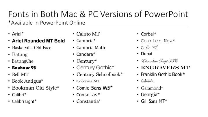
Let’s look at some specific examples. Using Comic Sans for a formal business presentation is a common misstep. While Comic Sans might be suitable for informal settings, its playful nature clashes with the seriousness of a professional context. A better alternative for a formal presentation would be Times New Roman, Garamond, or Calibri. Similarly, using a highly decorative script font for large amounts of body text will make the presentation difficult to read.
A simpler sans-serif font like Arial or Helvetica would be a much better choice for body text in this case. Imagine a slide with a title in a complex script font like Edwardian Script ITC, followed by several paragraphs of the same font. The visual clutter would make it extremely hard to focus on the content. Replacing the script with a clean sans-serif for the body text would dramatically improve readability.
Consider replacing Edwardian Script ITC with Playfair Display for headings and Arial for body text for a significant improvement.
Accessibility Considerations for PowerPoint Fonts: Best Fonts For Powerpoint
Source: visme.co
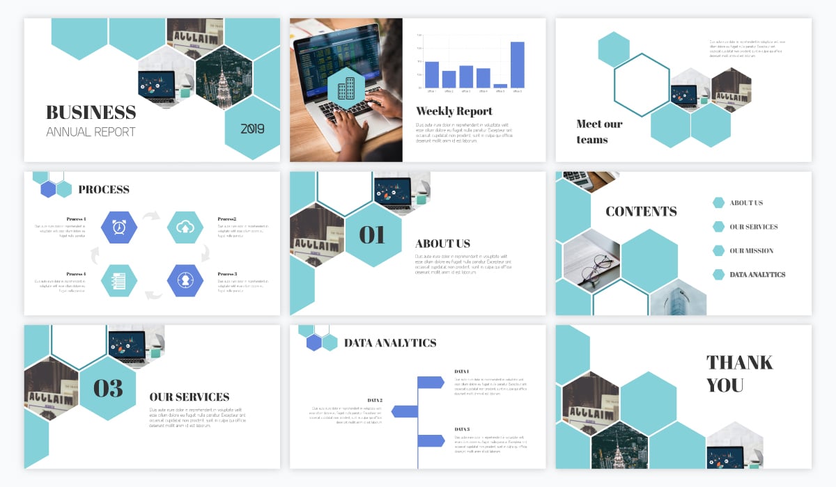
Creating engaging PowerPoint presentations is crucial, but equally important is ensuring your message reaches everyone in your audience. Choosing accessible fonts is not just a matter of good design; it’s about inclusivity and ensuring your presentation is understandable and usable by people with diverse needs, particularly those with visual impairments. Ignoring accessibility can lead to exclusion and prevent your message from being effectively communicated.Font size and contrast play a significant role in readability, especially for individuals with low vision or certain visual disabilities.
Smaller font sizes, or those with low contrast against the background, can be extremely difficult to read, leading to frustration and a poor presentation experience. Sufficient contrast between the text and background is key, preventing eye strain and improving comprehension. This is particularly important for individuals with conditions like macular degeneration or other visual impairments that affect contrast sensitivity.
Consider the impact of your font choices on those who may rely on screen readers or other assistive technologies.
Font Size and Contrast Recommendations
Optimizing font size and contrast is essential for accessible presentations. A minimum font size of 24 points for body text and 36 points for headings is generally recommended for on-screen presentations. This ensures readability from a distance, even for those with visual impairments. Furthermore, sufficient contrast is vital. A good rule of thumb is to aim for a contrast ratio of at least 4.5:1 between text and background color, as recommended by WCAG (Web Content Accessibility Guidelines).
This means the text should be significantly brighter or darker than the background to ensure easy readability. Using a color contrast checker tool can help you verify that your font choices meet these accessibility standards.
Accessible Font Recommendations
Choosing fonts that are clear, legible, and easy to read is critical for accessibility. Avoid overly stylized or decorative fonts, as these can be difficult to decipher, especially for individuals with visual impairments. Simple, sans-serif fonts are often preferred for their clean lines and clear readability.
- Arial: A classic, widely supported sans-serif font known for its readability.
- Calibri: Another popular sans-serif font, often included as a default in Microsoft Office.
- Helvetica: A highly legible sans-serif font with a clean and modern look.
- Verdana: A sans-serif font designed for on-screen readability, with clear letter spacing.
- Open Sans: A free and open-source sans-serif font known for its clarity and readability.
Remember that while these fonts are generally considered accessible, always test your presentation with different individuals and assistive technologies to ensure optimal readability for your diverse audience. Prioritizing accessibility is not just a matter of compliance but a commitment to inclusive design that ensures everyone can benefit from your presentation.
Creative Font Usage in PowerPoint
PowerPoint presentations don’t have to be visually monotonous. Strategic font choices can elevate a presentation from bland to breathtaking, transforming data points into compelling narratives and enhancing audience engagement. Beyond simply choosing readable fonts, exploring creative font pairings and techniques can significantly impact the overall message and aesthetic.By understanding the nuances of typography and how different fonts evoke specific emotions, you can craft presentations that are both informative and visually stunning.
This involves careful consideration of font pairings, size, weight, and color to create a harmonious and impactful design.
Font Pairing for Emphasis and Contrast
Effective font pairings are crucial for creating visual hierarchy and guiding the viewer’s eye. Consider using a strong, bold serif font for headings to command attention, paired with a clean, legible sans-serif font for body text to ensure readability. For instance, a pairing of Garamond (serif) for headings and Open Sans (sans-serif) for body text creates a classic yet modern feel.
Alternatively, a more contemporary pairing might involve Playfair Display (serif) for headings and Lato (sans-serif) for body text, offering a stylish and sophisticated look. The key is to select fonts with contrasting yet complementary characteristics to avoid visual clutter and ensure clarity.
Using Fonts to Convey Specific Emotions
Fonts possess inherent personality. A script font like Pacifico can evoke a feeling of whimsy and playfulness, ideal for creative presentations or announcements. Conversely, a bold, geometric sans-serif font like Montserrat can project professionalism and confidence, suitable for business presentations or reports. A more traditional serif font like Times New Roman can create a sense of authority and trustworthiness, making it suitable for presentations requiring a formal tone.
Understanding these subtle connotations allows you to tailor your font choices to match the presentation’s overall tone and intended message.
Innovative Font Usage Example
Imagine a slide showcasing a company’s growth over five years. Instead of simply using bullet points and charts, consider a more visually engaging approach. The title “Five Years of Growth” could be displayed in a large, bold sans-serif font like Roboto Condensed, emphasizing the key message. Each year’s data could then be represented by a different section, each using a progressively larger and bolder version of the same font, visually representing the company’s growth trajectory.
A subtle color gradient across the years could further enhance the visual impact. This method avoids the monotony of standard bullet points, creating a dynamic and memorable visual representation of data. The overall visual effect is a powerful narrative presented through a thoughtful and creative application of typography.
Resources for Finding PowerPoint Fonts
Finding the perfect font for your PowerPoint presentation can significantly impact its overall effectiveness. A well-chosen font enhances readability and visual appeal, while a poor choice can distract your audience and hinder comprehension. Luckily, numerous resources are available to help you discover and select the ideal fonts for your needs.
The world of fonts is vast, encompassing both free and premium options, each with its own licensing considerations. Understanding these differences is crucial for avoiding legal issues and ensuring ethical font usage in your presentations.
Free and Premium Font Licensing
Free fonts, often available from websites dedicated to font sharing, are typically licensed under open-source licenses like SIL Open Font License (OFL) or Creative Commons licenses. These licenses usually permit free use for personal and commercial projects, but it’s essential to carefully read the specific terms of each license to understand any limitations or required attributions. Examples of websites offering free fonts under various licenses include Google Fonts and Font Squirrel.
Premium fonts, on the other hand, require purchase and often come with specific usage rights defined in their End-User License Agreements (EULAs). These EULAs may restrict the number of projects you can use the font in, or prohibit certain uses, such as embedding the font in a website without additional licensing.
Reliable Websites and Tools for Discovering New Fonts
Several online platforms specialize in curating and providing access to a wide variety of fonts. These resources differ in their offerings, ranging from large collections of both free and premium fonts to specialized collections focused on specific styles or needs.
- Google Fonts: A comprehensive library of open-source fonts, offering a diverse range of styles and easy integration into web projects and applications. Google Fonts provides a user-friendly interface for browsing and selecting fonts based on style, weight, and other characteristics. The fonts are readily available for download and use under their respective open-source licenses.
- Font Squirrel: Another excellent source for free fonts, Font Squirrel meticulously vets fonts to ensure they are legally free for commercial use. They offer a user-friendly search interface and categorization system, making it easy to find fonts that meet specific design needs.
- Adobe Fonts (formerly Typekit): Adobe Fonts offers a subscription-based service providing access to a vast collection of high-quality fonts from renowned type designers. This is a great option for professionals who need access to a wide range of fonts for various projects, offering both classic and contemporary options.
- MyFonts: A marketplace for purchasing premium fonts, MyFonts offers a wide selection from independent designers and established foundries. The site provides detailed information on each font, including licensing details, usage rights, and previews of various styles and weights.
Evaluating Font Quality and Suitability
Choosing the right font involves more than just aesthetics; readability and appropriateness for the context are equally important. Several factors contribute to a font’s quality and suitability for PowerPoint presentations.
- Readability: Prioritize fonts with clear letterforms and sufficient spacing between letters and lines. Avoid overly stylized or decorative fonts, especially for body text, as they can hinder comprehension. Test the font at various sizes to ensure readability.
- Style and Appropriateness: Consider the overall tone and message of your presentation. A formal presentation might call for a classic serif font, while a more casual presentation might benefit from a modern sans-serif font. Ensure the font style aligns with the presentation’s theme and target audience.
- Weight and Contrast: Choose font weights (light, regular, bold) that provide sufficient contrast between headings and body text. Too much contrast can be jarring, while insufficient contrast can make the text difficult to read. Experiment with different weights to find the optimal balance.
- Kerning and Tracking: While not always adjustable in PowerPoint, be aware of kerning (spacing between individual letter pairs) and tracking (overall spacing of text). Poor kerning and tracking can make text appear cramped or uneven.
Summary
Ultimately, the best font for your PowerPoint presentation depends on your specific needs and the overall message you want to convey. Remember to prioritize readability, visual appeal, and accessibility. By carefully considering these factors and experimenting with different font combinations, you can create presentations that are not only informative but also visually stunning and engaging. So go forth and create presentations that truly captivate your audience!
Frequently Asked Questions
What’s the difference between serif and sans-serif fonts?
Serif fonts have small decorative strokes at the ends of their letters (like Times New Roman), often lending a more formal feel. Sans-serif fonts lack these strokes (like Arial), appearing cleaner and more modern.
How big should my font size be?
Headings should generally be larger (24-44pt) and body text smaller (18-24pt), but adjust based on your presentation size and audience distance.
Can I use too many fonts in one presentation?
Yes! Sticking to 2-3 fonts (one for headings, one for body text, and possibly one for accents) keeps things clean and prevents visual overload.
Where can I find free fonts for PowerPoint?
Websites like Google Fonts and Font Squirrel offer a wide selection of free, high-quality fonts.

