Best Fonts for Resumes Land Your Dream Job
Best fonts for resumes? It’s more than just picking something pretty; your font choice can seriously impact whether your resume even gets a second glance. Think of it like this: a stunningly designed website with blurry, illegible text is useless, right? The same applies to your resume. We’re diving deep into the font world to help you choose the perfect typography that showcases your skills and personality without sacrificing readability.
Get ready to ditch those Comic Sans nightmares!
This post will cover everything from the most readable fonts to those best suited for different industries. We’ll explore the nuances of serif vs. sans-serif fonts, discuss optimal font sizes and formatting, and even show you some killer font combinations to make your resume truly stand out. Let’s get started!
Introduction to Resume Font Selection
Source: theme-junkie.com
Your resume is your first impression on a potential employer – a silent salesperson advocating for your skills and experience. Choosing the right font is crucial to ensuring that your resume is not only visually appealing but also easily readable and professional. A poorly chosen font can make your resume look cluttered, unprofessional, or even difficult to decipher, potentially hindering your chances of landing an interview.
The impact of font selection on the overall effectiveness of your resume cannot be overstated.The readability of your resume directly correlates with its success. Recruiters and hiring managers often spend only a few seconds scanning each resume. If your font is too small, too stylized, or simply difficult to read, your qualifications might be overlooked. Clear, concise, and easily digestible information is paramount.
A readable font ensures your skills and experience are quickly and accurately understood, maximizing your chances of moving forward in the hiring process.
Examples of Unprofessional Resume Fonts
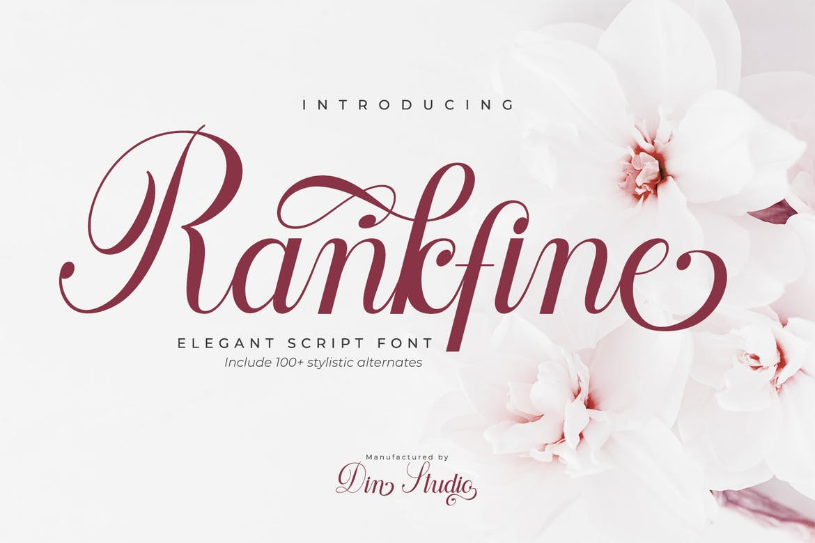
Certain fonts, while aesthetically pleasing in other contexts, are simply unsuitable for a professional document like a resume. These fonts often lack the clarity and professionalism required to make a positive impression. Using unconventional or overly decorative fonts can detract from the seriousness and credibility of your application. For instance, fonts with excessive embellishments, like script fonts or those with heavy serifs, can be difficult to read and may project an unprofessional image.
Similarly, overly playful or casual fonts – think Comic Sans or Papyrus – should be strictly avoided. These fonts are not appropriate for the formal context of a job application and could even be perceived as disrespectful to the hiring manager. Sticking to classic and easily readable fonts is key to presenting a professional and competent image.
Best Fonts for Readability
Source: growthhackyourcareer.com
Choosing the right font for your resume is crucial. A well-chosen font ensures your resume is not only visually appealing but also easy to read, increasing the chances of your application getting noticed. The wrong font, however, can make your resume look cluttered and unprofessional, leading to it being overlooked. This section focuses on fonts known for their readability, both in print and digital formats.
Characteristics of Readable Fonts
Readability isn’t just about aesthetics; it’s about the typeface’s inherent design features. Key factors include x-height (the height of lowercase letters), letter spacing (kerning), and overall font weight. A higher x-height makes text appear more open and less cramped, improving readability, especially in smaller font sizes. Proper kerning prevents letters from appearing too close together or too far apart, ensuring a smooth reading experience.
A font that’s too bold or too light can also hinder readability; a medium weight is generally preferred for resumes. Consider the contrast between the font and the background color as well; sufficient contrast makes the text easier to read.
Serif vs. Sans-serif Fonts for Resumes
The choice between serif and sans-serif fonts often comes down to personal preference and the overall design aesthetic you’re aiming for. Serif fonts (like Times New Roman or Garamond) have small decorative strokes at the ends of letters. These serifs can guide the eye along the lines of text, making it potentially easier to read large blocks of text.
Choosing the best fonts for resumes is crucial for making a strong first impression; readability is key! But even a perfectly formatted resume might get lost in the noise unless you’re actively promoting yourself, which is why I recently started learning more about video marketing, checking out resources like this great guide on getting it on with youtube to boost my online presence.
Ultimately, a strong online presence complements a well-designed resume, so both aspects are vital for career success.
However, some find serifs too traditional or heavy for a modern resume. Sans-serif fonts (like Arial or Calibri), on the other hand, lack these strokes, giving them a cleaner, more modern look. They are often considered easier to read on screens. Ultimately, the best choice depends on the specific font and its implementation in your resume.
Examples of Readable Fonts
Choosing a font that balances style and readability is essential. Here are some excellent options, categorized for clarity:
| Font Name | Font Style | Sample Text | Readability Score |
|---|---|---|---|
| Calibri | Sans-serif | This is a sample of Calibri text. | ★★★★★ |
| Arial | Sans-serif | This is a sample of Arial text. | ★★★★★ |
| Garamond | Serif | This is a sample of Garamond text. | ★★★★☆ |
| Times New Roman | Serif | This is a sample of Times New Roman text. | ★★★★☆ |
| Lato | Sans-serif | This is a sample of Lato text. | ★★★★☆ |
| Georgia | Serif | This is a sample of Georgia text. | ★★★★☆ |
| Verdana | Sans-serif | This is a sample of Verdana text. | ★★★★☆ |
Fonts Suitable for Different Industries
Choosing the right font for your resume is crucial; it’s the first visual impression a potential employer gets of you. While readability is paramount, the best font also subtly communicates your personality and suitability for a specific role. Different industries value different aesthetics, and your font choice should reflect this. A playful script might be perfect for a design portfolio, but it would likely seem unprofessional in a legal document.
The key is to strike a balance between readability and industry appropriateness. A highly legible font ensures your qualifications are easily absorbed, while an industry-appropriate style shows you understand the nuances of the field. This careful selection demonstrates attention to detail and professionalism – qualities highly valued across the board.
Fonts Suitable for Creative Industries
Creative industries, such as design, marketing, and advertising, often benefit from fonts that express personality and innovation. These roles value creativity and visual appeal, allowing for more stylistic choices than traditional sectors. However, even within this freedom, readability remains a critical factor. Overly stylized fonts can hinder the ease with which a recruiter can process your information.
| Font | Description |
|---|---|
| Playfair Display | A sophisticated serif font with elegant curves. It conveys creativity and a touch of classic elegance, suitable for design or marketing roles emphasizing a refined aesthetic. |
| Lato | A clean, modern sans-serif font. Its versatility makes it suitable for a wide range of creative roles, offering excellent readability without sacrificing a contemporary feel. |
| Montserrat | Another popular sans-serif font, Montserrat is geometric and clean, conveying a sense of professionalism while remaining approachable and modern. It’s a safe bet for many creative industries. |
Fonts Suitable for Traditional Industries
Traditional industries like finance, law, and accounting generally favor fonts that project professionalism, trustworthiness, and authority. These industries prioritize clarity and readability above all else; a font that’s easily scanned and understood is essential. Bold or overly decorative fonts are typically avoided in favor of clean, classic styles.
The goal here is to present your qualifications in a manner that instills confidence and demonstrates your understanding of the industry’s conservative standards. A well-chosen font can contribute significantly to this perception.
Font Choice and Professionalism
The font you choose for your resume directly impacts how you’re perceived. A poorly chosen font can undermine your credibility, even if your experience is exceptional. Conversely, a well-chosen font can subtly enhance your professional image, making you stand out from the competition.
In all industries, readability remains paramount. While stylistic choices vary across sectors, a font that is easy to read and doesn’t strain the eyes of the recruiter is always a smart choice. This ensures your qualifications are clearly presented and readily absorbed, maximizing your chances of getting an interview.
Font Size and Formatting: Best Fonts For Resumes
Choosing the right font size and formatting is crucial for creating a resume that’s not only visually appealing but also easy to read and understand. A well-formatted resume guides the recruiter’s eye, highlighting key information and making your qualifications stand out. Inconsistent sizing or excessive bolding can create a cluttered and unprofessional appearance, potentially hindering your chances of landing an interview.The key is balance – a clear hierarchy of information presented in a visually pleasing manner.
This involves carefully selecting font sizes for different sections, ensuring consistent spacing, and using font weights strategically to emphasize important details.
Optimal Font Sizes for Resume Sections
Different sections of your resume require different font sizes to establish a clear visual hierarchy. Headings should be larger to immediately grab attention, while body text needs to be easily readable without being too small. A common and effective approach is to use a slightly larger size for section headings, a smaller size for subheadings, and a standard size for the body text.
For example, you might use 14 points for headings, 12 points for subheadings, and 11 points for the body text. These sizes work well for most digital formats and are easily readable on screen. However, always consider the overall aesthetic balance; slightly adjusting these sizes might be necessary depending on your chosen font and the length of your resume.
Remember to maintain consistency throughout.
Consistent Font Sizing and Spacing, Best fonts for resumes
Maintaining consistent font sizes and spacing throughout your resume is paramount for readability and professionalism. Inconsistent sizing creates a jarring visual experience, making it difficult for the recruiter to quickly scan and absorb the information. This can lead to a negative first impression. Similarly, uneven spacing between lines, sections, or paragraphs can make your resume appear cluttered and disorganized.
Aim for a clean, uncluttered look with consistent spacing between lines (usually around 1.15 line spacing), paragraphs, and sections. Using a consistent font size and spacing helps create a professional and easy-to-read document that showcases your attention to detail.
Effective Use of Font Weights
Font weights, such as bold and italic, can be used effectively to highlight key information and improve readability. However, overuse can be distracting and make your resume look unprofessional. Bolding is best reserved for section headings and key skills or accomplishments to draw the reader’s attention to important information. Italics can be used sparingly to emphasize certain words or phrases within sentences, but overuse can make the text difficult to read.
For instance, you might bold your job titles and key skills within each experience section, but avoid bolding every single word or phrase in your resume. A well-balanced use of bold and italic font weights enhances the readability and professionalism of your resume without overwhelming the reader. Consider using bold for section titles and key achievements, and italics sparingly for emphasis on specific words or phrases, ensuring that these stylistic choices support, rather than detract from, the overall clarity and readability of your resume.
Visual Considerations
Your resume isn’t just a list of your accomplishments; it’s a visual representation of your brand. The font you choose plays a crucial role in how recruiters perceive your professionalism and attention to detail. A well-chosen font enhances readability and creates a positive first impression, while a poor choice can distract and even undermine your qualifications. Think of it as your first handshake – you want it to be firm, confident, and memorable, for all the right reasons.The visual impact of your resume font extends beyond simple readability.
It influences the overall aesthetic, contributing to a feeling of sophistication, modernity, or even creativity, depending on your chosen typeface. A clean, classic font projects an image of dependability, while a more contemporary font might suggest innovation and forward-thinking. Understanding these subtle cues and aligning your font choice with the image you want to project is key to a successful resume.
Font Weight, Kerning, and Tracking
Choosing a font involves more than just picking a name. Several subtle but impactful elements contribute to the overall visual harmony and readability of your resume. Paying attention to these details can significantly elevate the professional look of your application.
- Font Weight: This refers to the thickness of the font. Bold fonts can be used strategically for headings or to emphasize key skills, but overuse can appear aggressive or overwhelming. A regular or medium weight is generally preferred for body text, ensuring readability without being too faint. Consider using a slightly bolder weight for section headers to create visual hierarchy.
- Kerning: This is the spacing between individual letters. Poor kerning can make text appear cramped and difficult to read. Most modern fonts have excellent automatic kerning, but it’s worth checking for any unusual letter combinations that might need manual adjustment.
- Tracking: This refers to the spacing between words. Similar to kerning, appropriate tracking ensures comfortable reading. Too tight tracking makes the text appear dense, while too loose tracking makes it look sparse and unprofessional. Aim for a balanced, consistent tracking throughout your resume.
Negative Impacts of Overly Decorative or Unusual Fonts
While it’s tempting to use a unique font to stand out, remember that your resume’s primary goal is to communicate your qualifications clearly and effectively. Using overly decorative or unusual fonts can significantly hinder this goal.
- Reduced Readability: Highly stylized fonts often prioritize aesthetics over readability, making it difficult for recruiters to quickly scan and absorb your information. This can lead to your resume being overlooked.
- Lack of Professionalism: Unusual fonts can project an unprofessional or even unserious image, especially in conservative industries. Recruiters may perceive this as a lack of attention to detail or an inability to follow established norms.
- Compatibility Issues: Some fonts may not render correctly on all devices or operating systems, leading to a distorted or unreadable resume. This can create a negative impression and make it difficult for recruiters to assess your application properly.
- Distraction from Content: An overly decorative font can distract from the actual content of your resume, drawing attention away from your skills and accomplishments. The focus should be on your qualifications, not the font itself.
Examples of Effective Resume Font Combinations
Choosing the right font pairing for your resume is crucial for creating a visually appealing and professional document. The right combination enhances readability and reflects your attention to detail, subtly communicating your personality and professionalism to potential employers. A well-chosen font pair should offer a clear distinction between headings and body text, ensuring effortless scanning and comprehension.Selecting fonts is a balancing act between style and functionality.
You want something aesthetically pleasing, yet easily readable, and professional. The examples below demonstrate how different font pairings can achieve this balance, showcasing various levels of formality and visual impact. Remember that consistency is key; stick to your chosen fonts throughout your resume.
Effective Font Pairings for Resumes
The following examples illustrate successful font combinations, highlighting their strengths and how they contribute to a polished resume. Each example considers factors like readability, visual contrast, and overall professional impact.
- Combination 1: Heading: Garamond, Body: Calibri. This pairing offers a classic, sophisticated feel. Garamond, a serif font, provides a traditional, authoritative look for headings, while Calibri, a sans-serif font, ensures easy readability for the body text. The contrast between the serif and sans-serif fonts is subtle yet effective, creating visual interest without being distracting.
- Combination 2: Heading: Lato, Body: Open Sans. This combination is a modern and clean choice. Lato, a sans-serif font with a slightly geometric feel, works well for headings, conveying a sense of modernity and efficiency. Open Sans, another clean sans-serif font, provides excellent readability for the body text. The similarity in style creates a harmonious look, emphasizing clarity and professionalism.
- Combination 3: Heading: Playfair Display, Body: Lora. This pairing balances elegance and readability. Playfair Display, a serif font with a distinctive flair, adds a touch of sophistication to the headings. Lora, a serif font with a slightly more modern feel than Garamond, maintains excellent readability in the body text. This combination works well for creative fields or roles where a more expressive style is appropriate, while still maintaining professionalism.
Visual Impact of Font Combinations
The visual impact of each font combination significantly affects the overall perception of the resume. The Garamond/Calibri pairing projects a traditional, trustworthy image, ideal for conservative industries or established companies. The Lato/Open Sans combination projects a modern, clean, and efficient image, suitable for tech companies or fast-paced environments. The Playfair Display/Lora pairing conveys a more creative and sophisticated image, ideal for design, marketing, or other creative fields.
The key is to select a pairing that aligns with the industry and the specific job you’re applying for. Consider the company culture and the overall tone you want to project.
Creating a Professional Look with Fonts
Source: amazonaws.com
Your resume is your first impression on a potential employer, and the fonts you choose play a surprisingly significant role in shaping that impression. A well-chosen font conveys professionalism, attention to detail, and a clear understanding of visual communication. Conversely, an inappropriate font can make your resume look cluttered, unprofessional, and even difficult to read. The right font choices can subtly elevate your resume from a simple document to a polished marketing tool for your skills and experience.The impact of font choice extends beyond mere aesthetics.
A clean, legible font ensures your resume is easily scanned and understood by recruiters, who often spend only seconds reviewing each application. Consistency in font usage is equally crucial; switching fonts haphazardly disrupts the visual flow and detracts from the overall professional look. Maintaining a consistent font family, size, and style throughout your resume creates a cohesive and polished presentation that highlights your qualifications effectively.
Font Consistency and its Importance
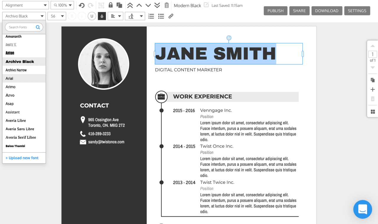
Maintaining a consistent font throughout your resume is paramount. Using different fonts for headings, body text, and contact information creates visual chaos and undermines the professional image you’re trying to project. Stick to one or, at most, two fonts from the same font family. For example, you might use a slightly bolder version of your chosen font for headings to create visual hierarchy without sacrificing consistency.
Inconsistency in font usage can suggest a lack of attention to detail, which is a negative impression you want to avoid at all costs. Imagine a resume where the header is in Times New Roman, the body text is in Arial, and the contact information is in Calibri – it’s visually jarring and unprofessional. A consistent font, on the other hand, presents a unified and polished look.
Sample Resume Text with Effective Font Usage
Let’s imagine a section of a resume showcasing effective font usage. We’ll use a classic and highly readable serif font like Garamond for the body text (size 11pt) and a slightly bolder version of the same font (Garamond Bold, size 12pt) for headings.
Experience
Senior Marketing Analyst | Acme Corporation | 2020-Present
• Developed and implemented marketing strategies resulting in a 15% increase in lead generation.
• Managed a team of five marketing specialists, overseeing project timelines and budgets.
• Conducted market research and analysis to identify key trends and opportunities.
This example demonstrates the clean, professional look achievable with consistent font usage. The slight difference in font weight between the heading and body text provides visual hierarchy without being distracting. The overall effect is one of sophistication and clarity, effectively presenting the candidate’s experience.
Final Review
Choosing the right font for your resume is a small detail with a big impact. By focusing on readability, industry appropriateness, and visual appeal, you can create a resume that not only presents your qualifications clearly but also makes a strong first impression. Remember, your resume is your first impression – make it count! Now go out there and land that dream job!
Top FAQs
Can I use a script font on my resume?
Generally, no. Script fonts are difficult to read and can appear unprofessional in a resume. Stick to clear, easy-to-read fonts.
What’s the best font size for my resume?
Aim for 10-12 points for body text and slightly larger for headings. Ensure consistent sizing throughout.
How many fonts should I use on my resume?
Two, maximum. One for headings and one for body text. Too many fonts can look cluttered.
Should I use bold or italics frequently?
Use bold and italics sparingly for emphasis. Overuse can make your resume look messy.
