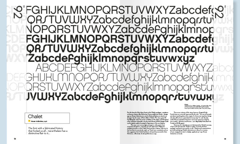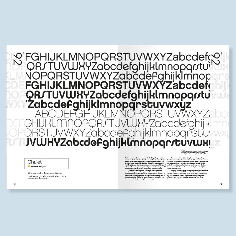
Best Fonts for Signs A Guide to Readability and Style
Best fonts for signs? It’s more than just picking a pretty typeface; it’s about clear communication. Think about it – a poorly chosen font can make even the clearest message incomprehensible, while the right one can make all the difference between a memorable brand and a missed opportunity. This post dives deep into choosing the perfect fonts for your signage, covering everything from legibility at a distance to how font style impacts your brand image.
We’ll explore the nuances of serif versus sans-serif fonts, the impact of font weight and size, and how to choose fonts that complement different sign materials and backgrounds. We’ll also cover different sign types – storefront signs, directional signs, and even warning signs – each requiring a unique approach to font selection. Get ready to transform your signage from bland to brilliant!
Font Legibility at a Distance

Source: pinimg.com
Creating effective signage, especially for outdoor use, hinges on choosing fonts that remain easily readable even from a distance. Poor font choices can lead to confusion, frustration, and ultimately, a failure to communicate your message effectively. The key is understanding the characteristics that contribute to distant legibility and selecting fonts that possess these qualities.
Characteristics of Fonts for Distant Readability
Several factors contribute to a font’s legibility at a distance. High x-height (the height of lowercase letters), strong stroke weight (the thickness of the letter strokes), and ample spacing between letters (kerning) and lines (leading) are crucial. Fonts with simpler, less ornate designs tend to perform better than those with intricate details that blur at a distance. Consider the viewing distance and the size of the sign when making your selection.
A font that works well on a billboard might be completely illegible on a smaller sign viewed from closer up.
Serif vs. Sans-Serif Fonts for Outdoor Signage
The debate between serif and sans-serif fonts for outdoor signage is ongoing. Serif fonts, with their small decorative flourishes at the ends of strokes, can sometimes appear cluttered at a distance, reducing legibility. However, some argue that the serifs can improve readability by guiding the eye along the lines of text. Sans-serif fonts, lacking these flourishes, often boast greater clarity and simplicity, making them a popular choice for large signs where clean lines are essential.
Ultimately, the best choice depends on the specific font, its design, and the context of its use. A well-designed serif font can be highly legible, while a poorly designed sans-serif font might fall short.
Font Comparison for Distance Viewing
The following table compares five fonts often used for signage, focusing on their suitability for distant viewing. The readability score is a subjective assessment based on common design principles and general experience, ranging from 1 (poor) to 5 (excellent). Remember that the actual legibility can vary based on factors like sign size, background, and lighting.
| Font Name | X-Height (approx.) | Stroke Weight | Readability Score (1-5) |
|---|---|---|---|
| Open Sans | High | Medium | 4 |
| Roboto | High | Medium | 4 |
| Arial | Medium | Medium | 3 |
| Helvetica | Medium | Medium | 3 |
| Impact | Medium-High | Heavy | 4 |
Font Styles for Different Sign Types
Choosing the right font for your sign is crucial for effective communication. The wrong font can lead to confusion, while the right one can make your message clear, memorable, and even enhance your brand image. Consider factors like readability at a distance, the overall message, and the context in which the sign will be displayed.The best font choices vary dramatically depending on the type of sign.
Storefront signs need to attract attention and reflect a brand’s personality, while directional signs prioritize clarity and easy navigation. Warning signs, on the other hand, require fonts that immediately communicate urgency and danger.
Storefront Sign Font Choices
Storefront signs are the face of your business. The font you choose should reflect your brand identity and appeal to your target audience. A modern, minimalist font might suit a tech startup, while a classic serif font might be better for a law firm. Think about the overall aesthetic you want to project and choose a font that complements it.
Choosing the best fonts for signs is crucial for readability and impact; you want something easily seen from a distance. But getting your signage noticed also means getting your brand out there online, which is why I recommend checking out this awesome guide on getting it on with youtube to boost your visibility. After all, a killer YouTube presence can complement your killer storefront signage!
Consider also the legibility of the font at a distance – a simple, bold sans-serif font is often a safe bet for maximum readability. For example, a bakery might use a slightly rounded sans-serif font to evoke a feeling of warmth and approachability, while a high-end jewelry store might opt for an elegant serif font to communicate luxury and sophistication.
Directional Sign Font Choices
Clarity is paramount for directional signs. The goal is to guide people efficiently and prevent confusion. Therefore, fonts should be highly legible, even from a distance. Simple sans-serif fonts are generally preferred for their clean lines and easy readability. Avoid overly decorative or stylized fonts, as these can hinder comprehension and slow down navigation.
Consider using a consistent font style across all directional signage in a particular area for a cohesive and user-friendly experience. For example, a large airport might use a bold, easily readable sans-serif font like Arial or Helvetica for all directional signage to ensure consistency and clarity for travelers.
Warning Sign Font Styles, Best fonts for signs
Warning signs need to grab attention and convey urgency immediately. The font should be bold, easily recognizable, and instantly communicate the seriousness of the situation. Avoid delicate or overly stylized fonts. High contrast between the text and the background is also essential.
Here are three suitable font choices for warning signs:
- Arial Black: Its bold, heavy weight makes it highly visible from a distance, and its simple design ensures readability even under stressful conditions.
- Impact: Similar to Arial Black, Impact is a strong, highly visible sans-serif font designed for maximum impact. Its condensed letterforms ensure the text doesn’t spread out too much, making it ideal for short, impactful warnings.
- Bebas Neue: While not as traditionally “warning-sign” as the previous two, Bebas Neue’s bold, condensed style is excellent for capturing attention and conveying a sense of urgency, especially in a more modern design context. Its slightly less blocky nature can make it a suitable alternative if a softer, but still commanding look is needed.
Font Considerations for Material and Background

Source: font2s.com
Choosing the right font for your sign isn’t just about aesthetics; it’s about ensuring your message is clear and easily read. The material of the sign and the interplay between font and background colors are crucial factors impacting legibility. Ignoring these aspects can lead to a sign that’s beautiful but ultimately ineffective.Font selection should be carefully considered in relation to the sign’s material.
Different materials lend themselves to different font styles and weights. The texture and reflectivity of the material will influence how the font appears at a distance.
Font Choices Based on Sign Material
The texture and reflectivity of the sign material directly impact font choice. A bold, sans-serif font might work well on a smooth, matte acrylic sign, while a more delicate serif font could get lost on a rough-hewn wooden sign. Consider the following examples:
| Material | Suitable Font | Example | Reasoning |
|---|---|---|---|
| Metal (e.g., brushed aluminum) | Bold Sans-serif (e.g., Arial Black, Impact) | Imagine a sleek, modern storefront sign with crisp, bold lettering. | The bold font contrasts well with the smooth metal surface, ensuring readability even from a distance. The sans-serif style is clean and contemporary. |
| Wood (e.g., rustic reclaimed wood) | Serif or slightly distressed font (e.g., Garamond, Playfair Display) | Picture a charming, vintage-style sign with slightly irregular lettering that complements the wood grain. | The slightly distressed or serif font adds to the rustic charm of the wood. A cleaner font might look out of place. |
| Acrylic (e.g., clear or colored acrylic) | Sans-serif or geometric font (e.g., Helvetica, Futura) | Visualize a contemporary, minimalist sign with clean lines and a simple font. | The smooth surface of acrylic works well with clean, modern fonts. Intricate fonts might be lost in the transparency. |
Font Color and Background Color Interactions
The contrast between font color and background color is paramount for readability. Insufficient contrast can render your sign illegible, especially from a distance. High contrast is crucial for optimal visibility.Effective combinations prioritize significant differences in lightness and darkness between the text and the background. For example, black text on a white background or white text on a dark blue background provides excellent contrast.
Ineffective combinations often use colors that are too similar in tone, such as light gray text on a beige background. This reduces contrast and hinders legibility.
| Font Color | Background Color | Legibility | Reasoning |
|---|---|---|---|
| Black | White | High | Classic and highly visible due to maximum contrast. |
| White | Dark Blue | High | Strong contrast, easy to read even in low light. |
| Light Gray | Beige | Low | Poor contrast makes the text difficult to discern. |
| Dark Green | Dark Brown | Low | Similar tones result in poor contrast and reduced legibility. |
Impact of Font Weight and Size

Source: carltonhibbert.com
Choosing the right font weight and size is crucial for ensuring your sign’s message is clear and easily readable, regardless of the viewing distance. A poorly chosen font can render your carefully crafted message unintelligible, defeating the entire purpose of the sign. This section explores the interplay between font weight, size, and readability, offering practical guidance for optimal sign design.
Font Weight and Readability at a Distance
Font weight significantly impacts readability, especially from afar. Lighter weights (like Light or Thin) can appear delicate and stylish up close, but they quickly lose their clarity at a distance. Their thin strokes can blend into the background, making the text difficult to decipher. Regular weight fonts offer a good balance, generally providing sufficient contrast against most backgrounds without being overly heavy.
Bold weights (Bold or Black) offer maximum contrast and readability at longer distances, but can appear aggressive or overwhelming up close. Consider this example: imagine a street sign using a light weight font for its street name. From a distance of 50 feet, the text would likely be illegible, whereas the same text in a bold weight would be easily readable.
Conversely, a menu board in a restaurant using a bold font for each item might appear jarringly heavy at a close viewing distance.
Determining Appropriate Font Size for Various Sign Sizes and Viewing Distances
Selecting the appropriate font size depends on several factors: the sign’s size, the viewing distance, and the font itself. A general rule of thumb is to ensure the smallest character height is at least 1/8th of the viewing distance. For instance, a sign viewed from 20 feet away should have a minimum character height of 2.5 inches (20 feet12 inches/foot / 8).
This is just a guideline; factors like the font’s x-height (the height of the lowercase ‘x’) and the overall design will also influence readability. For smaller signs viewed at close range (like a menu board), a smaller font size might be acceptable, while large outdoor signs viewed from a distance will require significantly larger font sizes. A well-designed 10ft x 5ft sign, for example, might utilize a 6-inch character height for the main heading and a 3-inch character height for supporting text, ensuring readability from a considerable distance.
Visual Representation of Font Size and Weight on a 10ft x 5ft Sign
Imagine a 10ft x 5ft sign. The main heading, “GRAND OPENING,” is displayed using a 6-inch tall, bold font. The bold weight ensures the text is clearly visible even from a significant distance. The letters are thick and well-defined, creating strong contrast against the sign’s background. Below the heading, supporting text like the store’s name and address uses a 3-inch tall, regular weight font.
This font size is still easily readable, but the regular weight avoids overwhelming the design or competing with the bold heading. A smaller, 1.5-inch light weight font is used for additional information like store hours, but its smaller size and lighter weight make it less visually dominant than the main heading and supporting text. The contrast between the bold heading, regular body text, and light secondary information ensures the message is hierarchically presented and easily understood.
The different font weights and sizes create a clear visual hierarchy, guiding the viewer’s eye and ensuring the most important information is easily seen.
Creative Font Usage for Branding: Best Fonts For Signs
Choosing the right font for your signage isn’t just about legibility; it’s a powerful tool for shaping your brand identity and leaving a lasting impression. A well-selected font can instantly communicate your brand’s personality and values, enhancing recognition and memorability. Think of it as the visual voice of your business, speaking volumes before a single word is read.A consistent font choice across all your signage – from storefront signs to menus to promotional displays – is crucial for building brand recognition.
This visual consistency reinforces your brand message and creates a cohesive brand experience for your customers. Inconsistency, on the other hand, can dilute your brand identity and make it harder for people to remember you. Think of how easily you recognize the instantly familiar logos of major corporations – a significant portion of that recognition is due to consistent font usage.
Brand Style and Font Selection
Understanding your brand’s personality is paramount when choosing fonts. Different fonts evoke different feelings and associations. Let’s explore how font choices can reflect distinct brand styles.
A modern brand often projects innovation, sophistication, and minimalism. Clean lines and geometric shapes are common. Suitable fonts might include Futura, Helvetica Neue, or Open Sans. Imagine a sleek, minimalist storefront sign using a crisp, sans-serif font like Helvetica Neue – it immediately communicates a sense of modern sophistication.
A rustic brand typically aims for a feeling of warmth, authenticity, and tradition. Think handcrafted items, natural materials, and a connection to the past. Fonts like Playfair Display, Lobster, or a well-chosen serif font with a slightly distressed effect would complement this aesthetic. Picture a charming cafe sign using a slightly distressed serif font like Playfair Display; it evokes a feeling of comfort and tradition.
A playful brand often uses bright colors, whimsical imagery, and a lighthearted tone. The goal is to be approachable, fun, and memorable. Fonts like Comic Sans (used sparingly and appropriately!), Bubblegum Sans, or a custom hand-drawn font can effectively communicate playfulness. Consider a children’s store sign using a rounded, friendly font like Bubblegum Sans; it creates an inviting and fun atmosphere.
Final Review
Ultimately, selecting the best font for your sign is a balancing act between aesthetics and functionality. Prioritizing legibility is key, but don’t underestimate the power of a font to reinforce your brand identity. By considering factors like viewing distance, sign material, and your target audience, you can create signage that’s not only easy to read but also visually appealing and memorable.
So go forth and create signs that truly make a statement!
FAQ Section
What’s the best font size for a storefront sign?
It depends on the size of the sign and the viewing distance. As a general rule, aim for a font size large enough to be easily readable from at least 20 feet away.
Can I use a script font for a directional sign?
Generally, no. Script fonts are decorative and can be difficult to read quickly, making them unsuitable for directional signs which prioritize clarity and ease of navigation.
How do I choose a font color that contrasts well with my background?
Use a color contrast checker tool online to ensure sufficient contrast between your font and background color. High contrast is crucial for readability, especially in bright sunlight or low light conditions.