Best Fonts for T-Shirts A Style Guide
Best fonts for t shirts – Best fonts for t-shirts? It’s more than just picking a pretty typeface; it’s about ensuring your awesome design is actually readable and looks killer on fabric. From the subtle nuances of font weight affecting legibility on different shirt colors to the impact of printing methods on the final product, choosing the right font can make or break your design.
Let’s dive into the world of typography and unlock the secrets to creating t-shirts that pop!
We’ll cover everything from choosing fonts that remain crisp and clear on dark shirts to mastering font sizes and spacing for optimal readability. Whether you’re designing minimalist tees or complex graphic prints, we’ll equip you with the knowledge to make informed decisions and create t-shirt designs that are as stylish as they are effective. Get ready to level up your t-shirt game!
Font Legibility on T-Shirts

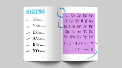
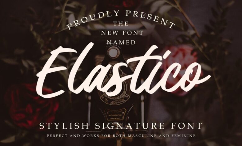
Source: amazonaws.com
Choosing the right font for your t-shirt design is crucial for ensuring your message is clear and easily read. The fabric, color, and even the font style itself can significantly impact legibility. Let’s explore the key factors that affect how well your design translates onto a printed shirt.
Factors Affecting Readability on Different Fabrics
The type of fabric used in your t-shirt directly influences how well the printed text will appear. Cotton, for example, tends to have a softer, more textured surface. This texture can sometimes cause the ink to appear slightly less crisp than on smoother fabrics. Polyester, on the other hand, is known for its smoother surface, which usually results in sharper, more defined text.
Blends of cotton and polyester will fall somewhere in between, depending on the percentage of each fiber. A higher polyester content will generally lead to better print clarity. The absorbency of the fabric also plays a role; cotton’s higher absorbency might cause ink to slightly bleed, while polyester’s lower absorbency reduces this risk.
Font Weight and Style Impact on Readability at Various Sizes, Best fonts for t shirts
The weight and style of your chosen font have a dramatic impact on readability, especially at smaller sizes. Bold fonts (heavy weight) are significantly easier to read than thin or light fonts, especially on darker colored shirts or at smaller sizes. Serif fonts (fonts with small decorative strokes at the ends of letters) can be more legible at larger sizes but often lose clarity at smaller sizes.
Sans-serif fonts (fonts without these strokes) generally maintain better readability across a wider range of sizes, making them a safer choice for t-shirt designs. Very ornate or stylized fonts, while visually appealing, are often the least legible, especially when printed at smaller sizes.
Fonts Maintaining Legibility on Dark-Colored Shirts
Printing on dark shirts presents a unique challenge. Light-colored inks can sometimes appear faded or washed out. To combat this, consider using bold, high-contrast fonts. Sans-serif fonts, such as Arial Black, Impact, or Bebas Neue, are generally excellent choices for dark shirts. Their clean lines and strong weight ensure the text remains easily readable even against a dark background.
Choosing a light-colored ink (white, off-white, or a light pastel) will also maximize legibility.
Comparison of Popular T-Shirt Fonts
The following table compares five popular t-shirt fonts, assessing their readability on both light and dark fabrics. Readability is rated on a scale of 1 to 5, with 5 being the most legible.
| Font Name | Readability (Light Fabric) | Readability (Dark Fabric) | Notes |
|---|---|---|---|
| Arial | 4 | 3 | Versatile, good at various sizes |
| Helvetica | 4 | 3 | Classic sans-serif, clean and legible |
| Arial Black | 5 | 5 | Excellent choice for dark fabrics, bold and clear |
| Impact | 4 | 4 | High contrast, works well in both light and dark |
| Times New Roman | 3 | 2 | Serif font, better for larger sizes and light fabrics |
Font Styles for Different T-Shirt Designs
Choosing the right font for your t-shirt design is crucial for achieving the desired aesthetic and ensuring readability. The font style significantly impacts the overall look and feel, from a clean minimalist aesthetic to a bold, graphic-heavy statement. The following explores various font styles and their suitability for different t-shirt designs.
Minimalist T-Shirt Designs: Font Selection
Minimalist designs prioritize simplicity and clean lines. Fonts should reflect this ethos. Think clean sans-serif fonts like Helvetica, Open Sans, or Futura. These fonts are highly legible, even at smaller sizes, and their unadorned nature complements the minimalist aesthetic. A simple, geometric sans-serif font in a bold weight can make a powerful statement without overwhelming the design.
Imagine a black t-shirt with a single, stark white word rendered in bold Futura – that’s minimalist design at its finest. Conversely, a thin, elegant sans-serif like Lato could work well for a more delicate minimalist design.
Complex Graphics and Illustrations: Font Considerations
When working with complex graphics or illustrations, the font choice needs to complement, not compete with, the artwork. The font should be legible but shouldn’t draw attention away from the primary visual element. Sans-serif fonts often work well here, particularly those with a medium weight. Fonts like Montserrat or Roboto offer a good balance of legibility and visual interest without being overly distracting.
It’s important to consider the color contrast between the font and the background graphic to ensure readability. For example, a bold white sans-serif font might stand out beautifully against a dark, detailed illustration, while a pale yellow font might get lost.
Serif vs. Sans-Serif Fonts for T-Shirt Printing
Serif fonts, characterized by small flourishes at the ends of letter strokes, generally possess a more traditional and sometimes formal feel. They can add a touch of elegance or sophistication to a t-shirt design, but their intricate details can sometimes be lost during the printing process, especially at smaller sizes. Sans-serif fonts, lacking these flourishes, are typically considered more modern and cleaner.
They tend to be more legible, especially in screen printing, making them a popular choice for t-shirt designs. The aesthetic impact differs greatly: a serif font might lend a vintage or classic vibe, while a sans-serif font might project a contemporary and minimalist feel. Consider the overall style of your design when making this choice.
Script Fonts on T-Shirts: Readability and Application
Script fonts, mimicking handwriting, can add a personal and artistic touch. However, they often present readability challenges, especially when printed on fabric. The flowing, connected nature of script fonts can make individual letters difficult to distinguish, particularly at smaller sizes or with certain printing methods. Therefore, script fonts should be used sparingly and only when readability isn’t compromised.
They might work well for a small, emphasized word or phrase on a t-shirt, but are generally unsuitable for large blocks of text. A carefully chosen script font, used judiciously, can create a beautiful, elegant effect. For instance, a single word brand name rendered in a stylized script font could be highly effective, provided the font is chosen for its legibility at the intended size.
Font Size and Spacing Considerations
Choosing the right font size and spacing is crucial for ensuring your t-shirt design is both stylish and easily readable. Poorly spaced text can make even the most beautiful font look cluttered and unprofessional, while text that’s too small will be illegible. Let’s explore the key factors to consider.
Ideal Font Size Ranges for Different T-Shirt Sizes
Determining the optimal font size depends heavily on the size of the shirt and the length of the text. A good rule of thumb is to start with a larger size than you think you need. For shorter phrases, a bolder font can also improve readability. Consider these approximate guidelines:
For a small (S) shirt, a minimum font size of 18-20 points is recommended for a single-line phrase. For multi-line text, consider 14-16 points. A medium (M) shirt can comfortably accommodate 16-24 points for a single line and 12-14 points for multiple lines. Large (L) and extra-large (XL) shirts can handle smaller font sizes more effectively, perhaps starting at 14-18 points for a single line and 10-12 points for multi-line text.
However, always prioritize legibility. Consider the viewing distance; someone will be looking at the shirt from a distance, not close up. A test print on the actual shirt size before mass production is highly recommended.
Kerning and Tracking Effects on T-Shirt Text
Kerning refers to the adjustment of space between individual letter pairs, while tracking adjusts the space between all letters in a block of text. Both significantly impact readability and aesthetics. Poor kerning can create awkward gaps or overlaps between letters, while inconsistent tracking can make text appear cramped or spread out. For example, the letter pairs “AV” or “WA” often need tighter kerning, while “To” might benefit from slightly more space.
Consistent tracking is especially important for longer phrases or paragraphs to maintain a visually balanced look. Fine-tuning kerning and tracking might require specialized design software, but the results are worth the effort for a professional look.
Effective Line Spacing for Multi-Line Text on T-Shirts
Line spacing, or leading, is the vertical distance between lines of text. Sufficient line spacing improves readability, preventing lines from merging together and creating a jumbled mess. For multi-line text on t-shirts, aim for a leading value that’s slightly larger than the font size. For example, if your font size is 14 points, a leading of 16-18 points would be appropriate.
Experiment with different leading values to find the optimal balance between visual appeal and readability. Too much spacing can make the text look sparse, while too little can make it cramped and difficult to read.
Best Practices for Aligning Text Within a T-Shirt Design
Text alignment plays a significant role in the overall design. Center alignment is often used for short, impactful phrases, creating a balanced and symmetrical look. Left alignment is suitable for longer texts, mimicking the flow of traditional reading. Right alignment is less common on t-shirts but can be used effectively for specific design purposes, perhaps creating a visually interesting contrast.
Justified alignment, while used in printed materials, should generally be avoided on t-shirts due to the potential for uneven spacing and readability issues. The choice depends on the overall design and the message you want to convey. Consider the shirt’s style and the intended audience when making your decision.
Exploring Different Font Families for T-Shirts
Choosing the right font for your t-shirt design is crucial for conveying the desired message and aesthetic. The font family you select significantly impacts the overall look and feel, influencing how your design is perceived by the viewer. A well-chosen font can elevate a simple design, while a poor choice can detract from even the most creative artwork.
This section delves into three common font families used in t-shirt printing, exploring their characteristics and providing examples suitable for various styles.
Characteristics of Three Common Font Families
Three font families frequently used for t-shirt designs are Serif, Sans-serif, and Script. Serif fonts feature small decorative strokes (serifs) at the ends of letterforms, often lending a classic or traditional feel. Sans-serif fonts lack these strokes, appearing cleaner and more modern. Script fonts mimic handwriting, providing a personal or elegant touch. The choice depends heavily on the desired aesthetic and the t-shirt’s intended message.
Examples of Fonts from Each Family and Their Suitability for Different Styles
Within each family, numerous fonts offer diverse styles. For instance, Times New Roman (Serif) evokes a vintage feel, while Helvetica (Sans-serif) represents a modern, minimalist aesthetic. A script font like Edwardian Script ITC can add a touch of elegance or whimsy depending on its application. The specific font chosen should complement the overall design and target audience.
Consider the context: a vintage band tee might benefit from a serif font like Playfair Display, while a modern streetwear design might use a sans-serif like Montserrat. A playful design for children’s clothing could use a script font like Pacifico.
Licensing Implications of Using Fonts for Commercial T-Shirt Production
Using fonts for commercial t-shirt production involves crucial licensing considerations. Many fonts are covered by copyright, and using them without a proper license can lead to legal issues and hefty fines. Before using any font, carefully review its licensing agreement. Some fonts offer free personal use licenses but require purchasing a commercial license for production. Others are entirely free for commercial use.
Always prioritize obtaining the correct license to avoid potential problems. Ignoring licensing can result in costly legal battles and damage your brand’s reputation.
Font Examples and Their Suitability for Specific T-Shirt Themes
Understanding the suitability of different fonts for specific themes is vital for effective design. Here are five examples from each family, highlighting their appropriateness for various t-shirt themes:
Serif Fonts:
- Times New Roman: Classic, suitable for vintage or historical themes.
- Garamond: Elegant, works well for sophisticated or literary designs.
- Playfair Display: Stylish, ideal for fashion or luxury brands.
- Didot: High contrast, suitable for formal or upscale t-shirts.
- Merriweather: Legible and versatile, suitable for a broad range of themes.
Sans-serif Fonts:
- Helvetica: Clean and modern, ideal for minimalist or contemporary designs.
- Arial: Versatile and widely used, suitable for many themes.
- Montserrat: Geometric and stylish, perfect for streetwear or urban themes.
- Open Sans: Highly legible, good for text-heavy designs.
- Roboto: Modern and friendly, suitable for a variety of themes.
Script Fonts:
- Pacifico: Playful and casual, ideal for children’s clothing or fun designs.
- Great Vibes: Elegant and flowing, suitable for romantic or feminine designs.
- Edwardian Script ITC: Formal and classic, works well for vintage or sophisticated themes.
- Allura: Stylish and modern, suitable for fashion or luxury brands.
- Lobster Two: Playful and retro, suitable for vintage or quirky designs.
Impact of Printing Method on Font Choice: Best Fonts For T Shirts
Choosing the right font for your t-shirt design is only half the battle; the printing method significantly impacts how that font will ultimately look and last. Different techniques have unique strengths and weaknesses when it comes to reproducing fine details and achieving a crisp, durable finish. Understanding these differences is crucial for creating a high-quality, long-lasting design.Screen printing, direct-to-garment (DTG) printing, and heat transfer printing each offer a distinct approach to applying designs, and each affects font choice in different ways.
The limitations of each method dictate the best font styles for optimal results.
Screen Printing and Font Choice
Screen printing, a time-tested method, excels at producing bold, vibrant designs with excellent durability. However, its reliance on stencils limits its ability to reproduce fine details or complex fonts. Intricate serifs, thin strokes, or heavily embellished typefaces might appear blurry or distorted. The stencil process is also not well-suited for gradients or subtle color variations within the font itself.
Therefore, simpler, bolder fonts like sans-serif typefaces with thicker strokes (like Arial Black or Impact) are ideal choices. These fonts hold up well under the pressure and ink saturation of screen printing, resulting in a clean, readable design that will last many washes. Fonts with high contrast between thick and thin strokes will also perform better than more delicate scripts.
Direct-to-Garment (DTG) Printing and Font Choice
DTG printing offers a high level of detail and precision. Unlike screen printing, it doesn’t rely on stencils, allowing for the reproduction of intricate fonts with sharp lines and fine details. This method is well-suited for complex scripts, serif typefaces with delicate features, and even highly stylized fonts. Because DTG prints directly onto the fabric, it can achieve a softer, more natural look compared to the more plasticky feel sometimes associated with screen printing.
However, DTG may not be as durable as screen printing, especially on darker fabrics. While it handles intricate fonts well, very thin strokes may still lose some definition after multiple washes. Fonts like Garamond, Didot, or even more elaborate script fonts can look stunning with DTG, but it’s important to consider the trade-off in durability.
Heat Transfer Printing and Font Choice
Heat transfer printing involves applying a pre-printed image onto the garment using heat and pressure. The quality of the final product heavily depends on the quality of the initial print. This method is generally better suited for simpler designs and fonts. Complex or highly detailed fonts can lose clarity during the transfer process. The transfer paper’s limitations can affect the sharpness and fine details of the font.
For heat transfer, choosing simple, bold sans-serif fonts or straightforward serif fonts that are not too delicate is recommended. Fonts like Helvetica or Times New Roman would be suitable, ensuring the transfer process doesn’t compromise legibility. Durability is also a concern; heat transfer prints tend to be less durable than screen printing or DTG, especially if the transfer paper is of low quality.
The transferred image might crack or peel with repeated washing, so font choice should reflect this potential for wear.
Choosing the best fonts for t-shirts is crucial for readability and style; a bold sans-serif works well for most designs. But to really get your designs out there, you need to promote them, which is where learning about video marketing comes in – check out this great guide on getting it on with youtube to boost your brand visibility.
Once you’ve mastered YouTube marketing, you can showcase those awesome t-shirt designs and the perfect fonts you’ve chosen.
Closing Notes

Source: designshack.net
Ultimately, selecting the best font for your t-shirt design is a balancing act between aesthetics and readability. Consider your target audience, the style of your design, the printing method, and the fabric of the shirt. By understanding the factors we’ve discussed—font legibility, style, size, spacing, and printing method—you can confidently choose fonts that will make your t-shirts stand out from the crowd and leave a lasting impression.
So go forth and create some amazing designs!
Helpful Answers
What’s the difference between kerning and tracking?
Kerning adjusts the space between individual letter pairs, while tracking adjusts the space between all letters in a block of text.
Can I use any font I want for commercial t-shirt printing?
No, you need to check the font license. Many fonts have restrictions on commercial use.
How does fabric affect font readability?
Thicker, textured fabrics like heavy cotton can obscure finer details, requiring bolder fonts. Smooth fabrics like polyester allow for more detail.
What if my design has multiple lines of text?
Use ample line spacing to avoid a cramped look and ensure readability. Consider using a slightly larger font size for multi-line designs.