Best Fonts for Wedding Invitations
Best fonts for wedding invitations? Choosing the perfect typeface is crucial for setting the tone of your big day! From classic elegance to modern minimalism, the right font can make your invitations truly unforgettable. We’ll explore a range of options, helping you find the perfect style to reflect your unique personality and wedding theme. Get ready to dive into the world of typography and discover the fonts that will make your invitations shine!
This post will guide you through different font styles – classic serifs, modern sans-serifs, elegant scripts, and how to pair them effectively. We’ll cover readability, visual impact, and offer practical tips to ensure your invitations are both beautiful and easy to read. We’ll even touch on creating stunning monograms and addressing envelopes with style. Let’s create invitations that are as unique as your love story!
Classic Elegance
Choosing the right font for your wedding invitations sets the tone for your entire celebration. A classic serif font exudes timeless sophistication and elegance, perfectly capturing the romance and formality of the occasion. These fonts, with their refined serifs and balanced proportions, offer a level of sophistication that’s hard to match. They’re versatile enough to complement various design styles, from minimalist to lavish.
Timeless Serif Fonts for Wedding Invitations
Selecting the perfect typeface involves considering factors like readability, visual impact, and overall aesthetic. The following table highlights five classic serif fonts ideal for formal wedding invitations, detailing their characteristics and how they can enhance your invitation design.
| Font Name | Style Description | Suitability for Invitation Type | Example Usage |
|---|---|---|---|
| Garamond | Elegant, traditional, slightly condensed with delicate serifs. | Formal, classic, romantic weddings. | Body text, headings, and monograms. |
| Times New Roman | Highly readable, versatile, and widely accessible. | Formal, traditional, and contemporary weddings. | Body text, especially for longer invitations. |
| Didot | High contrast, elegant, thin strokes with dramatic serifs. | Formal, luxurious, sophisticated weddings. | Headings, names, and short text blocks. |
| Baskerville | Transitional serif, elegant and readable with moderate contrast. | Formal, classic, and slightly modern weddings. | Body text, short paragraphs, and headings. |
| Bodoni | High-contrast, elegant, with sharp, dramatic serifs. | Formal, modern, and art deco-inspired weddings. | Headings, names, and short text elements. |
Sample Invitation Design Using Garamond
Imagine a wedding invitation featuring Garamond in a deep navy blue on a luxurious ivory cardstock. The main text, including the couple’s names and wedding date, is presented in a clean, elegant sans-serif font in a complementary color such as gold or a lighter shade of blue. The Garamond font is used for the detailed information, such as the venue and RSVP details, in a slightly smaller size to create a visual hierarchy.
A subtle, ornate border or a simple flourish adds a touch of extra elegance without overpowering the overall design. This combination of fonts and colors creates a classic yet sophisticated look that perfectly reflects the couple’s style.
Readability of Classic Serif Fonts at Various Sizes
Readability is crucial for wedding invitations; guests need to easily understand the essential information. Here’s a comparison of the readability of three classic serif fonts at different sizes:Garamond, with its delicate serifs, remains highly readable even at smaller sizes (10-12pt for body text). At larger sizes (14pt+), it exudes even more elegance. Times New Roman, due to its versatility, remains legible across a wide range of sizes (10-14pt for body text), making it a reliable choice.
Didot, with its high contrast, performs best at larger sizes (12pt and above) for body text; at smaller sizes, its thin strokes might be difficult to read. For headings, Didot’s dramatic impact is best showcased at sizes 18pt and above.
Modern Minimalism
Modern minimalist wedding invitations are all about clean lines, uncluttered design, and a sophisticated aesthetic. They focus on typography and strategic use of negative space to create a feeling of understated elegance. This style is perfect for couples who appreciate a sleek, contemporary look and want their invitation to reflect their personality with subtle sophistication.
Sans-serif Fonts for Modern Minimalist Invitations
Choosing the right font is crucial for achieving a truly minimalist aesthetic. Sans-serif fonts, with their clean lines and lack of decorative flourishes, are perfectly suited to this style. Their versatility allows them to be paired with other design elements, creating a cohesive and impactful invitation.
- Open Sans: A highly versatile and widely used font, Open Sans offers excellent readability and a friendly, approachable feel, making it ideal for both the main text and smaller details. Its geometric shapes contribute to the minimalist aesthetic.
- Lato: Lato boasts a clean, modern design with a slightly warmer feel than Open Sans. Its subtle variations in weight make it easy to create hierarchy within the invitation design, emphasizing key information.
- Montserrat: With a geometric structure and a slightly more geometric feel than Lato, Montserrat offers a strong, contemporary aesthetic. Its clean lines and even spacing make it perfect for minimalist designs.
- Poppins: Poppins is a geometric sans-serif font with a distinct personality. Its rounded edges soften the otherwise sharp lines, adding a touch of warmth to the minimalist design without sacrificing its clean aesthetic.
- Roboto: Roboto is a highly legible and versatile font that offers a neutral and clean appearance. Its balanced proportions and clear letterforms make it an excellent choice for body text and other essential information.
Minimalist Invitation Mock-up, Best fonts for wedding invitations
Imagine a crisp white invitation card. The only element is a simple sans-serif font, such as Montserrat, used for the couple’s names and wedding date. The names are set in a larger, bolder weight (perhaps Montserrat Bold), positioned centrally. The date is placed beneath, in a slightly smaller weight (Montserrat Regular). The ample negative space surrounding the text is a key element; it enhances the clean lines and allows the information to breathe.
A subtle texture, perhaps a very faint linen pattern, could be added to the background to add a touch of visual interest without detracting from the minimalist feel. The overall effect is one of refined simplicity and modern elegance.
Pairing Sans-serif and Script Fonts
Combining a sans-serif font with a script font can add a touch of elegance and personality to a modern minimalist invitation. The sans-serif font handles the essential information (names, date, location), while the script font can be used for more decorative elements like the couple’s names or a short, elegant phrase. For example, pairing Montserrat with a delicate script font like Great Vibes or Allura can create a beautiful contrast between modern and classic styles.
The script font adds a touch of romance and personality, while the sans-serif font maintains the clean, minimalist aesthetic. Another option would be to use Lato with a more contemporary script font like Amatic SC for a slightly bolder, more modern feel.
Script & Calligraphy
Source: designshack.net
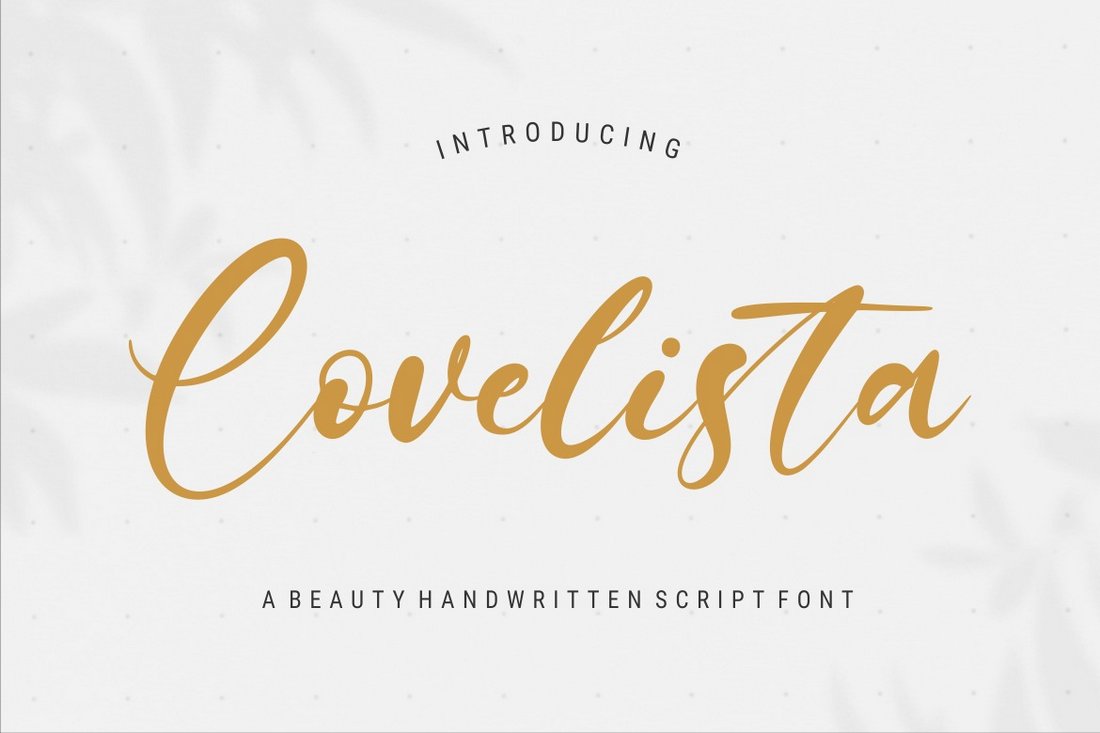
Script and calligraphy fonts bring a timeless elegance to wedding invitations, instantly elevating their aesthetic appeal. Their fluid, handwritten style evokes a sense of personal touch and romance, making them a popular choice for couples seeking a classic or luxurious feel. The choice of script font will significantly impact the overall tone and style of your invitation suite, so careful consideration is key.
Script Font Selection for Wedding Invitations
Choosing the right script font is crucial for setting the desired mood for your wedding. The level of formality, the thickness of the strokes, and the overall style will all contribute to the final impression. Below is a table showcasing three distinct script fonts and their applications.
| Font Name | Style | Level of Formality | Example Use Case |
|---|---|---|---|
| Great Vibes | Casual, playful, slightly whimsical | Informal to semi-formal | Rustic chic wedding, beach wedding, garden party |
| Playfair Display | Elegant, classic, refined | Formal | Black-tie wedding, traditional ceremony, upscale event |
| Sacramento | Modern, sophisticated, slightly edgy | Semi-formal to formal | Modern minimalist wedding, art deco-inspired wedding, contemporary celebration |
Addressing Envelopes with Script Fonts
Using a script font for addressing envelopes adds a touch of personalized sophistication. Several elegant techniques can enhance the visual appeal. For example, using a slightly darker ink color than the invitation itself can create contrast and make the address stand out. Alternatively, a simple yet elegant approach is to use a single, beautifully rendered script font for the names and address, maintaining a consistent and cohesive look.
For a more elaborate approach, consider incorporating a delicate flourish or monogram after the recipient’s name. Another elegant touch is to use a different color ink, such as gold or silver, for the return address, creating a subtle yet impactful distinction.
Designing a Monogram with a Script Font
For this monogram, I’ll use the Playfair Display font. Its classic elegance lends itself well to a traditional monogram design. The design process begins with selecting the initials of the couple – let’s say “A” and “M”. The “A” will be slightly larger, positioned centrally, and subtly overlapping the “M”. The “M” will be gracefully intertwined with the “A”, creating a sense of unity and connection.
The font’s inherent elegance will ensure that the monogram doesn’t need excessive embellishments; simplicity will be key to maximizing its impact. The visual impact will be one of sophisticated refinement, conveying a sense of timeless elegance and classic style. The slightly serifed characters of Playfair Display add a touch of formality, making it suitable for a traditional or formal wedding.
The carefully balanced intertwining of the letters suggests a strong partnership, adding a symbolic layer to the aesthetic appeal.
Font Pairing & Typography
Choosing the right fonts for your wedding invitations is crucial for setting the overall tone and aesthetic. Beyond simply selecting a beautiful typeface, understanding font pairing and typography principles ensures a cohesive and visually appealing design that reflects your unique style. Mastering these elements elevates your invitation from simply informative to truly memorable.Effective font pairing involves selecting fonts that complement each other, creating a harmonious balance without overwhelming the eye.
Different font styles offer distinct personalities, and pairing them thoughtfully enhances the overall impact of your invitation.
Serif and Sans-Serif Font Pairings
Combining serif and sans-serif fonts is a classic and effective approach to wedding invitation design. Serif fonts, with their delicate flourishes, often convey elegance and tradition, while sans-serif fonts, clean and modern, offer a contemporary feel. The contrast between these styles creates visual interest and helps to differentiate important information.
- Garamond (serif) and Helvetica (sans-serif): This pairing offers a timeless elegance. Garamond’s classic serif style provides a sophisticated base for the main text, while Helvetica’s clean lines are perfect for headings or shorter, impactful phrases. The contrast creates a balanced and refined look.
- Playfair Display (serif) and Lato (sans-serif): Playfair Display’s elegant, slightly more modern serif style pairs well with Lato’s clean, friendly sans-serif appearance. This combination is versatile, working well for both formal and slightly more relaxed wedding styles.
- Times New Roman (serif) and Arial (sans-serif): A classic and widely available pairing. While perhaps less visually exciting than some others, the familiarity of these fonts ensures readability and accessibility for all guests. This choice prioritizes clarity and functionality.
Font Weight, Size, and Spacing
The visual impact of your wedding invitation is significantly influenced by font weight, size, and spacing. These elements work together to create a hierarchy of information, guiding the reader’s eye and ensuring clarity.Careful consideration of font weight (boldness) helps to emphasize key information, such as the couple’s names or the date of the wedding. Larger font sizes naturally draw attention, while smaller sizes are suitable for secondary details.
Choosing the best fonts for wedding invitations is crucial; the right typeface sets the tone perfectly. I’ve been researching different styles, and to get some inspiration, I even checked out some amazing wedding invitation videos – you should check out this great guide on getting it on with youtube for promoting your business, which helped me understand video marketing better! Anyway, back to fonts – classic serif fonts always feel elegant, but a modern sans-serif might be perfect for a more contemporary feel.
Adequate spacing between lines (leading) and words (tracking) enhances readability and prevents the invitation from feeling cluttered. Too much or too little spacing can negatively impact the overall aesthetic. For example, overly cramped text can appear unprofessional, while excessively spaced text might feel too sparse and lack visual cohesion. A well-balanced design strikes a harmonious balance between these elements.
Typographic Hierarchy for Wedding Invitations
Establishing a clear typographic hierarchy ensures that essential information stands out while secondary details remain easily accessible. This is achieved through a strategic use of font size, weight, and style.
- Couple’s Names: Largest font size, bold weight, potentially a decorative or elegant script font. This immediately draws the reader’s attention to the central focus of the invitation.
- Date and Time: Second largest font size, bold or semi-bold weight, easily readable sans-serif or serif font. This information is crucial and should be clearly visible.
- Location: Medium font size, regular weight, a clear and easy-to-read font. This detail provides necessary context.
- Additional Information (RSVP details, website): Smallest font size, regular weight, a simple font. This information is secondary and should not compete visually with the main elements.
Visual Impact & Readability
Source: motionstamp.com
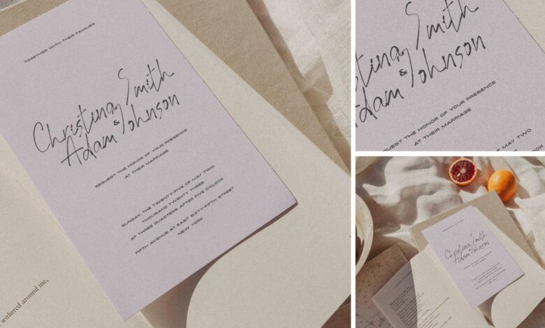
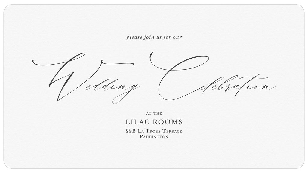
Choosing the right fonts for your wedding invitations is crucial; it’s not just about aesthetics, but also about ensuring your message is clear and impactful. The visual impact of your invitation sets the tone for your entire wedding, influencing the overall feeling and expectation guests will have for your special day. Readability, however, is paramount; if your guests struggle to decipher the details, the beauty of the design is lost.Font legibility plays a vital role in ensuring your wedding invitation is easily understood.
The size of the font directly affects readability. Smaller fonts, while potentially elegant, can become difficult to read, especially for older guests or those with impaired vision. Conversely, excessively large fonts can appear clunky and unprofessional. Finding the sweet spot—a size that’s both visually appealing and easily readable—is key. For example, a serif font like Garamond might be perfectly legible at 12 points for body text, while a sans-serif font like Helvetica might require 14 points for the same level of clarity.
The specific font’s design also influences its readability at different sizes; some fonts are inherently more legible than others, regardless of size.
Font Choice and Mood
The font you select significantly impacts the overall mood and tone of your wedding invitation. A classic serif font like Times New Roman evokes a traditional, formal feel, perfect for a classic or elegant wedding. In contrast, a playful script font like Brush Script MT creates a romantic and whimsical atmosphere, suitable for a more informal or rustic celebration.
Modern sans-serif fonts like Futura or Open Sans project a clean, contemporary feel, ideal for a minimalist or modern wedding. The use of a bold font can add a touch of drama or excitement, while a delicate script font conveys romance and sophistication. Consider the overall style of your wedding when making your selection. A gothic-inspired wedding might pair well with a font like Trajan Pro, while a beach wedding could utilize a more relaxed font like Amatic SC.
Font Color and Background Interaction
The visual impact of your wedding invitation is also significantly influenced by the interplay between font color and background. High contrast between the text and background is essential for optimal readability. For example, dark text on a light background (like black text on ivory or cream) is generally the most legible. However, you can also create a visually stunning invitation by experimenting with different color combinations.
A navy blue font on a blush pink background creates a sophisticated and romantic look. A deep green font on a cream background provides a natural and elegant feel. Conversely, low contrast combinations, such as light gray text on a light beige background, can make the invitation difficult to read and less visually appealing. Consider your wedding’s color palette when choosing font and background colors; maintaining a consistent aesthetic throughout the invitation is crucial.
For example, a wedding with a coral and gold color scheme could use a coral font on a gold background (with sufficient contrast adjustments), creating a cohesive and stylish design.
Concluding Remarks: Best Fonts For Wedding Invitations
Source: squarespace-cdn.com
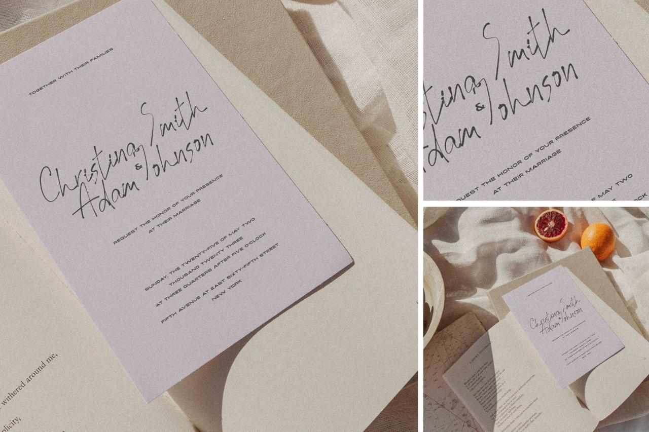
So, there you have it – a whirlwind tour of the best fonts for wedding invitations! Remember, the key is to choose fonts that reflect your style and create a cohesive visual message. Don’t be afraid to experiment with different pairings and styles until you find the perfect combination that captures the essence of your special day. Happy designing!
Questions Often Asked
What’s the difference between serif and sans-serif fonts?
Serif fonts have small decorative strokes at the ends of their letters (like Times New Roman), while sans-serif fonts don’t (like Arial). Serifs often feel more traditional, while sans-serif fonts are generally considered more modern.
How do I choose the right font size?
Consider your invitation’s size and the amount of text. Aim for a size that’s easily readable, typically between 10-14 points for body text. Headings can be larger.
Where can I find free wedding fonts?
Many websites offer free fonts, but always check the license to ensure you can use them for commercial purposes. Google Fonts is a great resource.
Can I mix and match different font styles?
Absolutely! Mixing fonts can add visual interest, but aim for harmony. Pair fonts with contrasting styles (e.g., a serif and a script) but similar weights and levels of formality.

