Best InDesign Proposal Templates Your Winning Strategy
Best InDesign proposal templates are your secret weapon for creating proposals that not only impress but also win you business. Forget struggling with design from scratch; these templates offer pre-designed layouts, professional typography, and impactful visuals, saving you time and ensuring a consistent brand image. Whether you’re a seasoned pro or just starting out, leveraging a well-crafted template is a game-changer.
This post dives deep into the world of InDesign proposal templates, exploring different styles, industry-specific examples, and essential elements for a truly compelling proposal. We’ll cover everything from choosing between free and premium options to customizing a template to perfectly reflect your brand. Get ready to transform your proposals from ordinary documents to persuasive marketing tools!
Top Features of InDesign Proposal Templates

Source: designercandies.net
High-quality InDesign proposal templates offer a significant advantage over creating proposals from scratch, streamlining the design process and ensuring a professional, polished final product. They provide a structured framework, incorporating best practices for visual communication and persuasive content delivery, ultimately leading to a higher chance of proposal acceptance.Pre-designed templates save considerable time and effort. Instead of wrestling with layout, typography, and overall design, you can focus on the content itself – the core message and persuasive arguments that will win over your client.
This efficiency translates directly into cost savings, both in terms of your time and any potential design fees.
Essential Features of High-Quality Templates
Effective InDesign proposal templates incorporate several key features. These include master pages for consistent branding and formatting across all pages, pre-defined styles for headings, body text, and other elements, ensuring uniformity and visual appeal. They often include placeholder text and images, guiding you through the content creation process, and providing space for charts, graphs, and other visual aids to strengthen your arguments.
Finally, professional templates typically offer multiple page layouts catering to different content needs, allowing flexibility in structuring your proposal.
Benefits of Using Pre-designed Templates
The advantages of using pre-designed templates extend beyond simple time-saving. Using a professionally designed template instantly elevates the perceived professionalism of your proposal. A visually appealing and well-structured document demonstrates attention to detail and respect for the recipient, creating a positive first impression crucial for securing business. Furthermore, consistency in branding and formatting throughout the proposal strengthens your message and reinforces your company’s identity.
This consistency also contributes to improved readability and comprehension, making it easier for the client to understand your proposal’s key points.
Comparison of Different Template Types
Different template types cater to various branding styles and project needs. Minimalist templates prioritize clean lines, ample white space, and a focus on essential information. This style is ideal for conveying complex information clearly and concisely. Modern templates often incorporate bold typography, vibrant color palettes, and dynamic layouts to create a contemporary and engaging feel. Corporate templates tend to follow a more formal and traditional design, often using sophisticated typography and a refined color scheme to project professionalism and trustworthiness.
The choice depends on your target audience and the overall tone you wish to convey. For instance, a tech startup might opt for a modern template, while a law firm would likely prefer a corporate style.
Visual Hierarchy and Readability
Visual hierarchy and readability are paramount in compelling proposals. Effective templates use visual cues like font size, weight, color, and spacing to guide the reader’s eye through the document, highlighting key information and ensuring a smooth reading experience. Clear headings, subheadings, bullet points, and white space break up large blocks of text, improving readability and comprehension. For example, using a larger, bolder font for headings helps draw attention to important sections, while consistent use of white space prevents the proposal from feeling cluttered and overwhelming.
Poor visual hierarchy, conversely, can lead to confusion and a diminished impact.
Categorizing InDesign Proposal Templates by Industry

Source: designercandies.net
Choosing the right InDesign proposal template isn’t just about aesthetics; it’s about effectively communicating your value proposition to a specific audience. Different industries have varying expectations regarding design style, tone, and information hierarchy. A template that works wonders for a tech startup might feel completely out of place for an architectural firm. Understanding these nuances is crucial for creating a proposal that resonates and converts.Different industries demand different visual languages.
A successful proposal template needs to reflect the industry’s established norms and expectations while still showcasing your unique brand personality. This means considering factors such as color palettes, typography, imagery, and overall layout. The goal is to create a proposal that’s not only visually appealing but also professionally appropriate and trustworthy.
Industry-Specific InDesign Proposal Templates
The following table showcases examples of how InDesign proposal templates can be tailored to different industries. Each example illustrates how design choices reflect the industry’s visual language and target audience.
| Industry | Template Style | Key Features | Design Choices |
|---|---|---|---|
| Marketing | Modern, Clean, and Data-Driven | Charts, graphs, case studies, strong call to action | Bold color accents (e.g., blues, greens), sans-serif fonts (e.g., Open Sans, Montserrat), high-quality photography showcasing successful campaigns. |
| Architecture | Sophisticated, Minimalist, and Visually Rich | High-resolution images of past projects, detailed floor plans, technical specifications | Muted color palettes (e.g., grays, beiges, with accent colors like deep blues or greens), serif fonts (e.g., Garamond, Times New Roman), emphasis on high-quality architectural renderings. |
| Technology | Sleek, Modern, and Tech-Forward | Infographics, technical diagrams, concise descriptions of features and benefits | Clean lines, geometric shapes, use of metallic or gradient accents, sans-serif fonts (e.g., Futura, Roboto), high-quality product images or mockups. |
| Healthcare | Professional, Trustworthy, and Clean | Credentials, certifications, client testimonials, detailed service descriptions | Calm and reassuring color palettes (e.g., light blues, greens, and neutrals), easy-to-read serif or sans-serif fonts (e.g., Arial, Calibri), professional photography that conveys trust and competence. |
Color Palettes and Typography
Effective color palettes and typography choices are critical for establishing the right tone and visual appeal in your proposal.For example, a marketing proposal might use a vibrant color palette to convey energy and creativity, while an architectural proposal might opt for a more subdued palette to project sophistication and professionalism. Similarly, typography should align with the industry’s norms. A technology proposal might use a modern sans-serif font to communicate innovation, whereas a legal proposal might favor a more traditional serif font to convey authority and trustworthiness.
Consider the following examples:* Marketing: A bold blue (#007bff) paired with a bright orange (#ffa500) could convey energy and innovation. Using a clean sans-serif font like Montserrat would complement the modern aesthetic.* Architecture: A palette of muted grays (#808080, #d3d3d3) accented with a deep teal (#008080) would convey sophistication and stability. A classic serif font like Garamond would enhance the sense of professionalism.* Technology: A combination of dark gray (#333333) and a bright accent color like teal (#008080) or a vibrant purple (#800080) could reflect the modern and tech-savvy nature of the industry.
A clean sans-serif font like Roboto would maintain a contemporary look.
Essential Elements of a High-Impact InDesign Proposal
Crafting a compelling proposal in InDesign goes beyond simply laying out text and images. It requires a strategic approach to design and content organization that maximizes impact and persuasiveness. A well-designed proposal not only presents your ideas clearly but also reflects your professionalism and attention to detail.
Effective Use of Headings, Subheadings, and White Space
Strategic use of headings and subheadings creates a clear visual hierarchy, guiding the reader through the proposal’s information. Think of them as signposts, directing the reader’s attention and making it easy to navigate complex information. White space, often overlooked, is crucial for readability and visual appeal. It prevents the proposal from feeling cluttered and overwhelming. The following example illustrates effective use of these elements:
Project Overview
This section provides a concise summary of the project goals, objectives, and expected outcomes. It sets the stage for the detailed information that follows.
Methodology
Phase 1: Research and Analysis
This phase involves conducting thorough market research and analyzing the client’s needs to develop a comprehensive understanding of the project requirements.
Phase 2: Design and Development
The design and development phase focuses on creating the proposed solution, incorporating feedback and iterative improvements.
Phase 3: Implementation and Launch
This phase involves the final implementation of the solution, followed by a comprehensive launch strategy to ensure successful market penetration.
Incorporating Compelling Visuals
Visuals are powerful tools for enhancing understanding and engagement. Charts and graphs effectively present data, making complex information more accessible. For example, a bar chart could compare projected sales figures against previous years’ performance, clearly illustrating growth potential. A well-designed infographic could summarize key project milestones and timelines, providing a visual roadmap. High-quality images, relevant to the proposal’s context, can add visual interest and reinforce key messages.
Imagine a photograph showcasing a successful implementation of a similar project, demonstrating the tangible results of your proposed solution. The impact of such visuals is to increase reader engagement and make the proposal more memorable and persuasive.
Effective Use of Bullet Points and Numbered Lists
Bullet points and numbered lists improve readability by breaking down large chunks of text into easily digestible pieces. They highlight key information, making it easier for the reader to quickly grasp the main points. For instance, a numbered list could Artikel the key steps in the project implementation process, while bullet points could summarize the key benefits of your proposed solution.
Use them strategically to emphasize critical information and guide the reader through complex details. Before using a list, always provide context. Don’t just drop a list into the proposal without explaining its purpose.
For example, consider this:
The key benefits of our solution include:
- Increased efficiency
- Cost savings
- Improved customer satisfaction
Common Mistakes to Avoid
Overcrowding the page with text and visuals leads to a cluttered and unappealing design. Poor image quality detracts from the proposal’s professionalism. Inconsistent font styles and sizes disrupt readability. Lack of white space makes the proposal feel overwhelming. Failing to proofread for errors undermines credibility.
Ignoring brand guidelines creates a disjointed and unprofessional look. Using inappropriate or irrelevant visuals weakens the message. Overlooking accessibility considerations excludes potential readers.
Finding and Using Free vs. Premium InDesign Proposal Templates

Source: designercandies.net
Choosing between a free and a premium InDesign proposal template is a crucial decision that impacts the overall professional look and feel of your proposal, potentially influencing its success. The right template can save you significant time and effort, while the wrong one can detract from your message. Understanding the strengths and weaknesses of each option is key.Free and premium InDesign proposal templates offer distinct advantages and disadvantages.
Free templates provide a cost-effective entry point, allowing you to quickly create a basic proposal. However, premium templates usually offer superior design quality, more customization options, and often come with additional support. This decision hinges on your budget, technical skills, and the importance of a polished presentation.
Advantages and Disadvantages of Free and Premium InDesign Templates
Free templates are readily accessible, saving you money upfront. They can be a great starting point for simple proposals or for those experimenting with InDesign. However, free templates often lack the professional polish of premium options, may contain limited customization possibilities, and might include watermarks or branding from the template creator. They may also lack support should you encounter problems.
Premium templates, conversely, boast high-quality designs, extensive customization options, and often include support from the creator. This ensures a professional look and simplifies the design process, but they come with a price tag.
Reputable Sources for Free and Paid InDesign Templates
Finding reliable sources for both free and paid templates is essential to avoid low-quality designs or potential copyright issues. Several reputable websites offer free InDesign templates. These often come with limitations but can be suitable for basic proposals. Examples include websites specializing in free design resources, often focusing on a community-driven approach where users contribute and share templates.
For premium templates, dedicated marketplace websites specializing in graphic design assets are excellent options. These platforms usually offer a range of styles, allowing you to find a template that aligns with your brand identity. Many also provide customer support and guarantee high-quality designs. Additionally, some individual designers offer their premium templates directly through their websites or portfolios.
Licensing Implications of Using Free Templates
It’s crucial to understand the licensing associated with free InDesign templates. Many free templates are offered under Creative Commons licenses, which dictate how you can use, modify, and distribute the template. Carefully review the license terms before using any free template to avoid copyright infringement. Some licenses might restrict commercial use, requiring attribution, or prohibit modifications. Ignoring these terms can lead to legal issues.
Always prioritize templates with clearly defined and accessible licenses.
The Value Proposition of Investing in a Premium Template
Investing in a premium InDesign proposal template offers significant value beyond the initial cost. The professional design immediately enhances your credibility, presenting your proposal in a polished and visually appealing manner. The superior quality and extensive customization options allow you to tailor the template perfectly to your specific needs and brand, creating a cohesive and impactful document. Furthermore, the support provided by premium template creators can be invaluable if you encounter technical difficulties.
The time saved by using a well-designed, pre-built template, rather than creating one from scratch, can significantly outweigh the cost. The potential increase in your proposal’s success rate, resulting from a more professional presentation, represents a significant return on investment.
Customizing InDesign Proposal Templates for Specific Needs
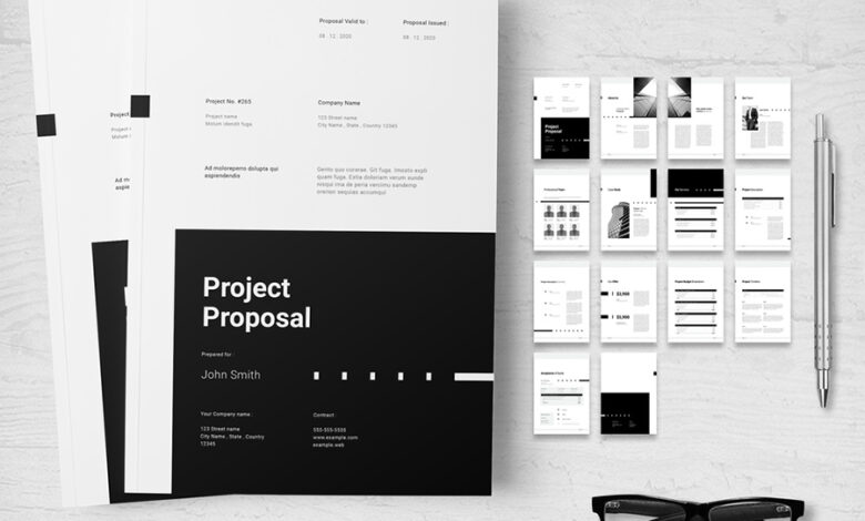
Choosing a pre-designed InDesign proposal template is a great starting point, but true impact comes from tailoring it to perfectly reflect your brand and the specifics of your proposal. A customized template ensures a professional, cohesive presentation that resonates with your client and effectively communicates your value proposition. This process involves more than just swapping out colors; it’s about strategically leveraging InDesign’s features to create a document that’s both visually stunning and highly functional.
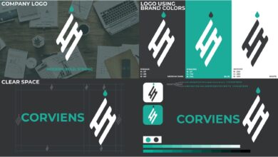
Branding Integration
Successfully integrating your company’s brand identity is crucial. This goes beyond simply placing your logo. Consistent use of your brand colors, fonts, and imagery creates a unified and memorable experience for the reader. Begin by creating a style guide within InDesign, defining your brand’s specific colors (using the color picker tool and saving them as swatches), fonts (selecting appropriate headings and body text fonts), and even specific paragraph styles for consistency throughout the document.
Import your logo as a high-resolution image and place it strategically on the master pages, ensuring it appears consistently on every page. Consider using a subtle watermark effect for a more sophisticated look. The consistent application of your brand guidelines transforms a generic template into a powerful representation of your company.
Master Pages and Styles
InDesign’s master pages are your secret weapon for efficient customization. Instead of manually adjusting elements on each page, design your header, footer, page numbers, and branding elements on the master page. Any changes made here automatically update across all pages, saving you significant time and ensuring consistency. Furthermore, leverage InDesign’s paragraph and character styles to maintain uniformity in formatting.
Define styles for headings, body text, lists, quotes, and captions. This ensures that every element, from the largest heading to the smallest footnote, adheres to your brand guidelines. For example, create a “Heading 1” style with your primary font, a specific size, and bold formatting; a “Body Text” style with your secondary font, size, and line spacing; and a “Quote” style with italics and indented margins.
This streamlined approach ensures consistency and allows for quick global updates if needed.
Adapting to Varying Proposal Lengths
InDesign templates are designed to be flexible. While a template might showcase a specific length, you can easily adjust it to fit your needs. For shorter proposals, simply delete unnecessary pages or sections. For longer proposals, add new pages and consistently apply your previously defined styles and master page elements. This ensures a seamless transition and prevents formatting inconsistencies as your document grows.
If your proposal includes extensive data, consider using tables with consistent formatting. InDesign’s table features allow for easy customization of borders, cell shading, and alignment, enhancing readability and presentation of numerical data.
Finding the best InDesign proposal templates can be a game-changer for landing those big clients. But remember, a killer proposal needs killer visuals, and that’s where video comes in. Check out this great resource on getting it on with youtube to learn how to create compelling video content to support your proposals and really wow potential clients.
Once you’ve got your video strategy down, those InDesign templates will shine even brighter!
Content Specific Customization, Best indesign proposal templates
Beyond branding, consider customizing content-specific elements. For example, if your proposal includes charts or graphs, ensure they are visually consistent with your brand and maintain a high level of professional quality. Likewise, ensure images used are high-resolution and relevant to the content. Consistent use of high-quality visuals significantly enhances the overall impact of your proposal. If you’re proposing a website design, include mockups that reflect your branding and the client’s vision.
This level of detail demonstrates your commitment to understanding their needs and providing a tailored solution. The more specific and relevant your customization, the more likely your proposal will resonate with the client.
Wrap-Up
Ultimately, the best InDesign proposal template for you depends on your specific needs and brand. By understanding the key features, industry best practices, and customization options, you can craft a proposal that effectively communicates your value proposition and leaves a lasting impression on your clients. Don’t underestimate the power of a well-designed proposal – it’s the first step towards securing that crucial deal.
So go forth, create stunning proposals, and watch your success soar!
FAQ: Best Indesign Proposal Templates
Can I use a free InDesign proposal template for commercial projects?
It depends on the license. Always check the license agreement of any free template before using it commercially. Some may restrict commercial use, while others might require attribution.
What file types are InDesign proposal templates usually available in?
Most often, you’ll find them as INDD (InDesign document) files. Some providers might offer additional formats like IDML (InDesign Markup Language) for compatibility with older versions of InDesign.
How much customization is possible with pre-designed templates?
InDesign templates are highly customizable. You can easily change colors, fonts, images, and text content. You can even modify master pages for consistent branding across the entire document.
Are there templates specifically designed for different proposal lengths?
While some templates are designed with a specific page count in mind, most can be easily adapted to suit different lengths by adding or removing pages and adjusting content accordingly.