Best Metal Band Fonts A Headbangers Guide
Best metal band fonts aren’t just about readability; they’re about capturing the raw energy, aggression, and sometimes subtle darkness of the music. From the brutal simplicity of a death metal logo to the intricate flourishes of a power metal emblem, the right font can make or break a band’s image. This exploration dives deep into the world of metal typography, examining the history, psychology, and technical aspects that make certain fonts iconic.
We’ll journey through decades of metal music, analyzing the evolution of font styles and their impact on band branding. We’ll discuss the technical nuances of typography – serif vs. sans-serif, weight, kerning, and more – and how these elements contribute to the overall aesthetic. We’ll even delve into the psychology behind font choices, exploring how different styles evoke specific emotions and resonate with the metalhead audience.
Get ready to unleash your inner graphic designer!
Defining “Best” Metal Band Fonts
Defining what constitutes the “best” metal band font is subjective, yet certain characteristics consistently appear in designs that resonate with the genre’s aesthetic. These fonts often project an image of power, aggression, and darkness, reflecting the music’s intensity and lyrical themes. The choice of font is intrinsically linked to a band’s overall branding and helps solidify their identity within the diverse landscape of metal subgenres.Font choice plays a crucial role in a metal band’s image and branding.
It’s a visual representation of their sonic identity, immediately communicating their style and genre to fans. A poorly chosen font can undermine a band’s carefully cultivated image, while a well-chosen one can enhance it significantly. Think of it as the visual equivalent of a band’s guitar tone – it needs to be right to hit the mark.
Font Styles Across Metal Subgenres
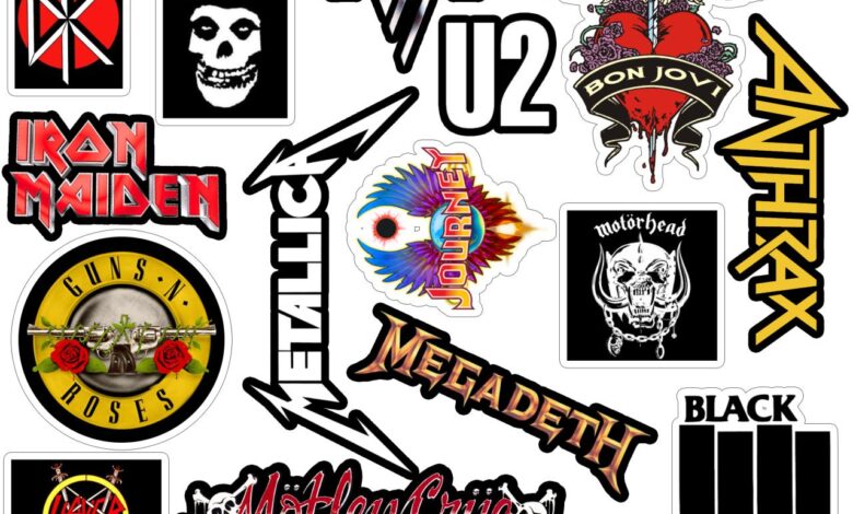
Many metal bands utilize fonts that evoke a sense of history and tradition. Black Sabbath, for example, often employed a classic serif typeface, lending a sense of timeless weight to their imagery. This contrasts sharply with the more modern, often angular and aggressive sans-serif fonts favored by many death metal bands like Cannibal Corpse, whose logo uses a stark, brutalist typeface perfectly reflecting their music’s sonic brutality.
Progressive metal bands, on the other hand, sometimes lean towards more elaborate and stylized fonts, reflecting the complexity and experimentation found in their music. Dream Theater’s logo, for instance, is a more intricate and less overtly aggressive design than many death metal bands. The contrast highlights how font choice can effectively communicate subgenre nuances.
So you’re designing killer merch for your death metal band and need the perfect font? Finding the right typeface is crucial, and honestly, a lot of that comes down to understanding your audience’s visual expectations. To really get your message across, though, you need to get those designs seen, which is where knowing how to leverage YouTube comes in – check out this great guide on getting it on with youtube to boost your band’s visibility.
Once your videos are popping, those awesome metal band fonts will be seen by even more fans!
Relationship Between Font Choice and Band Image
The relationship between font choice and a band’s overall image is paramount. A band aiming for a raw, underground aesthetic might choose a distressed or heavily textured font, while a band striving for a more polished, professional image might opt for a cleaner, more legible typeface. The choice reflects not only the music but also the band’s marketing strategy and target audience.
A band’s logo, often featuring their name in a distinctive font, serves as a visual shorthand, instantly conveying their identity and genre. This is crucial for recognition and brand building in a crowded market.
Designing Fonts for Metal Subgenres
Here are three distinct font styles, each designed to suit a different metal subgenre:
1. Blackened Death Metal: Imagine a font with sharp, angular serifs, almost like jagged metal shards. The letters would be condensed, heavy, and possess a slightly distorted or uneven appearance. The overall effect would be one of chaotic aggression and brutality, mirroring the intensity of the music. The color palette would likely be limited to deep blacks, greys, or blood reds.
2. Power Metal: This font would be more ornate and elaborate, perhaps incorporating elements of heraldry or fantasy. The letters could be slightly elongated and feature decorative flourishes, reflecting the epic and often theatrical nature of power metal. Think of a regal yet powerful script, possibly with a metallic sheen or texture implied through shading and design.
The color scheme might incorporate golds, silvers, and deep blues.
3. Doom Metal: This font would evoke a sense of slow, heavy, and oppressive atmosphere. Imagine a thick, heavily shadowed font with rounded, almost dripping serifs. The letters could be slightly distorted, giving a sense of decay or age. The overall feeling should be one of melancholy and weighty darkness.
The color scheme would probably stick to dark, muted tones such as deep browns, dark greens, and somber purples.
Technical Aspects of Metal Fonts
Source: graphicpie.com
Choosing the right font for a metal band logo is crucial; it’s more than just aesthetics; it’s about conveying the band’s image and genre. The technical aspects of typography play a significant role in achieving this. Understanding the nuances of different font types and their properties will help you create a logo that truly screams metal.Serif versus Sans-Serif Fonts and Their Suitability for Metal Band LogosSerif fonts, characterized by small decorative strokes at the ends of letters (like Times New Roman), often evoke a sense of tradition and formality.
Sans-serif fonts, lacking these strokes (like Arial), tend to feel more modern and clean. In the context of metal band logos, sans-serif fonts are far more prevalent. Their bold, often angular shapes lend themselves well to the aggressive and raw energy associated with many metal subgenres. While a carefully chosen serif font might work for a band with a more gothic or traditional metal sound, the starkness and impact of sans-serif fonts usually better reflect the genre’s overall visual identity.
Think of the iconic logo of Metallica – a clear example of a sans-serif font’s effectiveness.
Font Weight, Kerning, and Leading
Font weight refers to the thickness of the font’s strokes. Heavy weights (bold, extra bold) are overwhelmingly popular in metal band logos, projecting power and intensity. Kerning, the adjustment of space between individual letters, is vital for readability and visual balance. Poor kerning can make a logo look cramped or unprofessional. Leading, the space between lines of text (though less relevant for single-line logos), affects the overall visual density and should be considered if the logo incorporates multiple lines of text.
A well-kerned and appropriately weighted font will make a metal band logo instantly more impactful and memorable. For instance, a logo with poorly kerned letters might appear clumsy and unprofessional, whereas precise kerning creates a sense of precision and power.
Examples of Fonts Commonly Used in Metal Band Designs, Best metal band fonts
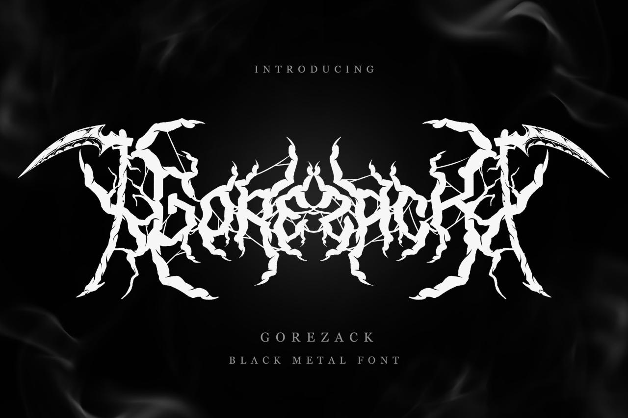
Many fonts possess characteristics that make them ideal for metal band logos. Fonts with sharp edges, for example, create a sense of aggression and danger. Blackletter fonts, with their intricate and often gothic styling, are frequently used for bands with a darker, more theatrical image. Distressed textures, simulating wear and tear, can add a gritty, raw feel, perfectly reflecting the rebellious nature of many metal bands.
Consider the sharp angles of a font like Impact, often used for its aggressive feel, or the more ornate but still powerful aesthetic of a font inspired by old-style blackletter designs. A distressed font might mimic the worn look of a vintage metal poster, adding to its authenticity and appeal.
Font Psychology in Metal Music Branding: Best Metal Band Fonts
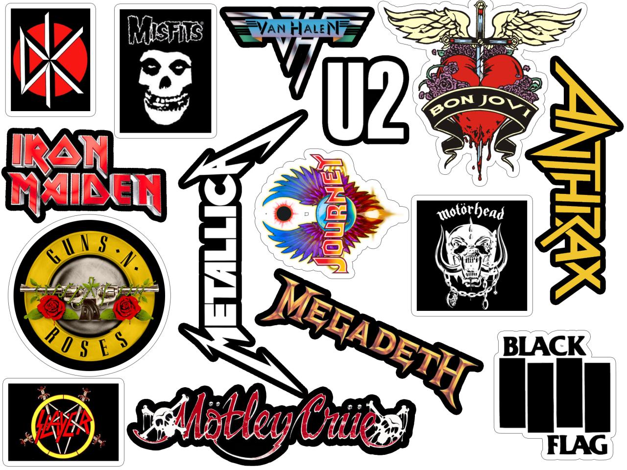
Source: slatic.net
The choice of font in metal music branding isn’t just about aesthetics; it’s a powerful tool for communicating a band’s identity and genre, directly impacting how listeners perceive their music. Different font styles evoke specific emotions and associations, shaping the overall brand experience and influencing listener engagement. A well-chosen font can amplify the band’s message, while a poorly chosen one can dilute or even contradict it.Font selection plays a crucial role in establishing a band’s visual identity and communicating its musical style.
The psychological impact of a font is subtle yet significant, influencing how fans connect with the band on an emotional level. This goes beyond mere readability; it’s about creating a visual representation that resonates with the genre’s established conventions and the band’s unique artistic vision.
Blackletter Fonts versus Sans-Serif Fonts in Metal Music
Blackletter fonts, with their ornate and often angular designs, are frequently associated with traditional heavy metal and black metal subgenres. Their complex forms evoke a sense of history, power, and sometimes even darkness or aggression. They can lend an air of authority and tradition, aligning well with the established imagery of classic metal bands. Conversely, sans-serif fonts, with their clean lines and minimalist aesthetic, project a more modern, sometimes aggressive, or even industrial feel.
They can be used to create a sense of starkness, precision, and even futuristic coldness, which suits certain subgenres of metal like deathcore or some forms of industrial metal. The stark contrast between the two styles illustrates how font choice can significantly alter the perceived mood and genre association of a band. For example, a band using a blackletter font might be perceived as traditional and powerful, while a band using a sans-serif font might be perceived as modern and aggressive, depending on the specific font choice and overall design.
Case Study: Designing a Death Metal Band Logo
Let’s imagine a fictional death metal band called “Necrotic Shrine.” To effectively communicate their brutal and uncompromising sound, a suitable logo needs to reflect this intensity. For this band, I would choose a custom-designed font that combines elements of both blackletter and death metal-specific typographic styles. The font would feature sharp, angular serifs, reminiscent of blackletter, but with exaggerated proportions and brutalized letterforms, reminiscent of the chaotic energy of death metal.
The letters would be heavily distressed, perhaps with a textured appearance suggesting decay and age. This blend creates a visual effect that is both historically rooted and intensely aggressive. The overall effect would aim to visually represent the band’s name in a way that is both dark, powerful, and immediately recognizable within the death metal aesthetic. The intended effect on the audience is to immediately communicate the band’s genre and musical intensity, creating a strong visual identity that is both memorable and fitting for their musical style.
The font would act as a visual amplifier, underscoring the band’s musical brutality and leaving a lasting impression on the listener.
Creative Applications of Metal Fonts
Metal fonts, with their aggressive aesthetics and powerful forms, offer a wealth of creative possibilities far beyond the typical band logo. Their unique characteristics can be leveraged across a range of design applications, enhancing brand identity and creating a strong visual impact. This extends to merchandise, posters, website design, and even unexpected areas like packaging or graphic novels.
The key is understanding how to use these fonts effectively to convey the desired message and maintain visual harmony.
The versatility of metal fonts allows for both subtle and dramatic applications. A subtly distressed typeface might add a gritty edge to a clothing brand’s logo, while a bold, heavily stylized font can dominate a concert poster. The careful selection and implementation of these fonts are crucial in creating a cohesive and impactful brand experience.
T-Shirt Design Incorporating a Custom Metal Font
This design features a black t-shirt with a central graphic showcasing a stylized dragon’s head rendered in a custom metal font. The font itself is inspired by blackletter styles, but with exaggerated serifs that resemble sharp claws and jagged edges, creating a menacing yet elegant look. The dragon’s head is not simply text; it is formed from the letters of the band name “Serpent’s Kiss,” each letter intricately detailed and connected to form the head’s features.
The color scheme is monochromatic, sticking to various shades of grey and black to maintain the gritty feel. The dragon’s eyes are small, glowing red circles, providing a single pop of color against the dark background. The overall aesthetic is dark, powerful, and subtly menacing, reflecting the band’s genre and style.
Effective Combination of Font Styles in a Single Design
Combining different font styles can dramatically enhance visual interest and establish clear hierarchy within a design. For example, a heavy, condensed blackletter font (like the one used for the dragon’s head) can be paired with a clean, sans-serif font for smaller text elements like band information or website URLs. The heavier font commands attention, while the sans-serif font provides readability for secondary information.
This contrast in weight and style creates a visually engaging and easily navigable design. Another effective strategy involves using a script font for a tagline or motto, contrasting the aggressive nature of the primary metal font, adding a layer of depth and sophistication. This careful layering of fonts can transform a simple design into a complex and visually captivating piece.
Legal Considerations of Font Usage
Choosing the right font is crucial for a metal band’s branding; it sets the tone and visual identity. However, using fonts without proper authorization can lead to significant legal problems and financial penalties. Understanding the legal landscape surrounding font usage is essential for any band aiming to build a strong and legally compliant brand.Font licenses, much like music licenses, dictate how a font can be used.
Many fonts are protected by copyright, meaning their design is legally owned by the creator or foundry. Using a copyrighted font commercially without permission constitutes copyright infringement, a serious offense that can result in lawsuits and substantial financial damages. This applies not only to using the font on merchandise like t-shirts and posters but also on a band’s website and social media profiles, if these platforms generate revenue or are used for commercial purposes.
Copyright Infringement and Font Licensing
Copyright infringement occurs when a copyrighted font is used without the permission of the copyright holder. This includes reproducing, distributing, displaying, or adapting the font for commercial purposes. The penalties for copyright infringement can be severe, ranging from cease-and-desist letters and legal fees to significant financial penalties. The amount of damages awarded can vary depending on factors such as the extent of the infringement and the profits made from its use.
For example, a small band using a copyrighted font on a limited run of t-shirts might face a smaller penalty than a major label using the same font extensively on albums and merchandise. Proving the extent of the infringement and the resulting damages is crucial in these cases. Detailed records of font usage and sales figures are essential in such legal disputes.
Obtaining Permission for Commercial Font Use
Securing permission to use a specific font commercially typically involves contacting the font foundry directly. Most foundries have clearly defined licensing options on their websites, outlining the costs and restrictions associated with different levels of usage. The licensing agreement will specify permitted uses (e.g., web use, print use, merchandise) and the number of copies or installations allowed. Negotiating a license might involve submitting a proposal detailing the band’s planned use of the font and the anticipated volume of its application.
The foundry may require payment of a licensing fee, which can vary significantly depending on the font’s popularity and the scope of the band’s intended use. It’s vital to carefully review the terms of any licensing agreement before signing it to ensure that it meets the band’s needs and avoids potential future legal issues. Ignoring the terms of a license, even inadvertently, can still lead to legal repercussions.
Alternative Strategies for Legally Sound Font Design
Instead of using copyrighted fonts, bands can explore several alternatives to create unique and legally sound font designs. Commissioning a custom font from a professional typeface designer offers complete ownership and avoids any copyright infringement risks. This ensures a truly unique visual identity perfectly aligned with the band’s aesthetic. Alternatively, bands can utilize free and open-source fonts available under licenses that permit commercial use.
These fonts often come with limitations, but they provide a cost-effective solution for smaller bands. Modifying existing free fonts by subtly altering their design elements can also create a unique look while staying within the legal boundaries of the original license. However, significant alterations might necessitate legal consultation to ensure compliance. Finally, careful exploration of Creative Commons licenses can reveal fonts that offer suitable commercial use options, provided the specific license terms are adhered to.
Final Thoughts
So, whether you’re a seasoned metalhead crafting your band’s identity or a designer looking to capture the essence of metal, understanding the power of typography is key. The right font can be more than just letters; it can be a weapon, a statement, a visual representation of the sonic fury within. From the sharp angles of blackletter to the raw power of a heavy sans-serif, the world of metal fonts offers endless possibilities for creative expression.
Now go forth and create something truly metal!
Query Resolution
What are some free resources for finding metal-inspired fonts?
Websites like Google Fonts and DaFont offer a wide selection of free fonts, though you might need to sift through to find those with a metal aesthetic. Be sure to check the license before using any font commercially.
How can I avoid copyright infringement when using fonts?
Always check the font’s license. Many fonts are only free for personal use, while commercial use requires a license purchase. Alternatively, consider designing your own custom font to avoid any legal issues.
What are some common mistakes to avoid when designing a metal band logo?
Avoid overly cluttered designs, illegible fonts, and clashing color schemes. Keep it simple, powerful, and memorable. Less is often more in metal logo design.
