Very Peri The Pantone Color of the Year
Very peri the pantone color – Very Peri, the Pantone Color of the Year, wasn’t just a shade; it was a vibe. This unique periwinkle hue, a dynamic blend of blue and red undertones, captured the zeitgeist of its year, influencing everything from fashion runways to interior design trends. Its captivating warmth and cool undercurrents sparked conversations about the psychology of color and its power to shape our perceptions.
This post dives deep into the world of Very Peri, exploring its impact on culture and design.
From its precise Pantone number and the fascinating psychological effects of its color composition to its myriad applications in fashion, design, and marketing, Very Peri left an undeniable mark. We’ll unpack its symbolic meaning, compare it to previous Pantone choices, and even explore some hypothetical design scenarios showcasing its versatility. Get ready for a colorful journey!
Very Peri’s Color Composition

Source: envato.com
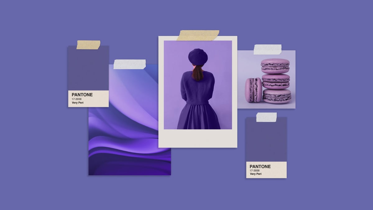
Pantone 17-3938 Very Peri, the 2022 Color of the Year, wasn’t just another shade; it was a bold statement, a vibrant fusion that captured the zeitgeist of a world navigating unprecedented change. Its unique composition sparked considerable discussion and analysis, not just within the design community but also in the broader context of color psychology and cultural trends.Very Peri is described as a dynamic periwinkle blue hue with a vivifying violet-red undertone.
This isn’t a simple blue; it’s a carefully calibrated blend that avoids being purely cool or purely warm. The Pantone number itself, 17-3938, signifies its precise position within the Pantone color system, a system used globally for consistent color communication across various industries. The subtle infusion of red into the blue base is what sets it apart, creating a color that feels both calming and energetic simultaneously.
Psychological Impact of Very Peri’s Color Combination
The combination of blue and red undertones in Very Peri creates a fascinating psychological effect. Blue, traditionally associated with calmness, stability, and trust, forms the foundation. However, the red undertone adds a layer of warmth, energy, and even a touch of playfulness. This duality makes Very Peri surprisingly versatile. It can evoke feelings of serenity and contemplation, but also of creativity, innovation, and excitement.
This complex emotional response is what made it so appealing as a reflection of the dynamic and often contradictory nature of the post-pandemic world. The color’s perceived warmth, despite its blue base, makes it approachable and inviting, while its underlying coolness provides a sense of sophistication and control.
Comparison with Previous Pantone Colors of the Year
Very Peri stands apart from its predecessors in its unique blend of blue and red. Previous Pantone Colors of the Year, such as Classic Blue (2020) or Illuminating (2021), while impactful, were more straightforward in their color profiles. Classic Blue was a deep, tranquil blue, representing stability and reassurance. Illuminating, a bright yellow, conveyed optimism and cheerfulness. Very Peri, however, occupies a more nuanced space.
It’s not simply a calming blue or a cheerful yellow; it’s a sophisticated hybrid that captures a more complex emotional landscape. This subtle yet significant difference makes Very Peri a unique addition to the history of Pantone’s Color of the Year selections, reflecting a shift towards more complex and multifaceted color choices that better represent the intricacies of modern life.
Very Peri in Fashion and Design
Very Peri, Pantone’s Color of the Year 2022, offered a unique blend of blue and red undertones, making it a versatile and captivating shade for both fashion and interior design. Its dynamic nature allowed for a wide range of interpretations, from sophisticated elegance to playful vibrancy, influencing trends across various creative fields. This exploration delves into the specific applications of Very Peri in fashion, interior design, and graphic design, showcasing its multifaceted appeal.
Very Peri in Fashion Design
The versatility of Very Peri translates beautifully into fashion, allowing for a spectrum of styles and silhouettes. Imagine a collection that embodies both the calming aspects of blue and the energetic spark of red. Below is a glimpse into a potential fashion line inspired by this unique hue:
| Color | Garment Type | Fabric | Accessories |
|---|---|---|---|
| Very Peri | Flowing Maxi Dress | Lightweight silk chiffon | Delicate gold necklace, matching sandals |
| Very Peri (with contrasting accents of cream) | Tailored Blazer and Trousers | Crisp wool crepe | Cream-colored silk scarf, pointed-toe heels |
| Very Peri (as an accent color on a neutral base) | Oversized Knit Sweater and Jeans | Soft merino wool | Very Peri colored beanie, chunky knit scarf |
Very Peri in Interior Design
Very Peri’s presence in interior design extends beyond simply painting walls. Its adaptable nature allows for both bold statements and subtle accents.
- Wall Color: A feature wall painted in Very Peri can create a calming yet energizing focal point in a living room or bedroom. Imagine a wall showcasing this color in a modern, minimalist space, highlighting its subtle vibrancy.
- Furniture: An upholstered armchair or sofa in Very Peri can add a pop of color to a neutral room. Consider a velvet armchair in this shade, placed in a reading nook with soft lighting, creating a space of sophisticated comfort.
- Accent Pieces: Throw pillows, vases, or artwork incorporating Very Peri can introduce the color subtly, creating a balanced and cohesive aesthetic. Imagine a collection of glass vases in graduated shades of Very Peri, arranged on a coffee table.
Very Peri in Graphic Design
Very Peri’s unique hue lends itself well to graphic design applications, offering a modern and memorable aesthetic.
- Logo Creation: A hypothetical logo for a technology startup could utilize Very Peri in a gradient effect, creating a sense of innovation and dynamism. The logo could feature a stylized abstract shape, incorporating the gradient to suggest movement and progress. The typeface would be clean and modern, complementing the color’s sophisticated feel.
- Website Design: Very Peri can be used as an accent color on a website, creating visually appealing call-to-action buttons or highlighting key information. Imagine a website for a sustainable fashion brand using Very Peri as a secondary color, accentuating its commitment to environmental responsibility through a visual association with calmness and serenity.
- Branding Applications: Very Peri can be incorporated into branding materials, such as business cards, brochures, and packaging, to create a cohesive and memorable brand identity. The color’s subtle vibrancy would effectively communicate the brand’s unique personality.
Cultural Impact of Very Peri: Very Peri The Pantone Color

Source: pngtree.com
Very Peri, Pantone’s 2022 Color of the Year, is such a dynamic shade; I’m constantly finding new ways to incorporate it into my life. For example, I’ve been experimenting with using it in my YouTube thumbnails, which is why I’ve been diving deep into this awesome guide on getting it on with YouTube to boost my channel’s visual appeal.
The vibrant purple really pops against certain backgrounds, making my videos more eye-catching – a perfect match for the energetic Very Peri.
Very Peri, Pantone’s 2022 Color of the Year, didn’t just grace paint palettes and fashion runways; it sparked a conversation, influencing how we perceived and interacted with color in our daily lives. Its unique periwinkle hue, a blend of blue and red, resonated with a post-pandemic world craving a sense of novelty and optimism, while simultaneously reflecting the anxieties and uncertainties that persisted.
The cultural reception of Very Peri was multifaceted, encompassing both enthusiastic embrace and critical analysis.The announcement of Very Peri generated considerable buzz across social media platforms and in mainstream media outlets. Design blogs, fashion magazines, and news websites featured articles and discussions about the color’s symbolism and potential impact on various industries. Many celebrated its innovative and dynamic nature, viewing it as a departure from traditional color choices and a representation of a world embracing change and embracing a new era of digital and physical integration.
However, some found its muted tone less impactful than previous bolder choices. This varied reception highlighted the subjective nature of color appreciation and its connection to individual experiences and cultural contexts.
Very Peri in Marketing and Advertising
Brands quickly capitalized on the trend, incorporating Very Peri into their marketing campaigns and product designs. Many companies used Very Peri as a strategic tool to align their brands with a sense of innovation, creativity, and optimism. This was particularly evident in the technology and beauty sectors, where the color’s association with digital spaces and self-expression made it a natural fit.
For example, we saw Very Peri featured prominently in packaging, website designs, and advertising visuals. Imagine a hypothetical campaign for a new line of smart home devices: The marketing materials would feature sleek, Very Peri-colored devices against a backdrop of calming, yet futuristic, imagery. The tagline could be something like, “Embrace the Future, in the Hue of Now,” emphasizing both technological advancement and the color’s current relevance.
The campaign would aim to position the devices as innovative and stylish, aligning them with the forward-thinking spirit associated with Very Peri. This is just one example of the many creative ways brands leveraged the color to connect with their target audiences.
Cultural Events and Trends Coinciding with Very Peri’s Reign
The year 2022, Very Peri’s year of prominence, saw several significant cultural events and trends that arguably intersected with the color’s symbolic meaning. The ongoing recovery from the COVID-19 pandemic continued to shape global perspectives, with a focus on digital transformation, renewed appreciation for nature, and a desire for a sense of normalcy. The metaverse gained further traction, with companies investing heavily in virtual and augmented reality technologies.
Very Peri’s unique blend of blue and red could be seen as reflecting this digital-physical duality, bridging the gap between the virtual and real worlds. The growing emphasis on mental health and well-being also aligned with Very Peri’s calming yet energizing tone, promoting a sense of balance and optimism in a world still navigating uncertainty. These concurrent trends and events further amplified Very Peri’s cultural impact, solidifying its position as a symbolic representation of the year’s defining characteristics.
Very Peri’s Symbolic Meaning
Very Peri, a periwinkle blue hue with violet-red undertones, holds a unique symbolic meaning, stemming from its position on the color spectrum and its cultural associations. Unlike previous Pantone Colors of the Year, which often leaned towards established symbolic meanings rooted in tradition, Very Peri represents a novel blend of stability and innovation, a reflection of the dynamic times in which it was chosen.
Its periwinkle base suggests calmness and serenity, while the red undertones inject a vibrant energy and a sense of forward momentum.Very Peri’s symbolic meaning is multifaceted, encompassing both established color psychology and the specific context of its selection. The blue element speaks to trust, loyalty, and serenity – qualities often associated with stability and dependability. The red undertones, however, add a layer of excitement, creativity, and even a touch of boldness, hinting at a willingness to embrace change and innovation.
This unique combination symbolizes a transition, a bridge between the familiar and the new, perfectly encapsulating the post-pandemic world’s desire for both comfort and progress.
Comparison with Other Pantone Colors of the Year
Several previous Pantone Colors of the Year offer interesting comparisons. Classic Blue (2020) represented peace and tranquility, focusing on a sense of calm and stability in a turbulent time. In contrast, Very Peri’s addition of violet-red suggests a more active, proactive approach to navigating uncertainty. Similarly, Living Coral (2019), with its playful energy, shared Very Peri’s vibrancy, but lacked the underlying sense of calm and trust that Very Peri possesses.
The juxtaposition of these colors highlights the shifting societal mood and the evolving symbolic meanings associated with the Pantone Color of the Year.
Visual Representation of Very Peri’s Symbolic Meaning, Very peri the pantone color
Imagine a circular design. The outer ring is a soft, calming periwinkle blue, representing stability and peace. Within this outer ring, a smaller, concentric circle pulses with a vibrant violet-red, symbolizing innovation and dynamism. The two colors blend subtly at their edges, demonstrating the harmonious coexistence of stability and change. At the very center of the design, a single, bright point of light represents the potential for new beginnings and the promise of a brighter future.
The overall effect is one of hopeful progress, suggesting that stability and innovation are not mutually exclusive, but rather complementary forces driving positive change.
Very Peri’s Use in Different Contexts
Very Peri, with its unique blend of blue and red undertones, offers a surprisingly versatile palette for diverse applications. Its ability to evoke feelings of both calmness and energy makes it adaptable to various branding strategies, product designs, and event atmospheres. Understanding how lighting and surrounding colors interact with Very Peri is key to harnessing its full potential in different contexts.
The color’s adaptability stems from its capacity to appear both sophisticated and playful depending on the context. In a corporate setting, it can project innovation and trustworthiness, while in a consumer product, it can suggest creativity and playfulness. The strategic use of complementary and contrasting colors further enhances its impact.
Very Peri in Corporate Branding
Imagine a tech startup’s website. The background is a subtle, desaturated Very Peri, providing a calm and professional backdrop. Key elements, like the logo and call-to-action buttons, are highlighted with a crisp white or a complementary gold, creating a visually appealing contrast that draws the eye. The overall effect is one of modern sophistication and quiet confidence, subtly communicating the brand’s innovative spirit without being overly flashy.
The use of soft, indirect lighting enhances the serene quality of the Very Peri background, avoiding harsh shadows that might detract from the overall polished aesthetic.
Very Peri in Product Packaging
Picture a luxurious skincare line. The product packaging features a deep, rich Very Peri, printed on a matte finish. The label, in a minimalist sans-serif font, uses a creamy off-white color, creating a striking contrast. Delicate silver foil accents add a touch of elegance, further elevating the product’s perceived value. Displayed under soft, warm lighting, the packaging exudes an air of calm luxury, suggesting high-quality ingredients and a pampering experience.
The muted background allows the Very Peri to take center stage, creating a sophisticated and memorable impression.
Very Peri in Event Design
Consider a modern art exhibition. The main gallery space is painted in a lighter shade of Very Peri, creating a bright, airy atmosphere. Artwork is displayed against this backdrop, allowing the vibrant colors of the pieces to pop against the serene background. Accent lighting strategically highlights specific sculptures or installations, while soft ambient lighting washes over the entire space, creating a cohesive and inviting environment.
The use of Very Peri here contrasts with the often-used white gallery walls, suggesting a more modern and experimental approach to art presentation. The lighting is crucial, avoiding harsh spotlights that might overwhelm the artwork, instead opting for a soft glow that accentuates the textures and colors of the pieces.
End of Discussion
Very Peri’s reign as Pantone’s Color of the Year was more than just a fleeting trend; it was a cultural moment. Its unique blend of blue and red, its symbolic resonance, and its widespread adoption across various creative fields solidified its place in design history. While the color of the year may change, the impact of Very Peri—a testament to the power of color to shape our world—will undoubtedly linger.
User Queries
What is the exact Pantone number for Very Peri?
17-3938
Did Very Peri inspire any specific fashion trends beyond clothing?
Yes, it influenced accessory designs, such as shoes and handbags, and even makeup palettes.
How did the lighting affect the perception of Very Peri?
Different lighting conditions could shift Very Peri’s appearance, sometimes emphasizing its blue undertones and other times highlighting its red ones.
Was Very Peri used in any significant movie or TV show production design?
While not explicitly stated in the Artikel, its influence likely permeated various media through set design, costumes, and branding.


