Biggest Pitfall in UX Design User Research Neglect
Biggest pitfall in UX design? Hands down, it’s neglecting user research. I’ve seen countless projects stumble, even crash and burn, because they skipped this crucial first step. Think of it like building a house without blueprints – you might get lucky, but the odds are stacked against you. Proper user research is the foundation upon which a truly user-centered design is built, and ignoring it is a recipe for disaster.
This isn’t just about ticking a box; it’s about deeply understanding your users’ needs, motivations, and frustrations. Are you designing for
-your* idea of what’s best, or are you genuinely solving a problem for real people? The difference is monumental. We’ll delve into why ignoring research is so damaging, explore effective research methods, and uncover how to avoid this common UX design pitfall.
Neglecting User Research
User research is the bedrock of successful UX design. Ignoring it is like building a house without a blueprint – you might end up with something structurally unsound and completely unusable. Failing to understand your users’ needs, behaviors, and pain points will inevitably lead to a frustrating and ultimately unsuccessful product. This post will delve into the critical importance of user research and explore some practical methods to avoid this common pitfall.
A User Persona for a Fictional E-commerce Website
Let’s imagine an e-commerce website selling handcrafted jewelry. A typical user persona might be: Name: Sarah Miller Age: 32 Occupation: Marketing Manager Demographics: Lives in a suburban area, married with one child, earns a comfortable middle-class income. Goals: Find unique, high-quality jewelry for special occasions (birthdays, anniversaries) and everyday wear. Wants a convenient and secure online shopping experience.
Frustrations: Complex website navigation, unclear product descriptions, difficulty finding specific styles, slow shipping times, lack of customer service responsiveness, and concerns about website security.
User Research Methods for a Mobile Banking App
Understanding the user experience of a mobile banking app requires a multifaceted approach. Three distinct research methods can reveal crucial insights:
Understanding the user experience of a mobile banking app requires a multifaceted approach. Three distinct research methods can effectively uncover crucial insights:
- Usability Testing: Observe participants as they use a prototype of the mobile banking app, noting their interactions, struggles, and successes. This provides direct insight into the ease of use and identifies areas of friction in the design. For example, observing users struggling to locate the “transfer funds” function highlights a navigation issue.
- Surveys: Distribute online surveys to a wider audience of potential users to gather quantitative data on their banking habits, app preferences, and satisfaction levels. This can help to quantify the prevalence of certain pain points, such as difficulty understanding transaction fees or lack of clarity regarding security features. For instance, a high percentage of respondents reporting difficulty with the mobile check deposit feature indicates a significant design flaw.
- Contextual Inquiry: Conduct in-person observations of users in their natural environment as they perform banking tasks, such as paying bills or checking balances. This allows researchers to understand the context of use and identify potential usability issues that might not be apparent in a lab setting. For example, observing a user struggling to use the app while commuting reveals a potential issue with one-handed usability.
Qualitative vs. Quantitative User Research
Qualitative and quantitative methods offer complementary perspectives on user experience problems.
Qualitative research focuses on in-depth understanding of user experiences and opinions. Quantitative research focuses on numerical data and statistical analysis to identify trends and patterns.
| Method | Type | Example | Revealed Aspect |
|---|---|---|---|
| User Interviews | Qualitative | In-depth conversations with users about their experiences with a website’s checkout process. | Users’ emotional responses, frustrations, and suggestions for improvement. For example, users might express anxiety about providing credit card information. |
| A/B Testing | Quantitative | Comparing two versions of a website’s homepage to see which one leads to higher conversion rates. | Which design elements are more effective at driving user behavior. For example, a specific button color might lead to a significant increase in clicks. |
Ignoring Accessibility
Accessibility in UX design isn’t just about following guidelines; it’s about ensuring everyone can use your product, regardless of their abilities. Ignoring accessibility severely limits your potential audience and can even lead to legal issues. It’s a fundamental aspect of inclusive design, creating a better experience for all users.
Accessibility Principles for Visually Impaired Users
Designing for visually impaired users requires careful consideration of several key principles. These users rely heavily on assistive technologies like screen readers, which interpret on-screen content verbally. Therefore, clear and logical information architecture is paramount. Meaningful alt text for images provides context for screen readers, while proper heading structure (using H1-H6 tags) helps users navigate the site efficiently.
Sufficient color contrast between text and background ensures readability, even for users with low vision. Keyboard navigation should be fully functional, allowing users to access all interactive elements without a mouse. Finally, clear and concise language avoids ambiguity, making content easier to understand.For example, consider a website showcasing a portfolio of photography. Each image should have detailed alt text describing the subject, composition, and any relevant details.
Instead of “Image of a sunset,” a more descriptive alt text might be: “Vibrant sunset over a calm ocean, featuring a long exposure showcasing the movement of the waves and a fiery orange and pink sky.” Using appropriate heading tags (e.g.,
,
Landscape Photography

Source: themendingmuse.com
) creates a clear structure that screen readers can easily interpret. High color contrast between text and background ensures readability, and all interactive elements should be accessible via keyboard navigation.
Impact of Disabilities on Website Interaction
The following table illustrates how various disabilities impact interaction with a common website feature – the search bar:
| Disability | Impact | Design Solution | Example |
|---|---|---|---|
| Visual Impairment | Difficulty seeing the search bar or inputting text. | Sufficient color contrast, clear labels, keyboard accessibility, screen reader compatibility. | Using a dark gray search bar on a light gray background is poor contrast; a black search bar on a white background is much better. Ensure the search bar is clearly labeled with “Search” or similar. |
| Motor Impairment | Difficulty clicking or precisely targeting the search bar. | Larger target areas, keyboard accessibility, alternative input methods (e.g., voice search). | Make the search bar larger and easier to click. Allow users to activate it and type using the Tab key and Enter key. |
| Cognitive Impairment | Difficulty understanding instructions or interpreting results. | Clear and concise language, simple interface, helpful error messages. | Instead of “Perform a query,” use “Search.” Provide clear instructions on how to use the search bar and what kind of results to expect. |
| Auditory Impairment | No direct impact on using a search bar, but related features like audio feedback may be inaccessible. | Provide visual feedback instead of relying solely on audio cues. | Instead of only playing a sound when the search button is pressed, provide visual feedback such as a loading animation or confirmation message. |
Accessibility Guidelines for a Mobile App (Motor Impairments)
To cater to users with motor impairments, a mobile app should prioritize large, easily-accessible interactive elements. Target areas for buttons and other controls should be significantly larger than the standard size to accommodate users with tremors or limited dexterity. Voice control should be integrated to allow for hands-free operation. Haptic feedback can provide confirmation of actions, and customizable gestures should be available to accommodate different user preferences and abilities.
One of the biggest pitfalls in UX design is neglecting user testing; you need real-world feedback to identify usability issues. This is crucial, even for seemingly straightforward projects like optimizing your YouTube presence, which is why I recommend checking out this insightful guide on getting it on with YouTube to understand how user experience plays a role in channel growth.
Ultimately, ignoring user feedback, whether on YouTube or any other platform, will severely hamper your design’s success.
The app should also support one-handed operation and avoid complex multi-step interactions whenever possible. Consider using switch controls for users who can only activate one button at a time. Finally, thorough testing with users with motor impairments is crucial to identify and address any remaining usability issues.
Overlooking Usability Testing
Usability testing is the cornerstone of effective UX design. It’s the crucial step where you move beyond assumptions and directly observe how real users interact with your product. Ignoring this phase is like building a house without checking the foundation – it might look good initially, but it’s likely to crumble under real-world use. By understanding how users navigate your interface, you can identify pain points, areas of confusion, and opportunities for improvement before your product launches, saving time, money, and frustration down the line.
Three Usability Testing Methods
Choosing the right usability testing method depends on your resources, timeline, and the specific goals of your testing. Each method offers a unique perspective on user behavior, and combining them can provide a comprehensive understanding of your product’s usability.
- Guerrilla Testing: This informal method involves testing your product with readily available participants in an impromptu setting. It’s quick, inexpensive, and great for early-stage feedback. However, the lack of controlled environment and diverse participant pool limits the generalizability of findings. For example, testing a new mobile app with friends at a coffee shop provides rapid feedback but lacks the rigor of a lab setting.
- Moderated Remote Testing: Participants complete tasks on your product remotely, while a moderator observes and guides them via screen sharing and communication tools. This method offers a balance between cost-effectiveness and control. While more structured than guerrilla testing, it can be challenging to capture subtle nonverbal cues. A platform like Zoom could be used to conduct such tests.
- Unmoderated Remote Testing: Participants complete tasks independently, often using specialized software to record their interactions. This is scalable and cost-effective, allowing for a large number of participants. However, the lack of real-time interaction means you miss the opportunity for clarification and deeper understanding of user behavior. Services like UserTesting.com facilitate this type of testing.
Usability Test Plan: New Social Media Platform, Biggest pitfall in ux design
This plan Artikels a moderated remote usability test for a new social media platform. Participant Selection Criteria: We will recruit 10 participants aged 18-35, active users of existing social media platforms (e.g., Instagram, Twitter, Facebook), with varying levels of technological proficiency. This ensures a representative sample of our target audience. Tasks: Participants will be asked to perform a series of realistic tasks, such as creating a profile, posting a message, following other users, and engaging with existing content.
These tasks will be designed to assess key aspects of the platform’s functionality and user experience. Data Collection Methods: We will record participants’ screens and audio during the sessions. We will also collect post-test questionnaires to gather their overall impressions and feedback. Qualitative data (e.g., verbal feedback, observations) and quantitative data (e.g., task completion time, error rate) will be collected.
Analyzing Usability Testing Data and Creating Actionable Recommendations
After collecting data, we’ll analyze it using a mixed-methods approach. Quantitative data (e.g., task completion rates, error rates, time on task) will be analyzed to identify patterns and trends. Qualitative data (e.g., user comments, observations) will be used to gain a deeper understanding of the “why” behind those patterns. We’ll then create a summary report that clearly Artikels the identified usability issues, their severity, and prioritized recommendations for design improvements.
For example, if a significant number of users struggle to upload photos, we’ll recommend redesigning the upload interface for better clarity and intuitive navigation. This process might involve creating user journey maps to visualize user flows and identify friction points.
Failing to Iterate and Refine
Building a successful UX design isn’t a one-and-done process. It’s a journey of continuous improvement, fueled by user feedback and a commitment to refining the design based on real-world usage. Ignoring this iterative process is a major pitfall, often leading to a product that fails to meet user needs and expectations. A static design, untouched by feedback, is a recipe for user frustration and ultimately, design failure.Iterative design is a cyclical process where you design, test, analyze, and then redesign based on the insights gathered.
This involves multiple rounds of testing and refinement, ensuring that the final product is user-centered and effective. Each iteration brings the design closer to perfection, addressing pain points and enhancing the overall user experience. The key is to embrace feedback, both positive and negative, as invaluable information guiding the design’s evolution.
Usability Testing and Design Revisions
Usability testing is the cornerstone of iterative design. It provides crucial data on how real users interact with your design, highlighting areas of friction and opportunities for improvement. For example, imagine conducting usability testing for a new e-commerce website’s shopping cart. During the testing, users struggle to find the “remove item” button, frequently abandoning their carts due to confusion.
This feedback clearly indicates a usability problem. The design revision would then involve making the “remove item” button more prominent, perhaps by increasing its size, changing its color, or relocating it to a more intuitive position. Another example could involve users struggling to understand the checkout process, leading to an increase in cart abandonment. This could be addressed by simplifying the checkout steps, adding clearer instructions, or incorporating progress indicators.
These revisions, directly informed by user feedback, aim to eliminate pain points and improve the overall shopping experience.
Iterative Design Example: Shopping Cart Optimization
Let’s consider a shopping cart design iteration process. In the initial design (Version 1), the “remove item” button was small and subtly placed near the item’s description. Usability testing revealed that many users missed it entirely. Version 2 addressed this by increasing the button’s size and using a contrasting color to make it more noticeable. However, some users still struggled with its placement.
Version 3 moved the button to a more prominent position, directly under the item’s quantity field. Each iteration involved gathering feedback, analyzing the results, and making targeted changes. This iterative approach ensured that the final design addressed the identified usability issue effectively. Another iteration might involve simplifying the quantity adjustment mechanism, based on user feedback highlighting difficulties with incrementing or decrementing items.
A/B Testing for Design Comparison
Once you have several design options for a specific feature, A/B testing allows you to compare their effectiveness directly. This involves presenting two or more variations of a design element (e.g., different button colors, layouts, or checkout flows) to different groups of users and tracking their behavior. By analyzing the data on metrics like conversion rates, click-through rates, and task completion times, you can identify which variation performs best.
For instance, in the shopping cart example, you could A/B test two different checkout button designs: one with a simple “Proceed to Checkout” label and another with a more action-oriented “Complete Purchase Now” label. By tracking the completion rates of each, you could determine which button design is more effective at driving users through the checkout process. This data-driven approach ensures that design decisions are informed and optimized for maximum impact.
Poor Information Architecture

Source: esoftskills.com
A well-designed website feels intuitive and easy to navigate. Poor information architecture, however, can lead to frustrated users, high bounce rates, and ultimately, a failed product. It’s about more than just pretty visuals; it’s the underlying structure that dictates how easily users can find what they need. This often overlooked aspect of UX design can significantly impact a website’s success.A poorly structured website forces users to expend unnecessary cognitive effort searching for information.
This leads to user dissatisfaction and ultimately impacts conversion rates and overall user experience. Imagine trying to find a specific course in a university’s online catalog with a haphazardly organized system – it’s a recipe for frustration. A solid information architecture, on the other hand, provides a clear path for users to reach their goals efficiently and effectively.
Information Architecture for a University Website
Designing intuitive navigation for a large and complex website like a university’s requires a strategic approach. We’ll focus on a hierarchical structure, prioritizing clear labeling and logical grouping of information. The main navigation could include sections like “Academics,” “Admissions,” “Research,” “Student Life,” and “About Us.” Each of these sections would then branch out into more specific sub-sections. For example, “Academics” might include departments, programs, courses, and faculty profiles.
Each page should have clear and concise headings, using consistent terminology throughout the site. Breadcrumbs, showing the user’s location within the site’s hierarchy, are also crucial for orientation. Internal linking should be implemented strategically to connect related content and provide alternative pathways for navigation. A site search function with robust functionality is also essential, allowing users to quickly find specific information even if they struggle with the main navigation.
Sitemap and Wireframes for an Online Course Platform
Let’s imagine a fictional online course platform called “Learnify.” Its sitemap would start with a homepage, branching into sections for “Courses,” “Instructors,” “Resources,” “About Us,” and “Account.” The “Courses” section would further categorize courses by subject, level, and instructor. Wireframes would visually represent the layout of each page, showing the placement of key elements like course listings, search bars, filters, and user accounts.
For instance, the course listing page would show a grid of course cards, each with a title, brief description, instructor name, and image. The instructor page would showcase instructor profiles, their courses, and contact information. The account page would provide access to enrolled courses, progress tracking, and user settings. These wireframes would serve as blueprints, guiding the visual design and ensuring a consistent user experience across the platform.
The Importance of Card Sorting
Card sorting is a valuable user research technique used to improve information architecture. Participants are given index cards, each representing a piece of content from the website. They are then asked to group these cards into categories that make sense to them, and often to name those categories. This provides invaluable insight into how users perceive and categorize information.
There are two main types: open card sorting, where participants create their own categories, and closed card sorting, where they organize cards into pre-defined categories. By analyzing the results of card sorting, designers can identify patterns in user thinking and optimize the website’s structure to align with their mental models. This iterative process ensures that the information architecture is intuitive and reflects how users naturally navigate and search for information.
For example, if a card sorting exercise reveals that users consistently group “financial aid” and “scholarships” together, it suggests that these items should be grouped together on the website rather than being placed in separate, unrelated sections.
Ignoring Context of Use
Designing a user experience that truly resonates requires understanding far more than just the user’s goals; it demands a deep understanding of thecontext* in which they’ll be interacting with your design. Ignoring this context – the where, when, and how – can lead to a frustrating and ultimately unusable product, no matter how aesthetically pleasing or feature-rich it might be.
A beautifully designed website is useless if it’s impossible to navigate on a small phone screen while commuting, for example.Context of use encompasses a wide range of factors, significantly impacting the user’s ability to effectively interact with a system. These factors include the physical environment (location, noise levels, lighting), the technological environment (device type, network connectivity), and the temporal environment (time of day, time constraints, urgency of the task).
Failing to consider these factors leads to designs that are impractical, inefficient, and ultimately fail to meet user needs.
Designing for Different Contexts
Consider the stark difference between using a mobile banking app at home versus on a crowded commuter train. At home, the user likely has ample time, good lighting, and a comfortable position. They can carefully review transactions, complete forms, and navigate complex menus without pressure. On a train, however, the user is likely juggling multiple tasks, dealing with distractions, and facing limited screen real estate and potentially poor network connectivity.
A design that works well at home might be completely unusable on the train. Therefore, designing for these varying contexts requires a different approach. For example, a mobile banking app designed for use on public transport should prioritize simplicity, minimize input requirements, and offer clear, concise information. Features that require extensive input or concentration might be better suited for use in a less demanding environment.
Contextual Influence on Interactive Elements
The context of use significantly influences the design of interactive elements like buttons and menus. For instance, buttons on a website viewed on a desktop computer can be smaller and more closely spaced than buttons on a mobile app used on a smaller screen. Similarly, complex nested menus, appropriate for a desktop experience, might be replaced with a simpler, flat menu structure on a mobile device to ensure ease of navigation and reduce the likelihood of accidental selections.
A touchscreen interface requires larger, more easily tappable buttons than a mouse-driven interface. Furthermore, time constraints heavily influence the design of interactive elements. In a time-sensitive application, like an emergency response system, quick access to critical functions is paramount, necessitating large, clearly labeled buttons and minimal steps to complete the task. Conversely, an application used for leisurely browsing can afford a more complex and nuanced interface.
Ignoring Visual Design Principles

Source: prosperousim.com
Ignoring visual design principles is a critical pitfall in UX design, often leading to a frustrating and ineffective user experience. A website, app, or any digital product, no matter how functional, will struggle to gain traction if its visual presentation is confusing, unappealing, or simply difficult to navigate. Effective visual design is about more than just aesthetics; it’s about guiding the user effortlessly through the interface and ensuring information is easily consumed and understood.Visual hierarchy and visual clutter significantly impact user experience.
A well-structured visual hierarchy guides the user’s eye naturally to the most important information first, creating a clear path to completion of their task. Conversely, visual clutter, resulting from an excessive amount of competing elements, disorients the user and makes it difficult to find what they need. Imagine a website homepage crammed with text, images, buttons, and animations, all vying for attention.
The user is overwhelmed, unable to discern the key message or call to action. In contrast, a homepage with a clear visual hierarchy, using size, color, and whitespace effectively, would guide the user directly to the main content, promoting engagement and reducing frustration. For example, a website selling handcrafted jewelry might prioritize high-quality images of the jewelry, placing them prominently above text descriptions and calls to action.
Visual Hierarchy and Clutter Impact on User Experience
Effective visual hierarchy uses size, color, and placement to direct the user’s gaze. Larger, brighter, and centrally located elements naturally draw more attention. Conversely, smaller, less saturated, and peripherally placed elements recede into the background. This creates a visual flow that guides the user through the information in a logical sequence. A lack of visual hierarchy leads to visual clutter, making the interface overwhelming and confusing.
For example, a poorly designed e-commerce website might display all products with equal prominence, making it difficult for users to find what they’re looking for. In contrast, a well-designed website would use visual hierarchy to highlight featured products or sales, guiding users toward specific items. Using whitespace effectively also contributes to a clean and uncluttered design, allowing elements to breathe and preventing visual overload.
Applying Gestalt Principles to Homepage Design
Gestalt principles are rules of perception that describe how humans visually organize information. Applying these principles can significantly improve a website’s homepage design. For example, the principle of proximity suggests that elements placed close together are perceived as a group. On a homepage, this could mean grouping related items, such as product categories or navigation links, together to improve scannability and comprehension.
The principle of similarity suggests that similar elements are perceived as a group. This can be used to create visual consistency by using the same font, color, or style for related elements. The principle of closure suggests that humans tend to complete incomplete shapes. This can be used to create interesting visual effects, but should be used cautiously to avoid ambiguity.
The principle of continuity suggests that the eye follows lines and curves. This can be used to create a visual flow through the homepage, guiding the user’s eye to important information. Finally, the principle of figure-ground describes the relationship between an object (figure) and its background (ground). A well-designed homepage ensures that the main content is clearly distinguished from the background.
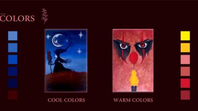
Color Theory and User Experience
Color theory significantly impacts user experience. Color evokes emotions, creates associations, and influences perceptions. An effective color palette supports the brand identity, enhances readability, and guides the user’s attention. For example, a website for a calming spa might use soft blues and greens, while a website for a high-energy sports brand might use bright reds and oranges. Ineffective color palettes can be jarring, distracting, or even inaccessible to users with color vision deficiencies.
Consider the contrast between text and background colors – sufficient contrast is crucial for readability and accessibility. A website using dark text on a dark background would be extremely difficult to read. Conversely, a website using high contrast, such as white text on a dark background, or vice versa, would be more accessible and easier to read.
Understanding color psychology and applying it thoughtfully is crucial for creating a positive user experience.
Epilogue
Ultimately, avoiding the biggest pitfall in UX design – neglecting user research – boils down to empathy and a commitment to understanding your users. It’s about moving beyond assumptions and embracing a data-driven approach. By prioritizing user research, incorporating accessibility considerations, and iterating based on real user feedback, you’ll not only create a better product but also build a stronger connection with your audience.
Remember, the user is always at the heart of successful design. So, ditch the guesswork and embrace the power of understanding your users. Your product (and your sanity) will thank you for it!
Quick FAQs: Biggest Pitfall In Ux Design
What’s the difference between usability testing and A/B testing?
Usability testing focuses on observing users interacting with your design to identify pain points and areas for improvement. A/B testing compares two different versions of a design element to see which performs better based on metrics like click-through rates.
How much user research is enough?
There’s no magic number. It depends on your project’s scope, complexity, and risk tolerance. Start with a minimum viable amount of research to validate core assumptions and iterate based on the findings. The more crucial the design, the more research you should conduct.
What if I have a limited budget for user research?
Prioritize your research questions. Focus on the most critical aspects of your design. Consider using cheaper methods like surveys and heuristic evaluations before moving to more expensive options like user interviews.