Birth of a Logo From Idea to Brand Mark
Birth of a logo: It’s more than just slapping some shapes together; it’s a journey! From the initial spark of an idea, fueled by client needs and market research, to the final polished product ready to represent a brand, the creation of a logo is a fascinating process. This post delves into every stage, from brainstorming and sketching to digital refinement and final presentation, revealing the creative decisions and meticulous work involved in bringing a logo to life.
We’ll explore different design approaches, the power of color psychology and typography, and the crucial role of testing and iteration. Get ready to witness the transformation from abstract concepts to a powerful visual identity—a symbol that embodies a brand’s essence and resonates with its target audience. We’ll even share some tips and tricks learned along the way, offering insights into the challenges and triumphs inherent in this exciting creative endeavor.
The Conceptualization Phase
The birth of a logo is rarely a spontaneous event; it’s a carefully orchestrated process of brainstorming, research, and refinement. This conceptualization phase is crucial, laying the foundation for a brand’s visual identity and lasting impact. It’s where the raw idea, a spark of inspiration, is nurtured and shaped into a tangible representation of a company’s essence.
Client Needs and Brand Identity, Birth of a logo
Understanding the client’s needs and desired brand identity is paramount. This involves in-depth discussions, exploring their business goals, target audience, and competitive landscape. We delve into their brand values – what makes them unique, their mission statement, and the overall message they wish to convey. For example, a tech startup aiming for innovation would require a vastly different logo than a traditional bakery emphasizing warmth and comfort.
This initial phase often includes questionnaires, mood boards, and competitor analyses to ensure a comprehensive understanding.
Creative Approaches to Logo Design
Designers employ diverse creative approaches when tackling a new logo. Two contrasting methods are the abstract and the representational. The abstract approach focuses on creating a symbolic mark, often using geometric shapes and typography to evoke a feeling or concept. Think of the Nike swoosh – a simple, yet powerful symbol representing movement and speed. In contrast, the representational approach involves directly depicting elements related to the business.
A logo for a coffee shop might feature a coffee bean or a coffee cup. Both approaches have their strengths; abstract logos are versatile and memorable, while representational logos clearly communicate the business’s nature. The choice depends on the brand’s personality and marketing strategy.
Market Research Influence on Initial Concepts
Market research plays a pivotal role in shaping the initial design concepts. Analyzing competitors’ logos helps identify trends and avoid visual clichés. Understanding the target audience’s preferences – their age, lifestyle, and cultural background – informs design choices. For instance, a logo for a youth-oriented brand might incorporate bold colors and modern typography, while a logo for a luxury brand might opt for a more sophisticated and minimalist aesthetic.
This research ensures the logo resonates with its intended audience and effectively communicates the brand’s message within the competitive market.
Mood Boards and Initial Sketches
Mood boards and initial sketches serve as visual brainstorming tools. They capture the initial design direction, exploring different visual styles and color palettes. A mood board might include images, textures, typography samples, and color swatches, creating a cohesive visual narrative. Initial sketches explore various logo concepts, experimenting with different shapes, symbols, and typography. These sketches are often rough and exploratory, serving as a springboard for more refined designs.
| Mood Board 1: Tech Startup Image description: A mood board featuring images of circuit boards, futuristic architecture, vibrant gradients, and clean sans-serif typography. The overall feeling is modern, innovative, and energetic. |
Mood Board 2: Organic Bakery Image description: A mood board featuring images of rustic bread, wheat fields, warm earthy tones, and handwritten fonts. The overall feeling is natural, wholesome, and inviting. |
Sketch 1: Abstract Logo Concept Image description: A sketch showing a stylized abstract shape, possibly a combination of geometric forms, conveying a sense of balance and harmony. |
Sketch 2: Representational Logo Concept Image description: A sketch depicting a simplified illustration of a coffee bean, with a focus on clean lines and a modern aesthetic. |
Sketching and Refinement: Birth Of A Logo
Taking a brilliant logo concept and transforming it into a tangible visual masterpiece is where the magic truly happens. This stage, the sketching and refinement phase, bridges the gap between abstract ideas and concrete visual representations. It’s a process of iterative exploration, where initial concepts are fleshed out, refined, and ultimately perfected through a series of sketches and revisions.The transition from abstract ideas to visual representations involves a delicate balance between capturing the essence of the brand and creating a visually appealing design.
This requires careful consideration of the brand’s personality, target audience, and overall message. It’s not just about drawing; it’s about communicating a feeling, a story, and an identity.
Sketching Techniques in Logo Design
Effective sketching is crucial in logo design. It allows for rapid experimentation and exploration of different ideas without the constraints of digital tools. Various techniques can be employed, each with its own advantages. Quick, loose sketches help generate a wide range of ideas, while more detailed sketches allow for refinement of specific elements. Thumbnails, small quick sketches, are invaluable for exploring many variations at once.
More refined sketches, on the other hand, allow for a greater focus on details and proportions. Using different tools like pencils, pens, or even charcoal can add texture and character to the sketches.
Iterative Design and Feedback
Iterative design is the cornerstone of successful logo creation. It’s a cyclical process involving repeated refinement based on feedback and analysis. The initial sketches serve as a foundation, upon which subsequent iterations are built. Gathering feedback from colleagues, clients, and potential customers is crucial at each stage. This feedback helps identify areas for improvement, refine the design’s strengths, and address any potential weaknesses.
This collaborative process ensures the final logo effectively communicates the brand’s message and resonates with its target audience. For example, a client might initially prefer a more playful logo but after seeing the final options decide a more serious and sophisticated logo is better suited to their needs.
Logo Sketch Examples
Below are three distinct logo sketches for hypothetical companies, illustrating the diversity of approaches in logo design.
Sketch 1: Tech Startup – “Innovatech”
This logo uses a stylized circuit board design, forming the letter “I” for Innovatech. The lines are clean and modern, reflecting the technological nature of the company. The color scheme is a vibrant teal and electric blue, suggesting innovation and energy. The overall style is minimalist and sleek.
Sketch 2: Coffee Shop – “The Daily Grind”
This logo features a coffee bean cleverly integrated into a circular design, reminiscent of a rising sun. The color palette consists of warm browns and a rich cream, evoking the comforting feeling of a cozy coffee shop. The font is a slightly rustic serif typeface, adding a touch of traditional charm.
Sketch 3: Non-Profit Organization – “Hope Haven”
This logo incorporates a simple, yet powerful image of a house with a heart as its roof. The style is clean and straightforward, emphasizing the organization’s focus on providing shelter and support. The color scheme is calming and reassuring, using soft blues and greens. The overall message is one of hope, safety, and community.
Digitalization and Vectorization
So, you’ve got your amazing hand-drawn sketches, the culmination of countless hours of brainstorming and refinement. Now it’s time to bring your logo concept into the digital realm – a crucial step in making it usable and scalable for any application, from business cards to billboards. This involves the process of digitalization and vectorization, transforming your analog creation into a precise, infinitely scalable digital asset.This process is all about transforming your rough sketches into clean, crisp vector graphics.
Vector graphics are made up of mathematical equations that define lines, curves, and shapes, allowing for resizing without any loss of quality. This is in stark contrast to raster graphics (like JPEGs or PNGs), which are composed of pixels and become blurry when enlarged. For a logo, which needs to be used at various sizes, vector format is absolutely essential.
Vector Graphics Software and Tools
The software you choose will heavily influence your workflow. Popular choices include Adobe Illustrator, a professional industry standard known for its power and versatility; Affinity Designer, a strong and more affordable alternative; and Inkscape, a free and open-source option ideal for beginners or those on a budget. These programs provide a suite of tools for creating and manipulating vector shapes, including pen tools for drawing precise lines and curves, shape tools for creating basic geometric forms, and type tools for adding text.
Beyond the core software, many designers utilize graphic tablets for a more natural drawing experience, mimicking the feel of pen on paper.
Vector Graphics Formats: A Comparison
Several vector formats exist, each with its strengths and weaknesses. The most common are SVG (Scalable Vector Graphics), EPS (Encapsulated PostScript), and AI (Adobe Illustrator). SVG is an open standard, widely supported by web browsers and readily usable online. EPS is a more traditional format, often used for print, and maintains compatibility with older software. AI is proprietary to Adobe Illustrator, offering maximum compatibility within the Adobe Creative Suite but less universally compatible.
Choosing the right format depends on the intended use of the logo. For web use, SVG is usually preferred for its broad compatibility and ease of embedding. For print, EPS might be a better choice, ensuring compatibility with print design software.
Creating a Simple Logo in Vector Software: A Step-by-Step Guide
Let’s imagine we’re creating a simple logo for a fictional coffee shop called “The Daily Grind.” We’ll use a stylized coffee bean as the central element.
1. Sketch Import (or Digital Creation)
Begin by importing a scanned image of a hand-drawn coffee bean sketch into your chosen vector software. Alternatively, if you’re working entirely digitally, you’d start by creating the coffee bean shape using the software’s pen or shape tools.
2. Tracing and Refining
Use the software’s pen tool to trace the Artikel of the coffee bean, creating a clean vector path. This step requires precision, carefully following the contours of your original sketch. Adjust anchor points and curves to achieve a smooth, polished shape.
3. Adding Details
Once the main shape is complete, add details like shading or highlights using additional vector shapes. You could create subtle gradients or use different shades of brown to give the coffee bean a more three-dimensional appearance.
4. Typography
Add the text “The Daily Grind” using the software’s type tool. Experiment with different fonts to find one that complements the coffee bean’s style. Adjust the font size, kerning (spacing between letters), and leading (spacing between lines) to ensure readability and visual balance.
5. Color Palette
Seeing a logo come to life is such a rush! It’s amazing to watch a simple idea evolve into a visual representation of a brand. This whole process reminded me of how much effort goes into building a successful YouTube channel, as outlined in this great article on getting it on with YouTube ; both require dedication and a clear vision.
Ultimately, the birth of a logo, like a thriving YouTube presence, is a testament to hard work and strategic planning.
Choose a color palette that reflects the brand’s identity. For “The Daily Grind,” a warm brown for the coffee bean and a complementary color like a muted green or cream for the text might be appropriate.
6. Arrangement and Refinement
Arrange the coffee bean and text elements to create a visually appealing composition. Ensure there’s sufficient spacing between the elements and that the overall design is balanced and harmonious. Continue to refine the design, making subtle adjustments until you achieve the desired aesthetic.
7. Export
Finally, export the logo in the appropriate format (SVG for web, EPS for print) at the required resolution. Remember to save multiple versions at different sizes for flexibility.
Color Palette and Typography
Source: dezeen.com
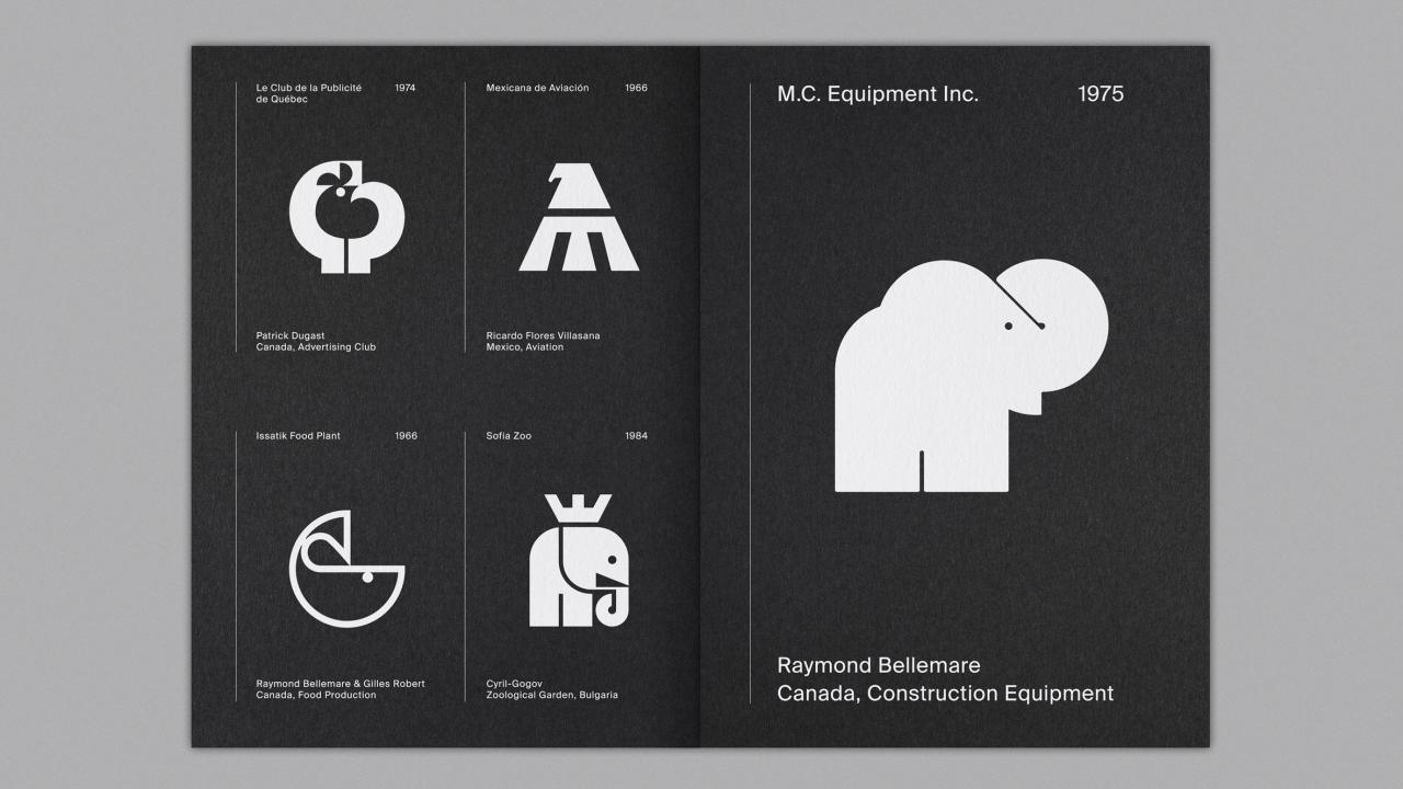
The visual identity of a brand is significantly shaped by its color palette and typography. These elements work in tandem to create a cohesive and memorable impression on the audience, influencing perceptions of quality, trustworthiness, and brand personality. A well-chosen color palette and typography style can elevate a logo from merely functional to truly impactful.
Color Psychology and Brand Perception
Color psychology plays a crucial role in logo design. Different colors evoke distinct emotions and associations. For instance, blue often signifies trust and stability, while red represents energy and passion. Green is associated with nature and growth, while yellow conveys optimism and happiness. Understanding these associations is critical for selecting colors that align with the brand’s values and target audience.
A tech company might opt for blues and greens to project reliability and innovation, whereas a food brand might use warmer tones like oranges and yellows to suggest warmth and appetite. The wrong color choice can inadvertently communicate the opposite of the intended message, potentially harming brand perception.
Font Styles and Brand Identity
The choice of font significantly impacts the overall aesthetic and readability of a logo. Serif fonts, characterized by small decorative strokes at the ends of letters (like Times New Roman), often project a classic and traditional feel. Sans-serif fonts (like Arial or Helvetica), lacking these strokes, tend to appear modern and clean. Script fonts, mimicking handwriting, can convey elegance and personality.
The selection should complement the brand’s personality and intended message. A luxury brand might utilize an elegant serif font, while a playful startup might choose a bold sans-serif font. Legibility is paramount; the font should be easily readable at various sizes and resolutions.
Example Color Palette for a Fictional Brand: “Evergreen Wellness”
This fictional brand focuses on sustainable and holistic wellness products. We’ll create a color palette reflecting nature, calmness, and growth.
| Color Name | Hex Code | RGB Value | Color Description |
|---|---|---|---|
| Forest Green | #228B22 | (34, 139, 34) | Represents nature, growth, and stability. A deep, earthy green evokes feelings of calmness and trustworthiness. |
| Soft Teal | #40E0D0 | (64, 224, 208) | Adds a touch of serenity and freshness, complementing the forest green while maintaining a natural feel. |
| Creamy Beige | #F5F5DC | (245, 245, 220) | Provides a neutral base, balancing the bolder greens and adding a sense of warmth and sophistication. |
| Olive Green | #808000 | (128, 128, 0) | Adds depth and variation to the palette, creating visual interest without clashing with the other colors. It subtly hints at earthiness and sustainability. |
Typography’s Contribution to Logo Impact and Readability
Typography is more than just choosing a font; it’s about selecting the right typeface, size, weight, and spacing to ensure both aesthetic appeal and clear communication. The font style should be consistent with the brand’s overall message and personality. A logo’s readability is critical; if the brand name is difficult to decipher, the logo’s effectiveness is significantly diminished.
Factors like kerning (spacing between individual letters) and tracking (spacing between words) play a crucial role in ensuring optimal readability and visual balance. The font’s weight (boldness) should be chosen to ensure the logo is easily visible and impactful, even at smaller sizes. For example, a logo for a law firm might use a classic serif font in a bold weight to project authority and trust, while a children’s toy brand might opt for a playful sans-serif font in a lighter weight.
Testing and Iteration
Source: f-cdn.com
So, you’ve got your beautiful logo sketches digitized, the colors are popping, and the typography is on point. But before you declare victory and plaster it everywhere, there’s one crucial step: rigorous testing and iteration. This isn’t just about making sure it looks good; it’s about ensuring it works effectively as a brand identifier and resonates with your target audience.
A well-tested logo is a successful logo.The testing phase is where your design truly gets put to the test, allowing you to identify and address any weaknesses before they impact your brand’s perception. This iterative process is key to refining your logo and maximizing its impact.
User Feedback Methods
Gathering user feedback is paramount. This helps you understand how your target audience perceives your logo. Different methods provide varying insights. For example, online surveys can reach a broad audience, allowing you to collect quantitative data on preferences. Focus groups, on the other hand, offer deeper qualitative feedback through discussions and observations.
A/B testing, comparing two slightly different versions of the logo, can pinpoint specific design elements that resonate most strongly. Remember to target your feedback collection to your specific demographic to ensure relevance. For example, if you’re designing a logo for a youth-oriented brand, you would focus on getting feedback from young people.
Logo Scalability and Application Across Mediums
A truly effective logo needs to be versatile. It should look equally sharp on a business card as it does on a billboard. This involves checking its scalability: does it maintain clarity and legibility when scaled down to small sizes (like a website favicon) or scaled up to large sizes (like a banner)? Test your logo on different mediums: print (business cards, brochures), digital (website, social media), merchandise (t-shirts, mugs), and even consider how it would appear as a watermark or embossed element.
A poorly designed logo will often lose its impact or become illegible when scaled or applied to different mediums. The core elements must remain recognizable and visually appealing across all applications.
Addressing Design Flaws
During the testing phase, you might discover flaws – perhaps the color palette clashes on certain backgrounds, or the font is hard to read at smaller sizes. These issues are opportunities for improvement, not failures. Based on the feedback, you can iterate on your design. This could involve tweaking the color palette, adjusting the font, simplifying complex elements, or refining the overall composition.
Each iteration should be documented and tested again to ensure the improvements are effective and don’t introduce new problems. Remember, the goal is to create a logo that is both aesthetically pleasing and functionally effective across various applications.
Examples of Successful and Unsuccessful Logo Iterations
- Successful Iteration: The evolution of the Apple logo. The original design was far more detailed and complex, featuring a realistic depiction of Newton under an apple tree. Over time, it was simplified to the iconic, minimalist apple silhouette we know today. This simplification improved scalability and memorability.
- Unsuccessful Iteration: The infamous Gap logo redesign of 2010. The updated logo, while modern, lacked the iconic simplicity and emotional connection of the previous design. The negative user response led to a swift reversal of the change, highlighting the importance of thorough testing and user feedback before implementing major logo alterations.
Finalization and Presentation

Source: gingersauce.co
The culmination of the logo design process is a crucial stage – not just the final touches on the artwork itself, but also the careful preparation for its presentation and handover to the client. This phase ensures a smooth transition from design to implementation and sets the stage for the successful launch of the brand. It’s about more than just a pretty picture; it’s about providing a comprehensive and usable asset.The final steps involve meticulous quality checks, ensuring the logo is consistent across various formats and applications.
This ensures the logo looks its best regardless of where it’s used. This also includes preparing comprehensive usage guidelines for the client to ensure consistent brand application.
File Formats and Applications
Different file formats are optimized for specific applications. Choosing the right format is crucial for maintaining the logo’s quality and integrity. For example, a high-resolution vector format like SVG is ideal for scalable applications on the web and for large-format printing. Raster formats such as PNG and JPG are better suited for web use where file size is a concern, although quality can be compromised at smaller sizes with JPG.
A print-ready PDF is usually needed for print applications requiring high-quality output.
- SVG (Scalable Vector Graphics): Best for web use and applications requiring scalability without loss of quality. Vectors are resolution-independent, meaning they can be scaled to any size without pixelation.
- PNG (Portable Network Graphics): Supports transparency, making it suitable for logos with transparent backgrounds, especially for web use.
- JPG (JPEG): A widely used raster format, suitable for web use but with potential quality loss when scaling or editing. Generally best for photographic images rather than logos.
- PDF (Portable Document Format): Ideal for print-ready files, ensuring consistent color and quality across different printers and devices. A print-ready version should include bleed and crop marks.
Presenting the Final Logo to the Client
Presenting the final logo isn’t simply about showing the finished product; it’s about explaining the design journey and justifying the design choices. A strong presentation builds confidence and trust, demonstrating the value and thought behind the logo. It’s an opportunity to highlight the key features, the design process, and the logo’s alignment with the client’s brand objectives. Consider a concise and visually appealing presentation, perhaps using a slideshow format.
Hypothetical Presentation Slide: Logo Design Process and Key Features
This slide would showcase the logo’s evolution from initial concepts to the final design.
The design process began with understanding the client’s brand values: innovation, trust, and reliability.
The slide would include a visual timeline:* Conceptualization: Showcasing initial mood boards and concept sketches.
Sketching & Refinement
Displaying several iterations of the logo design, highlighting the evolution of the form and elements.
Digitalization & Vectorization
Illustrating the transition from sketches to a polished digital version.
Color Palette & Typography
Showcasing the chosen color scheme and typography, and explaining the rationale behind them.
Testing & Iteration
Showcasing the testing process, feedback received, and how the design was adjusted based on feedback.
Final Logo
Presenting the final, polished logo in various formats.
The final logo utilizes a modern, clean sans-serif typeface to convey professionalism and trustworthiness. The color palette, a combination of [e.g., deep blue and vibrant green], reflects the client’s commitment to both stability and growth.
The slide would conclude with a clear summary of the logo’s key features and its alignment with the client’s brand objectives. This demonstrates a clear understanding of the design process and the client’s needs.
Final Conclusion
Creating a logo is a collaborative and iterative process, a true testament to the power of creative problem-solving and thoughtful design. From initial brainstorming sessions to the final unveiling, each stage plays a vital role in shaping the brand’s visual identity. The success of a logo ultimately hinges on its ability to capture the essence of the brand, resonate with its target audience, and stand the test of time.
So, the next time you see a logo, remember the journey it took to get there—a journey filled with creativity, precision, and a whole lot of passion.
Questions and Answers
What’s the difference between a logo and a brand?
A logo is a visual element – the symbol or icon. A brand is the overall perception and experience associated with a company, encompassing its logo, messaging, and customer interactions.
How long does it take to design a logo?
It varies greatly depending on complexity and client involvement, but expect anywhere from a few weeks to several months.
How much does logo design cost?
Pricing depends on the designer’s experience and the project scope. Expect a wide range, from a few hundred to several thousand dollars.
What file formats should I get for my logo?
You’ll want vector formats (AI, EPS, SVG) for scalability and raster formats (PNG, JPG) for web use.


