Best Cool Google Slides Themes A Stylish Guide
Best cool Google Slides themes aren’t just about pretty pictures; they’re about crafting presentations that truly resonate. This guide dives deep into what makes a theme “best” and “cool,” exploring popular styles, free vs. premium options, and the crucial role of visual elements and accessibility. Get ready to transform your presentations from drab to fab!
We’ll unpack the key elements of effective presentation design, from understanding color palettes and typography to mastering visual hierarchy and ensuring your slides are inclusive and accessible to everyone. Whether you’re a seasoned pro or just starting out, this guide will equip you with the knowledge and resources to create presentations that not only look amazing but also effectively communicate your message.
Defining “Best” and “Cool” in Google Slides Themes
Choosing the perfect Google Slides theme can significantly impact the effectiveness of your presentation. The terms “best” and “cool” are subjective, but we can establish objective criteria to guide your selection process and ensure your slides are both visually appealing and functionally sound. This allows for a more informed and confident choice, leading to a presentation that truly shines.Defining “best” involves a multifaceted assessment.
It’s not simply about aesthetics; functionality and user experience play crucial roles. A “cool” theme, on the other hand, often evokes a sense of modernity, sophistication, or perhaps a playful energy, depending on the context. Let’s explore these concepts in more detail.
Criteria for Evaluating the “Best” Google Slides Themes
The ideal Google Slides theme balances aesthetic appeal with practical functionality. Several key factors contribute to a theme’s overall quality. These factors should be considered when comparing different themes to determine which one best suits your needs and presentation goals.
- Visual Hierarchy and Readability: A good theme prioritizes clear visual hierarchy, ensuring that important information stands out. This is achieved through strategic use of font sizes, weights, colors, and spacing. Readability is paramount; the text should be easily legible against the background.
- Color Palette and Consistency: A cohesive color palette is essential. The colors should complement each other and align with the overall tone of the presentation. Consistency in color usage throughout the slides enhances professionalism and improves viewer comprehension.
- Layout and Structure: A well-structured layout provides a clear framework for your content. The arrangement of text and images should be logical and intuitive, guiding the audience’s eye smoothly through the information.
- Flexibility and Customization: The best themes offer ample customization options. This allows you to tailor the theme to your specific needs without compromising its core design elements. The ability to easily change colors, fonts, and layouts is crucial.
- Accessibility: Consideration for accessibility is vital. The theme should adhere to accessibility guidelines, ensuring readability for individuals with visual impairments. This might involve sufficient color contrast and appropriate font choices.
Elements Contributing to a “Cool” Aesthetic, Best cool google slides themes
While “cool” is subjective, certain design elements consistently contribute to a modern and visually engaging aesthetic. These elements often reflect current design trends and evoke a sense of sophistication or playful energy.
- Minimalist Design: Clean lines, ample white space, and a restrained use of visual elements create a sense of sophistication and clarity. This approach avoids visual clutter, allowing the content to take center stage.
- Geometric Shapes and Patterns: Subtle geometric patterns or shapes can add visual interest without overwhelming the design. These elements often convey a sense of modernity and structure.
- Modern Typography: Choosing a contemporary font family can significantly enhance the overall aesthetic. Fonts with clean lines and a modern feel contribute to a polished and professional look.
- Muted Color Palettes: Sophisticated color palettes often incorporate muted tones and earthy colors. These create a calming and refined atmosphere, particularly effective for professional presentations.
- Creative Use of White Space: Strategic use of white space can enhance the visual appeal and readability of the slides. It prevents the slides from feeling cramped and allows the audience to easily digest the information.
Objective Evaluation of Google Slides Themes
Using the criteria Artikeld above, you can objectively evaluate Google Slides themes. For instance, you can score each theme based on readability, color palette consistency, layout effectiveness, customization options, and accessibility features. This structured approach allows for a comparative analysis, helping you choose the theme that best meets your specific requirements. Consider creating a scoring rubric with weighted categories to further refine your evaluation process.
For example, readability might be weighted higher than the specific use of geometric shapes, depending on the presentation’s purpose.
Popular Google Slides Theme Styles
Choosing the right Google Slides theme can significantly impact the effectiveness of your presentation. The visual style you select sets the tone, influences audience perception, and ultimately helps communicate your message more clearly. Understanding the characteristics of popular theme styles is crucial for making informed design choices.
This section explores five prevalent Google Slides theme styles, outlining their typical design elements and suggesting appropriate use cases. By understanding these styles, you can select a theme that best suits your content and desired impact.
Minimalist Google Slides Themes
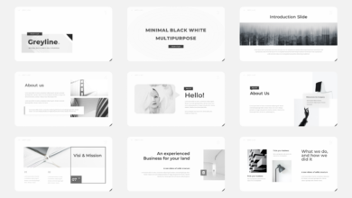
Minimalist themes prioritize simplicity and clean aesthetics. They often feature a limited color palette, typically using one or two main colors with subtle variations for accents. Typography is usually straightforward, employing one or two sans-serif fonts for readability. Imagery, if included, is sparse and high-quality, serving to enhance the core message rather than distract from it. Think clean white backgrounds, bold headlines, and a focus on clear, concise information.
Modern Google Slides Themes
Modern themes embrace contemporary design trends. They often incorporate geometric shapes, bold color combinations (sometimes including gradients), and a mix of sans-serif and serif fonts to create visual interest. Imagery is frequently abstract or uses high-resolution photos with a contemporary feel. The overall effect is sleek, stylish, and sophisticated.
Playful Google Slides Themes
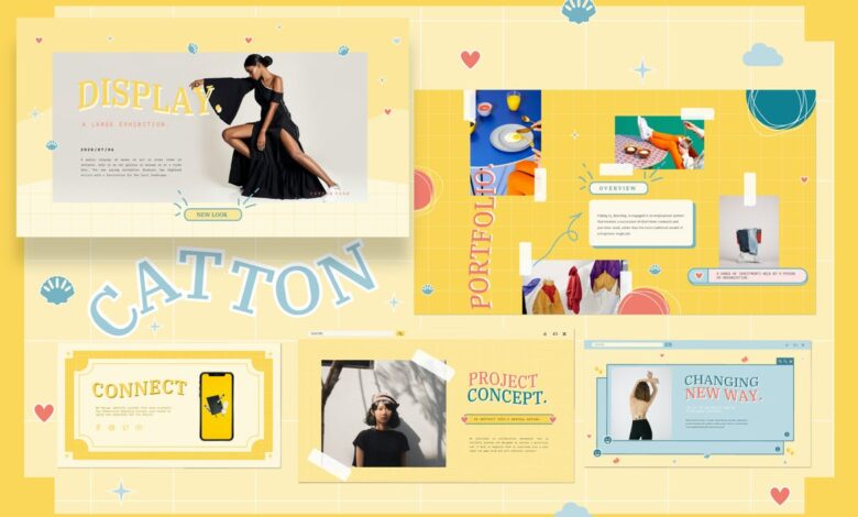
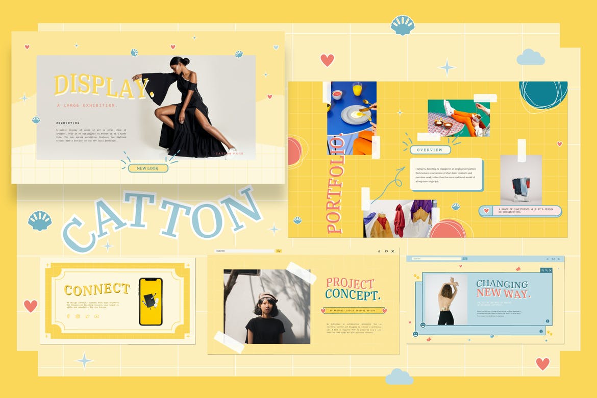
Playful themes utilize bright colors, quirky illustrations, and fun typography to create an energetic and engaging atmosphere. They might include hand-drawn elements, playful icons, or a more informal font selection. Imagery often features cartoonish illustrations or vibrant photographs that reflect a lighthearted tone. These themes are ideal for presentations that aim to be approachable and memorable.
Corporate Google Slides Themes
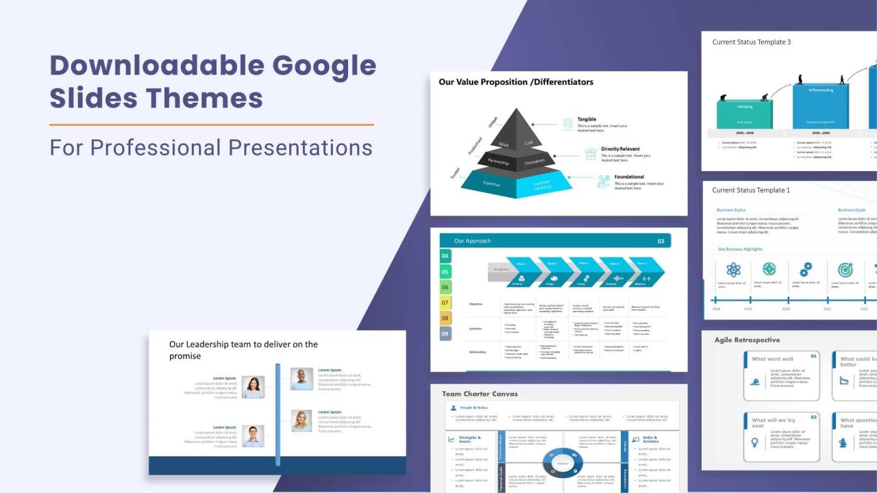
Corporate themes project professionalism and sophistication. They typically use a neutral color palette, often featuring shades of gray, blue, or black, with subtle accents. Typography is usually formal and legible, often using serif fonts for a classic look. Imagery is often high-quality photography, emphasizing professionalism and trustworthiness. The overall effect is clean, credible, and reliable.
Classic Google Slides Themes
Classic themes evoke a sense of timeless elegance and sophistication. They often feature muted color palettes, using earthy tones or soft pastels. Typography usually incorporates serif fonts, providing a sense of tradition and authority. Imagery tends towards elegant photography or subtle graphic elements. These themes are ideal for presentations that require a sense of stability and enduring quality.
| Style | Color Palette | Typography | Typical Use Cases |
|---|---|---|---|
| Minimalist | Monochromatic, limited color palette (e.g., whites, grays, one accent color) | Sans-serif fonts (e.g., Open Sans, Roboto) | Product launches, data presentations, technical reports |
| Modern | Bold colors, gradients, geometric patterns | Mix of sans-serif and serif fonts (e.g., Montserrat, Playfair Display) | Creative projects, marketing campaigns, portfolio presentations |
| Playful | Bright, vibrant colors, pastel shades | Informal fonts, hand-drawn elements | Educational presentations, children’s events, informal team meetings |
| Corporate | Neutral tones (grays, blues, blacks), subtle accents | Formal serif or clean sans-serif fonts (e.g., Times New Roman, Arial) | Business proposals, investor pitches, company reports |
| Classic | Muted colors, earthy tones, pastels | Serif fonts (e.g., Garamond, Georgia) | Formal events, academic presentations, historical overviews |
Finding and Evaluating Free vs. Premium Themes
Choosing the right Google Slides theme can significantly impact the presentation’s overall effectiveness. While free themes offer a convenient starting point, premium themes often provide a wider array of features and a more polished professional look. Understanding the differences is crucial for making an informed decision. This section explores the advantages and disadvantages of both, helping you determine which option best suits your needs and budget.The decision between free and premium Google Slides themes hinges on several factors, primarily your budget, design skills, and the level of professionalism required for your presentation.
Free themes are readily accessible and offer a basic level of customization, suitable for casual projects or internal communications. However, premium themes provide a more comprehensive set of features, including advanced design elements, unique layouts, and often superior quality graphics, making them ideal for professional presentations, client proposals, or important presentations where making a strong first impression is key.
Free vs. Premium Theme Comparison
The table below directly compares the features and limitations of free and premium Google Slides themes. Remember that the specific features offered can vary depending on the individual theme provider.
| Feature | Free Themes | Premium Themes | Overall Assessment |
|---|---|---|---|
| Design Quality | Often basic, may lack originality or high-resolution graphics. | Typically higher quality graphics, unique designs, and more sophisticated layouts. | Premium themes generally offer a more polished and professional aesthetic. |
| Customization Options | Limited customization options; may be difficult to significantly alter the core design. | Extensive customization options; often include master slides, allowing for consistent branding across the presentation. | Premium themes provide greater flexibility and control over the presentation’s design. |
| Number of Slides & Layouts | Usually a smaller selection of slides and layouts. | Wider variety of slide layouts and options, catering to different presentation needs. | Premium themes offer more versatility for diverse presentations. |
| Support & Updates | Limited or no support; updates are infrequent or nonexistent. | Often includes customer support and regular updates with bug fixes and new features. | Premium themes offer better long-term value and peace of mind. |
| Cost | Free to use; may require attribution in some cases. | Requires a one-time or subscription-based payment. | Cost is a significant factor; weigh the investment against the potential return. |
| Uniqueness | Higher chance of encountering similar themes used by others. | Lower chance of encountering identical themes, allowing for a more distinctive presentation. | Premium themes contribute to a more memorable and impactful presentation. |
The Value Proposition of Premium Themes
Investing in a premium Google Slides theme offers several key advantages beyond what free themes provide. For example, a professional-looking presentation delivered to potential clients using a high-quality premium theme can significantly enhance credibility and increase the likelihood of securing a deal. The time saved by using a pre-designed, well-structured theme, complete with high-resolution graphics, allows for more focus on the presentation content itself rather than spending hours designing from scratch.
This improved efficiency translates to a better return on investment (ROI) of your time. Furthermore, the superior design quality of premium themes contributes to a more engaging and memorable presentation, ultimately leading to better communication and more effective results. The availability of ongoing support and updates provides additional value, ensuring your presentation remains visually appealing and functionally sound.
Incorporating Visual Elements Effectively
Source: slideuplift.com
Choosing and placing visuals is crucial for a compelling Google Slides presentation. A well-designed theme provides a foundation, but the effective use of images and other visual elements elevates it from merely presentable to truly engaging. Think of your visuals as the storytellers, working in harmony with your text to convey your message powerfully and memorably.Effective visual communication hinges on carefully selected imagery and its strategic placement.
Poorly chosen or haphazardly placed visuals can distract from your message, leading to audience confusion and disengagement. Conversely, high-quality images strategically integrated within your design significantly enhance comprehension and retention.
Image Selection and Placement
The images you select should directly relate to the content of your slides. Avoid using generic stock photos that lack relevance; instead, opt for images that are high-resolution, visually appealing, and accurately represent your topic. Consider the mood you want to evoke: a vibrant image might be suitable for an energetic topic, while a more subdued image might be appropriate for a serious subject.
Placement is equally important. Avoid cluttering slides with too many images; strategically place them to create visual interest and guide the viewer’s eye. For instance, a compelling image could be placed next to a key point, emphasizing its importance. Imagine a slide about sustainable practices: instead of a generic image of a plant, you could use a close-up photo of hands planting a tree, visually connecting with the audience’s emotions and experiences.
Visual Hierarchy and Attention Guidance
Visual hierarchy directs the viewer’s attention to the most important information. This is achieved through the strategic use of size, color, contrast, and placement. Larger images and bolder text naturally draw the eye first. Think of a typical magazine layout: the main headline is large and prominent, while smaller text provides supporting details. You can replicate this in your slides by using a large, high-quality image to introduce a key concept, followed by supporting text and smaller images that provide context.
Consider using color strategically; a bright color against a neutral background will naturally attract attention. For example, a vibrant infographic summarizing key data points could be placed centrally, while text is positioned subtly around it.
Creating Visual Consistency
Maintaining visual consistency across your presentation is paramount. This ensures a professional and polished look. Use the same font styles, colors, and image styles throughout your presentation. Consistency reinforces your brand and message, making it easier for the audience to follow along. A consistent style guide, even a simple one, outlining font choices, color palettes, and image styles, can help you achieve this.
If your theme already provides a consistent color palette, leverage it by using these colors consistently across all your images, text, and shapes. For instance, if your theme uses a blue and green palette, you can maintain this consistency by using images with similar color tones, or using those colors to highlight important information in your text.
Accessibility and Inclusivity in Theme Design: Best Cool Google Slides Themes
Choosing a Google Slides theme isn’t just about aesthetics; it’s about ensuring your presentation is accessible and inclusive to everyone in your audience. A visually appealing theme that excludes a portion of your viewers due to accessibility issues or cultural insensitivity defeats the purpose of effective communication. Creating presentations that are both visually engaging and universally accessible requires careful consideration of design elements and their impact on diverse users.Making your presentations accessible is crucial for reaching a wider audience and ensuring everyone can understand and engage with your message.
Inclusivity, meanwhile, demonstrates respect for the diverse backgrounds and experiences of your audience, preventing unintentional offense and promoting positive communication. By prioritizing accessibility and inclusivity, you create a more equitable and welcoming experience for all.
Color Contrast and Font Considerations
Sufficient color contrast is paramount for readability, particularly for users with visual impairments. A theme with low contrast between text and background can make it extremely difficult to read, rendering the presentation inaccessible. Similarly, font size should be large enough to be easily read, even from a distance. Aim for a minimum font size of 18 points for body text and larger for headings.
Consider using sans-serif fonts like Arial or Calibri, as they are generally easier to read than serif fonts. Tools like WebAIM’s Color Contrast Checker can help you ensure your chosen color combinations meet accessibility standards (WCAG guidelines recommend a minimum contrast ratio of 4.5:1 for normal text). For example, a dark blue background with light yellow text would likely fail this test, while a dark blue background with white text would generally pass.
Avoiding Stereotypes and Cultural Insensitivity
Inclusivity in theme design goes beyond accessibility for people with disabilities. It also involves avoiding the use of images, icons, or color schemes that perpetuate stereotypes or are culturally insensitive. For instance, using images that depict only one gender or ethnicity, or employing color palettes associated with specific cultural traditions inappropriately, can alienate or offend segments of your audience.
Strive for diverse representation in your visuals, choosing images that reflect the variety of people in the world. Avoid using clichés or stereotypes associated with particular ethnic groups, religions, or genders. Remember to carefully consider the global context of your presentation and ensure your imagery is appropriate for all viewers.
Finding the best cool Google Slides themes can really elevate your presentations, and a polished presentation is key whether you’re pitching a project or showcasing your work. To get your message out there effectively, consider boosting your reach by checking out this great guide on getting it on with youtube ; it’ll help you get your amazing presentations in front of a wider audience.
Then, you can find even more awesome Google Slides themes to keep your content fresh and engaging!
Accessibility Checklist for Google Slides Themes
Before settling on a Google Slides theme, consider this checklist:
- Color Contrast: Does the theme offer sufficient contrast between text and background colors? Use a color contrast checker to verify compliance with WCAG guidelines.
- Font Size and Style: Is the default font size large enough (at least 18 points for body text)? Is the font style easy to read (sans-serif fonts are generally preferred)?
- Image Selection: Do the images used in the theme represent a diverse range of people and avoid perpetuating stereotypes or cultural insensitivity?
- Alternative Text for Images: Does the theme allow for adding alternative text (alt text) to images, which is crucial for screen readers used by visually impaired individuals?
- Layout and Structure: Is the theme’s layout clear, organized, and easy to navigate? Does it allow for sufficient white space to prevent visual clutter?
- Readability: Is the text easy to read, even with potential visual impairments? This includes considerations of font weight, kerning, and line spacing.
Illustrative Examples of High-Quality Themes
Choosing the right Google Slides theme can significantly elevate your presentations. A well-designed theme not only enhances visual appeal but also improves clarity and audience engagement. Here, we’ll explore three examples of themes that demonstrate excellence in design and functionality.
The following examples highlight themes that effectively combine aesthetics and usability, showcasing how thoughtful design choices can transform a simple presentation into a compelling visual narrative.
Minimalist Modern Theme
This theme prioritizes clean lines, ample whitespace, and a sophisticated color palette. Its strength lies in its versatility; it’s suitable for a wide range of presentations, from corporate reports to academic papers.
- Color Palette: A muted palette featuring shades of gray, navy blue, and a subtle accent color like a muted teal or soft olive green. This creates a professional and calming atmosphere without being overly stark.
- Typography: A sans-serif typeface like Open Sans or Lato is used for body text, ensuring readability. A slightly bolder sans-serif font, such as Roboto, is used for headings, providing visual hierarchy. The font sizes are carefully chosen to ensure comfortable reading even on smaller screens.
- Visual Impact: The overall effect is one of sophistication and clarity. The minimalist approach allows the content to take center stage, preventing visual clutter and maintaining focus on the key message.
- Unique Features: This theme might include subtle background textures or geometric patterns that add visual interest without distracting from the content. It could also offer pre-designed slide layouts optimized for different content types (e.g., title slides, data visualizations, quote slides).
Vibrant Corporate Theme
This theme uses a bolder, more energetic approach, suitable for presentations aiming to make a strong, memorable impact. It balances vibrancy with professionalism.
- Color Palette: A combination of a rich, deep base color (e.g., dark blue or deep purple) with bright accent colors (e.g., orange, yellow, or a vibrant green). These colors are strategically used to highlight key information and add visual interest.
- Typography: A clean sans-serif font is used for readability, but a more stylized or slightly decorative font might be used sparingly for headings to add a touch of personality. Consistent font usage across the theme ensures visual cohesion.
- Visual Impact: The theme creates a dynamic and engaging presentation. The use of vibrant colors adds energy and helps to capture attention, while the careful selection of typography maintains professionalism.
- Unique Features: This theme could include custom icons, illustrations, or graphic elements related to the corporate brand or industry. It might also offer pre-designed charts and graphs that seamlessly integrate with the overall aesthetic.
Elegant Nature-Inspired Theme
This theme draws inspiration from nature, creating a calming and sophisticated feel. It’s ideal for presentations related to environmental issues, sustainability, or wellness.
- Color Palette: Earthy tones such as greens, browns, and creams are dominant, complemented by subtle blues or grays. The palette evokes a sense of tranquility and natural beauty.
- Typography: A serif typeface, such as Garamond or Playfair Display, could be used for headings to create a classic and elegant feel. A legible sans-serif font is used for body text for readability. The font choices contribute to the overall sophisticated aesthetic.
- Visual Impact: The theme conveys a sense of calm and sophistication. The natural color palette creates a relaxing atmosphere, while the elegant typography enhances the overall refined aesthetic.
- Unique Features: This theme might incorporate subtle background images of natural elements (e.g., leaves, water, mountains) or use nature-inspired graphic elements as dividers or accents. It could also include pre-designed layouts optimized for showcasing photographs or illustrations of nature.
Customizing and Branding Google Slides Themes
Source: theme-junkie.com
Transforming a generic Google Slides theme into a powerful reflection of your brand is crucial for consistent messaging and professional impact. A well-branded presentation immediately establishes credibility and reinforces your brand identity, leaving a lasting impression on your audience. This process involves more than just slapping your logo on a slide; it’s about integrating your brand’s essence into every visual element.Customizing a Google Slides theme to match your brand involves a strategic approach to color palettes, fonts, and other design elements.
This ensures a cohesive brand experience across all your presentations, strengthening brand recognition and recall. Think of it as extending your brand’s visual language beyond your website and marketing materials into the presentation itself. This consistency is key to building a strong and memorable brand presence.
Modifying Color Palettes
Choosing the right color palette is paramount. Your brand likely already has a defined color scheme – primary, secondary, and accent colors. These should be meticulously replicated within your Google Slides theme. Google Slides offers robust color customization options. You can directly input hex codes for precise color matching or use the color picker to select shades visually.
Consistency is key; maintain these colors throughout the presentation, using them for backgrounds, text, shapes, and charts to create a visually harmonious experience. For example, if your brand uses a vibrant teal (#008080) as its primary color, ensure it’s prominently featured, perhaps as a background color for key slides or as the color for headings.
Applying Brand Fonts
Typography plays a vital role in brand identity. Your brand likely uses specific fonts for headings and body text. Google Slides allows you to select and apply these fonts directly. Maintaining consistency is important; stick to your chosen fonts throughout the presentation. For example, if your brand utilizes “Open Sans” for body text and “Montserrat” for headings, ensure these are consistently applied.
Avoid using too many different fonts, as this can create a cluttered and unprofessional look. Sticking to two or three fonts, maximum, is generally recommended.
Incorporating Brand Elements
This step involves seamlessly integrating your logo and other key visual elements, such as icons or patterns. Google Slides allows you to upload your logo and place it consistently on each slide, perhaps as a watermark or in the footer. Ensure the logo is high-resolution for crisp clarity. Other branding elements, like specific icons or patterns reflecting your brand’s style, can be added strategically to maintain visual consistency and reinforce brand recognition.
Remember to maintain appropriate sizing and spacing to avoid overwhelming the slides. For example, a subtly placed logo in the corner, alongside a consistent header design using your brand fonts and colors, creates a professional and cohesive look.
Applying a Custom Logo
To apply your custom logo, first upload the logo image to your Google Drive. Then, in Google Slides, go to “Insert” > “Image” > “Upload from Drive.” Select your logo file. Resize and position the logo as desired on your master slide (View > Master). This ensures the logo appears on every slide consistently. Consider using a transparent background for your logo for better integration with slide backgrounds.
Remember to maintain a consistent logo size and placement for a polished, professional presentation.
Last Word
Creating stunning and effective Google Slides presentations is within everyone’s reach. By understanding the principles of good design, leveraging both free and premium resources, and prioritizing accessibility, you can elevate your presentations from ordinary to extraordinary. So go forth, unleash your creativity, and make your next presentation unforgettable!
FAQ Section
Where can I find free Google Slides themes?
Google Slides itself offers a selection of free themes, and many websites offer free templates, but be mindful of quality and licensing.
How do I customize a theme’s colors?
Most themes allow you to adjust color palettes within the “Themes” menu. Experiment with different shades and hues to match your brand.
What fonts work best with Google Slides?
Choose clear, legible fonts like Arial, Calibri, or Roboto. Avoid overly decorative fonts that can be hard to read.
Can I use my own custom logo in a theme?
Absolutely! You can easily insert your logo as an image and position it strategically on your slides.
