Graphic Design Print vs Internet
Graphic design print vs internet: It’s a battle of the mediums, a clash of titans in the creative world! We’re diving deep into the fascinating differences between crafting visuals for the printed page and the digital screen. From file formats and color profiles to user experience and cost considerations, we’ll unpack the unique challenges and rewards of each.
Get ready for a whirlwind tour of the graphic design landscape!
This post explores the key distinctions between print and web design, examining everything from technical specifications like resolution and color space to the aesthetic choices and user experience considerations that shape the final product. We’ll delve into the specific software tools used for each medium, discuss cost implications, and touch upon the crucial aspect of accessibility. By the end, you’ll have a solid understanding of the fundamental differences and how to navigate the unique demands of both print and digital graphic design.
File Formats & Resolution
Choosing the right file format and resolution is crucial for successful graphic design, whether you’re creating a print piece or a web graphic. The differences are significant and understanding these nuances will ensure your designs look their best, regardless of the medium. Ignoring these factors can lead to blurry images, distorted colors, and overall poor quality.
Print and web design demand different approaches due to their fundamental differences in output methods and viewing conditions. Print relies on physical inks and precise measurements, while web design leverages screen resolution and digital display characteristics. This impacts the file formats, resolutions, and color spaces we use.
File Format Comparison: Print vs. Web
Different file formats are best suited for print and web applications due to their unique characteristics. For example, PDF is ideal for print due to its ability to preserve vector graphics and fonts, while JPG is preferred for web use due to its smaller file size and widespread compatibility.
| File Format | Ideal Resolution (PPI/DPI) | Color Space | Best Use |
|---|---|---|---|
| PDF (Portable Document Format) | 300 DPI (print) | CMYK (print), RGB (web) | Print, high-quality web documents |
| TIFF (Tagged Image File Format) | 300 DPI (print) | CMYK (print), RGB (web) | High-resolution print, archival purposes |
| JPG (JPEG – Joint Photographic Experts Group) | 72-150 PPI (web) | RGB | Web graphics, photographs |
| PNG (Portable Network Graphics) | 72-150 PPI (web) | RGB | Web graphics, logos, images with transparency |
| GIF (Graphics Interchange Format) | 72-150 PPI (web) | Indexed Color (limited palette) | Animated graphics, simple images with limited colors |
Resolution and Color Space Requirements
Resolution, measured in pixels per inch (PPI) for web and dots per inch (DPI) for print, directly impacts image sharpness. High resolution is crucial for print to ensure crisp lines and fine details when printed at a larger scale. Web graphics, however, don’t need the same high resolution because screen resolution is lower, and higher resolutions would result in larger file sizes and slower loading times.
Color space also plays a critical role; CMYK (Cyan, Magenta, Yellow, Key/Black) is used for print, while RGB (Red, Green, Blue) is used for screens.
For example, a high-quality print design for a poster might require a resolution of 300 DPI and a CMYK color space to achieve vibrant, accurate colors when printed on a large format printer. Conversely, a banner image for a website might only need a resolution of 72 PPI and an RGB color space. Using a high-resolution image (300 DPI) for a web banner would only increase file size without improving visual quality on the screen.
High-resolution images (300 DPI or higher) are essential for print to avoid pixelation and ensure sharp details, while lower resolutions (72-150 PPI) are suitable for web graphics to optimize loading speed and reduce file size.
Color Management
Getting your colors right is crucial, whether you’re designing for print or the web. The difference lies in how color is represented and reproduced – a fact that can lead to frustrating discrepancies if not properly managed. Understanding color profiles and their implications is key to achieving consistent and accurate color across all platforms.Color is fundamentally represented differently for print and digital displays.
The vibrant hues you see on your screen are typically based on the RGB (Red, Green, Blue) color model, while printed materials use the CMYK (Cyan, Magenta, Yellow, Key – black) color model. RGB uses additive color mixing; light is added together to create color. CMYK, on the other hand, uses subtractive color mixing; inks subtract light from white to create color.
This difference is the root cause of many color discrepancies between screen and print. A bright, saturated blue on your screen might appear duller and more muted in print because the CMYK color space has a narrower gamut, meaning it can’t reproduce the full range of colors achievable with RGB.
CMYK vs. RGB: Understanding Color Profiles and Their Impact
The RGB color model, used for screens, is based on emitted light. Each pixel is composed of varying intensities of red, green, and blue light, combining additively to produce millions of colors. The CMYK color model, used for print, is based on reflected light. Cyan, magenta, and yellow inks are combined to absorb light, leaving the reflected color. Black (K) is added to improve the depth and richness of dark tones and reduce ink consumption.
The CMYK gamut is smaller than the RGB gamut; this means that some colors that look great on screen might not be accurately reproduced in print. For example, a bright, vibrant neon green might appear more muted or duller in print, even with professional printing. Conversely, colors that appear rich and saturated in print might appear less vibrant on a screen.
Converting Images Between CMYK and RGB: A Step-by-Step Guide
Converting images between color spaces requires careful consideration. Direct conversion often leads to significant color shifts. Here’s a step-by-step approach:
1. Start with a High-Quality Image
Begin with the highest resolution image possible to minimize the impact of conversion.
2. Choose Your Conversion Method
Most image editing software offers conversion options. Explore different methods and compare results. Some software offers color management profiles which help improve accuracy.
3. Soft Proofing
Before printing, use your software’s soft proofing feature to preview the image in the intended CMYK profile. This gives you a more accurate representation of the final print.
4. Manual Color Correction (Optional)
After conversion, you might need to manually adjust colors to compensate for shifts. This is best done using tools like color balance, curves, or selective color adjustments in your image editor. Pay close attention to the color cast. A color cast is an unwanted hue that affects the overall image.
5. Test Prints
Always do a test print before committing to a large print run. This allows for final color adjustments and avoids costly mistakes.
Best Practices for Color Consistency Across Print and Digital Platforms
Maintaining consistent color across different platforms is crucial for brand identity. Here’s how:
Consistent color is paramount for brand recognition and visual appeal. The following best practices will help you achieve that consistency:
- Define a Brand Color Palette: Create a palette using a specific color space (like Pantone) that works well in both RGB and CMYK. Pantone provides standardized color matches for both digital and print. This allows for precise color matching across platforms.
- Use a Color Management System (CMS): A CMS helps manage color throughout the design and production process, ensuring consistency between your screen, your software, and your printer.
- Work in CMYK for Print Designs: Start your print designs directly in CMYK to avoid color shifts during conversion. This eliminates one stage of potential color alteration.
- Use High-Quality Images: High-resolution images are less prone to color degradation during conversion and printing.
- Regularly Calibrate Your Monitor: A calibrated monitor ensures that the colors you see on screen are as close as possible to the final print.
Design Principles & Aesthetics
Print and web design, while both aiming to communicate visually, diverge significantly in their application of design principles. The constraints and opportunities presented by each medium necessitate different approaches to typography, layout, visual hierarchy, and the use of whitespace. Understanding these differences is crucial for creating effective and engaging designs across both platforms.
The fundamental design principles remain consistent – balance, contrast, proximity, repetition, and alignment – but their implementation varies dramatically depending on the medium. Print allows for a tactile experience and higher resolution, while web design necessitates responsiveness and considerations for screen size and device capabilities. This leads to distinct stylistic choices and technical considerations.
Typography in Print and Web Design
Typography plays a pivotal role in establishing readability and tone. In print, designers often have more freedom to experiment with a wider range of fonts, including those with intricate details or unique textures, which might appear too heavy or slow to load on a website. Serif fonts, with their small flourishes at the ends of strokes, are often favored in print for their traditional and sophisticated feel.
For example, a classic serif like Garamond might be ideal for a high-end brochure, offering elegance and readability. Web design, however, generally prioritizes legibility and fast loading times. Sans-serif fonts, lacking these flourishes, are preferred for their clean and modern aesthetic and better on-screen readability. Helvetica or Open Sans are common choices, ensuring clear text across various devices and screen resolutions.
Additionally, web designers must consider font rendering differences across browsers and operating systems.
Layout and Visual Hierarchy
Print layouts often benefit from a more structured and rigid grid system, allowing for precise control over element placement and visual flow. The physical nature of print lends itself to multi-page layouts and complex design structures. A well-designed magazine, for instance, uses a consistent grid to guide the reader’s eye through articles, images, and advertisements. In contrast, web design embraces flexibility and responsiveness.
Layouts must adapt seamlessly to various screen sizes, from desktops to smartphones. Visual hierarchy on the web is crucial due to the abundance of information and the need to guide users quickly to key elements. This often involves strategic use of size, color, and white space to highlight calls to action and important content. A well-designed website will use clear visual cues to direct users to the most important information first.
Whitespace and Negative Space
Whitespace, or the absence of design elements, is equally critical in both print and web design, but its application differs. In print, whitespace can create a sense of sophistication and calm, preventing a cluttered feel. Think of a minimalist poster with ample white space surrounding a single, powerful image. This allows the image to breathe and command attention.
On the web, whitespace improves readability and enhances the user experience by preventing visual overload. It separates content blocks, making the information easier to scan and digest. Effective use of negative space creates visual breathing room, preventing a cramped or overwhelming layout on websites and apps. However, in web design, whitespace must be balanced carefully to avoid creating a sense of emptiness or lack of content.
The use of whitespace should always serve a purpose in guiding the user’s eye and enhancing the overall experience.
User Experience (UX) Considerations
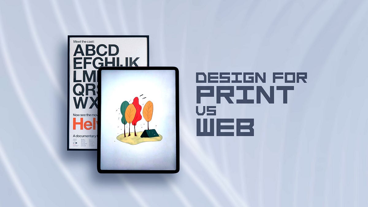
Source: medium.com
User experience (UX) design, while often associated with digital interfaces, is equally crucial in print design. The principles of creating a positive and intuitive experience for the user remain consistent across both mediums, although the methods and considerations differ significantly. A well-designed piece, whether a website or a brochure, guides the user effortlessly towards its intended purpose.Print and web design share the common goal of effective communication, but the ways in which users interact with each medium necessitate distinct approaches to UX.
Print relies on physical interaction and sequential processing, while web design leverages hyperlinks, scrolling, and dynamic content to create a more fluid and interactive experience. Understanding these differences is key to creating effective designs for each medium.
Readability and Navigation in Print Design
Readability is paramount in print design. Factors such as font choice, size, leading (line spacing), and kerning (spacing between letters) directly impact how easily a reader can process the information. Poor readability leads to frustration and a negative user experience. For instance, using a script font for large blocks of text would be a poor choice, as it is less legible than a sans-serif font.
Navigation in print design is typically linear, guided by page layout and visual cues such as headings, subheadings, and visual hierarchies. Clear visual pathways are essential for guiding the reader through the information efficiently. A well-designed magazine, for example, uses clear visual cues to guide the reader through articles and sections, preventing confusion.
Comparison of UX Design Processes for Print and Web
The UX design process, while sharing some common stages like user research and prototyping, differs significantly between print and web. Web design often involves iterative testing and A/B testing to optimize the user experience based on data analytics. Print design, on the other hand, relies more on user research, careful planning, and professional proofing to ensure the final product is effective.
While user feedback is valuable in both, the immediacy of feedback and the capacity for iterative improvements are significantly higher in web design. Consider a website redesign: A/B testing allows designers to compare different layouts and content to determine what works best for users. This kind of real-time, iterative refinement is generally not possible with print design, where revisions are more costly and time-consuming.
User Interaction Differences and Design Implications
User interaction fundamentally differs between print and digital media. Print is a passive medium; users engage sequentially, turning pages and following a predetermined path. Web design, however, is active and dynamic, allowing users to interact with content in a non-linear fashion. This difference significantly impacts design choices. In print, visual hierarchy and clear pathways are crucial for guiding the user’s eye.
On the web, interactive elements like buttons, menus, and animations play a significant role in guiding user navigation. For example, a well-designed print brochure might use color-coding and clear section headings to organize information. A website might use a clear navigation menu, breadcrumbs, and intuitive search functionality to achieve the same goal. The user’s journey is significantly more controlled in print, whereas on the web, the user has far greater freedom to explore and interact with content at their own pace.
Software & Tools: Graphic Design Print Vs Internet
Choosing the right software is crucial for success in both print and web graphic design. The tools you select directly impact your workflow, the quality of your output, and ultimately, the effectiveness of your designs. While there’s some overlap, the specific needs of print versus web design necessitate different software strengths and features.The software landscape is diverse, but certain applications have become industry standards.
Understanding their unique capabilities is key to making informed decisions about your design toolkit.
Print Design Software: Adobe InDesign and Alternatives
Adobe InDesign reigns supreme in the print design world. Its strengths lie in its robust capabilities for page layout, typography control, and precise placement of elements. Features like master pages, styles, and advanced text formatting allow designers to create consistent and complex layouts for books, brochures, magazines, and other print materials. InDesign excels at managing multiple pages and ensuring consistent branding across a publication.
While it’s a powerful tool, it has a steeper learning curve than some other options. Alternatives, such as Affinity Publisher, offer similar functionality at a lower price point, but might lack some of InDesign’s advanced features and extensive plugin ecosystem. QuarkXPress is another veteran player, known for its stability and robust features, though it holds a smaller market share compared to InDesign.
Web Design Software: Adobe Photoshop, Figma, and Other Options
Web design software prioritizes flexibility and responsiveness. Adobe Photoshop, though also used for print, is often employed for creating web assets like icons, buttons, and website banners. Its raster-based nature allows for detailed image editing and manipulation. Figma, on the other hand, is a vector-based collaborative design tool, ideal for UI/UX design and prototyping. Its real-time collaboration features and browser-based accessibility make it a popular choice for teams.
Other popular web design tools include Sketch (primarily for macOS), Adobe XD (combining vector and raster capabilities for UI/UX), and various CSS editors for front-end development. The choice often depends on individual workflow preferences and project requirements.
Software Comparison Table
The following table compares three popular software options for print and web design:
| Feature | Adobe InDesign | Adobe Photoshop | Figma |
|---|---|---|---|
| Primary Use | Print layout & design | Raster image editing, web assets | UI/UX design, prototyping, web design |
| Vector/Raster | Primarily vector | Raster | Vector |
| Collaboration Features | Limited, mostly through file sharing | Limited, mostly through file sharing | Excellent real-time collaboration |
| Cost | Subscription-based (Adobe Creative Cloud) | Subscription-based (Adobe Creative Cloud) | Free plan available, team plans available |
| Learning Curve | Steep | Moderate | Moderate |
| Operating System | Windows, macOS | Windows, macOS | Web-based (Windows, macOS, Linux) |
Cost & Production
Bringing your designs to life, whether on screen or in print, involves a significant cost consideration. Understanding these costs is crucial for effective budgeting and ensuring your project stays within financial parameters. This section breaks down the expenses associated with print production, comparing different methods and illustrating the cost differences between print and digital distribution.Print production costs are multifaceted, encompassing several key areas.
These include the raw materials used, the printing process itself, and any finishing touches applied to enhance the final product. Understanding these individual components allows for a more accurate cost projection.
Print Production Costs
Printing costs vary greatly depending on several factors, including the print method chosen, the quantity of prints needed, the paper stock used, and the complexity of the design. Offset printing, typically used for large print runs, offers economies of scale; the initial setup cost is high, but the per-unit cost decreases significantly with larger quantities. Digital printing, ideal for smaller runs or personalized prints, offers quicker turnaround times and lower setup costs but higher per-unit costs for smaller orders.
Materials such as paper, cardstock, and specialty finishes (e.g., embossing, foil stamping) significantly impact the overall cost. Finally, finishing processes like cutting, folding, binding, and lamination add to the final expense. For example, a 1000-copy brochure printed using offset printing might cost $500-$1000, while the same brochure printed digitally in a run of 100 might cost $300-$500. The difference is largely driven by the setup costs inherent in offset printing.
Comparison of Print Methods
Offset printing excels in large-scale projects, providing high-quality results at a lower per-unit cost for runs exceeding 500-1000 pieces. The initial plate-making process contributes to higher upfront costs, making it less economical for smaller print runs. Digital printing, conversely, shines in short-run and personalized projects. Its speed and on-demand capabilities offset the higher per-unit cost, making it suitable for smaller businesses or projects requiring quick turnaround times.
For example, a small business needing 50 personalized thank you cards would find digital printing far more cost-effective than offset printing. Large-scale publications like magazines or newspapers almost always rely on offset printing for cost efficiency.
Print vs. Digital Distribution Cost, Graphic design print vs internet
The cost difference between print and digital distribution is stark. Digital distribution, using platforms like websites or email, has minimal ongoing costs once the initial design and digital asset creation are complete. Distribution is essentially free beyond the initial setup. Print distribution, however, requires significant investment in printing, materials, and shipping. For example, distributing a 100-page report digitally to 1000 recipients is virtually free after the initial design cost.
Printing and mailing the same report would cost thousands of dollars in printing, paper, and postage. This disparity highlights the substantial cost savings associated with digital distribution, especially for large audiences.
Accessibility & Inclusivity

Source: geeksforgeeks.org
Creating designs that are both aesthetically pleasing and accessible to everyone is crucial for any graphic designer, whether working on print or digital projects. Inclusivity means considering the diverse needs and abilities of your audience, ensuring that your designs are usable and enjoyable by as many people as possible. This goes beyond simply making things “look good”—it’s about ensuring equitable access to information and experiences.Accessibility in graphic design focuses on making designs usable by people with disabilities.
This includes considerations for visual, auditory, motor, and cognitive impairments. While the specific methods differ between print and web, the underlying principle remains the same: design should not exclude.
Accessibility Considerations for Print Design
Appropriate font choices are paramount in print design for accessibility. Legibility is key, meaning choosing clear, easy-to-read fonts like Arial, Verdana, or Times New Roman in larger sizes (at least 12pt for body text, and significantly larger for headings). Sufficient color contrast between text and background is also essential. The WCAG (Web Content Accessibility Guidelines) suggests a minimum contrast ratio of 4.5:1 for normal text and 3:1 for large text.
For print, this translates to avoiding combinations like dark text on a dark background or light text on a light background. Consider using a color contrast checker tool to verify your choices. Furthermore, sufficient white space around text and images helps improve readability and reduces visual clutter, benefiting readers with visual impairments or cognitive differences. For those with visual impairments, the use of tactile elements like raised lettering or braille might be considered in specific applications.
Comparing Accessibility Guidelines for Print and Web Design
While both print and web design share the common goal of accessibility, the methods used to achieve it differ significantly. Web design has a more robust set of established guidelines, primarily the WCAG, which provides detailed technical specifications for making websites accessible. These guidelines cover aspects like keyboard navigation, alternative text for images, and structured HTML. Print design, while lacking such a formalized standard, relies heavily on clear visual communication, appropriate font choices, and sufficient color contrast.
The absence of interactive elements in print simplifies some accessibility considerations but introduces others, such as the need for clear and concise layouts that can be easily understood by individuals with cognitive impairments.
Ensuring Inclusivity in Print and Digital Graphic Design
Inclusivity in design goes beyond meeting minimum accessibility standards; it involves proactively considering the diverse experiences and perspectives of your audience. This includes representing diverse groups of people in your imagery, avoiding stereotypes, and using language that is inclusive and respectful. For example, in a print brochure promoting a health service, using images of people with various ethnicities, ages, and abilities promotes a welcoming and inclusive message.
Similarly, in a website design, providing multiple language options, ensuring that the site is navigable with screen readers, and providing captions for videos ensures a wider audience can access and enjoy the content. Considering cultural sensitivity in imagery and language is also crucial, especially when designing for global audiences. Careful selection of imagery, mindful use of color (considering cultural associations), and the use of plain language that is easy to understand are key elements to ensure inclusivity.
Image Optimization
Getting your images just right is crucial, whether you’re designing for the crisp clarity of print or the fast-loading demands of the web. The techniques used to achieve this differ significantly, impacting both the final aesthetic and the overall user experience. This section dives into the specific optimization strategies for each medium.
The core difference lies in resolution and file size. Print demands high resolution for sharp detail, while web prioritizes smaller file sizes for quicker loading times. Choosing the right file format and employing effective compression techniques are key elements in this process.
Image Optimization for Print
High-resolution images are paramount for print design. The goal is to achieve a level of detail that remains sharp even when printed at large sizes. Using a low-resolution image will result in a blurry, pixelated final product. This necessitates using image formats capable of handling high resolutions and employing color profiles that ensure accurate color reproduction.
For example, a professional photographer providing images for a high-end brochure would supply files at 300 DPI (dots per inch) or higher, usually in TIFF or EPS format. These formats support lossless compression, meaning no image data is lost during compression, preserving the image quality. Furthermore, ensuring the image is in the correct color profile (such as CMYK for most print processes) is vital for accurate color matching.
Image Optimization for Web
Web optimization prioritizes smaller file sizes to ensure fast loading times. Larger files lead to slower page load speeds, negatively impacting user experience and search engine rankings. This requires careful selection of file formats and compression techniques.
JPEG is a commonly used format for photographs due to its good compression ratio. However, JPEG is a lossy format, meaning some image data is lost during compression. The level of compression can be adjusted, balancing file size with image quality. For graphics with sharp lines and solid colors, PNG is a better choice as it supports lossless compression and transparency.
WebP, a newer format, offers superior compression compared to both JPEG and PNG, but browser compatibility needs to be considered.
Preparing Images for Print and Web
Often, you’ll need to prepare the same image for both print and web. This necessitates creating two versions: one high-resolution for print and one optimized for the web. Let’s consider a scenario: You’re designing a product brochure and a corresponding website for a new line of handcrafted jewelry.
For the brochure, you’d start with high-resolution images (at least 300 DPI) in TIFF or EPS format, ensuring the color profile is set to CMYK. For the website, you’d create optimized versions of the same images, likely in JPEG or WebP format, with a resolution suitable for web display (around 72 DPI) and significantly reduced file size using compression tools.
This ensures the website loads quickly without compromising the visual appeal of the jewelry in the brochure.
Specific Examples of Image Optimization Techniques
Consider a high-resolution image of a product, say, a vibrant red handbag. For print, this image would be saved as a TIFF file at 300 DPI in CMYK color mode. For web, the same image would be saved as a JPEG at 72 DPI, with a level of compression chosen to balance file size and image quality. The web version will have a smaller file size, crucial for faster loading times.
So, the big difference between graphic design for print and the internet? Print’s all about that tangible feel, the precise color matching. Online, it’s more about dynamic content and adaptability. But to really get your designs seen online, you need to master video, and that’s where learning how to leverage YouTube comes in – check out this awesome guide on getting it on with YouTube to boost your reach.
Ultimately, understanding both print and digital is key for a successful graphic design career.
Final Thoughts
So, print versus internet – which reigns supreme? Ultimately, the “better” medium depends entirely on your goals. Understanding the core differences in file formats, color management, design principles, and user experience is crucial for any graphic designer. Whether you’re creating stunning brochures or engaging websites, mastering both print and digital design opens up a world of creative possibilities.
Embrace the versatility, explore the nuances, and let your creativity flow across both mediums!
FAQ Resource
What’s the biggest difference between designing for print and the web?
Resolution is a major factor. Print requires much higher resolution for sharp, clear images, while web images are optimized for screen display and smaller file sizes.
Can I use the same design for both print and web?
While you can adapt some design elements, direct transfer is rarely ideal. Resolution, color profiles (CMYK vs. RGB), and file formats differ significantly, requiring adjustments for each medium.
Which software is best for both print and web design?
Adobe Creative Suite (Photoshop, Illustrator, InDesign) is a popular choice, offering tools for both. Figma is a strong contender for web design, and Canva is a user-friendly option for simpler projects.
How important is color accuracy?
Extremely important! Accurate color representation is vital for both print and web, although the color profiles (CMYK for print, RGB for web) differ, requiring careful color management.
